How to Master Smooth Transitions in Digital Art
Unlock the secret to flawless color blending and seamless gradients in digital art. Our comprehensive guide covers techniques, tools, and troubleshooting for professional-looking results—even if you're a beginner.
How to Master Smooth Transitions in Digital Art
I remember staring at my tablet, frustrated for hours. A vibrant sky met a purple mountain range, but instead of a gentle gradient, it looked like two neon-colored construction paper colliding with each other. Harsh. Ugly. Like a 5-year-old's finger-painting project gone wrong. Smooth transitions in digital art? Felt like trying to whisper in a disco club. But then something clicked—and today, I want to share that aha moment with you. Those seamless shifts between colors and textures aren't magic. They're a skill. And they're about to become yours.
Let me tell you something I wish I'd known earlier: transitions aren't just about making art "pretty." They're the difference between amateur work and professional mastery. I've spent years perfecting these techniques, watching my abstract pieces transform from flat compositions to immersive experiences. Today, I'm going to give you everything I've learned—no fluff, no shortcuts, just the real techniques that work. This isn't just about making pretty gradients; it's about creating art that makes people stop, look, and feel something.
The Crucial Role of Transitions
Let's talk about why this matters beyond just "making things pretty." Transitions are the backbone of mood, depth, and professional polish in digital art. Think of your composition as a conversation between elements:
- Depth layers: A soft atmospheric haze between foreground and midground creates instant distance
- Emotional flow: Gentle transitions in abstract pieces guide the viewer's eye through color narratives
- Realism: Seamless skin shading or fabric gradients sell the illusion of form and light
- Professional credibility: Flawless transitions signal technical mastery to fellow artists and clients
- Visual storytelling: How colors merge can create narrative tension or resolution
Without them? Your artwork feels flat, disjointed, and amateurish. I've seen it in galleries—artists with stunning concepts lose impact because of jarring color shifts. Don't let that be you.
Here's what separates the amateurs from the professionals: professionals understand that transitions are active design choices, not happy accidents. Every gradient, every soft edge, every blend tells a story about light, emotion, and space. This is what makes viewers stop scrolling and actually look at your work.
Key Concepts: Beyond Simple Brushwork
Before touching any tool, we need to understand what smooth transitions actually are:
Concept | What It Is | Why It Matters |
|---|---|---|
| Gradient | Gradual color shift between two hues | Creates dimension and light direction |
| Midtone Blending | Merging highlights/shadows into shared color space | Prevents harsh "halo" edges |
| Texture Integration | Seamless fusion of patterns (e.g., clouds on sky) | Maintains visual cohesion |
| Luminance Flow | Consistent light values across transition zones | Preserves realism despite abstract styles |
| Color Harmony | Scientifically balanced color relationships | Creates emotional resonance viewer subconscious responds to |
| Edge Softness | Controlled loss of definition at boundaries | Directs viewer attention and creates natural flow |
| Atmospheric Perspective | Color shift based on distance | Creates believable depth illusion |
| Subsurface Scattering | Light penetration simulation | Adds realistic quality to skin, leaves, translucent materials |

True mastery isn't just about avoiding lines—it's about controlling visual tension. That slight color vibration where ocean meets sunset? That's where art happens.
The Science Behind Smooth Transitions
What's really happening when we blend colors? It's not just about making things look "pretty"—there's actual optical physics at play. When two colors transition smoothly, we're creating simultaneous contrast—where adjacent colors influence each other's perception. This is why a blue sky can make distant mountains appear warmer, and why skin tones need careful midtone blending to look lifelike.
Understanding color temperature relationships is crucial. Warm colors (reds, oranges) advance visually, while cool colors (blues, greens) recede. Professional artists use this knowledge to create depth even in abstract compositions. That sunset you're trying to blend? The oranges and pinks should feel closer to the viewer than the deep blues of the distant horizon.
Essential Toolbox: Your Transition Arsenal
Let's get practical. You'll need these tools—they're the non-negotiable foundation:
Software Considerations
Different digital art platforms have different strengths when it comes to blending:
Software | Best For | Unique Features |
|---|---|---|
| Adobe Photoshop | Photo-realistic blending | Advanced brush engine, frequency separation |
| Procreate | Mobile/tablet artists | Smoothest pressure response, intuitive interface |
| Clip Studio Paint | Comic/illustration work | Excellent vector integration, perspective tools |
| Krita | Free alternative | Natural media simulation, powerful color management |
| Affinity Photo | Budget-conscious | Professional tools without subscription |
Choose based on your workflow, not just price. I started with Photoshop but now use Procreate for its incredible pressure sensitivity on the iPad.
Brush Settings That Actually Work
Don't default to that hard-edged round brush. Configure these parameters religiously:
- Opacity Dynamics: Set to "Pen Pressure" for natural fade-in/out
- Flow Control: Keep between 10-30% for gradual pigment build-up
- Hardness: Stay under 70% (my sweet spot is 45-55%)
- Size Jitter: Enable minimal variation (5-10%) for organic edges
- Brush Texture: Add subtle grain (8-12%) for natural pigment feel
- Smoothing: Set to moderate (40-60%) to avoid robotic edges
- Wet Edges: Enable for watercolor-like blending effects
- Airbrush Mode: Toggle for very gradual buildup
- Custom Brushes: Create your own with shape dynamics and scattering
My Custom Brush Presets
Here are my go-to brush configurations:

Brush Type | Hardness | Opacity | Flow | Use Case | |
|---|---|---|---|---|---|
| Soft Blender | 45% | 15-20% | 25% | General color transitions | |
| Atmospheric | 60% | 8-12% | 15% | Distance haze effects | |
| Texture Weave | 30% | 20-25% | 30% | Fabric, skin, organic textures | |
| Sharp Edge | 80% | 25-30% | 40% | Controlled hard edges | |
| Airbrush Smooth | 50% | 5-8% | 10% | Very gradual gradients |  |
| credit, | |||||
| licence |
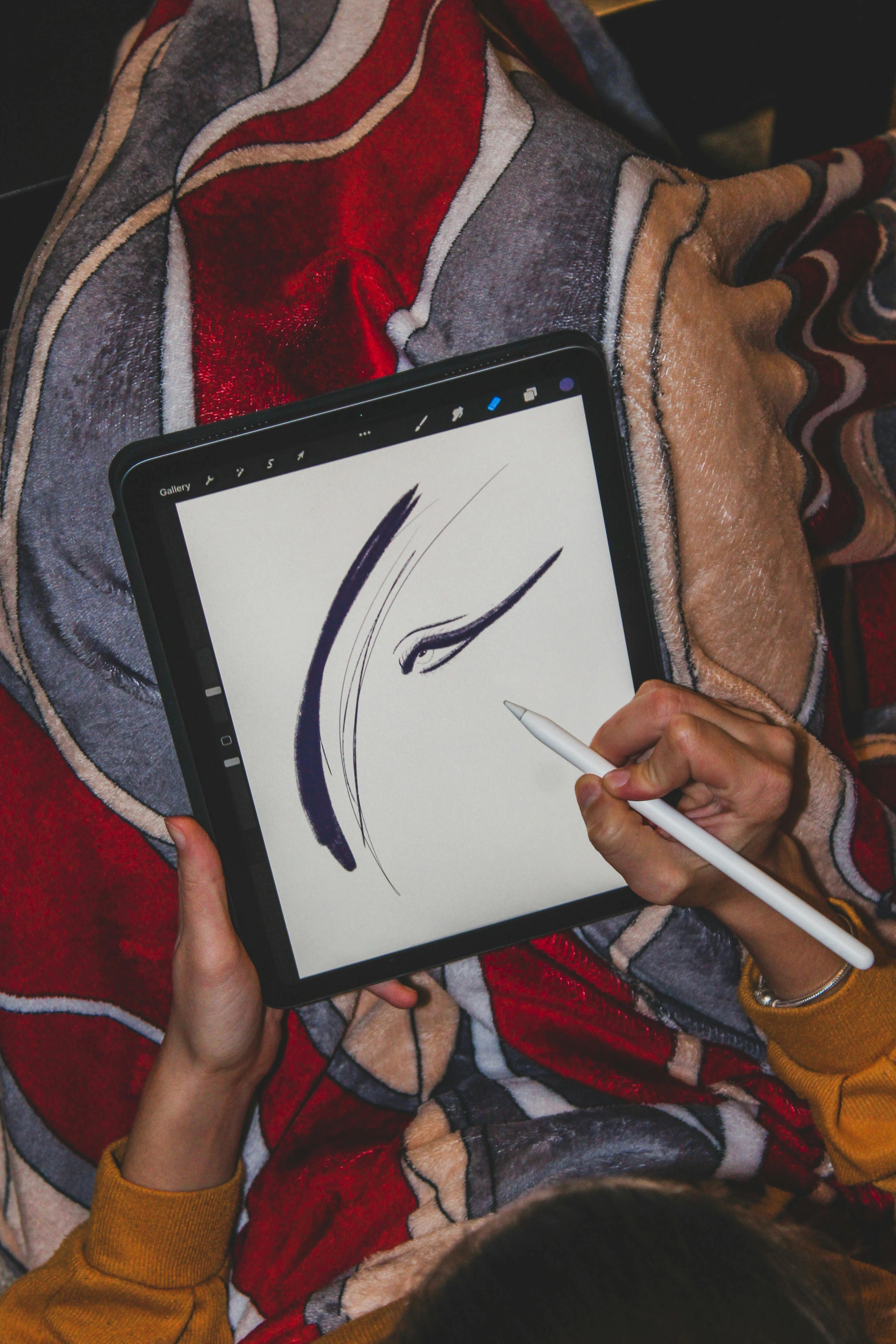
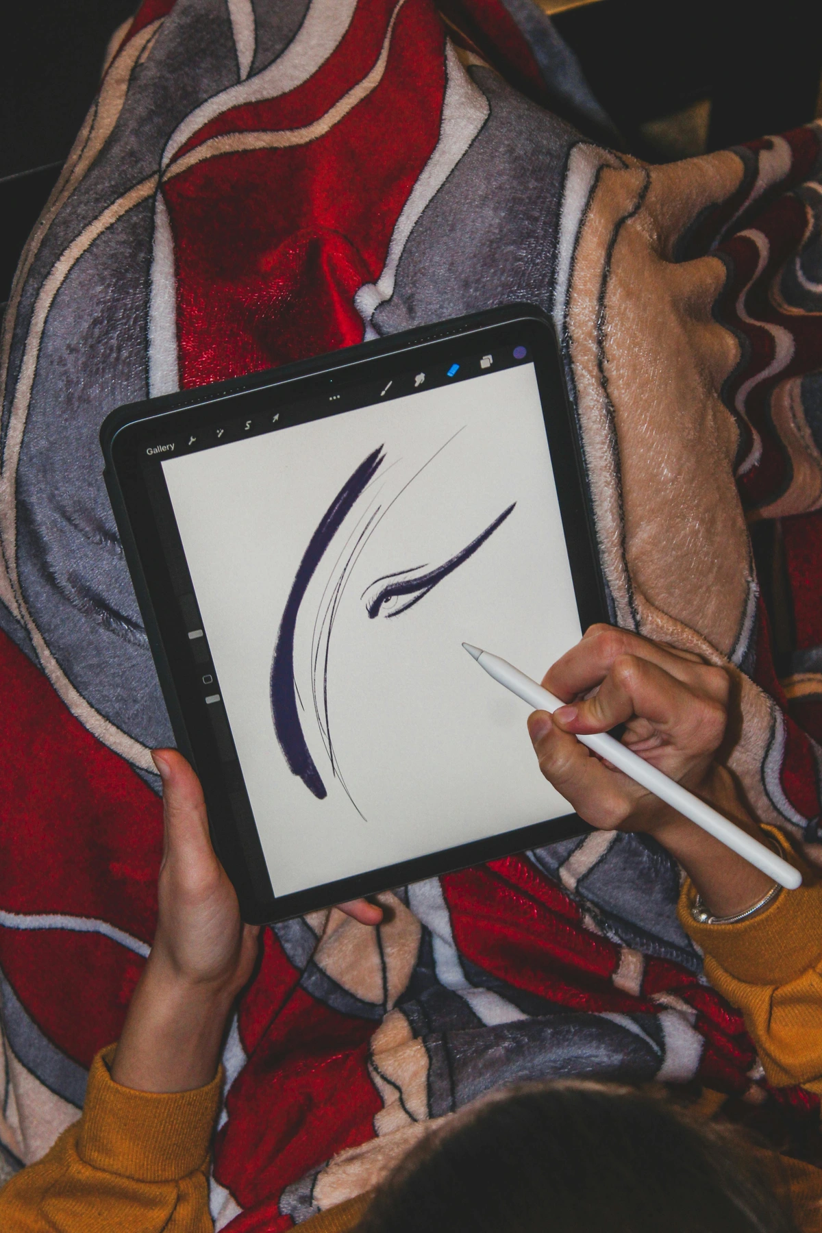
Credit: Scott Graham Licence: Unsplash
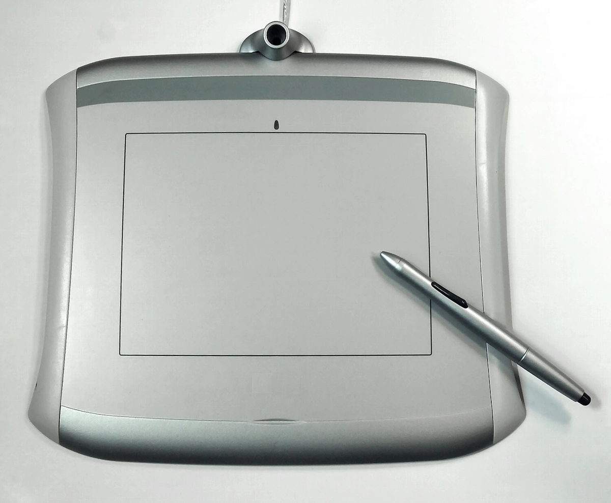
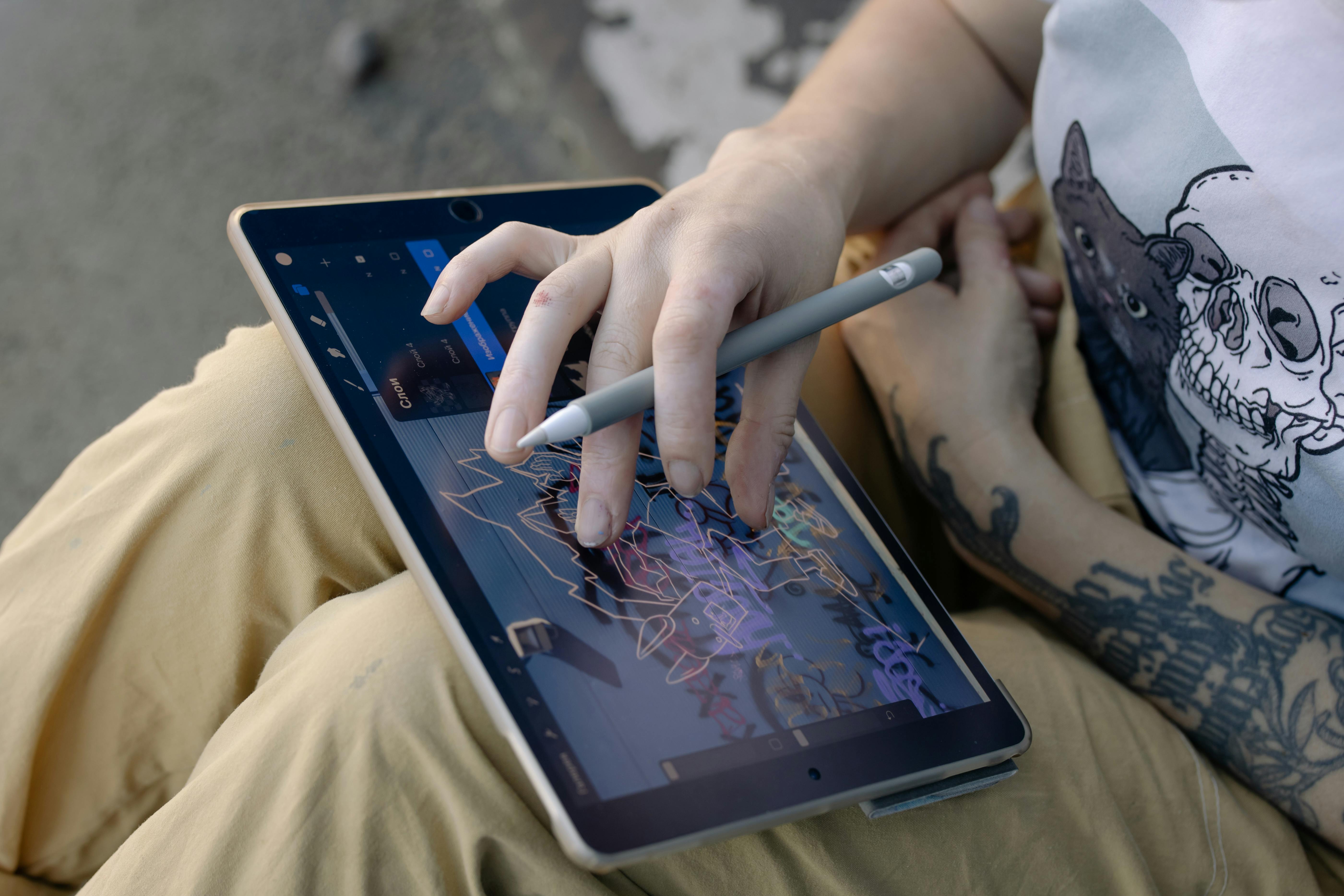
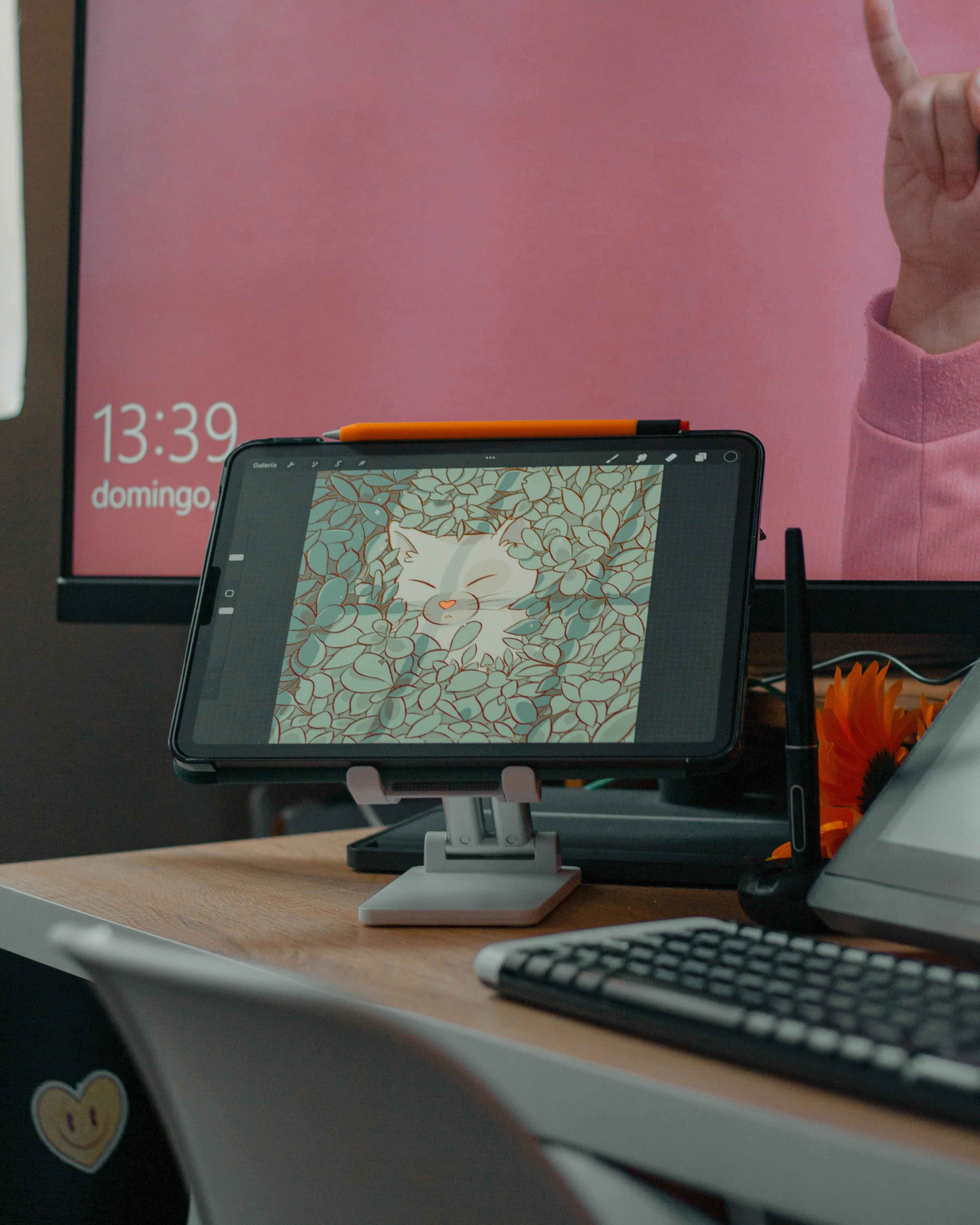
Hardware Recommendations
Your hardware significantly impacts blending quality:
Device Type | Recommended Specs | Blending Benefits |
|---|---|---|
| Graphics Tablet | Wacom Intuos Pro or Huion Kamvas | Pressure sensitivity is non-negotiable for smooth transitions |
| Screen Tablet | iPad Pro with Apple Pencil | Direct-to-screen drawing provides most natural experience |
| High DPI Monitor | 27" 4K or higher | Precise color detection and detail work |
| Color Calibrated Display | Eizo or Dell UltraSharp | Accurate color representation prevents blending surprises |
| Good Lighting | Natural daylight simulation | Reduces eye strain for long blending sessions |
I can't stress this enough: pressure sensitivity makes or breaks smooth transitions. I made the mistake of using a mouse for years—my work improved dramatically the moment I got my first tablet.
Layer Strategy for Perfect Blends
Isolate transition layers early:
Layer Type | Recommended Opacity | Blending Mode | Use Case |
|---|---|---|---|
| Base Color | 100% | Normal | Foundation layer |
| Highlight | 15-25% | Soft Light | Subtle brightness |
| Midtone Blend | 10-20% | Overlay | Shadow integration |
| Atmospheric Haze | 5-10% | Multiply | Depth effect |
| Color Correction | 10-15% | Color | Temperature adjustments |
| Texture Overlay | 8-12% | Overlay | Surface details |
| Final Polish | 5-8% | Normal | Subtle refinements |

Advanced Layer Techniques
Beyond basic layer organization, these techniques will elevate your blending:
- Clipping Masks: Use them for non-destructive blending adjustments
- Layer Groups: Organize different transition types (atmospheric, color, texture)
- Alpha Lock: Perfect for maintaining shape integrity while blending
- Layer Blending Options: Advanced effects like "Color" and "Luminosity" modes
- Adjustment Layers: Curves, Hue/Saturation, and Balance for precise color control
Pro tip: Duplicate your base layer before blending. That backup saved me countless hours when experiments backfired.
The Layer Hierarchy Method: Start with your base layer, then add adjustment layers above, followed by texture layers, and finally finish with atmospheric effects. This top-down approach ensures each layer builds properly on the ones below.
Step-by-Step Mastery Protocol
Ready to get your hands dirty? Follow this workflow for consistently smooth results:
Phase 0: Preparation and Color Theory
Before you even touch your brush, understand these fundamental principles:
- Color Temperature Relationships: Warm colors advance, cool colors recede
- Value Scales: Plan your transition zones using 5-7 key value steps
- Saturation Control: Desaturate transition areas to create natural depth
- Reference Gathering: Collect 3-5 reference images for your transition type
- Brush Testing: Create a small test swatch to verify your brush settings
The Color Temperature Rule: In any transition, the warmer color should typically feel closer to the viewer. This is why sunsets feel warm and intimate, while distant mountains feel cool and distant.
Phase 1: Preparation
- Block in major shapes on separate layers
- Create two new layers above for blending
- Sample colors 3-5 pixels away from transition zones (avoid the hard edges!)
- Set up your workspace with color swatches nearby
- Enable layer visibility toggles for easy comparison
- Create backup layers before destructive operations
- Zoom to 200-300% for precision work
- Check color values using eyedropper tools
Phase 1.5: Color Analysis
Before blending, analyze your colors:
Color Property | Target Range | Why It Matters | |
|---|---|---|---|
| Hue | Within 30-60 degrees | Creates harmony without monotony | |
| Saturation | Gradual reduction (10-20%) | Creates natural depth perception | |
| Brightness | Even distribution | Prevents harsh value jumps | |
| Temperature | Warm to cool progression | Creates believable atmospheric perspective | ### Phase 2: The Technique |
| Now for the magic—my three-step method: |
Step 1: The Underblend
- Select a soft-edged brush (@55% hardness, 15% opacity)
- Sample the receiving color (not the source)
- Paint along the transition edge, staying 5-10 pixels away
- Crucial: Use short, feathered strokes
- Vary pressure for natural pigment buildup
- Work in small sections to maintain control
- Check your work at 100% zoom frequently
Step 2: Luminance Alignment
- Create a clipping mask above your blend layer
- Pick up the darkest/lightest values from adjacent areas
- Paint highlights/shadows following the shape's natural curve
- Lower opacity to 5% for subtle shifts
- Use circular motions for organic blending
- Follow the form's natural contours
- Build up gradually rather than one heavy stroke
Step 3: Texture Weaving (For Advanced Effect)
When working with patterns (clouds, fabrics, skin):
- Apply Displacement Map (Image > Displace) using midtone layer
- Use Texture Brush (grain overlay) at 8% opacity
- Follow with Gaussian Blur (radius 0.8-1.2px)
- Add subtle noise for surface texture
- Use layer masks to control texture application
- Adjust opacity to maintain transparency
Phase 3: Refinement and Polish
This is what separates good from great:
- Edge Softening: Very轻微 blur at hard edges
- Color Harmony Check: Ensure transition zones don't clash
- Value Consistency: Verify smooth value transitions
- Atmospheric Effects: Add distance haze if needed
- Final Details: Small highlights and shadows
Common Transition Types and Their Specifics
Different subjects require different approaches:
Transition Type | Brush Hardness | Opacity | Special Techniques | |
|---|---|---|---|---|
| Sky to Horizon | 40-50% | 10-15% | Atmospheric perspective, color temperature shift | |
| Skin Tones | 30-40% | 15-20% | Subsurface scattering, subtle color variation | |
| Fabric/Folds | 50-60% | 20-25% | Follow weave direction, highlight folds | |
| Metal/Glass | 70-80% | 25-30% | Sharp edges, reflection mapping | |
| Fire/Smoke | 20-30% | 5-10% | Turbulent blending, opacity variations | I learned texture weaving after 18 months of struggling with cloth folds. The result? My abstract textile art finally moved beyond "flat paper." The breakthrough came when I realized I needed to think like a weaver—understanding how threads intersect, how light catches different angles of fabric, and how to translate that digital texture into something that feels tangible and real. |

Troubleshooting Nightmares
Even pros hit snags. Here's how to fix common disasters:
Problem | Cause | Solution |
|---|---|---|
| Mud Puddles | Overlapping warm/cool colors | Use 10% opacity; clean color swatches |
| Halo Effect | Midtone imbalance | Check luminance values in Curves |
| Jagged Edges | Incorrect brush hardness | Reduce to 40%; enable smoothing |
| Color Bleeding | Layer opacity too high | Clip adjustment layers; max 20% |
| Banding | Insufficient color depth | Add noise, use gradient maps |
| Over-blending | Loss of form definition | Preserve key edges, work on new layers |
| Color Cast | Uneven temperature sampling | Use color balance adjustment layers |
| Texture Loss | Excessive smoothing | Add back grain texture, reduce blur |
| Glitchy Transitions | Hardware/software issues | Check drivers, save frequently |
Advanced Problem-Solving Techniques
When basic fixes don't work:
- Frequency Separation: Break image into color and texture layers
- Non-Destructive Workflow: Use adjustment layers instead of direct edits
- Reference Comparison: Side-by-side view with reference images
- Color Isolation: Check individual RGB channels for issues
- Zoom Out: View at thumbnail scale to spot problem areas
The breakthrough came when I stopped blaming my tools. The real issue? Patience. Those hour-long transitions? I now call them "meditation intervals." The key is understanding that blending isn't about covering mistakes—it's about creating something new and beautiful from the intersection of two elements.

Beyond Technique: The Artist's Mindset
Here's what every tutorial misses: transitions are emotional. That sunset gradient? It doesn't just go orange to blue. It whispers "calm" or "melancholy." When blending, I ask:
- Where does this color carry energy? (Sharp transitions keep it)
- Where does the story soften? (Blur here)
- How does light flow? (Follow physics, not laziness)
- What emotion should this transition evoke?
- Where should the viewer's eye rest?
- How does this serve the overall composition?
My abstract pieces now dance because transitions breathe life between chaos and order. It's the same energy you'll find in our den Bosch museum installations—where color becomes a physical experience.
The Psychology of Visual Flow
Humans are wired to follow certain visual patterns:
- Curved paths are more natural than straight lines
- Gradual changes feel more comfortable than abrupt shifts
- Warm colors attract attention more than cool colors
- High contrast creates focal points
- Soft edges guide the eye smoothly
Understanding these principles helps you create transitions that feel intuitive and pleasing to viewers, even if they can't articulate why.
Frequently Asked Questions
What if I don't have a tablet? Start simple. Use GIMP's "Smudge" tool with a 5px brush. Pressure sensitivity helps, but it's not essential—just practice hand control. I began with cheap mice before finding an old tablet at a charity shop. For even cheaper options, try drawing apps on smartphones with styli—many surprisingly good options exist.
Why do my abstract transitions look muddy? You're likely over-blending. Keep midtones visible! Abstract thrives on controlled vibration—not soupiness. Try limiting blend layers to 3-5 strokes per transition. Another common issue is using too many colors in your transitions—stick to 3-5 related hues maximum.
Can I use reference photos? Absolutely! Study real sunsets or stone textures. But translate—not copy. My cloud textures come from observing weather patterns while buying original art materials. The key is understanding the underlying physics and color theory, not just copying the surface appearance.
How do I blend complex fabrics? Break them down: base color > weave texture > shadow following thread direction > highlight on peaks. That timeline piece? Months studying woven tapestries before the digital version clicked. Remember: fabric has structure—follow it!
Why won't blending modes work? Check your color space! RGB works better than CMYK for digital blending. Also, ensure clipped layers haven't accidentally merged. Another issue: some blending modes work differently in different software—experiment to find what works for your tools.
What's the best brush for smooth gradients? For most applications, a soft round brush with 40-60% hardness and 10-20% opacity works best. For smoother results, enable "smoothing" in your brush settings (but don't overdo it, or you'll lose organic texture).
How do I fix banding in digital art? Banding occurs when you don't have enough color depth. Solutions: add subtle noise (1-3%), use gradient maps for better color distribution, or manually add intermediate colors between bands. Working in higher bit depths (16+ bit) also helps.
What's the difference between blending and smoothing? Blending is about merging two different colors or textures together seamlessly. Smoothing is about removing roughness or imperfections in a single color area. You blend transitions between elements; you smooth surfaces within elements.
How long should transitions take? That depends on complexity! Simple color blends might take 5-10 minutes. Complex atmospheric effects could take 30-60 minutes. Don't rush—good transitions reward patience. I often work on them over multiple sessions, coming back with fresh eyes.
What's the most common mistake beginners make? Over-blending! Beginners often blend everything together until everything becomes one uniform mush. Remember: transitions should enhance your composition, not erase it. Preserve important edges and details.
Can I use blending modes for all transitions? No! Blending modes are tools, not solutions. For color-to-color transitions, Normal mode with careful brushwork often works best. Save blending modes for special effects like adding atmosphere, creating glows, or adjusting color relationships.
How do I achieve painterly transitions? For a painterly look, use textured brushes with grain, vary your stroke pressure, and don't blend everything perfectly. Leave some visible brushstrokes and texture. The imperfections add character! Study traditional painting techniques for inspiration.
Your transition Journey Starts Now
Look, I'll be honest—I still despise blending mountains against twilight. It's tedious. But when it works? When that gradient becomes a narrative? That's why we create. Those transitions aren't just techniques. They're visual poetry.
Practice Exercises to Master Transitions
Here are some exercises to build your skills:
- Basic Gradient Practice: Create smooth gradients between primary colors
- Atmospheric Perspective: Blend foreground to background with color shifts
- Skin Tones: Practice realistic skin blending with subsurface scattering
- Fabric Studies: Blend different fabric types and weaves
- Natural Elements: Practice clouds, water, fire, and smoke transitions
- Abstract Compositions: Create seamless color field paintings
- Speed Blending: Set timers (5-10 minutes) to practice efficiency
- Limited Palette: Use only 3-5 colors to force better transitions
Recommended Resources
Books and Tutorials:
- "Color and Light" by James Gurney
- Digital Painting Techniques series
- YouTube channels like Marco Bucci and Ctrl+Paint
Tools and Plugins:
- Photoshop: Kyle's Brush Megapack, Topaz Labs plugins
- Procreate: Paperlike brushes, atmospheric brushes
- Free resources: GIMP brush packs, Krita texture brushes
Community and Feedback:
- ArtStation for professional work
- Reddit's r/DigitalArt for feedback
- Discord art servers for real-time help
Professional Workflow Tips
When you're working on client projects:
- Plan transitions early in the sketch phase
- Save frequently—blending work can be lost easily
- Work at multiple zoom levels for accuracy
- Take breaks to avoid eye strain and poor decisions
- Get feedback when you're stuck—fresh eyes help
- Document your process for future reference
- Backup your work regularly
- Stay organized with clear layer naming
The journey to mastering transitions isn't about becoming perfect—it's about developing your eye, your patience, and your unique artistic voice. Every artist struggles with these challenges, and every breakthrough builds your confidence and skill.
So pick up your brush, configure those layers, and start blending. I'll be right here, cheering you on from my own next abstract mountain range.