
Master Professional Art Sales & Exhibition: Your Ultimate Blueprint for a Lasting Legacy
Elevate your art from studio to sale. This guide offers a comprehensive blueprint, detailing crucial varnishing, impactful presentation, robust documentation, smart pricing, and secure shipping for a thriving artistic career and enduring legacy.
Master Professional Art Sales & Exhibition: Your Ultimate Blueprint for a Lasting Legacy
The thrill of a sale can sometimes lead to overlooking critical professional details – a lesson I learned when I almost handed over a painting without signing it. Seriously. It was one of those lovely sales that flowed as smoothly as well-mixed paint; we'd had a great chat, the payment was sorted, and I was in that happy, post-sale glow, wrapping it up when a little voice in my head, usually reserved for reminding me to buy milk, screamed, "You absolute melon, you forgot to sign the thing!" It was a frantic, slightly embarrassing un-wrapping and signing session while the lovely, patient client waited, probably wondering if I was entirely sane. That near-disaster wasn't just embarrassing; it was a stark reminder that the true 'finished' artwork extends far beyond the final brushstroke. Finishing the painting and finishing the artwork are two completely different things. This wasn't just a lapse in professionalism; it was a glaring omission in the final, crucial steps that could undermine trust and value, and frankly, my livelihood. This isn't just about ticking boxes, or avoiding awkward moments; it's about safeguarding your artistic career, building unwavering trust with collectors, and ensuring your creative legacy endures. It’s the invisible infrastructure supporting your visible creativity, guiding your work from the studio wall to its new, valued home. This is your definitive blueprint, from the last brushstroke to the final delivery, ensuring every piece you create is a testament to your professionalism and your art's inherent value.
So, how do we make sure our art isn't just finished, but truly ready for its journey, its market, and its lasting impact? We focus on three crucial pillars, the unsung heroes of a sustainable art career. These pillars form a comprehensive blueprint designed to equip you with the essential steps to ensure your art isn't just completed, but truly ready to embark on its professional journey, transforming it from a studio creation to a valued, sellable product. This is your guide to mastering professional art sales and exhibition.
The Three Pillars: Protection, Presentation, and Paperwork
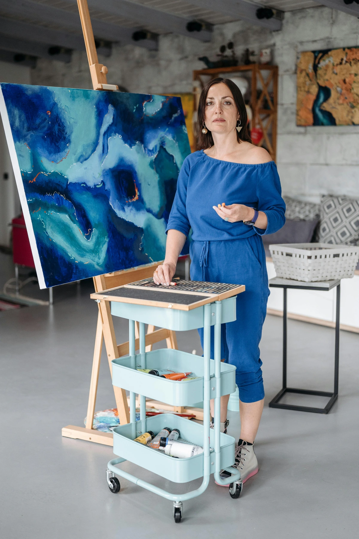
I like to break down this final stage into three core areas because, let's be honest, trying to tackle everything at once can feel overwhelming. If you get these right, you're not just selling a canvas; you're providing a complete, professional product that honors your own work and respects the buyer. This isn't optional, like deciding if you want extra glitter; it's foundational to building a sustainable art career. These pillars are the practical, often unseen, components that elevate your artistic practice from a passionate hobby to a robust, respected profession, allowing your visible creativity to stand on solid ground. Mastering these interconnected elements creates a seamless professional experience for the collector and strengthens your position as a serious artist. When you truly value your work, these steps become second nature, a non-negotiable part of your artistic process.
Pillar 1: Protection (The Final Armor)
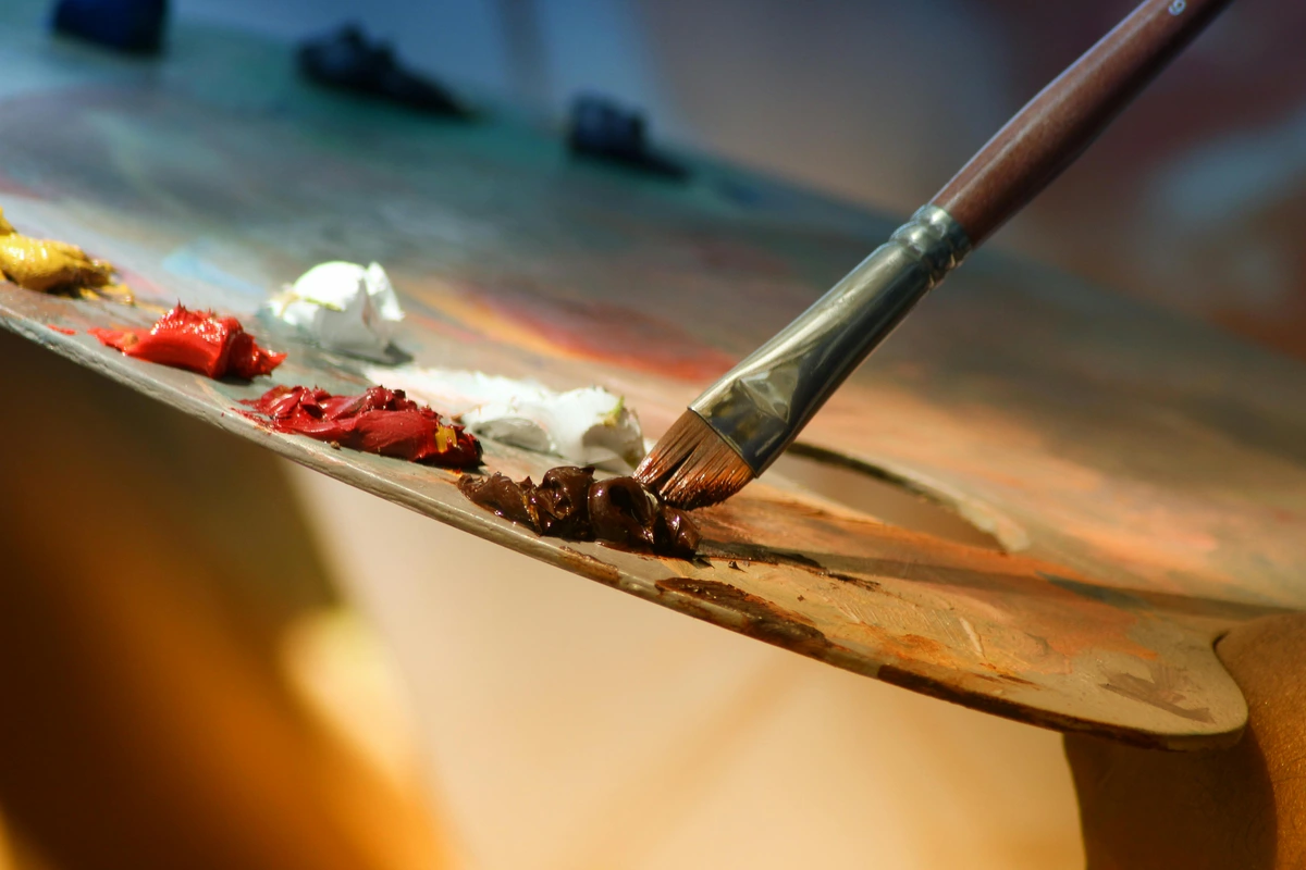
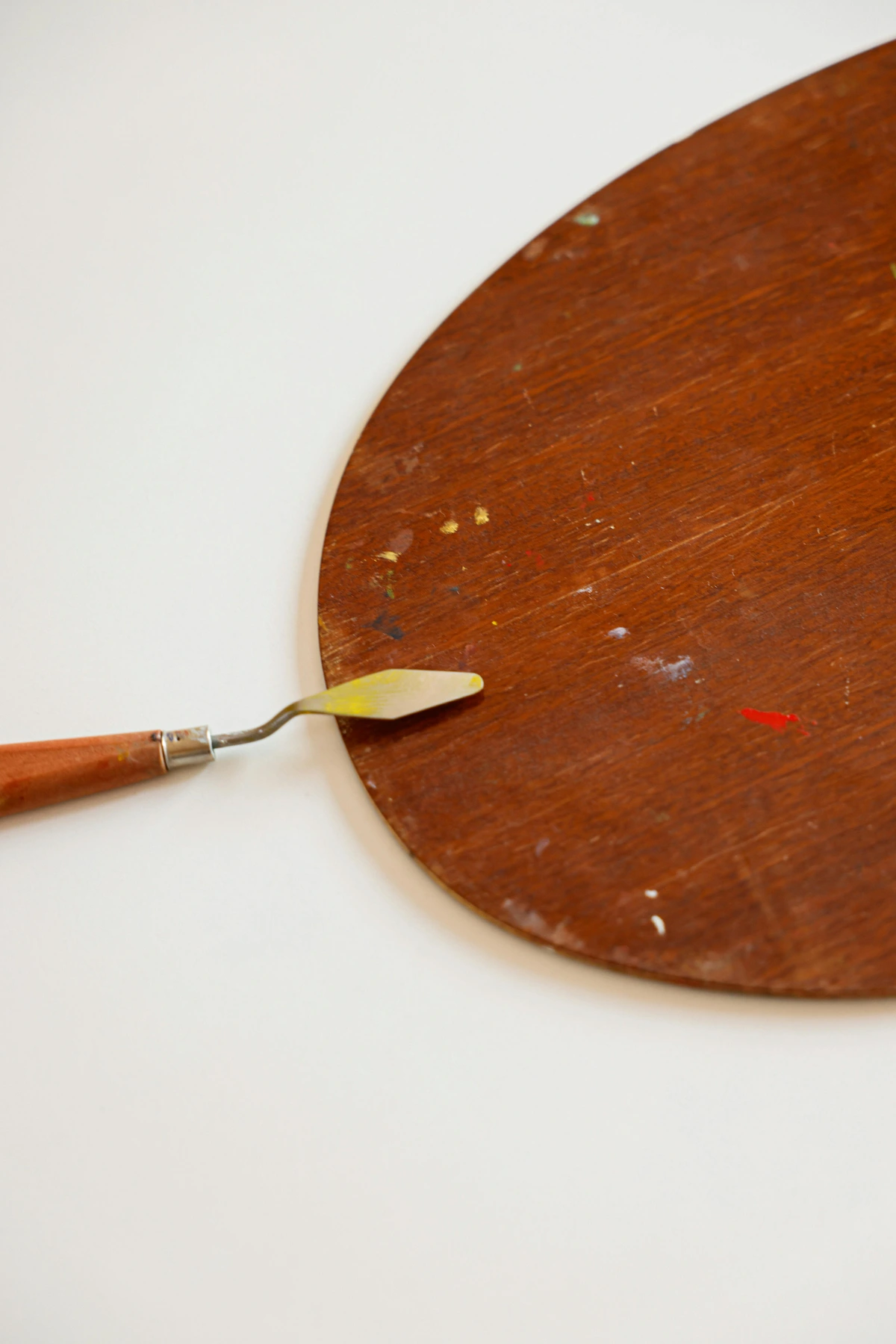
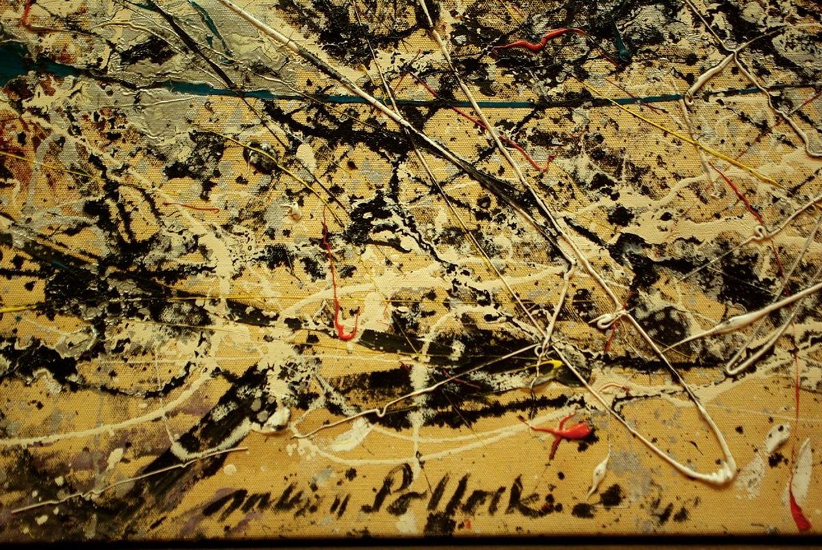
First things first, you need to protect the physical surface of your art. It’s going to live a long life, hopefully, and it will face dust, UV light, and maybe even a stray splash of wine at a dinner party (speaking from personal, slightly panicked experience). Your first, most crucial line of defense is varnish, a clear, protective coating applied to the finished artwork. Without varnish, your masterpiece is exposed to the ravages of time and environment, risking irreversible damage that no amount of future effort can undo. This can directly impact its long-term financial value and your reputation as an artist. Think of it like this: you wouldn't build a beautiful house and then skip putting a roof on it, right? Your varnish is that essential roof for your artwork.
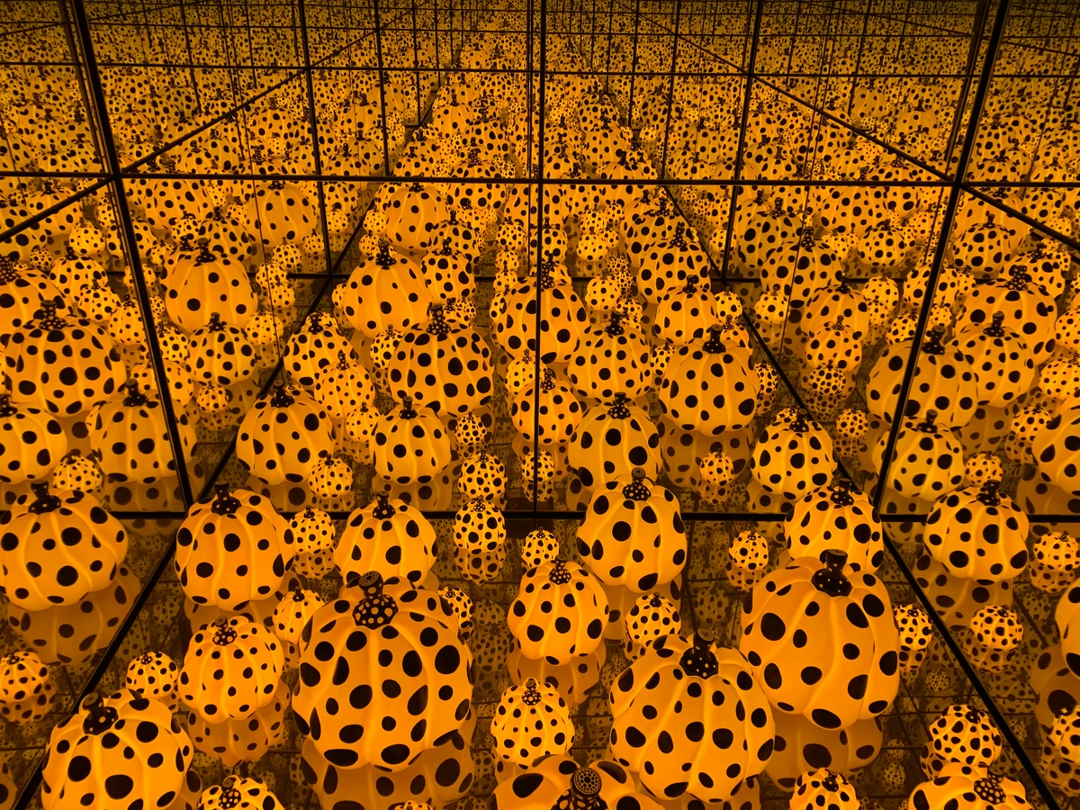
- Why Varnish? More Than Just Shine: Varnish provides a robust protective layer against dirt, grime, and environmental pollutants. Crucially, it also blocks harmful UV light, which can fade your colors over time. Imagine your vibrant reds turning to dull brick tones after a decade in a sunny window, or the delicate details of a portrait becoming obscured by ingrained grime or even accidentally cleaned off by a careless household cleaner. Varnish also plays a role in unifying the painting's sheen—some parts might be matte, others glossy, depending on your paint application; varnish pulls it all together, creating a consistent surface that enhances depth and vibrancy. It also saturates colors, making them appear richer and more vibrant, especially after the paint has dried and perhaps dulled slightly. An added bonus? Varnish can also revive dulled colors, especially in acrylics that sometimes absorb light and appear matte over time, bringing back the vibrancy you intended. For a deeper dive into materials, check out this definitive guide to paint types for artists.
- Pre-Varnish Preparation: The Unsung Hero: Before you even think about applying varnish, ensure your artwork is absolutely, completely dry. This is especially critical for oil paintings, which can take months, even 6-12 months for thicker applications, to fully cure (a chemical process where the oil hardens completely throughout the paint film), not just be touch-dry (meaning the surface feels dry to the touch, but the paint molecules are still undergoing chemical reactions internally). Varnish applied too soon can trap solvents, leading to cloudiness, yellowing, or embrittlement and delamination of the varnish layer over time. Think of it like pouring concrete: you wouldn't walk on it until it's fully cured, not just surface dry. For acrylics, while they don't need the same chemical curing time as oils, it's still essential that they are fully dry and any water-based additives or mediums have completely set and are not tacky before varnishing to avoid issues like blushing or adhesion problems. The surface must also be meticulously clean and dust-free; never varnish in a dusty environment, as this will permanently seal in debris. I use a very soft, dry brush or a lint-free cloth, or even a tack cloth (used gently for oils), to gently remove any debris. Skipping this step is how you end up with a permanently sealed cat hair (speaking from experience, sadly), or worse, plaster dust, airborne paint particles, or residual oils from handling. A pristine surface is paramount. Also, consider the environment: ideally, varnish in a dust-free space with moderate humidity (40-60%) and temperature (65-75°F or 18-24°C) to ensure even drying and prevent issues like blushing (a milky film) or tackiness. Avoid direct sunlight or excessively cold or humid conditions, as these can affect application and drying.
- Gloss, Satin, or Matte? The Aesthetic Choice: This is a deeply personal aesthetic choice, and it significantly impacts how the viewer perceives your work. Think of it like finishing a piece of furniture or the paint on a car:
- Gloss varnish throws colors into sharp relief, making them sing with an almost liquid intensity. It offers the deepest color saturation and highest reflectivity, like a polished, high-gloss car, making colors pop but potentially causing distracting glare. It's often ideal for dark, vibrant abstracts where you want maximum punch and depth, enhancing the perceived depth of the artwork.
- Matte varnish whispers, creating a hushed, contemplative atmosphere where texture takes center stage. It significantly reduces glare, creating a softer, more subtle look, akin to a soft suede texture, but can sometimes slightly dull the darkest colors and make the painting appear flatter. It works wonderfully for minimalist or heavily textured impasto pieces where surface quality is key, allowing the texture to be the star without reflective distractions, like a rough, sand-textured abstract.
- I'm a huge fan of satin varnish. It gives the colors a rich depth without the distracting reflections of a high-gloss finish, finding that sweet spot in the middle, much like a high-quality leather finish. I find it perfect for contemporary acrylics and detailed figurative oils, offering both protection and balanced visual appeal. My advice? Test them on a scrap piece or a hidden edge first, especially when trying a new product or finish. Remember, you can also mix different finishes (e.g., gloss and matte) to create a custom satin or semi-gloss effect, though always test thoroughly. The chosen finish can also subtly affect the perceived texture of a painting, with gloss finishes sometimes smoothing out pronounced textures slightly, or interact with lighting in a room, making certain colors appear warmer or cooler.
- Application Method: Brush-on vs. Spray:
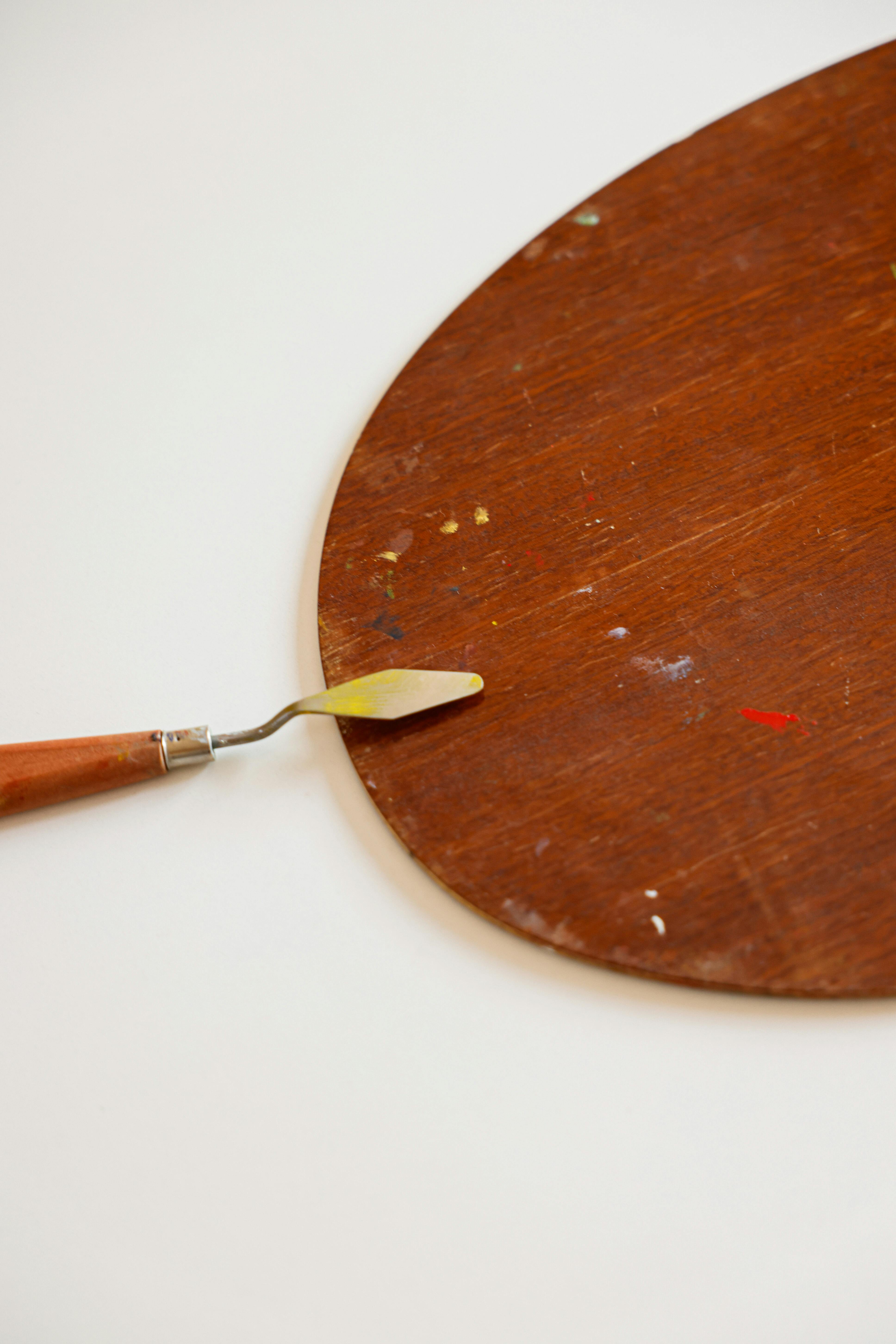
- Brush-on varnishes generally offer excellent control and often a thicker, more durable layer. They are usually solvent-based, providing a strong, permanent finish. Apply with a wide, soft, high-quality varnish brush (like a hake brush) in thin, even coats, allowing each coat to dry thoroughly. Be meticulous to avoid brush strokes, and avoid overworking the surface, which can lead to streaks by reactivating previous layers and causing unevenness. This method is great for larger, flatter pieces where you have control over the environment and want a substantial protective layer. Clean your brush thoroughly immediately after use with the appropriate solvent to maintain its quality for future applications.
- Spray varnishes are ideal for achieving a perfectly even, streak-free finish, especially on highly textured or impasto work where a brush would be difficult. They're often acrylic-based and can be easier for beginners. Hold the can at a consistent distance (as per manufacturer instructions, usually 10-12 inches) and apply multiple thin, overlapping coats in a well-ventilated, dust-free space. I cannot emphasize "dust-free" enough; doing this outdoors on a calm day or in a dedicated spray booth is ideal. For beginners, be cautious of applying too thickly, which can lead to drips, cloudiness, or an uneven finish that is difficult to correct. Always test spray patterns on scrap material first to ensure an even application and correct distance. Also, be mindful of overspray, protect surrounding areas, and wear appropriate personal protective equipment (gloves, mask) as a general safety precaution. My personal preference? I often start with a light spray coat for initial protection and evenness, especially on textured pieces, then follow with a carefully applied brush-on coat for maximum durability and desired sheen on flatter pieces.
- Varnish Types Beyond Finish: Composition Matters: While gloss, satin, and matte refer to the finish, it's also worth knowing about the composition of varnishes, which dictates their chemical properties and suitability for different mediums. These are industry standards trusted by many professionals for their archival qualities. Also consider that varnish can be applied multiple times over the years to refresh the protective layer, especially for pieces displayed in high-light or high-traffic areas. Some varnishes are also designed to be more flexible, important for artworks that might experience slight movement or temperature fluctuations.
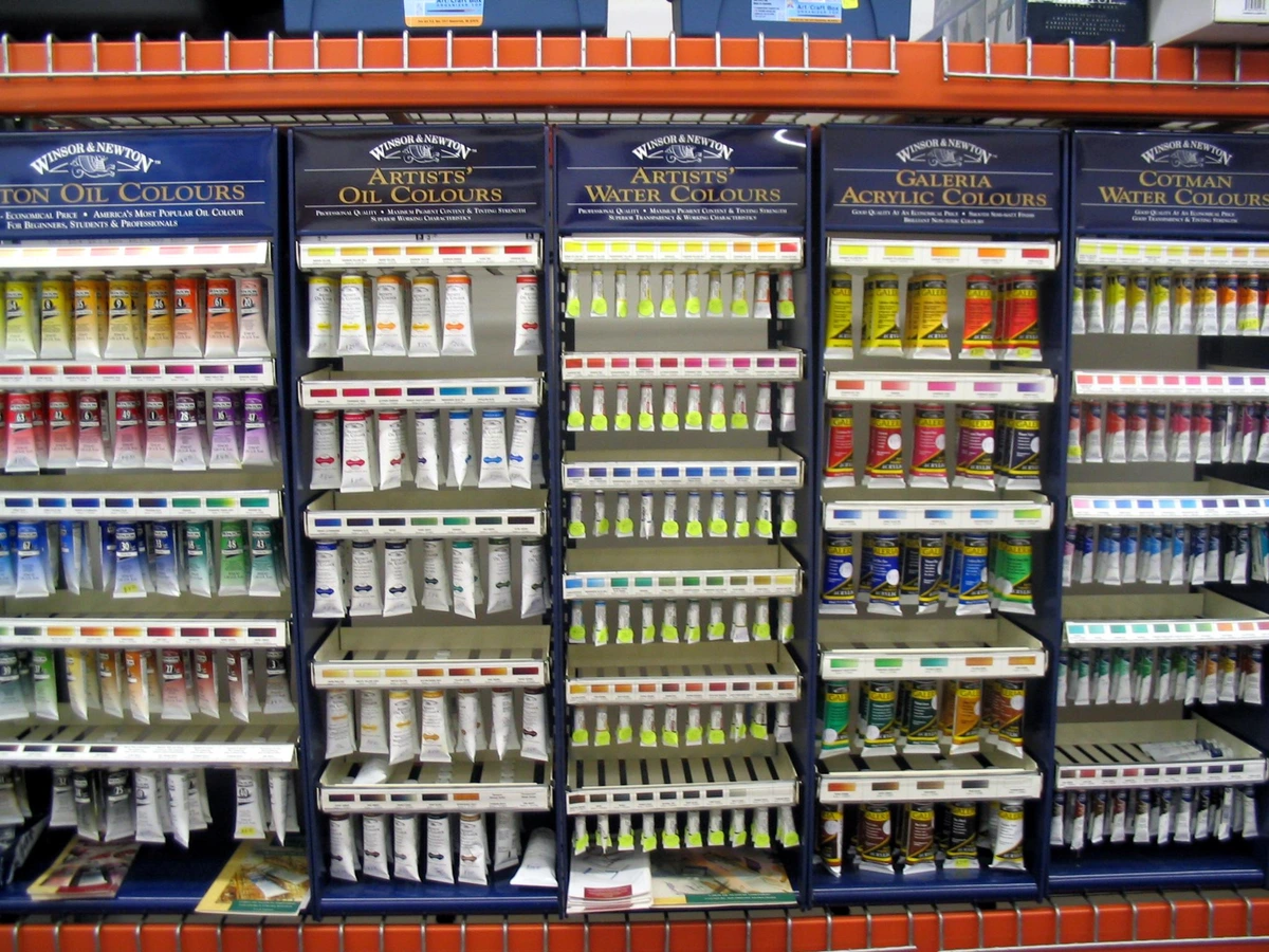
- Acrylic Varnishes: These are typically water-based and generally non-toxic, making them easy to clean up with water. They form a flexible film and are often removable with specific acrylic varnish removers. Great for acrylic paintings, they typically have less odor, lower VOCs (Volatile Organic Compounds), and faster drying times. Examples include Golden MSA Varnish (with UVLS) and Liquitex Professional Varnishes. They should generally not be used on oil paintings due to compatibility issues.
- Solvent-Based Varnishes (e.g., Synthetic Resin): Traditionally used for oil paintings, these offer a strong, durable, and highly protective finish. They are usually removed with mineral spirits or turpentine, requiring more care. While traditional Dammar varnish can yellow slightly over time and may crack, modern synthetic resin varnishes (like Gamblin Gamvar Picture Varnish, which I use for my oils, or Winsor & Newton Professional Matt/Satin/Gloss Varnish) are designed for non-yellowing properties and better long-term stability. Always ensure your oil painting is fully cured (months, not days) before applying, and wait for any specific mediums or additives (like cold wax or drawing media integrated into the painting) to fully cure. Some artists use a "retouch varnish" as a temporary solution for oil paintings that need to be exhibited before being fully cured; however, this is not a permanent substitute for a final varnish. These usually have a stronger odor and longer drying times but offer superior archival protection for oils. They should generally not be used on acrylics, and the solvent in solvent-based varnishes can sometimes reactivate or soften certain types of acrylic paints or mediums, so careful testing is always advised. The difference in sheen consistency is also typically better with synthetic resins compared to natural resins.
- Conservation Varnishes: These are specially formulated removable varnishes (often synthetic resins like MSA, or synthetic alternatives to natural resins) designed to be easily removed without affecting the underlying paint layers using mild, specific solvents. This is crucial for archival purposes and professional art restoration, ensuring the artwork can be cleaned and maintained for centuries. They are designed for long-term stability and minimal interaction with the paint surface. Some older oil paintings may require specialized conservation varnishes, and consultation with a professional conservator might be necessary.
Varnish Type (Finish) | Pros | Cons | Ideal For | My Preference/Notes | Example Impact | Troubleshooting |
|---|---|---|---|---|---|---|
| Gloss | Max color saturation; high reflectivity; vibrant; enhances perceived depth | High glare; can be distracting in certain lighting conditions; can sometimes smooth out pronounced textures slightly | Dark, vibrant pieces where reflectivity is desired (e.g., highly saturated abstracts or works where color intensity is paramount) | Use sparingly or in controlled viewing environments | Makes bold colors pop, but can obscure details with reflections | Cloudiness: Humidity too high or varnish applied too thickly. Streaks: Overworking or too much pressure. |
| Satin | Rich depth; reduced glare; balanced sheen | Can sometimes be perceived as slightly duller than gloss (compared to gloss) | Most general artwork; good compromise (e.g., contemporary acrylics and oils, detailed figurative work) | My go-to for contemporary acrylics and oils | Offers a subtle glow, enhancing form without harsh reflections | Uneven Sheen: Insufficient mixing of varnish; uneven application. |
| Matte | No glare; soft, subtle appearance; modern aesthetic; texture takes center stage | Can slightly dull darks and color vibrancy; delicate surface; can make painting appear flatter | Abstract, minimalist, or heavily textured works; photography (e.g., minimalist landscapes, highly textured impasto like a rough, sand-textured abstract) | Great for works where the surface texture is key | Creates a sophisticated, non-reflective surface, drawing attention to texture | Milky film: Too much flattening agent, especially if unmixed. |
| Varnish Type (Application) | Pros | Cons | Ideal For | My Preference/Notes | Example Scenario | Troubleshooting |
| Brush-on | Thick, durable coating; good control over application | Potential for brush strokes; harder to get perfectly even; environment control | Larger, flatter pieces; artists comfortable with application; less textured work | Requires patience, a steady hand, and a high-quality brush; clean brush immediately after use | Best for achieving a deep, even layer on smooth surfaces, like a detailed portrait | Brush marks: Use a softer brush, apply less pressure, flow varnish evenly. |
| Spray | Even, streak-free finish; easier for beginners; ideal for texture | Thinner coats may require more layers; less control over thickness/drips | Textured work; smaller pieces; quick application; delicate surfaces | Absolute necessity for dust-free conditions; watch for drips if applied too heavily; always test spray pattern first and wear PPE | Perfect for works with significant impasto where brush application would be difficult | Orange peel texture: Applying too close or in humid conditions. |
- Varnishing Alternatives for Delicate Mediums (Watercolors, Pastels, Charcoal): For certain mediums, the very idea of varnish can send shivers down an artist's spine – and for good reason! Varnishing is generally not recommended for works on paper like watercolors, gouache, pastels, or charcoal, as it can drastically alter their delicate pigment structure, smudging, or obscuring the matte texture and appearance of the pigments. It can even cause colors to bleed or darken unpredictably. Instead, the gold standard for protecting these fragile pieces is meticulous framing under UV-protective glass. This provides a physical barrier against dust and humidity while shielding against fading from harmful UV light, all without compromising the artwork's original aesthetic integrity. Think of it as a transparent, impenetrable shield. Also, avoid using hairspray or other household sprays as a makeshift varnish; they are not archival and can cause irreversible long-term damage, yellowing, and brittleness. Don't risk your work with a shortcut! For pastels or charcoals, a professional fixative spray can be used very sparingly before framing, but even then, it's best applied by a professional and not a substitute for proper framing.

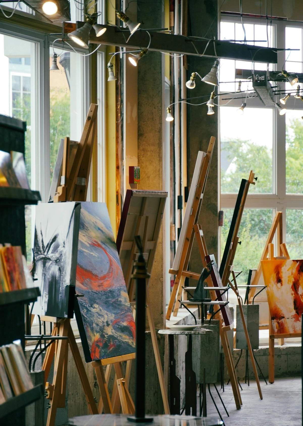
Pillar 2: Presentation (Making it Wall-Ready)
How the artwork is presented says a lot about you as an artist. A sloppy presentation can fundamentally undermine a brilliant piece of work, much like a poorly fitted suit detracts from a stunning design. This is about making a lasting professional impression and ensuring your art looks its absolute best in any setting, whether it's a gallery wall or a collector's living room. Your presentation acts as an extension of your artistic vision.
- Signing Your Work: Your Mark of Authenticity: We've established my near-failure here. The signature is your mark of authenticity and carries legal weight as proof of authorship. Historically, signatures have evolved from prominent, grand marks (think the bold, almost architectural signatures of Old Masters like Rembrandt) to discreet ones (a subtle initial on a contemporary abstract), reflecting changing aesthetic trends and artistic intentions, as well as societal attitudes or art movements. My own preference is a discreet signature on the front (usually a small initial or symbol, low-key so as not to distract) and a more detailed signature with the date and title on the back. It feels less intrusive on the artwork itself. The key, however, is consistency across your body of work. This consistency helps to create a coherent body of work for exhibitions and collections, making it easier for curators and collectors to identify your work and maintain accurate provenance. Pick a spot, pick a style (full name, initials, symbol), and stick to it. This builds your brand and makes your art instantly recognizable. For your digital presence, a small, discreet graphic watermark can serve a similar purpose for online images, subtly claiming authorship without detracting from the visual—just be mindful it doesn't get in the way or make the image unviewable. Remember, if you decide to change your signature over time, the signature used at the time of creation is typically the definitive one for that artwork. For more on this, check out how to sign a painting.
- The Back of the Canvas: The Hidden Professionalism: This is prime real estate! The back should be as neat and tidy as the front. Tidy up any stray paint drips, remove dusty cobwebs, and ensure the staples are secure. For a collector, a clean and professionally labeled back indicates an artist who cares deeply about their work and pays attention to every detail—it shows you respect your own work enough to finish it properly, inside and out. This is also where you should write the artwork's vital information clearly, preferably in archival ink (inks specifically designed to resist fading, bleeding, and degradation over time, ensuring permanence for decades or even centuries). Use a fine-tip archival pen for writing information to ensure legibility and prevent smudging, and test it on scrap material first to ensure it doesn't bleed. For lighter canvases, a black archival pen works well, while a white archival pen is best for darker canvases. Avoid standard ballpoint pens, which can fade or become acidic. You might also consider archival labels (like those from Gaylord Archival or even printable acid-free labels) for a truly pristine look, affixed with archival adhesive spray or double-sided archival tape. If you're creating many pieces, consider using a stencil for consistently formatted text to ensure legibility and a professional appearance. Use a ruler and pencil to lightly guide the placement of text for a neat and professional appearance. Crucially, this information reinforces the artwork's identity for long-term preservation and future provenance records, and should match your Certificate of Authenticity precisely:
- Your Full Name (as it appears on your CoA)
- Title of the Artwork (in quotes, exactly as listed on your CoA)
- Year of Completion
- Dimensions (e.g., 24" x 36" or 60 x 90 cm) – always specify height x width (x depth for 3D), with consistent units (e.g., "inches" or "cm")
- Mediums Used (e.g., "Acrylic and oil pastel on gallery-wrapped linen canvas") – be as specific as possible.
- A Unique Inventory Number – this number should be consistent across all documentation (CoA, back of canvas, inventory software) for easy tracking and authentication. For 3D artworks or sculptures, this information should still be clearly visible, affixed to a stable part of the piece or its base, perhaps on an archival label. For particularly valuable artworks, consider including a small, dated photograph of yourself signing the artwork on the back as part of the documentation.
- Edge Treatment for Unframed Art: The Integrated Frame: If you're selling your artwork unframed, the edges of your canvas are just as important as the front. A "gallery-wrapped" canvas (meaning the canvas wraps around the stretcher bars and is stapled on the back, creating a clean, borderless look) with thoughtfully painted edges is a professional choice that allows the piece to be hung directly without a frame. This could be a continuation of the main painting for an immersive effect, a complementary solid color that picks up a hue from the artwork, or a neutral tone that matches the wall it might hang on, effectively acting as an integrated frame. For minimalist styles, clean white or black edges can work, but they must be pristine and free of accidental marks. For a more refined touch on contemporary pieces, consider metallic paints for a subtle accent or even a clean, sealed edge with a custom wood stripping. Whatever you choose, the edges should look intentional, not neglected. They are part of the artwork's aesthetic and contribute to its overall perceived value. Some artists choose to use a specific type of varnish for the edges of their canvases if they are painting them, to give them a clean, finished look. If you're into DIY, you might even consider a guide to building a floating frame for canvas art to ensure your edges are perfectly presented.
- Framing and Wiring: Ready to Hang, Ready to Love: Are you selling it framed or unframed? If framed, make sure the frame complements the work without overpowering it. A frame is an extension of the art, not a distraction. Consider different frame styles: a minimalist floater frame for contemporary pieces, a traditional ornate frame for classic works, or a simple gallery frame for versatility. If unframed, it must be ready to hang. Install sturdy D-rings (or screw eyes) and appropriate weight-bearing picture wire on the back. For hanging, use braided steel wire appropriate for the artwork's weight (e.g., heavier gauge for larger pieces), placed approximately one-third down from the top edge of the canvas to ensure it hangs level and securely. Ensure the wire is rated for at least the weight of the artwork, with a good safety margin. Nothing is more annoying for a buyer than getting a piece home and realizing they have to take it to a framer just to get it on the wall; that frustration directly impacts their initial experience with your art. Remember, your framing choices contribute significantly to how your artwork is perceived in a domestic or gallery setting. For pieces requiring matting (e.g., works on paper), ensure it's acid-free archival mat board to prevent damage over time, and that the mat color enhances, rather than competes with, the artwork. Always use acid-free backing and mounting materials if the artwork is matted, even if the piece itself isn't on paper, to ensure long-term preservation. Also, consider UV-protective glass in framing as an additional layer of protection for paintings, especially those displayed in sunlit areas. This final touch often elevates the perceived quality and care given to a piece.
- Presentation for 3D Artworks & Sculptures: Elevating Form: Canvases aren't the only children in the art family! If you create sculptures, ceramics, or mixed-media installations, your presentation considerations shift, but the principle of professionalism remains paramount. Ensure your 3D work is stable and secure; nothing screams amateur like a wobbly sculpture. For smaller pieces, consider elegant, archival display cases that protect against dust and accidental touches, or custom-built pedestals that elevate the work both literally and figuratively. For larger installations, clear installation instructions and diagrams are crucial, not just for the buyer but for anyone who might re-install it in the future. If your work has multiple components, ensure they are clearly labeled and that the intended arrangement is unambiguous. Think about how a collector will interact with your piece—will it be displayed on a surface, hung from a ceiling, or mounted on a wall? Providing appropriate (and safely rated) mounting hardware or display accessories adds immense value and convenience. Consider how light interacts with your sculpture; sometimes a specific type of lighting can dramatically enhance its form and texture. A well-presented 3D artwork speaks volumes about the artist's attention to detail and respect for their craft. For further ideas on display, you might find inspiration in articles on displaying sculptures indoors beyond pedestal.
Pillar 3: Paperwork (The Invisible Architecture of Trust)
I know, I know. You're an artist, not an administrator. But this part is non-negotiable. It protects you, the buyer, and the legacy of your artwork. Think of it as the invisible infrastructure supporting your visible creativity, or the backbone of your artistic business. Without it, your beautiful creations are vulnerable, like a house without a foundation. This is where your professionalism truly shines, even in the smallest details. This pillar underpins the trust and value associated with selling art, acting as the invisible architecture of trust that allows your art business essentials to flourish. It’s also crucial for artist career development, maintaining a consistent artist brand, and building professional art sales. While I might groan a little every time I open a spreadsheet, I also know it's what ensures my art can continue its journey, protected and valued.
Your Artist Brand Essentials
- High-Quality Photographs: Your Artwork's Digital Twin: Before that piece leaves your studio forever, you need to document it properly. These aren't just for Instagram; they're for your portfolio, your website, potential prints, insurance purposes, and future provenance records. Don't rely on your phone's auto mode in a dimly lit room; this is a critical professional step. I learned that the hard way when I had to re-photograph a whole series because the colors were completely off – a headache you want to avoid! Remember to also photograph the back of the artwork, especially if there's significant detail or labeling that should be documented.
- Lighting is Everything: Natural, indirect daylight (from a large window or outdoors on an overcast day) is your best friend. For indoor shots, use two continuous soft light sources positioned at 45-degree angles to the artwork to minimize shadows and glare. Avoid direct flash, which creates harsh reflections. To capture texture, a subtle raking light from the side can be effective, but be mindful of casting distracting shadows. For highly textured or metallic works, experiment with subtle lighting adjustments to show off their unique qualities without excessive glare.
- Camera Settings (Smartphone): Ensure the phone is perfectly parallel to the artwork to avoid distortion (use gridlines!). If your phone supports RAW mode or offers a "Pro" mode with manual controls, use it for greater post-processing flexibility and precise control over focus, exposure, and white balance. Crucially, calibrate your white balance against a known neutral color (like a grey card or a piece of white paper) to ensure accurate color representation. Think of it as telling your camera what 'true white' looks like, so all other colors appear as they really are. Accurate white balance ensures that colors in your photographs faithfully represent the actual colors of your artwork, which is crucial for online sales, print reproduction, and maintaining a true representation of your work. Consider using a tripod for your smartphone to ensure absolute stillness and sharp focus.
- Camera Settings (DSLR/Mirrorless): Use a tripod for sharpness. Set your camera to a low ISO (e.g., 100-200) to reduce noise. A higher aperture (e.g., f/8 to f/11) will ensure the entire artwork is in sharp focus. Use a shutter speed fast enough to prevent motion blur, especially if hand-holding, but a tripod removes this concern. For absolute color accuracy, a color checker card (like an X-Rite ColorChecker Passport) photographed in the same light as the artwork will allow for precise calibration in post-processing. Use a remote shutter release or timer to avoid camera shake, even with a tripod. Aim for high-resolution images suitable for various uses.
- Post-Processing (Keep it Real): Use a basic editing app (like Adobe Lightroom Mobile, Snapseed, or your phone's built-in editor) to crop precisely, adjust white balance for accurate colors, and fine-tune brightness and contrast to match the real-life artwork as closely as possible. Avoid heavy filters or oversaturation that alter the true appearance. This is about documentation, not artistic enhancement. If you're serious about color accuracy across all your digital screens, consider investing in a monitor calibration device (like a SpyderX Pro).
- Artist Statements: Your Voice, Your Context: Often required for exhibitions, an artist statement provides crucial context to your work. It's a brief, written introduction to your art, your philosophy, and your process. It helps viewers connect more deeply with what you do. The key is to tailor your statement for different audiences and purposes, avoiding common clichés (e.g., "My art explores the beauty of the natural world" without further specificity; instead, try: "My abstract landscapes, rendered in impasto oils, capture the ephemeral light of coastal sunsets, focusing on the interplay of texture and color to evoke a sense of fleeting moments."). Think of it as your art's dating profile: concise, compelling, and showcasing its best features. Always proofread meticulously and read it aloud to catch awkward phrasing or errors. Ensure it resonates authentically with your visual work, maintaining a consistent artistic voice and visual style across all touchpoints. Also, remember to maintain professional artist credentials, like a well-crafted artist bio and resume, and keep them updated. For more in-depth guidance, consider this article on the art of the artist statement crafting your narrative.
- Short (100-150 words): For exhibition labels, brief bios, or social media captions. Focus on your core themes, medium, and perhaps a key inspiration. (e.g., "My mixed-media abstracts explore the transient beauty of urban decay, utilizing layered acrylics and repurposed materials to capture moments of quiet reflection amidst the city's ceaseless energy, reflecting on moments of stillness in constant flux.")
- Medium (250-300 words): For gallery submissions or portfolio introductions. Expand on influences, techniques, the emotional impact you aim to achieve, and perhaps a concise overview of your artistic journey. (e.g., "Through my gestural abstract paintings, I seek to translate the raw energy of urban environments into a visual language of color and form. Influenced by street art and industrial textures, my process involves building up and scraping away layers of paint, mirroring the city's constant cycle of construction and decay. My aim is to evoke a sense of both the beauty and tension found in these liminal spaces.")
- Longer (500+ words): For your website's 'About' page, grant applications, or in-depth interviews. This can include personal narrative, inspirations, your artistic journey, philosophical underpinnings, and specific historical or contemporary influences. A useful exercise: imagine explaining your art to a curious, intelligent stranger who knows nothing about art. What would you say? (And please, for the love of all that is creative, avoid generic 'art-speak' jargon that alienates rather than engages!)
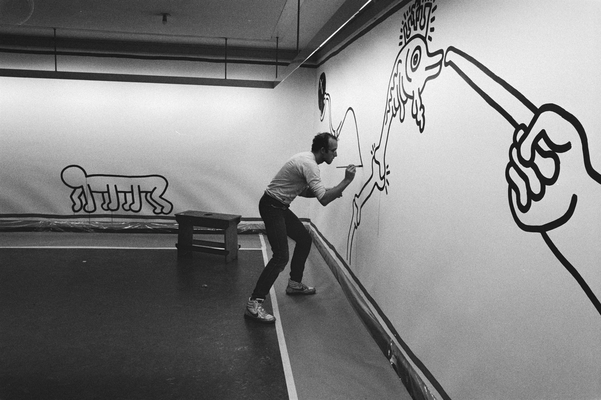
- Documentation of the Creative Process: Your Story Unfolds: While not formal paperwork for a sale, documenting your creative journey is incredibly valuable for building your artist brand and connecting with your audience. Take photos of sketches, works-in-progress, your studio, and even your inspirations (nature, architecture, music, literature, historical events, other artists' work). This isn't just about 'documentation'; it's about sharing the magic, the struggle, and the evolution of your art – it's the stories that truly connect people to your work. Sharing these behind-the-scenes glimpses has not only demystified my process for collectors but has also fostered a deeper connection and appreciation for the dedication behind each piece – it's incredibly rewarding to see how viewers connect with the journey as much as the destination. These provide compelling content for social media (think time-lapse videos of a painting coming to life, short studio tour reels, or "day in the life" glimpses), your artist website, blog posts, or even short exhibition videos, further engaging potential collectors. They offer collectors a deeper connection to your process and demonstrate your dedication and skill, showing the evolution of an idea, not just the final result. Remember to maintain a professional online presence (website, social media) that aligns with your overall professional image. To explore more about my personal process, feel free to visit my timeline.
Key Business Documents

- Certificate of Authenticity (CoA): The Artwork's Passport: This is a formal document that proves the artwork is yours. This CoA isn't just a piece of paper; it's your promise to the collector, adding significant value and legitimacy to the sale and acting as a crucial safeguard against fraud and fakes. A gallerist will expect one, and a private collector will appreciate it immensely. For limited edition prints, each CoA should include the print number (e.g., "3/50") and total edition size. You can provide CoAs physically (printed on quality paper, potentially with a watermark or hologram for security) or digitally (e.g., a PDF), though a physical copy with a wet ink signature is generally preferred for its tangibility and perceived security. Ensure the CoA precisely matches the information on the back of the artwork, including title, year, and dimensions, to avoid any confusion or perceived discrepancies. Consider including a unique inventory or accession number that links directly to your provenance record for seamless tracking and cannot be used for fraudulent purposes with other pieces. For added security, some artists use holographic stickers, embossed seals, or security threads, especially for high-value pieces. The CoA is also typically transferable if the artwork is resold, which adds to its long-term value and provenance. If the artist has passed away, the signature of their estate or executor, along with proper documentation, can serve as verification. If you use a distinctive symbol or logo as your signature, it should be clearly explained and consistently used on the CoA. The "Statement of Authenticity" should include a disclaimer that the certificate represents the artist's belief in the artwork's authenticity and is intended to aid in provenance. It's the artwork's birth certificate and its long-term identity card rolled into one.
Information to Include in a CoA | Why it's Important | Notes/Security Enhancements |
|---|---|---|
| Artist's Full Name | Establishes creator's identity | Your legal name or primary artist name; consistent with other documents |
| Artwork Title | Unique identifier | Consistent with back-of-canvas info; use quotes |
| Year of Completion | Historical context | Important for cataloging and appraisal; crucial for dating artistic periods |
| Dimensions | Physical specifications | Height x Width (x Depth for 3D); specify units (inches/cm); consistent formatting |
| Mediums Used | Material identification | e.g., "Acrylic on gallery-wrapped canvas"; be precise |
| High-Quality Image | Visual confirmation | A clear, color-accurate high-resolution photo or scan of the artwork (front view, perhaps detail of signature) with no glare or distortion |
| Statement of Authenticity | Legal declaration | "I hereby certify that this artwork is an original work by me..." (add disclaimer about artist's belief/aid in provenance) |
| Artist's Signature | Verification | The most crucial element; should match your consistent, established signature (wet ink on physical CoA); legible |
| Date of Issuance | Record keeping | When the CoA was created/signed; important for historical tracking |
| Edition Number (for prints) | Rarity & value | e.g., "1/100" and total edition size; essential for prints |
| Unique Inventory Number | Cross-references provenance | Links directly to your internal records; can be a serial number; consistent across all documentation |
| Security Features | Prevents counterfeiting/fraud | Watermark, embossed seal, holographic sticker, security thread (deters counterfeiting, increases buyer confidence) |
- Provenance Documentation: The Story of Ownership: Provenance is just a fancy word for the artwork's history of ownership. You are starting that history. Keep a meticulous record of who you sold the piece to, the date of sale, the price, and any exhibitions where the artwork was displayed. This becomes part of the artwork's story and is invaluable for future appraisals, exhibitions, insurance, and resale value. For buyers, strong provenance offers assurance of authenticity, contributes to the artwork's historical and market value, and makes it a sound investment. Collectors, galleries, and especially auction houses place immense value on a clear and unbroken chain of ownership, as it verifies authenticity and often enhances market value. I recommend a digital spreadsheet (Google Sheets or Excel), dedicated art inventory software (like Artwork Archive, Artlogic, or MyArt), or even a well-organized physical ledger for tracking. The choice of system should align with the artist's scale of operation and budget, offering a spectrum from simple spreadsheets to more robust databases. Consistency in data entry is key to unlocking the full benefits of these systems. Remember to back up digital records regularly, ideally using cloud-based storage solutions with automatic backups, to protect against hardware failure or accidental deletion.
- Inventory Software Breakdown: These platforms often offer features like: Inventory Management (tracking all your pieces, their details, and status), Client Databases (managing collector information and relationships), Exhibition Tracking (keeping tabs on where your art has been shown), and Sales Reporting (easily generate reports for taxes, insurance, or exhibition applications). Each type of system provides different levels of detail and integration, so choose one that fits your scale and needs. For instance, a simple spreadsheet might suffice for an emerging artist, while a subscription-based software is better for established artists or small galleries. A simple workflow would be: 1. Record artwork details (title, dimensions, mediums). 2. Assign a unique inventory number (accession number). 3. Log sale date, buyer's name (if agreeable), and price.
- As for blockchain technology for provenance, while it aims to provide immutable records, I remain skeptical due to its evolving nature, volatility, and potential complexities. The energy consumption can be substantial, regulatory frameworks are still uncertain, and the technical barriers for widespread adoption by most artists and smaller galleries are significant. Plus, you still need a trusted entity to link the physical artwork to its digital token, which undermines some of the decentralization promises. Instead, well-maintained traditional records (digital or physical) are currently the most reliable and widely accepted method for establishing provenance in the art world. Stick to established, verifiable methods for now. If using traditional methods, meticulous record-keeping, legible handwriting (if using a ledger), and storing physical records (original invoices, sales receipts, gallery invoices) in archival sleeves or folders within a secure, fireproof location, preferably off-site, are paramount. Keep records in chronological order for easier historical tracking. You can see how art is curated and stored in my article about art storage solutions for collectors.
- Digital Archiving: Your Work's Digital Safety Net: In our increasingly digital world, your digital files are as valuable as your physical artworks. Think of them as the blueprints and high-resolution records of your entire creative output. A robust digital archiving strategy is non-negotiable. This means not just saving files to your computer, but implementing a rigorous backup system. I personally use a three-pronged approach: local backups (an external hard drive that I sync regularly), cloud storage (for off-site redundancy and accessibility, though choose a reputable, secure provider), and for truly critical, high-resolution original files, a separate, perhaps even offline, archive. This approach protects against various failures: a local backup for quick recovery, cloud for protection against physical disasters, and an offline archive for ultimate security against cyber threats or cloud service issues. Label your files clearly, use consistent naming conventions (e.g., "ArtworkTitle_Year_Dimensions_HighRes.tif"), and organize them into logical folders (e.g., by year, series, or medium). This meticulousness protects against data loss, simplifies finding specific images for print inquiries or exhibition applications, and forms an invaluable part of your artwork's permanent record. Don't learn this lesson the hard way after a hard drive crash! It's a bit like digital insurance for your creative output.
- Inventory Lists for Galleries: The Organizer's Friend: When working with a gallery, you'll need to provide a detailed inventory list for each piece you submit. Think of your inventory list as your gallery's best friend – a clear, accurate list makes their job easier and shows them you're a serious professional. This includes the title, dimensions, medium, year, and your retail price. Galleries may also request exhibition history, previous sales, your artist's statement, and an artist bio. Accuracy is key here to avoid discrepancies. Keep this list meticulously updated as pieces sell or move, potentially integrating it with your chosen inventory software.
- Consignment Agreements: Read the Fine Print! If a gallery is selling your work, you'll sign a consignment agreement. This legally binding document outlines the terms of the sale, including commission rates (often 40-60% of the sale price, sometimes higher for emerging artists or lower for very established ones), insurance responsibilities while the art is in their care, duration of the agreement, and payment terms after a sale. Read it carefully! Seriously, every single word. Don't be afraid to ask questions or seek legal advice if anything is unclear. Pay close attention to clauses regarding gallery responsibility for damage, return policies, how long they have to pay you after a sale, and any exclusivity clauses that might restrict your ability to sell work elsewhere (e.g., exclusively with them in a certain region, or for a certain period). Understanding these agreements is crucial for protecting your interests and ensuring fair compensation. While this article provides essential information, it's always advisable to consult with a legal professional for advice tailored to your specific situation.
- Pricing Strategies: Value Your Worth: Developing a consistent and fair pricing strategy is fundamental for any professional artist. Your pricing is a statement of confidence in your talent and your artistic vision. Don't undervalue the journey your art represents. Factor in your materials cost, the time you spent (consider an hourly rate for your labor), your studio overhead, the scale of the artwork, and, importantly, market research into comparable artists and sales. Never let anyone convince you your work is "just a hobby" or that you should price it for pennies. Your time, skill, and unique vision have immense value, and your pricing should reflect that confidence. Be prepared to adjust for gallery commissions, but always ensure your base price reflects the true value of your work. Consistent pricing across all sales channels (studio, galleries, online platforms) is vital for building trust with collectors and maintaining a stable market value for your work, demonstrating respect for both your art and your patrons. If framing is integral to the piece or adds significant value, incorporate that into your pricing transparently, explaining its contribution to the overall artwork, or itemize it clearly. If a collector inquires about pricing, be ready to explain how you arrived at that figure, highlighting material costs, time invested, and the unique value of your artistic contribution. As your career progresses, implement planned price increases, perhaps annually or after significant achievements (e.g., major exhibition, award). Frame the discussion of pricing not just as a monetary exchange, but as a way to communicate the perceived value and quality of the artwork, both to collectors and to yourself as an artist. This investment in your career fuels future artistic development.
- Art Insurance: Protecting Your Investment (and Peace of Mind): Consider insuring your artwork, especially if it's high-value, traveling, or on display in a public space. Your home insurance might cover art within your studio, but works in transit or at a gallery often require specialized art insurance. This protects against damage, loss, or theft, giving you peace of mind and safeguarding your creative investment. Don't skip this critical step! When reviewing policies, pay close attention to what's covered (e.g., accidental damage, natural disasters, theft) and what's excluded (e.g., inherent vice, gradual deterioration), as well as the claims process and required documentation. Understand the difference between "agreed value" (where the insurer agrees to pay a specific amount for the artwork in case of loss, based on a recent appraisal) and "actual cash value" (ACV, which factors in depreciation and might pay out less than the artwork's market value). For art, agreed value is almost always preferred. Always update your policy as your artwork's value increases, and consider working with a specialized art insurance broker who understands the nuances of the art market. With your investment and creative output protected, understanding your rights as the creator becomes paramount. For more on valuation, check out understanding art appraisals: what every collector needs to know.
- Reproduction Rights & Copyright: Your Creative Legacy: When you sell an original artwork, you are generally selling the physical object, not the copyright (the exclusive right to reproduce the image). Remember, when you sell the original, you're selling the object, not your creative authorship. Your copyright is your enduring legacy and a crucial revenue stream. Unless explicitly stated in a sales agreement (and this is uncommon for original sales), the artist retains the copyright in most countries. It's good practice to make this clear to buyers, especially if you plan to create prints, license the image for book covers, merchandise, editorial use, or use images of the artwork for promotional materials. This protects your artistic legacy and potential future income. Licensing typically involves a separate agreement outlining usage, duration, territory, and royalty structures. For instance, if a buyer wants to use an image of your painting for their company's calendar, you'd draft a licensing agreement for that specific use. The concept of "work for hire," where the person commissioning the work owns the copyright, is rare in fine art and typically requires a very explicit written agreement – assume you retain copyright unless you've signed it away. A simple statement on your invoice or CoA like "Artist retains all copyright and reproduction rights" can be very effective. This also clarifies that selling an original artwork does not grant the buyer the right to reproduce it for any purpose without explicit permission or licensing. Watermarking your online images, as mentioned in the presentation section, is a preliminary digital step to protect your copyright. While this article provides essential information, it's always advisable to consult with a legal professional for advice tailored to your specific situation. For related information, see how to license your art.
- Artist Resale Rights (Droit de Suite): Your Enduring Stake: This is a fascinating and important aspect of artistic legacy, though it's not universally applied. In some countries, notably across the European Union, the Droit de Suite (Artist Resale Right) legally entitles an artist (or their heirs, for up to 70 years after their death) to a percentage of the sale price each time their artwork is resold through an auction house or gallery. This right acknowledges that an artist's value can grow over time and provides a continuing revenue stream beyond the initial sale. The percentages are usually small and apply to works sold above a certain threshold. While it might not apply everywhere, it's vital for professional artists to be aware of this right and understand how it might impact their work in different markets. It's a testament to the enduring value and societal recognition of an artist's creative contribution.
- Building Relationships with Your Buyers: Fostering Patronage: The sale isn't the end of the journey; it's the beginning of a relationship. These collectors aren't just customers; they're patrons who invest in your vision, and nurturing those relationships is one of the most rewarding aspects of this career. Follow up with a thoughtful thank-you note or email after a sale. Offer clear care instructions for the artwork (e.g., "Avoid direct sunlight," "Dust gently with a soft, lint-free cloth," "Maintain consistent room temperature and humidity"). Be available to answer questions. Building genuine connections with collectors fosters loyalty, encourages repeat business, and transforms one-time buyers into enthusiastic patrons and advocates of your work. Happy collectors are your best marketing tool. Consider inviting long-term collectors for studio visits or offering them early previews of new collections, or even sending a thoughtful birthday card if appropriate and known. Sharing these insights into your process or even a small anecdote about the creation of the piece can deepen their connection significantly. Nurturing these valuable relationships extends to ensuring your artwork arrives safely, a process that requires its own meticulous attention to detail. This also brings us to the logistics of getting your art to its new home.
The Final Goodbye: Packing and Shipping
Sending a piece off is always a little bittersweet. It's like sending a child off to college – you're incredibly proud, but also a tiny bit anxious about their journey into the big wide world. But knowing you've done everything possible to ensure it arrives safely and is professionally presented makes that goodbye a lot sweeter. This stage can be nerve-wracking, but with proper planning, it doesn't have to be a horror story. Remember that different shipping carriers (e.g., UPS, FedEx, DHL, national postal services) often have specific packing requirements for artwork, so research these to ensure your insurance or claim is valid if damage occurs. Failing to follow their guidelines could void your coverage, which is a risk you absolutely want to avoid. What are the best ways to pack artwork for shipping to ensure it arrives safely?
- Create a Condition Report Before Packing: Your "Before" Picture: Before you even touch the bubble wrap, take detailed, high-resolution photographs of the artwork from all angles, capturing any existing imperfections, and write a thorough condition report. This document details the exact state of the artwork (e.g., "no visible damage to paint layer, minor scuff on bottom left edge of frame"). This is your baseline, your "before" picture. In the unfortunate event of shipping damage, this report and photos are absolutely invaluable for insurance claims and proving the artwork's pre-shipment condition. It's a small administrative step that can save you enormous headaches and financial loss, proving invaluable for a dispute or claim.
- Protect the Corners: The Most Vulnerable Point: The corners are the most vulnerable part of a canvas or framed piece. Use cardboard or dense foam corner protectors. Don't skip this; I've seen too many otherwise perfect pieces arrive with dinged corners, ruining the presentation and potentially devaluing the artwork. It's a small step that makes a huge difference. For extra security, custom-cut foam inserts can cradle the entire piece, and apply plenty of strong packing tape to secure the protectors. For framed pieces, ensure additional padding is placed between the frame and the glass if it's a front-loaded frame to prevent pressure on the glass.
- Wrap it Up: Layers of Love: First, a layer of glassine paper over the painted surface to prevent anything from sticking to the varnish and to protect against abrasion. Glassine paper is preferred over regular paper because it's acid-free, smooth, non-abrasive, and less likely to stick to the artwork. Secure it with painter's tape or artist's tape if needed, ensuring it won't leave adhesive residue. Then, a generous amount of bubble wrap (bubbles facing out, to avoid imprinting a pattern on the art if there's any residual stickiness or pressure). Use large-bubble bubble wrap for more substantial cushioning and a double layer for enhanced protection, especially for larger or heavier pieces. The "bubbles out" method provides more cushioning and reduces the risk of imprinting on the artwork's surface. For larger or more fragile pieces, I sometimes add a layer of sturdy cardboard or rigid foam sheets on top of the bubble wrap for extra rigidity and puncture protection, effectively forming a snug, protective cocoon. For very delicate or high-value works, consider creating a basic inner box of foam board around the wrapped artwork before placing it in the shipping box. For an extra layer of protection, consider acid-free tissue paper directly against the artwork's surface before the glassine and bubble wrap.
- Find the Right Box: Snug and Secure: Use a sturdy cardboard box that is slightly larger than the wrapped artwork. The box should be at least 2-3 inches larger than the artwork on all sides to allow for adequate padding. A snug fit is good, but you don't want the art pressing against the sides. Fill any gaps with more bubble wrap, foam peanuts, or crumpled paper to prevent it from shifting during transit. I've found that specialized 'mirror boxes' or "art shipping boxes" from shipping supply stores work wonders for canvases and framed pieces, as they are often made with thicker, corrugated cardboard and have reinforced edges and corners. For very valuable, delicate, or large pieces, investing in a custom-built art crate is often essential. Ensure the box is double-walled for added protection, especially for international shipping. Seal the box thoroughly with strong packing tape across all seams and openings, using the H-tape method (taping all seams, then taping across the box in an H shape on top and bottom) for maximum integrity. Reinforce the seams with extra packing tape, especially on the bottom, to prevent it from breaking open. Ensure any existing labels or barcodes are removed or covered to avoid confusion. For very delicate or valuable artworks, a two-box system (a snug inner box and a larger outer box with cushioning between them) offers superior protection.
- Shipping Insurance & Specialist Shippers: Don't Skimp on Safety: For valuable works, always purchase adequate shipping insurance. Understand precisely what your chosen carrier's insurance policy covers (e.g., full value, replacement value, maximum limits) and the exact steps for filing a claim. Be aware that some carriers have strict rules for art, and some types of damage (e.g., changes in temperature/humidity, inherent vice) might not be covered by standard policies, so understanding the specific terms and conditions are paramount. Obtain multiple quotes from different carriers or specialist shippers for high-value items. It's crucial to understand the difference between "declared value" for insurance (the amount you tell the carrier the item is worth for shipping liability, which may not be the actual market value) and the actual cost of the artwork, as this can impact claims. For extremely high-value, delicate, or oversized works, or for international shipments, consider using a specialized art shipper. These companies (often called fine art handlers) have expertise in handling, packing, and transporting fine art, offering custom crating, climate-controlled options, white-glove delivery services, and often handle customs documentation for international transit (be mindful of potential customs duties, import taxes, and the need for accurate declarations to avoid delays). While more expensive, the peace of mind and specialized care can be invaluable. Do your research, get multiple quotes, and ask specific questions about their insurance, handling procedures, and tracking capabilities. Before packing for shipping, create detailed condition reports and take comprehensive photos of the artwork, which can be invaluable for insurance claims.
Sending a piece off is bittersweet, but knowing you've done everything possible to ensure it arrives safely and is professionally presented makes it a lot sweeter. After all your hard work, this final checklist ensures your art begins its new life on the right foot, upholding your reputation as a professional artist and safeguarding your creative legacy. Investing in these professional steps unlocks greater artistic freedom and career sustainability. To explore more about my art and process, feel free to visit my timeline or consider a purchase.
FAQ: Your Final Questions Answered
Here are some of the most common, pressing questions artists have about selling their work professionally, with quick answers and pointers to more in-depth explanations in the article:
Do I really need to varnish my acrylic/oil painting?
Yes. I mean, you don't have to, but you really, really should. It's the single best thing you can do to ensure the longevity of your work. It protects against dust, UV damage, and environmental pollutants. Skipping it is like building a beautiful house and not putting a roof on it – your masterpiece is exposed to the ravages of time and environment, risking irreversible damage that no amount of future effort can undo. The risks of not varnishing include color fading, surface grime becoming permanently embedded, uneven sheen that detracts from the professional finish, and vulnerability to household cleaners. It can also help revive dull, matte colors in acrylics and unify the painting's sheen. Don't let your hard work literally fade away! For watercolors, gouache, pastels, or charcoal, however, skip the varnish and opt for framing under UV-protective glass. For a deeper dive into the types, finishes, and application methods, please refer to the "Pillar 1: Protection" section above.

What's the difference between acrylic and solvent-based varnish, and which should I use for my medium?
This is a crucial distinction! Acrylic varnishes are typically water-based, less toxic, and best suited for acrylic paintings. They dry quickly and are removable with specific acrylic removers. Solvent-based varnishes (often synthetic resins like Gamvar) are traditionally used for oil paintings, offering a very durable, non-yellowing finish. They require mineral spirits or turpentine for removal and a much longer curing time for oils before application. Never use solvent-based varnishes on acrylics, and generally avoid acrylic varnishes on oils due to compatibility issues. Always match the varnish type to your paint medium for optimal protection and longevity. For comprehensive details on each, refer to "Varnish Types Beyond Finish: Composition Matters" in Pillar 1.
How do I take good photos of my art without a fancy camera?
Modern smartphone cameras are surprisingly good! The key isn't the camera, but the lighting and setup. Wait for a bright, overcast day and take your painting outside or near a large window (out of direct sunlight). Prop the painting perfectly parallel to your camera to avoid distortion. Use your phone's gridlines to make sure everything is straight. If possible, use a tripod for your smartphone to ensure absolute stillness and sharp focus. For greater control, use your phone's "Pro" mode to adjust white balance manually against a neutral grey card or white paper, or ideally, a color checker card for professional accuracy. Accurate white balance ensures true color accuracy, which is crucial for representing your artwork faithfully. Take the photo and then use a simple editing app (like the built-in photo editor on your phone, Snapseed, or Adobe Lightroom Mobile) to crop it and adjust the white balance, brightness, and contrast to match the real-life artwork as closely as possible. No fancy filters! The goal is accurate representation, not artistic interpretation of the photo itself. You can find more tips in the "High-Quality Photographs" section above.
Is it okay to sign on the back instead of the front, or discreetly?
Absolutely. It's a valid artistic choice. Some artists feel a signature on the front disrupts the composition or the aesthetic. As long as you are signing the work somewhere (and preferably dating and titling it on the back with archival ink), you're good. Consistency is the most important thing for collectors and galleries, so whatever you choose, make it your standard. Just ensure it's easy for someone to find your mark of authenticity. Your art, your rules, as long as the provenance is clear! I personally prefer a subtle initial on the front and full details on the back to keep the focus on the art itself, and ensure a coherent body of work. You can find more details in "Signing Your Work: Your Mark of Authenticity" in Pillar 2.
How do I determine the right price for my artwork?
Pricing your art can feel like a guessing game, but it's a strategic decision rooted in respect for your work. Start by calculating your material costs and the time invested (considering an hourly rate for your labor). Add in a percentage for your studio overhead. Crucially, research comparable artists in your career stage and medium to understand market value. Don't forget to factor in the scale of the artwork. Consistent pricing across all sales channels builds trust. Remember, your pricing is a statement of confidence in your talent and vision. Be prepared to explain your pricing rationale to potential buyers, highlighting the value of your artistic contribution. For a comprehensive breakdown, refer to the "Pricing Strategies: Value Your Worth" section in Pillar 3.
How do I create a professional Certificate of Authenticity (CoA) for my artwork?
Creating a professional CoA is straightforward but requires meticulous attention to detail. It should include your full name, artwork title, year of completion, precise dimensions, mediums used, and a high-quality image of the artwork. Most importantly, it needs your wet ink signature (on a physical CoA) and the date of issuance. For prints, include the edition number and total size. Consider adding a unique inventory number consistent with your records. This formal document validates your artwork and adds significant value. You'll find a detailed table of what to include in the "Certificate of Authenticity (CoA)" section under Pillar 3.
Should I price my art with or without the frame?
This depends. My general rule is to price the artwork itself and list the frame as an optional, separate cost, or include it only if it's a very standard, inexpensive gallery frame. Some collectors have very specific framing preferences and might want to re-frame the piece anyway. By separating the costs, you give them flexibility. However, if the frame is an integral part of the artwork (e.g., an artist-made frame or a vintage frame chosen specifically to be part of the concept) or significantly enhances its value/character, then it should be included in the total price, with a clear explanation of its contribution. Transparency is always best here. If you're selling to a gallery, they often prefer unframed work unless a frame is part of the artistic vision. You can find more information in "Pricing Strategies: Value Your Worth" under Pillar 3.
How do I handle artwork that has been damaged during shipping?
This is a nightmare scenario, but it happens. First, document everything: take photos of the damaged packaging and the artwork from multiple angles immediately upon discovery. Contact the shipping carrier to file a claim; most require this within a specific timeframe (often 24-48 hours). You'll also need to notify the buyer and your insurance provider (if you have specialized art insurance). Be prepared to provide your CoA, high-quality pre-shipping photos (especially your condition report photos!), and proof of value. Having good documentation is crucial for a successful claim. Throughout this stressful process, communicate empathetically and professionally with the buyer, offering clear next steps and potential resolutions (e.g., repair by a conservator, replacement if possible, refund, or a small discount on a future purchase as a gesture of goodwill). Transparency and swift action are your best allies. Remember, failing to follow a carrier's packing guidelines can void your insurance. For more on this, see "Shipping Insurance & Specialist Shippers" in the "Final Goodbye" section.
What are the best practices for creating limited edition prints that will be sold with a CoA?
For limited edition prints, consistency and meticulous record-keeping are paramount. Each print should be numbered (e.g., 1/50, 2/50, etc.), signed, and often dated on the print itself. The Certificate of Authenticity for each print should include the specific print number, the total edition size, and a clear description that it is a print from an original work. Keep a master record of all prints, their numbers, and who purchased them in your inventory software. This ensures the integrity and value of your editions. Think of each print as a unique piece of a limited family, and its CoA as its birth certificate.
How do I deal with critiques or negative feedback after a sale?
It's tough when a buyer expresses dissatisfaction, but handling it professionally is key to maintaining your reputation. First, listen actively and empathetically to their concerns. Avoid becoming defensive; your goal is to understand, not to argue. Ask clarifying questions to understand the issue fully. If it's a matter of subjective taste, explain your artistic intent respectfully. If there's an actual defect, a misunderstanding of the description, or shipping damage, offer a clear resolution plan (e.g., repair by a conservator, return, credit towards another piece, or a small discount on a future purchase as a gesture of goodwill). Your goal is to maintain a positive relationship and uphold your professional reputation, even if the outcome isn't perfect. Every interaction is an opportunity to strengthen your brand and demonstrate your commitment to client satisfaction.
What are Artist Resale Rights (Droit de Suite)?
Artist Resale Rights, or Droit de Suite, are legal rights in certain countries (like those in the EU) that grant artists (or their heirs) a small percentage of the resale price each time their artwork is resold through a professional art market channel (e.g., auction house, gallery). This means that even after the initial sale, artists can continue to benefit financially if their work appreciates and is resold. It's a way for society to acknowledge the enduring value of an artist's contribution beyond the first transaction. While not universal, it's a crucial aspect of art law that professional artists should be aware of, especially if selling internationally. For more details, see "Artist Resale Rights (Droit de Suite)" in Pillar 3.
Your Professional Art Sales Checklist (Studio Ready Checklist)
Before your art begins its new life, ensure you've ticked every box. This isn't just about selling; it's about building a professional legacy. Consider this checklist your go-to reference, perhaps even a downloadable PDF or interactive form for your studio records. This is the culmination of all the careful steps we've discussed, ensuring your art is not just seen, but truly valued, respected, and preserved for years to come. You can also explore more about my art and process here.
Category | Action Item | Status | Notes/Details (e.g., Date, Specifics) |
|---|---|---|---|
| Protection (Varnish) | Artwork fully cured (oils) or dry (acrylics) and dust-free before varnishing. | ☐ | e.g., Oil painting cured for 9 months; cleaned with lint-free cloth; no dust in studio. N/A |
| Varnish type chosen (Acrylic, Solvent-based, Conservation) and finish (Gloss, Satin, Matte). | ☐ | e.g., Gamvar Satin (solvent-based) for oil; Liquitex Professional Satin (acrylic) for acrylic. | |
| Varnish applied evenly in thin coats, per manufacturer's instructions. | ☐ | e.g., 3 thin coats applied with hake brush in dust-free environment. Test spray pattern first. | |
| Varnish tested on a scrap piece or hidden edge. | ☐ | e.g., Tested on scrap canvas from same batch. N/A | |
| Work area well-ventilated; appropriate PPE worn for varnishing. | ☐ | e.g., Respirator and gloves used; studio fan on. | |
| (If applicable) Non-varnishable mediums framed under UV-protective glass. | ☐ | e.g., Watercolor matted with acid-free board, framed with museum glass. N/A | |
| Presentation (Ready to Hang) | Artwork signed (front and/or back, consistently). | ☐ | e.g., Initials front, full name + date + title back (archival ink). |
| Back of canvas detailed (Name, Title, Year, Dimensions, Medium, Unique Inventory #) with archival ink/label. | ☐ | e.g., Black archival fine-tip pen, unique inventory #, HxW (x D) format, all consistent with CoA. N/A | |
| Canvas edges finished (if unframed, intentionally and professionally). | ☐ | e.g., Edges painted as continuation of artwork / complementary solid color. | |
| Hanging hardware installed (D-rings & appropriate weight-bearing wire, correctly placed). | ☐ | e.g., Heavy-duty D-rings, braided steel wire (50lb rated, at least artwork weight), 1/3 down from top. N/A | |
| Matting is archival and appropriate for artwork (if applicable, for works on paper). | ☐ | e.g., Acid-free 4-ply museum board; acid-free backing. N/A | |
| (For 3D works) Stable, secure, and appropriate display/mounting solutions considered. | ☐ | e.g., Custom pedestal built, clear installation instructions drafted. N/A | |
| Paperwork (Documentation & Business) | High-quality photos taken (front, back, details, accurate color, calibrated). | ☐ | e.g., DSLR, f/8, low ISO, color checker card used, RAW files retained, phone Pro mode used. N/A |
| Artist Statement prepared (tailored for audience/purpose). | ☐ | e.g., Short version for label, medium for gallery submission, long for website. N/A | |
| Documentation of creative process (sketches, WIPs, inspiration photos) for portfolio/social. | ☐ | e.g., Folder on hard drive, labelled and backed up to cloud. N/A | |
| Digital archiving strategy implemented (local & cloud backups, organized files). | ☐ | e.g., External HDD synced, cloud backup verified, files named consistently. N/A | |
| Certificate of Authenticity created & signed (physical/digital, with security features; matches artwork info). | ☐ | e.g., Printed on watermarked paper, embossed seal, includes inventory # & image, wet ink signature. N/A | |
| Provenance recorded (buyer, date, price, exhibition history) in inventory software/ledger. | ☐ | e.g., Updated in Artwork Archive, buyer name, sale price. Digital records backed up. N/A | |
| Inventory list updated (if selling via gallery), including additional required info. | ☐ | e.g., Sent to gallery, cross-checked with all pieces. N/A | |
| Consignment agreement reviewed & understood (if applicable, terms, insurance, payment). | ☐ | e.g., Commission rate 50%, gallery insured, 30-day payment term after sale. Legal advice consulted. N/A | |
| Pricing strategy established (fair, consistent, factors considered, framing itemized). | ☐ | e.g., Material + time + overhead + market; studio vs. gallery price defined. Pricing logic clear. N/A | |
| Art insurance considered/obtained (for transit, display, value, policy understood). | ☐ | e.g., Specialized art insurance for exhibition, agreed value policy. N/A | |
| Copyright/Reproduction rights clarified (explicitly to buyers, on invoice/CoA). | ☐ | e.g., Statement on invoice that artist retains all copyright and reproduction rights. N/A | |
| Buyer relationship initiated (thank-you note, care instructions, follow-up). | ☐ | e.g., Hand-written card, printed care sheet with maintenance tips. N/A | |
| Shipping (Safe Transit) | Condition report created and photos taken before packing. | ☐ | e.g., Detailed photos taken, minor scuff noted on report. N/A |
| Corners protected (cardboard/foam protectors, custom inserts for delicate works). | ☐ | e.g., Custom-cut foam corners securely taped. Extra padding between frame/glass. N/A | |
| Glassine layer applied (over painted surface to prevent abrasion/sticking). | ☐ | e.g., Acid-free glassine, secured with painter's tape. N/A | |
| Bubble wrap applied (bubbles out, generous amount, multiple layers, secured). | ☐ | e.g., Two layers of large-bubble wrap, bubbles facing outwards, taped securely. Foam board for rigidity. N/A | |
| Sturdy box chosen (mirror box/art crate, double-walled for larger pieces, adequate padding). | ☐ | e.g., Double-walled art shipping box, 2-3 inches larger than art, filled with void fill. N/A | |
| Shipping carrier requirements checked (packing guidelines for insurance validity). | ☐ | e.g., FedEx fine art packing rules reviewed for domestic/international. N/A | |
| Box sealed securely (all seams taped using H-tape method). | ☐ | e.g., Heavy-duty packing tape, all openings and seams taped. Old labels removed. N/A | |
| Shipping insurance purchased/understood (for potential claims, agreed value, T&C understood). | ☐ | e.g., Insured for retail value + shipping cost; claim process understood. Multiple quotes obtained. N/A | |
| Specialist art shipper considered/booked (for high-value/delicate/international works). | ☐ | e.g., Quotes obtained from Fine Art Logistics, service booked. Condition report created. N/A |