Choosing Art Materials: A Practical Guide to ASTM Certification and Lasting Quality
A practical guide to ASTM-certified art materials. Learn what the codes mean, how to pick the right paints and papers, and why it matters for art that lasts.
The Artist's Guide to Picking Materials: Making Sense of ASTM Certification
Confession time: for years, I treated the cryptic codes and charts on the back of paint tubes like background noise. ASTM D4303? Lightfastness IV? It felt like reading stereo instructions in a language I didn't speak. I just wanted the color that looked right. It wasn't until a gallery asked about the archival quality of my work that I realized I'd been flying blind. I had no idea if my vibrant reds would turn into muddy pinks in five years, or if the support I chose would self-destruct from within.
That moment sent me down a rabbit hole, and I'm here to share what I found. Think of this as a guide from one artist to another—not a technical manual, but a translation. Because choosing the right materials shouldn't be about guessing; it should be about making your art live on, exactly as you intended it.
What is ASTM Certification, and Why Should You Care?
Let's start with the basics. ASTM International, which used to stand for the American Society for Testing and Materials, is a globally recognized organization that develops and delivers voluntary consensus standards for a mind-boggling array of products and systems. Think of them as the rule-makers for everything from the steel beams in skyscrapers to the chemical composition of the pigments in your favorite cadmium yellow. They write the rulebook that manufacturers play by.
When a material is labeled as conforming to an ASTM standard, it means it's been rigorously tested in a lab to meet a specific, published set of criteria. It's not just a marketing term. It's a manufacturer's verifiable promise—a contract, really—that their product has been independently evaluated for specific qualities like longevity, durability, and safety. For artists, this is the most important promise a manufacturer can make.

It’s like choosing between a beautiful, flimsy umbrella that inverts in a light breeze and a sturdy one built to last a decade. Both might look good on day one, but only one will serve you when you really need it.
Decoding the Labels: The Key Terms You Need to Know
Once you start looking, you'll see a few key terms and codes pop up again and again. Let's break them down into plain English.

- ASTM D4236 (Chronic Toxicity Labeling): Before we even talk about performance, we have to talk about safety. This standard is probably the most important one for your health. It ensures that all art materials have been evaluated by a toxicologist and are properly labeled for any chronic health hazards. Look for the statement "AP" (Approved Product) or "CP" (Certified Product), which means it's non-toxic when used as intended. The "CL" (Cautionary Labeling) designation means there are some hazards to be aware of.
- ASTM D4303 (Artists' Paints): This is the big one for paints. It's the standard specification for artists' acrylic, watercolor, and gouache paints. It sets the requirements for things like pigment concentration and, most importantly, lightfastness.
- Lightfastness: This is just a fancy word for a paint's resistance to fading when exposed to light, especially ultraviolet (UV) light. It's arguably the most critical factor for longevity. To test this, paint samples are exposed to intense light (either natural sunlight or a powerful xenon-arc lamp meant to simulate it) for a set period. The results are then compared to a standardized scale.
Lightfastness Rating | What It Means (The Lingo) | What It Actually Means For Your Art |
|---|---|---|
| I (Excellent) | This stuff is a tank. It laughs in the face of sunlight. | Your colors will remain virtually unchanged for a century or more if framed correctly. Use this for work you want to last forever. |
| II (Very Good) | Highly resistant to fading. | Excellent durability. Ideal for almost all gallery and museum work. A completely reliable choice. |
| III (Good) | Holds up well under normal conditions. | Perfectly fine for sketches, studies, and pieces that won't be in constant, direct sunlight. |
| IV (Fair) | Known fugitive. Handle with care. | This color will fade noticeably over time. Think of it as a temporary effect, not a permanent choice. |
| V (Poor) | Highly fugitive. It's already packing its bags. | Avoid for any finished work you care about. These are often organic dyes (like some rose madders or certain alizarin crimson hues) that are beautiful but fleeting. |
- Pigment vs. Dye: Know the Difference. This is a fundamental concept that explains so much about lightfastness. Pigments are tiny, solid, insoluble color particles that are suspended in a medium (like linseed oil, acrylic polymer, or gum arabic). They are generally more stable and lightfast because they are physically robust crystals. Think of them like tiny, colored rocks. Dyes, on the other hand, are colorants that are dissolved into a medium on a molecular level. They can produce incredibly vibrant, transparent colors, but many are notoriously fugitive. When you see a Lightfastness rating of IV or V, you're almost always looking at a dye-based color, often a lovely but fleeting organic one like rose madder or some alizarin crimson hues.

- ASTM D6901 (Paper): This standard applies to the paper you're painting or drawing on. It covers qualities like its internal bonding strength (so it doesn't fall apart when wet), its color retention, and its pH level. An acid-free paper with a pH of 7 or higher is crucial for preventing yellowing and brittleness over time.
- Lignin-Free: Often paired with "acid-free," this refers to the removal of lignin, a natural polymer in wood pulp. Lignin is what makes a newspaper turn yellow and brittle after a few days in the sun. A lignin-free paper is a hallmark of true archival quality.
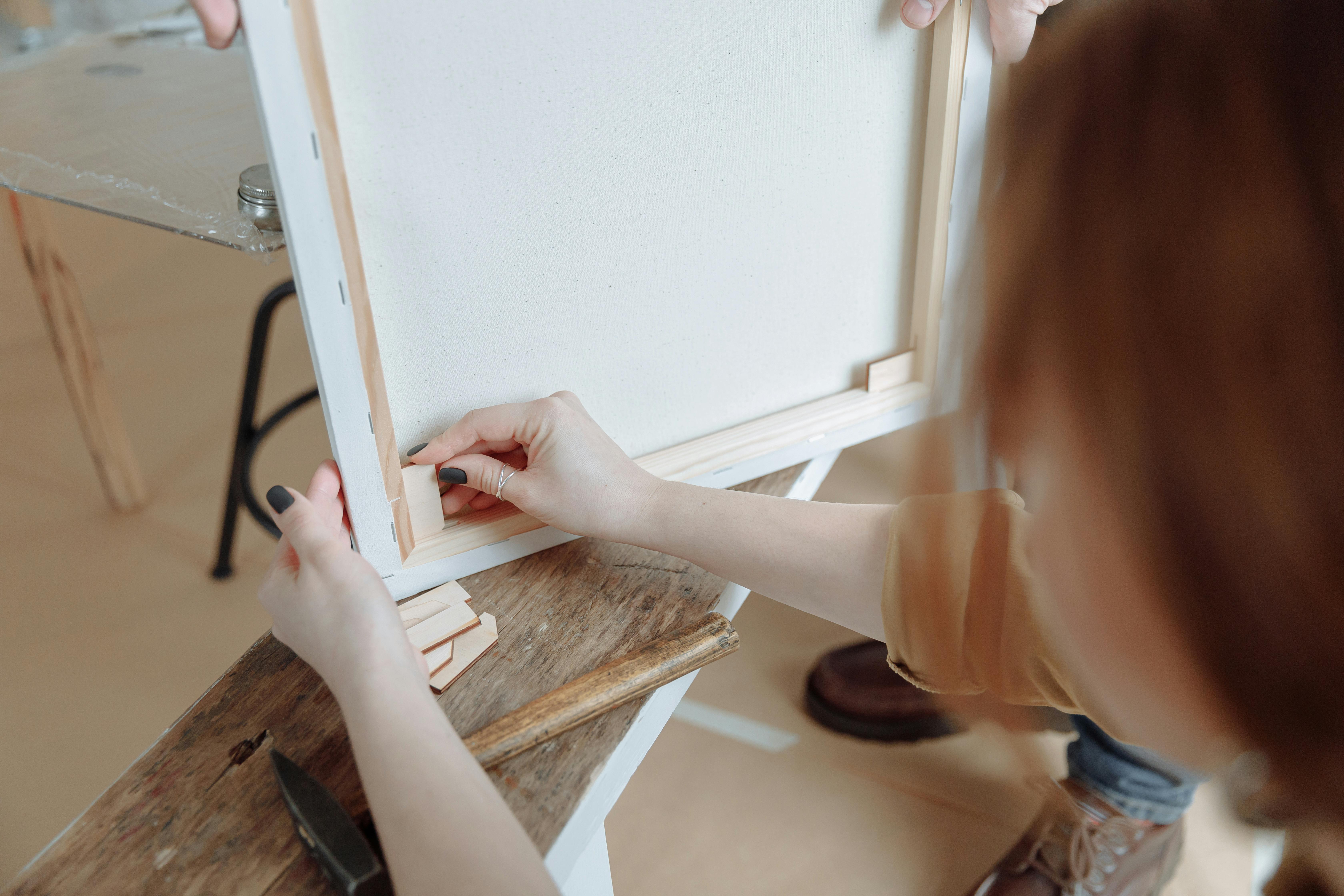
- ASTM D5723 (Canvas & Panels): This one's for the painters. It specifies the requirements for artists' canvas boards and panels. It ensures the support is dimensionally stable—meaning it won't warp, crack, or shrink dramatically with changes in humidity. Ever seen an old painting where the canvas is a wavy mess? That's a failure of the support, and this standard helps prevent it.
- ASTM D5398 (Varnishes): The final step for many paintings. This standard covers the physical properties of varnishes—both natural resins like dammar and synthetic ones. Crucially, it also sets requirements for the varnish's removability. A good varnish isn't just a shield; it's a shield you can and should be able to safely take off in 50 years for cleaning, without damaging the paint layer beneath.
- ASTM D5724 (Pastels): Calling all dry media artists! This standard ensures your soft pastels, oil pastels, and chalk have sufficient pigment load and, you guessed it, lightfastness. It helps guarantee that your delicate marks won't fade away before your eyes.
- ASTM F2772 (Colored Pencils): For a tool as precise as a colored pencil, permanence is paramount. This standard governs the composition, durability, and lightfastness of artists' quality colored pencils, ensuring your finely rendered details endure.
Putting It All Together: A Practical Guide for Your Studio
Okay, so you have the terms. How do you actually use this information when you're staring at a wall of paints at the art store or clicking through options online? Here’s the process I've settled into.
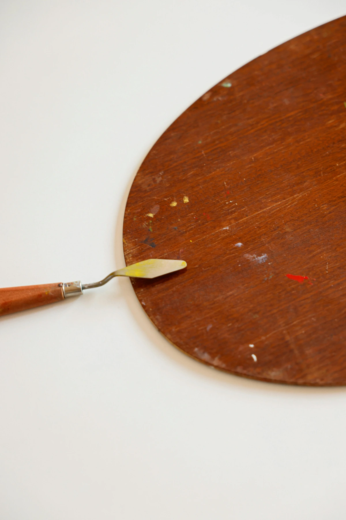
1. The Paint Tube Interrogation: Become a Materials Detective
Don't just glance at the color swatch. Flip the tube over—that's where the truth is.
Here's a step-by-step guide to decode your paint tube:
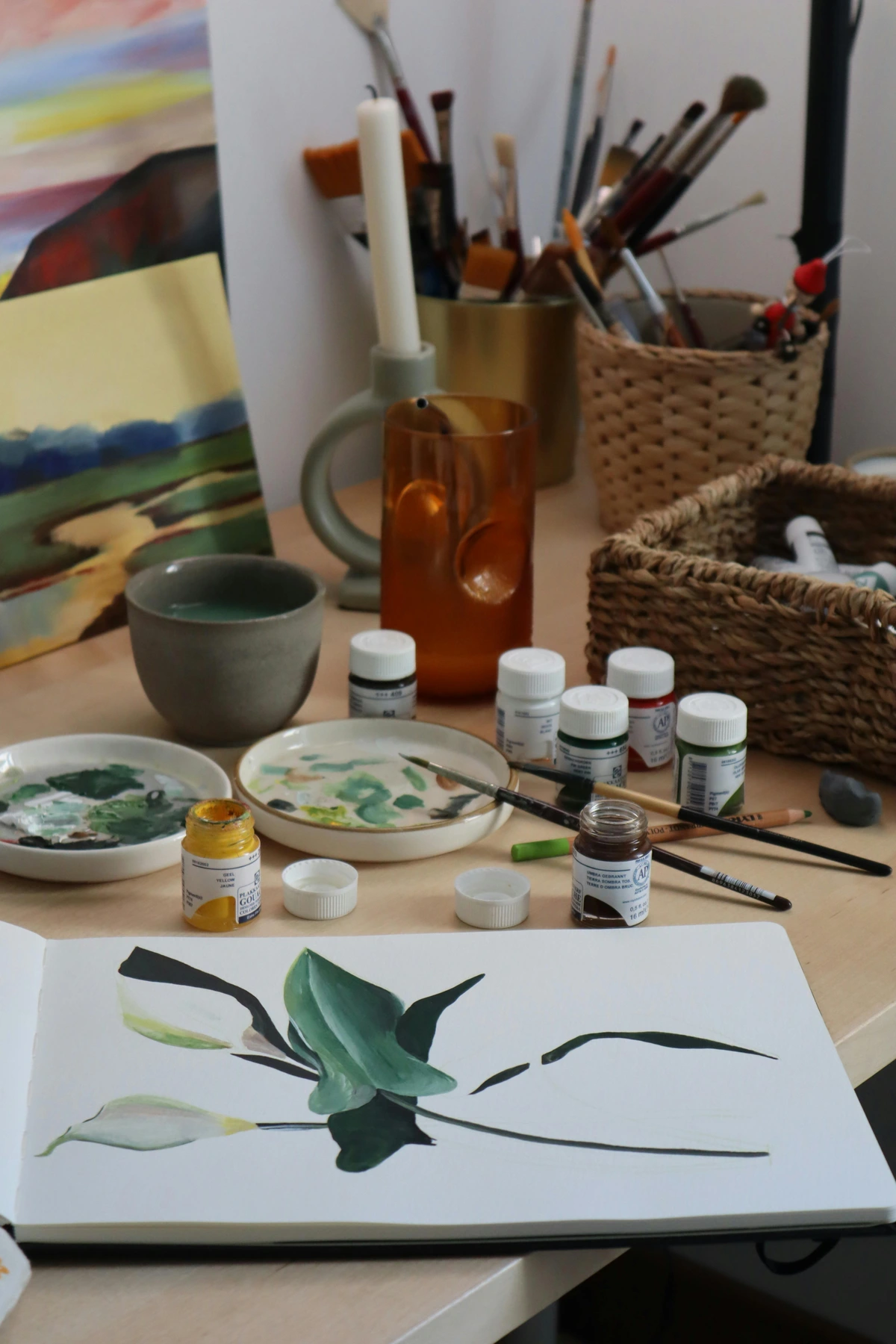
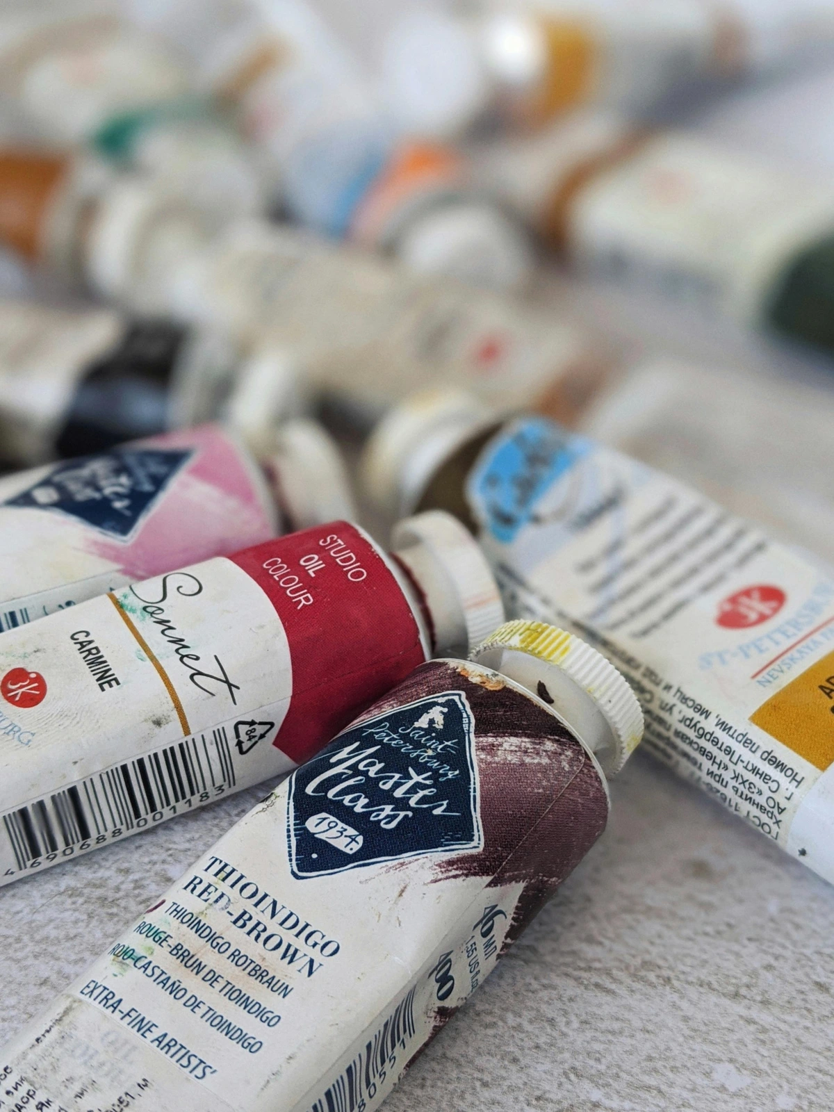
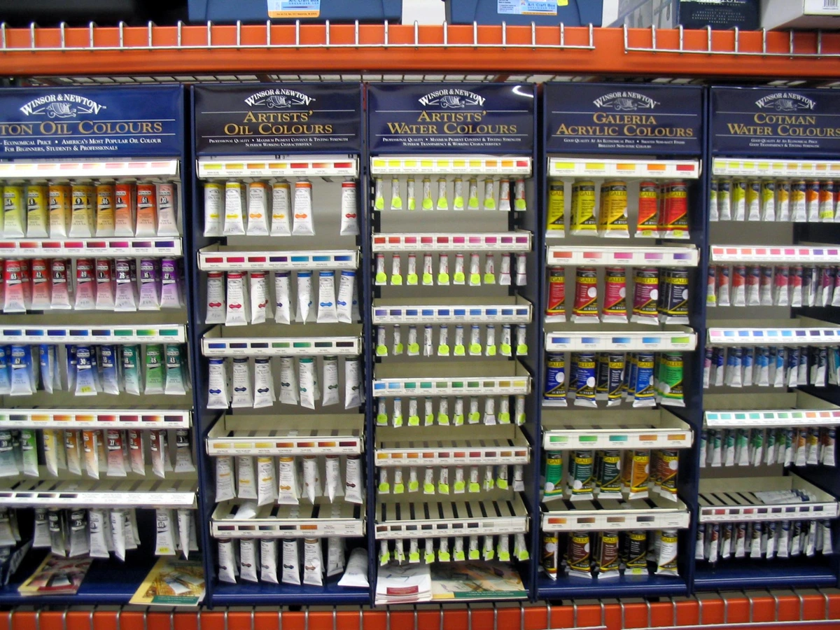
- Look for the ASTM Standard: Your first clue is the ASTM D4303 designation printed on the label. Its presence means the manufacturer is submitting their product to the industry's standard performance tests. Most reputable brands (think Golden, Winsor & Newton, Daniel Smith) are transparent about this.
- Find the Lightfastness Rating: Next, hunt for the lightfastness rating for that specific pigment. It’s usually a small Roman numeral (I, II, III, IV, V). This is the most crucial piece of information.
- Identify the Pigment(s): Look for the pigment number (e.g., PW6, PR254). This is the chemical fingerprint of your paint and the true indicator of its properties. A paint's color name can be misleading; 'Quinacridone Red' can mean different things to different brands. The pigment code is universal.
- Check for Additives: Many paints, especially student-grade, may list fillers like aluminum hydrate or barium sulfate. While not inherently bad, a high concentration of fillers means less pigment, which can affect tinting strength and value.
I've made it a non-negotiable rule to avoid anything rated IV or V for finished work. If this information isn't on the tube, go to the manufacturer's website. A brand confident in its product will have detailed technical specifications (often as PDFs) available for download. If the information is buried or missing entirely, that's a major red flag. If a company isn't proud of their testing data, you shouldn't be proud to use their paint.
2. The Paper Predicament: Your Foundation Matters
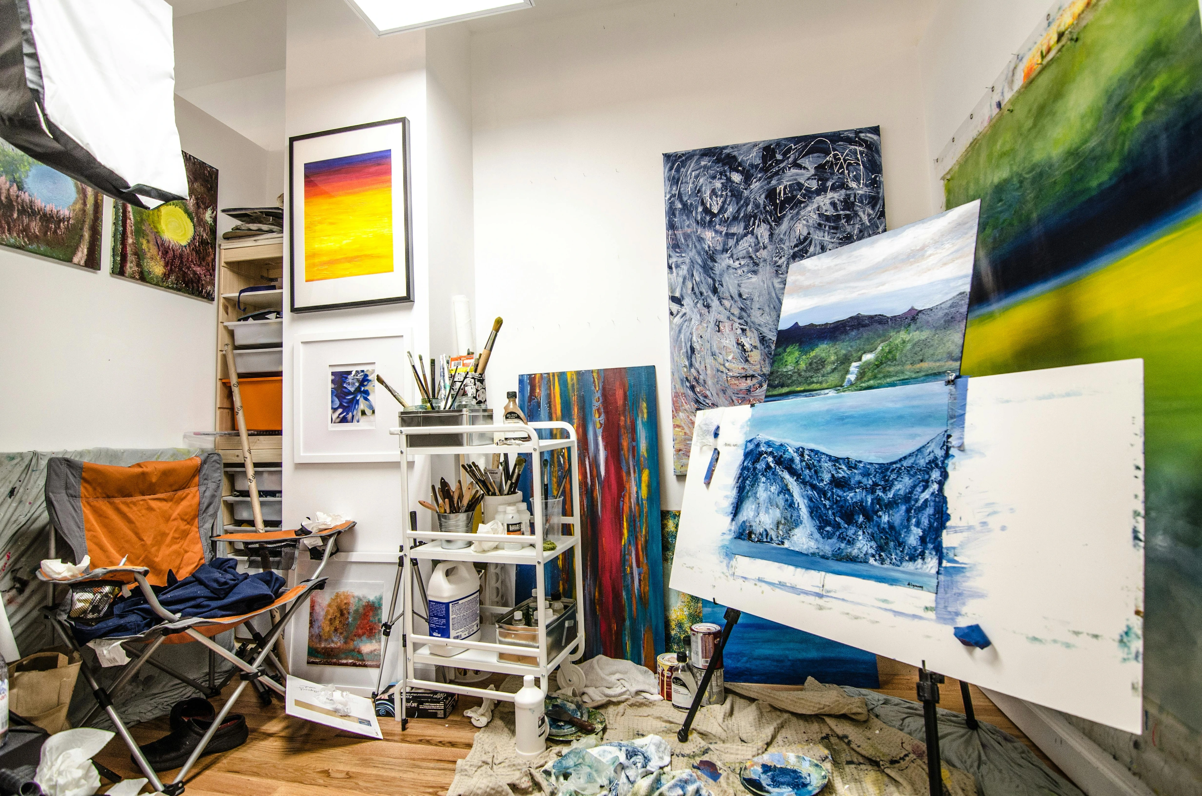
Paper choice is just as critical as your paint, if not more so. If you're a watercolor artist, that paper isn't just a surface—it's the foundation of your entire piece. Look for products that explicitly state 'acid-free,' '100% cotton rag,' or 'museum-quality.' These papers are engineered to last for centuries and have excellent internal sizing, meaning your paint will sit on the surface with control and brilliance instead of soaking in like a sponge.
But here's where it gets tricky. Don't be fooled by '100% rag.' It just means no wood pulp was used; the rag content could be cotton or linen. Crucially, it doesn't automatically guarantee it's acid-free (though it's often a good sign). The 'acid-free' designation is the non-negotiable stamp of longevity. I learned this lesson the hard way after a series of early charcoal drawings on cheaper paper began to yellow at the edges within a year. It was a heartbreaking reminder that the foundation is everything.
3. The Good-Better-Best Rule for Framing and Presentation
Your job isn't over when the paint dries. In many ways, that's when the real protection begins. How you frame and display your art can either ensure its survival for generations or sentence it to a slow, unseen decay. For detailed instructions on the final steps of your artwork, check out this guide on how to finalize and protect a painting.
- Good: Simply frame it. At the very least, this protects it from dust, physical bumps, and airborne pollutants. It's a basic shield, but a necessary one.
- Better: Use a mat board. This creates a vital air gap, preventing the artwork from touching the glass where condensation can become trapped, leading to mold or adhesive transfer. It also provides a clean, professional aesthetic border.
- Best: Use a museum-quality mat board (also acid-free!) paired with UV-protective glass or acrylic (look for brands like Tru Vue®). This is the gold standard, the equivalent of a climate-controlled museum case for your work. It blocks over 99% of harmful UV rays, dramatically slowing the fading process even for less lightfast pigments. Yes, it's more expensive. But when you consider the hours you've invested, it's the only choice that makes sense for a piece you intend to last.
The Hinge is Everything: How you attach the artwork to the backing board is a detail that speaks volumes about archival intent. Use archival-quality tape like Lineco neutral pH self-adhesive tape. For the ultimate in reversibility, use Japanese kozo paper hinges applied with a water-soluble starch paste. These methods ensure you aren't introducing acids or aggressive adhesives that can stain or damage the paper over decades. Let me be clear: never, ever use regular masking or Scotch tape. It's a slow-acting acid bath for your art.
- For Oil Paintings: The rules change slightly. Never varnish an oil painting too soon. It needs to be fully cured, which, depending on the thickness of the paint, can take anywhere from six months to over a year. Adding a varnish to a painting that's still off-gassing can trap solvents and lead to future clouding or cracking. A good varnish also needs to be easily removable by a conservator in the future, without damaging the paint layer beneath, a key tenet covered by ASTM D5398.
The Inevitable Trade-Offs: Price, Beauty, and Permanence
This is the part of the conversation I find most interesting, or maybe frustrating. The reality is that some of the most historically beloved and stunningly beautiful pigments are notoriously fugitive. That gorgeous, deep crimson you get from a genuine rose madder? It's a Lightfastness V. It will fade. Period.

Does that mean you should never use it? Not necessarily. But there's also a fascinating conversation happening around this. Some artists intentionally use these "fugitive" colors with full awareness, creating work that is designed to evolve and change over time. The impermanence becomes part of the art's conceptual narrative. The key, however, is the crucial difference between intention and accident. It's the ability to confidently tell a collector, "This piece utilizes historical pigments that are known to mellow with age, and that evolution is part of the concept." That is a vastly different, and more honest, conversation than being forced to ask yourself, "Why is my painting fading?"

For my own work, I tend to stick with the I's and II's. My personality craves stability, and that extends to my art. I want to imagine my pieces—the ones I sell, the ones I send out into the world—looking as vibrant on someone's wall decades from now as they did the day I finished them. If you're curious, you can see the materials I use and trust on my buy page.
It’s a personal choice, a dance between the perfect color and the promise of permanence. And believe me, no one is judging you for the choice you make, as long as you're making it with your eyes wide open.

Advanced Topics: Permanence in the Real World
So you've stocked your studio with Lightfastness II paints on acid-free paper. You're golden, right? Almost. Permanence isn't just about the materials you start with; it's about the environment they'll live in.
A Primer on Accelerated Aging Tests
Ever wonder how a manufacturer can claim their paint will last 100 years? Do they have a secret vault where they store paintings and check on them every decade? Not exactly. They rely on the fascinating science of accelerated aging tests. A common method involves placing carefully prepared paint drawdowns under a powerful xenon-arc lamp, which bombards them with light equivalent to decades of sunlight in just a matter of weeks. Another common test involves baking samples in an oven to simulate extreme dry heat. I find this process oddly reassuring. It means there's hard, if simulated, data backing up those longevity claims. It also highlights how different pigments behave under stress—some fade, some shift in hue, and a select few remain stubbornly unchanged.
Test Type | What It Simulates | Key Insights |
|---|---|---|
| Xenon Arc | Decades of intense sunlight exposure | Measures color shift and fading (lightfastness). |
| Oven Aging | Extreme heat and dry conditions over time | Checks for embrittlement, cracking, and chemical breakdown. |
| Humidity Chamber | Long-term exposure to high moisture levels | Tests for mold growth, swelling, and layer adhesion. |
The Care and Feeding of Art
Think of your art like a vampire. It loves the dark. Well, okay, that's an exaggeration, but the principle holds. I keep my finished, unframed works in a flat file or portfolio, stored in the dark. Light damage, or "light exposure," is cumulative. Every minute a piece spends in bright light, especially sunlight, is a minute off its total lifespan.

But it's not just light. Think about moisture, heat, and dust.
- Temperature: The Goldilocks Zone. Keep it stable and moderate. Avoid storing art in attics (too hot and fluctuating) or damp basements (too humid). You're aiming for a cool, dry environment, generally between 65-75°F (18-24°C). Wild temperature swings can cause the support and paint layers to expand and contract at different rates, leading to cracking over time. This is a key consideration in professional art conservation methods.
- Humidity: The Invisible Enemy. This is a huge one, especially for works on paper or canvas. These materials are hygroscopic, meaning they absorb and release moisture from the air. Aim for a relative humidity (RH) of around 40-50%. Too dry, and paper can become desiccated and brittle. Too humid, and you risk mold growth, foxing (those brown spotches you see on old paper), and staining. A simple hygrometer is a small investment for big peace of mind.
- Pollutants & Dust: The Quiet Abrasion. Dust isn't just unsightly; it's abrasive and can become acidic over time if left to settle on the surface. The real villains are invisible atmospheric pollutants like ozone and nitrogen oxides, which can cause fading and chemical degradation in certain pigments. The best defense is a good offense: frame your work, or store it in archival sleeves or portfolios. I've even started keeping my most prized, fugitive watercolor pans in an airtight compartment box—it might be overkill, but I like the ritual of protecting them.
Artists' Materials FAQ
Here are some of the most common questions I had when I started learning about all this.
What is the Blue Wool Scale?
That's a great question that often comes up when you start digging into technical guides. The Blue Wool Scale is a different, older system for measuring lightfastness, originating in the textile industry. It uses eight blue wool dye references, with L2 being the least lightfast and L8 being the most. While you might still see it referenced, especially for paper or pastels, the modern ASTM D4303 standard is what you should rely on for paints.
Blue Wool Scale | Approx. ASTM Lightfastness Equivalent | What It Means |
|---|---|---|
| L2 - L3 | V (Poor) | Fugitive. Will fade quickly. |
| L4 | IV (Fair) | Known to fade significantly over time. |
| L5 - L6 | III (Good) | Moderate stability, suitable for non-critical work. |
| L7 | II (Very Good) | Highly resistant to fading. |
| L8 | I (Excellent) | Exceptional permanence. |
For practical purposes, just know that any material rated Lightfastness I or II on the ASTM scale is a robust choice, generally equivalent to the top tiers of the Blue Wool Scale.

Is oil painting medium itself archival?
This is one of the most common questions I get from painters, and it's a great one because it gets to the heart of material interaction. The short answer is yes, but with a few critical caveats. The traditional binders used in artist-grade oil paints—linseed oil, walnut oil, poppy oil—are all highly stable natural polymers once they've fully cured. A properly dried oil paint film, left alone for a year or more, is one of the most durable and flexible things you can create.
However, the longevity of an oil painting depends on two other things: the pigments used (Lightfastness I and II are your friends here!) and, just as importantly, the preparation of the support. If you paint on an unprimed or acidic canvas, the oil binder will eventually oxidize and degrade the cellulose fibers, leading to a condition called "inherent vice," where the artwork deteriorates from the inside out. This is why applying a high-quality, alkaline gesso (a modern acrylic gesso is excellent for this) on an archival panel or primed canvas is non-negotiable. The binder is strong, but it can't overcome a flawed foundation. Think of it like building a beautiful house on a crumbling foundation—eventually, the whole thing will fail, no matter how good the materials above are.
What does "archival" even mean?
Great question. It’s a marketing term that gets thrown around a lot, often without much substance behind it. "Archival" is an ideal, not a formal, legally-defined certification. It implies that a material is of high enough quality and stability to last for a very long time—often cited as 100 years or more—without significant deterioration. A product might be called "archival" if it's acid-free, lignin-free, and made with stable, lightfast pigments.
However, without specific certifications like ASTM to back it up, the term can be frustratingly vague. A manufacturer can call their product "archival" because it passed one test, while another's "archival" product passed ten. Always look for the hard data on the tube or in the spec sheet. "Archival" is a promise, but "ASTM D4303" is a guarantee.
Can I use student-grade paints and just varnish over them?
This is a classic question, and it gets to the heart of a common cost-cutting temptation. The short answer: you can varnish them, yes. You should certainly varnish your finished work to protect it from dirt, dust, and airborne pollutants. But a varnish is not a magical shield against fading.
Think of a UV-protective varnish as a high-quality pair of sunglasses for your painting. It filters out a significant amount of the sun's harmful rays, but it doesn't block them all. Crucially, it cannot fully stop the degradation that is happening within a poorly formulated, fugitive pigment. If the paint itself isn't lightfast, the varnish will only slow the inevitable, not stop it. The fading will still occur; it will just take a bit longer.
Here's the reality I learned the hard way: it's always better to start with good materials. I have some early acrylic paintings on canvas that have noticeably darkened over the years, even under UV-protective glass, because I cheaped out on the initial paints. It's a permanent reminder of a temporary saving.
That said, the landscape of student-grade paints is changing. Some lines, like Winsor & Newton's Winton series or Gamblin's 1980, now use the same durable, lightfast pigments as their professional counterparts, just at a lower concentration and mixed with less expensive fillers. If you do your homework and find these budget-friendly workhorses, you can absolutely get away with using them for studies and even some finished pieces. The key is to research the specific line, not just the brand name.
It's worth noting that the drive for permanence isn't new. Artists have always sought stable materials, as explored in the history of ancient Roman art, where the permanence of frescoes and mosaics was paramount.
Why do some famous old paintings have faded colors if Old Masters used "fugitive" pigments?
This is a fantastic question that gets to the heart of why all this matters. Artists like Van Gogh and Turner used pigments they knew were unstable. They did it for the color. The vibrant, almost acidic yellows in some of Van Gogh's paintings were achieved with chrome yellow, which we now know is prone to browning under certain conditions. They made a conscious trade-off. Today, we have the benefit of centuries of chemical analysis and accelerated testing. We have modern, synthetic pigments that can achieve similar or better effects with unparalleled permanence. We have the tools and knowledge to make work that lasts for centuries, a privilege the Old Masters simply didn't have. Our challenge—and our responsibility—is to use these tools wisely.
Stepping into the world of ASTM certification and lightfastness ratings can feel intimidating. I get it. It introduces a layer of science and data into a process that many of us want to keep purely intuitive and emotional. But I've come to see it differently. This knowledge isn't a cage; it's a tool. It’s a way to ensure that the time, energy, and passion you pour into your work are protected.

Look, no one wants to think about test tubes and pH levels when they're inspired. But for me, knowing that I've built my work on a solid foundation gives me the freedom to take bigger creative risks, to be bolder with my vision.
Here's the thing no one tells you when you're starting out: permanence is a conversation, not a rulebook. In the end, the choice of what materials to use is yours. Maybe the fleeting beauty of a madder lake is precisely the statement you want to make. Perhaps a work is meant to be ephemeral. But an informed choice is a powerful one. It's the difference between an accident and an intention. It's what transforms you from a hobbyist into an artist with a voice, someone who understands the legacy of their materials and chooses exactly how to write—or unwrite—the history of their work.
The Final Frontier: What the Future Holds for Artist Materials
The science of artist materials isn't standing still. It's a dynamic conversation between art, chemistry, and technology, driven by a relentless desire for longer-lasting, safer, and more expressive tools. What was once a quest for simple permanence is now an exploration of what's possible.

The Laboratory Renaissance: A New Palette of Pigments
One of the most exciting frontiers is in pigment development. Many of the durable 'workhorse' pigments we rely on today—the quinacridones, the phthalos—are born in laboratories, not mined from the earth. Modern synthetic inorganic and organic pigments offer levels of stability, vibrancy, and non-toxicity that were unthinkable just fifty years ago. We're moving into an era of designer pigments, engineered to perform under specific conditions with incredible predictability. I believe this is where the future of truly permanent color lies, allowing us to achieve hues the Old Masters could only dream of, with a durability they could never guarantee.

The Digital Dilemma: Permanence in a New-Media World
As our tools expand, so does our definition of 'archival.' What does permanence mean for the digital artist or photographer?
For digital prints, the conversation shifts from the chemical properties of paint to the stability of the ink and the substrate it’s printed on. The key is understanding the difference between dye-based inks and pigment-based inks.
Ink Type | How it Works | Lifespan | Key Considerations |
|---|---|---|---|
| Dye-Based | Colorant is dissolved in liquid. | 25-50 years under optimal conditions. | Known for incredibly vibrant, glossy colors. However, they are notoriously susceptible to fading from light and atmospheric pollutants. Often less water-resistant. Best for short-term display or proofing. |
| Pigment-Based | Microscopic solid color particles are suspended in liquid. | 100+ years, sometimes over 200 years on the right paper. | More resistant to fading, water, and pollutants. While often slightly less vibrant in glossy mode, pigment inks printed on matte, acid-free cotton rag paper are the gold standard for archival digital prints. Giclée prints should ideally use pigment inks. |
Choosing an acid-free, lignin-free paper is just as critical for prints as it is for watercolors. I’ve spent hours comparing papers, feeling the tooth, and researching the manufacturing process. It’s a whole new world of material science, and it’s thrilling to see artists engage with it just as rigorously as they do with traditional media.