Mastering Perspective Drawing with Degree Angles: An Artist's Practical Guide
A personal and in-depth guide to using degree angles in perspective drawing. Master vanishing points, avoid common mistakes, and learn unconventional tips from a working artist.
Why Your Brain Lies to You About Perspective (And How Angles Set It Straight)
You're staring at a drawing of a street, and something feels off. The buildings seem to be leaning awkwardly, the lampposts look like they might topple over, and the whole scene just doesn't feel real. I've been there—more times than I'd like to admit. For years, I thought I could just "eyeball" perspective. My brain told me it looked right, but my brain, as it turns out, is a terrible judge of depth on a flat piece of paper. It has a bad habit of swapping what it knows (a building is straight) for what it sees (a set of converging lines), and on a flat page, that internal lie becomes obvious.
It’s a ghost in the machine of our perception. You know a building is vertical and that its sides are parallel. Yet, when you sit down to draw it, your pencil wants to make everything a perfect rectangle. The result is a flat, unconvincing cutout pasted onto the page. The disconnect is jarring. I'd have drawings of city blocks that looked like stage sets, teetering on the edge of collapse because the angles were too shallow or too symmetrical, a kind of sterile perfection that screamed "fake." The problem wasn't a lack of effort; it was a lack of a reliable system to mediate between what I knew and what I actually saw.
Then I started thinking in angles.
It wasn't about becoming a human protractor. It was about finding a reliable anchor in a sea of visual guesswork. This is a guide for anyone who's ever felt that frustration. We'll go beyond the simple one-point and two-point perspective rules and dig into the practical, slightly obsessive art of using degree angles to build a world that actually feels real. If you learn to measure not with a ruler, but with the invisible geometry of your own sight, you can build any scene from the ground up with confidence.
Angles, I discovered, are that anchor. They are the hard numbers in a soft-focus world. They are the bridge between the logical fact that a building is a series of rectangles and the optical illusion that it's a set of trapezoids shrinking into the distance. This guide is about building that bridge, plank by plank. We'll start with the simple geometry that underpins everything, then move to the practical application—how to actually put pencil to paper and place those crucial vanishing points. Finally, we'll delve into the more advanced conversations, the emotional weight of an angle and the common traps that ensnare every artist, including how even the most well-intentioned artist can accidentally create a perspective disaster.
The Illusion of Depth: A Quick Refresher
To understand why angles are a game-changer, we must first be fluent in the language of perspective itself. It's not just a set of rules; it's the geometric translation of light rays entering a single point—your eye.
Let's get one thing out of the way. Perspective drawing is the system we use to create the illusion of 3D space on a 2D surface. It's a magic trick based on one simple fact: objects appear smaller the farther away they are. When you look at the world, you're not seeing things as they are in some objective sense, but as they're projected onto the curved surface of your retina. Think about that for a second: the world is projected onto a curved surface. It's weird, and brains are bad at translating that weirdness back onto a flat piece of paper without help. This is the fundamental disconnect of drawing. Our perception is a 3D, curved, full-sensory experience. A drawing is a 2D, flat, silent one. The system of perspective is our set of rules for bridging that impossible gap, for translating the language of the real world into the language of marks on paper.
It is, essentially, a controlled deception. A magic trick. And like any good magician, you need to know the mechanics of the trick perfectly before you can perform it with any flair.
The core of this trick is the vanishing point. This is the spot on the horizon line where parallel lines (like train tracks or the edges of a building) seem to converge. Think of it as the point where things get so far away they vanish. But here's the subtle part most people miss: the vanishing point isn't just a point on the paper. It's the visual representation of an infinite distance in a specific direction. It's where a line in the real world would end up if it went on forever. Geometry dictates that all parallel lines share a single vanishing point. Think of it like a secret meeting location for all lines of the same family. If you have three rows of buildings running parallel to each other, the edges of all three rows will converge at the exact same spot on the horizon. This principle, called perspective unity, is what stops your drawing from looking like a chaotic jumble and makes it feel like a single, cohesive world.
- One-Point Perspective: Imagine looking straight down a long, empty road. The sides of the road and the lines on it all converge at a single point on the horizon. That's one-point perspective. It’s powerful for creating a sense of deep space, but it only really works when you're facing things head-on. A common mistake is to use it for a view that's even slightly off-center, and the whole illusion collapses.
- Two-Point Perspective: This is where things get interesting for most subjects. Now, imagine looking at the corner of a building instead of the face. The edges of the building, which are parallel in real life, will head towards two different vanishing points on the same horizon line. This creates that classic, dynamic view of a city block. It feels much more natural because it's the way we usually see most objects in the world—not perfectly straight on, but at an angle. The critical decision for an artist here is: how far apart should the vanishing points be? This choice dictates the object's perceived stance in space—whether it's open and welcoming or closed-off and dramatic. This is precisely where thinking in degrees gives you a non-negotiable answer.
- Zero-Point Perspective: It's worth mentioning this too. This is when there are no converging lines because all planes are parallel or perpendicular to your view. Think of a perfectly flat, frontal view of a building. There’s no illusion of depth from line convergence, only from overlapping objects and shading.
But here's the problem with just learning these rules: how do you decide where to place those vanishing points? Put them too close together, and your building looks like a wedge of cheese. Put them too far apart, and it looks stretched and weird. This is the question that can stump an artist for years. You end up placing them by 'feel,' and that feeling is usually based on your brain's flawed assumptions, not on how light actually travels into your eye. This is where degrees change everything. They give you a logical, measurable basis for your lines, turning a frustrating guess into a predictable construction. We are moving from a world of arbitrary points to a world of measurable angles, and that shift in mindset is what allows for true artistic control. You stop being a passive guesser and become an active constructor of reality.

The "cheese wedge" effect is something I've seen countless times, especially in my own early work. It happens when the two vanishing points are too close to each other on the horizon. It compresses the view, making the object appear unnaturally wide at the back and narrow at the front. Conversely, when the points are far off the page, the recession can become so gradual that the sense of depth is lost, creating that stretched, anemic look. These aren't just minor mistakes; they break the spatial logic of the drawing, making the viewer feel vaguely uncomfortable without knowing why. Degrees are the remedy. They let you find that Goldilocks zone—not too close, not too far—where the perspective feels just right.

The Power of the Degree: What That Number Actually Means
Let’s talk about what an angle is, but without the intimidating math. Imagine you are standing in the middle of a giant clock face painted on the floor. The 12 o'clock position is directly in front of you, your line of sight. If you turn to face 3 o'clock, you've turned 90 degrees. Every turn you make is measured relative to that center line.
Your cone of vision, also known as your field of view—the area you can see clearly without moving your head—is about 60 degrees. This is a critical concept. The human eye is not a wide-angle lens; it has a sweet spot. If you try to draw an object whose vanishing points fall outside your 60-degree field of view, you are distorting the geometry in the same way a fisheye lens does. It's a valid artistic choice, but for realism, keeping your primary construction inside this 60-degree window is a golden rule. Artists often extend this a bit for a more dynamic composition, but if you go much beyond 90 degrees, you're seeing the world with significant distortion (think of a fisheye lens). That distortion happens because you're trying to cram a wide-angle view of the world onto a relatively small flat surface, and the geometry starts to break down at the edges.
Think of it this way: if you draw a circle around your central line of sight, that circle represents a 60-degree cone of vision. Everything within that circle will look geometrically "correct" on your page. Anything outside of it will be subject to increasing distortion. This is why, in most realistic drawings, the main subject and its primary perspective lines fall comfortably within that 60-degree range. It's the sweet spot for optical truth. Pushing beyond it is a stylistic choice—one that can be very effective for creating a sense of claustrophobia, immense scale, or surrealism—but it's a choice that actively breaks the conventional rules for effect.
Now, let's connect this to your vanishing points. The angle between your line of sight (the center of your vision) and a set of parallel lines receding into the distance is the perspective angle. This angle is the secret ingredient, the measurable cause that creates the visible effect of a vanishing point. For centuries, artists have fumbled intuitively with these angles. Filippo Brunelleschi is famously credited with formalizing the mathematics of linear perspective in the early 15th century, allowing artists of the Renaissance to achieve a shocking new level of realism. Before that, artists relied on overlap and atmospheric effects to imply depth, never quite capturing the rigid geometry of architectural space.
- A 0-degree line runs parallel to your line of sight. It doesn't converge because it isn't moving away from you in depth. It's like looking at a wall directly in front of you. It's just a flat, horizontal line.
- A 45-degree line slopes away from you at a 45-degree angle. It's a classic, balanced angle in two-point perspective, where the two receding faces of a cube appear equal in width. It creates a sense of symmetry and stability. It's the default "look" of most perspective drawing demonstrations, and for good reason—it's clear, easy to understand, and logically sound.
However, this symmetry can be a bit of a trap. Because it's so common, it can lead to static, uninteresting compositions where every object feels posed. The real world is rarely so perfectly centered. The subtle asymmetry of a 40/50 degree split, or a 25/65 degree split, often feels far more natural and dynamic. The 45-degree angle is a powerful tool, but it should be a conscious choice, not an autopilot setting.
- A 90-degree line runs directly away from you, perfectly perpendicular to your line of sight. This is the line that heads straight to a central vanishing point. It’s the line of maximum recession, the fastest way to make something look like it's going deep into the picture plane.
Why does this matter? When you know the angle of a line, you can place its vanishing point in a logical, realistic spot on your horizon line. It stops being a guessing game. You are no longer just hoping the lines look right; you are building them based on the same laws of geometry that govern our perception of reality. This is what separates a drawing that feels vaguely 'off' from one that feels solid, believable, and intentionally placed in space.
Putting Angles to Work: My Practical Guide
Okay, let's stop talking theory and get to the part where you're actually drawing. I'm going to walk you through a method that has saved me countless headaches. You don't need a protractor or fancy software to start (though they can help later). The goal here isn't mathematical perfection, but optical plausibility. We want to trick the eye. You are, in essence, becoming a con artist, but the mark you're fooling is the viewer's brain. A good con needs a sturdy structure to make the illusion believable, and that's what this construction phase is all about.
Step 1: Find Your Horizon Line and Eye Level
First, what are you looking at? Are you looking up at a skyscraper? Then your horizon line is low on your page. Are you on a hill looking down at a valley? Your horizon line is high. The horizon line is always at your eye level. It's a direct representation of your physical position in space. Draw it in lightly. This line is the single most important anchor for your entire drawing; everything above it is going up from your viewpoint, and everything below it is going down. If you want to create a sense of looking up at something from a mouse's perspective (a worm's-eye view), you'd place the horizon line near the bottom of the page. If you want a bird's-eye view, you'd place it near the top. Most of our lives are spent with the horizon line somewhere in the middle third of our visual field, and placing your horizon line here communicates a grounded, human-scale view of the world.
This is a critical mental model, so let's make it concrete. Imagine you are sitting at a cafe. Your eye level is about 4-5 feet off the ground. That's where your horizon line is. A person sitting across from you will have their eyes on that same line. A person standing behind them will have their eyes above the line. A child walking by will have their head below the line. This isn't just an abstract rule; it has practical, measurable consequences for everything in your drawing. Getting this line right is the first and most important step in grounding your scene in reality.

Step 2: Determine Your Vanishing Point Angles
This is the key step where you stop guessing and start constructing. Let's say you're drawing a simple cube on a table. The goal is to make it look like it's sitting there, not floating awkwardly or about to tip over. If you were just "winging it," you'd probably draw the two receding faces as roughly the same size, because you know a cube is symmetrical. Your brain lies. By assigning specific angles, you take charge and tell your brain how the cube actually looks from this specific point in space.

I want you to imagine that cube isn't just a shape, but a solid mass with weight. Its position in space is determined by where you are standing. Every line you draw is an expression of that relationship. This is the moment you stop being a passive observer and start acting like an architect or a surveyor, actively measuring the world with your sight. To do this, you need to consciously decide on the fundamental viewing relationship. Are you seeing a lot of the left side and a little of the right? Or are you seeing them both equally? This single decision will dictate everything that follows.
- Establish Your View: Are you looking at the cube mostly from the front (so the left and right sides recede gently)? Or are you seeing a sharp corner, where both sides recede away from you equally? The first scenario might use a shallow angle (like 10-20 degrees), while the second might use a steeper one (like 30-45 degrees). This decision dramatically changes the character of your drawing. A front-heavy view (like 15° and 30°) feels more static and monumental, as if the object is standing firm and you are walking past it. A corner-heavy view (like 40° and 45°) feels more dynamic and three-dimensional, like you've stopped to examine the object's form directly.
- Estimate and Mark: Let's choose 40 degrees for the left side of the cube and 30 degrees for the right. This asymmetric view is very natural and avoids the "perfect cheese wedge" effect. From the corner of your cube, use a ruler or your pencil held up to the paper to visually estimate a 40-degree line going off to the left. This takes practice, but you're developing an intuitive feel for geometry. Mark a small tick on your horizon line where that 40-degree line would intersect it. That's your first vanishing point (VP1). Do the same for the 30-degree angle to find your second vanishing point (VP2).
A quick tip for estimating angles with your pencil: hold it up at arm's length, keeping it parallel to visually estimate a 40-degree line going off to the left. This takes practice, but you're developing an intuitive feel for geometry. Mark a small tick on your horizon line where that 40-degree line would intersect it. That's your first vanishing point (VP1). Do the same for the 30-degree angle to find your second vanishing point (VP2).
Now for the gut-check. Look at VP1 and VP2. Do they look reasonably far apart? If they're crammed together on a small section of your paper, your angles are probably too acute. If they feel impossibly far apart—or are even off the page entirely—that's a good sign. The "correct" vanishing points for most natural viewpoints are often far outside the boundaries of your drawing. It's completely normal to have to tape extra paper to the sides of your board or just trust that your ruler, when placed at the corner, is aimed correctly at the off-page point. The tick mark on your horizon line is just a visual confirmation; your brain and your ruler handle the rest.

I've watched so many students get paralyzed by this. They place their vanishing points, they look at the construction lines, and their brain screams, "This looks weird!" because the lines seem so flat. They're not weird. They're correct. Your brain is just used to seeing the world dynamically, with two eyes, and it takes a conscious effort to trust the geometry of a single, static viewpoint. This is the leap of faith. This is where you stop trusting your gut and start trusting the system. 3. The "Check Your Work" Trick: Your primary angle (the one that defines the bulk of the shape) should generally be less than 60 degrees. Remember that cone of vision? This is where it becomes a practical tool. If your angle is wider than 60 degrees, your vanishing point is outside your natural field of view, and you are essentially creating a fisheye effect. It's a fantastic style choice, but if your goal is realism, it's a sign you need to bring your angles back towards the center.
Step 3: Construct the Form
Now that you have your vanishing points, the hard part is over. You can use them to construct your entire scene. This is where the magic happens and all your initial estimations pay off. You will literally build the object in space using the invisible scaffold you've just created.

- Draw a vertical line to represent the nearest corner of your cube. This is your starting point, the one solid anchor in your construction. All other lines will radiate from here. This vertical line is your "corner post," the one edge in your drawing that is, for now, perfectly perpendicular to the ground. Think of it as the fulcrum upon which all the action of your drawing will be balanced.
- Draw light construction lines from the top and bottom of that corner to both VP1 and VP2. These are your guidelines. They are the skeleton of your cube, defining the planes that recede into the distance. Keep them faint so you can erase them later. They represent the infinite paths along which the top and bottom edges of your cube will travel as they move away from you. I can't stress this enough: draw these lines lightly. You are building a ghost, a transparent framework of your object. Drawing them heavily is one of the most common mistakes. These lines are temporary aids, not final statements.
- Decide how deep and wide your cube is. This is a critical decision. Where you place these vertical lines determines the proportion of your object as it exists in space. A line placed close to the corner creates a shallow object, like a picture frame. A line placed farther along the construction line creates a deep object, like a long crate. Draw vertical lines anywhere along those construction lines to define the other corners. This is how you control the proportions of your object in 3D space. Where those new vertical lines stop, connect their endpoints back to the opposite vanishing point to find the final top and bottom edges and complete the form. The lines will intersect, creating the back edge of your cube. It feels methodical, almost like building with an erector set, because that's exactly what you're doing—building a structure that is optically sound before you even think about shading or detail. What you're actually doing is creating a perfect geometric footprint, a ghostly scaffold of your object, before you commit to any of its final lines. It's a slow, thoughtful process that is the complete opposite of just "drawing the outside."
You're building a structure that is optically sound before you even think about shading or detail. It's a crucial change in mindset. You're not just drawing the outside of an object; you're first constructing its underlying, hidden geometry as it exists in a defined space. This is the core difference between a sketch and a construction. A sketch can capture energy, but a construction captures truth.
Here is a simple table summarizing how different angles feel:

Angle of Receding Lines (Degrees) | Visual Effect | Common Use Case |
|---|---|---|
| 0-15° | Very shallow, gentle recession | Drawing objects head-on, roads extending forward |
| 15-30° | Subtle depth, feels natural and relaxed | Most general drawing and sketching |
| 30-45° | Clear, defined depth; dynamic but not overly so | Classic two-point perspective (looking at corners) |
| 45-60° | Strong, dramatic recession | Exaggerated perspective, action scenes |
| 60°+ | Extreme distortion, fisheye effect | Specific artistic effects, unusual viewpoints |
Common Traps and How to Avoid Them
We all fall into them. Here are the ones that used to trip me up constantly. Learning to draw is as much about unlearning bad habits as it is about learning good ones, and perspective is full of tempting shortcuts that lead to dead ends.

- The "Two Walls That Look Identical" Trap: This is the biggest clue that you guessed your angles and didn't observe the scene. In real life, unless you're staring directly at the center of a corner, one plane of a building is always more dominant in your vision than the other. If your drawing looks like a perfect isosceles triangle from above, you've probably made this mistake. It creates an oddly symmetrical, unnatural feeling, like a diorama rather than a real scene. The fix: Force yourself to make one angle steeper—say, 40 degrees—and the other shallower—say, 30 degrees. This asymmetry is the key to a natural look. Forcing this asymmetry forces your brain out of its lazy, generalized mode and into a mode of active, specific observation.
- The "My Vanishing Point is Off the Page" Trap: For steep angles, your vanishing points can be miles off your paper. Don't panic. You don't need to pin them down on your board with a thumbtack. Just align your ruler with the point on the edge of your paper and draw the line. You're extending an imaginary line to an imaginary point. That's perfectly fine. A great practical tip is to use a long, clean straightedge like a yardstick. I've even seen people tape their paper to a large drawing board and let their rulers extend right off the edge. The key is to trust the system and know where your ruler is pointing, even if the point is in another zip code. You can also use a compass or a piece of string to 'walk' the angle out to the edge of your paper for a more precise mark.
The biggest mistake I see here is the "shortcut." An artist will know the vanishing point is off the page, so they'll just "guess" the direction of the line. This never works. The line ends up subtly wrong, which throws off the next line, and the next, until the whole drawing is a warped mess. The act of physically placing your ruler, aligning it with a tick mark on the horizon line or the edge of your paper, and trusting the resulting angle no matter how wrong it looks is a crucial act of discipline and faith in the system.
- The "Forgetting Slanted Lines Have Vanishing Points Too" Trap: I'd draw a perfect building and then ruin it with a roof that looked like it was sliding off. Remember, any set of parallel lines that aren't vertical or horizontal will have their own vanishing point. A slanted roof, for instance, will have its lines converge somewhere above or below the horizon line, depending on whether they're sloping up or down into the distance. I'll cover this more in the 'Advanced Angle Thinking' section, but the key is to realize these lines aren't arbitrary; they obey the same laws as everything else. Stairs, roads going up a hill, gabled roofs—they all have their own dedicated vanishing points. Think of it as creating a whole new family of lines that are related, but not identical, to your main horizon. The roof, the stairs, the ramp—they're all subject to the same rule that governs the walls. This concept is what separates a competent drawing from a truly believable one.
An Unconventional Tool: Using Your Phone
Want to cheat? I do. My phone is my best friend for tricky perspective. Open the camera app and hold it up so the top edge is perfectly horizontal. Now, look at the grid overlay (most phones have one you can turn on in the settings). The converging lines you see are a live demonstration of vanishing points and angles. You can even trace them on your screen (with a wipeable stylus) to understand the geometry of your subject before you even put pencil to paper. A more advanced cheat is to actually take a photo, import it into a simple drawing app like Procreate or even the Photos markup tool, and physically trace the perspective lines. This 'traced photo study' is one of the fastest ways to train your brain to see the real angles instead of the ones it invents.
I'll also use an app with an augmented reality (AR) function to literally draw 3D shapes in space. It's a mind-bending experience that teaches you how angles are just a representation of your position in space relative to an object. It's not really cheating; it's using modern tools for what they're best at: making the invisible visible.
Advanced Angle Thinking: For the Obsessed
The tools we've discussed—angles, vanishing points, the cone of vision—are just instruments. Like chords on a guitar, they can be played in different combinations to evoke different feelings. While the basics are about accuracy, mastery is about using that accuracy to tell a story. This is where you transition from being a student of the rules to an artist who uses the rules to build emotional worlds. Think of it as the difference between an architect's blueprint and a novelist's evocative description of a house. Both describe a physical space, but one is concerned with technical accuracy, and the other with creating a mood, an atmosphere, a feeling of being there. This is where the craft of drawing meets the art of visual storytelling.
To become a true practitioner, you need to build another mental model: the Station Point and its close cousin, the Cone of Vision. Let’s make this simple.
Imagine you are standing on a sidewalk, about to draw a building across the street. Your position is fixed. This exact, fixed location—the spot your feet are planted—is your Station Point in architectural drawing. It's the vertex from which all your visual angles radiate. You can't just decide to move your vanishing points because you feel like it; their location is mathematically determined by your stationary position in space relative to that building. If you move five feet to the left, all your angles change. Your drawing is a 2D representation of the view from that one, single point.
Now, expand your view. Your Cone of Vision, which we mentioned earlier, is the 60-degree field you see clearly from your Station Point. Anything outside this cone will start to distort, like a fisheye lens effect. This is crucial for deciding how "wide" a scene to include in your picture plane. If you try to cram a 120-degree view onto your paper, the edges will look stretched and unnatural. If you stick to what's in your 60-degree cone, the geometry will remain optically plausible.
Why does this matter? It trains you to think of your drawing not as a collection of objects, but as one frozen moment of sight. You are not just drawing a building; you are drawing the experience of seeing that building from a very specific spot. When I finally internalized this, my drawings stopped feeling like disconnected floating objects and started feeling like a coherent unified space. I was no longer sketching buildings; I was sketching my own viewpoint.
- Low Horizon + Steep Angles: Creates a feeling of looking up at a powerful, monumental object. Think of looking up at a cathedral or a skyscraper. The vertical lines seem to converge dramatically, and the receding horizontal lines shoot upwards at a steep angle, creating a sense of awe, power, and the sublime. It makes the viewer feel small. The angle of those receding lines isn't just a line; it's a feeling of being overwhelmed by scale.
- Common Mistake: Making the vertical lines truly vertical instead of allowing them to converge slightly towards a third vanishing point high above. When you're looking up at a massive structure, your brain knows they should be parallel, but your eye sees the convergence. Trusting this convergence is what sells the height.
- High Horizon + Shallow Angles: Creates the feeling of looking down on a vast landscape, a sprawling map, or a busy city intersection. It makes the viewer feel omniscient, in control, like a bird or a director looking down on the world. It's a commanding view. It places the viewer "above it all," creating a sense of psychological distance and observed action rather than immersion.
- Common Mistake: Forgetting that objects closer to the viewer don't just get bigger; they also have steeper, more dramatic angles. A car parked right below you in a high-angle shot will have extremely steep recession angles, while a car in the distance will have very shallow ones. Forgetting to grade the angles creates a flat, unrealistic map-like effect.
- Multiple Objects in Space: When drawing multiple objects (like a line of cars, a row of houses, or furniture in a room), don't randomly place their vanishing lines. They should all converge at the same vanishing points on the horizon. This is what unifies a scene and makes everything feel like it exists in the same world, under the same rules of light and space. This concept, called perspective unity, is what separates a cohesive drawing from a jumble of separate sketches pasted onto the same canvas. Imagine you're drawing a table with a lamp and a book on it. The table recedes towards VP1. Turn the book on the table so it's at a different angle. Your brain wants to give it its own new vanishing points. Fight that urge. The book's edges must also, within reason for small rotations, obey VP1. This discipline is what creates a believable reality.
Visualize this with a simple exercise: imagine you're drawing a street with three buildings of different sizes. One is a massive skyscraper, one is a small shop, and one is an average office building. Your brain wants to give each one its own "correct" angles. But if you do that, they'll look like they exist in three different realities, haphazardly pasted onto the same street. The secret is to establish a single pair of vanishing points on your horizon line—let's say VL at 40 degrees and VR at 30 degrees—then force every single building on that street to obey those exact points. The small shop, the skyscraper, the cars, even the sidewalk cracks—they all use VL and VR. This single-minded discipline is what creates a potent, believable space.
And remember those slanted lines? For stairs, gabled roofs, or ramps, these lines are called inclined lines. They are just sets of parallel lines that are not parallel to the ground. And like all other parallel lines, they will converge at their own vanishing point. I tend to think of them as belonging to a 'third dimension' of perspective, a new plane of existence for lines that want to climb or descend through the picture, rather than just recede along the ground. It sounds a bit sci-fi, but it helps me visualize that they operate under their own specific set of rules.
- If the line goes up and away from you, its vanishing point is above the horizon. Imagine a receding roofline; its lines will eventually meet in the sky. This point is called a vertical vanishing point (VVP). To find it, you would extend the inclined lines upward until they converge. This is essential for drawing complex architecture like gothic cathedrals or multi-level buildings.
- If the line goes down and away from you, its vanishing point is below the horizon. Think of a ramp descending into a parking garage or a set of basement stairs; its edges will converge at a point under the ground. This lower vertical vanishing point is the mirror image of the one in the sky. It's used less frequently but is just as crucial for creating believable spaces that exist below the main eye level of the scene.
- The steeper the incline, the farther away from the horizon line its vanishing point will be. A 45-degree roof will have a vanishing point much higher or lower than a 15-degree ramp.
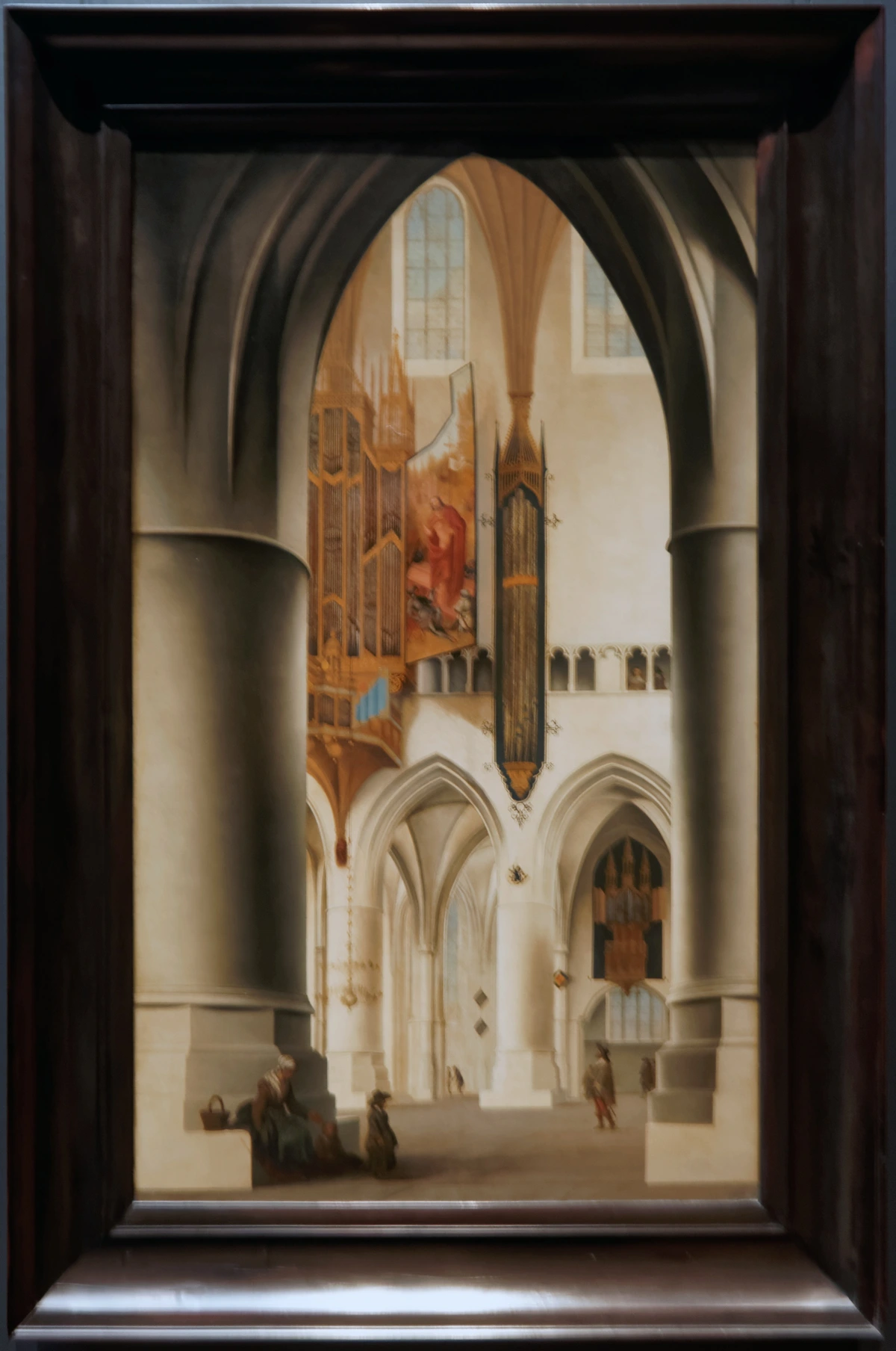
Finding these points requires a few extra construction steps using the perspective lines you already have, but knowing they exist and obey these rules is half the battle. You can learn more about drawing architectural structures at places like the Design Museum in Den Bosch, where perspective is everything. It teaches you that even the most complex buildings are just collections of simple geometric forms obeying these fundamental rules.
The Goal is Not Perfection
Let's be clear. The goal of this isn't to make every single line a perfect geometric construction, though that can be a fun exercise. That would be boring and take forever. The goal is to understand the underlying structure of reality so well that you can imply it with a few confident strokes, or even knowingly break the rules for effect.
This whole process is ultimately about building visual confidence. When you know the "why" behind the illusion, your lines become more purposeful, your compositions more deliberate, and your artistic voice more distinct. It's the difference between guessing your way up a mountain and using a reliable map to explore its most interesting peaks.
Think of it like an architect. They know every load-bearing beam and every stress point in a design, but they hire an artist to paint the final rendering to give it life. You are the architect and the artist. The first phase, the angle construction, is your analytical mind building the skeleton. The second phase, the shading, line work, and texture, is your artist's mind putting flesh on the bones. One gives the drawing truth; the other gives it soul. The construction is the armature upon which you hang the skin.
That's why this process can feel a bit rigid. It's supposed to. It's the armature, the underlying structure that no one sees but that makes the whole thing possible. Once it's in place, you can be as loose, as expressive, and as messy as you want. The solid foundation you've built will keep your drawing from falling apart. I've seen so many drawings that are beautifully rendered but feel fundamentally wrong because that underlying skeleton was weak or missing entirely. The skeleton is what allows the drawing to stand up without collapsing under the weight of its own implausibility.
Let me put it another way. The perspective construction is the grammar of your visual sentence. You can write a beautiful sentence with poetic imagery, but if the grammar is wrong, no one will understand it—it will just feel broken. The grammar has to be invisible, correct, and sturdy enough to carry the meaning. The shading, the form, the life of the drawing—that's the poetry. But the poetry can only fly if the grammar is solid. It's the difference between a wobbly shed built on a hillside and a skyscraper anchored deep into the bedrock. One is at the mercy of the wind; the other defines the skyline. Think of a painter like M.C. Escher. His work is famously imaginative and surreal, but it's built on a foundation of absolute, relentless technical precision. He understood the rules so completely that he could break them in ways that were both mind-bending and structurally sound. He could build impossible architectures that feel real because the grammar of his perspective is impeccable. You don't get the magic without first mastering the mechanics.
Beyond the Chart: The Emotional Math of Angles
We've established that angles are a technical tool, but I want to pause here and talk about something that took me years to grasp: every angle has a personality. Every choice you make in placing those vanishing points isn't just a technical decision; it's a narrative one. It's a form of visual rhetoric that speaks directly to the viewer's gut.
Consider the difference between 10 degrees and 75 degrees.

- A shallow angle (let's say 5-20 degrees) is contemplative, almost cinematic. It's like the opening shot of a movie where the camera is slowly pushing in. It suggests a quiet space, a gentle unfolding of the scene. It's calm, inviting, and it gives the viewer time to breathe. You might use this for a landscape, a peaceful interior, or the long hallway leading to a solitary figure. It whispers.
- A moderate angle (around 30-45 degrees) is our everyday reality. It's how we mostly see the world as we walk through it. It feels balanced, active but not frantic, solid and grounded. It's the workhorse of drawing, the angle you use when you want to communicate information clearly without a lot of dramatic fuss. It's the prose of perspective.
- A steep angle (anything from 50 degrees upwards) is pure energy. It's frantic, chaotic, or heroic. It's the exaggerated perspective you see in comic book panels of Spider-Man swinging through New York—buildings receding at impossible angles to heighten the feeling of speed and motion. It screams.
I used to think my job was to simply "get the angle right." Now I ask a different question: "What is the angle doing?" Is it creating tension? Is it guiding the eye? Or is it just holding the form? When you start thinking this way, you stop being a slave to the ruler and start using it as an expressive instrument. You're not just drawing a building; you're directing the viewer's entire experience of that building. You decide if they feel awe, comfort, or vertigo.
Conclusion: The Line Between Faith and Sight
Let's end where we began: with the lie your brain tells you. It’s a powerful liar, always trying to substitute what it knows for what it sees. Learning to draw with angles is the fundamental act of training yourself to ignore that lie—to trust the geometry of light over the assumptions of the mind.
It might feel rigid at first, all these rules and vanishing points. But the goal is the opposite. The goal is ultimate freedom. It’s the freedom to build a world from scratch and have it feel not just plausible, but inevitable. It's the freedom to manipulate reality for effect—to make a building feel oppressive or a street feel endless—because you understand the underlying mechanics. It's the freedom to break the rules on purpose, not by accident.
When you pick up that pencil tomorrow, I want you to remember that you're not just drawing lines. You are an architect of perception. And every degree you measure, every vanishing point you place, is a quiet act of rebellion against the fuzzy logic of your own brain, a small step toward seeing the world as it truly is, one precise, beautiful angle at a time.
From Rules to Reality: Your Questions Answered
The real test of understanding something isn't just knowing the rules, but knowing what to do when the rules get messy. Here are some of the most common hurdles artists face when they start thinking in angles.
I've heard of three-point perspective. Where does that fit in?
Great question. We've been talking primarily about two-point perspective, where the vertical lines are all parallel to each other. In three-point perspective, you're looking at an object from either a very high (worm's-eye) or a very low (bird's-eye) vantage point. In this case, even the vertical lines are no longer parallel—they also converge at a third vanishing point in the sky (if you're looking up) or below the ground (if you're looking down). It's a powerful tool for extreme angles that create a lot of drama, scale, and vertigo. It's the language of superhero comics and dramatic architectural photography. Great question. We've been talking about two-point perspective, where the vertical lines are all parallel. In three-point perspective, you're looking at an object from either a very high or a very low vantage point. In this case, the vertical lines are no longer parallel—they also converge at a vanishing point in the sky (if you're looking up) or below the ground (if you're looking down). It's a powerful tool for extreme angles that create a lot of drama.
Do I really need to measure everything? My sketchbook is for sketching, not math!
Of course not! For quick sketches, just thinking about the concept of angles helps. Is the roof line sloping at a 45-degree angle, or is it more like 20? That mental check is often enough. Think of this as your formal training. The more you practice the formal method with a ruler and guidelines, the better your intuitive sketches will become, because your eye will be trained to see the underlying geometry of the world more accurately. It's like learning scales on a piano—you practice them so you can eventually just play the song.
The goal isn't to turn every sketch into an architectural plan. The goal is to internalize the logic of geometry so that your intuitive marks, the ones you make without thinking, are more likely to be optically correct. You're not doing math; you're cultivating a feel for structure.
Can I use this for abstract art? Absolutely! I use these principles all the time. You can use vanishing points to create abstract shapes that still feel grounded and have weight and dimension. The lines don't have to form a building; they can just be lines that create a sense of dynamic space. It's about creating structure within the chaos.
I've learned perspective, but my drawings still look flat. What gives?
This is a fantastic question and it gets to the heart of something important: perspective is only about linear depth—the convergence of lines. It creates the geometry of space. But what gives objects their sense of volume and presence within that space is a combination of other factors:
- Atmospheric Perspective: This is the principle that distant objects have less contrast and detail, and often take on a bluer, cooler tone due to particulate matter in the atmosphere. It's the reason far-off mountains look hazy. The Italian Renaissance masters were masters of this, calling it sfumato—literally 'smoked.' Applying this in your drawing—making the background elements lighter, less detailed, and slightly cooler in tone—pushes them back in space far more effectively than line work alone.
- Overlap (or Occlusion): Simply having one object partially cover another is the single most powerful and primitive way to create a sense of foreground and background. The brain intuitively reads the occluded object as being farther away. It's a powerful tool that requires no perspective lines at all.
- Size Difference: Objects of the same type, like trees or people, get progressively smaller as they recede. Your brain knows how tall a person is, so when you draw them smaller on the page, it's an automatic, powerful cue for depth. Don't fall into the trap of making everything the same size—this is one of the most common signs of an untrained eye.
- Shading and Light: This is the big one. Linear perspective gives you the skeleton—the shape and position of the form in space. Shading ("chiaroscuro" in classical terms) gives it flesh. It's the way light rakes across a form, creating highlights, midtones, and cast shadows, that makes it feel solid and three-dimensional. A sphere drawn with perfect perspective is just a flat circle until you shade it.
Most artists I know have been trying to create this level of depth since they were kids, whether they realize it or not. It's the reason we draw distant mountains lighter, and why we shade the side of a circle. These aren't separate techniques; they are all part of the same unified goal: to translate the four-dimensional experience of reality (three dimensions of space, one of time and light) onto a flat, static, two-dimensional surface. It's an impossible task. And the magic is that by combining these tools, we can get so close that the human brain willingly suspends its disbelief and enters the world we've created. Linear perspective is the strict, logical foundation; these other elements are the decoration, the lighting, and the atmosphere that makes the house feel like a home.
What are the most common mistakes you see beginners make with angles?
Besides the traps we already discussed, one of the biggest is inconsistent angles within a single object. You might draw the base of a building receding at a 30-degree angle, but then accidentally let the roof and windows recede at 45 degrees. It looks wrong because it violates the fundamental rule that all parallel lines converge at the same point. Everything on the same plane of an object, from the foundation to the gutter, must obey the same perspective angle. Always check your construction lines—are they all radiating from the same vanishing point?
Another is the "default mode" error. Because a 45-degree angle is so common and balanced, it's easy to fall into the habit of making every single drawing a perfect 45/45 split. It's comfortable. It's also boring. The world is rarely that perfectly centered. Fight the symmetry. Introduce a little chaos by making one angle 40 degrees and the other 25. That tiny bit of asymmetry is often the difference between a drawing that feels like a technical exercise and one that feels alive.
How do I practice this without getting overwhelmed?
Start with the most boring, simple things you can find. Don't try to draw a whole city block. Draw a cereal box. Draw a coffee mug. Draw your shoe. Isolate one object and just focus on finding its basic angles. Ask yourself: "If I had to put a number on the slope of that side, what would it be? 20 degrees? 35?" Do this for ten minutes a day for a week. You'll start to see the world differently. You'll be standing in line at the supermarket and mentally tracing the vanishing lines of the checkout counter. It's a strange side effect, but it means you're learning.

Should I learn the "measuring point" or "distance point" method?
Ah, the rabbit hole. If you really want to get into the weeds, you can explore measuring points. It's a traditional drafting technique that uses geometry to precisely place a vanishing point at a specific distance, which in turn determines the exact angles. It is the most mathematically pure way to construct perspective. My personal take? It's incredibly useful for architectural renderings or technical illustrations where precision is paramount. For everyday drawing and sketching, however, I find it adds a layer of complexity that can get in the way of simply seeing. For most of us, learning to trust our eyes and use our basic angle-estimation skills is a more direct path to confident drawing. Know that it exists, but don't feel like you have to master it to make good art.