
My Insider Guide: Mastering Art Composition & Visual Harmony
Unlock the secrets of compelling art! This insider guide demystifies 10 core composition principles—from balance to harmony—revealing how artists transform intuition into powerful visual stories.
Okay, let's talk about composition. For years, the word itself made me cringe a little. It sounded so incredibly… academic, you know? Like something whispered in hushed tones in dusty art history lectures, far removed from the vibrant, intuitive chaos of throwing paint onto a canvas. I pictured stern instructors with monocles, lecturing on the Golden Ratio while I just wanted to make something feel right, to have that satisfying thrum of visual harmony. And honestly, for a long time, I just winged it. I'd paint, stand back, squint, and if it felt okay, I'd call it a day. But if I'm being truly honest with myself, there was this persistent, nagging feeling, a quiet whisper that there was something more – a deeper, unspoken language I wasn't quite speaking yet. My artist's journey, much like yours I'm sure, is absolutely filled with these moments of stumbling and discovery, much like you can explore on my timeline. That nagging feeling? It stemmed from something fundamental: my brain, much like yours, is wired to seek order and meaning. It's a deeply ingrained human tendency, perhaps rooted in our evolutionary need to quickly process information for survival, leading us to instinctively organize visual input into coherent wholes. This innate human tendency is precisely why composition, far from being academic, is so deeply rooted in how we perceive the world. As I started to truly look at art, and my own work, I realized these 'rules' weren't arbitrary pronouncements from an ivory tower. Instead, they're more like natural laws of visual perception, deeply rooted in how our brains process visual information. Understanding them didn't stifle my creativity; it actually unlocked new levels of freedom and intentionality. It's like learning the grammar of a language – suddenly you can write poetry, or break the rules knowingly. You're no longer just randomly assembling words, but consciously crafting sentences that convey precise meaning, or even deliberately twisting grammar to create a unique effect. It turns intuition into intention, and that's where the magic really happens.@At its heart, composition is simply how you arrange the visual elements in a work of art. It’s the layout, the structure, the choreography of everything you see. Think of a movie director deciding where to place the actors, the props, and how the camera moves – that’s composition in action. In art, it's like a chef meticulously arranging ingredients on a plate: not just what you put in the frame, but how you put it there, and crucially, why. And this isn't just for painting, mind you; composition is the backbone of photography, graphic design, sculpture, and even filmmaking. For me, especially in my abstract art, composition is all about guiding your eye, telling a story without words, and creating a feeling. It's the unseen architecture beneath the colors and textures, a concept I explore further in The Unseen Structure: How Composition Guides My Abstract Art. Composition, you see, builds directly upon the foundational elements of art like line (the path of a point), shape (2D enclosed area), color (hue, saturation, value), form (3D shape), texture (surface quality), value (lightness/darkness), and space (area around/between objects). These elements are the building blocks, and composition is how we arrange them to create meaning and impact. They aren't just building blocks; they inherently influence visual weight (a thick, dark line feels heavier than a thin, light one), direction (a diagonal line suggests movement), and emphasis (a bright, saturated color draws the eye). If you'd like to explore those building blocks first, I've written about that too, and they're a great place to start. Composition also establishes a crucial visual hierarchy, dictating what your eye should see first, second, and so on, guiding you through the artwork's narrative. A strong composition can even create an illusion of depth and dimension in a flat artwork, inviting the viewer to step into the scene. @If you've ever felt overwhelmed by the idea of "good composition" or wondered why some artworks just draw you in, you're in the right place. In this guide, I'll break down the ten core principles that form the backbone of compelling art, transforming your creative process and how you see the world. Think of it as peeking behind the curtain of visual harmony, a journey from intuition to intentional creation. We'll dive into these core principles – the ten pillars, if you will – that guide not just my abstract work, but pretty much all art you encounter: Balance, Emphasis, Negative Space, Movement, Pattern & Repetition, Rhythm, Proportion, Variety, Unity, and Harmony. And for you, the viewer, understanding these principles can totally change how you experience art, turning passive looking into an active, appreciative dialogue with the piece. It's a bit like learning the secret handshake of art, minus the awkward hand movements. For a deeper, highly respected dive into this topic, you might also find The Definitive Guide to Understanding Composition in Abstract Art an invaluable resource.  https://www.flickr.com/photos/vintage_illustration/51913390730, https://creativecommons.org/licenses/by/2.0/@---## The Big Ten: My Toolkit for Visual Harmony (and Controlled Chaos)@Alright, now that we've demystified what composition is at its core, let's dive into the practical tools I use – the ten principles that act as my compass in the creative wilderness. These aren't rigid rules etched in stone, but rather my go-to mental checklist, even when I'm letting intuition lead. They help me understand why something feels off or how to push a piece further. These principles rarely work in isolation; they often overlap and dance together to create the final effect. So, let's unpack them, shall we? @### 1. Balance: Achieving Visual Stability and Emotional Equilibrium@Think of balance like visual weight, not necessarily physical weight. A composition needs to feel stable, like it won't fall over if you nudge it. This doesn't mean everything has to be perfectly symmetrical, but it needs a sense of equilibrium. Our brains are hardwired to seek stability, and an unbalanced image can create a subtle sense of unease, even if we don't consciously know why. Historically, the pursuit of balance has been central to art, from the harmonious proportions of ancient Greek sculpture and the carefully calibrated compositions of the Renaissance (think Alberti's theories on perspective and rational order) to the dynamic tension of Baroque masterpieces (like Rubens' energetic, often asymmetrical arrangements). Even Impressionists, with their seemingly spontaneous brushstrokes, often maintained an underlying sense of balance. Balance typically aims to create feelings of serenity, dignity, or dynamic tension, dictating the overall mood of a piece. I remember one early abstract piece where I kept adding vibrant elements on one side, convinced it needed more, only to step back and realize it felt like it was about to slide right off the easel! Finding that sweet spot of equilibrium was a delightful challenge, like trying to get a wobbly stack of books to finally stand straight. Visual weight itself refers to the perceived heaviness of an element, which isn't just about its physical size but also its color intensity, texture, and placement. A small, bright red dot can feel heavier than a large, muted grey area, simply due to its visual punch. @#### Symmetrical Balance: Order, Formality, and Calm@This is when elements are evenly distributed on either side of a central axis, creating a strong sense of calm, formality, or even regality. Think of a perfectly centered Renaissance portrait by Leonardo da Vinci, the serene, frontal compositions of ancient Egyptian art, or the formal balance in religious iconography. It's often predictable, which can be reassuring and can evoke a strong sense of order and serenity, making the viewer feel grounded. Symmetrical balance frequently signifies stability, divinity, or importance, often used to create a monumental or sacred feel. @#### Asymmetrical Balance: Dynamic Engagement and Modernity@My personal playground! This is where you have different elements that still feel equally weighted, even if they look nothing alike. Maybe a small, bold splash of red on one side counters a large, subdued blue area on the other. It’s dynamic, engaging, and a bit like a visual puzzle, often preferred for its subtle complexity and visual tension. It engages the viewer more actively as their brain works to find the equilibrium. I've often used this in my larger abstract pieces, contrasting a dense, textured area with a lighter, more open space to keep the eye moving without feeling lopsided. It’s like balancing a feather with a brick – you just need the right leverage. Asymmetrical balance can evoke feelings of excitement, modernity, and a more organic, natural sense of harmony. @#### Radial Balance: Centered Expansion and Unity@Here, everything radiates out from a central point, like ripples in a pond or spokes on a wheel. Think of intricate mandalas in spiritual art, the rose windows in Gothic cathedrals, or even ancient Roman mosaics. While less common in my abstract work, radial balance can be incredibly powerful when employed, drawing the eye directly into the core, creating a sense of expansion or implosion. It often symbolizes unity, infinity, or a powerful central force, leading the eye inwards or outwards from a focal point. Radial balance creates a sense of focus, often evoking spiritual or cosmic themes. @So, when I'm assessing balance, I'm really asking: does this piece feel visually stable, or does it lean too heavily one way? Do you feel a sense of calm or dynamic tension when you look at it? Balance ensures a visual stability that anchors the viewer's experience, dictating the overall mood of a piece. Try to identify if a composition feels balanced the next time you encounter a painting or even a photograph – you might be surprised at what your subconscious is already picking up.
 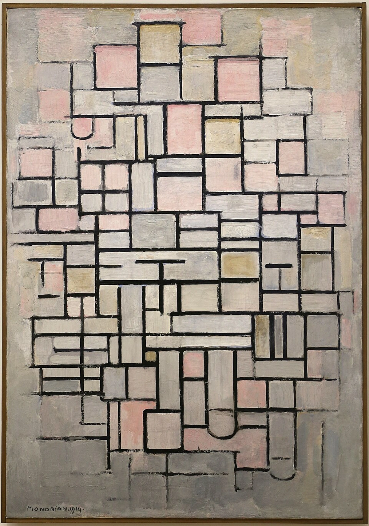 https://commons.wikimedia.org/wiki/File:Piet_mondrian,_composizione_n._IV-composizione_n_6,_1914,_01.jpg, https://creativecommons.org/licenses/by/3.0@This Mondrian piece is a perfect example of asymmetrical balance in action. The careful placement of different-sized blocks of color and curved shapes, though not mirroring each other, creates a dynamic sense of equilibrium. It feels deliberate, doesn't it? It just sits right. For my own work, I often achieve this by pairing a vibrant, concentrated color block with a larger, more diffuse area of a complementary hue, allowing the eye to constantly adjust and find its resting point. I find it fascinating how the brain works to resolve these visual puzzles, much like trying to keep a wobbly stack of books from finding its unique, often off-kilter, point of stability! Historically, artists like Caravaggio sometimes deliberately tilted compositions or exaggerated forms to create a dramatic, almost unsettling imbalance, drawing the viewer into an intense narrative rather than offering serene repose. This demonstrates that even "breaking" the rule of balance can serve a powerful artistic intent. But I digress... it's all about intentionality, isn't it? @### 2. Emphasis: Guiding Your Eye to the Visual Story's Core@Every good story has a main character, right? In art, that's the point of emphasis, or the focal point. It's where I want your eye to go first, the star of the show. Our visual system is highly tuned to detect differences, which was crucial for survival (think spotting a tiger in tall grass!). So, artists leverage contrast to create emphasis and establish a visual hierarchy, telling your eye what's most important. Emphasis is a powerful tool to convey the hierarchy of importance, guiding the viewer to the core message or emotion of the artwork, creating a sense of clarity or drama. I once created a piece that felt utterly chaotic and directionless, until I realized it lacked a clear focal point. Adding a single, intense splash of color instantly gave the piece an anchor, pulling everything else into context and making the whole piece sing. @I achieve this through various forms of contrast:@* Color Contrast: A brighter, more saturated color against muted tones, like a vibrant red flower in a field of green. This instantly draws attention due to its intensity and emotional punch. * Line Contrast: A sharp, decisive line among soft curves, or a thick, bold line against thin, delicate ones, creating a visual accent that stands out. * Texture Contrast: A particularly dense, tactile texture against a smooth area, inviting the eye (and imagination) to feel a distinct difference. * Value Contrast: Perhaps the strongest tool, a bright element against a dark background will always pop, regardless of its hue. Think of a moon against a night sky. This is often enhanced by chiaroscuro, the use of strong contrasts between light and dark, which can dramatically sculpt forms and direct attention, as seen in many Baroque masterpieces. * Isolation: Placing an element apart from others, giving it solitary importance and forcing the eye to acknowledge its separation, making it feel uniquely significant. * Placement: Using compositional guides like the Rule of Thirds or the Golden Ratio to strategically position focal points where the eye naturally falls. The Rule of Thirds involves imagining a tic-tac-toe grid over your canvas, dividing it into nine equal sections by two horizontal and two vertical lines. Key elements are often placed along these lines or at their intersections, making compositions more dynamic and engaging than simply centering everything. It works so well because our eyes naturally follow these implied lines and intersections, making them comfortable resting spots. The Golden Ratio (approximately 1.618:1), also known as the Divine Proportion, is a mathematical ratio found extensively in nature and art, offering aesthetically pleasing proportions that often lead the eye to key areas with an organic, harmonious feel. Its effectiveness likely stems from our inherent preference for patterns and proportions found in the natural world. Both provide intuitive ways to create points of interest and are excellent tools for beginners and masters alike. For a deeper dive into this fascinating mathematical principle, you might like to explore Understanding the Golden Ratio in Art and Design. * Negative Space as Emphasis: Sometimes, the absence of elements around a positive form can draw attention. A large expanse of quiet, empty space can make a small, central object feel incredibly significant or isolated, turning the 'nothing' into a powerful frame. The drama of a single boat in a vast, empty ocean is a classic example. @In some of my abstract works, I’ll intentionally leave a stark, single mark or a small, intensely saturated color patch to draw your attention there first. Honestly, I've had pieces where I failed to establish a clear focal point, and the whole thing just seemed to drift aimlessly, like a conversation where no one quite knows what the main topic is. Without emphasis, your eye might just wander aimlessly, like someone lost in a crowded room. It's my way of saying, "Hey, look here!" before I let you explore the rest of the piece. Think of the dramatic spotlight on a single figure in a Rembrandt painting, the stark, isolated object in a minimalist composition, or even the intense gaze of a subject in a Renaissance portrait. Emphasis guides the viewer's gaze, highlighting the most important part of the visual narrative or emotional core, creating focus and clarity. What is the first thing your eye is drawn to in your favorite artwork, and why?
 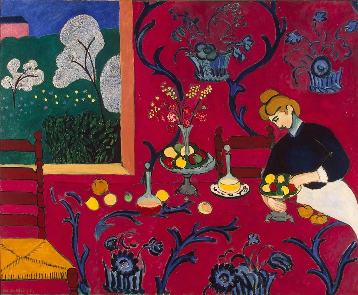 https://www.flickr.com/photos/pingnews/4811188791, https://creativecommons.org/licenses/by-sa/2.0/@Matisse's "The Red Room" is a masterclass in emphasis. While the entire canvas vibrates with color, the striking, uniform red of the room itself, punctuated by the blue patterns and the window, immediately grabs your attention before your eye wanders to the other details. That's intentional! The vibrant red acts as a powerful anchor, demonstrating how even a large area of color can be a focal point if it dominates the visual field. It's less about a tiny detail, and more about a commanding presence that sets the stage for the rest of the visual story. @### 3. Negative Space: The Unseen Powerhouse for Definition and Mood@Speaking of emphasis and guiding the eye, negative space is a compositional element often overlooked but incredibly powerful, especially in abstract art. It refers to the empty areas surrounding and between the subjects or elements of an image. It's the 'unpainted' or 'unfilled' part of the canvas, but it's far from inactive. Think of it as the vital pauses in a conversation or the silence between musical notes – it defines the positive space (the subject), creates balance, and can even become a focal point itself. Without well-considered negative space, an artwork can feel suffocating or overwhelmingly busy – a common beginner's pitfall, I might add. I remember one early piece where I just kept adding elements, thinking more was more, only to realize it felt utterly claustrophobic until I scraped back huge sections, letting the raw canvas breathe. That was an aha! moment for me, transforming what felt like a chaotic explosion into controlled chaos where the voids were as important as the marks. Negative space, you see, is deeply intertwined with Gestalt principles (more on those later, but essentially how our brains perceive wholes from parts), allowing us to 'read' implied shapes and relationships. Beyond defining forms, negative space can be used to create a sense of scale, suggesting vastness or intimacy depending on its proportion to the positive elements. Imagine a tiny figure dwarfed by a huge, empty sky to convey solitude or loneliness in a representational landscape, versus a figure tightly enclosed by surrounding shapes to suggest confinement. It also contributes profoundly to atmosphere, evoking feelings from expansive calm (think minimalist landscapes with vast, empty skies, like the stark plains in Andrew Wyeth's work) to claustrophobic tension (like an object squeezed into a corner). In some abstract pieces, negative space can even create figure-ground ambiguity, where the positive and negative spaces can flip roles, challenging the viewer's perception and adding layers of visual interest – a fascinating trick of the eye that I often play with! In my abstract pieces, I consciously use negative space to give elements room to breathe, to create tension, or to suggest forms without explicitly drawing them. It's the silent partner, working hard to make the 'noisy' parts sing. When I'm working with negative space, I'm thinking about the 'silences' in my visual 'music', or the expansive horizons in a landscape that evoke awe, making the positive elements feel incredibly intentional and present. Historically, Japanese art, particularly sumi-e ink wash painting, masterfully employs negative space (or ma) to convey depth, mood, and elegance, proving that what's not there can be profoundly expressive. Negative space provides context and breathing room, often defining the very presence of positive forms and shaping the emotional landscape of a piece, evoking feelings from calm to tension. How does the empty space in a piece of art make you feel, and what does it communicate? Do you ever find yourself drawn to the quiet parts of an image? https://commons.wikimedia.org/wiki/File:Piet_mondrian,_composizione_n._IV-composizione_n_6,_1914,_01.jpg, https://creativecommons.org/licenses/by/3.0@Look at this piece by Piet Mondrian. The seemingly empty background isn't truly empty; it's activated negative space. It defines the scattered positive elements and creates a powerful sense of rhythm and isolation, making those lines and blocks feel incredibly intentional. For me, leaving substantial areas of raw canvas or subtle washes can be just as impactful as a bold stroke, proving that sometimes, less truly is more. It's about letting the quiet parts speak volumes, allowing the viewer's eye to rest and ponder the deliberate arrangements. @### 4. Movement: Guiding the Gaze on a Visual Journey@This principle is all about how your eye travels through the artwork. Do your eyes swoop, dart, or slowly meander? Movement is the visual pathway, the narrative flow, created through lines, shapes, and the arrangement of elements that lead your gaze from one point to another. Our brains are naturally drawn to movement and implied direction, always looking for a story or a path to follow. The effective use of movement can create feelings of energy, calm, drama, or even disorientation, orchestrating the viewer's experience and making the piece feel alive. I remember painting a large, sprawling abstract, and it felt static, until I introduced a series of diagonal brushstrokes, like a visual river, that pulled the eye from corner to corner. Suddenly, the piece breathed with energy, guiding the viewer through its abstract landscape. @This can involve explicit elements like:@* Leading Lines: Actual lines that physically direct the eye, like a road vanishing into the distance, a winding river, or a series of brushstrokes arranged diagonally. These are often used in landscapes to draw the viewer into the scene and create depth, acting as visual arrows. * Implied Lines: The way our brain connects a series of points or forms, creating an invisible path for the eye to follow (e.g., a row of distant figures, the gaze of multiple subjects converging on one point, or a sequence of color shifts). This subtle guidance can be very powerful, creating a sense of narrative without explicit lines, engaging the viewer's subconscious. @The use of diagonals for dynamism, repeating shapes, or shifts in value and color can all orchestrate this journey. Even color temperature plays a role; warm colors (reds, yellows) tend to advance and create energy, while cool colors (blues, greens) recede, suggesting depth and calm. Different line directions also contribute profoundly to the emotional impact: horizontal lines often suggest calm, stability, and rest (think a serene horizon or a sleeping figure); vertical lines imply strength, growth, or aspiration (like towering trees or monumental pillars); and diagonal lines create dynamism, tension, and a sense of action or instability (a fallen tree, a figure running, or the dramatic sweep of a Baroque composition). It's this dynamic tension that makes diagonals so captivating, pulling the viewer's eye along a path of implied narrative or energy, a trick mastered by artists like Rubens or Delacroix. Even Cubist artists, like Picasso or Braque, used fragmented forms and multiple perspectives to create a sense of visual movement and a dynamic, fractured reality, challenging our traditional sense of linear flow. A particularly nuanced aspect is visual flow, which describes the effortless, almost unconscious way your eye glides through a composition, often created by subtle connections between elements rather than explicit leading lines. In my abstract pieces, I often use sweeping gestures or repeating forms, sometimes even a sequence of colors, to create this sense of dynamism. I want your eyes to dance across the canvas, not just land in one spot and stay put, much like a choreographer directs a dancer across a stage. Think of it as creating a visual current, gently pushing or pulling the viewer's attention. How does your eye navigate this artwork, and what feelings does that journey evoke? Movement directs the viewer's eye, creating a visual narrative or flow through the artwork that dictates its energy, pace, and emotional rhythm. Where does your eye travel first, second, and third when you look at an artwork, and what story does that path tell?
  https://www.flickr.com/photos/abstract-art-fons/30634352376, https://creativecommons.org/licenses/by/2.0/@In this abstract expressionist piece, the bold, gestural strokes and interplay of colors create a strong sense of movement, guiding the eye across the canvas in an energetic dance. It’s not a straight path, but a lively, interwoven one that makes the piece feel alive. In my own work, a series of quick, energetic brushstrokes leading across the canvas often serves as an invitation for your eye to follow, a deliberate visual whisper. @### 5. Pattern & Repetition: The Comfort of a Familiar Beat and Visual Unity@I’m lumping these two together because they’re like siblings, often working hand-in-hand and strongly connected to what psychologists call Gestalt principles. Gestalt, a German word meaning "form" or "shape," refers to the mind's tendency to organize individual visual elements into a unified whole. It's like our brains have these built-in shortcuts, always trying to make sense of things by spotting patterns and connections rather than just seeing individual parts. My brain, bless its little heart, is always trying to make sense of things! Understanding these 'shortcuts' our brain takes helps artists craft more compelling compositions by leveraging our innate desire for order and connection. This is where Gestalt principles directly inform our understanding of pattern and repetition, helping us create visual coherence. Here are the key Gestalt principles at play, and how they help build pattern and repetition:@* Proximity: Our brains are wired to see things that are close together as belonging together, like a little visual family. In art, grouping similar shapes or colors creates an immediate visual connection, forming repetition through close arrangement. Think of a cluster of small dots on a canvas; your eye perceives them as a single unit, a unified mass, even if they aren't physically connected. * Similarity: Elements that look alike (in color, shape, size, or texture) are grouped, even if they're separated. All the red shapes in a painting, for instance, become a visual unit, providing visual echoes. This directly underpins repetition, as identical or similar elements scattered throughout a piece create visual rhymes and a sense of unity. Textural repetition can be incredibly powerful, creating a tactile rhythm for the eye. * Closure: Our tendency to complete incomplete forms, seeing a whole even if parts are missing. We perceive a broken circle as a full circle, filling in the gaps mentally. This can create intrigue and active viewer participation, making repetitive elements feel more resolved and unified even when fragmented. Think of a series of fragmented lines that, when mentally connected, form a recognizable pattern. * Common Fate: Elements moving or pointing in the same direction are perceived as a group, acting as a single force. Imagine a flock of birds moving in unison, or how all the brushstrokes in a swirling vortex seem to follow a shared trajectory; our brain groups them. In art, this principle helps unify repeated elements that share a directional flow, transforming individual marks into a cohesive movement or pattern – like a swirling mass of brushstrokes all heading upwards, grouped into a unified force. @Essentially, pattern is the regular, predictable arrangement of repeated elements, creating a sense of predictable rhythm and structure – think of a perfectly tiled floor or the consistent stripes in a fabric. Repetition, on the other hand, is simply using the same elements (like a specific color, shape, or texture) multiple times throughout a composition, but not necessarily in a strict, predictable pattern – like seeing the same warm red appear several times throughout a painting, scattered almost organically. Repetition helps unify a piece by creating visual echoes and consistency. Both create a sense of rhythm and predictability, which can be incredibly comforting or, if used too much, a bit boring. I remember trying to create an abstract series with only random marks, but it felt disjointed. Adding just a subtle repetition of a specific shape or brushstroke brought a surprising sense of order and intention to the chaos. In my abstract work, I often use subtle repetitions of shapes or marks to create a sense of internal logic and flow, like a recurring motif in music, giving the eye something familiar to hold onto, a quiet reassurance amidst the chaos. Think of the repetitive forms in Islamic geometric art or the repeated, distinct brushstrokes of Van Gogh. Sometimes, with very dense or fine repetition, you can even create a visual vibration or moiré effect, which some artists intentionally use for optical illusion or kinetic energy, adding an unexpected layer of engagement. Pattern and repetition establish rhythm and unity, offering visual familiarity and structure, often rooted in how our brains instinctively organize visual information, creating comfort or intriguing visual echoes. Can you find repeating elements in the art around you today, and what feelings do they evoke?
 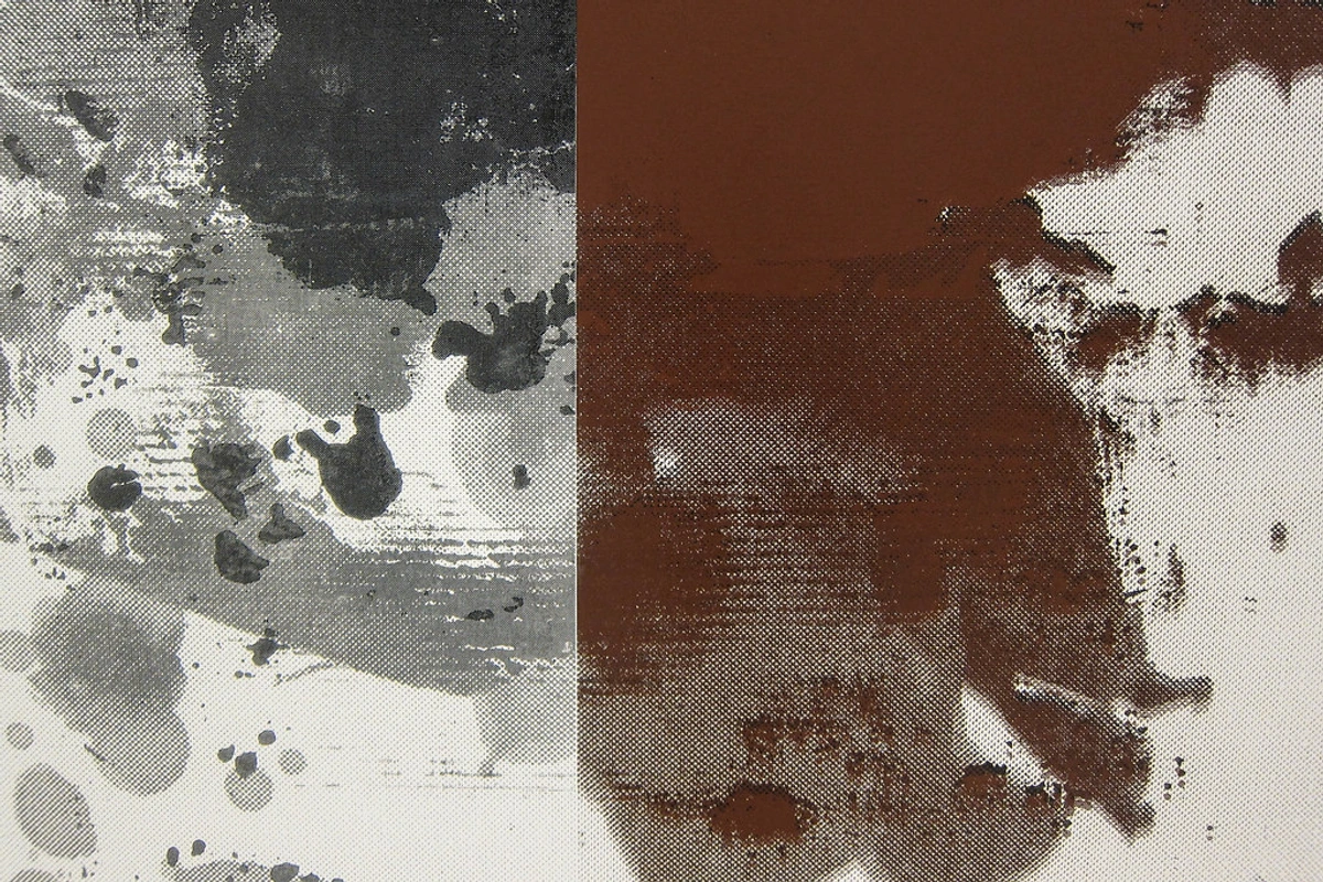 https://live.staticflickr.com/2880/13401911013_b30b13ff6d_b.jpg, https://creativecommons.org/licenses/by/2.0/@This abstract detail by Christopher Wool, with its repeated, overlapping brushstrokes and gestural marks, beautifully demonstrates repetition. While not a strict 'pattern' in the conventional sense, the recurrence of similar forms and textures creates a powerful internal rhythm and a sense of visual continuity. It's almost like a visual chant, isn't it? Each stroke, though unique, echoes the last, creating a cohesive visual language that makes the whole feel intentional and resolved. @### 6. Rhythm: The Visual Soundtrack of a Piece's Emotional Cadence@This one ties closely with movement, pattern, and repetition, drawing on their combined effects. Rhythm in art is the visual tempo or beat – it’s the effect of organized movement created by the recurrence and variation of elements, much like a dance or a piece of music. It's the experience your eye has as it moves through the patterned or repeated elements, creating an emotional cadence. Our perception of rhythm is deeply ingrained; it helps us anticipate and understand sequences, making the visual journey more engaging and allowing the artwork to tell a story through its pace. I remember experimenting with a series of small, rapid brushstrokes on one canvas and then longer, slower sweeps on another. The difference in the feeling of the pieces was profound, purely due to the rhythm I created – one felt like a frantic conversation, the other a peaceful meditation. @Different types of rhythm evoke different feelings:@* Alternating Rhythm: Elements repeat in a predictable A-B-A-B sequence, like fence posts or the alternating colors on a checkerboard. It can feel structured, regular, and quite formal, creating a steady, predictable pace that often evokes stability or a ceremonial feel. * Flowing Rhythm: Elements move and connect smoothly, like waves on a shore, the gentle curves of a river, or the organic lines found in Art Nouveau. Often created with gentle curves or elongated forms, it suggests calm, elegance, and natural progression, leading the eye in a soft, continuous journey that can feel graceful and serene. * Progressive Rhythm: Elements gradually change in size, color, or shape, creating a sense of growth, expansion, or movement through a sequence. Think of concentric circles expanding outwards, a series of figures diminishing in size to suggest distance and perspective, or a color gradient slowly shifting hue. This rhythm often conveys transformation, development, or a sense of vastness and dynamism. * Staccato Rhythm: Sharp, abrupt elements or broken lines (like fragmented shapes, jagged edges, or rapid, disconnected brushstrokes) create a fast, erratic beat, evoking excitement, energy, or even chaos. This is often used to convey urgency, disruption, or a powerful, fragmented experience, making the viewer feel a jolt of energy. @When I’m painting, I'm thinking about how the viewer's eye will move, how quickly or slowly, how consistently. I might use rapid, energetic brushstrokes and dense clusters of marks to create a fast, staccato rhythm, or longer, sweeping lines with more negative space to evoke a calm, flowing cadence. It's all about creating a silent visual symphony. For me, rhythm is about choreographing the viewer's experience, guiding their gaze at a particular pace across the canvas. Do the visual elements create a steady pulse or a wild crescendo? Rhythm dictates the pace and flow of the viewer's visual journey through the composition, deeply influencing the emotional impact and narrative thrust of the piece, from serene to energetic. What kind of rhythm does a piece of music or art usually evoke in you? Can you feel the beat of the brushstrokes?
  https://www.flickr.com/photos/42803050@N00/31171785864, https://creativecommons.org/licenses/by-nd/2.0/@Robert Delaunay's work, like this example, often pulsates with a clear rhythm, where the overlapping circles and segments create a visual tempo that feels almost musical. The repetition of circular forms, combined with the shifts in color and transparency, generates a flowing and dynamic rhythm. It’s a dance of shapes, constantly moving yet harmoniously connected, inviting your eye to follow its intricate beat. @### 7. Proportion: When Relative Size Matters for Impact@Proportion refers to the relative size of objects or elements within a composition. It's how elements relate to each other in terms of scale, and how their comparative sizes create meaning and feeling. A huge shape next to a tiny one creates a very different feeling than two shapes of similar size. It can convey importance, distance, or even create a sense of the absurd. For me, it's less about the exact numbers and more about how the feeling of size plays out on the canvas, manipulating the visual effect rather than adhering to a strict mathematical definition. Our perception of scale can evoke strong emotions, connecting to our own human experience of being small in a large world, or vice-versa. I once purposely painted a tiny, intricate detail within a vast, empty field of color, and the impact was astonishing; that small detail felt monumentally important simply due to the extreme difference in proportion, like a tiny whisper demanding all your attention. @Related to this is the distinct concept of scale, which refers to the size of an artwork or its elements in relation to a standard or to the human body. While proportion compares elements within a composition, scale considers the artwork's size in its broader context. Monumental scale can evoke awe, power, or an overwhelming presence, making the viewer feel small in comparison (think vast Rothko paintings, the imposing figures in Surrealist works by Dalí, or a massive public sculpture). Intimate scale, on the other hand, might suggest closeness, vulnerability, or insignificance, drawing the viewer into a specific, quiet emotional state (like a small, detailed miniature portrait or a delicate watercolor). Artists use scale to control how you, the viewer, physically and emotionally relate to the piece, setting the stage for your encounter with the art. Then there's visual weight, which is the perceived heaviness of an element. A smaller element might hold more visual impact due to its intensity of color, texture, or placement, effectively 'weighing' more in terms of perceived importance than a physically larger, but subtler, component. @Techniques like foreshortening in more traditional art manipulate proportion to create an illusion of depth, making distant objects appear smaller or close objects larger. I remember trying to master this in my early studies, constantly drawing hands that looked like clumsy stumps until I finally understood how foreshortening could bring a sense of dynamic energy to a figure! Renaissance artists like Mantegna truly mastered this, creating dramatic spatial effects that pull you right into the scene. Even the ancient Greek concept of the Golden Ratio (a mathematical ratio found throughout nature, often approximated as 1.618:1, also known as the Golden Mean or Divine Proportion) has been extensively studied for its aesthetically pleasing proportions. Often visualized as a Golden Rectangle (where the ratio of the longer side to the shorter side is the Golden Ratio) or a Golden Spiral (a logarithmic spiral that grows by the Golden Ratio with each quarter turn), this principle influences classical painting and design, suggesting an inherent human preference for certain visual relationships that feel inherently balanced and harmonious. The Golden Ratio is often perceived as pleasing because its proportions are consistently replicated in natural forms, from the spirals of a sunflower to the branching of trees, making it feel intrinsically 'right' to our subconscious, a kind of visual comfort food. For instance, a canvas or a facial feature arranged according to the Golden Ratio often feels naturally pleasing to the eye, inviting a deeper, almost subconscious, sense of order. @In my abstract pieces, I often play with unexpected proportions to create a dynamic tension or to draw attention to a particular area. When I'm considering proportion and scale, I'm asking: how do the sizes of my elements enhance the story I'm trying to tell, or the feeling I want to evoke? Does the scale create drama or serenity? Proportion defines the relative scale of elements, influencing their visual weight and perceived importance, thereby shaping the viewer's emotional response to the artwork, from awe to intimacy, while scale dictates the physical and emotional relationship between the artwork and the observer. How do the sizes of elements in a composition make you feel? Do you feel expansive, confined, or simply intrigued?
 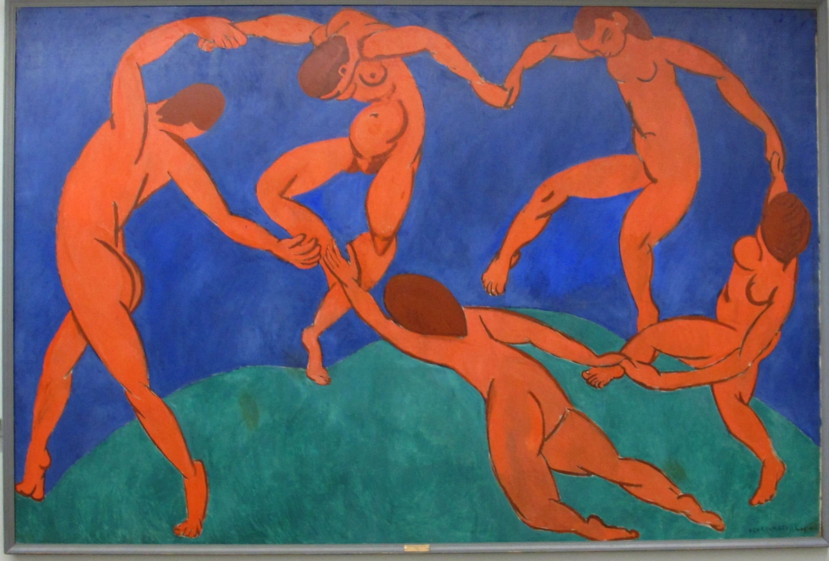 https://upload.wikimedia.org/wikipedia/commons/8/87/Henri_matisse,_la_danse.jpg, https://creativecommons.org/licenses/by-sa/4.0@Matisse's "La Danse" showcases dynamic human figures, emphasizing how relative size and placement create a sense of movement and connection within the composition. The interplay of proportions, while not strictly realistic, creates a powerful sense of energy and balance, demonstrating how scale can be manipulated for expressive effect, making the figures feel both monumental and fluid. @### 8. Variety: The Spice of Visual Life and Engagement@On the flip side of unity (which we'll get to in a moment), we have variety. Without it, even the most beautifully unified composition can become monotonous – like eating the same meal every day, no matter how delicious. Variety introduces difference, contrast, and interest to a composition. It's the unexpected twist, the contrasting texture, the pop of an unusual color. A piece without variety risks being flat, predictable, and ultimately unengaging. I remember trying to paint a series of very similar, muted squares once, thinking it would be minimalist and elegant. It was just... boring. Adding one wild, energetic mark in a contrasting color totally transformed it, bringing it to life – it was like a quiet field suddenly interrupted by a single, vibrant wildflower, without actually overwhelming the piece. @Indeed, contrast in its many forms – light/dark (value), rough/smooth (texture), large/small (proportion), straight/curved (line/shape), warm/cool (color), or even varied line weight and direction – is the primary engine of variety, preventing visual boredom. It keeps the viewer engaged, adding excitement and preventing the piece from becoming dull. It can also be achieved through unexpected juxtapositions, where seemingly disparate elements are placed together to create visual tension and intrigue – like a sharp geometric form within an organic, flowing composition, or a splash of vibrant street art against an ancient stone wall. Sometimes, I even intentionally introduce an element that feels almost "wrong" or jarring at first glance, like a crude, heavy black line slashing through a delicate, colorful wash. But if it's done with intention, that very dissonance can create a powerful pull, demanding attention and making the surrounding elements sing even louder. This kind of contrast can highlight specific themes, create a sense of dissonance, or simply add visual richness and narrative depth, challenging the viewer to find connections. Our brains are designed to seek novelty, and variety provides just that.
  https://www.flickr.com/photos/gandalfsgallery/20970868858, https://creativecommons.org/licenses/by-nc-sa/2.0/@However, too much variety without a unifying element can lead to visual chaos and confusion. It's about finding that sweet spot between enough consistency to feel unified and enough difference to feel alive. Think of a jazz improvisation that always returns to its core melody but takes fascinating detours, or a compelling novel that weaves diverse subplots into a cohesive main narrative. So, if a piece feels a bit flat, I'll often ask myself: where can I introduce a touch of variety to spark some visual interest? What contrasting element would make this pop, and how can I integrate it without losing the overall cohesion? Variety introduces engaging differences and contrasts, preventing monotony and adding visual interest, vital for keeping the viewer's attention and communicating depth, often evoking excitement or intrigue. Where do you see moments of beautiful variety in your everyday life, and how do they capture your attention?
  https://live.staticflickr.com/65535/51907566658_1100dbeb2a_b.jpg@This abstract painting by Gerhard Richter exemplifies variety through its subtle yet distinct shifts in hue, value, and texture across the horizontal streaks. While the overall composition is unified, the careful inclusion of contrasting accents and variations in light and dark keeps the eye engaged, proving that controlled differences are key to an exciting piece. When I aim for variety, it's about making sure my canvas tells a multi-faceted story without losing its core message. It's the moment of playful rebellion within a carefully constructed framework, ensuring the viewer's journey is anything but dull. @### 9. Unity: Bringing It All Together for Cohesion and Purpose@This is the glue. Unity means that all the elements in a piece of art feel like they belong together, forming a coherent whole. Even if the piece is chaotic, there’s an underlying sense of cohesion that makes it feel resolved, intentional. It’s that feeling when everything clicks, like all the instruments in an orchestra playing the same score. Our brains crave coherence; we want to make sense of what we see, and unity helps us do that. A unified artwork feels complete and purposeful, inviting the viewer into a cohesive visual world, often evoking feelings of completeness, harmony, or a shared understanding. I've definitely had pieces that felt like a jumble of disconnected ideas, a visual cacophony, until I found a way to unify them, perhaps with a consistent color wash or a repeated mark, and suddenly everything sang – a jumble transformed into a symphony. @You can achieve unity through:@* Repetition: Of color, shape, texture, or motif, creating visual echoes across the canvas, tying disparate elements together. * Proximity: Grouping elements close together, making them appear as a single unit (a key Gestalt principle!). This naturally forms visual clusters that the eye perceives as belonging, creating immediate connections. * Continuity: Elements aligning to create a sense of flow or connection, even if they aren't physically joined. This could be a continuous line, an implied path, or a consistent directional thrust that guides the eye smoothly. * Dominant Theme/Color Scheme: An overarching consistent color palette or a strong conceptual dominant mood or theme that ties everything together. Think of a monochromatic piece or a series focusing on a particular subject, where a single idea or hue permeates the work. * Visual Hierarchy: Establishing a clear order of importance that guides the viewer through the piece in a deliberate, organized way, preventing visual confusion and making the artwork's message clear and accessible. * Closure: Our inherent tendency to complete incomplete forms, seeing a whole even if parts are missing – like perceiving a full circle from just a few arcs. This Gestalt principle helps unify fragmented images by inviting the viewer's mind to actively participate in creating wholeness, drawing connections between disparate elements. * Common Fate: Elements moving or pointing in the same direction are perceived as a group, even if they aren't explicitly connected (think a flock of birds moving in unison, or a swirling mass of brushstrokes all heading upwards, grouping into a unified force). This creates a sense of collective purpose. * Artistic Voice/Signature Style: This is a more subtle form of unity. Across a body of work, a consistent artistic voice – your unique way of handling color, line, or subject matter – creates a recognizable coherence, making all your pieces feel like they belong to the same creator, even if they differ greatly. @It's what makes the artwork feel like a complete thought, not just a jumble of ideas. For me, achieving unity is about ensuring that even my most experimental abstract pieces still feel like a single, considered statement, a full sentence rather than just scattered words. For example, I might use a strong diagonal line (movement) and repeat a subtle texture (repetition) across the canvas, all within a limited color palette (dominant color scheme), to pull all the diverse shapes and colors into a single, cohesive narrative. Think of how Jackson Pollock's drips, though seemingly random, coalesce into a unified, energetic field, or the harmonious overall effect of a Roman mosaic, despite being made of thousands of tiny, individual tesserae. Unity ensures all elements coalesce into a coherent and harmonious whole, making the artwork feel complete and comprehensible, often conveying a sense of resolution or shared purpose. What elements give a piece of art a sense of belonging together for you, making it feel like a single, powerful statement?
  https://live.staticflickr.com/65535/53064827119_1b7c27cd96_b.jpg@In this Gerhard Richter piece, the variety is palpable, yet there's a powerful sense of unity. The repetition of broad strokes and the overarching horizontal movement, combined with a consistent (though varied) texture, pulls all the disparate elements together into a cohesive visual statement, a testament to the idea that even chaos can find harmony. It feels resolved, doesn't it? As if all those seemingly random scrapes and smears are actually working towards a single, powerful message, creating an abstract narrative that is both complex and unified. @### 10. Harmony: The Grand Finale – When Everything Sings Together@While often used interchangeably with unity, I see harmony as the overarching feeling of completeness and aesthetic pleasure that arises when all principles of composition are working together perfectly. It’s the ultimate goal, a synthesis where all elements, despite their individual differences (variety) or visual weights (balance), feel like they are meant to be together, creating a beautiful and coherent visual experience. Harmony isn't just about things looking "nice" together; it's about a deeper resonance, a feeling of rightness – a state where all elements, even those that seem to clash or create initial tension, ultimately find a resolved and aesthetically pleasing relationship. Sometimes, true harmony emerges not from a lack of conflict, but from the successful resolution of visual dissonance, leading to a richer and more profound aesthetic experience. It's the sensation that the artwork is right, that it exists in a state of grace, and evokes a profound emotional response from the viewer. This emotional resonance is achieved through the careful interplay of all compositional principles, where each decision contributes to a holistic and deeply satisfying aesthetic. I remember a moment, years ago, when I finally finished a particularly challenging piece. I stepped back, and there it was – that undeniable feeling of everything clicking. Not just unified, but truly harmonious, speaking a silent language that felt both profound and simple, like the perfect resolution of a complex musical chord. @Harmony often evokes a particular mood or emotional response, such as calm, beauty, intellectual satisfaction, or even profound disruption if that's the artist's intent and that disruption feels intentional and resolved. Think of how individual musical notes, when played together with intention, form a perfect chord that evokes a specific emotion. Similarly, lines, shapes, and colors are the 'notes' in visual art, and harmony is when they combine to create a compelling 'visual chord.' In historical contexts, from the balanced classicism of the Renaissance to the deliberate color palettes of Impressionism and the emotional weight of Expressionism, artists have always striven for this ultimate sense of harmonious resolution. For me, when a piece achieves harmony, it’s not just visually appealing; it resonates on a deeper level, speaking directly to the viewer's emotions and intellect. It's the moment when the controlled chaos truly transforms into art, when every choice, no matter how subtle, contributes to a cohesive and impactful experience, making the abstract feel profoundly real. What emotions does a truly harmonious artwork evoke in you? Does it make you feel at peace, invigorated, or something else entirely? Harmony is the culmination of all principles, creating an aesthetically pleasing and emotionally resonant visual experience that feels both complete and purposeful, inviting deep connection and satisfaction.---## My Toolkit for Visual Harmony: A Quick Reference@Before we wrap up, here's a concise overview of the 10 principles of art composition, my go-to guide for creating meaningful visual experiences, along with their key emotional impacts:@|Principle|Key Function & Emotional Impact| |---|---| |Balance|Achieves visual stability & equilibrium. Evokes calm, formality, dynamism, or focus.| |Emphasis|Directs the viewer's eye to a focal point. Creates clarity, drama, or hierarchy of importance.| |Negative Space|Utilizes empty areas to define forms, create depth, suggest mood, and establish scale. Evokes calm, tension, vastness, or intimacy.| |Movement|Guides the viewer's eye through the artwork. Dictates energy, pace, and narrative flow (e.g., excitement, serenity, drama).| |Pattern & Repetition|Establishes rhythm, unity, and familiarity. Creates comfort, structure, cohesion, or intriguing visual echoes.| |Rhythm|Dictates the pace and flow of the visual journey. Influences emotional cadence (e.g., steady, flowing, progressive, staccato).| |Proportion|Defines the relative scale & size of elements, influencing visual weight. Evokes awe, intimacy, or drama.| |Variety|Introduces engaging differences & contrasts. Prevents monotony, adds interest, communicates depth, and can evoke excitement.| |Unity|Ensures all elements coalesce into a coherent & harmonious whole. Conveys completeness, resolution, and shared purpose.| |Harmony|The culmination of all principles. Creates an aesthetically pleasing & emotionally resonant visual experience, inviting deep connection.|---## Why I Bother with All This (It's Not Just for Galleries)@Have you ever wondered what separates a good piece of art from one that truly moves you? For me, understanding these principles isn't just for art critics or museum curators (though I love a good visit to my museum in 's-Hertogenbosch, or any gallery, for that matter!). For me, it transforms the act of creation itself. It means I'm not just throwing paint around; I'm orchestrating a visual experience. Whether in abstract fields or representational landscapes, composition isn't just about aesthetics; it's about conveying specific emotions and telling a story. These principles are universal, applying to everything from classical masterpieces to contemporary digital art, graphic design, and even photography. @Consider how specific principles shape feeling, and how I use them in my own abstract work (as well as in more traditional genres like landscape or portraiture):@* Symmetry can evoke calm and stability due to its predictability and inherent order, often used in religious or formal art to suggest perfection or divine presence. In my abstract pieces, I might use symmetrical elements sparingly to create a fleeting sense of grounding before disrupting it, often to create a subtle visual tension that then resolves. * Asymmetry often creates dynamic energy and intrigue, engaging the viewer's eye to actively seek equilibrium, which can feel more modern or natural. This is frequently my go-to method for guiding the eye through complex, energetic abstract compositions, building and releasing visual tension as the eye travels. * Strong diagonals (movement) inherently suggest energy, conflict, or instability, while horizontal lines whisper calm, peace, or vastness. I frequently use sharp diagonals in my abstract work to inject a powerful, almost urgent, sense of motion and drama, often contrasting them with more stable elements to heighten the visual drama. * Large proportions and monumental scale can evoke awe, power, or insignificance, drawing the viewer into a grand narrative or making them feel small within a vast scene. I sometimes use large, sweeping fields of color to create an overwhelming sense of space, making smaller, more intense marks feel incredibly poignant – a deliberate play on scale to emphasize emotional weight. * Restricted negative space can create feelings of claustrophobia or intensity, while expansive negative space can evoke peace, emptiness, or freedom. In my abstract art, negative space is a deliberate choice to either amplify the tension of dense forms or to offer moments of quiet contemplation, using the 'empty' space to shape the emotional response. @It gives me a framework to experiment, to break rules on purpose, and to communicate more effectively through my art. Moreover, when a piece feels "off" or I hit a creative block, returning to these principles helps me troubleshoot and understand why something isn't working, guiding me toward a solution. It also helps me, as an artist, to deconstruct and learn from the work of other artists, to peek behind their creative process, too. Even if you're just looking at art, knowing these principles enriches your experience, allowing you to appreciate the 'why' behind what you see. These concepts, by the way, are equally applicable whether you're painting on canvas, sculpting clay, designing a website, taking photographs, or even arranging furniture in a room. Before I even pick up a brush, I often envision how I'll use balance, emphasis, and movement to tell my story on the canvas. Try it yourself: next time you look at a painting, ask yourself where your eye goes first, and why. When you see a piece of my abstract art that truly resonates with you, it's often because these compositional principles are at play, creating that subconscious connection. It's the silent language through which I hope my art speaks to you. If something catches your eye, perhaps it's a testament to the power of these unseen forces in action. You can always check out my latest pieces for sale to see them in action!
  https://www.publicdomainpictures.net/pictures/250000/nahled/messy-colorful-artists-palette.jpg, https://creativecommons.org/publicdomain/zero/1.0/@---## A Quick Chat: FAQs About Composition (Because You Probably Have Questions, I Know I Did)@### Q: Is composition only for traditional, realistic art?@Absolutely not! Composition is fundamental to all visual art, whether it's a classical landscape, a minimalist sculpture, or the most wild abstract expressionist piece. In abstract art, where there's no recognizable subject matter, composition becomes even more critical. It's what provides structure, meaning, and visual interest in the absence of obvious narrative elements. Historically, while rules of perspective and proportion were rigorously applied in representational art, modern and abstract artists have continuously reinterpreted and challenged these principles, proving their universal applicability across all art forms, including contemporary digital art, graphic design, and mixed media. Composition is the language that transcends style and medium, making it a timeless tool for expression. @### Q: Can you break the rules of composition?@Oh, you absolutely can! In fact, some of the most groundbreaking art has come from artists intentionally challenging or breaking these principles. But here's the kicker: you need to understand the rules first to break them effectively. Breaking a rule blindly often leads to a weak or confusing composition, but breaking a rule with intention can create powerful, revolutionary effects. It's about knowing why you're doing it, and what emotional or intellectual impact you're aiming for. It's like a jazz musician improvising – they know the scales and chords intimately before they venture into uncharted territory, subtly bending notes or shifting rhythms for a powerful, expressive effect. My advice? Learn the rules, internalize them, and then decide how you want to bend or break them to serve your unique artistic vision. Trust me, it's much more satisfying to break a rule knowing exactly what you're doing. @### Q: How do I practice understanding composition?@The best way? Look at art, a lot of it. Go to museums, browse galleries (online or in person), and pay attention to how different artists arrange their elements. Try to identify the principles we discussed – pick just one or two to focus on initially. Then, experiment in your own creative endeavors. Even if you don't paint, try arranging objects in your home, taking photos, or just sketching. As an additional challenge, try to recreate simple compositional arrangements from masterworks you admire, focusing purely on the placement of forms and lines – imagine simplifying a realistic landscape into abstract shapes and then composing them. Or even simpler, try cropping a photograph in a dozen different ways, analyzing how each crop changes the balance or emphasis. The more you consciously observe and create with these principles in mind, the more intuitive they'll become. It's a journey of seeing, and my artist's journey has certainly been filled with a lot of seeing and learning! You can also find a practical guide to applying composition principles in your own art for hands-on practice. @### Q: How do I develop my own compositional style or overcome creative blocks?@This is a fantastic question, and one I grapple with constantly! Developing your own style often comes from a deep understanding of these principles, followed by intentional experimentation and rule-breaking. Don't be afraid to try extreme compositions – highly symmetrical, wildly asymmetrical, or focusing solely on negative space. Document what works and what doesn't. When I hit a compositional block, I often go back to basics: I simplify. I might limit myself to just two colors, or just lines, and try to create balance or movement with those constraints. Sometimes, literally rotating my canvas 90 degrees can offer a fresh perspective. As a specific exercise, try painting the same subject three times, each time focusing on a different compositional principle: once for strong emphasis, once for dynamic movement, and once for serene balance. Looking at other artists' work, particularly outside your usual genre, can also spark new ideas, sometimes even from something as mundane as a cracked sidewalk or the way light hits a building. Remember, it's an ongoing dialogue with your art; the block itself can be a sign you're about to discover something new! @### Q: Are there any common compositional mistakes beginners make?@Definitely. Here are a few frequent pitfalls I’ve noticed, and definitely stumbled into myself, causing more than a few artistic headaches:@* Overcrowding: Trying to put too many elements into a single piece without enough negative space to let them breathe, leading to a busy and confusing image. It's like trying to shout a message in a crowded room – no one hears you, and everyone feels overwhelmed. * Lack of a Clear Focal Point: This leaves the viewer's eye wandering aimlessly, unsure where to settle. If everything is important, nothing is, and the piece lacks a clear message. * Absence of a Visual Path: Elements don't lead the eye logically through the piece, making it feel disjointed or chaotic. This can leave the viewer feeling lost or frustrated, unable to find a narrative flow or connection. * Unintentional Imbalance: One side of the canvas feels much heavier than the other, making the whole piece feel unstable, like a wobbly table that threatens to collapse. @The good news? These aren't insurmountable problems; with practice and conscious observation, they're often surprisingly straightforward to identify and adjust! A fresh set of eyes (or even just stepping away and coming back with new perspective) can often spot these quickly. Seeking feedback from another artist or friend can also be invaluable. @### Q: How do I know if my composition is "good"?@That's the million-dollar question, isn't it? Ultimately, for me, a "good" composition achieves its intended effect. Does it guide the viewer's eye effectively? Does it evoke the specific emotion you intended? Does it tell the story you wanted, even if abstractly? Does it feel resolved and coherent? Here's a quick self-critique checklist to get you started:@* Focal Point: Is there a clear focal point, or does my eye wander aimlessly? If so, what do I want the viewer to see first? * Balance: Does the piece feel balanced, even if it's asymmetrical? Does it feel stable or intentionally unstable? * Movement: Is there a sense of movement or flow that guides my eye through the artwork, or does it feel static and disjointed? * Unity: Do the elements feel like they belong together (unity), or is it a chaotic jumble? What connects them? * Variety: Is there enough variety to keep it interesting without being overwhelming? Where can I add contrast or difference? * Emotional Resonance: Does the overall arrangement evoke the mood or message I intended? What emotion is it communicating, and is it the right one? @Try this: create two versions of the same subject using different compositional approaches. Or even better, ask a friend or fellow artist what they see first, what feelings the piece evokes, and if anything feels 'off' – fresh eyes can be incredibly insightful. Which one feels more impactful, and why? It’s a mix of objective principles and subjective feeling, but an effective composition fundamentally serves the artist's intent and meaningfully engages the viewer. Critically observing your own work and seeking feedback can also be incredibly valuable. There's no single right answer, but a composition that effectively communicates its visual message and elicits a desired response usually stands out. @### Q: How do these principles apply to different art forms?@That's the beauty of them – they're universal! Whether you're a photographer, graphic designer, sculptor, filmmaker, or even a chef arranging food on a plate, these principles are constantly at play:@* Photography: Think of the Rule of Thirds for emphasis, leading lines for movement, or negative space to isolate a subject and create drama. * Graphic Design: Balance is crucial for page layout, hierarchy guides the eye to key information, and variety keeps a design from becoming stale and predictable. * Sculpture: Balance is literal and visual (ensuring the piece stands!), proportion defines the form's scale and presence, and movement can be implied through the flow of carved lines or draped materials. * Filmmaking: Directors meticulously compose every shot, using emphasis to draw attention to characters, movement to guide the viewer through a scene, and rhythm to control the pace of the narrative and build tension or calm. @Once you grasp these foundational ideas, you'll start seeing them everywhere, across all creative disciplines! It really opens your eyes to the 'language' of visual communication. @### Q: How can I find inspiration for composition when starting a new piece?@This is where the magic happens! When I'm feeling stuck, I often turn to unexpected places. Sometimes it's a pattern in nature – the way leaves fall, the swirl of coffee in my mug (true story!), or the lines on a cracked pavement. Other times, I look outside of painting: a striking architectural photograph, the layout of a magazine page, or even the choreography of a dance. I might take a simple photograph and intentionally crop it in dozens of ways to see how different compositions change its feeling and impact. Or I'll set up a still life with random objects and try to arrange them to tell a story using only balance or emphasis. Don't underestimate the power of simply drawing abstract lines and shapes without a preconceived notion – let your hand explore. Often, the spark for a compelling composition comes from something seemingly mundane, viewed with fresh eyes and the principles of composition in mind. It's about seeing the potential for visual harmony everywhere, and trusting your intuition to guide you.---## My Journey Continues (And Yours Can Too)@So, there you have it: my personal take on the principles of art composition. It's a vast subject, and I'm still learning and experimenting every single day. But understanding these basics has genuinely transformed how I approach my canvas, turning moments of uncertainty into opportunities for thoughtful expression. It's moved my work from merely making art to truly creating a dialogue with you, the viewer, building a bridge between my inner world and your perception. I hope this little peek behind my process has demystified things a bit for you, too. I even find myself analyzing the composition of my morning coffee foam (true story) – once you start seeing it, you can't unsee it! @Remember, art is a journey of exploration, both for the creator and the observer. I challenge you to consciously seek out these principles in the art you encounter today, whether in a gallery, a museum, or just on your morning commute. Even better, try to create something – anything – with just one or two of these principles in mind. As a starting point, maybe try a simple compositional exercise like making three quick sketches of the same object, each time focusing on a different type of balance (symmetrical, asymmetrical, radial). Keep looking, keep questioning, and keep letting your eyes dance. There’s a whole world of visual language waiting to be understood, and a practical guide to applying composition principles in your own art might be a great next step. And hey, if you're curious to see how I put all this "theory" into practice in my own vibrant, often chaotic, world of abstract painting, take a peek at my latest pieces for sale – you might just spot a few of these principles dancing across the canvas! For a deeper understanding of how these principles apply specifically to non-objective art, explore The Definitive Guide to Understanding Composition in Abstract Art.


