The 7 Elements of Art: A Personal Guide to Decoding Visual Language
Feeling lost in front of art? Join my personal journey through the 7 Elements of Art (line, shape, form, space, color, texture, value) and how they build visual meaning. Understand art's language, especially abstract works, and deepen your appreciation.

Understanding Abstraction in Art
You know, for a long time, I felt like art was speaking a language I just didn't get. It was like trying to read a menu in a fancy French restaurant when all I knew was "hello" and "thank you." I remember this one particular gallery visit, standing in front of a giant canvas — all wild slashes of paint and inexplicable textures — and feeling utterly silly. The little white card next to it had some profound, multi-paragraph explanation, and I just stood there, nodding vaguely, thinking, "This is… paint? Okay." It all seemed so incredibly profound, so wonderfully enigmatic, that it felt designed to make everyone else feel intellectually inferior. And honestly, it sometimes worked on me. My mind just couldn't bridge the gap between "this is pigment on linen" and "this is meaningful expression." This feeling, I've come to realize, is shared by many, especially when faced with the boundless freedom of abstract art.
For me, approaching art, especially abstract art – which, at its heart, uses shapes, colors, forms, and gestural marks to create an effect rather than represent visual reality – was like trying to solve a complex puzzle without ever seeing the picture on the box. It felt like a beautiful, chaotic mess I couldn't quite grasp. But here’s the thing: art, at its core, is just a conversation. And like any good conversation, or a really delicious meal, it’s built from smaller, simpler pieces. These fundamental building blocks, the visual ingredients an artist uses, are what we call the Elements of Art. Think of them not just as a chef's ingredients, but as the basic notes in a musical scale, or the letters of an alphabet.
The good news? Once I started understanding these foundational pieces, those chaotic messes slowly, wonderfully, began to make sense. It wasn't about instantly grasping some deep philosophical meaning, but about recognizing the individual notes in the symphony. So, if you've ever felt bewildered by a painting or sculpture, consider this our little chat about the alphabet of art. This article will break down these core visual ingredients, the Elements of Art, so you can start reading poetry, or even writing your own. My journey wasn't some sudden, blinding revelation, by the way. More like a slow, delightful realization over many cups of coffee, often involving me staring blankly at a canvas, wondering if I'd ever truly "get" it. But trust me, you can. And it's incredibly rewarding.
Before we dive into each element, it’s worth noting that the very idea of breaking art down into components isn't new. Philosophers and artists, from the classical era to the Renaissance masters like Leonardo da Vinci, have pondered how visual information is perceived and constructed. While our modern understanding has evolved, the core quest to define the 'ingredients' of visual expression has a long and rich history, adapting as art itself transformed through movements and styles.
The Seven Wonders: Unpacking the Core Elements
Alright, so what exactly are these mysterious "elements" I keep rambling about? At their core, they are the visual ingredients an artist uses to create a work of art. Traditionally, we talk about seven primary ones, but some theories even consider a point – a single dot, the smallest possible mark – as the very genesis, the precursor to all other elements. Think of it: a line is just an infinite series of points, right? These elements are your foundational toolkit. Imagine you’re building something, anything; these are your bricks, your mortar, your wood, your nails. Without them, building anything truly meaningful would be incredibly difficult, no matter how grand your vision. So, let's get down to the nitty-gritty, the actual building blocks that make all this visual magic happen. Let’s dive into each, shall we? And trust me, it’s far less dry than it sounds.
1. Line: The Journey Itself
What's the very first thing your eye latches onto when you look at a drawing, even before your brain registers the subject? More often than not, it's the line. I often think of line as the true starting point, the very first mark we make on a blank surface, essentially a point extended. It’s the path of a moving point, like a pencil dancing across paper or a brushstroke arcing across a canvas. Lines come in all sorts of personalities: straight, curved, thick, thin, zig-zagging, dotted, continuous, broken. Beyond just describing outlines, artists use different types to convey different messages: contour lines that define edges, gestural lines that capture movement and energy, and perhaps most subtly, implied lines. Implied lines aren't physically drawn; instead, your eye connects a series of points, a row of dots, or even the gaze of figures in a painting to create an invisible pathway. It's as if your brain completes the circuit, suggesting a direction or boundary.
Think about a simple sketch. Before you even have a recognizable object, you have lines. They're leading your eye, telling a story, even if it's just about the direction of a bird's flight or the curve of a mountain. In abstract art, lines can be incredibly powerful in their own right, crisscrossing to create tension, flowing harmoniously, or serving as mere suggestions. The artist uses lines to invite your eye on a journey, suggesting where to explore next. If you're particularly fascinated by this fundamental tool, I've dived even deeper into the definitive guide to understanding line in abstract art from gestural marks to geometric forms.
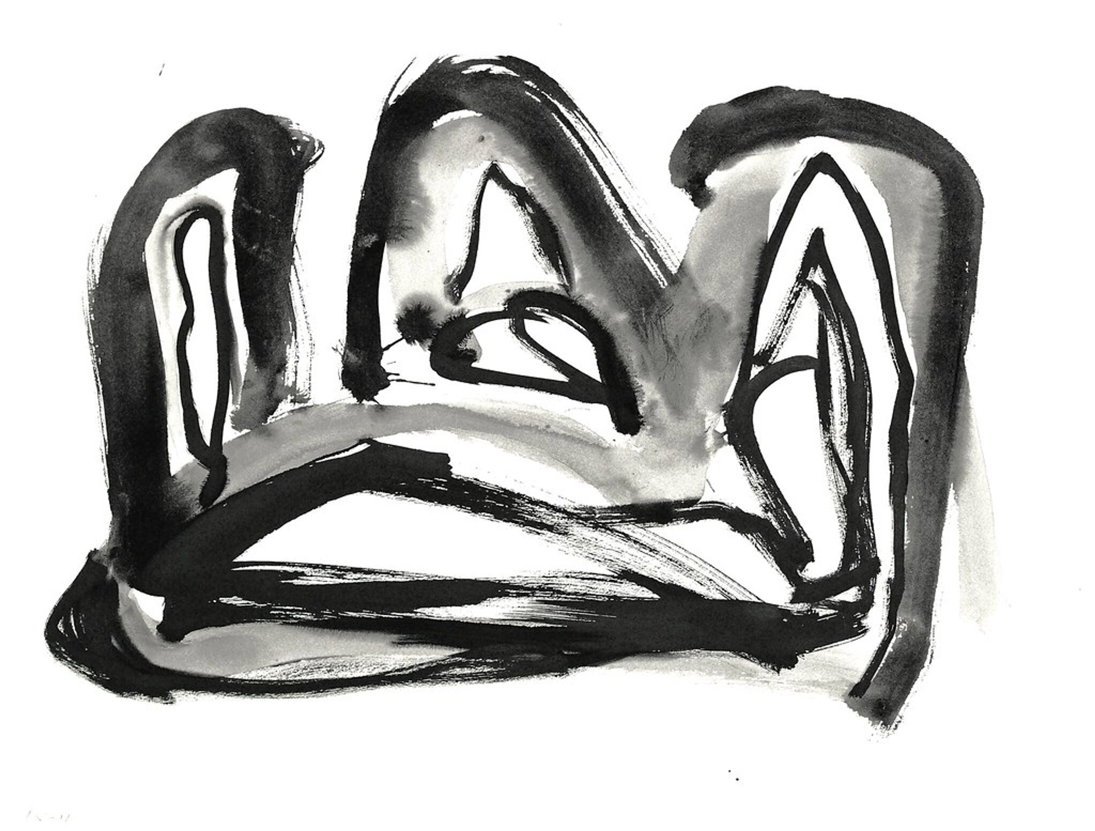
Remember that feeling when you're trying to draw something, and you just keep making lines, searching for the "right" one? That's the artist's struggle and joy, laid bare. Lines are dynamic, personal, and frankly, they’re everywhere once you start looking. In essence, line is the artist's initial gesture, guiding your eye and setting the stage.
2. Shape: Defining the Space
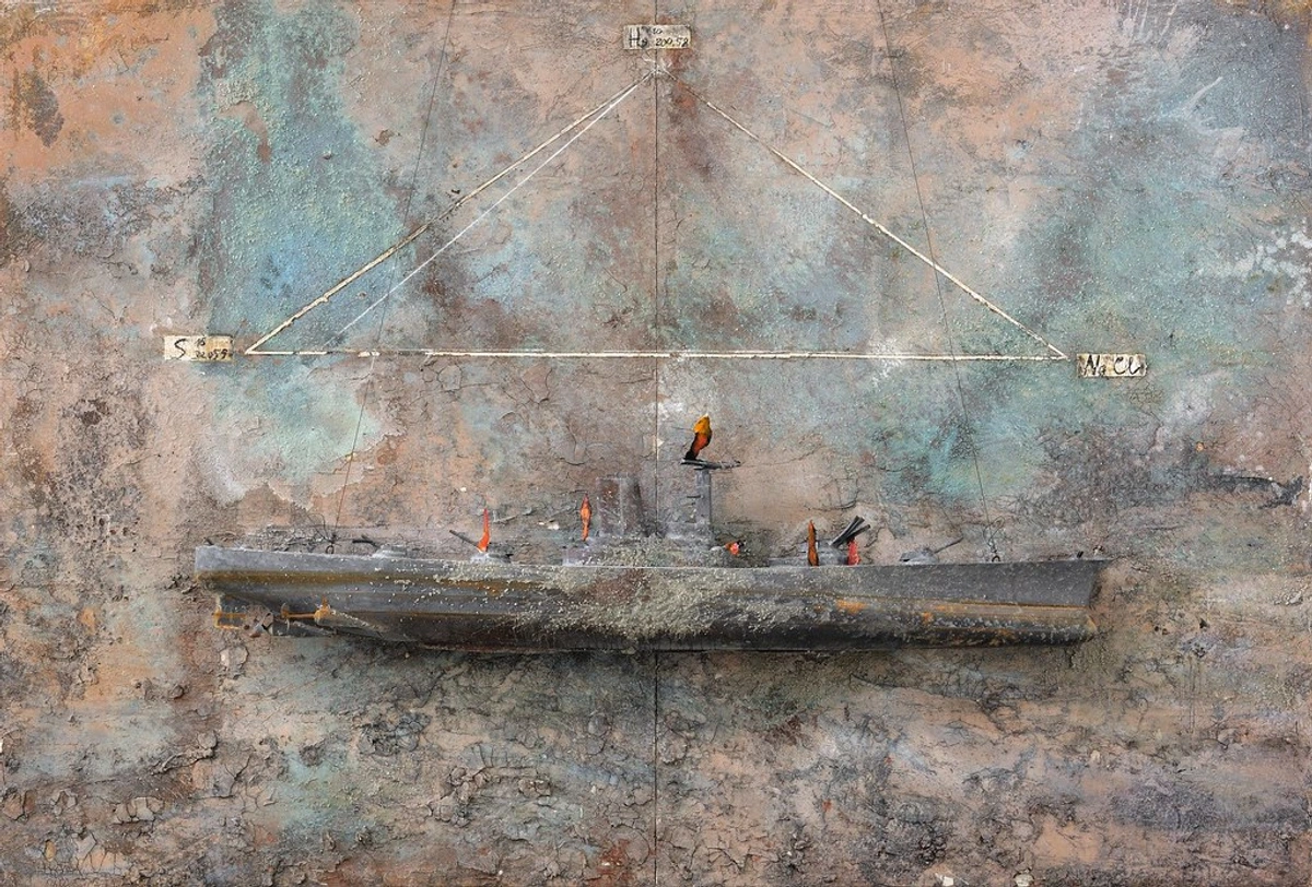
What happens when a line decides to close itself off, circling back or meeting other lines? Bingo, you’ve got a shape! Shapes are two-dimensional areas defined by lines or boundaries. Think of them as flat outlines, existing solely in height and width. They come in two main flavors: geometric shapes (like squares, circles, triangles – which, confession time, are my absolute favorites for their stark, powerful beauty, especially in abstract pieces) and organic shapes (think a leaf, a cloud, or a wonderfully unpredictable blob). Within an artwork, shapes aren't just the subjects; we also talk about positive shapes (the actual objects or subjects) and negative shapes (the empty, often overlooked, space around them).
Shapes are more than just outlines; they give concrete form to ideas and can be used to establish visual hierarchy, guiding your eye to specific points of interest. A large, bold geometric shape can assert itself, demanding attention, while a cluster of smaller, softer organic shapes might invite a quieter contemplation. I find myself constantly playing with geometric shapes in my own abstract works, seeing how they interact, overlap, and create entirely new narratives. They’re like the individual words in a sentence; each has its own meaning, but together, they craft something far more profound. They dictate the rhythm of the composition, urging your gaze from one point to the next.
Ultimately, shapes provide the fundamental definitions, carving out distinct areas and establishing presence within a work.
3. Form: Bringing Dimensions to Life
Ever looked at a painting and genuinely felt like you could reach out and touch something that isn't actually there, feeling its curves and edges? That, my friend, is the magic of form. If a shape is 2D, existing only in height and width, then form is its beefy 3D cousin. It's the three-dimensional aspect of an object, giving it volume and depth. While sculptures inherently are form – existing in tangible space, literally having height, width, and depth – artists working in 2D mediums like painting create the compelling illusion of form through masterful techniques. We're talking shading, perspective, and the careful manipulation of light and shadow. Techniques like chiaroscuro, which is basically using dramatic contrasts between light and dark to create a sense of depth and solidity, are fundamental for giving the impression of three-dimensionality. Artists also employ methods like foreshortening (making an object appear shorter than it actually is because it's angled towards the viewer) and atmospheric perspective (using haziness and color shifts to suggest distance) to pull off this visual trick.
This is where things start to feel tangible and real, even on a flat surface. I've always been utterly fascinated by how artists can essentially trick your eye into seeing depth on a canvas. It’s a powerful testament to how deeply artists understand and master these elements. Imagine you’re at a museum – perhaps even my museum in 's-Hertogenbosch, if you're ever in the Netherlands! – and you see a sculpture. That’s pure, undeniable form, something you could walk around and experience from all angles. But even in a painting, the illusion of form can be incredibly potent, making elements pop off the surface. For a more in-depth exploration of how artists master this, I’d highly recommend checking out the definitive guide to space and form in abstract art.

In short, form transforms flat shapes into volumetric objects, giving them a sense of presence and tangibility.
4. Space: The Seen and the Unseen
What's just as important as the subject of an artwork, but often goes completely unnoticed until someone points it out? It's space. This isn't just about emptiness; space refers to the area within an artwork, or the illusion of depth created by an artist. It’s essentially the perceived volume or expanse where elements exist, or don't exist. We talk about positive space – which is the subject or object itself (think a bold red square in an abstract painting) – and negative space – which is the area around and between those objects (the white background around that red square). They are two sides of the same coin, constantly defining and influencing one another. In fact, sometimes the negative space is the most compelling part of a composition!
Artists also masterfully manipulate foreground, middle ground, and background to create illusions of depth. In an abstract piece, the foreground might be sharp, brightly colored shapes appearing closest to you; the middle ground could be slightly softer, perhaps overlapping forms; and the background might recede with muted colors or blurred edges, creating a sense of vastness or intimacy. Think of it like a stage: the performers are positive space, but the empty stage and wings are negative space, both crucial for the play to unfold. Manipulating space can evoke feelings of openness, claustrophobia, or even a serene calm. It's often where the quiet power of a piece truly resides. Understanding space is also crucial for design principles, as how elements are arranged within that space dictates the overall composition. If you're curious about how artists carve out depth on a flat canvas, my guide on the definitive guide to space and form in abstract art goes into further detail.
Ultimately, space is the breathable air within an artwork, giving context and dimension to everything else.
5. Color: The Soul of the Palette
What's the most immediate impact a painting has on you, the thing that grabs your attention first and pulls you in? For most of us, it's undeniably color. This element often feels the most immediate, the most emotional, and honestly, it’s a fascinating rabbit hole to explore. Color is what our eyes perceive when light reflects off an object, and it has three main properties that artists manipulate like a conductor with an orchestra:
**Hue**: This is the pure, unadulterated color itself – red, blue, yellow, green. It's what we typically think of when we just say "color."**Intensity**(or Saturation): This refers to the brightness or dullness of a color – think of a vibrant, pure red versus a muted, dusty, almost grayed-out red.**Value**: This is the lightness or darkness of a hue, a pale pink versus a deep crimson (we'll dive more into value as a standalone element in its own dedicated section!).
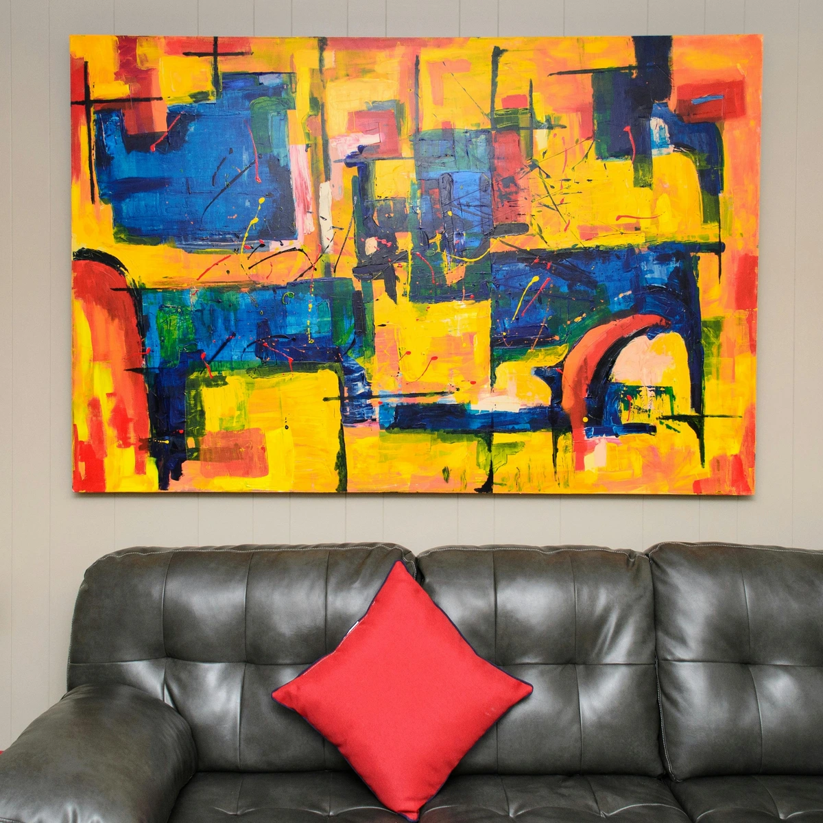
Beyond these, there’s also color temperature, categorizing colors as warm (reds, oranges, yellows, which tend to advance and feel energetic) or cool (blues, greens, violets, which tend to recede and feel calming). We can also think about color through additive models (like light on a screen, where combining colors creates white) or subtractive models (like pigments, where combining colors creates black). And then there’s color harmony, which is about how colors are combined on a color wheel to create visually pleasing relationships. Artists might use complementary colors (opposites on the wheel, like red and green, for high contrast) or analogous colors (neighbors on the wheel, like blue, blue-green, and green, for a more serene, flowing feel) to craft specific moods or visual appeals. I remember early on, I just picked colors I liked, hoping for the best. Now, I see how they play off each other, how a splash of vibrant red next to a deep blue can make both sing. Colors evoke feelings, memories, and sometimes, just a powerful, visceral reaction. Ever notice how some abstract pieces just hit you with a wave of emotion? A huge part of that is carefully considered color choices. If you want to dive deeper, you might enjoy my thoughts on how artists use color or even the psychology of color in abstract art.
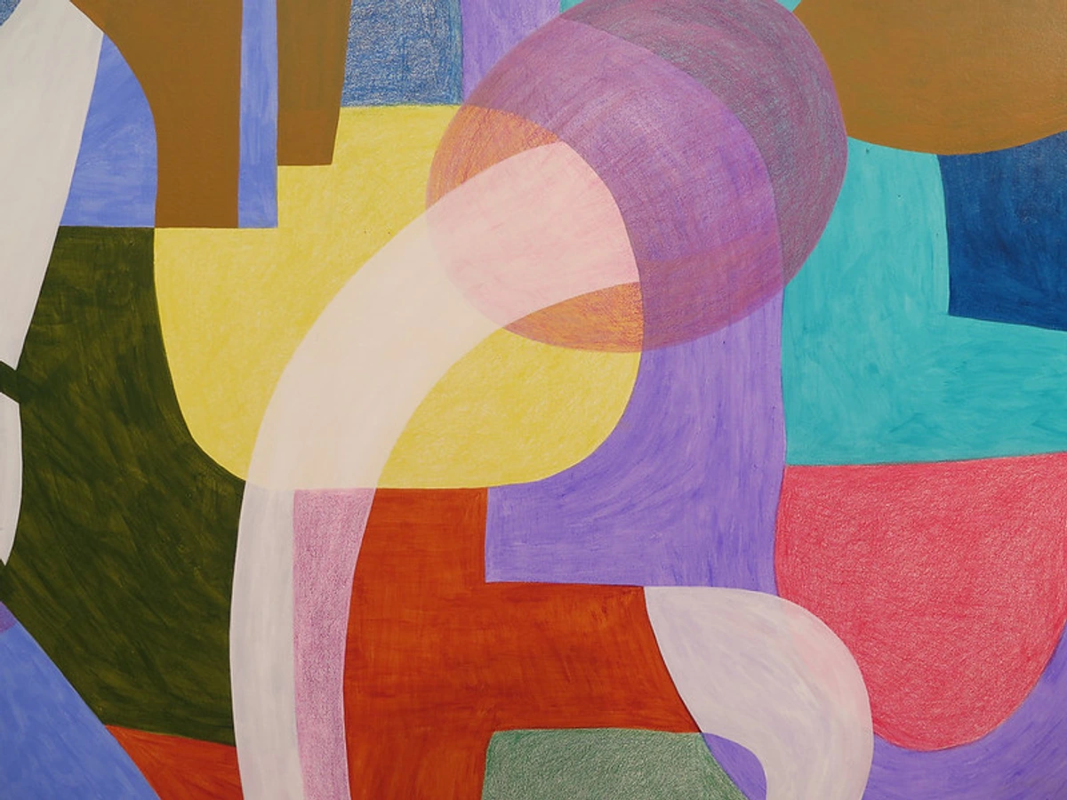
In sum, color is the emotional powerhouse, conveying mood, energy, and visual attraction with immediate impact.
6. Texture: The Invitation to Touch (or Imagine)
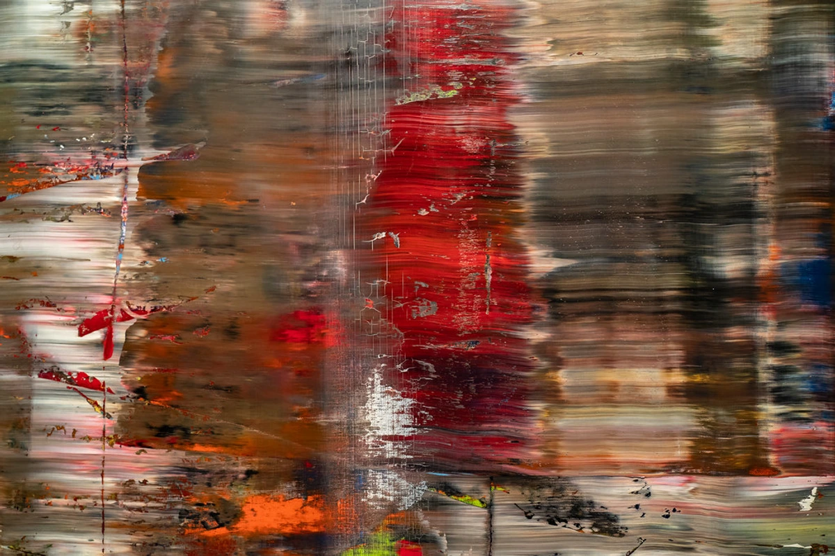
Have you ever just wanted to reach out and touch a painting, to feel the canvas beneath your fingertips? That visceral urge is almost always triggered by texture. Texture refers to the perceived surface quality of a work of art – how something feels to the touch, or, more often in 2D art, how it looks like it would feel if you could touch it. It can be rough, smooth, bumpy, soft, hard, gritty, slick, fuzzy.
Artists can create actual texture, where the surface literally has raised or lowered areas (think thick impasto paint that stands off the canvas, giving it a truly bumpy, tangible surface, or a collage with layered materials). Then there's implied texture, which is where a painting looks rough or smooth, even though the physical surface is perfectly flat. For example, an artist might use incredibly fine, delicate brushstrokes or specific patterns, stippling (dots), or cross-hatching lines to suggest the roughness of tree bark, the softness of velvet fabric, or the cool, hard sheen of metal on an otherwise smooth canvas. It’s a masterful visual trick that engages our tactile memory.
When I'm creating, I'm often thinking about how your eye will experience the surface, even if you can't physically touch it. A heavily textured piece can feel raw, immediate, and energetic, while a super smooth, polished one might convey serenity or precision. It's an often-overlooked element, but it adds so much richness and depth to the viewer's experience. Sometimes, I just want people to imagine running their hand over the canvas, experiencing that tactile illusion and sensing the material quality. To truly appreciate this tactile illusion, consider my deeper exploration in the definitive guide to understanding texture in art.
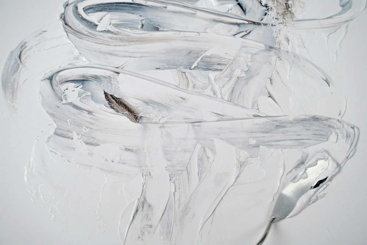
Simply put, texture is the visual invitation to touch, adding a sensory layer to the viewing experience.
7. Value: The Dance of Light and Shadow
How does an artist conjure a sense of dramatic tension or profound softness using nothing but light and dark? Ah, that’s the subtle yet immense power of value. This is the lightness or darkness of tones or colors. It ranges on a continuous scale from pure white (the lightest possible value) through an infinite spectrum of grays to pure black (the darkest possible value).
Value is absolutely crucial for creating contrast, depth, and mood in any artwork, regardless of whether it's bursting with vibrant color or rendered in stark monochrome. Without value, everything would appear flat, dull, and lifeless. Think about the enduring impact of a classic black and white photograph; all its emotional punch comes from the powerful interplay of light and dark values. In a colorful painting, value is the unsung hero, helping to define shapes, create the illusion of form, and strategically direct your eye around the composition.
Consider this: imagine a bright red circle and a dark blue square in an abstract painting. If both have very similar values (meaning they're equally light or dark), the image might feel subtle and calm, almost blending together – that's low contrast. But if that red circle is brilliant and light, and the blue square is deep and shadowy, the difference in value creates a dramatic, energetic tension, making the red pop forward – that's high contrast. A high-contrast piece feels dynamic and assertive, while a low-contrast piece can be introspective and serene. It truly is the silent storyteller of light and shadow, dictating the mood. For a full spectrum of insights into light and shadow, my guide on the definitive guide to understanding value in art is an excellent resource.
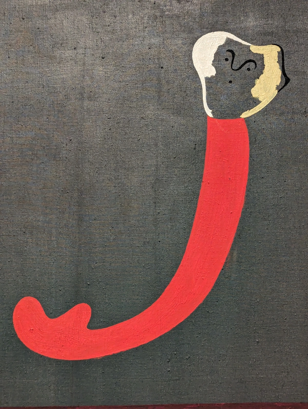
In essence, value is the master of light and shadow, shaping mood, depth, and contrast within any composition.
The Symphony of Elements: Weaving It All Together
So, we've broken down the individual instruments in our artistic orchestra. But here's where the real magic happens: when these elements don't just exist side-by-side, but interact, harmonize, and even clash, creating a cohesive, impactful whole. An artist doesn't simply use "a line" or "a color." They thoughtfully employ a specific type of line, in a particular color, at a certain value, within a defined space, to create a shape that hints at form with an implied texture. See how they all pile on, each influencing the next? It’s a complex, beautiful dance, a meticulously choreographed ballet of visual information.
What's also fascinating is the power of absence. Sometimes, what an artist chooses not to include – a stark, empty space, a monochrome palette, or the deliberate lack of implied texture – can be just as impactful as the elements they do deploy. This strategic omission can create tension, draw focus, or evoke a sense of quietude that louder compositions cannot.
Let me give you a more concrete, hypothetical example from an abstract piece. Imagine a dynamic painting where a bold, jagged black line (high value contrast, minimal color) slices diagonally across the canvas, immediately drawing your eye. This line defines an aggressive, triangular shape in the foreground, which, through clever shading and subtle highlights, creates the illusion of a sharp, protruding form. This dominant shape pushes against a softer, hazy background, establishing a deep sense of space. Within that background, swathes of muted, analogous blues and greens (low intensity color) create a serene counterpoint, while small, deliberate brushstrokes suggest a rough, almost fabric-like texture in a specific area. Every single choice, from the quality of the line to the nuance of the color, works in concert to evoke a feeling, tell a story, or simply compel your eye. This intricate interplay is precisely what we refer to as composition – the overall arrangement and organization of all these visual elements.
I remember once, quite early in my journey, I painted an abstract piece where I was so intensely focused on bold, exciting colors that I completely neglected the element of value. The result? A flat, muddy mess despite the vibrant hues! It was a profound lesson in how truly interconnected these elements are. You simply can't pick one and ignore the others; they are always collaborating to build the artist's visual message.
This is why understanding these elements is so incredibly empowering, especially if you're drawn to abstract art like I am. Instead of asking "What is it supposed to be?", you can confidently start asking "How is the artist using line here?", "What do these shapes communicate about balance?", or "How does the color palette make me feel?". It shifts your focus from a frustrating quest for identification to a rewarding journey of interpretation and experience. This understanding not only deepens your appreciation but also empowers you when you're looking to acquire art, allowing you to articulate why a piece resonates with you and truly see the artist's dialogue. If you’re curious to see how I weave these elements together in my own work, feel free to visit my museum in 's-Hertogenbosch.
Beyond fine art, these fundamental elements are the backbone of all visual communication, from graphic design to photography to even film. Understanding them truly gives you a new, more insightful lens through which to see the entire world around you. If you want to explore further concepts in abstract art, you might enjoy my guide on decoding abstract art: a guide to finding meaning in non-representational works.
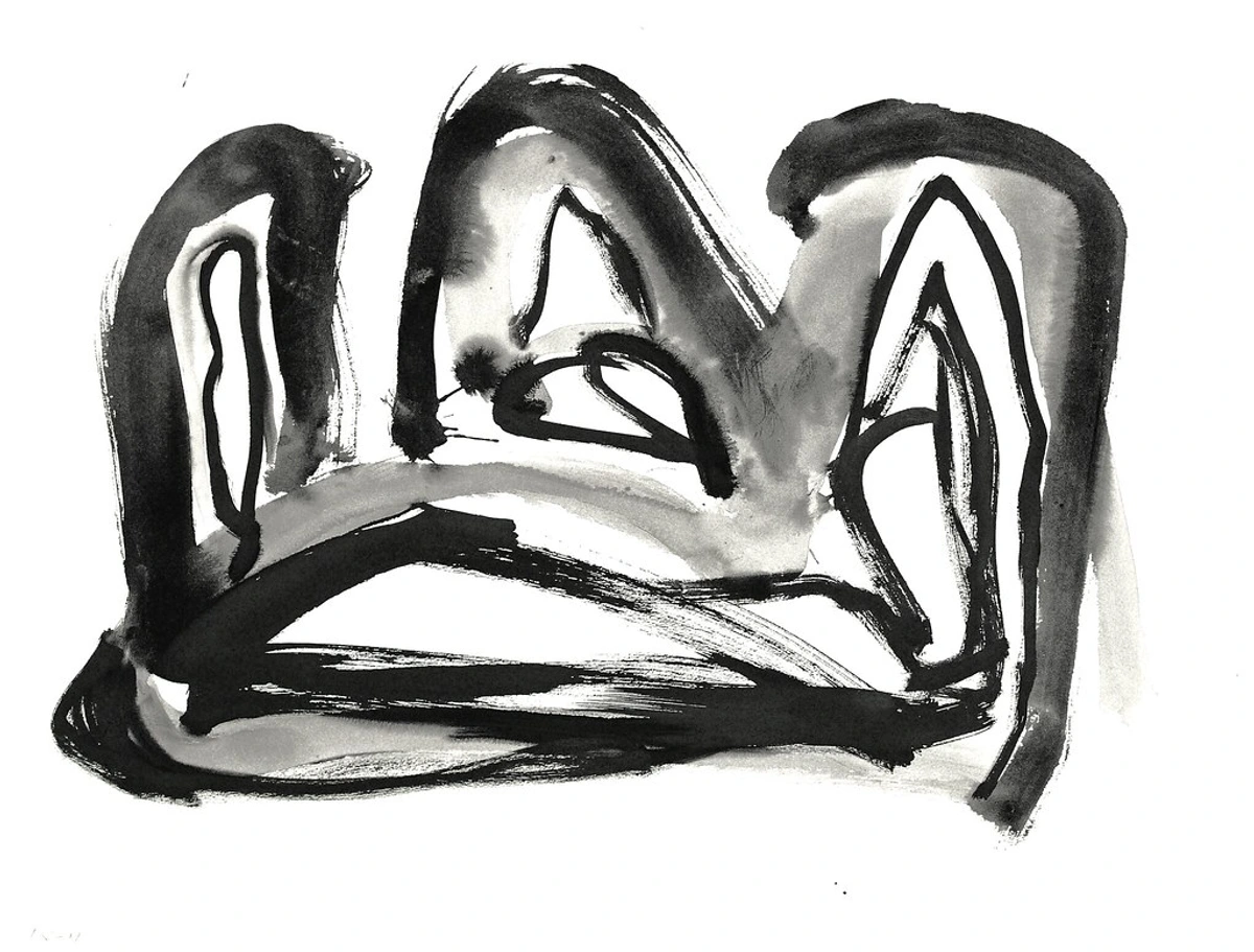

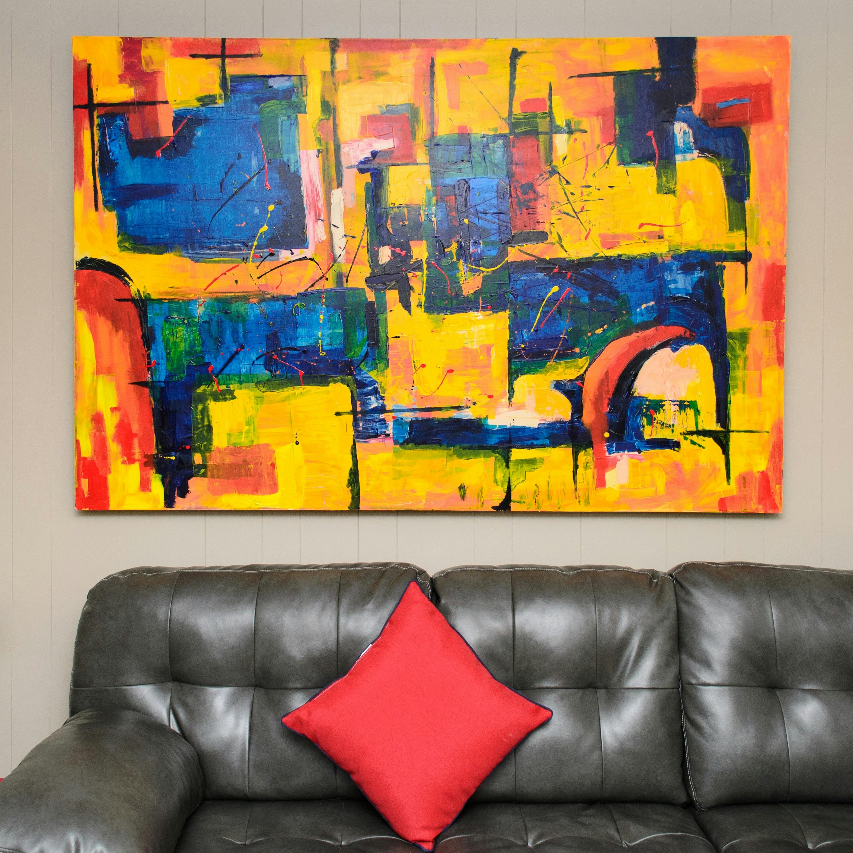



The Principles of Design: Orchestrating the Elements
Now, if the Elements of Art are our individual ingredients – the raw materials like flour, sugar, or spices – then the Principles of Design are the recipe itself. They tell us how to use those ingredients, how to combine and arrange them to create something truly harmonious, compelling, and effective. Understanding them is like understanding the grammar that allows the alphabet (elements) to form eloquent, meaningful sentences. And here’s a thought: these principles aren’t always rigid rules, and some theorists might emphasize certain aspects over others, but they generally serve as an artist's intuitive toolkit for making things work visually.
Here are some of the key principles I think about when composing my own abstract pieces:
Balance: Finding Visual Equilibrium
Balance refers to the distribution of visual weight in an artwork. It's about how elements are arranged to create a sense of stability, or even intentional instability. It can be symmetrical (mirroring on both sides, like a perfect butterfly), asymmetrical (uneven but still visually balanced, like a large shape on one side countered by several smaller shapes on the other), or radial (elements arranged around a central point). In an abstract work, a large, dark shape on one side might be subtly balanced by a cluster of smaller, brighter, more active shapes on the other, preventing the piece from feeling lopsided.
Contrast: The Spice of Visual Life
Contrast is simply the difference between elements, such as light and dark, rough and smooth, large and small, or even geometric and organic. It’s what adds visual interest, creates hierarchy, and can evoke dramatic tension or quiet subtlety. Think of a vibrant orange line sharply defined against a muted blue background in an abstract painting – that's high color and value contrast making both elements pop.
Unity (or Harmony): Making It All Belong
Unity is the sense that all elements in a design belong together, creating a coherent, harmonious whole. It's about how well different parts work together, even if they're varied. Without unity, a piece can feel disjointed or chaotic. An abstract piece might use a repeating motif or a consistent color palette across varied shapes to achieve a sense of unity, making the disparate parts feel connected.
Rhythm: The Visual Beat
Rhythm is created by the repetition of elements, often with some variation, to create a sense of organized movement. Think of the regular beat in music, or the flowing cadence of a recurring motif. It guides your eye in a predictable, yet engaging, sequence. In abstract art, a series of vertically stacked rectangles, each slightly different in size but sharing a common color, can create a palpable rhythm that leads the eye upwards.
Emphasis: The Focal Point
Emphasis is about drawing attention to a particular area or object in an artwork, creating a focal point. It tells the viewer where to look first, creating a visual hierarchy. An artist might use a burst of highly saturated color, an exceptionally intricate line drawing, or a stark difference in value in one specific area of an abstract piece to create emphasis.
Movement: Guiding the Eye
Movement refers to the way an artist leads the viewer's eye through the artwork, often towards areas of emphasis or along a narrative path. Lines, shapes, colors, and values can all contribute to directing this visual journey, creating a dynamic flow. A long, sweeping diagonal line or a sequence of overlapping shapes in an abstract composition can effectively create a sense of movement, guiding your gaze across the canvas.
Pattern: Order and Repetition
Pattern is the repetition of a design, motif, or element. Patterns add visual texture and rhythm, and can create a sense of order, structure, or decorative flair. They can be regular and predictable or more organic and fluid. Many abstract artists use repeating geometric patterns or rhythmic sequences of brushstrokes to create a sense of structure and visual interest.
Variety: Keeping Things Interesting
Variety is the use of different elements to create interest and avoid monotony. While unity ties things together, variety keeps them from being boring, adding visual spice and preventing predictability. An abstract work might feature a variety of line weights, a mix of geometric and organic shapes, or a diverse palette of warm and cool colors to keep the viewer engaged.
These principles are not rigid rules, but rather intuitive guidelines that artists use to compose their works effectively. Together with the elements, they form the complete toolkit for visual creation. For a full overview, you might find my guide on understanding elements of art comprehensive guide a good next step.
Frequently Asked Questions About the Elements of Art
Q: Why are the Elements of Art important?
A: That's a fundamental question, isn't it? I think of them as the foundational vocabulary of visual communication. They are the essential tools in any artist's creative arsenal, enabling them to communicate visually with depth, emotion, and structure. Understanding them unlocks the artist's message and allows you to truly "read" a work. Beyond the artist's intent, these elements also play a huge role in how we, as viewers, psychologically and culturally interpret art – think how a color like red might evoke passion in one culture but danger in another.
Q: Are there always exactly seven elements, and do they have a history?
A: Mostly, yes, the core seven (line, shape, form, space, color, texture, value) are universally recognized building blocks. However, art theories can sometimes combine or slightly rephrase them. For instance, a 'point' is often considered a precursor to line – the simplest mark imaginable. The concept of breaking down art into fundamental components has roots in classical aesthetics, with early thinkers like Aristotle considering concepts of form and substance. This framework evolved significantly through the Renaissance, as artists honed techniques of perspective, light, and composition. As art itself transformed through movements, these elements adapted, and contemporary theories sometimes add elements like 'time and motion,' especially in performance, digital, or kinetic art. The key is to understand that these are flexible frameworks, not rigid dogma. Don't stress too much about slight variations in terminology; the core idea of these visual building blocks remains consistent.
Q: How can I practice recognizing these elements in art?
A: The best way, in my opinion, is simply to look – but look with intense intention! Try what I call a "visual scavenger hunt." Go to a gallery, open an art book, or even just observe everyday objects around you. Pick one element – say, "line" – and try to find all the different types of lines you can see in a painting for five minutes. Then switch to "color," focusing only on the hues, their intensity, and their values. Do this for each element individually. It's like training your eye muscles, and you'll be amazed at what you start to notice. It sharpens your perception dramatically! You could even visit my artistic timeline to see how my own use and understanding of these elements have evolved over time.
Q: Do the Elements of Art apply to different art forms beyond painting?
A: Absolutely! While we often discuss them in the context of painting, these elements are fundamental to all visual art forms. In sculpture, for example, form and texture are literal and tangible, and space is actively occupied and shaped. In photography, value and composition (which uses elements like line and shape) are paramount. Even in digital art or film, elements like color, line, and movement are manipulated to create effects. Understanding them gives you a universal language for analyzing and appreciating any visual creation, no matter the medium.
Final Thoughts: Your Artistic Compass
Look, at the end of the day, I'm just a guy who loves putting colors and shapes together, and who, somewhere along the line, found immense joy in understanding how these things truly work. These elements and principles aren't rigid rules meant to trap you in a box, but rather a powerful compass to guide you. They're there to help you navigate the vast, beautiful, and sometimes wonderfully bewildering world of art, both as a viewer and perhaps even as a creator.
So, the next time you find yourself standing before a painting – especially an abstract one – try not to feel lost or intimidated. Instead, take a deep breath, pick out a prominent line, observe an interesting shape, notice a striking color, and simply see where that initial observation takes your eye and your mind. You might just surprise yourself with what you discover, and the connections you make. Who knows, maybe it will even inspire you to start your own artistic journey – perhaps even by visiting my artistic timeline to see how my own understanding of these elements evolved and shaped my work! Remember that feeling of being intimidated by art? Trust me, it slowly, wonderfully, fades away as you start to truly speak its language. What visual conversation will you start today?