The Secret History of Thioindigo Pigment in Art
A deep dive into the rich, complex history of Thioindigo pigment, from its industrial roots to its bold presence in modern art. Explore the techniques, the artists, and the chemistry that makes this color so compelling.
Thioindigo: The Fugitive Pigment That Defined Modern Art and Why It Still Matters
Have you ever mixed a color and felt like you were conducting a secret alchemical experiment, one where the results could either stain your canvas or your reputation? That’s the feeling I get every time I work with thioindigo pigments. This isn't your everyday earth tone or a simple synthetic. It's the color equivalent of a beautiful, complicated ghost. Its story begins not with an artist's brush, but in the smokestacks of early 20th-century German factories, a tale of industrial dye that made a daring escape onto the palettes of Rothko, Newman, and other giants of modernism. It's a color that feels both ancient and impossibly modern at the same time, a hue that whispers of alchemy and shouts of innovation.
If you're a painter or just a color enthusiast, you've probably marveled at those deep, resonant red-violets and rust-oranges in modern art, wondering, "How did they get that?" More often than not, the answer involves a class of synthetic pigments that changed everything. Today, I want to pull back the curtain on one of the most fascinating: thioindigo.
The Chemistry of a Ghost: Deconstructing Thioindigo's Split Personality
Let's get the technical bit out of the way first, because it's actually pretty cool. Thioindigo is a synthetic organic pigment, and its name is a clear roadmap to its identity. The prefix 'thio-' refers to its sulfur (Greek: theion) atoms—crucial players in creating its deep resonance. The 'indigo' points to its chemical kinship with the ancient natural dye, sharing a similar indigoid molecular skeleton. But where natural indigo is coaxed patiently from plants, thioindigo is a true child of the laboratory, born from the marriage of anthranilic acid and sulfur under precise, high-temperature conditions. Its very creation was an act of modern magic, a deliberate forging of color rather than a gentle extraction.

Its most striking characteristic is its polymorphism. No, that’s not a spell from a fantasy novel, though its effects can feel just as mysterious. It means the pigment can crystallize in different three-dimensional arrangements (its polymorphic forms, like alpha or beta), and each form scatters light differently, resulting in a completely different color. The most common version is a deep, bluish-red, often described as a maroon or a violet-red. But under certain conditions—like how finely you grind it, or even the specific chemical partners used during its synthesis—it can shift to a more orange or rust tone. Imagine having a tube of paint that could change its hue based on how you looked at it or mixed it. It’s a constant surprise, and that inherent unpredictability is something I find deeply appealing.

The chemistry is what gives it those remarkable properties. Unlike inorganic pigments like cadmium or cobalt, which are essentially tiny, durable mineral particles based on metals, thioindigo is carbon-based. This organic nature results in much smaller particle sizes, which gives it a unique translucency and a special kind of saturation that’s hard to replicate. Think of it like the difference between the deep, internal glow of a ruby and the flat, opaque surface of a painted brick. It doesn't just reflect light; it absorbs it and re-emits a deep, resonant frequency of color.
From Vat Dye to Avant-Garde: The Accidental Journey of a Pigment
The story of thioindigo is a perfect example of how industrial innovation can spark an artistic revolution. It wasn't created for artists; it was created for commerce. The key achievement was engineering insoluble, stable pigment versions of these dyes, often referred to as 'vat dyes'. These were developed to color everything from plastics and lacquers to printing inks and paints.
- 1905-1915: The first thioindigo dyes are synthesized in Germany, with the initial patent for the core chemical structure often credited to researchers at the Badische Anilin- & Soda-Fabrik (BASF) around 1905-1906. Their primary use was in textile dyeing, prized for their vividness and relative lightfastness compared to some earlier synthetic dyes. At this stage, it was just a chemical, a tool for industry, a number in a ledger.
- 1920s - 1930s: As the chemical industry refined these dyes, the idea of creating insoluble, stable pigment versions emerged. These 'vat dyes' were engineered to be durable colorants for synthetic resins, plastics, printing inks, and automotive lacquers. Artists, however, were still largely working with the traditional palette of earths, cobalts, and cadmiums, unaware of this new world of color waiting for them.
- Post-World War II (1945-1960s): This is where the magic happened. The economic boom and the explosion of the chemical industry made a new world of synthetic pigments available. Paint manufacturers, like the legendary Leonard Bocour of Bocour Artist Colors, saw an opportunity. These small, innovative companies began to experiment, taking these stable, intense industrial dyes and hand-mulling them into artists' oils and acrylics, creating a bridge between the factory and the studio.
Thioindigo, with its unique depth and hue, was a prime candidate. It offered a shade that was difficult to achieve with existing earth pigments or the more well-known alizarin crimson. This was more than just a new tube of paint; it was a new emotional vocabulary. It filled a gap on the palette, providing a chromatic stepping-stone between red and violet that had real power and presence. It was new, it was modern, and it perfectly matched the post-war spirit of innovation where artists were no longer just depicting the world, but trying to materialize feeling itself.
The Alchemical Transformation: From Dye to Pigment
The distinction between a dye and a pigment isn't just academic; it determines whether your color will bleed, fade, or last for centuries. It's the difference between a stain and a stone. Think of it this way:
- A dye is like making sweet tea. The sugar (the dye) completely dissolves in the water (the substrate), becoming part of it on a molecular level. It's a complete union.
- A pigment, on the other hand, is like sand in water. The tiny colored particles are suspended in the liquid (the binder, like oil or acrylic polymer), but they never truly dissolve. They float, they scatter light, and that's how we perceive their color.
Thioindigo the dye was born first, meant to permanently stain textile fibers. But for painters, we needed thioindigo the pigment—a finely ground, insoluble powder that could be mixed into paint media. This transformation from a water-soluble dye to a stable, insoluble pigment was the crucial alchemical step that made it a viable artists' material. It meant the color could be suspended in oil or acrylic and wouldn't just fade or bleed into adjacent colors at the first sign of moisture.
This fundamental difference explains why some paints feel more transparent than others. A pigment like thioindigo, with its small particle size and organic nature, creates a paint that's naturally more lyrical, transparent, and less opaque than something like cadmium red, which is basically tiny, dense rocks of color.
The Art of Taming a Ghost: Key Techniques and Considerations
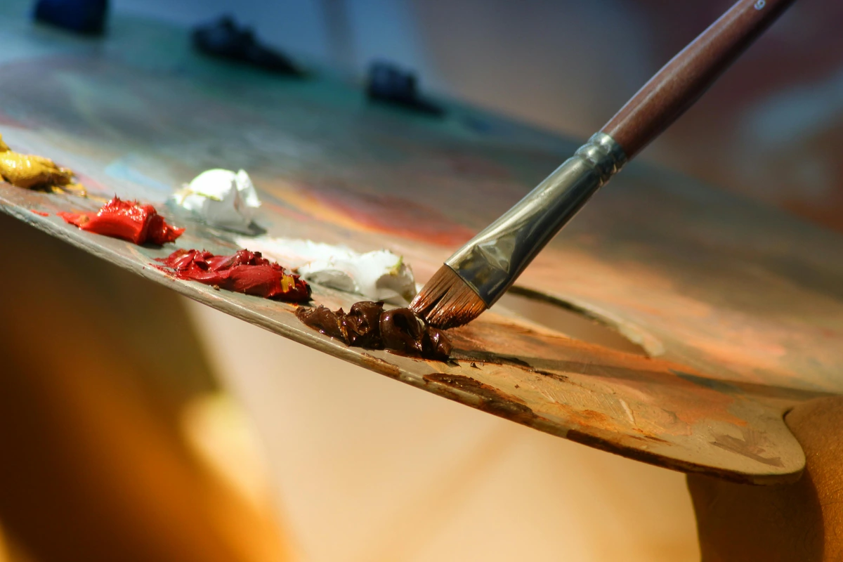
Working with thioindigo and its descendants is a conversation, not a command. You can't just slap it on and expect it to behave. It requires a certain respect, or at least a wary understanding of its peculiarities. Here are a few things I've learned, often the hard way, through streaks, curses, and the occasional happy accident.
The Power of Layers: Transparency and Glazing
This is its superpower. Thioindigo and its modern quinacridone cousins are incredibly transparent, making them a dream for glazing. I love building up depth in a painting by layering thin glaze after thin glaze. A single layer might look unassuming, but three or four layers of thioindigo over a lighter underpainting creates a color that is luminous and seems to glow from within—a depth you feel in your chest, not just see with your eyes. For portraits or creating a sense of deep, atmospheric space in abstract work, it's an invaluable tool for creating mystery and resonance. You just have to be patient. And have good ventilation—those glazing mediums can be potent.

But let's be honest, that patience can be maddening. The first time I tried it, I laid down what I thought was a perfect glaze, only to watch it dry into a streaky, uneven mess. I nearly threw the tube across the room. The secret, I learned later, is that thioindigo has a mind of its own; its low surface tension makes it want to pool and gather, like rainwater on a waxed car hood. You can either fight it by over-brushing (a losing battle) or embrace it. Now, I use that tendency, letting it flow into the recesses of my brushstrokes to create natural shadows and veils of color that look like they grew there organically.
Mixing and Compatibility
Because it's transparent, its mixing behavior is different from opaque pigments. It doesn't "cover" other colors so much as it "stains" them. Imagine dropping ink into water versus dropping sand into it—thioindigo is the ink. Mixing it with a white, like titanium white, will produce a range of surprisingly delicate lilacs and mauves, not a solid pastel. But the real fun begins when you mix it with other transparent colors. A touch of quinacridone gold can push it towards deep, earthy browns that seem to have a warm, red-violet glow from within, while a mix with phthalo blue can create some of the blackest, most velvety darks you've ever seen—a black that's full of secret color, not a void.
It’s this chameleon-like quality in mixtures that makes it so valuable. It’s not a color you use on its own; it’s a color you use to transform other colors.
The Achilles' Heel: A Frank Discussion on Lightfastness
Time for a reality check, the part of the story where romance meets science. Not all thioindigo pigments are created equal, and this is where its reputation as a "fugitive" color comes from. Some early versions, particularly the original dye forms or poorly-made pigments, had questionable lightfastness. This means they could fade over time when exposed to strong light, like a beautiful fabric left in a sunny window. It's a classic trade-off: the very same double-bond-heavy chemical structure (the azo and carbonyl groups) that gives it that incredible saturation can also act as a target for degradation from UV light, causing the color molecules to break down and lose their vibrancy.
It's a heartbreakingly beautiful but inherently fragile relationship with light.
This is where artist-grade paints become non-negotiable. Reputable manufacturers who produce thioindigo for artists invest in refining the pigment and testing it extensively for durability. If you're going to invest your time and creative energy into a painting, you need to know the materials will last. I usually check the manufacturer's lightfastness rating (I look for ASTM I or II) before I commit.
The difference between a pigment rated ASTM I (Excellent) and ASTM III (Fair) isn't just a letter; it's a lifetime. It's the difference between a shout and a whisper. For a painting you hope will outlive you, anything less than the best is just borrowing color from the future, and eventually, that debt comes due as a faded, washed-out ghost of what you intended.
Underpainting Secrets: The Best Friend You Never Knew You Had
This is a technique I wish someone had taught me years ago. Thioindigo, in all its transparent glory, is an incredible base for underpaintings—a technique I once stumbled upon in frustration and now swear by. Because it's so transparent and relatively neutral when used thinly, it creates a luminous shadow tone that doesn't muddy the more transparent colors you layer on top. Unlike a black or even a burnt umber underpainting which can deaden a painting like a wet blanket on a fire, a thioindigo wash leaves everything feeling alive and humming. It provides structure without suffocation.
Imagine painting a landscape. You can lay down a wash of thioindigo for the dark areas of trees and shadows. Then, when you layer your greens and earth tones on top, the blue-red of the underpainting creates a natural, deep shadow that vibrates with color, rather than a flat, dead zone. It's like building a house on a foundation that's already half-alive.
The Binder's Dance: Oil, Acrylic, and Watercolor
How you mix thioindigo changes everything. In my experience, it truly sings in oils. The slow drying time allows the pigment to settle and create those deep, gem-like layers of glaze I'm always chasing. It feels like it was made for oil paint, as if the patience required by the medium is the key to unlocking its secrets.
In acrylics, its personality shifts entirely. It's still useful, but the fast drying time can make glazing a frantic race against the clock—a mad dash to smooth out brushstrokes before they're frozen in place forever. I find I get the best results with acrylics by mixing it into a dedicated glazing medium first, which buys you a precious few extra seconds of working time. Or, I lean into its nature and use it for pure staining effects, letting its intense color create beautiful, immediate washes where you want permanent, transparent color that won't lift.
Advanced Glazing Formulas and Ratios
I've spent countless hours experimenting with glaze formulas, and I've found some ratios that consistently work for achieving those deep, luminous shadows:
- For oils: 1 part pigment : 3 parts linseed oil : 1 part odorless mineral spirits. This gives you a workable consistency that doesn't get too oily or runny.
- For acrylics: 1 part pigment : 4 parts glazing medium (I prefer slow-drying mediums for this) : 1 drop flow improver. This combination extends your working time and helps prevent brush marks.
- For watercolor: 1 part concentrated pigment : 5 parts water with a tiny drop of gum arabic to improve flow and granulation control.
The key insight I've gained through all this experimentation is that thioindigo and its modern descendants reward careful observation. Don't just mix blindly—watch how the pigment behaves in different mediums. Notice how it settles, how it flows, how it dries. Each medium reveals a different aspect of its character.
And then there's watercolor. This is where thioindigo and its modern descendants can be a bit of a diva. They have a reputation for being difficult to rewet and can sometimes 'bloom' or form uneven, grainy washes as they dry—a phenomenon known as back-run or 'cauliflowering'. But if you can tame it, its staining power can be put to great use. For intense, non-lifting shadows in a portrait or the deep crevices in a botanical illustration, it's unmatched. It's a challenge, but sometimes the most difficult paints are the ones that teach you the most about control, humility, and the nature of the medium itself.
Masters of the Hue: Notable Artists and Thioindigo's Mark
While thioindigo isn't a household name like ultramarine blue, its fingerprints are all over the latter half of the 20th century. It became a key player for artists who were pushing the boundaries of color, abstraction, and expression.

- Mark Rothko: This is the big one. While Rothko rarely discussed his specific materials, analysis of his iconic color-field paintings has confirmed the presence of thioindigo and related compounds. It's easy to see why. The pigment's ability to create deep, resonant, and emotionally charged fields of color was perfectly suited to his goals. When you stand in front of one of his murals, feeling that dark, pulsating crimson or maroon wash over you, you are likely seeing the unique character of thioindigo at work.
- Barnett Newman: Similar to Rothko, Newman's "zip" paintings rely on enormous fields of unmodulated color. To achieve those immense, flat, yet vibrating areas of deep red and maroon, a pigment with high tinting strength and transparency was essential. A more granular, opaque pigment might visually "break up" the massive plane of color. Thioindigo provided the solid, profound ground that his brilliant zips of color could illuminate.
- Alberto Burri: The Italian artist Burri, famous for his textured paintings on burlap sacks, used thioindigo to evoke a sense of profound materiality and, at times, wound-like depth. The deep reds in his work don't feel decorative; they feel raw and visceral. The color’s ability to be both rich and slightly industrial, given its origins, perfectly matched the aesthetic of his combustioni (combustion) and cretti (crack) series.
Thioindigo in Contemporary Color Craft
Today, the spirit—or perhaps the ghost—of thioindigo lives on, albeit in a more stable form. If a paint tube is labeled "Permanent Alizarin Crimson" or a particularly deep, transparent "Quinacridone Red-Violet," you're seeing its direct descendants or intended replacements. Modern chemistry, learning from the flaws of its ancestors, has developed pigments that mimic or improve upon thioindigo's best qualities—that intense saturation and transparency—while often offering superior lightfastness. We traded a bit of the alchemical romance for permanence.
The Heirs to the Throne: A Guide to Modern Replacements
So, what exactly are these modern pigments that have taken up the mantle? The evolution of thioindigo is a story of chemistry constantly playing catch-up, trying to create the perfect red-violet. It's less of a family tree and more of a royal succession, with each new contender being more stable and reliable than the last.
Pigment Codes and Performance Comparison
If you're serious about your materials, understanding the Color Index system becomes crucial. These standardized codes tell you exactly what pigment you're dealing with, regardless of the manufacturer's fancy marketing name.
Pigment Name | Color Index | Lightfastness (ASTM) | Transparency | Tinting Strength | Common Uses |
|---|---|---|---|---|---|
| Thioindigo | Vat Red 41 | II-III (Variable) | Excellent | Very High | Specialized uses, historical interest |
| Quinacridone Violet | PV19 | I (Excellent) | Excellent | High | Glazing, mixing deep violets, permanent alizarin replacement |
| Quinacridone Red | PR209 | I (Excellent) | Excellent | High | Clean reds, mixing violets with blues |
| Perylene Maroon | PR179 | I (Excellent) | Very Good | Very High | Deep shadows, intense dark mixes |
| Anthraquinone Red | PR177 | I (Excellent) | Excellent | High | Saturated violets, modern crimson replacement |
The thing that strikes me about this table isn't just the technical data—it's the story it tells about progress. We went from a beautiful but temperamental pigment (Thioindigo) to a whole family of engineered colors that maintain the aesthetic magic while eliminating the practical problems.
Here are the key players in today's paint market:
Quinacridone (PV19): Consider this the true heir apparent. Discovered at DuPont in the 1950s, Quinacridone Red and Quinacridone Violet (both derived from the same parent chemical, just processed differently) are transparent, exceptionally lightfast, and hit many of the same color notes as thioindigo. It comes in several shades, each with its own personality:
- Quinacridone Red (PV19): A beautiful mid-red with a slight blue undertone, less violet than its sibling.
- Quinacridone Violet (PV19): A deep, resonant red-violet, the closest in spirit and mood to the classic thioindigo experience.
- Quinacridone Magenta (PR122): A cooler, pinker shade that can be mixed to extend the range into the fuchsias. What makes it the king? Its near-perfect lightfastness (ASTM I), making it a reliable choice for artists who want their work to last for generations, not just seasons.
Perylene (PR149, PR179): These are the deeper, more intense cousins, the baritones of this color family. Perylene Maroon (PR179) and Perylene Crimson (PR149) are incredibly powerful, transparent pigments that offer remarkable depth and staining power. They are prized for their ability to create rich, velvety dark tones without the chalkiness or lifelessness that can occur when mixing with black. Their color is often more neutral—less bluish and slightly 'earthier' than thioindigo—but their performance and permanence (ASTM I) are undeniable.
Anthraquinone Reds and Violets: A newer family of pigments, often designated with numbers like PR177 or PV5, that are chemically related to the original quinacridones. They can offer a wider range of cleaner, more vibrant violet and crimson shades. Think of them as the specialist branches of the family—they provide specific, often more saturated options for artists seeking unique color possibilities within the same high-performance category.
This evolution is a clear example of the fascinating, sometimes clumsy back-and-forth between art and science. Artists, tired of watching their ethereal colors disappear like fog in the sun, needed a more permanent, reliable version of a beautiful but flawed pigment. Science, in its pragmatic way, listened and delivered—trading a bit of the ghost for immortality.
The Modern Palette: Why We Love These Colors
For contemporary artists, including myself, these deep red-violets are essential for creating mood, depth, and contrast. They are the secret ingredient in a dark passage that still holds color, the key to mixing a black that isn't just a hole in the canvas. On my own palette, a modern equivalent like Quinacridone Burgundy (a mixture, often based on PV19) performs a similar role, allowing me to build up those glazed, atmospheric effects that are so central to my work.
The way these modern pigments absorb and reflect light creates a sense of depth and luminosity that you simply can't get with more opaque colors, and thioindigo was the father of that sensation. It taught us that a shadow could be a color, not just an absence of light.
Looking to explore how deep, resonant colors like these can transform your own space? You can see a collection of my own work where these glazing techniques are central over at my gallery on /buy, a process I find endlessly fascinating.
The Lasting Allure of an Industrial Pigment
What draws me to thioindigo is its beautiful contradiction. It’s a color rooted in science and industry, yet it has been used to express some of the most profound human emotions in modern art. It's a reminder that our tools don't define our expression; they enable it. The journey of thioindigo—from a factory dye to a crucial component in the creation of a Rothko—is a testament to the endless, surprising possibilities of color, and a lesson in the unexpected beauty that can arise from the marriage of science and art.
Afterword: Resources for the Curious
If this exploration has sparked your interest as much as mine, here are some next steps for deeper investigation:
Recommended Reading:
- The Secret Language of Color by Joann Eckstut and Arielle Eckstut - A beautiful exploration of color science and history
- Bright Earth by Philip Ball - The definitive history of artist pigments from cave paintings to modern synthetics
- Color by Victoria Finlay - A journalist's fascinating global journey in search of pigments and dyes
Online Resources:
- The Smithsonian Museum Conservation Institute publishes detailed pigment analysis reports
- Kremer Pigmente's website offers extensive technical data sheets on historical and modern pigments
- Handprint.com by Bruce MacEvoy - Though dated now, still contains invaluable technical information about watercolor pigments
Where to Buy Quality Pigments:
- Kremer Pigmente (Germany/US) - For historical pigments and high-quality modern materials
- Natural Pigments - Excellent selection and technical information
- Daniel Smith, Winsor & Newton, Gamblin - For professional-grade paints
It teaches us to look deeper, to understand the physical properties of our materials, and to see the hidden stories in every hue. The next time you see a powerful, deep red-violet in a modern painting, take a closer look. It might just be the ghost of a forgotten pigment, still vibrating with power and history, a beautiful secret hiding in plain sight.
Perhaps you might even be inspired to experiment with these remarkable materials yourself. After all, every painting is ultimately a conversation between artist, material, and the physical universe—and thioindigo offers one of the most fascinating voices in that ongoing dialogue.
Philosophical Dimensions: The Metaphysics of Matter and Color
Beyond the technical and historical aspects, thioindigo's story touches on something deeper about art and materiality. I've often wondered whether there's something metaphysical happening when we work with these pigments—whether the industrial origins and chemical complexity somehow embed themselves in the finished work.
It makes me think about how contemporary artists like myself are navigating this space between the handmade and the industrially produced, between the natural and the synthetic. We live in a world where most of our visual environment is created through industrial processes. Maybe using pigments with industrial origins isn't a compromise or a betrayal of some "pure" artistic tradition, but rather an honest reflection of the world we actually inhabit.
There's also something profound about the way these pigments make visible the interaction between light and matter. We're literally watching electrons in pigment molecules absorb photons and re-emit them as specific wavelengths. The color we see is physics happening in real time, translated by our brains into emotional experience. Thioindigo isn't just "red-violet"—it's a specific vibrational frequency of light that we've learned to associate with depth, complexity, and introspection.
This connects to something I've noticed in my own work: the more I understand the material science behind my pigments, the more I feel like I'm not just applying color to a surface, but engaging in a kind of alchemical dialogue with matter itself. Each painting becomes an experiment in material transformation, not just image-making.
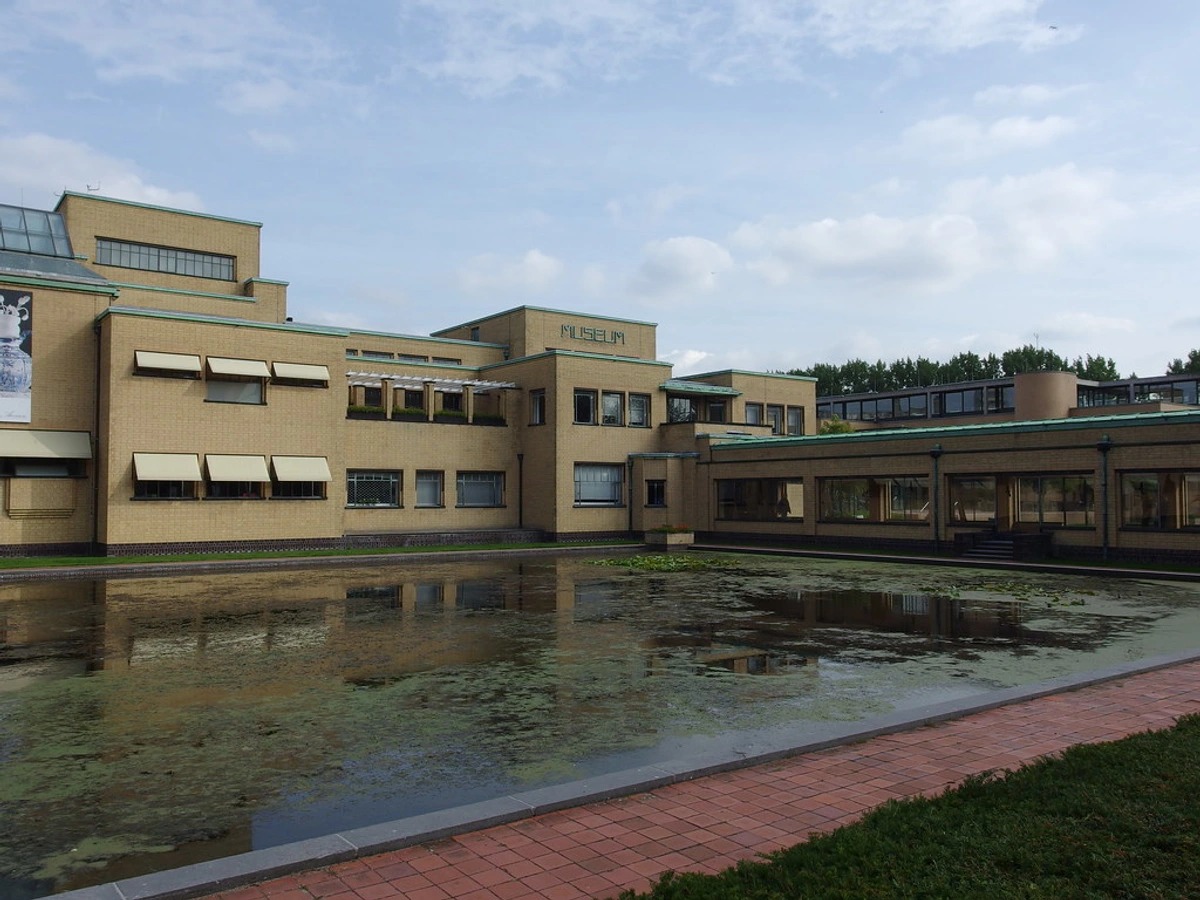
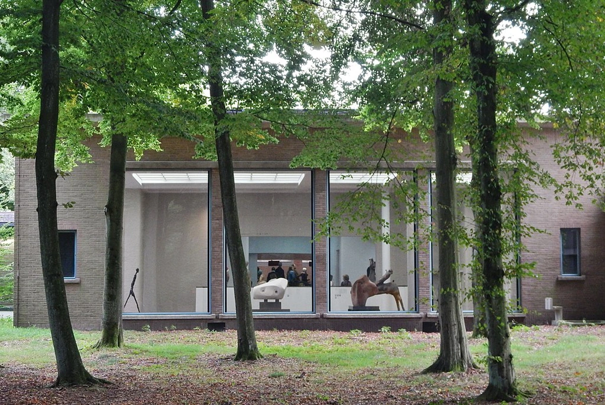
Looking to explore how deep, resonant colors like these can transform your own space? You can see a collection of my own work where these glazing techniques are central over at my gallery on /buy, a process I find endlessly fascinating. Or, if you're curious about the sophisticated lighting and presentation challenges that museum-quality paintings require, I've shared some insights from my experience visiting the Den Bosch Museum) in the Netherlands.
Frequently Asked Questions (FAQ)
What color is thioindigo?
Thioindigo is most famously a deep, bluish-red, often described as a maroon, burgundy, or violet-red. It occupies a very specific emotional space on the palette—one of depth and resonance, not primary cheerfulness. However, due to its polymorphic nature (the ability to crystallize in different forms), it can also produce shades that are more rust-colored or orange. It’s not a single, fixed hue. It's a mood, more than a color—the color of a deep bruise, a royal robe, a blood stain on linen, or a wine stain on a white tablecloth.
Is thioindigo lightfast?
This is the most critical question. The lightfastness varies dramatically. Early industrial versions often had poor to fair lightfastness and were prone to fading. Modern, artist-grade versions are significantly more stable, often reaching ASTM I (Excellent) or II (Very Good) ratings, but it remains a pigment that requires attention. The organic nature of thioindigo means it is inherently more susceptible to damage from ultraviolet light than its mineral-based cousins like the cadmiums. For important work intended to last, it's wise to use a modern, high-rated alternative like a PV19 quinacridone, which has all the beauty with none of the fragility. Think of it as the difference between a beautiful old photograph that's been left in the sun versus one that's been kept in an archival album.
Is thioindigo the same as alizarin?
No, they are chemically distinct, though they are often confused because they perform similar jobs on the palette. Alizarin is derived from anthraquinone and was originally extracted from the madder root plant before being synthesized. Thioindigo is a sulfur-based indigoid. However, they occupy a similar visual space on the color wheel, both providing rich, transparent reds, and are often used for similar effects like glazing. A modern tube labeled "Permanent Alizarin Crimson" is almost always formulated with highly lightfast quinacridone (PV19) or thioindigo-like pigments to replace the notoriously fugitive original alizarin.
Who invented thioindigo?
Thioindigo was not invented by a single person for artistic purposes. It emerged as part of the broad wave of innovation in the German chemical industry in the early 20th century, primarily developed by companies like BASF and Hoechst for use in textile dyeing. Its adoption by artists was a later, almost accidental evolution. I see its history less as a single invention and more as a discovery that crossed over from the industrial world. It's a product of a time, a place, and an industrial ambition that accidentally gave artists a new voice and a new way to materialize feeling.

Why don't many modern paint brands sell "thioindigo" by name?
Over time, chemists have developed new synthetic organic pigments that offer similar or better performance with higher reliability, superior lightfastness, and more consistent results. Pigments like Quinacridone Violet (PV19) and various Perylenes have become the industry standard. So, while "pure" thioindigo is now a rare find on the art store shelf, its coloristic spirit and emotional impact are thriving in these superior modern pigments. It's a classic case of progress; the children have outshone the parent, offering a similar soul but a more durable, longer-lasting body.