Crafting Your Visual Story: How to Mix & Match Art Styles for a Cohesive Gallery Wall
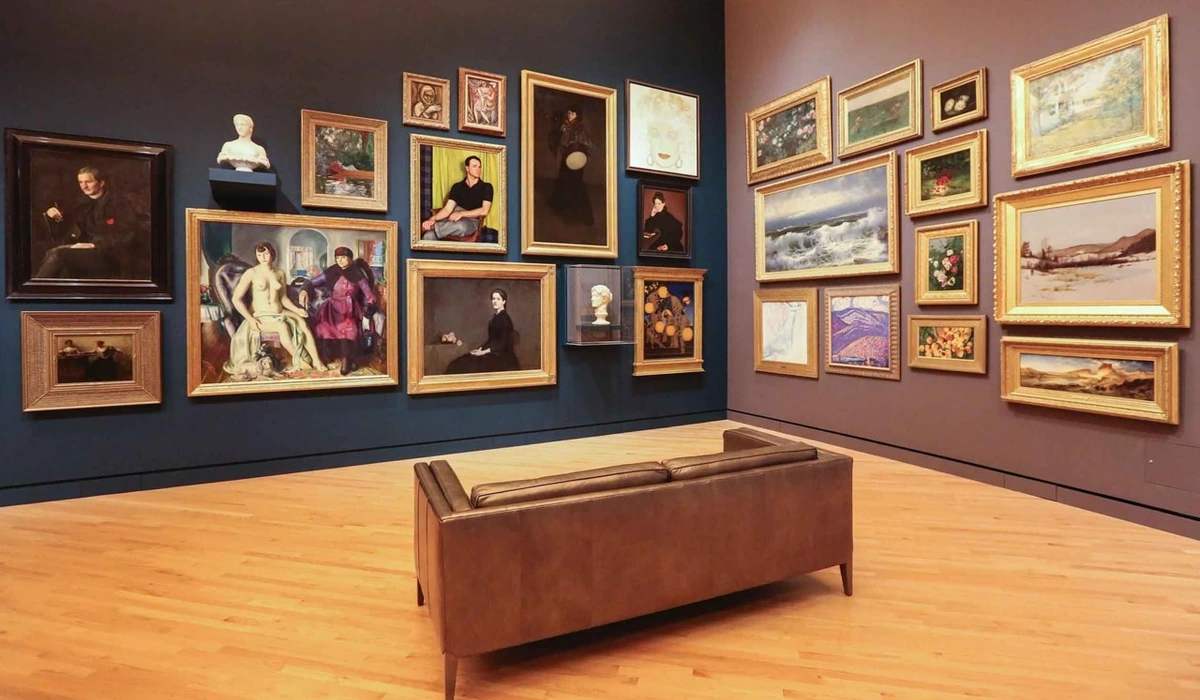
There’s this wonderful, slightly terrifying moment when you stand in front of a blank wall, armed with a pile of art pieces you love – a vibrant abstract, a classic landscape, a quirky illustration, maybe even a family photo. Your brain, bless its organized heart, immediately screams, “Chaos! This won't work!” I’ve been there, staring at a collection that felt more like a visual argument than a conversation. But my dear friend, I’m here to tell you that’s precisely where the magic begins. Mixing and matching art styles for a cohesive gallery wall isn't about rigid rules; it’s about discovering the quiet, often unexpected, conversations between seemingly disparate pieces. It’s about letting your unique taste shine, even if it feels a little messy at first. And honestly, a bit of glorious, intentional mess often makes the best art, right? In this guide, we'll explore how to find unifying elements, arrange your pieces with purpose, and even add those personal touches that make your wall truly sing.
For years, I was a bit of a stickler for order, especially in my own displays. My inner critic, an incessant nag, insisted everything had to ‘match’. But as an artist, I learned that true beauty often emerges from unexpected combinations. This journey, this delightful exploration of what 'fits' and what 'challenges' on a wall, is a microcosm of life itself. We grow, we change, our tastes evolve, and our homes should reflect that beautiful, ever-unfolding story. So, let’s ditch the fear and embrace the glorious potential of a truly diverse gallery wall, turning that initial visual argument into a harmonious visual symphony.
The Myth of Matchy-Matchy: Why Diversity is Your Secret Weapon
Remember those perfectly coordinated rooms from magazines, where every cushion matched every curtain matched every painting? Yeah, me too. And while they look lovely, they sometimes feel… a little lifeless, don’t they? Like a beautifully set stage waiting for a play that never starts. This rigid adherence to perfectly matched styles harks back to eras when interior design often prioritized signaling status over expressing personality. Think of the grand, symmetrical salons of old versus today's personalized, eclectic living spaces. Our homes, much like our lives, are vibrant, evolving spaces. They should tell a story of who we are, where we’ve been, and what we dream of. And frankly, my story isn't a single, uniform hue. It's a rich tapestry, sometimes frayed, sometimes vibrant, always unexpected.
I’ve always felt that trying too hard to make everything ‘match’ actually stifles creativity. It's like trying to force all your friends to wear the same outfit to a party. Sure, they'd be coordinated, but where's the fun in that? Or imagine a symphony where every instrument plays the same note – harmonious, maybe, but ultimately dull. A diverse gallery wall, much like a diverse group of friends or a full orchestra, brings depth, intrigue, and a whole lot of personality to a room. It speaks volumes about your journey, your passions, and your refusal to be boxed in. It’s less about interior design trends and more about expressing your soul. For more on how art has evolved in our living spaces, you might find this interesting: The Evolution of Art in Interior Design.
Finding Your Thread: Unifying Elements in a Diverse Collection
Okay, so we’ve agreed that diversity is good. But how do you prevent it from looking like a garage sale explosion? The secret lies in finding subtle common threads. Think of yourself as the conductor of an orchestra where each instrument plays a different tune, but together, they create a symphony. You're looking for those underlying harmonies. But how do we translate this idea of subtle connections into tangible design choices? Let's start with the most fundamental element: color.
Color Harmony: The Silent Conductor
This is often the easiest and most effective way to create cohesion. Even if your art styles vary wildly, a consistent color palette can tie everything together. Perhaps you pick out a dominant hue (a recurring blue, a subtle green) or a complementary set of colors that appear in several pieces. It’s like a secret handshake between your artworks. I remember a client who insisted their vibrant abstract wouldn't 'go' with a serene landscape. But by picking up a muted bronze undertone from the abstract and finding a landscape print with that same subtle warmth, we created an unexpected, powerful link. It doesn't have to be the main color; just a whisper can do the trick. It's truly amazing what color can do. If you're curious about how I approach color in my own work, take a look at How Artists Use Color.
Theme & Narrative: More Than Just Pictures
What story do you want your wall to tell? A thematic link can be a powerful unifier, even if rendered in vastly different styles. It doesn't have to be explicit; it can be a feeling or a shared subject matter. Think of it as your personal mood board writ large, a visual diary of your inner world. Different art styles can embody these themes in unique ways:
Theme & Feeling | Art Style Examples (Mix & Match) |
|---|---|
| Travel & Wanderlust | Vintage maps, contemporary cityscape photography, abstract pieces with oceanic blues, framed travel souvenirs, minimalist line drawings of landmarks. |
| Nature's Embrace | Botanical prints, tranquil landscape paintings, earthy-toned abstract art, delicate pressed flowers, natural fiber textile art, realistic wildlife sketches. |
| Personal Milestones | Cherished family photos, a child's unique artwork, achievement certificates, symbolic abstract art (growth, new beginnings), framed concert tickets or letters. |
| Whimsy & Joy | Quirky illustrations, pop art prints, brightly colored abstracts, humorous quotes in stylish frames, playful mixed-media collages, vibrant graphic designs. |
| Urban Edge & Grit | Street photography, distressed abstract pieces, graffiti art prints, industrial-inspired metal sculptures, architectural sketches. |
| Serenity & Calm | Minimalist abstracts, soft watercolors, monochromatic photography, nature-inspired linocuts, muted landscapes. |
Framing & Matting: The Unsung Heroes
Frames are like the clothes your art wears – they can make a huge difference! You don't have to have all matching frames, but a consistent element can create a sense of order amidst the stylistic variety. Consider:
- Material: All natural wood (varying tones are fine!), all sleek metal, or all simple black frames. A raw wood next to a sleek, brushed gold can speak volumes if chosen thoughtfully – perhaps the raw wood grounds an ethereal piece, while the gold elevates a gritty one, creating an intriguing dialogue of contrasts.
- Style: All minimalist, all ornate, or a thoughtful blend where one style dominates. For instance, you could have 70% minimalist frames for a clean look, with 30% ornate frames to highlight specific, cherished pieces.
- Matting: Consistent matting (e.g., all white, all off-white) provides a visual breath of fresh air between diverse works. It’s a clean border that allows each piece, no matter its style, to feel intentionally presented.
Or, you could deliberately mix frames but ensure a balance – perhaps two-thirds consistent, one-third varied. For a deeper dive, check out The Ultimate Guide to Framing Your Artwork.
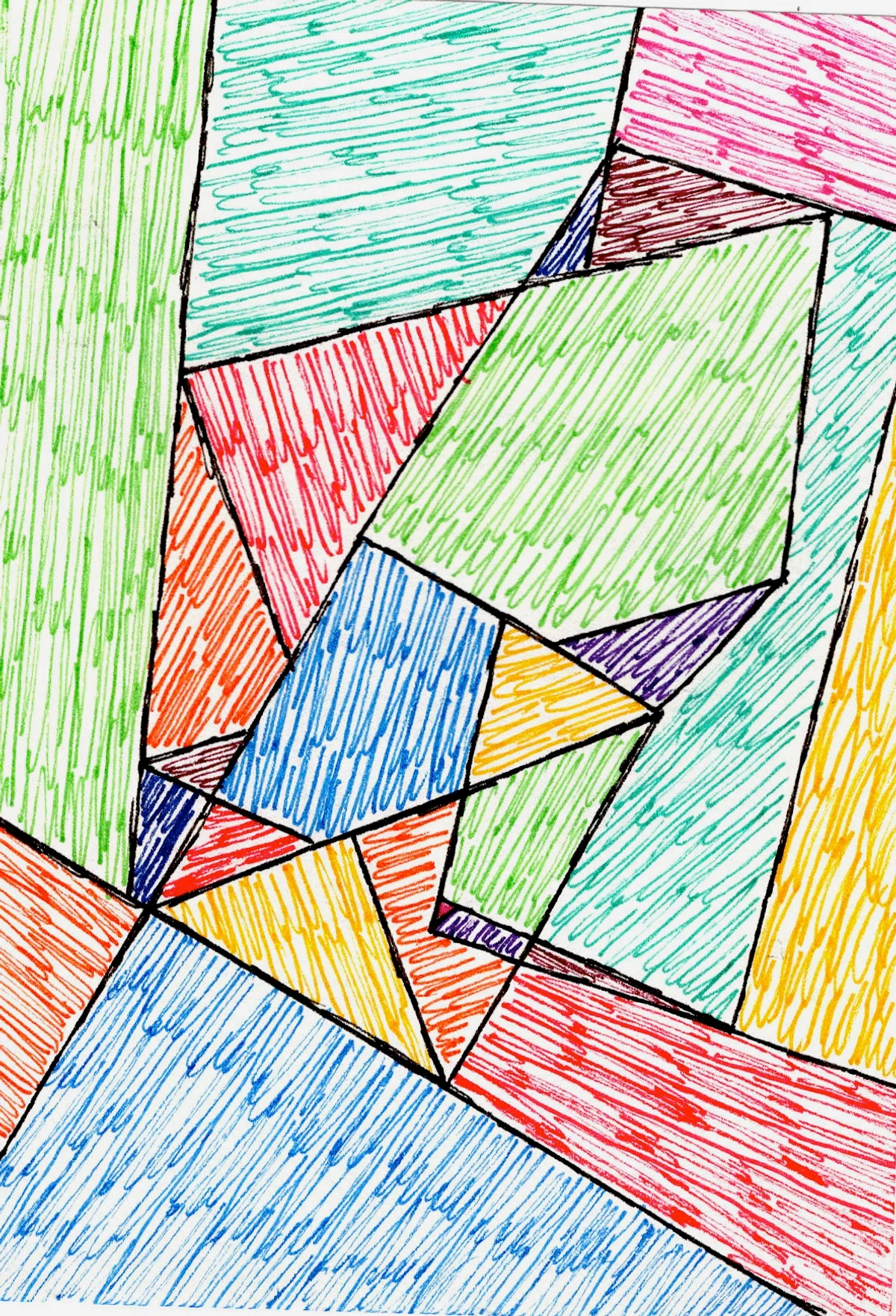
Texture & Medium: A Tactile Experience
Don't forget the power of texture! Juxtaposing different textures invites the eye to linger and explore each surface, moving beyond just visual appeal to a more tactile experience. Imagine a glossy photographic print next to a heavily textured oil painting with impasto (thickly applied paint that stands out from the surface), perhaps balanced by a delicate watercolor, a grainy charcoal sketch, a soft woven tapestry, or even a piece of small metal sculpture. These contrasts add incredible depth and sensory impact, allowing each piece to pop. My abstract works, for example, often play with texture to create sensory impact. Learn more about it here: The Definitive Guide to Texture in Abstract Art.
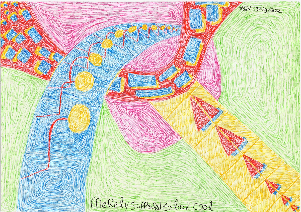
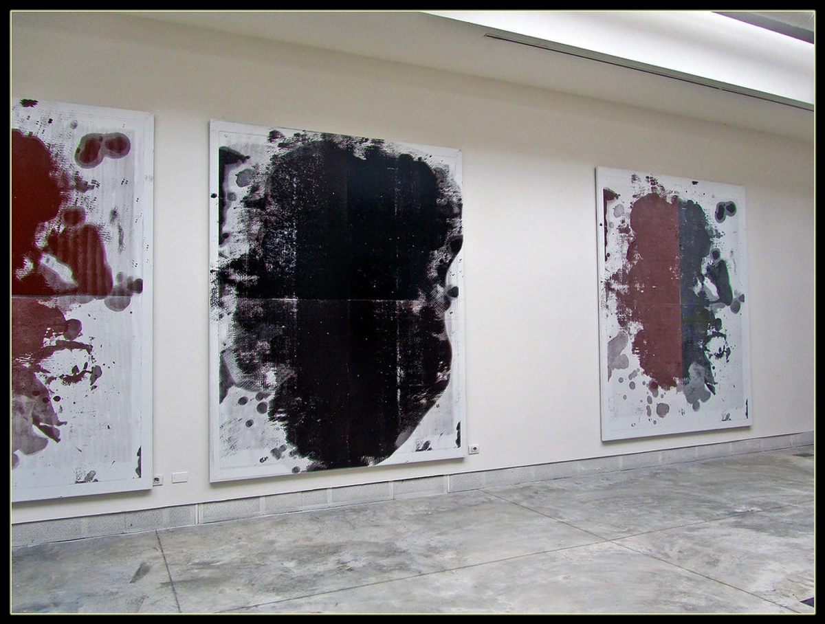
Incorporating Abstract Art: The Visual Diplomat
Abstract art is, in my humble opinion, the ultimate chameleon – the visual diplomat of any gallery wall. Because it doesn't tell a specific story, it's brilliant at connecting pieces that might otherwise feel worlds apart. It speaks the universal language of form, color, and gesture, allowing it to subtly harmonize with diverse styles, bridging visual gaps. I often find that a seemingly wild abstract can be the quiet linchpin, echoing a curve from a classical portrait or pulling a neglected color from a forgotten still life. A bold geometric abstract can sit perfectly next to a vintage botanical print, using a shared color palette or a complementary shape as a silent bridge. Its versatility makes it an incredibly valuable element in any diverse wall, offering a visual pause or an unexpected link. You can find some unique abstract prints for sale directly from my art for sale page.
What subtle color connections are already present in your existing art collection?
The Art of Arrangement: Making Diverse Pieces Sing Together
Once you've curated your diverse collection and identified your unifying threads, the exciting, and sometimes daunting, task of arranging them on the wall begins. This is where I typically lay everything out on the floor first, shifting pieces around like a giant, beautiful jigsaw puzzle, often muttering to myself and wondering if I’ve bitten off more than I can chew. It's a process of trial and error, and that's perfectly okay! Even I've had my share of 'oops' moments and plaster repairs.
Start with a Focal Point (or two!)
Every great story has a protagonist. Your gallery wall can benefit from one too. Choose a larger, perhaps more impactful piece to be your anchor. This doesn't mean it has to be the most expensive or 'important' piece, just one that draws the eye and acts as a gravitational center for the others. Then, build outwards from there. It gives your eye a place to land, even amidst the diversity. For tips on creating impact, see Creating a Focal Point with Abstract Art.
The Layout Labyrinth: Trial and Error (and paper!)
Before you grab the hammer, grab some butcher paper. This is truly a lifesaver! Here's how I approach it:
- Trace: Trace each frame onto butcher paper or newspaper.
- Cut: Carefully cut out each paper template.
- Arrange: Tape these paper cutouts to your wall, experimenting with different arrangements without putting a single nail hole in your wall.
- Visualize: Step back and live with the arrangement for a day or two. This allows you to play with symmetry, asymmetry, tight clusters, or expansive flows.
Seriously, this step has saved me countless plaster repairs! For a step-by-step approach, I’ve put together a guide: Curating Your Perfect Gallery Wall.
Spacing: Giving Each Piece Room to Breathe
Even with diverse styles, consistent spacing between pieces can bring a sense of order. I usually aim for about 2-4 inches (5-10 cm) between frames, but this isn't a hard and fast rule. Sometimes, a tighter cluster works wonders, especially if you have a few smaller pieces you want to group. Conversely, giving larger pieces more room can enhance their individual impact. It's all about what feels right to your eye, and also considering the scale and proportion of the wall and the room itself. A sprawling wall can handle more generous spacing, while a smaller nook might benefit from a more intimate cluster.
The Power of Negative Space
Beyond just spacing, consciously consider the blank wall space around your art – the negative space. This isn't wasted space; it's a deliberate design element. Strategic negative space prevents your wall from feeling cluttered, allowing each piece to stand out, breathe, and contribute clearly to the overall composition. It gives your eye a place to rest, creating visual balance and an inviting flow, even amidst a rich tapestry of styles.
How do you typically decide when an arrangement 'feels right' to you?
The Practical Canvas: Hanging Your Masterpiece
Now that you've meticulously planned your layout, it's time to bring your vision to life on the wall. This isn't just about hammering a nail; it's about precision and confidence to truly make your vision pop.
- Tools of the Trade: A good measuring tape, a reliable level, a pencil, and a stud finder are your best friends. Don't skip these! For heavier pieces, invest in appropriate wall anchors or stud finders – a falling artwork is a sad sight indeed.
- Measure Twice, Hammer Once: This old adage is gospel for gallery walls. Mark your hanging points precisely. For drywall, specialized picture hooks are often sufficient for lighter pieces, but for anything substantial, use toggle anchors or Molly bolts. For heavier items, always try to hit a stud.
- Start with Your Focal Point: Just as in the layout, hang your largest or central piece first. This provides a stable anchor from which to measure and align the surrounding art.
- Step Back Often: As you hang, frequently step away to view your progress from a distance. Minor adjustments can make a huge difference to the overall balance and flow.
- Lighting Your Canvas: Don't forget how light interacts with your art! Natural light is ideal, but for artificial lighting, consider adjustable track lighting or picture lights mounted above individual pieces. This can dramatically enhance textures, colors, and the overall mood of your gallery wall, creating depth and drawing attention to specific artworks, especially if they have varying sheens or surfaces. Soft, diffused lighting often works best to avoid glare.
- Embrace Imperfection (Strategically): And if your wall isn't perfectly plumb, or your ceiling has a slight curve? Embrace it! A gallery wall often looks more organic and lived-in with a touch of charming imperfection, or simply use your level strategically for horizontal and vertical lines, letting the overall cluster feel balanced.
Beyond the Canvas: Adding Depth & Story
Beyond the 'rules,' there are those personal elements that truly make a gallery wall yours. This is where my artist's heart really connects with the decorator's instinct, transforming a collection of images into a living, breathing narrative.
Objects and Mementos: Your Story, Three-Dimensional
Don't limit yourself to flat art! Incorporate small mirrors, wall sculptures, decorative plates, or even meaningful mementos that tell your story. These three-dimensional elements add incredible depth, break the visual monotony, and inject an element of delightful, personal surprise. It's about building layers of meaning, not just layers of paint. Consider:
- Small mirrors in varied shapes or frames to reflect light and add dimension, making the wall feel more expansive.
- Wall sculptures or decorative plates that echo a theme or color from your art, creating continuity.
- Textile art, such as a small tapestry, macrame piece, or a beautifully embroidered fabric swatch, for warmth, softness, and an additional layer of texture.
- Vintage maps, framed letters, or postcards from places dear to your heart, adding personal narrative.
- Treasured souvenirs, like a beautifully carved wooden bird from a memorable trip, a vibrant hand fan, or a delicate ceramic piece collected from a local artisan.
- Even a child's special artwork or a framed memento from a significant life event, celebrating personal history.
By consciously integrating these personal objects, you’re not just decorating a wall; you're creating a rich, evolving portrait of your life.
FAQs: Your Gallery Wall Conundrums Solved
Your brilliant minds have conjured some fantastic questions, and I'm here to offer my two cents (and a few hard-won lessons!). Here are some common questions I get about gallery walls, especially when mixing styles, often asked by folks with that wonderfully organized brain I mentioned earlier:
- Can I really mix photography with paintings and drawings? Absolutely, yes! This is where the magic truly happens. Use consistent framing or a unifying color palette to bring them together. The contrast in medium adds visual interest and a rich narrative. It tells a story of diverse perspectives, much like a good conversation. The psychological impact of different mediums can also be fascinating – a stark photograph next to a dreamy watercolor can evoke a range of emotions.
- How many pieces are too many for a cohesive look? There’s no hard rule, but generally, if your wall feels cluttered, or your eye darts around frantically without finding a resting place, you might have too many. Sometimes, less is more, or you might need to increase the spacing slightly. Trust your gut – it usually knows when it’s too much visual chatter.
- What if my art styles are too different – like a vintage botanical print next to a graffiti piece? This is where finding a common thread (color, frame style, or even just a shared sense of rebellion and unapologetic expression!) becomes crucial. Embrace the juxtaposition, but give them a subtle reason to be together. Maybe both are vibrant, or both hint at urban decay. The unexpected pairing can be incredibly powerful. A common element, even if abstract, can be the glue.
- Should all frames be the same color or style? Not necessarily! A mix can be incredibly chic and add character. Try to keep one element consistent (e.g., all frames are wood, but different tones; or all frames are metal, but different finishes). Or, make sure the varied frames complement each other rather than clash. Think of it as a curated wardrobe, not a uniform.
- How do I balance large statement pieces with smaller, more intimate works? Use your focal point strategy! Let a large piece anchor a section, then build smaller pieces around it, perhaps in clusters. Treat smaller works as supporting characters that add detail and nuance. Ensure enough breathing room around larger pieces to let them make their statement without overwhelming the smaller ones.
- How do I ensure the longevity of different art mediums on my gallery wall? This is a thoughtful question! Different mediums have varying sensitivities to light, humidity, and temperature. Generally, avoid direct sunlight for all art. For delicate pieces like watercolors or vintage photographs, consider UV-protective glass. Keep humidity stable, especially for oil paintings and paper-based works. While mixing is encouraged, be mindful of placing highly sensitive pieces next to those that are very robust if their environmental needs are vastly different. Consider the provenance of older pieces and ensure they are appropriately protected.
Your Wall, Your Story
Creating a gallery wall is a deeply personal act. It's about surrounding yourself with images and objects that resonate with you, that spark joy, or that simply make your space feel like home. Don't be afraid to experiment, to move things around, and to let your wall evolve as you do. There's no single 'right' way, only your way – a unique expression of your journey, your inner world, and your ever-unfolding story. Your gallery wall is a living entity, a testament to your journey, and it should evolve with you. And remember, every piece you choose, every arrangement you create, is a brushstroke in the masterpiece that is your life.
If you're looking for that perfect abstract piece to add to your evolving collection, I invite you to explore my art for sale. Perhaps a piece from my studio could be the next chapter in your wall’s story. Or if you’re ever in the Netherlands, swing by my museum in 's-Hertogenbosch for some real-life inspiration. Happy curating!