The Ultimate Guide to Using Digital Canvas for Artistic Freedom
Unlock your creative potential with this comprehensive, personal guide to mastering digital canvas art. From beginner steps to advanced techniques.
The Ultimate Guide to Using Digital Canvas for Artistic Freedom
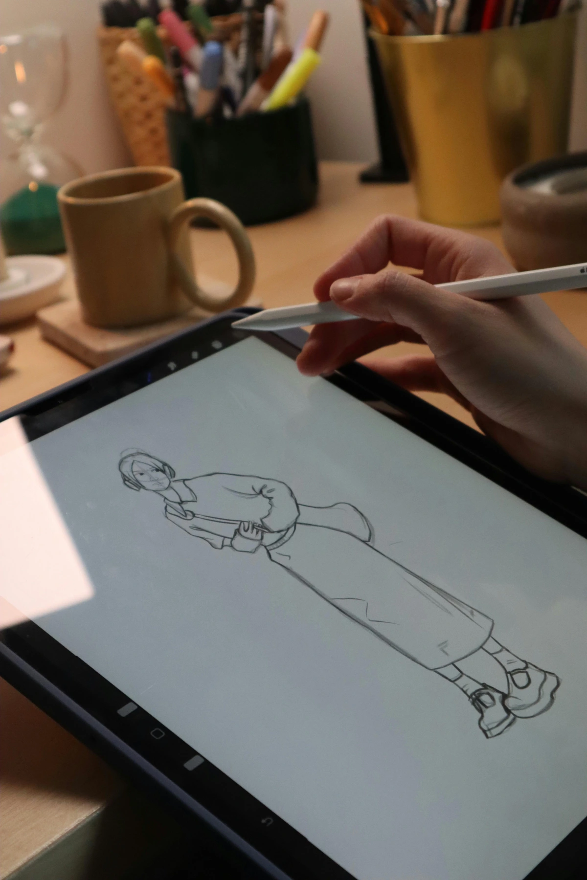
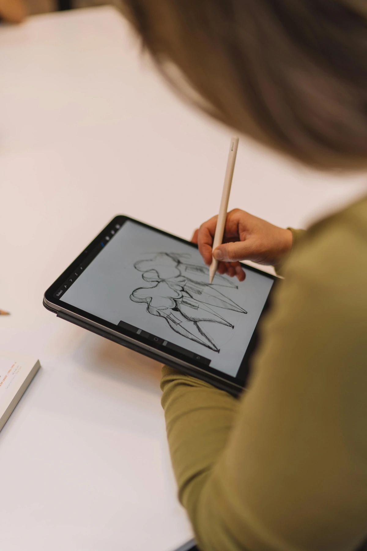
I still remember the first time I traded a dusty sketchbook for a digital tablet. The panic! The sheer terror of staring at a blank canvas that somehow felt more empty than any paper before. But here’s the thing: digital canvas isn’t about replacing traditional art—it’s about expanding the playground. It’s like discovering you’ve been painting with one hand behind your back. Today, I want to share everything I’ve learned about making digital tools sing for your creativity. No hype, just hard-won truths and practical steps. Ready?
A Brief History: From Pixels to Masterpieces
Digital art didn’t start with the sleek tablets we know today. It began in the 1960s with rudimentary computer graphics, where artists wrote code to create basic shapes and patterns. Fast forward to the 1980s, and we saw the first digital painting software like MacPaint and Deluxe Paint. These tools were revolutionary but limited by the computing power of their time.
The real game changer came in the 1990s with software like Photoshop and Corel Painter. Suddenly, artists had access to layers, brushes, and effects that mimicked traditional media but offered new possibilities. I remember my first encounter with a Wacom tablet in college—those pressure-sensitive pens felt like magic compared to my mouse-based attempts at drawing.
Today, we’re in a golden age. Procreate, Clip Studio Paint, and Krita have democratized digital art, making powerful tools accessible to anyone with a tablet or even just a smartphone. The community has exploded, with millions of artists sharing their work online, collaborating across continents, and pushing the boundaries of what’s possible digitally.
What fascinates me most is how digital art isn’t just about imitating traditional media anymore. It’s evolved into its own language—one that embraces imperfection, experimentation, and the unique properties of pixels and algorithms. But let’s be real: even with all this progress, that initial panic I felt? It never completely goes away. Every blank canvas, digital or physical, holds that same terrifying potential for greatness... or disaster.
What Exactly Is a Digital Canvas?
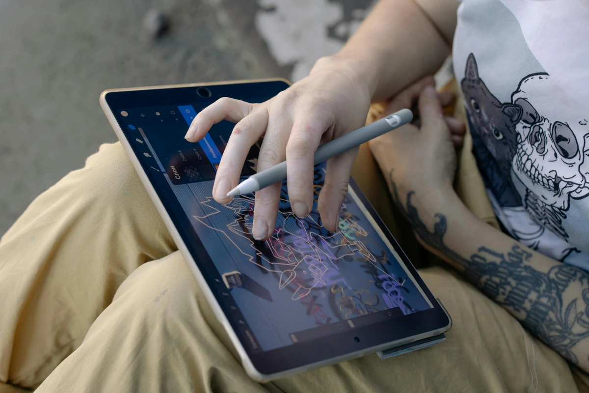
At its core, a digital canvas is just that—an infinite surface where you create using software instead of physical materials. Whether it’s Canva, Procreate, or Adobe Fresco, the concept remains: you’re painting digitally, not literally. But here’s where it gets interesting: this virtual space breaks all physical rules. No more running out of paper. No more waiting for paint to dry. Just you, your ideas, and the undo button that’s saved me from countless disasters.
- No mess: No paint smudges on your cat’s fur. No charcoal dust in your coffee. Just glorious, clean chaos.
- Unlimited redo: Made a mistake? Just Ctrl+Z and pretend it never happened. My secret weapon? Using undo as a creative tool—I often experiment wildly because I know I can backtrack.
- Accessibility: Rainy days, late nights, a tiny apartment—digital art works anywhere. That’s why I’ve done everything from sketching on a bus to finishing a piece at 2 AM in a hotel room.
Why Artists Are Obsessed with Digital Canvas
Let’s be real: digital tools aren’t better than traditional ones—they’re different. And this difference unlocks unique powers. I resisted for years, thinking digital "lacked soul." Then I realized: the soul comes from you, not the tool. The software is just a paintbrush with superpowers.
The Psychology of Digital Creation
What makes digital art so compelling from a psychological standpoint? It’s the freedom to experiment without consequence. I’ve found that when I know I can undo mistakes, I take risks I’d never take with traditional media. This leads to more creative breakthroughs.
There’s also the instant gratification factor. Traditional art requires patience—waiting for paint to dry, for ink to set. Digital art gives you immediate feedback. You can see your brushstroke appear, blend colors in real-time, and adjust lighting with a slider. This immediacy can be incredibly addictive and motivating.
Digital Art vs Traditional: A Deeper Dive
While the comparison table covers surface differences, let’s dive deeper into the philosophical distinctions:
Digital Art Advantages:
- Non-destructive workflow: Every change can be reversed or modified
- Infinite canvas size: No more "I ran out of space" moments
- Perfect reproduction: Your art looks identical every time it’s displayed
- Global collaboration: Work with artists anywhere in the world
- Version control: Save different versions without cluttering your space
Traditional Art Strengths:
- Tactile experience: The physical connection to materials
- Unique originals: Each piece is truly one-of-a-kind
- No technical failures: No crashes, no corrupted files
- Market value: Originals often appreciate over time
- Therapeutic qualities: The sensory experience of creating
The key? Use each medium for what it does best. I use digital for experimentation and client work, traditional for personal meditation pieces.
credit licence

Key Advantages for Artists: Deeper Analysis
While this comparison table gives you the basics, let's dive deeper into what these differences actually mean for your artistic practice:
Feature | Traditional Art | Digital Canvas | Practical Implications |
|---|---|---|---|
| Cost | Physical supplies add up (ongoing expense) | One-time software investment (recurring subscriptions) | Traditional: Budget for consumables. Digital: Higher initial cost but lower ongoing expenses. Many artists start traditional due to lower barrier to entry. |
| Undo/Redo | Permanent mistakes become part of the piece | Infinite revision freedom | Digital: You can experiment fearlessly. Traditional: Mistakes teach acceptance and creative problem-solving. Both approaches develop different artistic muscles. |
| Colors | Limited by palette (physical mixing) | Millions of color options (theoretical infinite) | Digital: Perfect color matching across projects. Traditional: Develops deep understanding of color theory through hands-on mixing. |
| Portability | Heavy supplies, limited workspace | Work from anywhere (tablet + laptop + stylus) | Digital: Create while traveling, waiting in lines, or between meetings. Traditional: Requires dedicated studio space, which can be both limiting and freeing. |
| Sharing | Physical prints, shipping required | Instant online sharing, global reach | Digital: Build online presence quickly, get feedback immediately. Traditional: Creates more intimate, valuable physical objects for collectors. |
| Learning Curve | Immediate tactile feedback (learn by doing) | Steeper technical learning (tools first, then art) | Traditional: More intuitive start, develops hand-eye coordination. Digital: Steeper initial investment in tool mastery, but faster iteration once learned. |
| Physical Health | Better for hand-eye coordination, full body engagement | Risk of repetitive strain, sedentary lifestyle | Traditional: More physical movement, different muscle groups engaged. Digital: Risk of RSI, requires ergonomic setup and breaks. |
| Storage | Physical space needed (galleries, studios) | Digital storage required (cloud + local backups) | Traditional: Limited by physical reality, creates tangible legacy. Digital: Virtually unlimited storage, but dependent on technology and file formats. |
| Environmental | Paints/chemicals impact (disposal, production) | Energy consumption concern (electricity, e-waste) | Traditional: Chemical disposal issues, paper/wood consumption. Digital: Energy usage, electronic waste from hardware upgrades. |
| Authenticity | Tangible original (provenance, physical presence) | Reproducible infinitely (challenges exclusivity) | Traditional: Built-in scarcity and physical presence create different value. Digital: Challenges traditional notions of "original" but creates new forms of value through access and distribution. |
Additional Important Factors:
- Speed of creation: Digital allows for much faster iteration and completion times. Traditional art often develops more slowly, with drying times and physical processes that can't be rushed.
- Collaboration potential: Digital enables real-time collaboration across distances. Traditional collaboration requires physical presence or complex shipping logistics.
- Educational resources: Digital has exponentially more tutorials and learning resources available instantly. Traditional benefits from fewer, but often more in-depth, master-apprentice relationships.
- Archival considerations: Traditional art has established conservation methods. Digital art faces challenges with file format obsolescence and media degradation over time.

Getting Started: Your First Digital Strokes
Embarking on your digital art journey is exciting, but it can feel overwhelming. The sheer number of tools, options, and techniques might make you want to quit before you even start. But here's the secret: every digital artist, no matter how accomplished, started exactly where you are now—overwhelmed by possibilities but excited by potential.
I remember my first digital setup: a clunky laptop with a tiny external drawing tablet that cost less than my monthly rent. The stylus felt like trying to draw through a thick pane of glass, and my early attempts looked like something a five-year-old would create. But I kept going, not because I was talented, but because I was stubborn. And somewhere along the way, something clicked.
This section will help you build your foundation systematically. We'll cover everything from hardware selection to software choices, workspace setup, and those crucial first steps that will determine whether you stick with digital art or abandon it after a frustrating week. The goal isn't to buy the most expensive equipment—it's to create a system that supports your creative growth without breaking your bank or your spirit.
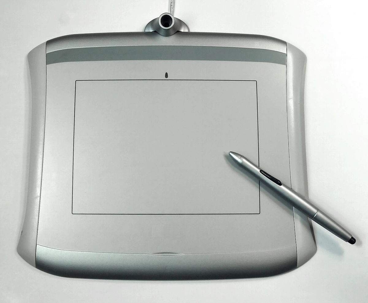
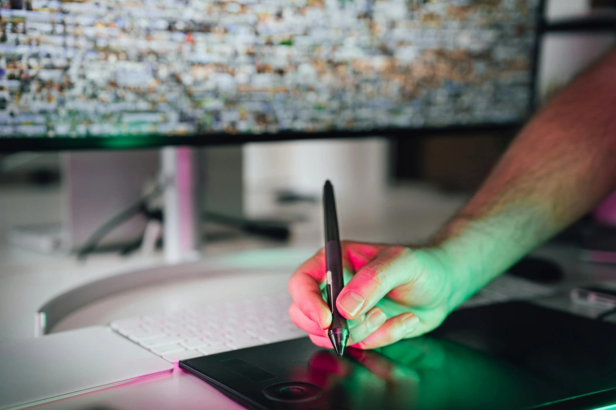
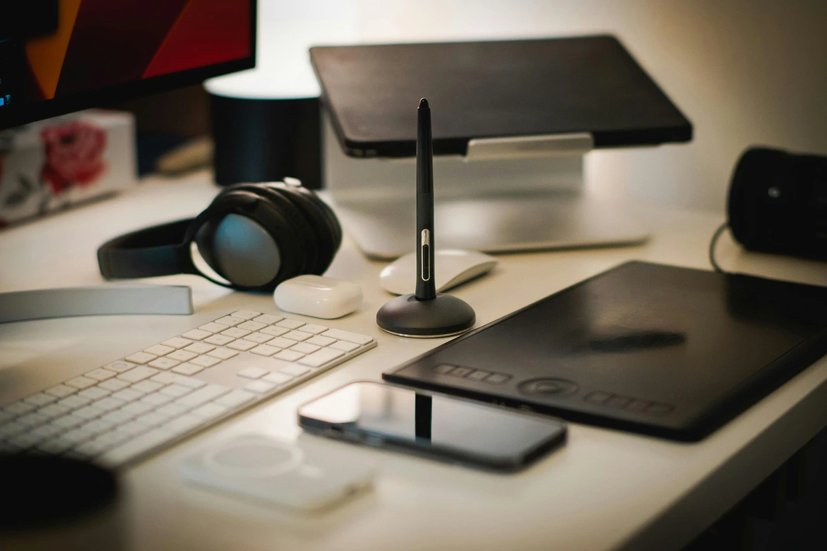
Hardware Essentials: Beyond Just a Tablet
You don’t need a $5,000 setup to start, but you do need the right foundation. I began with a 15-inch laptop and a $50 drawing tablet. Here’s what I recommend:
The Bare Minimum:
- Decent computer/laptop: 8GB RAM, Intel i5 or equivalent
- Drawing tablet: Any Wacom Intuos or Huion Kamvas entry-level model
- Mouse: For precise clicks until you master the tablet
- Basic monitor: 1920x1080 resolution minimum
The Sweet Spot:
- 16GB RAM: Essential for complex illustrations
- Solid-state drive (SSD): For faster file loading
- Color-calibrated monitor: Accurate colors are crucial
- Pressure-sensitive stylus: For natural brush control
- Second monitor: For reference materials and tools
Professional Setup:
- 32GB+ RAM: For 4K work and animation
- Wacom Cintiq or iPad Pro: Direct drawing experience
- Ergonomic chair and desk: Your body will thank you
- Color-accurate display: Eizo or BenQ professional monitors
- Backup system: External drives and cloud storage
I learned this hierarchy the hard way when my 8GB laptop crashed while working on a complex piece with 50+ layers. Now I always recommend at least 16GB for serious work.

Software Selection Guide: Finding Your Creative Partner
Choosing the right software is one of the most important decisions you'll make in your digital art journey. It's not just about tools—it's about finding your creative partner, the interface that will understand your artistic vision and help you bring it to life. The market offers dozens of options, each with different philosophies, strengths, and learning curves.
Here's how to approach this decision: don't just look at feature lists. Think about how you create art naturally. Are you a perfectionist who needs precise control? An intuitive painter who flows with inspiration? A technical artist who loves mathematical precision? Your personality and creative process should guide your software choice as much as your artistic goals.
Free Software Options: The Power of Free
Krita: The Professional's Hidden Secret
- Best for: Painting, illustration, concept art, matte painting
- Pros: Completely free, incredibly sophisticated brush engine, professional-level features, cross-platform, active development, excellent community support
- Cons: Interface can feel complex for beginners, some advanced features require learning curve
- My experience: This is where I started. The brush engine is surprisingly sophisticated—I've created brushes in Krita that rival commercial software. What most people don't realize is that Krita has features like perspective grids, animation tools, and even basic 3D capabilities that make it a complete creative suite.
- Hidden gems: The color management system is actually better than many paid options, and the stabilization features for shaky lines are unparalleled.
GIMP: The Photoshop Alternative
- Best for: Photo manipulation, basic illustration, web graphics, photo restoration
- Pros: Free, cross-platform, extensive plugin system, mature and stable, powerful selection tools
- Cons: Interface can feel dated for some users, text tools are less refined than commercial alternatives
- My advice: Great for photo editing and basic digital painting. Many professional photographers use GIMP as their primary editing tool because of its non-destructive editing capabilities.
- Best uses: Quick photo edits, creating textures for digital painting, web graphics, and as a stepping stone to more complex software.
Inkscape: Vector Art Excellence
- Best for: Vector illustration, logo design, typography, technical drawing
- Pros: Free, powerful vector tools, SVG format support, excellent bezier curve editing, text manipulation tools
- Cons: Not ideal for raster/painting tasks, steeper learning curve for vector concepts
- My workflow: Use for logos and illustrations that need to scale infinitely without quality loss. I often create vector elements in Inkscape and import them into raster programs for final painting.
- Vector vs raster understanding: Inkscape teaches you the fundamental difference between vector (mathematical) and raster (pixel-based) art—a crucial concept for any digital artist.
Canva: The Unexpected Powerhouse
- Best for: Social media graphics, simple illustrations, presentations, quick mockups
- Pros: User-friendly, web-based, collaborative features, massive template library, surprisingly good photo editing tools
- Cons: Limited advanced features for serious artists, subscription required for premium features
- Surprise factor: More capable than most artists give it credit for. I've created entire portfolio pieces in Canva when I needed to work on a low-powered computer. The design principles you learn in Canva translate directly to more sophisticated software.
- Professional uses: Creating social media content for artists, quick mockups for client presentations, designing promotional materials, and even creating simple illustrations when away from your main setup.
Commercial Software Options
Adobe Creative Cloud (Photoshop, Illustrator):
- Best for: Professional illustration, photo editing, graphic design
- Pros: Industry standard, extensive features, regular updates
- Cons: Expensive subscription, can feel overwhelming
- My recommendation: Essential for professional work, but consider alternatives if budget is tight
- Best for: iPad illustration, painting, sketching
- Pros: Intuitive interface, amazing brushes, one-time purchase
- Cons: iPad-only, less suited for print work
- Personal favorite: My go-to for client illustration work
Clip Studio Paint:
- Best for: Comics, manga, illustration
- Pros: Excellent comic tools, affordable one-time purchase
- Cons: Interface takes getting used to
- Special feature: Best perspective tools I’ve used
Corel Painter:
- Best for: Natural media simulation, traditional artists transitioning
- Pros: Realistic brushes, familiar interface for traditional artists
- Cons: Can be resource-intensive, expensive
- My experience: Great for artists coming from watercolor or oil backgrounds
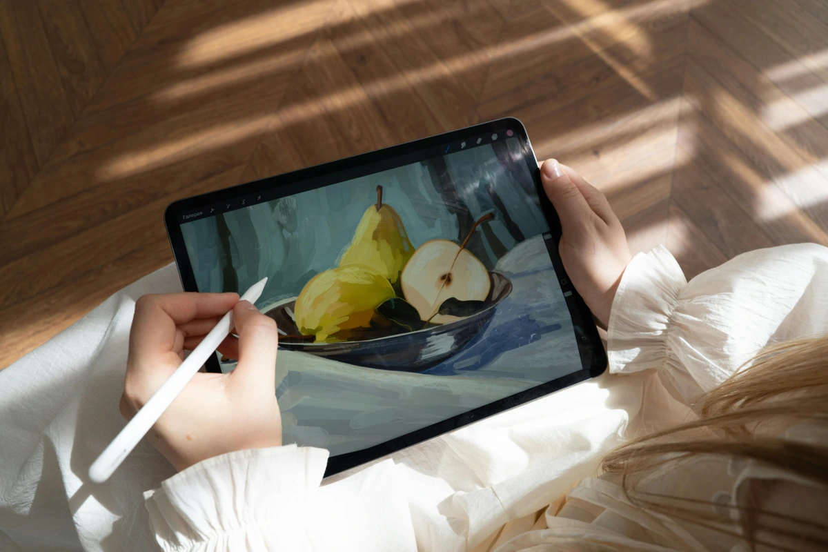
Mobile and Tablet Apps: Creating Anywhere
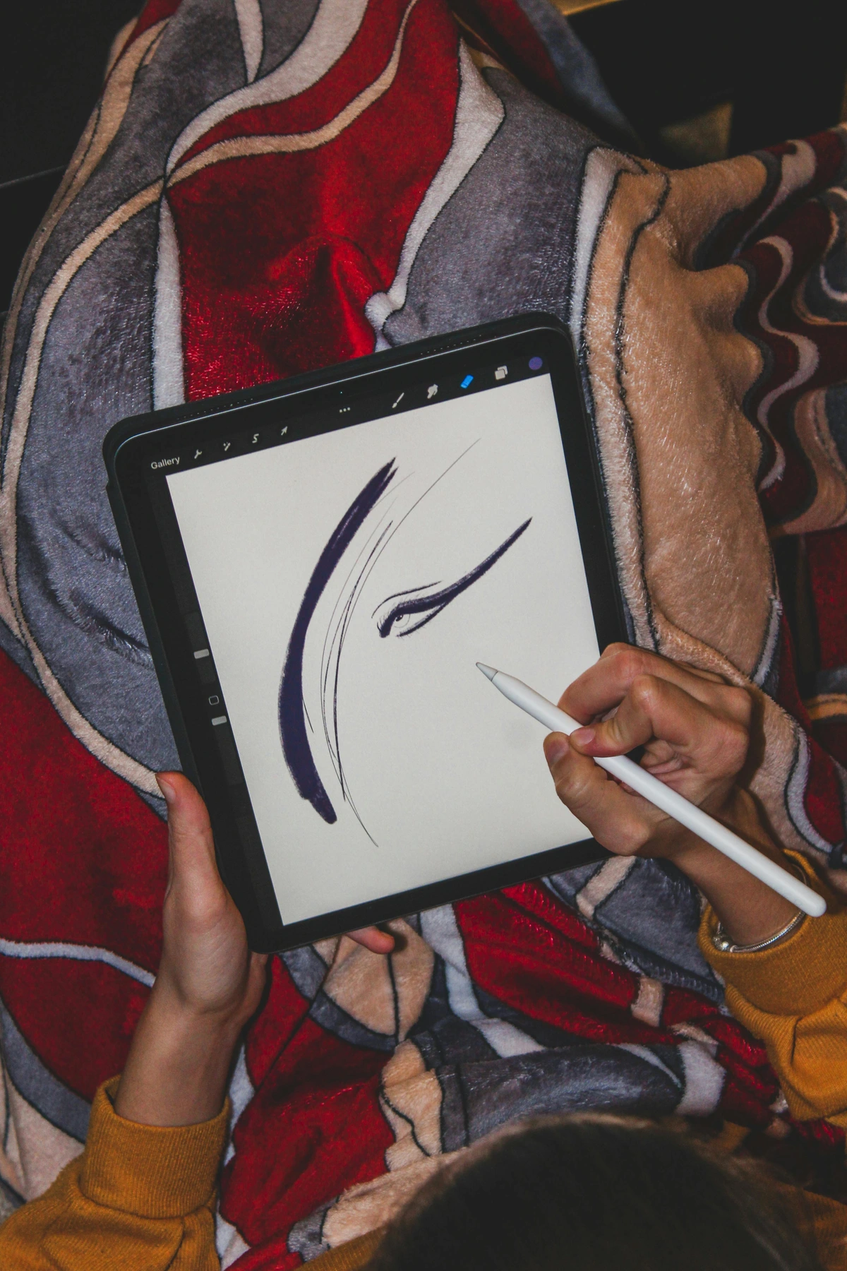
Procreate Pocket: The Power of Procreate in Your Pocket
- Best for: iPhone sketching, on-the-go art, quick ideation
- Pros: Full Procreate experience optimized for phone, affordable ($4.99), excellent brush library, gesture controls, iCloud integration
- Cons: Small screen limits detailed work, some features from desktop version missing
- Use case: Perfect for quick sketches, capturing ideas when you're away from your main setup, and creating artwork specifically for mobile platforms.
- Pro tip: Use Procreate Pocket for thumbnails and composition planning, then transfer the concepts to your main software for detailed execution.
ibisPaint X: The Android Powerhouse
- Best for: Android illustration, layer management, comic creation
- Pros: Free with optional premium features, cross-platform (iOS and Android), excellent layer organization tools, vast brush library, community features
- Cons: Interface can be complex for beginners, some premium features require payment
- Strength: Excellent layer organization tools and the ability to share brushes and materials with other artists in the community.
- Unique features: The "Snap Guide" tool helps with perspective drawing, and the "Stabilization" feature can correct shaky lines in real-time.
Adobe Fresco: Adobe's Free Offering
- Best for: Cross-platform illustration, natural media simulation, watercolor and oil painting
- Pros: Free Adobe app, excellent watercolor and oil simulation, works on iPad and Windows, integration with Adobe Creative Cloud
- Cons: Limited compared to full Photoshop, requires Adobe ID, some features behind subscription
- My take: Great for artists who want Adobe tools without the subscription. The watercolor brushes are particularly impressive, using physics simulations to behave like real watercolor.
- Professional use: Many illustrators use Fresco for the natural media simulation, then export to Photoshop for final compositing and effects.
Additional Mobile Options:
Autodesk SketchBook: Professional-grade drawing app with an intuitive interface. Great for both beginners and professionals.
Pixel Studio: Specialized for pixel art and retro-style illustrations. Popular among indie game developers.
ArtFlow: Android alternative to Procreate with excellent brush customization and layer management.
Tayasui Sketches: Beautiful, minimalist drawing app focused on the natural feel of traditional tools.
Concepts: Infinite canvas app with excellent vector and raster tools, popular among architects and designers.
Mobile Art Creation Strategy:
- Use mobile apps for: Quick sketches, capturing inspiration, creating while traveling, testing ideas, and creating content specifically for social media.
- Don't use mobile apps for: Final portfolio pieces, complex illustrations with many layers, or print-quality work.
- The hybrid approach: Start ideas on mobile, develop them on desktop, and finalize in professional software. This creates an efficient workflow that leverages the strengths of each platform.
Software Comparison Matrix: Choosing Your Creative Partner
Software | Price Model | Best For | Learning Curve | Platform | Unique Feature | Best For Artists Who... |
|---|---|---|---|---|---|---|
| Krita | Completely Free | Painting, Illustration, Concept Art | Medium | Windows/Mac/Linux | Amazing brush engine with physics simulation | Want professional features without cost, love painting, enjoy customization |
| Adobe Photoshop | Subscription ($52.99/month) | Professional Design, Photo Editing, Digital Painting | Steep | Windows/Mac | Industry standard, massive ecosystem | Need to work with clients, require photo editing capabilities, want access to all Adobe tools |
| Procreate | One-time Purchase ($9.99) | iPad Illustration, Painting, Sketching | Easy | iPad | Intuitive interface, excellent gesture controls | Prefer creating on tablet, want quick workflow, love Apple ecosystem |
| Clip Studio Paint | One-time Purchase ($49.99) | Comics, Manga, Illustration | Medium | Windows/Mac | Best comic tools, perspective rulers | Create comics/manga, need perspective assistance, want one-time pricing |
| GIMP | Completely Free | Photo Editing, Basic Illustration | Medium | Cross-platform | Free alternative to Photoshop | Can't afford commercial software, need photo editing basics |
| Canva | Freemium (Free + Premium) | Social Media Graphics, Simple Illustration | Easy | Web/Browser | User-friendly, massive template library | Create social content, need quick results, aren't tech-savvy |
| Adobe Illustrator | Subscription ($52.99/month) | Vector Art, Logo Design | Steep | Windows/Mac | Best vector tools, industry standard | Need to create logos, illustrations that scale, typography work |
| Adobe Fresco | Free (with optional Premium) | Natural Media, Watercolor/Oil Simulation | Easy | iPad/Windows | Realistic natural brushes, Adobe integration | Love traditional media, want Adobe tools without subscription |
| Affinity Designer | One-time Purchase ($54.99) | Vector Art, Graphic Design | Medium | Windows/Mac/iOS | Professional vector tools, no subscription | Want Adobe-quality tools without subscription costs |
| Corel Painter | Subscription ($14.99/month) | Natural Media Simulation | Medium | Windows | Most realistic traditional media simulation | Come from traditional art background, want authentic digital replication |
My Software Recommendations by Skill Level
Beginner: Start with Krita or Canva. Both have gentle learning curves and won’t overwhelm you with options.
Intermediate: Procreate (if you have iPad) or Clip Studio Paint. These offer professional features without the complexity of Adobe software.
Advanced: Adobe Creative Cloud for maximum flexibility and industry compatibility.
Specialized: Choose software that matches your focus—Corel Painter for natural media simulation, Blender for 3D work, etc.
The most important thing is to pick one software and master it before moving to others. Jumping between tools too early can slow your progress significantly.
- Canvas Size: Start with 300 DPI at 8x11 inches—enough quality to print later if you want. Pro tip: Always work larger than your final size to avoid pixelation.
- Print resolution: 300 DPI minimum
- Web resolution: 72 DPI for faster loading
- Social media: Square format (1080x1080) works best
- Large prints: Consider 600 DPI for gallery-quality work
- Brush Setting: Don’t get lost here! Start with a basic round brush. You’ll develop preferences later, but complex settings early just slow you down.
- Round brush: Most versatile starting point
- Texture brushes: Add depth and character
- Custom brushes: Create your own from scans
- Brush smoothing: Helps with shaky lines (use sparingly)
- Tablet Sensitivity: Calibrate your pen pressure so it feels natural. I spent a month hating my tablet until I adjusted this setting—and everything clicked.
- Pressure curve: Adjust in tablet settings for natural feel
- Tilt sensitivity: For realistic brush angles
- Eraser settings: Make sure it responds to pen tip
- Pen buttons: Program undo/zoom for efficiency
- File Format: Save in .PSD (with layers) for editing, .JPG for sharing. And for God’s sake, save backups! I learned this the hard way after a 10-hour piece corrupted mid-save.
- .PSD: Photoshop format, preserves layers
- .TIFF: High-quality, lossless compression
- .JPG: Web-friendly, smaller file size
- .PNG: Transparent backgrounds, lossless
- .SVG: Vector graphics, infinitely scalable
- .WEBP: Modern web format, excellent compression
Setting Up Your Workspace: Creating Your Creative Environment
Digital tools thrive on organization, but workspace setup is about more than just file folders—it's about creating an environment that supports your creative flow. I've worked in studios, cafes, home offices, and even hotel rooms, and I've learned that the physical space around your digital canvas significantly impacts your creativity and productivity.

A well-organized workspace doesn't just save time—it reduces cognitive load, allowing you to focus on creating rather than hunting for tools or dealing with technical frustrations. Here's how to set up a workspace that works for you:
Digital Workspace Organization
- **Tool Palette Optimization:** Keep your most-used brushes, erasers, and color pickers visible. Create custom toolbars for specific projects. I have different tool presets for character design, landscape painting, and illustration work.
- **Layer Discipline:** Name each layer! "Clouds_Layer," "Character_Hair," "Background_Mountains." Use consistent naming conventions and group related layers into folders. This becomes crucial when you have 50+ layers in a complex piece.
- **Keyboard Shortcuts Mastery:** Memorize essential shortcuts: Ctrl+Z (undo), Ctrl+B (brush), E (eraser), Ctrl+T (transform), Ctrl+L (levels), Ctrl+M (curves). Create custom shortcuts for your most-used actions. The time saved over months of work is astronomical.
- **Reference Management:** Open Pinterest or a folder of inspiration alongside your canvas. Use reference images as guides, not crutches. The best artists use references to understand reality, not copy it directly.
- **Workspace Layout:** Arrange panels logically. Keep tools on the left, layers on the right, and your canvas in the center. Create different workspace profiles for different types of work.
Mastering Core Techniques: From Beginner to Professional
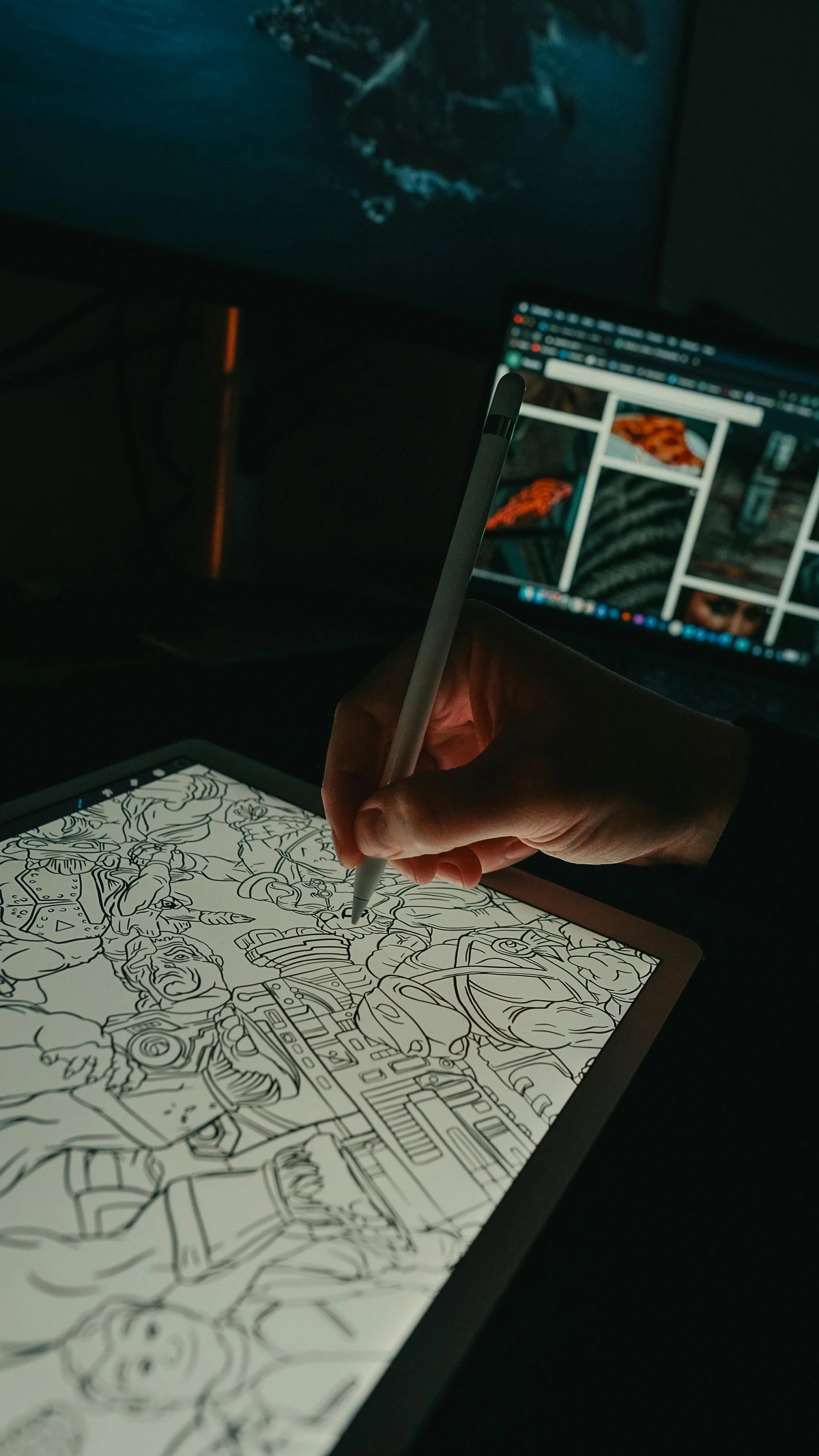
Now that you have your tools and workspace set up, it's time to develop the actual skills that will transform your digital art from amateur to professional. This is where the real magic happens—where you learn to think like a digital artist rather than just pushing pixels around.
The techniques in this section are the fundamental building blocks of digital art mastery. I've organized them progressively, starting with the absolute basics and moving toward advanced concepts that professional artists use daily. The key isn't just learning these techniques—it's understanding how they work together to create cohesive, compelling artwork.
What separates hobbyists from professionals isn't necessarily more talent or better tools—it's a deeper understanding of these core techniques and the discipline to practice them consistently. I still practice these fundamentals daily, even after a decade of professional work.
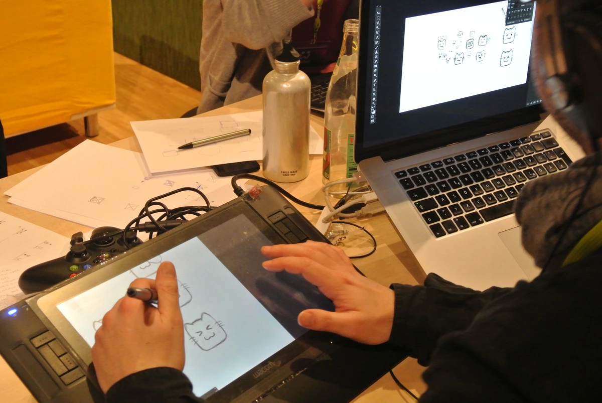
Once you’re comfortable, it’s time to level up. Here are the techniques I use daily:
Layering Like a Pro: The Foundation of Digital Art
Layers aren't just a feature—they're the fundamental paradigm shift that makes digital art uniquely powerful. If traditional art is like painting on a single canvas, digital art is like having an infinite stack of transparent glass sheets that you can paint on, rearrange, and modify independently. This single concept unlocks virtually all the creative possibilities of digital creation.
I've seen artists who understand layers create work that seems impossibly complex, while artists who don't understand layers struggle with basic compositions. The difference isn't talent—it's understanding how to think in layers. Once you grasp this concept, your entire approach to digital art will transform.
Advanced Layer Strategies
Beyond the basic layer types, here are pro techniques I’ve developed over years of trial and error:
Layer Organization Systems:
- Naming convention: Be descriptive! "Character_Eyes_Background" beats "Layer 12"
- Color coding: Use layer colors to organize groups (e.g., red for characters, blue for backgrounds)
- Folder structure: Create logical groups: Sketches, Lineart, Colors, Shading, Effects
- Locked layers: Use lock alpha to prevent coloring outside lines
Blending Mode Mastery: The Digital Alchemist's Toolkit
Blending modes are like having an infinite palette of special effects that blend layers in mathematically interesting ways. Mastering these transforms your ability to create realistic lighting, atmospheric effects, and complex color relationships:
- Multiply: The shadow workhorse. Perfect for shadows and realistic shading. It works by multiplying the pixel values of layers, making darker areas darker. Essential for creating depth and form.
- Screen: The opposite of multiply. Great for highlights and light effects. It works by inverting, multiplying, and inverting again, making lighter areas lighter. Perfect for glows, sparks, and bright highlights.
- Overlay: Enhances contrast while preserving midtones. It combines multiply and screen modes, making darks darker and lights lighter while leaving midtones relatively unchanged. Excellent for adding dramatic lighting or enhancing textures.
- Soft Light: Subtle contrast enhancement. Similar to overlay but with a gentler touch. Great for adding atmospheric effects or subtle color shifts without overwhelming the original image.
- Color: Changes hue while preserving luminance. Perfect for color grading entire scenes or changing the color of elements without affecting their brightness values.
- Hue: Changes color while preserving brightness and saturation. Useful for subtle color adjustments or creating cohesive color palettes across different elements.
- Saturation: Adjusts color intensity while preserving hue and brightness. Great for making colors more vibrant or muted in specific areas.
- Luminosity: Adjusts brightness while preserving hue and saturation. Perfect for controlling light intensity without affecting color.
- Difference: Creates psychedelic color effects by subtracting pixel values. Great for creating abstract effects or finding edges in images.
- Exclusion: Similar to difference but with lower contrast. Creates interesting color interactions while maintaining some image readability.
Pro Blending Mode Strategies:
- Combine multiple modes: Use different blending modes on different layers to create complex lighting effects. For example, use multiply for shadows, screen for highlights, and overlay for overall contrast.
- Opacity control: Reduce the opacity of blending mode layers for more subtle effects. 20-50% opacity often works better than 100%.
- Layer order matters: The order of layers with blending modes dramatically affects the final result. Experiment with different arrangements.
- Create custom effects: Combine blending modes with layer masks and adjustment layers to create unique visual effects that no one else has.
Non-Destructive Workflow: The Professional Standard
Non-destructive editing means you can make changes to your artwork without permanently altering the original pixels. This gives you incredible flexibility and allows you to experiment fearlessly:
- Adjustment layers: These are special layers that apply effects like curves, levels, hue/saturation, and color balance to the layers below them. You can double-click them anytime to modify the effect.
- Layer masks: Hide or show parts of layers without deleting content. Paint with black to hide, white to reveal, and gray for partial transparency. Essential for clean compositing.
- Smart objects: Convert layers to smart objects to apply filters and transformations that can be edited later without quality loss. Perfect for scaling images or applying complex effects.
- Clipping masks: Apply effects to specific layers only. The clipped layer takes on the shape of the layer below it. Great for coloring inside lines or applying effects to specific elements.
- Fill layers: Create solid color, gradient, or pattern layers that can be modified anytime. Perfect for backgrounds and color adjustments.
The Non-Destructive Workflow System:
- Start with base layers: Create your basic artwork on regular layers.
- Convert to smart objects: Once you're happy with a composition, convert key layers to smart objects.
- Use adjustment layers: Apply color and tonal corrections using adjustment layers.
- Add layer masks: Use masks to control where effects are applied.
- Create layer groups: Organize related layers into groups for easier management.
- Save as PSD: Always keep your layered PSD file for future editing.
Benefits of Non-Destructive Workflow:
- Creative freedom: Experiment with different effects without fear of ruining your work.
- Efficiency: Make global changes to your artwork with a single adjustment layer.
- Professional collaboration: Other artists can understand and modify your work more easily.
- File management: Keep your files organized and manageable even with hundreds of layers.
- Future-proofing: As software evolves, your layered files remain editable and adaptable.
I once worked on a complex illustration with 127 layers, each meticulously organized and labeled using the systems I've described. When the client wanted to change the background color, it took me 30 seconds instead of hours because of proper layer management. I simply selected the background folder, created a new fill layer, and adjusted the color. The beauty of this system is that it scales—even with 500 layers, you can find and modify specific elements quickly.
- Sketch Layer: Rough composition in light gray
- Keep opacity around 20-30% so lines don't interfere with colors
- Use a hard brush for clean sketch lines
- Name it clearly: "_SKETCH_Composition" (underscore keeps it at top)
- Lineart Layer: Clean lines on top—opacity lowered while coloring
- Create on a separate layer so you can modify later
- Use a smooth brush with slight texture
- Consider creating line variations: thin for details, thick for outlines
- Base Color Layer: Flat colors beneath everything
- Use clipping masks to keep colors inside lines
- Group related colors (skin tones, clothing, environment)
- Leave some areas transparent for later effects
- Shading Layer: Multiply blending mode for shadows
- Don’t shade directly on base colors—use separate layers
- Create multiple shading layers for different lighting sources
- Use reference photos to understand how light works
- Texture Layer: Scanned paper or water marks for depth
- Place at top with low opacity (10-20%)
- Try different blending modes: Overlay, Soft Light, Multiply
- Consider creating your own textures from real media
- Highlight Layer: Screen blending mode for bright areas
- Add after shadows for complete lighting
- Use a soft brush for natural-looking highlights
- Consider rim lighting for dramatic effects
- Final Effects Layer: Sparkles, glows, atmospheric effects
- Add last to avoid interfering with other elements
- Use various blending modes for different effects
- Less is often more with effects
This way, you can shade without messing up your lines. It’s like having infinite transparent sheets of glass to paint on.
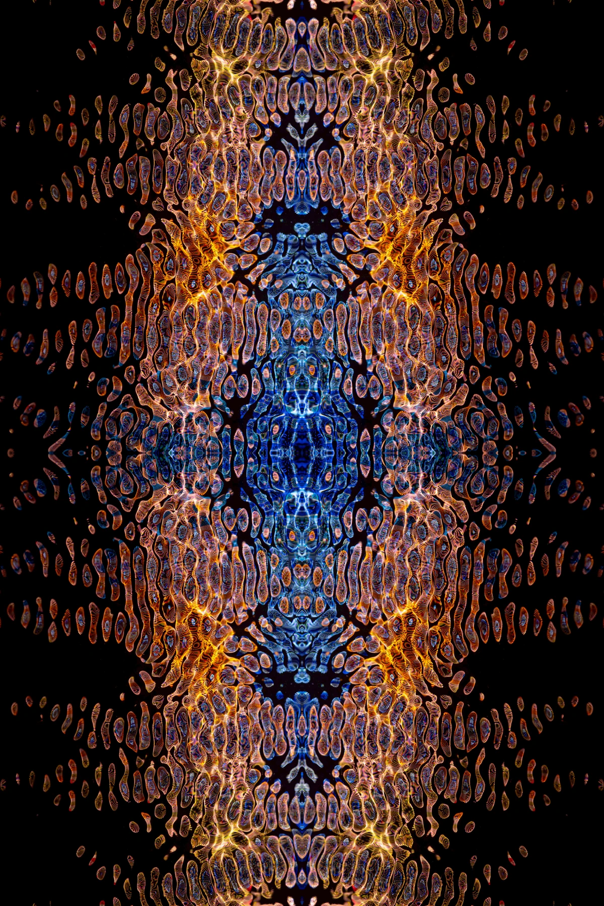
Texture & Magic Brushes
Digital art risks looking too "perfect." That’s where textures come in:

- Scan Real Media: Lay paper over watercolor paint, scan it, overlay, and set to overlay blending mode. Instant richness.
- Custom Brushes: Make your own! Scan actual brush strokes, load them as brushes, and create chaotic edges. My noise brushes? Saved every flat-colored piece I’ve ever made.
- Paper Textures: Don’t overdo it, but a subtle paper grain layer adds warmth. Like digital canvas underwear for your masterpiece.
Color Theory for Digital Artists
Colors vibrate differently on screen. Here’s how to control them. Traditional color theory works digitally, but you need to account for how screens display colors differently than printed materials or physical paint.
Digital Color Psychology
Screen vs. Print Color Differences:
- RGB vs. CMYK: Screens use additive color (light), prints use subtractive (ink)
- Gamma correction: Screens appear brighter than printed materials
- Color profiles: Different devices have different color gamuts
- Viewing conditions: Ambient lighting affects how we perceive colors
Building Digital Color Palettes:
- Start with 3-5 colors: Too many colors create visual chaos
- Use the 60-30-10 rule: 60% dominant color, 30% secondary, 10% accent
- Consider accessibility: Ensure sufficient contrast for readability
- Test in grayscale: Check if values work without color distraction
Advanced Color Techniques:
- Color harmony: Use analogous (adjacent on wheel) or complementary (opposite) schemes
- Color temperature: Warm colors advance, cool colors recede
- Saturation control: Desaturate backgrounds to make subjects pop
- Color grading: Apply unified color treatment to entire piece
Color Management Essentials
Working with Color Profiles:
- sRGB: Standard for web and digital displays
- Adobe RGB: Wider gamut for print work
- ProPhoto RGB: Largest gamut, but beware of file size
- Convert profiles: Don’t embed different profiles in same document
Calibration Best Practices:
- Monitor calibration: Use hardware calibration tools for accuracy
- Proof settings: Enable soft-proofing for print work
- Color temperature: Set to 6500K for consistent viewing
- Brightness: Adjust to match ambient lighting conditions
Exporting for Different Platforms:
- Web: Save as JPG or PNG with sRGB profile
- Print: Use CMYK color space, 300 DPI minimum
- Social media: Square format, optimized compression
- Mobile apps: Consider file size limits and loading times
- Use Color Pickers Sparingly: Don’t just pick random brights. Build cohesive palettes using analogous or complementary schemes.
- Color harmony tools: Use coolors.co or Adobe Color for palette inspiration
- Limit your palette: 3-5 colors maximum for cohesive work
- Color psychology: Consider what emotions different colors evoke
- Mind the Glow: Screens emit light unlike paint. Add muted tones next to brights to calm the eye—otherwise colors fight each other.
- Screen brightness: Adjust monitor brightness to match room lighting
- Color temperature: Use warmer tones for screen-friendly viewing
- Contrast control: Avoid extreme contrasts that cause eye strain
- Viewing distance: Consider how colors appear from different distances
- Export Adjustments: Colors can look different on phones vs. monitors. Test on real devices before declaring anything "finished."
- Device testing: Check colors on phone, tablet, and different monitors
- Time of day: Colors may appear different under various lighting conditions
- Print proofing: Order test prints before final production
- Social media preview: Use platform-specific preview tools
From Sketch to Showstopper: Your Workflow
Here’s how I tackle a piece from concept to completion:
1. **Thumbnail Sketching:** 20 tiny 1x1 inch ideas—quick, no pressure. Pick the strongest one.
2. **Rough Layout:** Full-size sketch focusing on composition. Where’s the eye drawn?
3. **Lineart Cleanup:** Refine lines; hide sketch layer. Fix wobbles here—it’s easier than later.
4. **Flat Colors:** Fill in shapes. Use clipping masks to keep colors inside lines. No shading yet!
5. **Shading & Lighting:** New layer, multiply blend. Shadows first, then highlights. No detail yet!
6. **Details & Effects:** Hair strands, sparkles, texture overlays. Save this for last—it’s addictive!
7. **Final Polish:** Check contrast, adjust curves, and add one "wow" element (like a glowing accent).
Challenges & How to Beat Them
Digital art has unique frustrations. I still face them, but here’s how I cope. The digital realm presents challenges that traditional artists rarely encounter, but with the right strategies, you can overcome them.
Mental & Creative Challenges
Overwhelm and Decision Paralysis:
- Problem: Endless options, tools, and techniques can freeze your creativity
- Solutions:
- Start with constraints: Limit your tools to just 3 brushes for a project
- Use templates: Create custom canvases with your preferred settings
- Break it down: Focus on one small part at a time
- My method: Start with a black background—it creates instant contrast and reduces visual noise
Creative Block and Burnout:
- Problem: The digital nature can make art feel repetitive and uninspiring
- Solutions:
- Change environment: Work from a different location or device
- Try new mediums: If you paint, try vector illustration
- Art challenges: Daily prompts like Inktober or self-created challenges
- My story: Once I painted nothing but toast for a week. Sounds crazy, but it broke my creative block completely
- Limit scope: Create something in 30 minutes—no perfection allowed
Perfectionism and Comparison:
- Problem: Social media makes it easy to compare your work to professionals
- Solutions:
- Hide social media: Take breaks from platforms that trigger comparison
- Focus on process: Document and celebrate your progress, not just results
- Embrace "good enough": Perfection is the enemy of completion
- Track improvement: Look back at your old work to see growth
Physical Health Challenges
Stylus Hand Cramps and Fatigue:
- Problem: Hours of holding a stylus can cause strain and fatigue
- Solutions:
- Ergonomic tools: Use pens with weighted barrels and comfortable grips
- Frequent breaks: Follow the 20-20-20 rule (every 20 minutes, look 20 feet away for 20 seconds)
- Stretching routine: Hand, wrist, and finger exercises
- Alternate hands: If you’re ambidextrous, switch hands periodically
- My setup: I use a Wacom Pro Pen 2 with a weighted grip and take breaks every hour
Eye Strain and Screen Fatigue:
- Problem: Staring at screens for long periods causes eye fatigue
- Solutions:
- Blue light filters: Use software or glasses that reduce blue light
- Monitor positioning: Keep screen at eye level, about arm’s length away
- Screen calibration: Adjust brightness and contrast to comfortable levels
- Ambient lighting: Ensure room lighting doesn’t cause screen glare
- My routine: Every 2 hours, I look out a window for 5 minutes to rest my eyes
Posture and Back Pain:
- Problem: Poor posture during long drawing sessions
- Solutions:
- Ergonomic chair: Invest in proper seating with lumbar support
- Desk height: Ensure your elbows are at 90 degrees when drawing
- Standing desk: Alternate between sitting and standing
- Movement breaks: Stand up, stretch, and walk around every hour
- My setup: I use an adjustable standing desk and set reminders to change positions
Technical Challenges
Software Crashes and File Corruption:
- Problem: Losing hours of work to technical failures
- Solutions:
- Auto-save settings: Set frequent auto-saves (every 5-10 minutes)
- Version control: Save incremental versions of your work
- Cloud backup: Use services like Dropbox or Google Drive for backups
- Hardware redundancy: Keep external drives with recent backups
- My system: I save every 15 minutes and keep 3 backup locations
Performance Issues and Lag:
- Problem: Slow performance with large files or complex brushes
- Solutions:
- Optimize files: Reduce resolution for working files, upsize only for final export
- Brush settings: Use fewer brush dynamics for better performance
- Layer management: Merge layers when possible during working stages
- Hardware upgrades: Consider more RAM or SSD storage
- My workflow: I work at 50% scale during early stages, then scale up for final details
Sharing & Selling Your Digital Work
Digital art is easy to share—but easy to get lost in the noise. Here’s how to stand out:

Online Presence
- Portfolio: Only show your best 10-15 pieces. Quality over quantity, always.
- Curation: Be ruthless—if it doesn’t make you proud, don’t show it
- Organization: Group work by style, theme, or client type
- About section: Tell your story and artistic philosophy
- Contact information: Make it easy for potential clients to reach you
- Mobile optimization: Ensure portfolio looks great on all devices
- Process Videos: People love watching messy beginnings and final polish. It humanizes your art.
- Equipment: Use screen recording software like OBS or built-in tools
- Editing: Speed up boring parts, add music for mood
- Platform choice: YouTube for long tutorials, TikTok/Instagram for quick clips
- Content variety: Show different techniques, mistakes, and solutions
- Engagement: Ask viewers what they want to see next
- SEO Basics: Tag images with descriptive terms (e.g., "abstract digital painting teal and gold" rather than "my art").
- File names: Use descriptive names like "ocean-abstract-blue-gold-digital-art.jpg"
- Alt text: Describe the image for accessibility and SEO
- Image descriptions: Write detailed captions explaining the piece
- Keyword research: Use tools like Google Keyword Planner to find search terms
- Local SEO: Include location terms if targeting local clients
Selling Right
You’re here because you love art, not capitalism—but if you want to sell, avoid these pitfalls. Pricing and selling digital art requires business thinking alongside artistic vision. I’ve made every mistake possible in this area, so learn from my experience.
Pricing Strategies That Work
The Pricing Formula:
- Time calculation: Track how long pieces take (include planning and revisions)
- Material costs: Software subscriptions, hardware depreciation, texture packs
- Skill premium: Your expertise and artistic vision add value
- Market research: What do similar artists charge?
- Client budget: Be prepared to adjust for different markets
Common Pricing Models:
- Hourly rate: $25-150/hour depending on experience
- Project-based: Quote for entire project scope
- Per piece: Set prices for different sizes and complexities
- Subscription model: Regular content for recurring payment
- Licensing fees: One-time or ongoing use of your work
My Pricing Philosophy:
- Never work for free: Even friends pay something—it respects your craft
- Graduated pricing: Smaller pieces = lower prices, larger = higher
- Package deals: Offer prints + digital files + merchandise bundles
- Seasonal adjustments: Raise prices as your skills improve
- Transparency: Be clear about what clients get for their money
Digital Sales Platforms
Print-on-Demand Services:
- Pros: No inventory, automatic fulfillment, global shipping
- Cons: Lower profit margins, less control over quality
- Top platforms: Printful, Printify, Redbubble, Society6
- My setup: I use Printful for high-quality prints and Redbubble for casual merchandise
Direct Sales Platforms:
- Pros: Higher profits, direct customer relationships, full control
- Cons: Requires marketing, inventory management, shipping
- Top platforms: Shopify, Etsy, Big Cartel, Gumroad
- My strategy: Shopify for premium prints, Etsy for smaller items
NFT Platforms (Proceed with Caution):
- Environmental concerns: Energy usage is significant
- Market volatility: Prices can swing dramatically
- Regulatory uncertainty: Laws are still developing
- My position: I avoid NFTs due to environmental concerns and market instability
Print Production and Fulfillment
Quality Control Essentials:
- Test prints: Always order samples before offering to customers
- Paper selection: Choose archival-quality paper for longevity
- Color calibration: Ensure prints match digital files
- Packaging: Invest in professional presentation
- Shipping: Use protective packaging and tracking
Packaging That Sells:
- Unboxing experience: Create memorable opening moments
- Branding: Include business cards, thank you notes
- Certificates of authenticity: Add value and legitimacy
- My approach: I use custom packaging with my logo and a handwritten thank you note
- Don’t Undercharge: Factor in software costs, time, and originality. Your art isn't "just digital." It's skill, time, and vision.
- Calculate true costs: Include software subscriptions ($20-50/month), hardware ($1000+ initial), and your time
- Research market rates: Check what similar artists charge in your niche
- Start higher than you think: You can always lower prices later, but raising them is difficult
- Value your uniqueness: What makes your style special? Charge for it
- NFTs Proceed with Caution: The market is volatile, environmental concerns are real, and regulation is murky. I've sold digital prints for years with zero NFT drama. Stable, sustainable, and—I'd argue—more rewarding.
- Environmental impact: Bitcoin mining uses more energy than some countries
- Market speculation: Prices often don't reflect actual artistic value
- Legal uncertainty: Copyright and ownership laws are still developing
- My alternative: Focus on traditional prints, merchandise, and digital downloads
- Offer Physical Prints: Bridge the gap between digital and traditional. This is where I found my happiest collectors. Explore my print collections for inspiration on how packaging and presentation matter.
- Quality over quantity: Fewer high-quality prints sell better than many mediocre ones
- Limited editions: Create scarcity with numbered, signed prints
- Size variety: Offer different sizes to accommodate different budgets and spaces
- Custom framing: Partner with local framers for complete packages
Artist Community
You need peers. Badly. I found mine through:
- Sketchbook Challenges: Daily or weekly prompts keep you practicing
- Popular challenges: Inktober, Drawcember, MerMay, Inksgiving
- Creating your own: Develop challenges specific to your style and interests
- Community building: Share your progress and encourage others
- Skill development: Consistent practice builds muscle memory and style
- Discord Server: For critique and camaraderie
- Finding communities: Search for "digital art," specific software, or art style servers
- Participating actively: Share work, give feedback, ask questions
- Creating your own: Build a community around your artistic niche
- Moderation: If you create a server, establish clear guidelines and moderation
- Instagram Reels: Show personality, not just finished art
- Content variety: Process videos, studio tours, quick tips, artist interviews
- Engagement strategies: Ask questions, run polls, respond to comments
- Hashtag research: Use relevant but not oversaturated tags
- Consistency: Post regularly but focus on quality over frequency
Building Your Creative Network
Finding Your Tribe:
- Local art groups: Check community centers and art schools
- Online forums: Reddit’s r/digitalart, specialized Discord servers
- Social media: Follow artists you admire and engage with their content
- Art events: Attend virtual and in-person exhibitions and workshops
- Collaborations: Partner with artists in complementary fields
Giving and Receiving Feedback:
- Specific requests: Ask for feedback on particular aspects ("How’s the composition?" not "What do you think?")
- Constructive criticism: Focus on actionable improvements, not just praise
- Receiving feedback: Listen openly, ask clarifying questions, decide what to implement
- Feedback groups: Join or create regular critique sessions with peers
Mentorship and Growth:
- Finding mentors: Identify artists whose work you admire and study their process
- Being mentored: Ask specific questions and show you’ve done your homework
- Becoming a mentor: Share what you’ve learned with beginners
- Continuous learning: Take courses, attend workshops, practice regularly
Collaboration Opportunities:
- Art trades: Exchange artwork with other artists
- Group projects: Collaborate on themed collections or exhibitions
- Commission exchanges: Trade services instead of money
- Teaching opportunities: Create workshops or courses based on your expertise
- My collaborations: I’ve done art trades, joint exhibitions, and even collaborated with musicians on album artwork
FAQs About Digital Canvas Art
Q: Do I need to be able to draw traditionally first? Not at all! I know amazing digital artists who never touched paper. Different hand skills. Some say digital art is more accessible because mistakes are less scary. Traditional drawing skills help, but they’re not required. Digital art has its own muscle memory and techniques.
Q: Is digital "cheating"? Only if you’re using AI generators. Tools don’t create art—intent does. A hammer doesn’t build a house; a carpenter does. Same here. The creativity comes from you, not the software. Even with the most advanced tools, if you don’t have vision and skill, the result will reflect that.
Q: Can I print digital art? Absolutely! Just save at 300 DPI. I’ve had large prints done that rival traditional works. Bonus: you can reprint when the cat "accidentally" hangs a piece on the wall. The key is using high-quality printers and paper. I recommend archival-quality paper for longevity.
Q: Which software is best for beginners? Canva is surprisingly robust for artists. It’s intuitive, has free options, and is often overlooked for serious work. My advice? Try three tools, then pick one and master it. Other great options include Krita (free), Procreate (iPad), and Clip Studio Paint (affordable one-time purchase).
Q: How do I develop my style digitally? Steal from everyone until it becomes yours. Imitate artists you admire, then mashup styles. I blended watercolor textures with graphic design shapes and evolved from there. Style isn’t found—it’s forged. Keep experimenting, keep learning, and keep making art.
Q: What’s the best tablet for digital art? It depends on your budget and needs. Entry-level options like Wacom Intuos start around $50. Mid-range like Huion Kamvas offer screens around $300. Professional options like Wacom Cintiq or iPad Pro cost $1000+. For beginners, I recommend starting with a non-screen tablet to develop fundamental skills first.
Q: How long does it take to get good at digital art? Most artists see significant improvement within 3-6 months of consistent practice (1-2 hours daily). Professional-level skill typically takes 2-5 years. The key is consistent practice, not天赋. Even natural talent requires years of refinement.
Q: Do I need a powerful computer for digital art? Basic digital art can be done on most modern computers. For complex illustrations with hundreds of layers, you’ll want at least 16GB RAM and a dedicated graphics card. For animation or 3D work, more powerful hardware is recommended. Many artists work successfully on laptops with good specs.
Q: How do I protect my digital artwork online? Use watermarks on preview images, register copyrights for important pieces, and consider using low-resolution versions for social media. Some artists also use digital rights management (DRM) services. Remember, once something is online, it can be copied, but legal protection still exists.
Q: Can I make a living from digital art? Yes, but it takes business skills alongside artistic talent. Many digital artists work in illustration, concept art, UI design, animation, or sell prints and merchandise. Building a brand and marketing are as important as creating the art itself. Most successful artists diversify their income streams.
Q: What about animation in digital art? Digital animation is a natural extension of static digital art. Software like Adobe Animate, Toon Boom Harmony, or even Photoshop can create simple animations. Many digital artists start with small GIFs or short animations before moving to more complex projects.
Q: How do I handle creative blocks with digital art? Try working traditionally for a change, use art challenges, study artists outside your usual style, or take a complete break from creating. Sometimes the best solution is to step away and return later with fresh eyes. I find that switching between different digital tools can also break creative ruts.
Q: Are there any health concerns with digital art? Yes, repetitive strain injuries are common. Take regular breaks, practice good ergonomics, and consider exercises for your hands and wrists. Eye strain from screens is another concern—use proper lighting and take screen breaks. Many artists develop their own stretching routines to prevent issues.
Q: What file formats should I use for digital art? For working files, use PSD, XCF, or native software formats to preserve layers. For exports, use PNG for transparency, JPG for general use, and TIFF for high-quality prints. For web, consider WEBP for better compression. Always save multiple copies in different formats.
Q: How do I get feedback on my digital art? Join online communities like Reddit’s r/digitalart, Discord servers, or social media groups. Be specific about what kind of feedback you want (composition, colors, technique). Also consider art critique platforms or finding a mentor who can provide structured feedback.
Q: Can digital art look as good as traditional art? Absolutely! Many digital pieces are indistinguishable from traditional media. The key is understanding traditional techniques and applying them digitally. With the right tools and techniques, digital art can achieve the same depth, texture, and emotional impact as traditional artwork.
Q: What’s the difference between raster and vector digital art? Raster art (Photoshop, Procreate) uses pixels and is best for painting and photo manipulation. Vector art (Illustrator, Inkscape) uses mathematical equations and scales infinitely without quality loss, making it ideal for logos and illustrations. Many artists use both depending on their project needs.
Q: How much should I charge for digital art? Pricing depends on experience, complexity, market demand, and usage rights. Beginners might charge $20-50 for simple illustrations, while professionals can charge $200-2000+ for complex work. Consider factors like time invested, software costs, and your target market when setting prices.
Q: What are the best resources for learning digital art? YouTube channels like Proko and Drawabox offer free tutorials. Online platforms like Skillshare, Domestica, and School of Motion provide structured courses. Books like "Keys to Drawing" and "Color and Light" by James Gurney are excellent for fundamentals. Practice regularly and don’t be afraid to copy masters to learn.
Q: How do I build an art portfolio? Select your best 10-15 pieces that showcase your range and style. Organize them by theme or category. Include process shots to demonstrate your technique. Update your portfolio regularly as you improve. Consider both online platforms (Behance, ArtStation) and a personal website for maximum exposure.
Q: Can I use digital art for traditional printing? Yes! Just ensure your files are high resolution (300 DPI) and in the correct color space (CMYK for print). Many artists create digital art specifically for printing on various substrates like canvas, paper, or metal. Test prints are essential to ensure colors match your digital files.
The Takeaway
Digital art isn’t about being "techy"—it’s about embracing new pathways for expression. It’s frustrating, messy, and occasionally terrifying, just like any art worth making. But freedom? That’s what this gives you. The freedom to explore without fear, to create anywhere, to rewrite history with every Ctrl+Z.
Your Digital Art Journey Starts Now
Remember, every expert was once a beginner. That "professional" digital artist you admire? They started where you are now, with a blank canvas and more questions than answers. The difference isn’t talent—it’s persistence. They kept going when they wanted to quit, they learned from their mistakes, and they developed their own voice through countless hours of practice.

Key Principles for Success
Embrace the Process:
- Focus on learning, not perfect results
- Document your progress to see growth over time
- Celebrate small victories along the way
- Remember that every mistake is a learning opportunity
Develop Your Unique Voice:
- Study artists you admire but don’t copy them
- Experiment with different styles and techniques
- Let your personality and experiences show in your work
- Trust your artistic instincts, even when others don’t understand
Build Sustainable Habits:
- Create regularly, even when you don’t feel inspired
- Take care of your physical and mental health
- Balance creation with business and marketing
- Never stop learning and evolving as an artist
Final Thoughts
The digital canvas is more than just a tool—it’s a mindset. It represents possibility, freedom, and the endless potential of human creativity expressed through technology. Whether you’re creating for yourself, for clients, or for the world, remember that the magic doesn’t come from the software or the hardware. It comes from you—from your vision, your passion, and your willingness to keep creating even when it’s difficult.
So grab your tablet, ignore the "expert" voices, and make something that only you could make. And if you ever feel stuck? Visit my timeline to see how even pros have messy starts. Now go make some magic. The digital canvas awaits.
Resources to Continue Your Journey
Learning Resources:
- YouTube channels: Proko, Drawabox, Ctrl+Paint
- Online courses: School of Motion, Domestika, Skillshare
- Books: "Keys to Drawing" by Bert Dodson, "Color and Light" by James Gurney
- Communities: Reddit’s r/learnart, Discord art servers
Tools and Software:
- Free options: Krita, GIMP, Inkscape, Canva
- Paid options: Adobe Creative Cloud, Procreate, Clip Studio Paint
- Hardware: Wacom, Huion, XP-Pen tablets
- Accessories: Pen displays, tablet stands, screen protectors
Business and Marketing:
- Portfolio platforms: Behance, ArtStation, personal websites
- Print-on-demand: Printful, Printify, Redbubble
- Social media: Instagram, TikTok, Pinterest, Twitter
- Business resources: CreativeLive, The Futur, LinkedIn Learning
The digital art world is vast and constantly evolving. What’s cutting-edge today might be obsolete tomorrow, but the fundamental principles of art and creativity remain timeless. Focus on building strong foundations, stay curious, and never stop creating. Your journey as a digital artist is just beginning.
This guide was built from countless hours of trial, error, and discovery—both mine and the brilliant artists who shared their journeys along the way. If you have more questions, dive into the comments below!
About the Author
I’m a digital artist who’s navigated the same questions and challenges you’re facing now. What started as a hobby has evolved into a career spanning illustration, concept art, and teaching. My work blends traditional artistic principles with digital techniques, creating pieces that feel both timeless and contemporary.
Through years of trial and error, I’ve developed methods that help artists at all levels grow their skills and build sustainable creative practices. Whether you’re just starting out or looking to take your work to the next level, I’m here to help you unlock your digital art potential.
Connect with me:
- Follow my creative journey on social media
- Join my weekly art challenges and workshops
- Access exclusive tutorials and resources
- Get personalized feedback on your work
Remember, every masterpiece started as a single brushstroke. Your digital art journey begins today.