How to Photograph Your Art for a Portfolio: My Unvarnished Guide to Making Your Work Shine
Unlock the secrets to capturing your artwork beautifully for an impactful portfolio. This comprehensive guide covers everything from gear to lighting, editing, and common pitfalls, all from a personal, experienced perspective.
How to Photograph Your Art for a Portfolio: My Unvarnished Guide to Making Your Work Shine
I'll be honest with you, when I first started out, photographing my art felt like a mystical dark art itself. I mean, after pouring my soul onto a canvas or into a sculpture, the last thing I wanted was for a shoddy photo to diminish all that hard work. But a great photo for your portfolio? That's not just a nice-to-have; it's absolutely non-negotiable, a vital bridge between your creation and the eyes of the world. It’s how galleries, collectors, and potential buyers first meet your work.
Why Bother? The Portfolio's Power and Your First Impression
Think of your portfolio photos as the digital handshake, the virtual gallery visit. This is where you make your case, often before anyone ever sees the physical piece. A blurred, poorly lit, or color-inaccurate image doesn't just look unprofessional; it actively undermines the perceived value of your art. It whispers, "I don't really care enough to present this properly." And honestly, who wants that?
It's a reflection of your respect for your craft. And, let's face it, we live in a visual world. People scroll quickly. You have mere seconds to grab attention. High-quality images are your secret weapon.
The Big Picture: What Makes a Truly Good Art Photo?
So, what are we aiming for? I distil it down to three core principles, and trust me, they're harder to master than they sound, but utterly worth the effort:
- Clarity and Detail: Every brushstroke, every texture, every nuance should be visible. If someone can't zoom in and get a sense of the material, you've missed a trick.
- Color Accuracy: This is a big one. The colors in your photo must faithfully represent the original. There’s nothing worse than a collector receiving a piece and thinking, "Wait, this isn't the vibrant red I saw online!" It breaks trust.
- Context (or lack thereof): For a portfolio, most of the time, you want your artwork to be the undisputed star. No distracting backgrounds, no strange shadows. Just your art, beautifully presented. Sometimes, a well-placed contextual shot (e.g., your art in a simple, elegant room setting) can work wonders, but that's for specific showcasing, not typically the core portfolio shots.
Gear Talk: What You Actually Need (and What You Can Probably Skip)
Now, before you panic and think you need to mortgage your house for a fancy camera, let's talk essentials. I've photographed my work with everything from a high-end DSLR to my iPhone, and frankly, it's more about knowing how to use what you have than having the absolute best kit. Still, some things make life easier.
- Camera: A modern smartphone with a good camera can absolutely get you started. If you're serious, a DSLR or mirrorless camera offers more control. The key is manual settings.
- Tripod: Non-negotiable, in my humble opinion. Even the steadiest hands shake. A tripod ensures sharpness and consistency between shots, which is crucial if you're photographing a series of works.
- Lighting: We'll dive deeper into this, but good lighting is paramount. Sometimes, it’s just the sun; other times, it's a few inexpensive lights.
- Color Checker/Gray Card: Seriously underrated! This little tool helps you nail color accuracy in post-processing. I kick myself for not using one earlier.
Lighting is Everything (Seriously, Everything)
This is where most people — including my past self — go wrong. You can have the best camera in the world, but if your lighting is bad, your photos will be bad. End of story.
Natural Light: The Fickle Friend
Ah, natural light. It's free, it's beautiful, and it's also incredibly unpredictable. My favorite time to shoot is on a bright, overcast day. The clouds act like a giant softbox, diffusing the light evenly and reducing harsh shadows and glare. Try to avoid direct sunlight at all costs; it creates horrible hot spots and deep shadows. Find a north-facing window if you can, as it offers the most consistent light throughout the day. Place your artwork parallel to the window, not facing it directly.
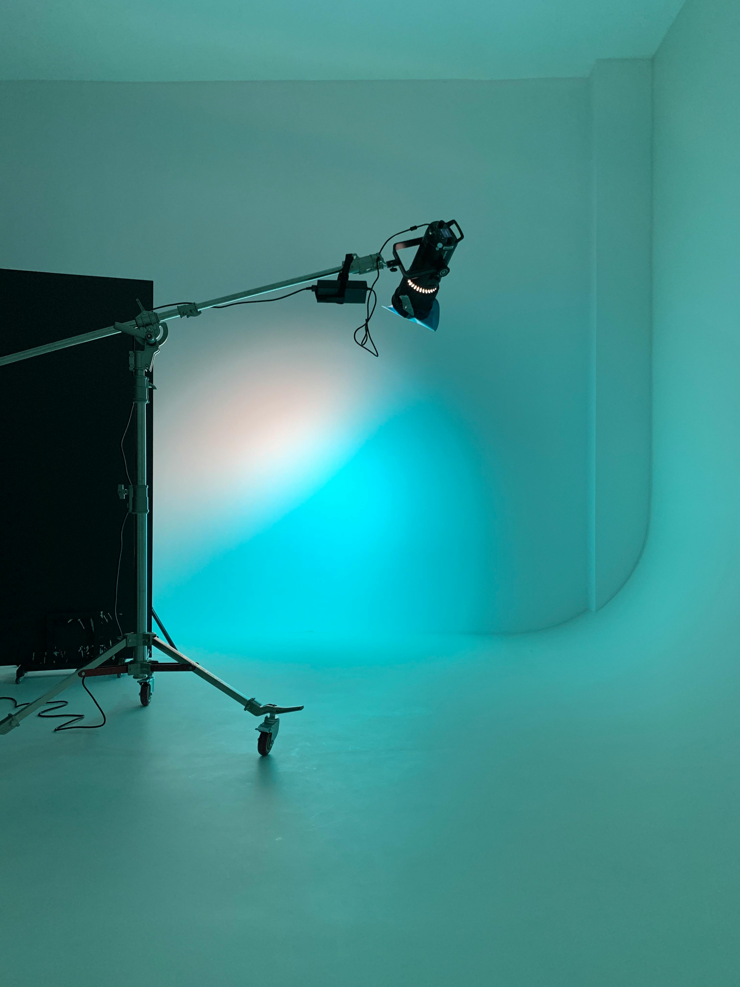
Artificial Light: The Controlled Chaos
This is where you gain control, and frankly, I prefer it because it's repeatable. You'll generally want two continuous light sources (not flashes, unless you really know what you're doing with studio strobes) placed at 45-degree angles to your artwork. This setup minimizes glare on flat surfaces like paintings and provides even illumination. I usually use LED softboxes, but even strong, diffused work lamps can work in a pinch. Remember, consistency is key for a cohesive portfolio.
If you're serious about creating a dedicated setup, I've had a lot of thoughts on how to properly light your art studio, which also applies here.

Feature | Natural Light (Overcast Day) | Artificial Light (Controlled Setup) |
|---|---|---|
| Cost | Free | Initial investment for lights/diffusers |
| Consistency | Variable (weather, time of day) | High, repeatable |
| Quality | Often beautiful, soft, even | Excellent, controllable |
| Setup Time | Minimal (find a good spot) | Moderate (positioning lights, diffusers) |
| Glare Control | Good with proper positioning | Excellent with 45-degree angles and diffusers |
Setting the Scene: Backgrounds and Framing
For portfolio shots, simplicity is your friend. A clean, neutral background—white, light gray, or black—lets your artwork speak for itself. Avoid patterned wallpaper, busy furniture, or anything that pulls focus. For flat works, you can mount them against a wall, or even lay them flat on a clean floor if you're shooting from directly above with a tripod. For 3D pieces, a seamless backdrop (like a roll of paper) creates a professional, infinite background.
Shooting Techniques for Different Mediums
Each type of art presents its own unique challenges. I've learned this the hard way.
Flat Artwork (Paintings, Drawings, Prints)
The goal here is perfectly flat, perfectly square, and glare-free. Set your camera on a tripod directly in front of the center of your artwork, ensuring the lens is parallel to the piece. This prevents distortion. Use a remote shutter release or a timer to avoid camera shake. For paintings with texture or gloss, those 45-degree angle lights with diffusers are your best friends to minimize glare.

Sculptural and 3D Work
This gets a bit more complex, but also more fun! You'll need multiple angles to show the piece comprehensively. Photograph it from the front, back, sides, and any interesting details. Think about the form and how light interacts with it. Use a turntable if you have one! Again, 45-degree lighting helps define form without harsh shadows. You might also want a 'detail' shot to highlight texture or a specific feature. Occasionally, a shot with a hand or another familiar object for scale can be helpful, but use sparingly and only if it enhances the understanding of the work.
The Post-Production Power-Up: Editing Basics
Raw photos are rarely perfect. A little post-production goes a long way. I use software like Adobe Lightroom or even free tools like GIMP or your phone's built-in editor. Focus on:
- Cropping and Straightening: Get those edges perfect. Use the grid overlay to ensure everything is perfectly straight and square.
- Color Correction: This is crucial. Use your color checker/gray card if you have one to white balance accurately. Adjust saturation and vibrance subtly to match the original. Resist the urge to make your art look 'better' than it is. Authenticity is paramount.
- Brightness and Contrast: Enhance detail and make your artwork pop without losing information in shadows or highlights.
- Sharpening: A touch of sharpening can bring out fine details, but don't overdo it, or your image will look artificial.
A Quick Note on File Formats and Sizes
When you're saving, think about where these photos are going. For online portfolios, you want high-resolution images that load quickly. Usually, a JPEG at 72 dpi with a long edge of 1500-2000 pixels is sufficient. For print portfolios or submissions, you'll need much higher resolution (e.g., 300 dpi TIFF files). I've covered this in more detail in articles like photographing artwork for web and print and how to photograph artwork for online sales. These are absolutely vital resources, so give them a read!
Curating Your Portfolio: Beyond Just Photos
While high-quality images are the foundation, a compelling portfolio is more than just a collection of pretty pictures. What else do I recommend including?
- Artist Statement: This is your voice, your philosophy. It helps people understand why you create what you create. If you're struggling, I have some thoughts on the art of the artist statement crafting your narrative that might spark some ideas.
- Biography/CV: Your professional journey, exhibitions, education, awards.
- Artwork Details: Title, medium, dimensions, year created, and price (if applicable).
It's about telling a complete story. What story do you want to tell about your artistic journey? You can see a bit of my own journey on my timeline.
Common Pitfalls I've Stumbled Into (So You Don't Have To)
Trust me, I've made all these mistakes and then some. Learn from my pain!
- Crooked Shots: Seriously, get a tripod and use your camera's grid overlay. There’s nothing less professional than a painting that looks like it's leaning.
- Bad Lighting/Glare: Direct flash, uneven room lighting, shadows from your own body. Avoid, avoid, avoid. This is the biggest killer of good art photos.
- Inconsistent Quality: Don't have one masterpiece photo and then three blurry, poorly lit ones. Every piece in your portfolio should be represented with the same dedication.
- Ignoring Color Accuracy: Your unique color palette is part of your artistic signature. Don't let bad photography misrepresent it.
- Cluttered Backgrounds: Resist the urge to show off your messy studio. The art is the star, remember?
FAQ: Your Burning Questions, Answered
What's the best camera to photograph art for a portfolio?
Honestly, the "best" camera is the one you have and know how to use well. A good quality smartphone (iPhone 11 or newer, recent Samsung Galaxy, etc.) with good lighting and a tripod can produce excellent results. If you're looking to invest, a mirrorless camera like a Sony Alpha series or Fujifilm X-T series, or a DSLR like a Canon Rebel or Nikon D3500, offers more manual control and larger sensors for better image quality.
Can I just use my phone to photograph my art?
Absolutely! Modern smartphones have impressive cameras. The key isn't necessarily the camera itself, but lighting, stability (use a tripod!), and post-processing. You'll need to use apps that allow manual control over ISO, shutter speed, and white balance to get the best results. Treat your phone like a serious camera, and you'll be surprised.
How many photos should I include per artwork in my portfolio?
For flat artwork (paintings, drawings), usually one perfectly square, full-shot photo is sufficient. For sculptural or 3D work, you'll want 3-5 photos from different angles to give a comprehensive view, including at least one full shot and a few detail shots. Always prioritize quality over quantity.
Should I include in-situ (contextual) photos of my art?
Yes, but judiciously. In-situ photos (your art displayed in a room, on a wall, etc.) can help potential buyers visualize the artwork in a home or gallery setting. However, these should complement, not replace, your clean, white-background portfolio shots. Ensure the contextual environment is minimal and doesn't distract from the artwork itself. You can also explore options like choosing art for your living room to see examples of good contextual photography for inspiration.
Should I use watermarks on my portfolio photos?
This is a personal choice. Watermarks offer some protection against unauthorized use, but they can also distract from the artwork itself. If you're concerned, place a small, subtle watermark in a less intrusive area. For official submissions to galleries or competitions, generally, watermarks are discouraged unless explicitly requested. If you are selling your art, remember that the high-resolution files you send to clients won't need a watermark.
My Final Thoughts: It's All About Respect
Ultimately, photographing your art for a portfolio isn't just a technical task; it's an act of respect. Respect for the hours you poured into creating your work, respect for your artistic vision, and respect for the people you hope will engage with it. Invest the time, learn the tricks, and don't be afraid to experiment. Your art deserves to be seen in its best light, literally. And when it is, well, that's when the magic truly begins. Ready to share your creations with the world? You can always buy some of my work to see how it's presented!


