My Quest for the Perfect Line: An Artist's Deep Dive into Drawing Pens for Abstract Art
You know that feeling when you pick up a tool, and it just *clicks*? Like it's an extension of your hand, a whisper of your thought on paper? I chase that feeling, especially with drawing pens. As an artist who finds solace and expression in abstract art, the humble line is often where it all begins for me. It's not just about putting ink on paper; it's about defining emotion, creating movement, building texture. So, yeah, I've got a bit of a pen obsession, and I've tried more than my fair share. In this deep dive, I'll share the ones that made the cut, the ones that disappointed, what I personally look for in a good pen, and most importantly, how to choose the right tools that integrate seamlessly into your own abstract practice. This article will cover specific pen types, my personal criteria for selection, and practical advice to help you find your perfect line, comparing various drawing pens suitable for artists, covering different ink types, nibs, and applications.
My Quest for the Perfect Line: An Artist's Deep Dive into Drawing Pens for Abstract Art
You know that feeling when you pick up a tool, and it just clicks? Like it's an extension of your hand, a whisper of your thought on paper? I chase that feeling, especially with drawing pens. As an artist who finds solace and expression in abstract art, the humble line is often where it all begins for me. It's not just about putting ink on paper; it's about defining emotion, creating movement, building texture. So, yeah, I've got a bit of a pen obsession, and I've tried more than my fair share. In this deep dive, I'll share the ones that made the cut, the ones that disappointed, what I personally look for in a good pen, and most importantly, how to choose the right tools that integrate seamlessly into your own abstract practice. This article will cover specific pen types, my personal criteria for selection, and practical advice to help you find your perfect line, comparing various drawing pens suitable for artists, covering different ink types, nibs, and applications.
The Pen Predicament (My Journey Through Ink and Nib)
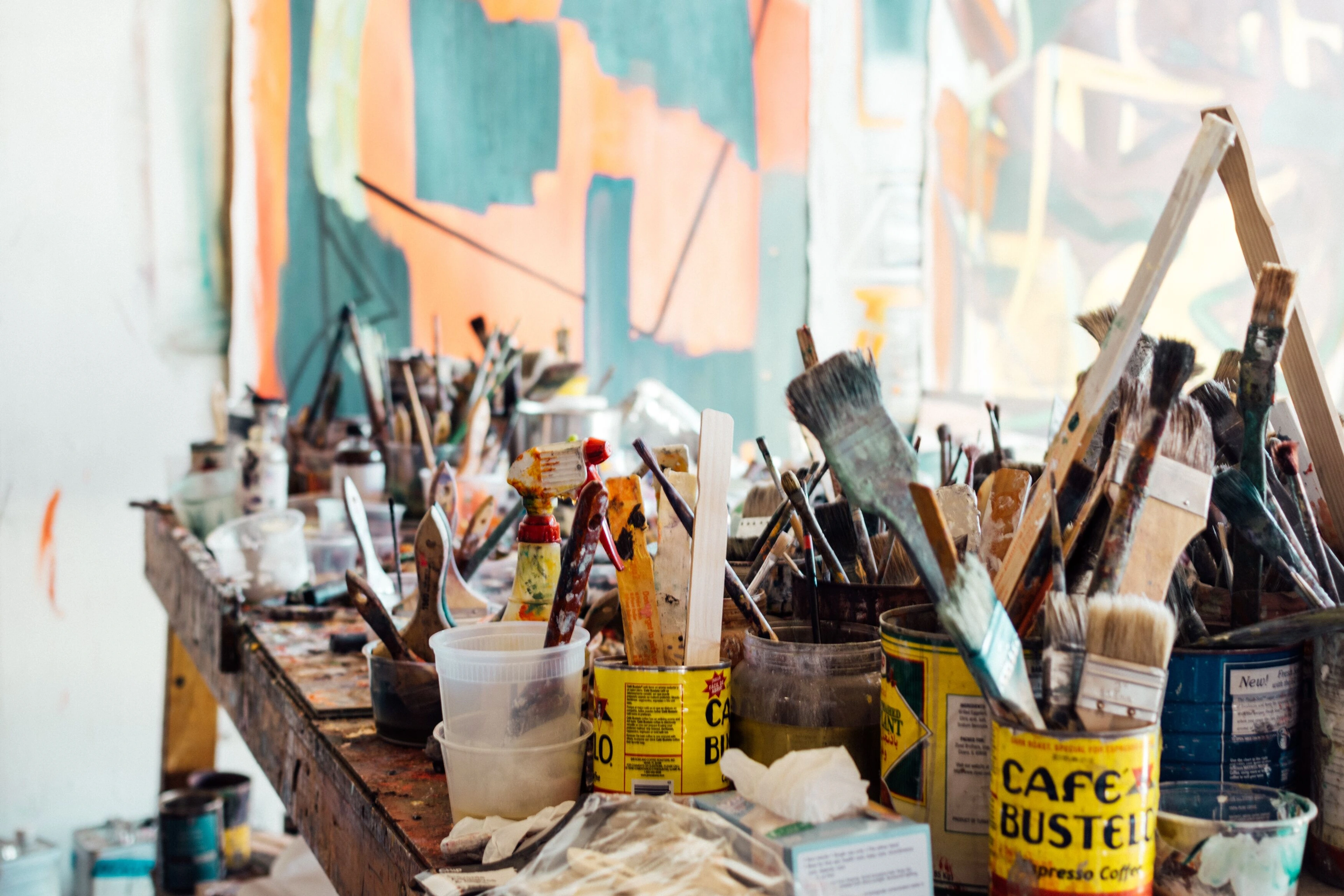
I remember starting out, grabbing whatever cheap pen was lying around. And look, sometimes that's all you need, right? But then you hit a wall. The ink bleeds, the nib scratches, the line isn't quite... you. That's when I started my deep dive, a journey that felt a bit like being a mad scientist in a cluttered lab. My studio, I confess, is less 'organized precision' and more 'controlled chaos,' often with a forgotten coffee cup playing hide-and-seek among the brushes. I've had my share of failed experiments, like that one time I tried using an ancient, rusty dip pen with acrylic ink—a total disaster. The nib grated like fingernails on a chalkboard, the thick acrylic refused to flow, clumping into a sludge that tore at the paper, leaving behind nothing but a muddy, lumpy mess and a distinctly unpleasant metallic smell. Or the time I thought a cheap highlighter pen, vibrant as it was, would work for foundational sketches. It bled through every page, turning my beautiful sketchbook into a ghostly echo of its former self – a haunting, yellow-green stain on every subsequent drawing. And then there was the glitter pen incident – seemed like a fun idea for a pop of shimmer, but the ink flow was so inconsistent, it left more frustrating gaps than sparkle, and then clogged irrevocably after just one use. Oh, and the time I tried using a ballpoint pen on a heavily gessoed canvas for some preliminary marks; the ink skipped and glopped, refusing to adhere to the slightly slick surface, creating a patchy, uneven mess that I ended up having to paint over entirely. But it's all part of the process, this endless dance of trial and error. I even have a drawer dedicated solely to retired pens – a graveyard of good intentions and mismatched nibs, each with a story of a line that just wasn't meant to be.

This personal struggle for the perfect line is, of course, as old as art itself. Before we dive into the specifics of modern drawing pens, it’s worth remembering that the human quest for expressive mark-making tools goes back millennia. From charcoal on cave walls to reeds and quills dipped in lampblack ink, artists have always sought ways to translate thought into tangible lines. Each era brought new innovations, refining the delivery of pigment to surface, much like our ongoing journey today. The invention of the steel nib in the early 19th century democratized writing, moving beyond temperamental quills. Then came the fountain pen, a marvel of engineering that brought portable, continuous ink flow, liberating artists and writers from dip pots. By the 20th century, precision technical pens emerged, indispensable for drafting and architectural plans, bringing an era of exacting, consistent lines. So, in a way, my messy studio full of discarded pens is just a contemporary echo of that ancient, enduring pursuit of the perfect line.
Key Pen Types I've Explored (and Loved/Loathed)
Over the years, I've spent countless hours, and a fair bit of coin, exploring the vast universe of drawing pens. While many pens exist, including everyday gel or rollerball pens, I've found that for serious abstract art, especially pieces I hope will last, they often lack the archival quality, lightfastness, and diverse nib types needed. Crucially, the ink flow – how smoothly and consistently ink is delivered from the nib to the paper – is a defining characteristic for each pen type, impacting line quality and overall user experience. Here's a rundown of the main players I've welcomed (or sometimes, reluctantly tolerated) into my artistic toolkit:
- Fineliner Pens: The Precision Whisperers These are often the workhorses, aren't they? Brands like Pigma Micron or Staedtler Pigment Liners. These are typically quite affordable and readily available. I swear by them for intricate details, crisp outlines, and adding those delicate layers that truly build depth in my abstract pieces. While most fineliners use a felt tip, some brands offer needle-point versions. The felt tips are generally smoother but can wear down quicker, while needle-points provide incredible control for minute details and often have better durability, though they can feel a bit scratchier on certain papers. You might also encounter 'liner pens' specifically designed for drawing, which often boast even more robust nibs and superior pigment inks for artistic applications. They're usually waterproof and lightfast, which is a godsend when you're layering with washes or other mixed media. The consistent line weight they offer is fantastic for creating geometric patterns or subtle textural elements. Think of artists like Sol LeWitt or Agnes Martin, who often used precise, repetitive lines to build complex, minimalist structures; fineliners are their modern equivalent for achieving such exacting detail. Just a quick note: while many fineliners use archival pigment inks, watch out for cheaper dye-based options if permanence is key – those vibrant colors might not stand the test of time. The only downside? Sometimes they feel a bit too... uniform. It's that consistent line, the lack of organic variation, that can feel restrictive when I want raw, emotional gestural marks. So, does this surgical precision resonate with your artistic spirit, or do you crave a bit more... looseness?
- Brush Pens: The Expressive Dancers Oh, the joy of a good brush pen! Tombow Dual Brush Pens, Pentel Arts Brush Pen, even some of the more elaborate refillable ones. These range from affordable to mid-range. These are where I turn when I want to unleash some wild, expressive energy. They can go from a super fine line to a broad, bold stroke with just a change in pressure. For instance, a quick flick of the wrist with a brush pen can create a sweeping, energetic arc, instantly conveying movement or adding dynamic sweeps. Abstract Expressionists like Franz Kline embraced the dynamic sweep, and while he used brushes, the spirit of bold, gestural expression is perfectly captured by a brush pen's versatility. A good brush pen also offers excellent snap-back, meaning the flexible tip returns quickly to its original shape after pressure is released, allowing for crisp, precise transitions between thin and thick lines. The ink is often dye-based, so be mindful of lightfastness and water resistance if you're planning on heavy layering. However, pigment-based options are emerging, often found in high-quality Japanese brush pens, offering excellent permanence. They've taught me a lot about varying line in abstract art – how a single mark can carry so much weight and emotion. Are you ready to let your lines dance?
- Technical Pens: The Uncompromising Architects Let's be clear: when I talk about 'technical pens,' I'm thinking of the true precision drafting tools like Rotring Isographs, which are designed to be refillable and maintained, featuring a metal nib and internal mechanism for consistent ink flow. These are distinct from what some might call 'technical' but are actually high-quality fineliners (like many Faber-Castell Pitt Artist Pens) that are disposable felt-tip markers. True technical pens are often refillable, with metal nibs designed for exacting drafting and an unyielding, consistent line. These are often an investment, but worth it for precision. I don't reach for these daily, but when I'm working on a piece where exacting geometric forms are paramount, or I need an incredibly even, dense black line, they're indispensable. For those who admire the meticulous grids of Agnes Martin or the detailed architectural renderings where every line counts, these pens are indispensable. I once had a commission for a highly geometric abstract where every line had to be perfectly straight and uniform – a technical pen saved me from endless frustration and made the details pop. They demand a certain respect and a steady hand. Not for the clumsy among us, like me, who occasionally forgets to cap them and ends up with a dried-out, clogged mess – a minor artistic tragedy that feels disproportionately annoying when it happens! Do you crave unyielding consistency in your marks, or are you, like me, occasionally prone to minor artistic calamities?
- Fountain Pens: The Soulful Storytellers Now, a fountain pen isn't traditionally a 'drawing pen' for everyone, but for me, it's a fascinating tool. Filled with artist-grade, waterproof pigment inks like De Atramentis Document Inks or Platinum Carbon Black, they offer a flow and character unmatched by most disposable pens, with superior lightfastness and permanence. They typically use either pre-filled ink cartridges (convenient, but limited color choice and more waste) or a converter (a small, refillable reservoir that draws ink from bottles, offering vast color options and greater sustainability). The feed – the intricate system of channels that draws ink from the reservoir to the nib – plays a crucial role in regulating ink flow, preventing blobbing or skipping. The initial cost can be a bit of an investment, but bottled inks are very economical in the long run. The nibs can vary wildly, from extra fine to flexible 'flex' nibs that give you line variation similar to a brush pen. Nib materials also play a role; steel nibs are common and durable, while gold nibs often offer a bit more 'bounce' and a smoother writing experience, though they come with a heftier price tag. Another unique artistic quality of fountain pen inks is shading (where the color varies in intensity across a line) and sheen (where the ink displays a metallic or iridescent luster at certain angles), adding another layer of visual interest. Artists like Cy Twombly, with his expressive, almost calligraphic scribbles, show how deeply personal and emotive ink lines can be, a spirit easily echoed by a good fountain pen. There's a ritual to them, isn't there? Filling the converter, cleaning them regularly (a bit like tending to a demanding, inky pet), dealing with the occasional nib creep or blobbing if the ink isn't just right... it's a commitment. But the lines they produce, especially with unique ink colors, carry a certain depth and personality. It feels more connected to the act of creation, a bit like a personal journey. Are you drawn to the ritual and unique character of a fountain pen, even with its quirks?
- Dip Pens: The Explorers of Infinite Ink Not strictly a 'pen' in the modern sense, but a holder for interchangeable nibs, used with bottled ink. Dip pens offer unparalleled versatility in line quality and ink choice, from super-fine to expressive broad strokes. You can use traditional India ink (known for its rich black and permanence), sumi ink (great for washes and subtle tonal shifts), drawing inks (often pigment-based and available in various colors), watercolor, or even thinned acrylics. With a range of nibs like mapping nibs for incredible detail or broad-edge nibs for calligraphic flourishes, the possibilities are vast. They require patience and a separate ink source, making them less portable, but the freedom to experiment with different inks and nibs is incredibly rewarding. I love them for their unpredictable charm and for achieving unique textures and dark, rich blacks that modern pens can sometimes miss.
- Calligraphy Pens & Markers: The Bold Statement Makers Whether it's a traditional dip pen with India ink (requiring separate ink and nibs) or a modern chisel-tipped calligraphy marker (often very affordable), these are for when you want to make a statement – a declaration, a visual shout! Broad strokes, dramatic flair, a real sense of unapologetic presence. I use these sparingly in my abstract work, mostly for adding very deliberate, heavy marks or bold textural elements. Sometimes, a single, powerful calligraphic stroke can serve as a strong focal point, drawing the eye and contrasting sharply with more delicate lines – like a broad, sweeping arc of India ink dissecting a field of delicate cross-hatching, creating immediate visual tension. Think of how Robert Motherwell incorporated bold, powerful forms in his Elegies, or contemporary artists using large graphic elements; calligraphy pens deliver that kind of visual punch. They require a different approach, almost like painting with a pen, which is a fun challenge when you're trying to push your boundaries. So, are you ready to let your lines command attention and deliver a truly unforgettable flourish?
- Specialty Pens & Digital Tools: Expanding the Horizon Beyond the traditional categories, there's a growing universe of specialized tools. Paint markers, like those from Posca or Molotow, offer opaque, vibrant color with a pen-like delivery system, perfect for bold accents or covering larger areas with crisp edges. Their opacity allows them to layer over other colors and media without becoming transparent, making them invaluable for creating strong visual contrasts and highlights in abstract compositions. While not always 'pens' in the strictest sense, their immediacy and versatility make them invaluable for certain abstract applications. And then there's the digital realm: graphic tablets and styluses for programs like Procreate or Photoshop. While the tactile sensation is different, these tools allow for incredible experimentation with line, texture, and color in a non-destructive environment, often serving as a powerful planning or sketching tool before committing to physical media. Beyond physical tools, the digital realm offers powerful alternatives. Graphic tablets and styluses paired with software like Procreate or Photoshop allow for digital brushes that can mimic the tactile feel and line variations of traditional pens, providing a non-destructive space for planning and experimentation. They don't replace the joy of ink on paper for me, but they certainly expand the possibilities of what a 'drawing tool' can be.
Pen Type Summary
To quickly compare, here's a brief overview of the characteristics of each pen type I've discussed:
Pen Type | Nib Type | Ink Type (Typical) | Line Variation | Best For | Potential Downsides |
|---|---|---|---|---|---|
| Fineliner Pens | Fine felt/plastic | Pigment-based (archival) | Minimal/Consistent | Intricate details, crisp outlines, consistent lines | Can feel 'uniform', less organic feel |
| Brush Pens | Flexible brush | Dye/Pigment-based (dye can fade) | High (pressure-sensitive) | Expressive strokes, varying line weight, movement | Dye inks less lightfast, can fray |
| Technical Pens | Rigid metal | Pigment-based (archival) | Minimal/Consistent | Exacting precision, uniform dense lines | High maintenance, less expressive |
| Fountain Pens | Metal (various flex) | Dye/Pigment-based (dye can fade) | Moderate to High (flex nibs) | Unique line character, varied ink colors, ritual | Maintenance required, specific inks needed |
| Dip Pens | Interchangeable metal | Various (India, sumi, watercolor) | High (nib/ink dependent) | Experimental lines, custom ink effects, rich blacks | Less portable, messy, requires separate ink |
| Calligraphy Pens | Chisel, broad felt/metal | India ink/Dye-based (dye can fade) | Moderate (angle/pressure) | Bold statements, dramatic flair, strong focal points | Less control for fine detail |
| Specialty Pens | Various, often broad | Pigment (opaque acrylic/gouache) | Minimal/Consistent | Bold accents, opaque color, covering areas | Can be bulky, less fine detail |
With these types in mind, let's delve into the specific qualities I prioritize when selecting a pen.
What I Look For in a Drawing Pen (My Personal Criteria)
But beyond the broad strokes of pen categories, what truly makes a pen sing in my hand, helping me hit that elusive perfect line? So, after all that experimentation, what's my personal checklist when I'm eyeing a new pen? It boils down to a few key things that really impact my process. Remember, these are my priorities, and yours might be different – that's the beauty of art, isn't it?

credit, licence
- Nib Type & Feel: This is hugely personal. Do I want a needle-fine point for precision or a robust brush for sweeps? How does it feel on the paper – smooth, scratchy, juicy? A good nib should offer control without feeling restrictive. It should also provide good feedback – that subtle tactile sensation of the nib on paper. For me, that 'feedback' might be a whispery drag that lets me feel the paper's texture and control my mark, or a subtle resistance that tells me I'm connected to the surface. Nothing worse than a nib that frays after a few uses.
- Ink Type & Longevity: Is it pigment-based or dye-based? Will it fade in sunlight (lightfastness)? Is it waterproof when dry? For my work, especially pieces that might end up in a collection, permanence is crucial. Imagine spending hours on an intricate piece, only for its vibrant blues and reds to soften into pale ghosts a few years later when exposed to indirect sunlight – that's the risk with non-lightfast dye inks. Think of pigment inks as tiny, tough shields for your colors, made of solid particles that resist fading, while dye inks are more like delicate fabrics whose color molecules can break down over time. I definitely don't want my vibrant lines to turn into ghostly whispers. It’s also worth noting the distinction between archival inks (designed for extreme longevity, often pigment-based and acid-free for preserving documents) and artist-grade inks (which prioritize lightfastness and permanence for artworks, but might not always meet the strict acid-free criteria of true archival documents). For most abstract art, artist-grade pigment inks are more than sufficient. Beyond permanence, consider ink viscosity (how thick or thin the ink is, affecting flow and potential feathering) and drying time (crucial for layering and preventing smudges, especially for left-handed artists like myself).
- Ergonomics & Comfort: Call me old-fashioned, but if a pen isn't comfortable to hold for extended periods, it's a non-starter. I often get lost in my work, and the last thing I need is a cramped hand pulling me out of the flow. My hand cramps faster than a beginner's sketch sometimes, so weight, grip, balance – they all matter more than you'd think.
- Refillability & Sustainability (and Cost): I'm trying to be more mindful of my environmental footprint, so pens that can be refilled (like many technical pens or fountain pens) get extra points. Beyond just reducing plastic waste from cartridges, the manufacturing of disposable pens consumes significant resources and contributes to landfill waste. Choosing bottled ink for a refillable pen drastically cuts down on this and is often more cost-effective in the long run; while the initial investment might be higher, buying ink in bottles or refills is usually cheaper than constantly replacing disposable pens. It’s a small change, but one that feels good both for the planet and my wallet.
- Versatility for Mixed Media: Can it stand up to layers of acrylics, pastels, or watercolor washes? Will it smudge, bleed, or lift? Compatibility with other materials is a big deal in my studio.
- Paper Compatibility: This might seem obvious, but the wrong paper can ruin a good pen experience. For most pen work, I’d recommend smoother surfaces like Bristol board, hot-press watercolor paper, or a heavy-weight drawing paper (100-140lb) to prevent feathering and preserve nib integrity. Conversely, very thin papers (like newsprint) can bleed, and highly textured cold-press watercolor paper can fray delicate nibs, especially fineliners. Always test a new pen, or even a familiar one, on a scrap piece of the actual paper you intend to use for your final artwork. Trust me, unexpected feathering or bleed-through can turn excitement into exasperation! Also, be aware that very wet or highly saturated inks can sometimes cause even heavy papers to buckle or warp. For intense applications, consider stretching your paper first or working on a rigid board for support.Paper as a Partner: Matching Your Surface to Your MarkWhile we obsess over the pen, let's not forget the silent partner in every mark: the paper. The right surface can elevate your marks, while the wrong one can fight you every step of the way. Think of paper as an active participant in your artistic dialogue. Here’s how different types play along:
- Smooth Surfaces (Bristol Board, Hot-Press Watercolor): These are my go-to for crisp, clean lines. Fineliners and technical pens glide effortlessly, leaving behind unblemished, precise marks. Ink sits on the surface beautifully, preventing feathering (where ink spreads along the paper fibers, making lines fuzzy). Ideal for intricate details, geometric precision, or when you want your ink to look particularly vibrant.
- Slightly Textured Surfaces (Vellum, Medium-Weight Drawing Paper): Here, you get a little more character. Brush pens can show slight variations in stroke due to the tooth of the paper, adding organic richness. Fineliners still perform well, but you might feel a subtle drag, giving you more feedback. This is a versatile sweet spot for many abstract artists, offering a balance between control and expressive potential.
- Rough/Cold-Press Watercolor Paper: This is where things get interesting, but also a bit tricky. The texture can gobble up delicate fineliner nibs, causing them to fray quickly. However, for dip pens with robust nibs or brush pens where you want a truly textural, broken line, these surfaces can be magical. The ink might bleed a little more, creating softer edges that can be beautiful in their own right, or catastrophic if you’re aiming for precision. Always test!
- Absorbency & Weight: Beyond texture, how absorbent the paper is matters. Highly absorbent papers (like newsprint or very thin sketching paper) will often cause ink to bleed and show through, ruining subsequent pages. Heavy-weight papers (100-140lb or more) are less prone to buckling with wet inks and provide a sturdy foundation for layering. It's all about finding that perfect dance partner for your chosen pen and ink.
My Top Picks (with personal anecdotes)
With those criteria in mind, if you pushed me to name my absolute favorites, the ones I keep coming back to, it would probably be a short list. These are the ones that have truly earned their permanent spots in my studio:
For the sheer joy of varied line work and vibrant color, I often grab my Tombow Dual Brush Pens. I adore how effortlessly I can transition from a whisper-thin line to a bold, confident stroke just by adjusting pressure. Once, I used a vibrant Tombow blue to quickly lay down an initial, sweeping gesture across a canvas, letting that dynamic mark guide the entire composition that followed. It felt like painting with pure energy. They're fantastic for sketching out initial compositions or adding bursts of vibrant color and emotion.
For those crisp, non-negotiable lines, Pigma Microns in various sizes are always within reach. These fineliners use archival, pigment-based ink that is waterproof and fade-resistant, giving me peace of mind about permanence. I lean towards the 0.05, 0.1, and 0.3 mm for different levels of detail because the 0.05mm is perfect for hair-thin textures, the 0.1mm for delicate outlines, and the 0.3mm for slightly bolder, foundational lines that still maintain precision. I once used a 0.05mm Micron to create a vast, intricate network of tiny lines that formed a subtle background texture in a large painting – it was painstaking but so rewarding, adding an almost hidden layer of complexity. These pens are my go-to for anchors and details.
And for that rich, deep black that never fades, I've got a couple of Staedtler Pigment Liners that have seen me through countless late nights. They're dependable, consistent, and frankly, a bit boring in the best possible way. I remember one particularly frustrating abstract piece where nothing felt right; I picked up a 0.5mm Staedtler, and the sheer reliability of that consistent, opaque black line helped me find a strong, grounding element. I guess sometimes, consistency is exactly what you need in an unpredictable world!
Integrating Pens into My Abstract Art
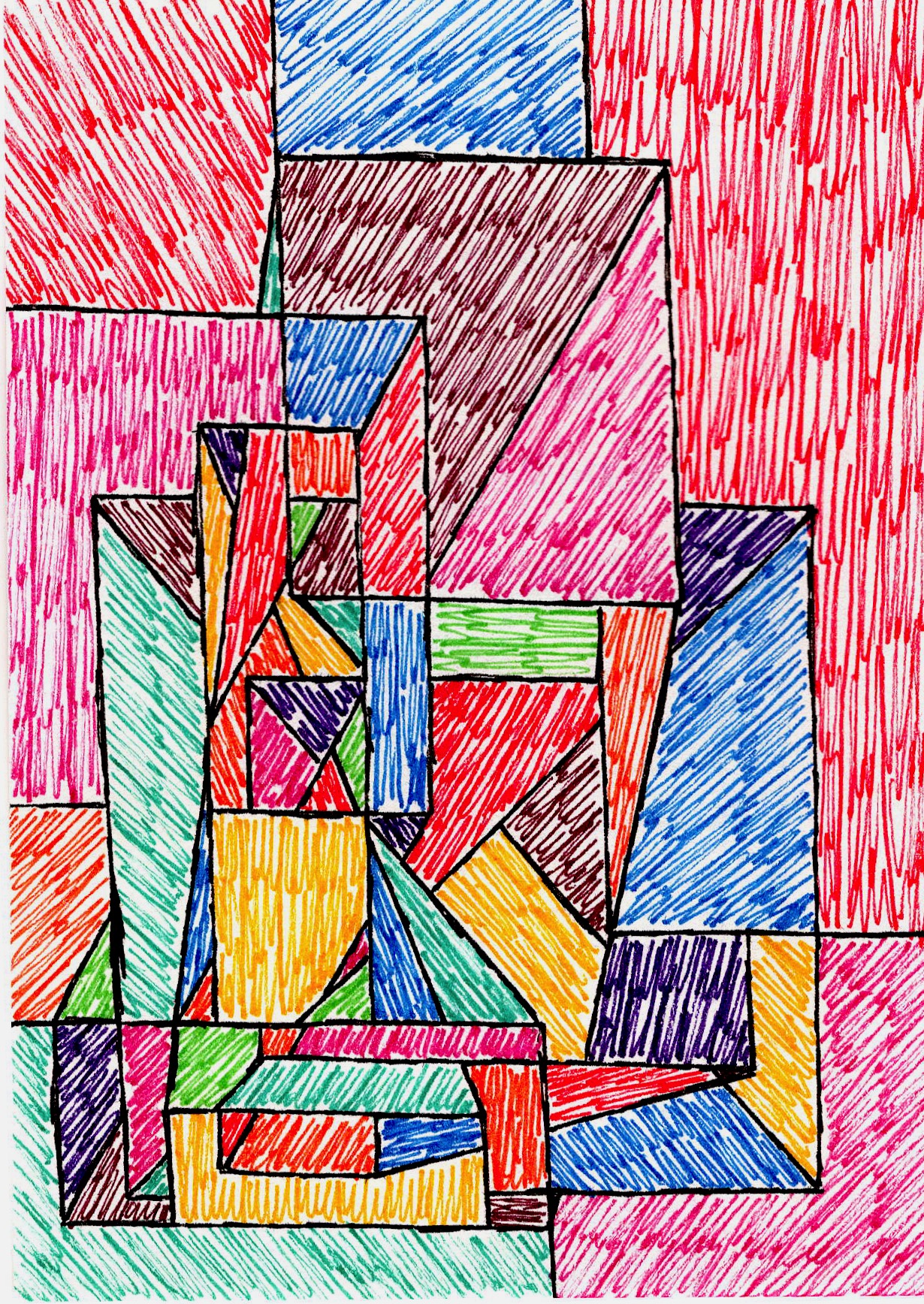
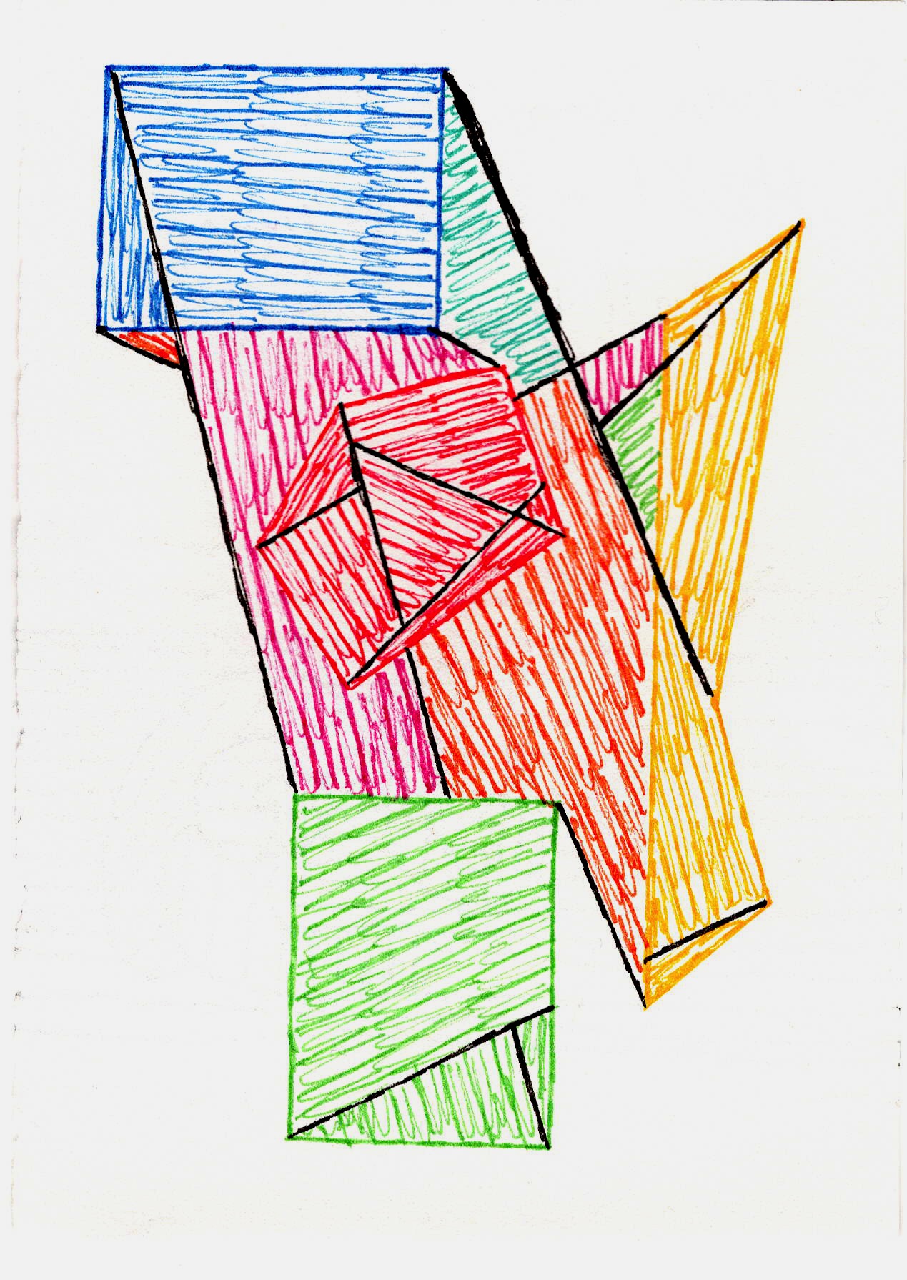
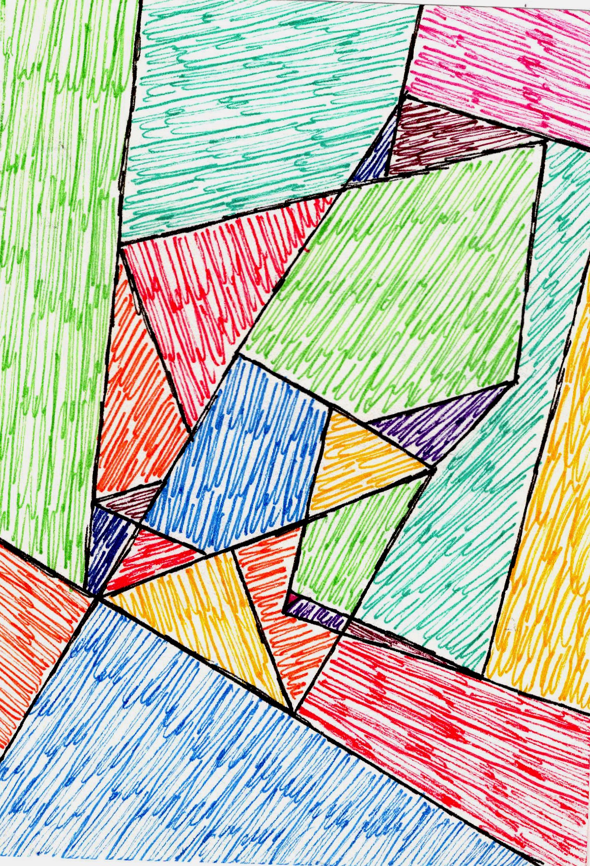
You might wonder how pens fit into my world of abstract painting, which often involves broad strokes and bold colors. For me, they're indispensable. Pens offer a unique interplay with other media, providing control and intimacy that brushes sometimes don't. They're the secret weapon for those underlying patterns that peek through layers, or for creating a sense of intricate detail that contrasts with sweeping gestures.
Sometimes, I'll lay down a spontaneous acrylic wash and then use a fine technical pen to define sharp geometric structures over it, creating a push-and-pull between chaos and order. For example, I might lay down a chaotic, gestural acrylic wash in warm tones, then use a 0.1mm technical pen to draw a precise, repeating geometric pattern in cool black over it, creating a visual tension between the organic and the structured. Other times, I'll start with vibrant brush pen gestures, then mute them slightly with transparent layers of gesso or pastel, allowing the underlying energy to peek through. Pens are fantastic for creating intricate cross-hatching that offers subtle textural contrast to thick paint, or for drawing sharp, almost architectural edges that carve out space within a field of soft gradients. They help me define the language of line within a piece, bringing structure to the seemingly chaotic, or injecting chaos into the overly structured. Sometimes, a single, deliberate pen stroke is all it takes to complete a painting, a final thought on the canvas.

Maintaining Your Creative Tools: Tips for Pen Longevity
Let's be honest, nothing kills creative flow faster than a dried-out pen or a clogged nib. Taking a few moments for maintenance can significantly extend the life of your drawing tools and prevent those frustrating artistic emergencies. Here are my go-to tips:
- Cap Them Immediately: This sounds obvious, right? But in the heat of creation, it's easy to forget. Make capping your pens firmly and immediately a habit, especially fineliners and brush pens whose felt tips can dry out quickly.
- Store Horizontally: Whenever possible, store your pens horizontally. This helps keep the ink evenly distributed to the nib, preventing drying on one side or gravity pulling ink away from the tip. This is particularly important for brush pens.
- Regular Cleaning:
- Fineliners/Disposable Markers: For these, a gentle rinse of the nib under cool water might dislodge a minor clog. Unfortunately, for many, once they're truly dry, they're done.
- Fountain Pens: These are designed for cleaning! Fill and empty the converter or cartridge repeatedly with cool water until it runs clear. For stubborn clogs, a specialized pen flush can be used. Always use fountain pen-specific ink; never India ink or acrylics!
- Technical Pens (Refillable): These often come with tiny cleaning wires. Disassemble them carefully and rinse all parts thoroughly with cool water. Regular rinsing after each use is key to preventing clogs.
- Avoid Harsh Chemicals/Hot Water: Stick to cool water for cleaning. Hot water can damage delicate pen parts and actually cause some inks to dry faster and cling more stubbornly.
- Lighten Your Touch: Especially with brush pens and fineliners, excessive pressure can fray the nib, reducing its lifespan and altering its line quality. Learn to control your line with a lighter touch.
Tips for Choosing Your Perfect Pen
Alright, so you've heard my rambling about pens and my own quest for the perfect line. But how do you embark on your own pen journey and find your perfect tool? Here's my advice, distilled from years of obsessive testing and countless marks:
- Consider Your Style: Do you gravitate towards meticulous detail, energetic sketches, or bold, graphic statements? Your style dictates your pen choice. A calligrapher won't use the same tools as someone doing technical drawings.
- Experiment, Experiment, Experiment: This is the most crucial tip. Buy a single pen from a few different brands or types. Try them out. See how they feel. Don't commit to a whole set until you've found a pen that sings to your hand.
- Start Small, Dream Big (Budget-Wise): You don't need the most expensive pen to start. Many affordable options offer incredible quality. Invest more once you know what you truly love.
- Read Reviews (Like This One!): But always take them with a grain of salt. What works for me might not work for you, and vice versa. It's a starting point, not the definitive answer.
FAQ: Your Pen-Related Queries, Answered (My Way)
- Q: What's the deal with 'artist pens' versus 'regular pens'?
- A: Oh, the difference is usually quite significant! Mostly, it comes down to permanence, ink quality, and nib consistency. 'Artist pens' typically use archival, lightfast, and waterproof pigment ink designed to last for decades without fading or bleeding. Their nibs are also generally more consistent and durable. While some 'regular' pens (like certain gel pens) can offer good lightfastness, artist pens are specifically engineered for longevity and professional artistic results. Regular pens are great for your grocery list, but not so much for a masterpiece you want to endure.
- Q: How do I choose the right nib size for different effects?
- A: This depends entirely on the effect you're after! For delicate textures and intricate cross-hatching, an extra-fine nib (like a 0.05mm fineliner) is perfect, often great for background elements that suggest depth. For crisp outlines or slightly bolder details, a 0.1mm or 0.3mm often hits the sweet spot, bringing elements forward. When you want expressive, varied lines for gestural marks or movement, a flexible brush pen is your best friend, as the line weight changes with pressure. Think about the scale of your work, too: larger pieces can often handle bolder lines, while smaller works demand more finesse.
- Q: How do I stop my pens from drying out?
- A: See my section on "Maintaining Your Creative Tools" above! The short answer: Cap them immediately and firmly after use, and store them horizontally if possible. Regular, gentle cleaning helps too.
- Q: Can I use different ink colors in my fountain pen?
- A: Absolutely! That's one of the best parts. Just make sure you clean the pen thoroughly when switching between ink types or colors to prevent clogging and cross-contamination. And always use fountain pen-specific ink – never India ink or acrylic inks, as they will permanently damage your pen!
- Q: How do I choose the right ink for my fountain pen?
- A: Oh, this is a rabbit hole of joy! Beyond color, consider properties like water resistance (crucial for layering), lightfastness (for permanence), flow (how easily it writes; some inks are 'wet,' some 'dry'), and drying time. You might also explore shading inks (where color subtly varies across a line) or sheening inks (which display a metallic luster at certain angles) for added artistic effect. Pigment-based inks like Platinum Carbon Black or De Atramentis Document Inks are excellent for archival abstract art. Always check ink compatibility with your specific pen, as some inks can clog delicate mechanisms. It’s a bit like pairing wine with food – finding the perfect match is part of the fun!
- Q: My brush pen nib is fraying, what do I do?
- A: This usually happens from pressing too hard or using it on very textured paper. Try to lighten your touch, especially on rougher surfaces. Some artists 'rehabilitate' slightly frayed nibs by gently drawing on smooth glass or ceramic, but often, it's just a sign it's time for a new one.
- Q: How do I clean my pens, especially if they get clogged?
- A: Again, check the dedicated "Maintaining Your Creative Tools" section! In short: gentle rinsing for fineliners, thorough flushing with cool water for fountain pens, and careful disassembly/rinsing with cleaning wires for true technical pens. Prevention through regular capping and storage is your best defense!
The Final Stroke: Finding Your Own Drawing Voice
Ultimately, finding the 'best' drawing pen isn't about a brand name or a price tag; it's a deeply personal odyssey, not a destination. It's about discovering tools that resonate with your inner voice, that become extensions of your creative spirit. My journey with pens is ongoing, and my preferences shift as my art evolves, each new pen offering a fresh dialogue, a different whisper on the paper. So, go forth, embrace the trial and error, make glorious marks that are uniquely yours. And when you find that connection, that moment where the tool truly feels like an extension of your soul, remember that feeling. It's in those moments that art truly comes alive.
Explore More
If you're curious how these humble tools translate into larger narratives, my collection awaits here. Or, if you happen to be in 's-Hertogenbosch, drop by my museum to see the marks in person and explore my artistic evolution through the years on my timeline.


