Using Alizarin Crimson in Painting: The Artist's Ultimate Guide
Discover how to master alizarin crimson in painting with expert mixing techniques, color harmonies, and practical strategies for creating depth and vibrancy. A complete artist's guide with real-world examples.
Using Alizarin Crimson in Painting: The Artist's Ultimate Guide
Ever stand in front of your canvas, brush paused, wondering how to capture that perfect deep red without it losing life? That moment of hesitation when alizarin crimson sits on your palette, both powerful and temperamental? I’ve been there more times than I care to admit. That's what we're diving into today - not just what alizarin crimson is, but how to make it sing in your work. Whether you're painting intimate portraits or abstract explorations, this pigment is a secret weapon worth mastering.

The Heart of the Matter: What Is Alizarin Crimson?
At its core, alizarin crimson is a synthetic organic pigment born from alizarin (a natural compound from the madder plant) and calcium aluminate. But don't let the chemistry distract you - its magic lies in its character. We're talking about a cool red with exceptional transparency and staining power. It’s that deep, wine-red that can whisper or shout depending on how you use it. Unlike its warmer cadmium red cousins, alizarin leans toward purple undertones, making it invaluable for creating shadows and atmospheric depth. It’s not just red; it’s emotional depth in a tube.
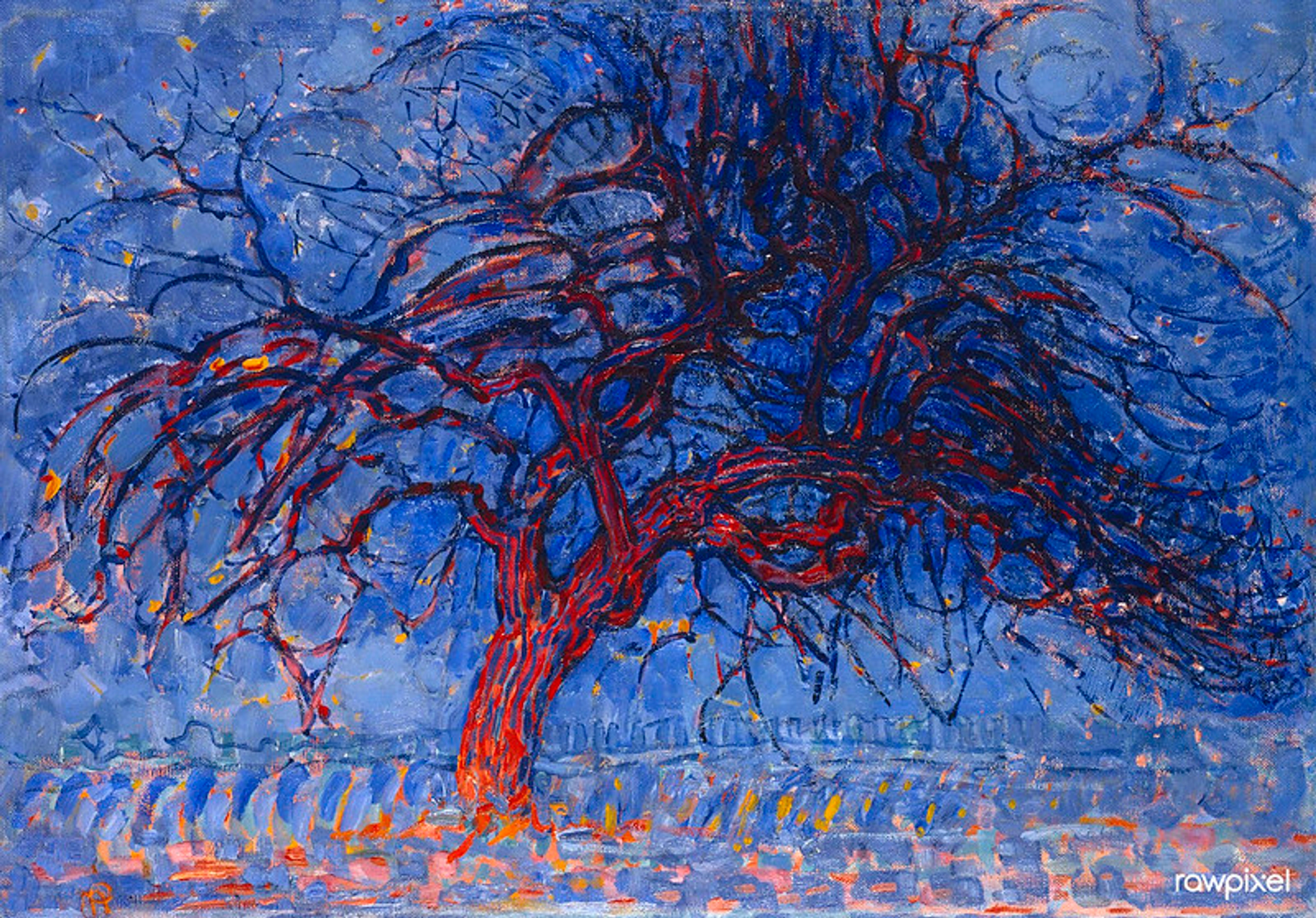
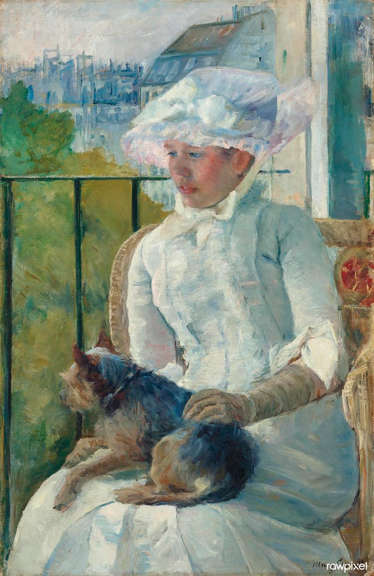
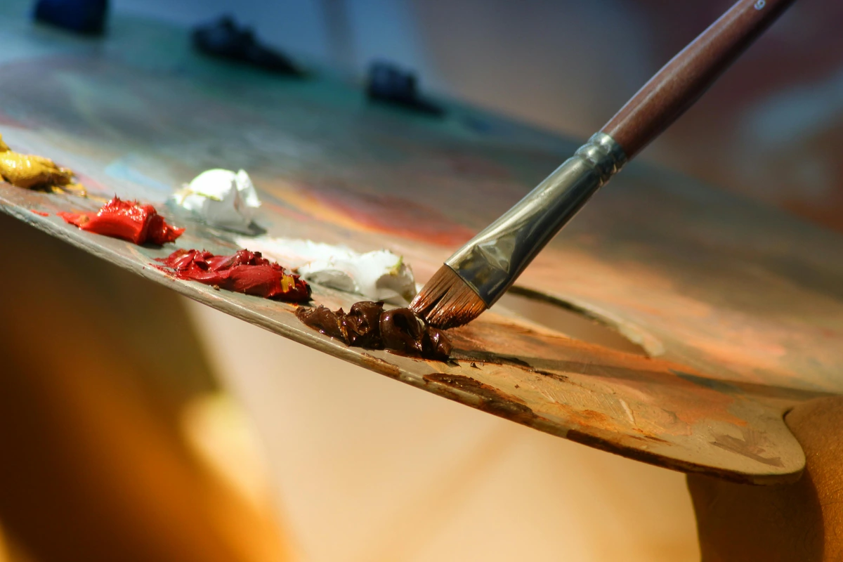
[ credit,
licence](https://example.com/alizarin-crimson-pigment.jpg)
credit,
licence](https://example.com/alizarin-crimson-pigment.jpg)
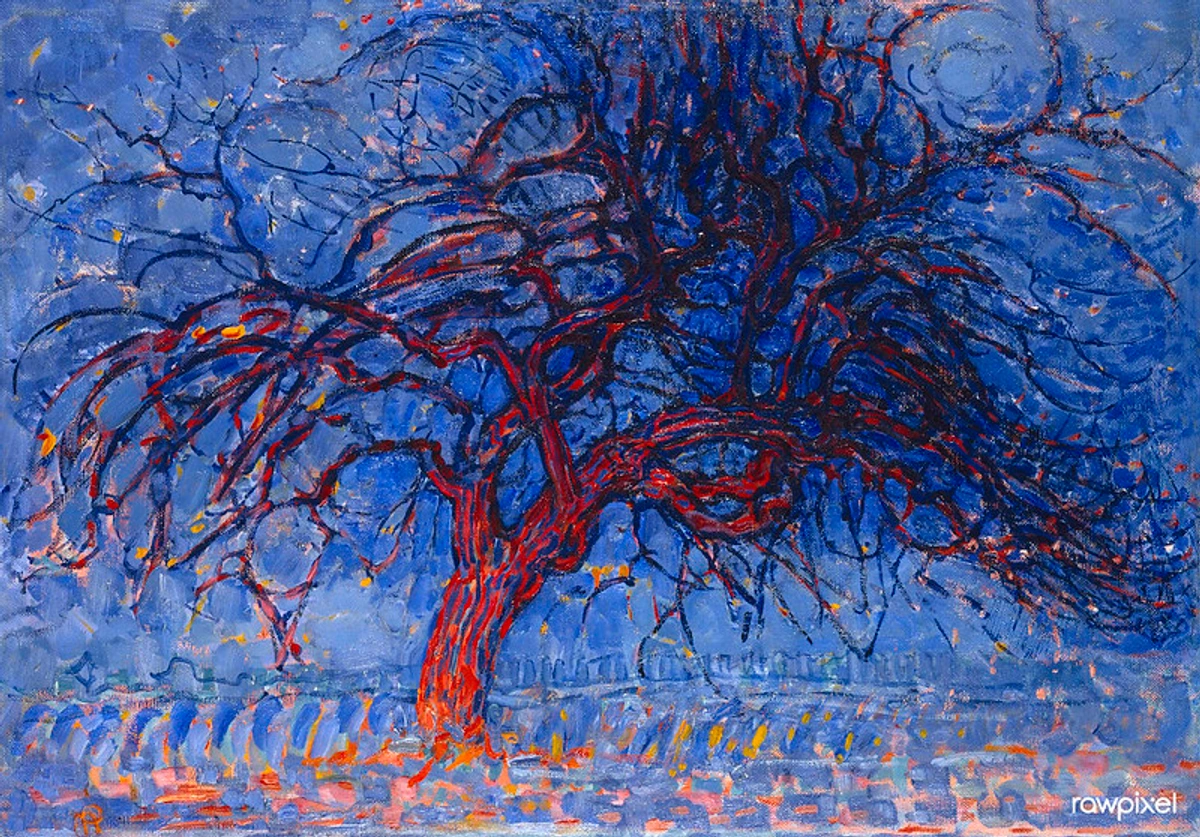
credit: National Gallery, licence

Why Alizarin Crimson Deserves a Spot on Your Palette
Think of your painting as a stage. Every pigment has a role. Alizarin? That's your method actor - nuanced, adaptable, capable of incredible range. Here’s why it’s indispensable:
- Shadow Magic: Need convincing shadows? Mix it with blues or greens for those rich, believable darks that don't look flat.
- Transparency Power: Its translucency allows underpainting to show through, creating luminous glazes impossible with opaque pigments.
- Mood Communicator: It carries emotional weight. Use it sparingly for intimate moments or liberally for passionate, brooding compositions.
- Mixing versatility: It's a chameleon - shift to pink with white, plum with blue, or deep purple with a touch of black.
- Historical Authenticity: For classical painting techniques and historical reproductions, alizarin provides the cool red tones found in Renaissance and Baroque masterpieces.
- Modern Appeal: Contemporary artists love it for its ability to create depth in abstract work and its sophisticated edge in mixed media pieces.
- Value Extender: Small amounts go a long way - a little alizarin can transform an entire color scheme without overwhelming it.
I remember once trying to paint a winter sunset. My warm reds were overpowering until I switched to alizarin crimson mixed with cerulean blue. Suddenly the glow had that cold, distant quality of dusk. That’s when I truly understood its power isn't in its brightness, but in its soul.
Mixing Mastery: Making Alizarin Crimson Work FOR You
Here’s where alizarin can get moody. Let’s tame it. The key is control - knowing its neighbors and dance partners on the palette.

Mixing Companions & Partners
Understanding who plays well with alizarin is crucial for your success. Think of these as your pigment's best friends and collaborators:
The Essential Cool Blues:
- Ultramarine Blue: Creates deep, mysterious plums perfect for shadows and moody atmospheres. This is your go-to for dramatic nighttime scenes.
- Cerulean Blue: Produces dusky, atmospheric purples ideal for twilight scenes and misty mornings.
- Cobalt Blue: Yields rich royal purples for dramatic statements and regal subjects.
- Prussian Blue: Creates deep, almost blackish purples for intense shadows and dramatic contrast.
The Warm Neutrals for Depth:
- Burnt Sienna: Creates warm browns that feel natural and earthy. Perfect for tree bark, soil, and flesh tones.
- Raw Sienna: Produces rustic earth reds perfect for landscapes and underpainting.
- Yellow Ochre: Creates earthy reds with historical authenticity. Great for aged-looking surfaces.
- Raw Umber: Adds depth and darkness to alizarin mixtures for more complex shadows.
The Delicate White Partners:
- Zinc White: Best choice for preserving alizarin's character and transparency.
- Titanium White: Use sparingly as it can overwhelm the pigment, but excellent for strong tints.
- Flake White (Lead White): Traditional choice that creates unique, warm pink tones but requires safety precautions.
The Cool Blues (Best Friends):
- Ultramarine Blue: Creates deep, mysterious plums perfect for shadows and moody atmospheres
- Cerulean Blue: Produces dusky, atmospheric pur ideal for twilight scenes
- Cobalt Blue: Yields rich royal purples for dramatic statements
The Warm Neutrals (Trustworthy Allies):
- Burnt Sienna: Creates warm browns that feel natural and earthy
- Raw Sienna: Produces rustic earth reds perfect for landscapes
- Yellow Ochre: Creates earthy reds with historical authenticity
The Whites (Delicate Partners):
- Zinc White: Best choice for preserving alizarin's character
- Titanium White: Use sparingly as it can overwhelm the pigment
The Yellows (Energy Boosters):
- Lemon Yellow: Creates rusty red-oranges for sunsets and autumn scenes
- Aureolin Yellow: Produces warm, golden-reds for skin tones
The Greens (Drama Creators):
- Viridian: Creates earthy olives for natural foliage
- Phthalo Green: Produces deep forest shadows for dramatic depth
Handling the Temperamental Side
Alizarin loves to dominate. If you’re not careful, those beautiful glazes can turn muddy brown or lifeless with a single wrong mix. Here's how to keep it vibrant:
- Isolate it: Keep alizarin on a section of your palette away from earth tones and white. It stains fiercely.
- Glaze it: For those transparent effects, mix with a medium and apply thin, consecutive layers. Less is more.
- Rinse immediately: Clean your brush between colors. One second with white on your brush, and alizarin turns pinky-brown. Brutal but true.
- Mix on the fly: Don't pre-mass large batches. Its vibrancy shifts drastically as it dries.
Quick Reference Table: Complementary Mixes
Base Color | Ratio (Alg:C) | Result | Best For |
|---|---|---|---|
| Ultramarine | 2:1 | Deep Plum Shadow | Background Depth |
| Viridian | 1:1 | Earthy Olive | Natural Foliage |
| Zinc White | 1:4 | Delicate Rose | Flesh Tones |
| Lemon Yellow | 1:3 | Rusty Red-Orange | Sunsets, Autumn |
| Raw Sienna | 1:1 | Brownish Red | Underpainting neutrals |
Comprehensive Alizarin Mixing Chart
Here's a more extensive mixing guide that covers more complex combinations:
Base Color | Ratio (Alg:C) | Result | Best For | Application Tips |
|---|---|---|---|---|
| Cerulean Blue | 3:1 | Moody Dusky Purple | Night scenes, shadows | Apply in thin layers |
| Burnt Sienna | 2:1 | Warm Brown | Tree bark, earth tones | Good underpainting base |
| Cadmium Red | 1:2 | Rich Burgundy | Velvet, drapery | Blends well with other reds |
| Phthalo Green | 1:1 | Deep Forest Shadow | Foliage, distant trees | Use sparingly |
| Naples Yellow | 1:3 | Warm Coral | Sunrise, skin tones | Mix with white first |
| Cobalt Blue | 1:1 | Royal Purple | Royal subjects, luxury | Bold applications only |
| Yellow Ochre | 1:2 | Rustic Earth Red | Autumn landscapes | Textural applications |
| Ivory Black | 1:6 | Deep Wine Red | Wine glasses, rich fabrics | Glazing technique needed |
Creating Depth & Vibrancy: Alizarin in Action
Depth in painting isn't about making things dark - it's about creating the illusion of light and air moving through space. Alizarin crimson helps you cheat physics in the most beautiful ways possible. This is where the magic truly happens, where theory meets practice and transforms your work.
The Physics of Depth Perception:
Our brains interpret depth through several visual cues: atmospheric perspective (objects get bluer and lighter with distance), shadow temperature (cool shadows suggest depth), and value contrast (stronger contrast draws the eye forward). Alizarin crimson excels at all three:
- Cool Undertones: Its natural purple shift creates the perfect cool shadow temperature that suggests distance
- Transparency: Allows underlying layers to show through, creating that atmospheric depth effect
- Staining Power: Ensures the color remains vibrant even when heavily diluted
Real-World Example: I once painted a landscape where the distant mountains used almost pure alizarin mixed with just a touch of ultramarine. The result was those misty, atmospheric mountains that seemed to fade into the distance naturally. The local color of the mountains was actually much warmer, but the alizarin created the optical illusion of great depth.

Alizarin Crimson Across Different Painting Mediums
What works beautifully in oil behaves completely differently in watercolor, and acrylic has its own entirely different set of rules. Understanding these medium-specific behaviors is crucial for success - it's the difference between frustration and triumph. Let's break down how to make alizarin shine in each medium.
Tempera and Gouache Applications:
While less commonly discussed, alizarin crimson works beautifully in egg tempera and gouache, offering unique advantages:
Egg Tempera:
- Mix with egg yolk for incredibly luminous, jewel-like effects
- Dries quickly, allowing for precise detail work
- Excellent for medieval and Renaissance style paintings
- Creates a unique matte finish that's perfect for gold leaf applications
Gouache:
- Can be reactivated with water, allowing for glazing techniques
- Creates opaque, velvet-like effects when used straight from the tube
- Perfect for illustration and design work
- Mixes well with other gouache colors while maintaining its character
Special Medium Considerations:
- Casein Paint: Alizarin creates rich, durable effects but requires careful layering due to fast drying
- Encaustic: Works beautifully but needs to be mixed with encaustic medium at proper temperatures
- Polymer Mediums: Can be used in mixed media but test compatibility first
In Oil Painting
Oils give alizarin its absolute best performance and most stunning results. The slow drying time allows for extensive glazing techniques that simply aren't possible in other mediums, and the transparency creates that luminous depth that oils are famous for. Through years of trial and error, I've found that using linseed oil rather than walnut oil keeps the transparency optimal and prevents any unwanted darkening. The one caution? Traditional alizarin can yellow slightly over time, though modern synthetic formulations have significantly improved this issue. Pro tip: For the most stable results, use alizarin from reputable manufacturers who have addressed the lightfastness concerns.
In Watercolor
Watercolor alizarin is an entirely different beast from its oil counterpart, and understanding its unique characteristics is key to mastery. Here, its granulating properties become a beautiful feature rather than a bug. Those little particles that settle during drying create incredible textural effects perfect for skies, misty atmospheres, and atmospheric perspective. The key technique is to work wet-on-wet initially, then let the granules settle and dry completely before adding more layers. This creates a depth that feels almost three-dimensional. I love using this for creating distant mountains or hazy horizons - the alizarin settles in just the right way to suggest distance and atmosphere. Remember that watercolor alizarin is usually more transparent and staining than its oil counterpart, so adjust your ratios accordingly.
In Acrylic
Acrylic presents arguably the biggest challenge for working with alizarin crimson. The fast drying time means you have to work incredibly quickly for blending, and the transparency can be less forgiving than in oils or watercolors. My solution? Always use acrylic glazing medium to extend working time and maintain that essential translucency. This medium prevents the paint from drying too quickly and allows for those beautiful layering effects that make alizarin special. Also crucial: remember that acrylic white (titanium) is dramatically stronger than oil whites, so you'll need significantly less alizarin to achieve the same tinting strength. I usually recommend using about half the amount you would in oils. Another tip: keep a spray bottle handy to mist your palette and prevent premature drying while you work.

The Underpainting Technique
Start your canvas with a thin layer of alizarin crimson (sometimes called a velatura). Let it dry. As you build layers of light colors, this underpainting glows through, pushing shadows back. It’s like the blue in denim - the deeper you look, the more it reveals. Especially effective in portraits - notice how the red undertones in cheeks and lips seem to pulse with life through lighter layers.
Glazing for Atmosphere
Want mist at dawn? Mix alizarin with lots of white and glaze horizontally. That cool pink instantly suggests distance and humidity. The same principle works for fire: thin glazes of alizarin over bright yellow = heat shimmering upward. Less pigment, more magic.
Vibrancy Through Contrast
True vibrancy comes from contrast. Place a pure dab of alizarin next to its complements (viridian greens or cerulean blues) - they'll make each other vibrate. But avoid complementary mixing directly in a blob - create their tension side-by-side on the canvas instead. Think of it as visual jazz - the notes play against each other to create resonance.

Famous Artists and Their Alizarin Mastery
Throughout art history, countless artists have mastered alizarin crimson to create unforgettable works. Let's look at some notable examples and what we can learn from their techniques:
Classical Masters:
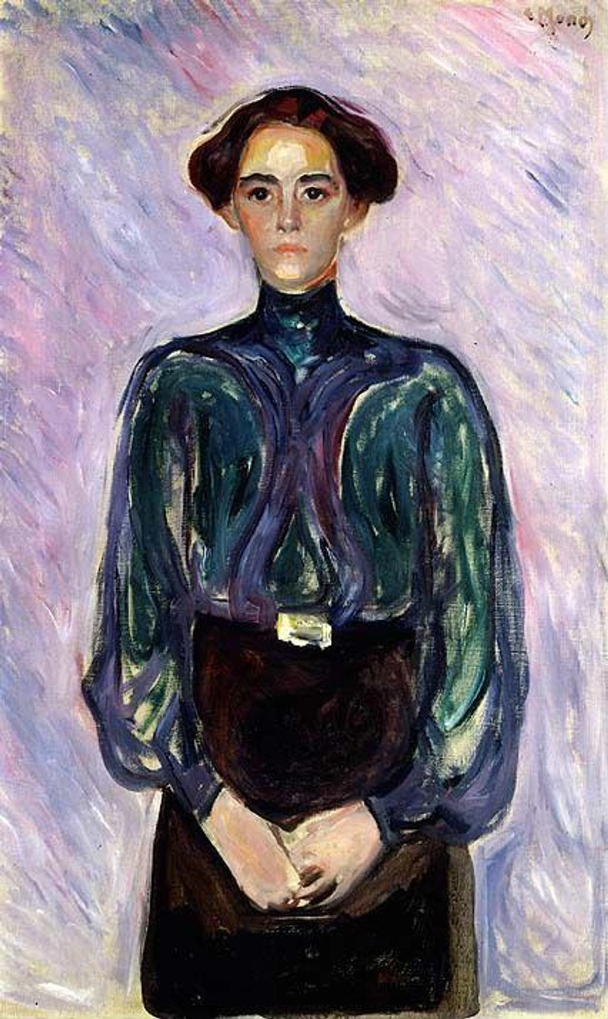
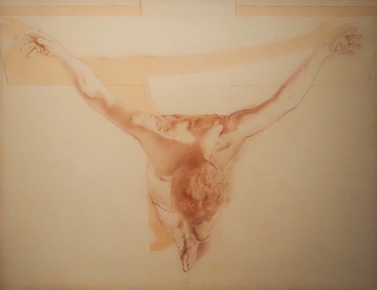
Rembrandt van Rijn (1606-1669):
- Used alizarin (or its historical equivalent) for deep red draperies and flesh tones
- Created luminous skin effects through careful glazing over warm underpaintings
- His use of red in portraits suggests both wealth and emotional depth
- Lesson: Start with warm underpaintings, then glaze with alizarin for that incredible skin luminosity
J.M.W. Turner (1775-1851):
- Used red pigments extensively for atmospheric effects in his landscapes
- Created dramatic sunsets and stormy skies with transparent red glazes
- His works show how red can suggest both fire and atmosphere
- Lesson: Use thin, transparent applications for atmospheric effects
Modern Masters:
Mark Rothko (1903-1970):
- Used red extensively in his color field paintings
- Created meditative, emotional spaces through carefully balanced reds
- His work shows how red can be both soothing and intense
- Lesson: Consider the emotional impact of red placement and intensity
Gerhard Richter (b. 1932):
- Used red in both representational and abstract works
- Demonstrates versatility across different styles and approaches
- Shows how red can ground abstract compositions
- Lesson: Alizarin works in both traditional and contemporary contexts
Color Harmonies: Playing Well with Others
Harmony doesn't have to mean safe or boring. In fact, some of the most compelling color combinations come from controlled friction - and alizarin crimson excels at creating tension that sings. Understanding color theory with alizarin opens up endless creative possibilities.
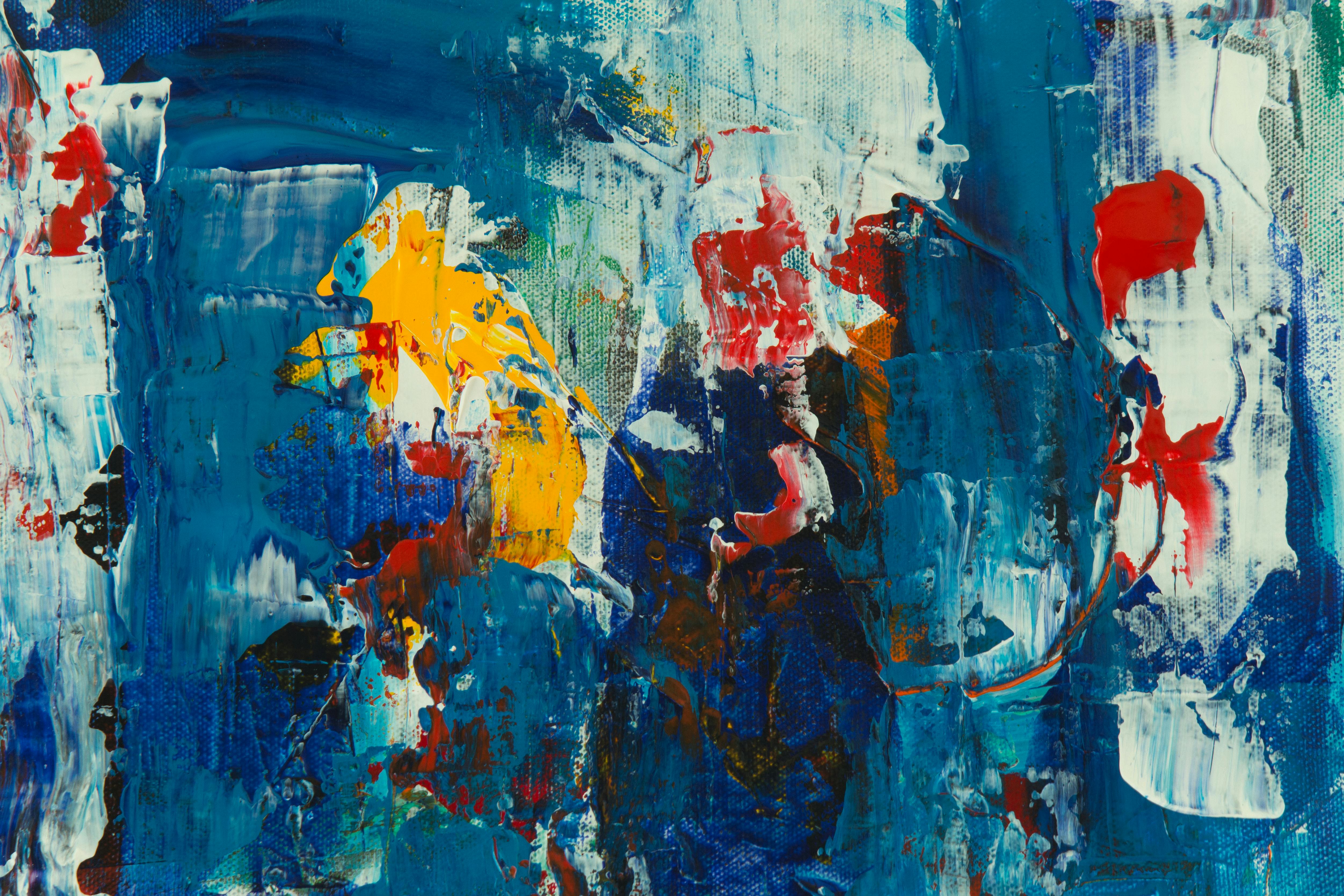
- Analogous Triad: Alizarin + Cadmium Red + Aureolin Yellow = Unified energy with warmth leaning left. Perfect for expressive landscapes.
[ credit,
licence](https://example.com/alarin-analogous-harmony.jpg)
credit,
licence](https://example.com/alarin-analogous-harmony.jpg)
credit: ColorMatters, licence
- Split Complement: Alizarin + Viridian Green + Cerulean Blue. Complex drama without discord. Ideal for moody narratives.
- Triad Power: Alizarin + Cadmium Green Light + Dioxazine Purple. High-risk, high-reward. Use in small doses for abstract dynamism.
Quick Reference: Alizarin Crimson Cheat Sheet
Essential Mixing Ratios:
- Shadow Purple: Alizarin + Ultramarine Blue (2:1)
- Flesh Tone Pink: Alizarin + Zinc White + touch of Yellow Ochre (1:4:1)
- Sunset Orange: Alizarin + Lemon Yellow (1:3)
- Rich Brown: Alizarin + Burnt Sienna (1:1)
- Deep Purple: Alizarin + Cobalt Blue (1:1)
Common Problems & Solutions:
- Muddy Mix? Add Permanent Rose or use Zinc White
- Too Transparent? Apply more layers or mix with slightly opaque pigment
- Drying Too Fast? Use appropriate medium or work in cooler conditions
- Color Fading? Use lightfast formulations and proper varnish
Studio Essentials:
- Must-have White: Zinc White (preserves alizarin's character)
- Must-have Blue: Ultramarine Blue (creates perfect shadows)
- Must-have Neutral: Burnt Sienna (versatile mixing partner)
- Must-have Medium: Glazing medium for transparent effects
Quick Tips:
- Start with warm underpaintings for best results
- Let layers dry completely before glazing
- Keep alizarin away from earth tones on palette
- Clean brushes immediately after use
- Test colors on scrap paper before applying to main work
Practical Tips from the Trenches
Years of stained brushes and muddy moments have taught me hard-earned lessons:

- Start light, end dark: Put your alizarin details in last. Build toward it.
- Stain alert: It will stain your palette permanently. I mark mine with tape so I don’t accidentally use a contaminated spot for pastel-mixing.
- Watercolor vs. Oil: In watercolor, it granulates beautifully. In oils, use it with linseed oil for even fluidity. Avoid walnut oil with it - causes odd darkening.
- The drying game: Alizarin dries slowly. Let it settle for 48 hours before glazing over to prevent lifting.
- Rescue mission: If your mix goes muddy, add a touch of permanent rose to reheat it, or titanium white to lighten.
Frequently Asked Questions (FAQ) - Expanded Edition
Q: Is alizarin toxic? Should I worry about safety?
A: Modern synthetic alizarin is non-toxic, but like all pigments, avoid inhaling the powder. Wear a mask when scooping, and wash hands after use. The historic madder version had arsenic - today's version is safe.
A: Modern synthetic alizarin is non-toxic, but like all pigments, avoid inhaling the powder. Wear a mask when scooping, and wash hands after use. The historic madder version had arsenic - today’s version is safe.
Q: Can I use alizarin crimson for flesh tones?
A: Absolutely - but with the crucial caveat: sparingly! Alizarin can create beautiful, realistic rosy areas when used correctly. For flesh tones, mix it with white and just a touch of yellow ochre to create natural-looking blush, rosy cheeks, or ear tones. In my portrait work, I use it primarily for lips, earlobes, and the subtle redness around nostrils, but I never use it in foundation skin mixes (those should lean warmer toward cadmium red or permanent rose). Remember this important rule: shadows on skin are rarely orange or warm - they tend toward cooler, muted tones that alizarin helps create beautifully.

Q: Why does my alizarin turn brown when mixing white?
A: Ah, the classic trap that has frustrated artists for generations! Alizarin has such powerful undertones that when you mix it with titanium white, its cool purple tones can take over completely, creating that dreaded muddy pink-brown instead of the delicate pink you wanted. The solution? Use zinc white instead - it's less opaque and preserves the hue much better. Alternatively, you can add a touch of permanent rose to brighten the mix and counteract those muddy undertones. I keep both whites on my palette specifically for this reason.
Q: How do I store alizarin crimson long-term?
A: Keep it away from light and air. Use a sealed airtight container - it's extra light-sensitive compared to other pigments. I put my tube inside a dark box to prevent fading over years. It'll outlive your grandchildren if treated well.
A: Keep it away from light and air. Use a sealed airtight container - it’s extra light-sensitive compared to other pigments. I put my tube inside a dark box to prevent fading over years. It’ll outlive your grandchildren if treated well.
Q: Can I replace alizarin crimson with quinacridone red?
A: They're cousins but different. Quinacridone red is warmer, less transparent, and more lightfast. Alizarin's coolness and transparency can't be replicated. For historical accuracy or specific techniques, use the real deal. For quick studies? Quinacridone red is a more resilient substitute.
A: They’re cousins but different. Quinacridone red is warmer, less transparent, and more lightfast. Alizarin’s coolness and transparency can’t be replicated. For historical accuracy or specific techniques, use the real deal. For quick studies? Quinacridone red is a more resilient substitute.
Your Next Adventure with Alizarin Crimson
Look, there will be moments it frustrates you. When that potential red becomes mud, take a step back. Clean everything. Remember why you fell for this pigment in the first place - it’s not a blunt instrument. Alizarin crimson demands respect, conversation, and patience. It’s the difference between shouting and whispering, and knowing when to do each is what separates a technician from an artist.
I often think about the first time I saw alizarin used masterfully in a Rembrandt reproduction. That deep red fabric didn't just look red - it felt ancient, whispered secrets, held the weight of the entire composition. That’s what it can do for your work too. Start small. Mix it with courage. Let it surprise you.
Want to see how alizarin crimson transforms in real paintings? Explore my gallery of abstract works where it plays a starring role. Or visit the Den Bosch museum this season - they’ve got an exhibition on historical reds that changed art.
Happy painting, and may your alizarin sing.
Advanced Techniques: Taking Alizarin to the Next Level
Once you've mastered the basics, it's time to explore more advanced techniques that can truly elevate your work with alizarin crimson. These methods require more skill and patience but can produce breathtaking results.

Glazing Mastery
Glazing is where alizarin truly shines, but doing it well requires precision:
The Science of Glazing: Glazing works because light passes through the transparent alizarin layer, reflects off the underlying layer, and comes back through. This creates depth that you simply can't achieve with opaque paint. The key is controlling how much light gets through each layer.
Professional Glazing Sequence:
- Preparation: Your canvas must be completely dry between layers. Use a moisture meter if available.
- Mixing: Mix alizarin with your medium until it's almost transparent. You should be able to read text through it.
- Application: Use a soft brush and apply in one smooth, even stroke. Don't go back over wet areas.
- Drying: Allow at least 24 hours between glazing sessions for proper chemical bonding.
- Building: Apply 5-10 thin layers rather than 2-3 thick ones. Each layer should be barely visible when wet.
Advanced Glazing Effects:
- Scumbling: Drag a dry brush over a partially dried glaze for textural effects
- Sgraffito: While alizarin glaze is still wet, scratch into it with a tool to reveal underlying layers
- Wash Effects: Create atmospheric effects with very thin, watery washes
- Preparation is everything: Your canvas must be completely dry between layers. Rushing this process is the most common mistake.
- Thin is beautiful: Mix alizarin with your medium until it's almost transparent. You should be able to read text through it.
- Build gradually: Apply 5-10 thin layers rather than 2-3 thick ones. Each layer should be barely visible when wet.
- Let each layer cure: Allow at least 24 hours between glazing sessions for proper chemical bonding.
Texture Creation with Alizarin
While alizarin is typically transparent, you can create interesting textural effects:
Watercolor Textures:
- Granulating washes: Let the granules settle to create sky-like textures
- Lift-off techniques: While wet, use a brush to lift color and create highlights
- Salt effects: Sprinkle salt into wet washes for unique crystalline patterns
Oil Painting Textures:
- Impasto glazing: Apply thick impasto strokes, then glaze thin alizarin over them
- Texture mediums: Mix alizarin with texture paste for dimensional effects
- Collage applications: Use alizarin as a transparent layer over collage elements
Mixed Media Approaches:
- Sgraffito technique: While alizarin glaze is still wet, scratch into it with a tool to reveal underlying layers
- Frottage: Place textured materials under paper and rub with alizarin-covered surfaces
- Monoprinting: Use alizarin for transparent printing effects
Layering Strategies
Different layering approaches create different effects:

Traditional Layering: Light to dark, with alizarin as your final dark layer Reverse Layering: Start with dark alizarin underpainting, then build lighter colors on top Selective Layering: Use alizarin only in specific areas, creating focal points through contrast
Studio Organization for Alizarin Work
Working successfully with alizarin requires some specific studio setup:
Palette Management:
- Keep alizarin in a dedicated area, clearly marked
- Use a separate palette knife for alizarin to prevent contamination
- Have a "rinse station" specifically for brushes used with alizarin
Brush Care:
- Natural hair brushes work best with alizarin in oils
- Keep a separate set of brushes for alizarin work to prevent staining
- Clean brushes immediately after use - don't let alizarin dry on them
Storage Solutions:
- Use airtight containers for tubes and pans
- Store alizarin away from direct light
- Consider a dedicated "light-sensitive pigments" box
Comparison with Similar Red Pigments
Understanding how alizarin crimson compares to other red pigments helps you make informed choices for your work:
Alizarin Crimson vs. Cadmium Red:
Characteristic | Alizarin Crimson | Cadmium Red |
|---|---|---|
| Temperature | Cool (purple undertones) | Warm (orange undertones) |
| Opacity | Transparent to semi-transparent | Opaque |
| Staining | High staining power | Low staining power |
| Cost | Generally less expensive | More expensive (cadmium is toxic) |
| Best For | Shadows, glazes, flesh tones | Bold statements, highlights |
| Lightfastness | Good but can yellow over time | Excellent |
Alizarin Crimson vs. Quinacridone Red:
Characteristic | Alizarin Crimson | Quinacridone Red |
|---|---|---|
| Temperature | Cool, purple shift | Warm, clean red |
| Transparency | Very transparent | Transparent |
| Staining | Very staining | Moderately staining |
| Granulation | Yes (in watercolor) | No, smooth |
| Cost | Moderate | Higher (organic pigment) |
| Best For | Traditional techniques, glazing | Modern applications, washes |
Alizarin Crimson vs. Permanent Rose:
Characteristic | Alizarin Crimson | Permanent Rose |
|---|---|---|
| Hue | Deep wine-red | Bright pink-red |
| Opacity | Transparent | Transparent |
| Mixing | Complex undertones | Cleaner, more predictable |
| Character | Moody, sophisticated | Fresh, lively |
| Best For | Atmospheric work, shadows | Floral subjects, highlights |
Choosing the Right Red:
- For traditional oil painting: Alizarin Crimson is essential for classical techniques
- For watercolor glazing: Both Alizarin and Quinacridone Red have unique advantages
- For bold, opaque work: Cadmium Red or other opaque reds
- For modern abstract work: Experiment with multiple red types
- For flesh tones: Alizarin for shadows, other reds for highlights
Troubleshooting Common Alizarin Problems
Conservation and Preservation of Alizarin Works
If you create important works with alizarin, proper conservation is essential:
Varnishing: Use non-yellowing varnishes specifically formulated for transparent pigments Display: Keep artworks away from direct sunlight and UV light sources Environmental Control: Maintain stable humidity (40-60%) and temperature conditions Handling: Use cotton gloves when handling unvarnished alizarin paintings
Environmental and Safety Considerations
While modern alizarin is generally safe, there are some environmental considerations:
Disposal: Never pour alizarin water down drains - it can stain plumbing Ventilation: Always work in well-ventilated areas, especially when sanding old paint Waste Management: Collect rinse water and dispose of it as hazardous waste Sustainable Alternatives: Consider more lightfast modern alternatives for outdoor work
Cultural and Symbolic Meanings of Alizarin
Throughout history, red pigments have carried deep cultural significance:

Western Art: Alizarin's depth makes it perfect for portraying nobility, wealth, and emotional intensity Eastern Traditions: Red (including alizarin tones) symbolizes luck, prosperity, and celebration Religious Art: Deep reds represent blood, sacrifice, and divine passion Contemporary Context: In modern art, alizarin can suggest nostalgia, memory, and the passage of time
Digital Painting Applications
While traditionally a physical medium, alizarin crimson principles translate well to digital art:
Color Mixing: Understand how digital alizarin behaves differently from physical pigment Layering: Use digital layers to simulate traditional glazing techniques Texture: Combine digital filters with alizarin effects for unique results Lightfastness: Digital alizarin never fades, but you can simulate aging effects
Career Applications for Artists Using Alizarin
Mastering alizarin crimson can open various professional opportunities:

Portrait Painting: Many portrait artists specialize in flesh tones using alizarin techniques Conservation: Restorers need to understand historical pigments like alizarin Teaching: Alizarin techniques are valuable subjects for art education Gallery Representation: Works featuring masterful alizarin use often attract gallery attention Art Supply Development: Some artists collaborate with manufacturers on pigment development
Material Recommendations and Suppliers
Not all alizarin crimson is created equal. Here are some recommendations:
Professional Grade: Michael Harding, Old Holland, Daniel Smith Student Grade: Winsor & Newton, Gamblin, Holbein Watercolor Specific: Schmincke, Maimeri, Da Vinci Specialty Formulations: Try different manufacturers to find your preferred transparency and staining qualities
Seasonal Applications of Alizarin
Different seasons call for different approaches to alizarin:
Spring: Use alizarin mixed with fresh greens for new growth and renewal Summer: Bold applications for intense heat and vibrant energy Autumn: Deep, warm mixtures with earth tones for harvest and change Winter: Cool, atmospheric mixtures with blues for frost and quiet reflection
Weather-Influenced Techniques
Weather conditions can affect your alizarin work:
Humid Conditions: Work slower, allow more drying time between layers Dry Conditions: Alizarin may dry faster - adjust your mixing accordingly Cold Temperatures: Paint may become thicker - use appropriate mediums High Altitude: thinner air affects drying times - be patient
Exhibition and Gallery Considerations
When showing works featuring alizarin:
Lighting: Ensure gallery lighting won't accelerate fading Placement: Consider how alizarin works with neighboring artworks Documentation: Photograph works carefully to capture true color relationships Conservation Notes: Provide specific care instructions for alizarin-rich pieces
Pricing and Value Considerations
Works featuring masterful alizarin use often command premium prices:
Technical Difficulty: The complexity of alizarin techniques adds value Time Investment: Multiple glazing sessions mean more artist time Historical Reference: Connection to traditional painting methods adds depth Market Demand: Collectors often seek works demonstrating technical mastery
Step-by-Step Alizarin Tutorial
Here's a practical project to master alizarin techniques:
Project: Atmospheric Landscape with Alizarin
- Materials Needed: Canvas, alizarin crimson, ultramarine blue, titanium white, linseed oil
- Step 1: Create a warm underpainting with light red and yellow ochre
- Step 2: Let dry completely (24+ hours)
- Step 3: Apply thin alizarin glazes for distant hills
- Step 4: Build foreground with warmer mixtures
- Step 5: Final details with pure alizarin accents
- Step 6: Varnish when completely dry (1+ week)
Pro Tips:
- Work from back to front
- Keep your darkest mixtures for last
- Experiment with different brush strokes for variety
- Don't be afraid to let some areas remain simple
Advanced Color Theory with Alizarin
Beyond basic mixing, explore deeper color relationships:
Temperature Variations: Create warm and cool versions of alizarin Saturation Control: Learn to mute alizarin effectively Value Scales: Create full value ranges using alizarin Color Harmony Systems: Apply different harmony theories to alizarin work
Psychological Impact in Different Genres
Alizarin affects different genres in unique ways:
Portraiture: Creates emotional depth and psychological intensity Landscape: Suggests history, time, and atmospheric perspective Abstract: Can evoke emotional responses and visual tension Still Life: Adds richness and historical reference
Conclusion: Your Alizarin Journey
Mastering alizarin crimson is more than learning about a pigment - it's embarking on a journey into the heart of color, light, and emotional expression. This pigment demands patience, respect, and courage, but the rewards are immeasurable. As you continue to work with alizarin, remember that each painting is both a lesson and an adventure. There will be moments of frustration and moments of triumph, but through it all, you'll develop a deeper understanding of color and your own artistic voice.

The artists who have truly mastered alizarin throughout history - from the Old Masters to contemporary abstract painters - didn't just master a technique. They learned to listen to the pigment, to understand its personality, and to allow it to express itself authentically through their work. That's the true secret of alizarin crimson: it's not about controlling the color, but about having a conversation with it. So pick up your brush, mix with intention, and let alizarin crimson surprise you. Your artistic journey is just beginning.
Quick Reference: Alizarin Crimson Mixing Guide
Essential Color Combinations:
Desired Effect | Formula | Application |
|---|---|---|
| Deep Shadow | Alizarin + Ultramarine Blue (2:1) | Background depth, dramatic shadows |
| Flesh Tone | Alizarin + Zinc White + Yellow Ochre (1:4:1) | Cheeks, lips, earlobes |
| Sunset Glow | Alizarin + Lemon Yellow (1:3) | Warm skies, autumn leaves |
| Rich Brown | Alizarin + Burnt Sienna (1:1) | Tree bark, soil, aged wood |
| Royal Purple | Alizarin + Cobalt Blue (1:1) | Regal subjects, luxury items |
| Warm Coral | Alizarin + Naples Yellow (1:3) | Sunrise, tropical scenes |
| Atmospheric Mist | Thin alizarin glaze + white | Distant mountains, fog effects |
| Velvet Texture | Alizarin + cadmium red (3:1) | Rich fabrics, drapery |
Quick Problem Solver:
Problem | Solution |
|---|---|
| Muddy Mix | Add permanent rose or use zinc white |
| Too Transparent | Apply more layers or mix with opaque pigment |
| Turns Brown | Avoid mixing with complementary colors directly |
| Drying Too Fast | Use glazing medium or work in cooler conditions |
| Color Fading | Use lightfast formulations and proper varnish |
Studio Essentials Checklist:
- Alizarin Crimson (professional grade)
- Zinc White (for preserving character)
- Ultramarine Blue (for perfect shadows)
- Burnt Sienna (versatile mixing partner)
- Glazing medium (for transparent effects)
- Separate palette knife for alizarin
- Dedicated brush set for red work
- Airtight storage container
- Stain-removal soap for brushes
- UV-filtered varnish for final protection
Glossary: Alizarin Crimson Terms
Technical Terms:
- Velatura: A thin, transparent underpainting layer, often used with alizarin crimson
- Glazing: Applying thin, transparent layers of paint over dried layers beneath
- Staining Power: The ability of a pigment to permanently affect the surface it's applied to
- Lightfastness: A pigment's resistance to fading when exposed to light
- Granulation: The tendency of watercolor pigments to settle into textured patterns when dry
- Underpainting: Initial layers of paint that provide foundation for subsequent layers
- Tinting Strength: How much a pigment can affect other colors it's mixed with
Color Theory Terms:
- Cool Red: A red with purple or blue undertones (like alizarin)
- Warm Red: A red with orange or yellow undertones (like cadmium red)
- Analogous Colors: Colors adjacent to each other on the color wheel
- Complementary Colors: Colors opposite each other on the color wheel
- Split Complement: A color plus the two colors adjacent to its complement
- Triadic Harmony: Three colors evenly spaced on the color wheel
Painting Techniques:
- Scumbling: Dragging a dry brush over a partially dried surface
- Sgraffito: Scratching into wet paint to reveal underlying layers
- Impasto: Applying paint thickly to create texture
- Frottage: Rubbing a drawing tool over a textured surface
- Monoprinting: Creating unique prints from painted surfaces
Studio Terms:
- Palette Knife: A tool for mixing and applying paint
- Medium: A substance added to paint to alter its properties
- Binder: The material that holds pigment particles together (oil, acrylic, etc.)
- Pigment: The colored component of paint
- Vehicle: The liquid component of paint that carries the pigment
- Isolation Coat: A protective layer between paint layers
The Alizarin Crimson Mood Palette
One of the most magical aspects of alizarin crimson is how incredibly different moods and atmospheres can be created using just this single pigment as your foundation. Here's your comprehensive emotional mood dictionary - think of these as recipes for specific feelings:
Detailed Mood Palette Recipes:
Mysterious & Intimate:
- Base Formula: Alizarin + Ultramarine Blue + Titanium White (2:1:1)
- Variations:
- Deeper mystery: Add more ultramarine
- Softer intimacy: More titanium white
- Ethereal quality: Add a touch of viridian
- Best Applications:
- Moody portraits with hidden stories
- Twilight landscapes with depth
- Interior scenes with dramatic lighting
- Abstract compositions suggesting mystery
- Psychological Impact: Evokes curiosity, introspection, and emotional depth
Passionate & Bold:
- Base Formula: Pure Alizarin + touches of Cadmium Red (4:1)
- Variations:
- More intense passion: Increase cadmium red
- More sophisticated boldness: Add a touch of purple
- Warm intensity: Mix with orange undertones
- Best Applications:
- Dramatic focal points
- Expressive abstract work
- Bold portraits with strong character
- Emotional themes requiring intensity
- Psychological Impact: Conveys energy, courage, and strong emotions
Serene & Peaceful:
- Base Formula: Alizarin + Zinc White + touches of Yellow Ochre (1:4:1)
- Variations:
- More tranquility: Increase white, reduce alizarin
- Warmer peace: More yellow ochre
- Cooler serenity: Add a touch of cerulean blue
- Best Applications:
- Calm landscapes and seascapes
- Gentle portraits and figures
- Meditation or spiritual themes
- Spaces requiring peaceful atmosphere
- Psychological Impact: Promotes calmness, reflection, and inner peace
Dramatic & Theatrical:
- Base Formula: Alizarin + Viridian Green + Burnt Sienna (1:1:1)
- Variations:
- More drama: Increase viridian for deeper shadows
- Warmer theater: More burnt sienna
- Richer complexity: Add a touch of ivory black
- Best Applications:
- Stage-like compositions
- Theatrical lighting effects
- Historical or dramatic scenes
- Abstract work with strong contrast
- Psychological Impact: Creates excitement, tension, and emotional engagement
Ethereal & Dreamlike:
- Base Formula: Multiple thin glazes of Alizarin over warm underpaintings
- Underpainting Options:
- Golden warmth: Yellow ochre + light red
- Rosy glow: Alizarin + permanent rose
- Earthy foundation: Burnt sienna + raw sienna
- Glazing Technique:
- 5-10 very thin layers
- Allow 24 hours between layers
- Build gradually for depth
- Best Applications:
- Spiritual or mystical themes
- Dream sequences and fantasy work
- Atmospheric landscapes with mist
- Soft-focus portraits with luminosity
- Psychological Impact: Evokes wonder, imagination, and otherworldly feelings
Autumnal & Reflective:
- Base Formula: Alizarin + Burnt Sienna + Yellow Ochre (1:2:1)
- Variations:
- More autumn: Increase burnt sienna
- More reflective: Add titanium white for softness
- Richer harvest: Touch of cadmium orange
- Best Applications:
- Autumn landscapes
- Harvest themes
- Nostalgic compositions
- Historical or period scenes
- Psychological Impact: Conveys harvest, abundance, and thoughtful reflection
Winter & Cool:
- Base Formula: Alizarin + Cerulean Blue + Titanium White (1:2:3)
- Variations:
- More frost: Increase cerulean blue
- Softer winter: More titanium white
- Cold intensity: Touch of ultramarine blue
- Best Applications:
- Winter landscapes
- Frosty scenes
- Cool interior lighting
- Serene, quiet compositions
- Psychological Impact: Suggests peace, quiet, and cool reflection
Resource Guide for Alizarin Mastery
Books and Publications:
Classical References:
- The Artist's Handbook by Ralph Mayer - Comprehensive pigment information
- The Materials of the Artist by Max Doerner - Historical perspective on pigments
- Technical Handbooks of the Painters by A.P.L. Dupré - Detailed mixing techniques
Modern Guides:
- Color and Light by James Gurney - Contemporary color theory applications
- Alla Prima by Richard Schmid - Oil painting techniques with red pigments
- Watercolor: Materials and Techniques by Charles LeClair - Watercolor-specific approaches
Online Resources:
Educational Websites:
- Handprint.com - Detailed pigment information and lightfastness data
- Natural Pigments - Historical pigment information
- Daniel Smith Blog - Artist interviews and techniques
Video Tutorials:
- Search for "alizarin crimson techniques" on art education platforms
- Look for workshops by master portrait artists
- Explore time-lapse videos showing glazing techniques
Community and Networking:
Artist Forums:
- WetCanvas pigment forums
- Reddit r/ArtFundamentals discussions
- Professional artist association websites
Workshops and Classes:
- Local art center workshops focused on color theory
- Online courses from art schools and institutions
- Master classes with professional artists known for their use of red
Suppliers and Materials:
Professional Suppliers:
- Michael Harding (professional oils)
- Daniel Smith (watercolors and oils)
- Old Holland (traditional oil paints)
- Schmincke (watercolors)
Student-Friendly Options:
- Winsor & Newton (student grade)
- Gamblin (balanced professional/student range)
- Holbein (good quality at reasonable prices)
Further Exploration:
Historical Research:
- Visit museums and examine paintings with red pigments
- Study color usage in different art periods
- Research pigment manufacturing history
Experimental Approaches:
- Try making your own alizarin-based mixtures
- Experiment with different mediums and binders
- Explore alizarin in mixed media applications
Final Thoughts: The Alizarin Philosophy
Working with alizarin crimson has taught me more about painting than any other pigment. It's not just about getting the color right - it's about understanding relationship, patience, and the subtle dance between transparency and opacity.
The Philosophy of Patience: Alizarin teaches us that good things take time. Those beautiful glazes can't be rushed. Each layer needs to cure, each color needs to settle. This is true for painting and for life itself.
The Power of Restraint: The most powerful alizarin applications are often the most restrained. A single, well-placed stroke of pure alizarin can have more impact than an entire canvas covered in red. This teaches us about the power of less.
The Beauty of Imperfection: Sometimes alizarin doesn't do what we expect. It muddies, it shifts, it surprises us. And in those moments of imperfection, we often discover our most creative solutions. This teaches us to embrace the unexpected.
The Connection to History: Every time we use alizarin, we're connecting with centuries of artistic tradition. We're using the same pigment that Rembrandt used, that Turner mastered, that Rothko transformed. This gives our work depth beyond the canvas.
As you continue your journey with alizarin crimson, remember that it's more than just a pigment - it's a teacher, a challenge, and a companion. It will frustrate you and delight you in equal measure. But through it all, it will help you become a better artist, a more thoughtful colorist, and a deeper thinker about your craft.
So go forth, mix with courage, and let alizarin crimson guide your hand. Your most beautiful work is still waiting to be created.