The Curator's Voice: The Language of Surface: Understanding Paper Texture in Art
Explore the intricate world of paper texture in art. Learn how surface characteristics like tooth and grain influence artistic expression across different mediums.
The Curator's Voice: The Language of Surface: Understanding Paper Texture in Art
I remember the first time I ran my fingers across a sheet of cold-pressed watercolor paper. It felt like touching the bark of an ancient tree—rough, organic, full of stories. That tactile experience changed how I thought about art. It wasn’t just about what I saw; it was about what I could feel, what the surface could whisper to my fingertips. Today, I want to take you on a journey through the often-overlooked world of paper texture in art. It’s a language of its own, and once you learn to read it, you’ll never look at a piece of art the same way again.
Paper texture is more than just a surface; it’s a conversation between the artist and the medium. It influences how the artwork is created, perceived, and preserved. Whether you're a seasoned artist or just starting, understanding paper texture can transform your creative process and elevate your work.
I remember the first time I ran my fingers across a sheet of cold-pressed watercolor paper. It felt like touching the bark of an ancient tree—rough, organic, full of stories. That tactile experience changed how I thought about art. It wasn’t just about what I saw; it was about what I could feel, what the surface could whisper to my fingertips. Today, I want to take you on a journey through the often-overlooked world of paper texture in art. It’s a language of its own, and once you learn to read it, you’ll never look at a piece of art the same way again.
Art is not just visual; it’s tactile. The texture of the paper can evoke emotions, guide the medium, and even dictate the longevity of the artwork. It’s a silent yet powerful partner in the creative process.
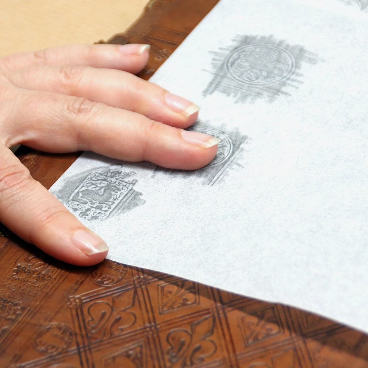
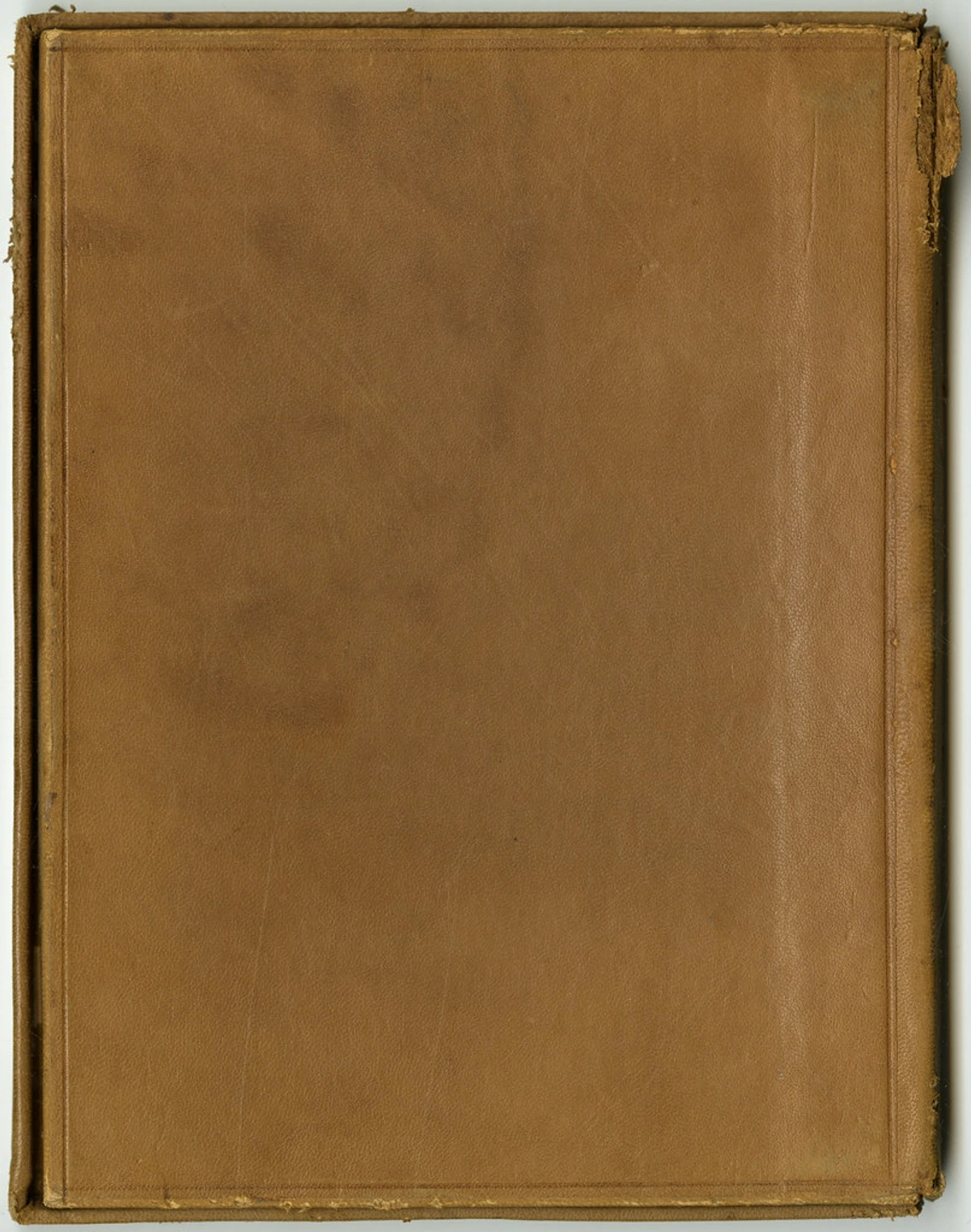
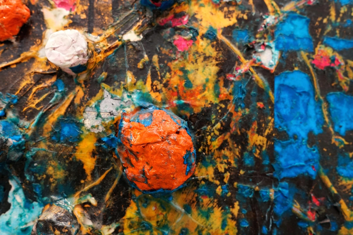
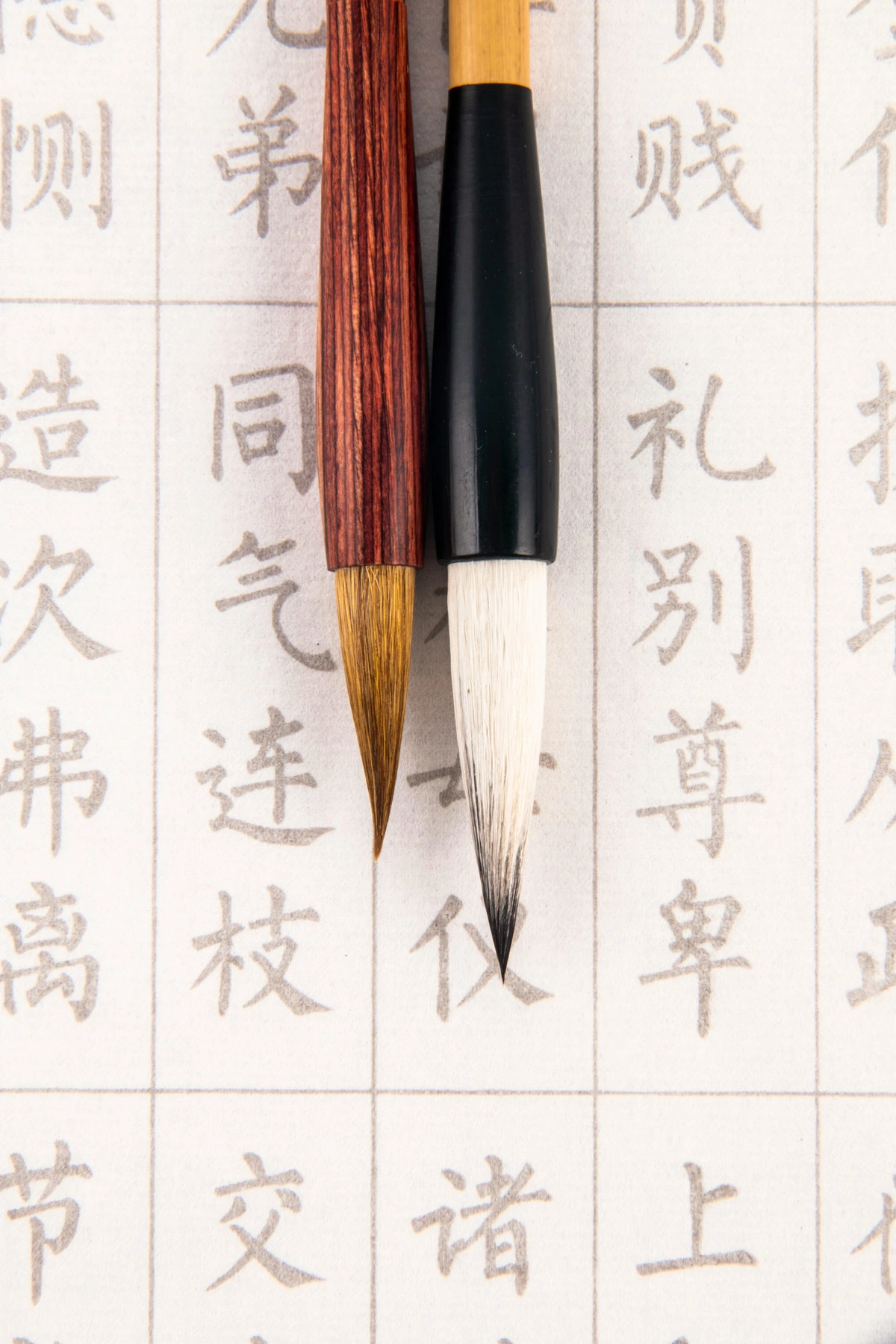
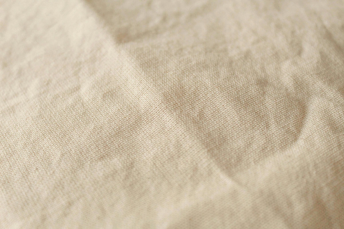
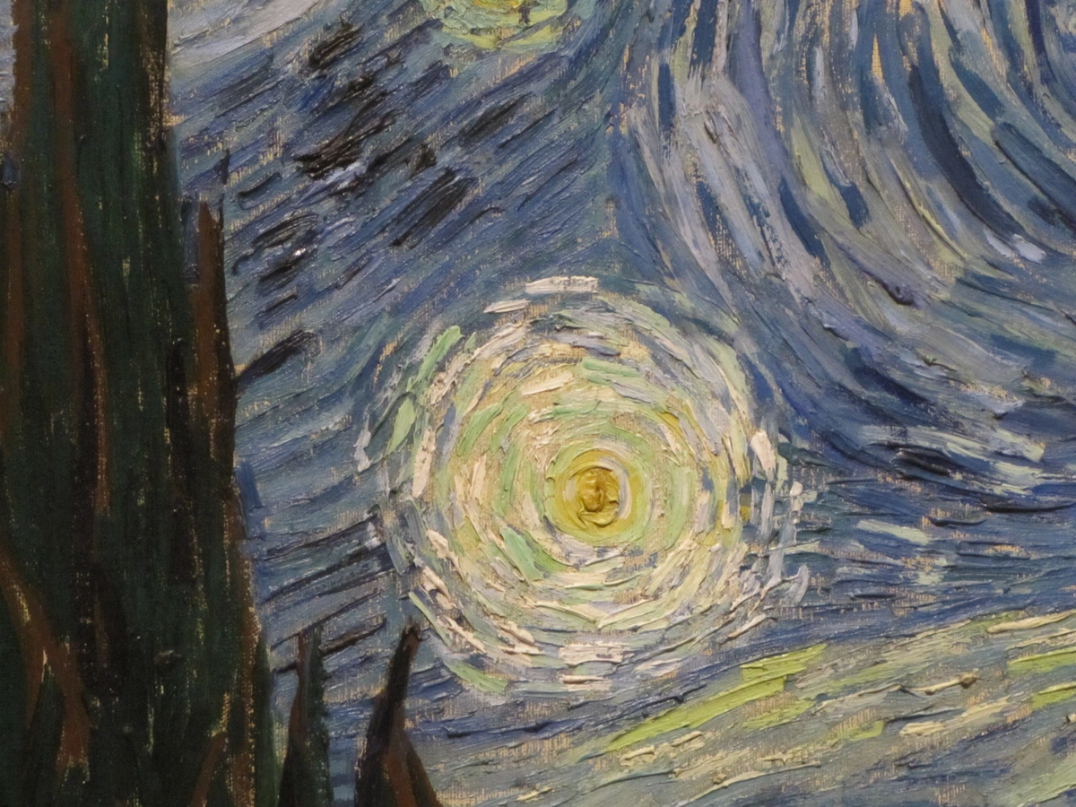
This image captures the essence of cold-pressed paper, showcasing its unique texture and natural fibers. It’s a testament to how paper texture can influence the final outcome of an artwork.
Why Paper Texture Matters in Art
You might be thinking, Isn’t paper just paper? Oh, how wrong that assumption is. The texture of paper—its tooth, its grain, its weight—can make or break an artwork. It’s the difference between a painting that feels alive and one that lies flat on the surface. Let me break it down for you.
The Emotional Impact of Texture
Texture isn’t just about how the paper feels; it’s about how it makes you feel. A rough texture can evoke a sense of raw, untamed energy, while a smooth surface might convey elegance and precision. Artists leverage these emotional cues to enhance the narrative of their work.
For example, imagine creating a stormy seascape on rough paper. The texture of the paper can mimic the turbulence of the waves, adding depth and emotion to the scene. Conversely, a smooth surface might be ideal for a serene portrait, where every detail needs to be crisp and controlled.
The Tooth of the Matter
Tooth refers to the roughness or smoothness of the paper’s surface. It’s what gives the paper its grip, its ability to hold onto mediums like charcoal, pastel, or paint. Here’s a quick breakdown:
Type of Tooth | Description | Best For |
|---|---|---|
| Rough | Highly textured, almost sandy | Bold, expressive works; watercolor; pastels |
| Cold-Pressed | Moderately textured, slightly bumpy | Versatile; watercolor, ink, acrylic |
| Hot-Pressed | Smooth, almost glossy | Detailed work; pen and ink, fine line drawings |
I once tried to draw a detailed portrait on rough watercolor paper. Let’s just say it was a disaster. The tooth was so aggressive that my pencil lines looked like they’d been through a blender. Lesson learned: match your medium to the tooth.
Exploring Tooth in Mixed Media
When working with mixed media, the tooth of the paper becomes even more critical. Different layers of mediums interact with the texture, creating a dynamic surface that can add depth and complexity to the artwork. Experimenting with tooth can lead to unexpected and exciting results.
The Grain Game
Paper grain is like the DNA of the sheet. It’s the direction in which the fibers align during manufacturing, and it affects everything from how the paper absorbs water to how it ages over time.
- Grain Long: The fibers run parallel to the longer edge of the paper. Ideal for most artworks because it’s more stable.
- Grain Short: The fibers run parallel to the shorter edge. Can be tricky—it’s more prone to warping when wet.
Imagine you’re painting a large wash of color. If you go against the grain, the paper might buckle like a waves in a storm. It’s a small detail, but it can ruin hours of work.
Grain and Artistic Techniques
Understanding grain can also influence your artistic techniques. For example, when working with watercolors, aligning your brushstrokes with the grain can create smoother transitions and reduce the risk of warping. This knowledge can be a game-changer for artists looking to refine their craft.
Grain and Archival Quality
The grain of the paper also plays a role in its longevity. Papers with a consistent grain tend to age better, resisting yellowing and deterioration. This is especially important for artists who want their work to stand the test of time. Always consider the grain when choosing paper for pieces you intend to preserve.

Preserving Artwork with the Right Grain
For artists focused on archival quality, selecting paper with a consistent grain is essential. This ensures that the artwork remains vibrant and intact over time, preserving its beauty and value for future generations.

Weighty Considerations
Paper weight is measured in grams per square meter (gsm). The higher the gsm, the thicker and more durable the paper. Here’s a quick guide:
Weight (gsm) | Description | Best For |
|---|---|---|
| 90-120 gsm | Lightweight, flimsy | Sketching, practice work |
| 140-300 gsm | Medium weight, versatile | Watercolor, acrylic, mixed media |
| 300+ gsm | Heavy, rigid | Professional watercolor, thick applications of paint |
I once used a 90 gsm paper for a watercolor piece. By the time I finished, the paper had warped so much it looked like a topographic map of the Himalayas. Not the effect I was going for.
Choosing the Right Weight for Your Project
Selecting the appropriate paper weight is crucial for the success of your artwork. Lighter weights are ideal for quick sketches and practice, while heavier weights provide the durability needed for professional pieces. Understanding the demands of your project will guide you in making the right choice.
How Artists Use Paper Texture
Watercolor Wonders
Watercolor and paper texture are like dance partners. The rougher the paper, the more the pigment pools and creates those beautiful, organic textures. Cold-pressed paper is the Goldilocks of watercolor papers—not too rough, not too smooth, just right.
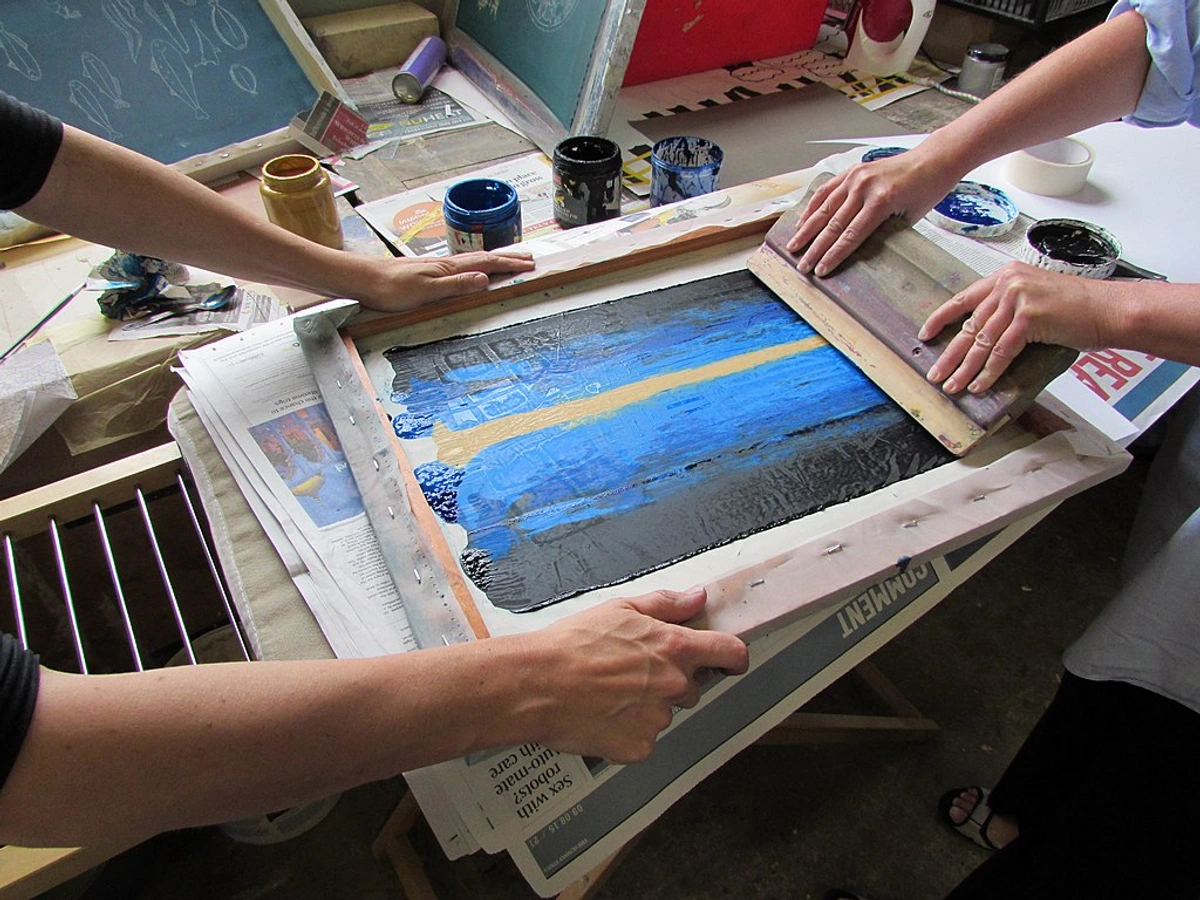
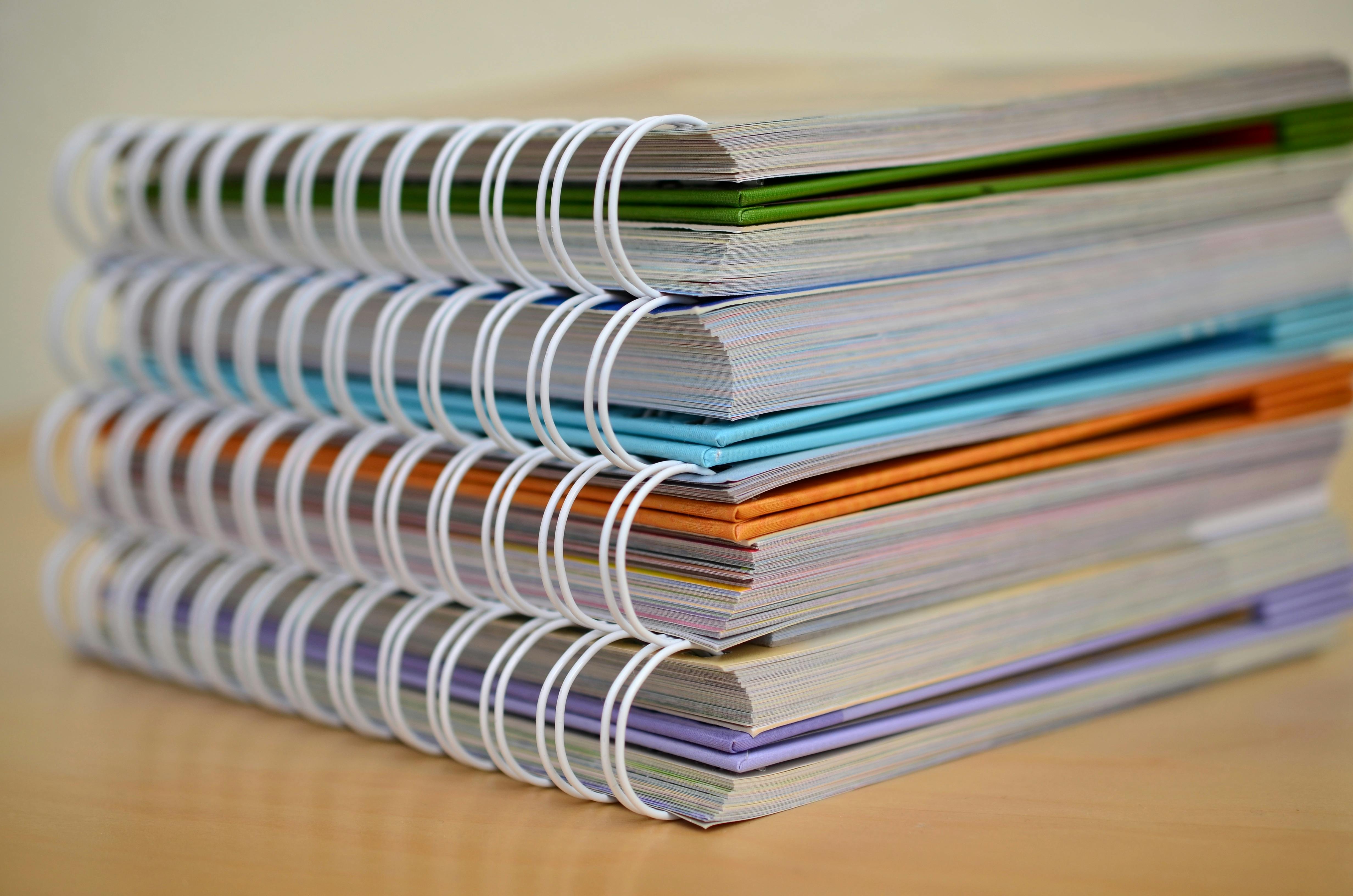
Credit, License
The Role of Texture in Watercolor Techniques
Different watercolor techniques benefit from specific textures. For example, wet-on-wet techniques work beautifully on rough paper, as the texture helps create organic, flowing patterns. Dry brush techniques, on the other hand, can be more controlled on smoother surfaces, allowing for finer details and crisp edges.
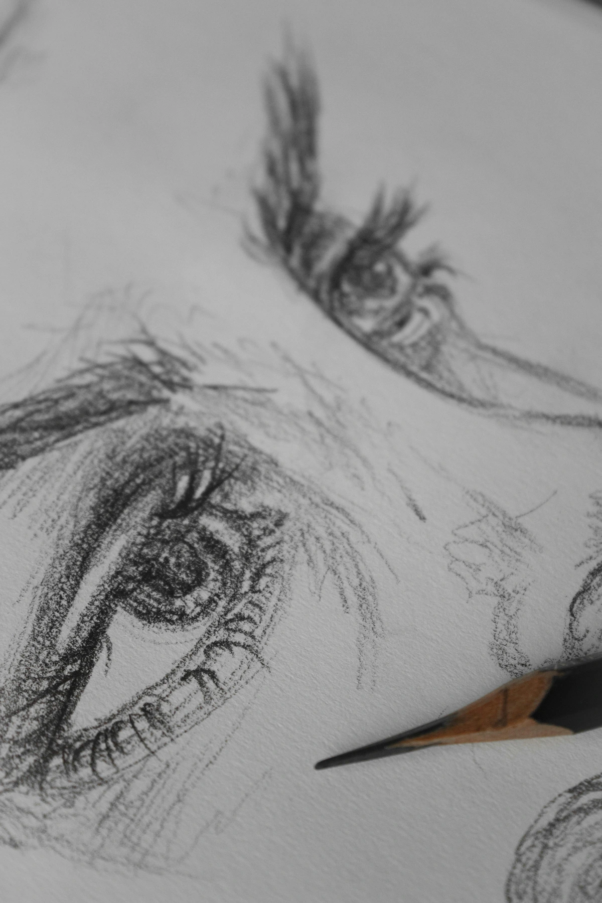
The Charcoal Challenge
Charcoal loves tooth. The rougher the paper, the more it can hold those rich, dark tones. Smooth paper? Forget about it. Your charcoal will slide around like a hockey puck on ice.
Exploring Charcoal on Different Textures
Experimenting with charcoal on various paper textures can yield surprising results. Rough textures allow for bold, expressive strokes, while slightly textured papers can provide a balance between control and spontaneity. Understanding these interactions can help artists achieve their desired effects.
Pastel Perfection
Pastels need a surface that can grip their dusty, crumbly nature. That’s why pastel papers often have a sand-like texture. It’s like giving your pastels a playground to cling to.
Layering Pastels on Textured Surfaces
Textured surfaces are essential for layering pastels. The grit of the paper allows multiple layers of pastel to adhere, creating depth and richness in the artwork. Without the right texture, pastels can become muddy or fail to adhere properly, leading to a less vibrant final piece.
Choosing the Right Paper for Your Art
Know Your Medium
Different mediums demand different textures. Here’s a quick cheat sheet:
Medium | Ideal Paper Texture | Why? |
|---|---|---|
| Watercolor | Cold-pressed | Balances absorbency and texture |
| Acrylic | Heavyweight, textured | Handles layers and thick paint |
| Charcoal | Rough, toothy | Holds pigment, prevents smudging |
| Pastel | Sanded or velour | Grips pastel particles |
| Ink | Hot-pressed or smooth | Prevents bleeding, crisp lines |
| Mixed Media | Versatile, medium tooth | Accommodates multiple mediums |
The Importance of Acid-Free Paper
When choosing paper, especially for works you intend to preserve, opt for acid-free options. Acid-free paper resists yellowing and deterioration over time, ensuring your artwork remains vibrant and intact for years to come. This is particularly important for pieces that will be displayed or stored for long periods.
Experiment and Explore
I can’t stress this enough: experiment. Try different papers, different textures. See how they interact with your medium. Keep a sketchbook of samples. Note what works and what doesn’t. Your future self will thank you.
Creating a Paper Texture Library
One of the best ways to understand paper texture is to create a library of samples. Collect small pieces of different papers and label them with their type, weight, and grain. Test each one with your preferred mediums and note the results. Over time, you’ll develop an intuitive sense of which paper works best for your artistic goals.
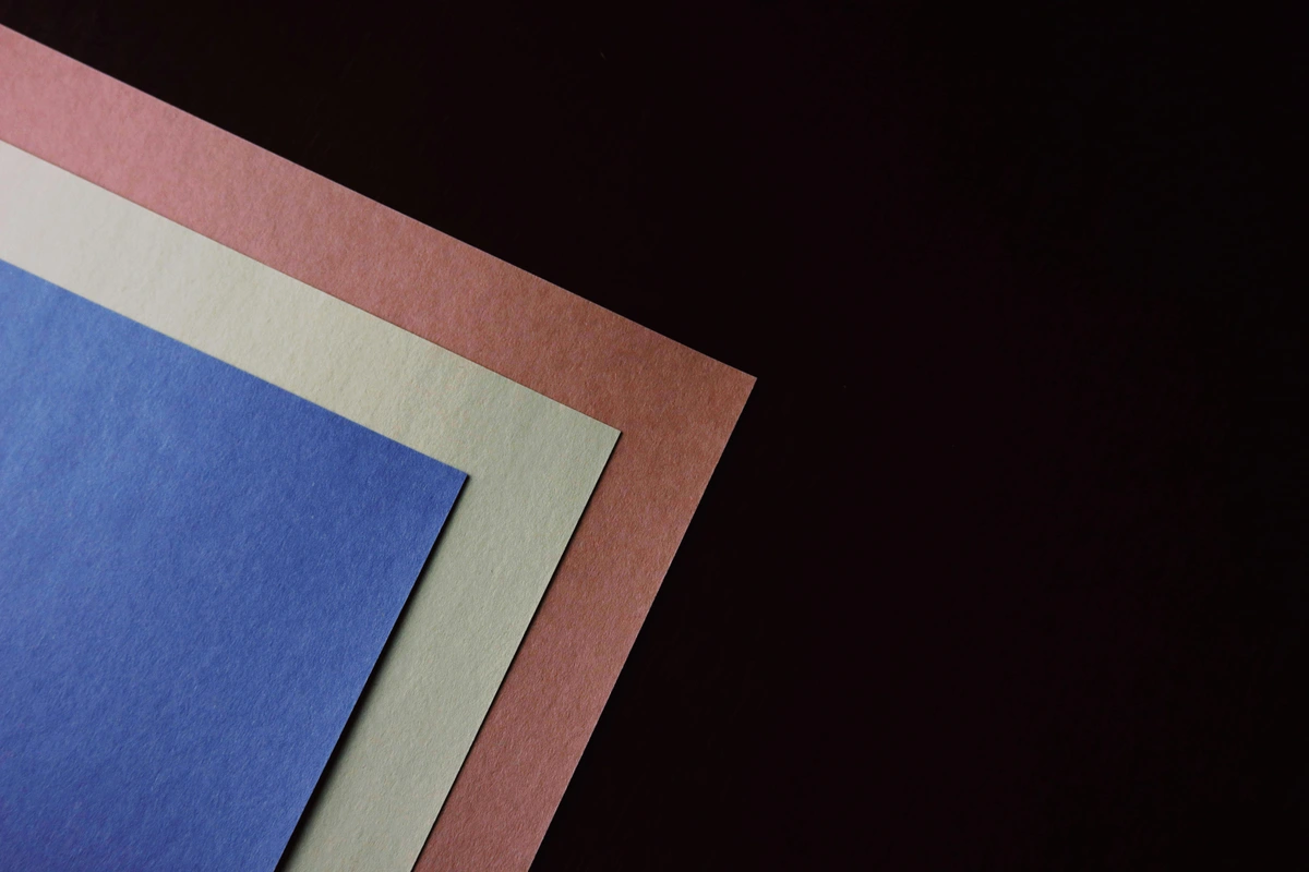
Consider the Finish
The finish of the paper can dramatically affect the final look of your artwork:
- Matte: No shine, great for a subtle, understated look.
- Glossy: Shiny, vibrant colors, but can be tricky with certain mediums.
- Satin: A middle ground, slight sheen without too much glare.
The Role of Finish in Presentation
The finish of your paper also plays a role in how your artwork is presented. A matte finish can reduce glare, making it easier to view under different lighting conditions. A glossy finish, while vibrant, may require careful lighting to avoid reflections. Consider the environment in which your artwork will be displayed when choosing a finish.
FAQ
What is the best paper for beginners?
If you’re just starting out, I’d recommend a cold-pressed watercolor paper around 140-300 gsm. It’s versatile enough for most mediums and gives you a good feel for how texture affects your work.
How does paper texture affect digital art?
Even in digital art, understanding paper texture can be beneficial. Many digital artists use textured brushes or overlays to mimic the feel of traditional media. Experimenting with these textures can add depth and authenticity to your digital work, making it feel more tactile and organic.
Can I use the same paper for different mediums?
You can, but it’s not always ideal. For example, while cold-pressed paper works for both watercolor and acrylic, it might not give you the best results for detailed ink work. It’s like using a Swiss Army knife—it does a lot, but not everything perfectly.

What is the best way to store paper to maintain its texture?
To maintain the texture and quality of your paper, store it in a cool, dry place, away from direct sunlight. Use acid-free folders or portfolios to prevent damage and avoid stacking heavy items on top of your paper, which can cause indentations or warping.
How do I prevent my paper from warping?
Warping happens when the paper absorbs moisture unevenly. To prevent it:
- Stretch your paper before painting (especially for watercolor).
- Use a heavier weight paper (300 gsm or more).
- Work on a flat, stable surface.
- Avoid excessive water or medium.
Can I fix warped paper?
If your paper has already warped, you can try to flatten it by placing it between two heavy books or using a paper press. For more severe warping, lightly misting the back of the paper with water and pressing it flat under a weight can help. However, prevention is always better than cure.
What’s the difference between student-grade and artist-grade paper?
Student-grade paper is more affordable and great for practice, but it’s usually less durable and has less consistent texture. Artist-grade paper is made from higher-quality materials, has better archival properties, and offers more consistent performance. If you’re serious about your art, invest in artist-grade.
Is it worth investing in expensive paper?
Investing in high-quality paper can significantly enhance your artwork. Expensive papers often have better texture, durability, and archival qualities, which can make a noticeable difference in the final piece. While it may seem like a small detail, the right paper can elevate your work and make it more professional.
How does paper texture affect the longevity of my artwork?
The texture and quality of the paper play a huge role in how your artwork ages. High-quality, acid-free papers with the right texture will resist yellowing, deterioration, and damage from light and moisture. It’s like choosing the right foundation for a house—it needs to stand the test of time.
What are some common mistakes artists make with paper texture?
One common mistake is not considering the texture of the paper when choosing a medium. For example, using smooth paper for charcoal can lead to smudging and poor adhesion. Another mistake is not testing the paper before starting a major project. Always experiment with small samples to ensure the paper works well with your chosen medium.
Conclusion
Paper texture is the unsung hero of the art world. It’s the silent partner that can elevate your work from good to extraordinary. Next time you pick up a sheet of paper, take a moment to feel its surface. Run your fingers across it. Listen to what it’s telling you. And remember, the right texture can turn a simple piece of paper into a canvas that sings.
If you’re curious to see how different textures come to life in artwork, take a look at some pieces in our collection. Or, if you’re ever in Den Bosch, visit our museum to experience the textures in person. And for a deeper dive into the evolution of artistic techniques, check out our timeline.
Happy creating, and may your paper always have the perfect tooth.
Additional Resources
For further reading and exploration, consider the following resources:
- History of Art Guide: A comprehensive look at the evolution of art through the ages.
- Creative Process: Sketchbook to Canvas: Insights into the journey from initial sketches to finished artwork.
- Archival Printmaking Techniques: Learn about preserving your artwork for future generations.