Mastering Die Brücke Techniques: A Bold, Raw Guide
Discover the visceral power of Die Brücke art. Learn core techniques, artist insights, and how to channel their revolutionary style into your contemporary practice.
Mastering Die Brücke Techniques: A Bold, Raw Guide
I remember stumbling upon Kirchner's street scenes in a museum catalogue decades ago. The colors weren't just bold; they vibrated. The figures weren't just people; they were psychological landscapes carved into plywood. There was no artifice, no polite composition—just raw, unfiltered human emotion laid bare. That feeling isn't dated. It's electric. So what made Die Brücke's techniques so visceral? How can you harness that raw energy today? Let's shatter the polished veneer of art history and dive into the gutter where Die Brücke was born.
The Raw Spirit of Rebellion: Who Were Die Brücke?
Picture Dresden, 1905. Four young artists—Kirchner, Schmidt-Rottluff, Heckel, and Mueller—sick of academic perfectionism. They formed Die Brücke (The Bridge), not as a formal manifesto, but as a collective scream against the sterility of mainstream art. Their goal? To connect old traditions with a new, emotional truth. They weren't just making art; they were building a bridge to something raw, something human, something danger. Rejecting galleries, they painted in cramped studios, rented dance halls, or outdoors, where the wind and grit became part of the process. This wasn't theory; it was survival.
Imagine them: not well-fed academics, but men haunted by the dawn of industrialization, World War I looming, society cracking at the seams. Their art wasn't escape; it was confrontation. Every woodblock carving, every raw pigment stroke, was a middle finger to polite society. So when we talk about "techniques," we're not discussing brushwork tips. We're talking about a philosophy: art as an act of psychological survival.
Core Die Brücke Techniques: Breaking the Rules Intentionally
Die Brücke didn't invent techniques so much as they weaponized forgotten methods. Their approach was about reduction and distortion to reach emotional truth. Let's dissect the key methods that defined their revolutionary output.
technique-table
Core Technique | Characteristic Elements | Purpose in Die Brücke Art | Materials & Tools |
|---|---|---|---|
| Woodcuts | Simplified forms, jagged lines, visible grain, stark contrasts | To amplify raw emotion through physical force | Wood blocks, gouges, ink/water-based paints |
| Color Palettes | Jarring, non-naturalistic hues (cadmium reds, blues, yellows) | To evoke psychological states, not depict reality | Oil paints, tempera, commercial pigments |
| Line & Form | Aggressive, uneven outlines; distorted figures/landscapes | To convey inner tension, not outward beauty | Ink, charcoal, graphite, stiff brushes |
| Compositions | Cropped perspectives, disorienting angles, overlapping forms | To fracture conventional viewing experience | Paper, canvas, any surface with "character" |
| Surface Texture | Rough, sometimes unfinished areas, visible application marks | To emphasize the physicality of making art | Unprimed canvas, cardboard, reused materials |
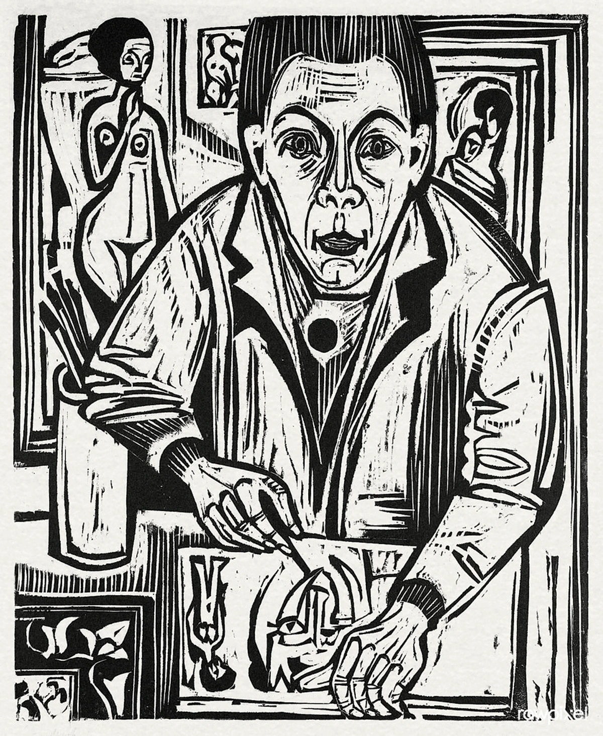
Woodcuts: Carving the Anxiety
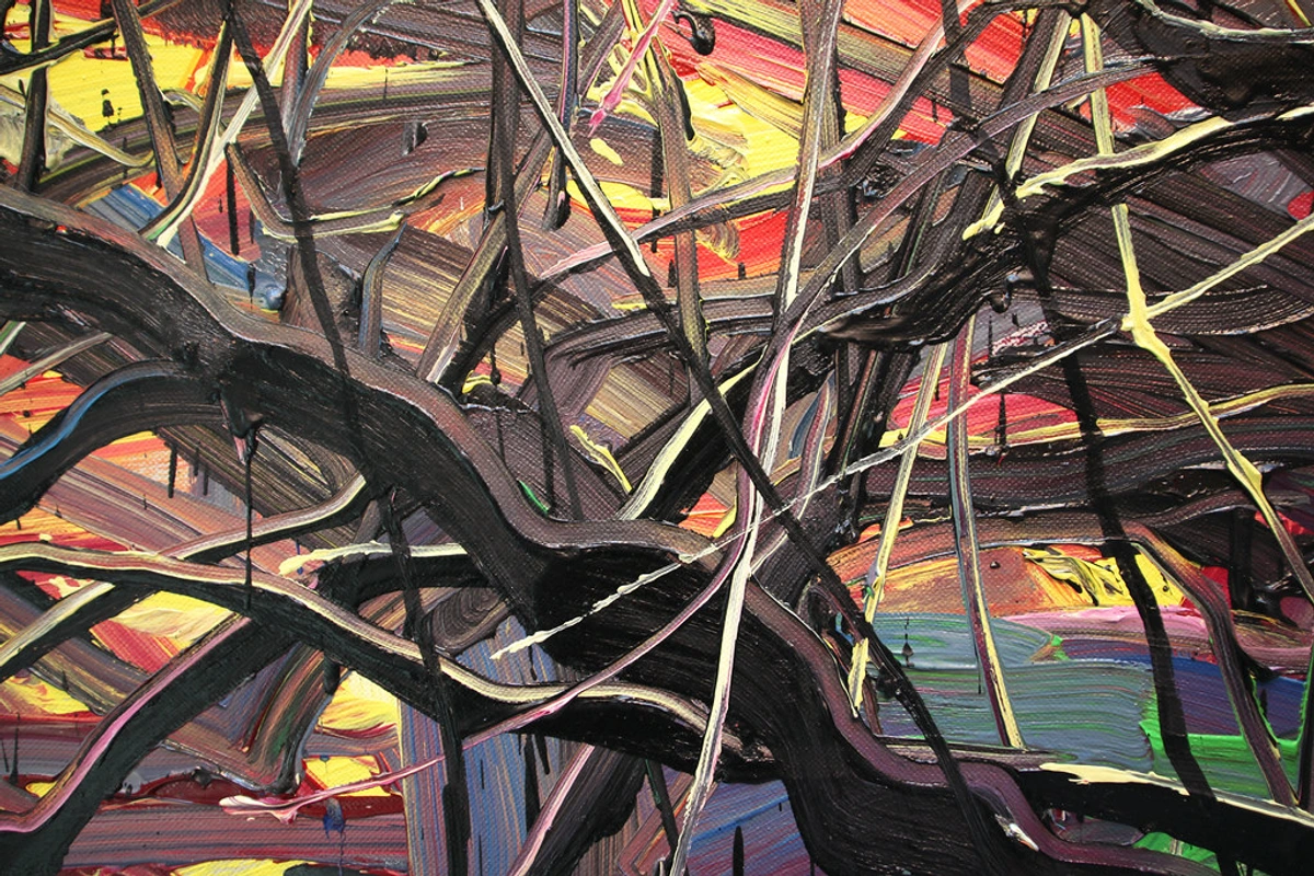
Forget smooth prints. Die Brücke's woodcuts were acts of violence made visible. They used soft woods like pine and poplar, carving with heavy gouges to create deep, aggressive textures. Instead of hiding the wood grain, they embraced it as part of the image's nervous system. Printmaking was physical: they inked blocks with bare hands, applied pressure with barren rollers, and often printed multiple layers of bright, clashing colors. The result? A work that felt like it could scratch your eyes out. It wasn't "pretty"; it was alive.
I've tried mimicking this. Take a block of wood. Don't sand it. Grab a large gouge and carve a shape with too much pressure—let it slip, let it tear. This isn't failure; this's Kirchner's "I don't know where the line ends, but I feel it." Print that. Notice how the ragged edge grabs more ink. See how the grain creates a texture that mimics a heartbeat? That's the power.
Color: Not a Description, a Scream
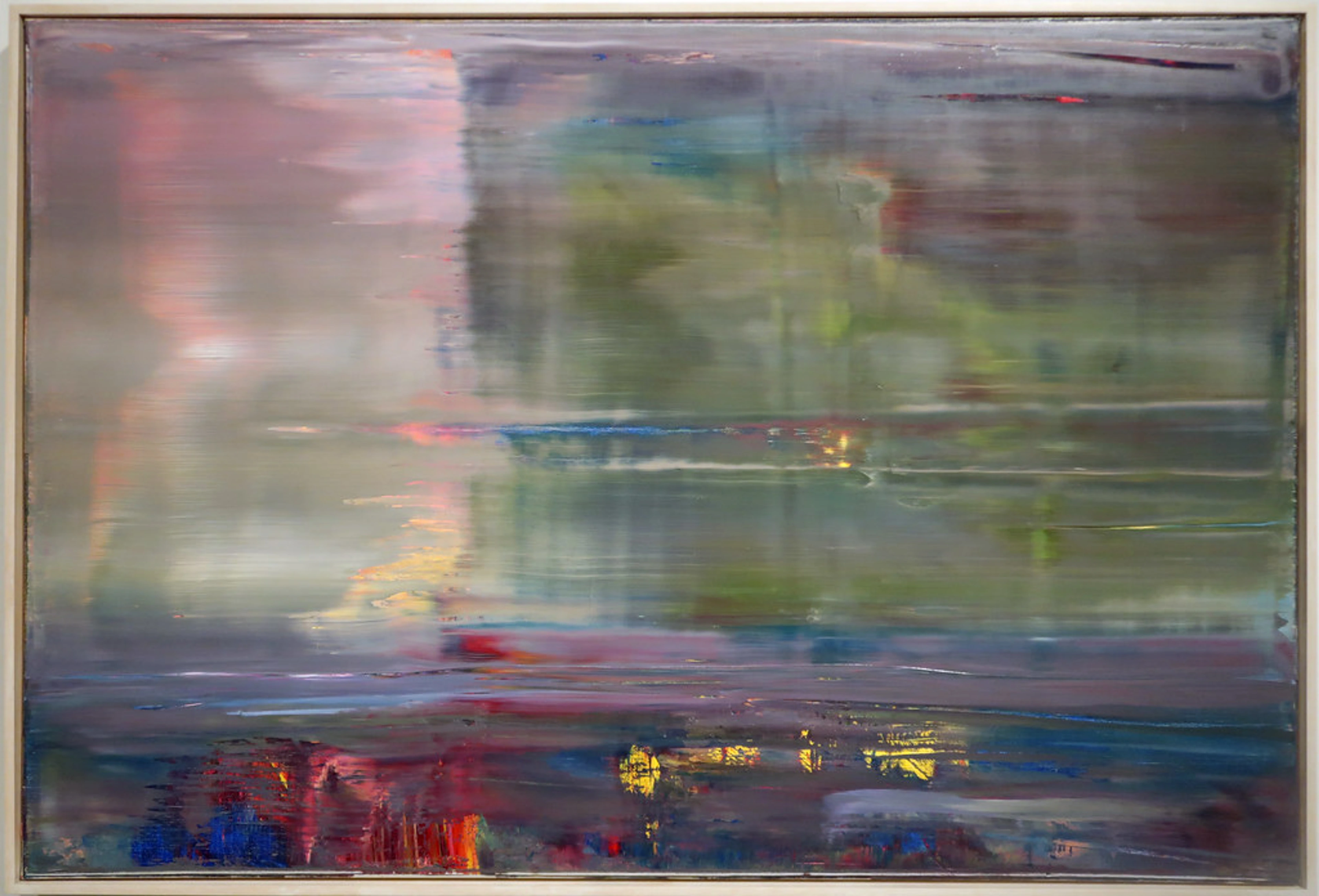
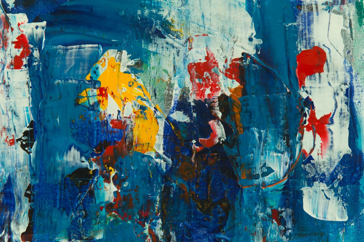
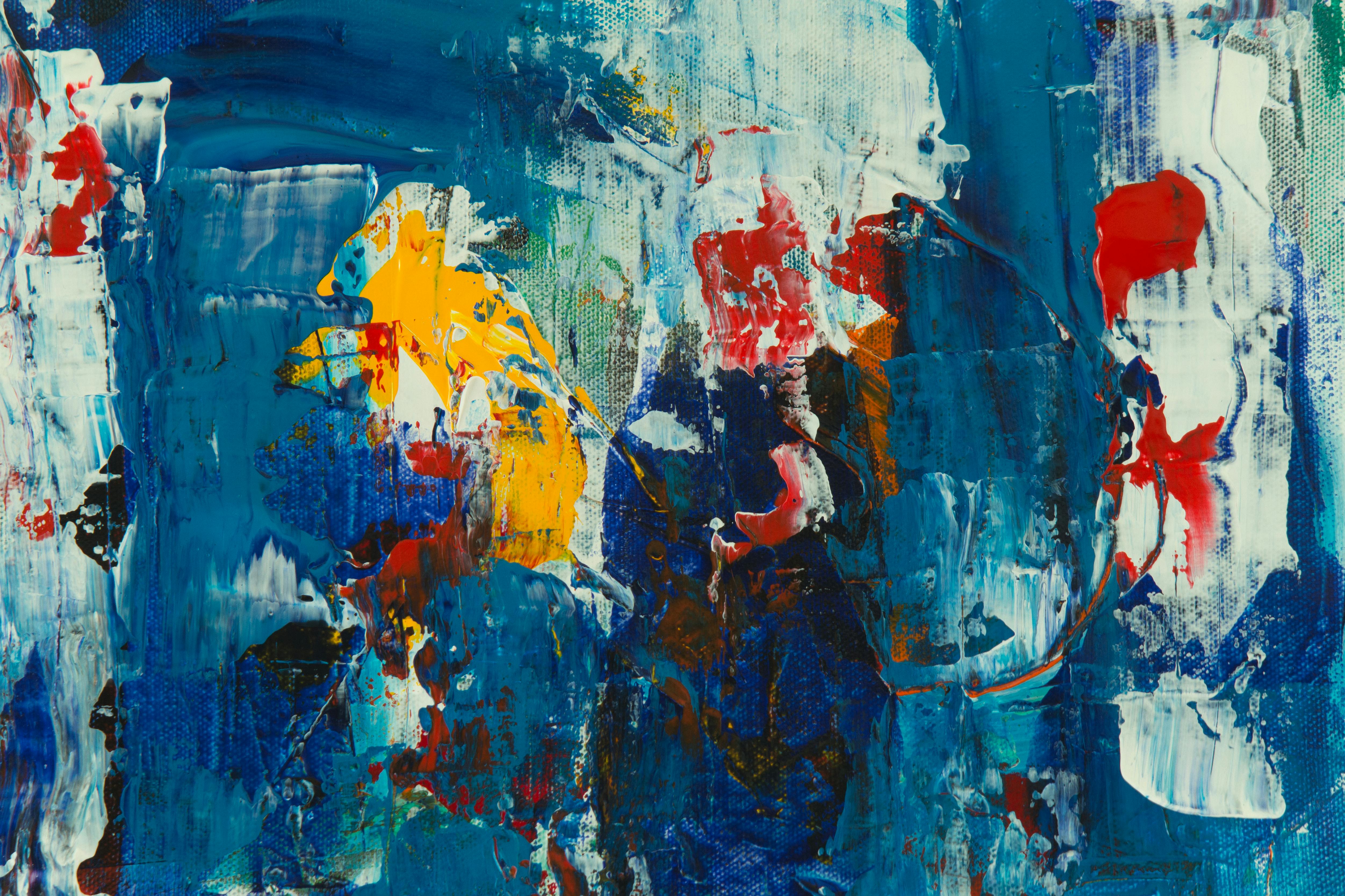
Die Brücke artists didn't consult color theory charts. They painted with emotional logic. Skin wasn't flesh-toned; it was sickly yellow or bruised purple. Sky wasn't blue; it was acidic, screaming green. Buildings were jarring reds, blacks, and ochres. Colors weren't blended smoothly; they were slapped on next to each other, creating vibrating optical tension. This wasn't a lack of skill; it was a deliberate choice to bypass the intellect and hit the viewer in the gut.
Think about it: when you're angry, do you blend your feelings into a nuanced gray? No. You feel RED. You feel BLACK. Die Brücke painted pure, undiluted emotional hues. Their palette wasn't diverse—it was focused. Five, six max. Often using cheap commercial pigments for their intensity over subtlety. The goal wasn't harmony; it was resonance.
Line & Form: Distorting the Human
Forget classical proportion. In a Die Brücke painting, a woman's neck might elongate like a reed about to snap. A city street might tilt vertiginously. Landscapes weren't vistas; they were claustrophobic pressure cookers. This distortion wasn't cartoonish; it was psychological. A figure's posture wasn't anatomically correct; it was a visual shout of alienation or desire. The lines were nervous, scratching at the surface. A glance at Heckel's figures shows this perfectly—long, angular limbs, faces reduced to masks of feeling. The form served emotion, not reality.

Key Artists, Unique Approaches
While Die Brücke shared core principles, each member translated the raw energy differently:
- Ernst Ludwig Kirchner: The chaotic energy incarnate. His cityscapes are fever dreams—figures with staring eyes, sharp angles conveying social anxiety, jarring color clashes like a subway screeching to a halt. Technique? Speed. He painted almost frantically, leaving visible brushstrokes as evidence of his handiwork. His woodcuts are brutally direct, almost violent in their simplicity.
- Karl Schmidt-Rottluff: The architect of rawness. While Kirchner was chaotic, Schmidt-Rottluff brought geometric force. His landscapes reduce hills to sharp triangles, trees to thick, dark slashes. Compositions feel monumental yet primitive. His woodcuts often used large, bold shapes and fewer lines, creating powerful, almost sculptural impact. Less internal frenzy, more elemental power.
- Erich Heckel: The lyricist of angst. Heckel's work often feels more melancholic. His figures, though distorted, sometimes exude a quiet sensitivity. Landscapes can be brooding, using deeper greens and earth tones alongside the signature Die Brücke bolds. His technique in painting often involved layering thin washes of oil, creating a sense of depth within the rawness.
- Otto Mueller: The romantic primitive. Mueller brought a softer, lyrical touch to the group. His nudes often move with a flowing grace, set in natural settings rendered with a softer line. His technique was more fluid, washes of color merging gentler, while still retaining the core Die Brücke commitment to emotional truth over accuracy. He understood the rebellion could also be tender.
Legacy: Why Does This Still Matter?
Die Brücke didn't just influence art; they infected it. They laid the groundwork for German Expressionism, which bled into Abstract Expressionism (think Pollock's frenetic energy!), Neo-Expressionism in the 80s, and countless contemporary artists grappling with anxiety, alienation, and raw feeling. Look at the distorted figures in Baselitz's "inverted" paintings, the visceral color in Kiefer's monumental works, the street-level grit in Basquiat's scribbles – you're seeing Die Brücke's DNA. Their techniques aren't historical artifacts; they're blueprints for making art that refuses to be polite. In a world saturated with slick digital perfection, the scratchy, honest, slightly dangerous feel of Die Brücke feels more vital than ever.
Bringing Die Brücke Into Your Studio Today: A Practical Guide
Want to channel that raw energy? Forget waiting for a manifesto. Here’s how to infuse your practice with Die Brücke’s revolutionary spirit:
Materials: Embrace the "Imperfect"
- Surfaces: Don't reach for pristine pre-primed canvas. Use roughhewn wood panels, thick watercolor paper, cardboard, old Masonite, or even burlap. The texture is part of the statement. Unprimed surfaces grab paint and ink differently, creating a more physical, less "finished" result. Imagine painting on the side of a crate – that's the spirit.
- Pigments: Prioritize intensity over subtlety. Look at cheap student-grade oils/acrylics in pure, unmixed hues. Cadmium Red, Cadmium Yellow, Ultramarine Blue, Mars Black – use them straight from the tube. Avoid pre-mixed "earth tones" or "fleshes." Your palette should scream intention, not accident. Dilute ink heavily for woodcuts – transparency and pooling create texture.
Step-by-Step: A Die Brücke-Inspired Project
- Subject & Sketch (Fast, Frenzied): Don't over-plan. Think: Anxiety. Urban isolation. Raw nature. Sketch directly onto your chosen surface with charcoal or a thick ink stick. Make the lines nervous, jagged, thick. Let them wander. Don't erase – embrace the "mistakes." This isn't a blueprint; it's the raw nerve of the idea.
- Blocking Color (Brutal Application): Forget glazing. For painting, load a stiff brush or palette knife with pure color and lay it down in flat, distinct patches. Don't smooth it out. For woodcuts, carve your key block first – the strongest shape, often in a dominant color. Print it. Let it dry. Then carve the next strongest shape, print it over the first, deliberately misregistering it slightly. The chaos is the point.
- Distorting Form (Follow the Feeling): Looking at your sketch? Ask: Does this feel anxious? Distorted? Is the line conveying tension? Exaggerate it. Tilt that building. Elongate that neck. Shorten that perspective. Reduce details to bold, graphic shapes. A face isn't eyes, nose, mouth; it's a slash of yellow (fear), a blob of red (rage), a triangle of white (light). Capture the essence, the psychological truth.
- Texture & Mark (Leave Evidence): Don't hide your process. Leave visible brushstrokes, wood grain from the carving, scuffs on the cardboard. Rub sand or dirt onto a wet ink layer. Let paint drip. Your hand's presence, the physical act of making, is crucial. Let the surface feel worked, not manufactured. This is where the soul lives.
- Editing (Less is More): Die Brücke rarely added details for detail's sake. Do you need that fifth leaf? That third rivet? Reduce. Focus on the core emotion. Use strong cropping. Let an arm or a building edge slice through the frame. Create tension, not comfort.
techniques-table
Common Pitfall to Avoid | Die Brücke Solution | Application Tip |
|---|---|---|
| Blending colors smoothly | Apply pure, unblended colors next to each other (juxtaposition) | Use separate brushes loaded with different colors, scrape palette knife between applications |
| Trying for realistic anatomy | Distort forms to convey emotion (elongation, angularity) | Ask "What feeling does this shape need?" not "Is it accurate?" |
| Smoothing surfaces | Embrace texture: wood grain, visible brushstrokes, roughness | Don't sand wood aggressively; let tool marks show; use thick paint |
| Overworking details | Focus on powerful, simplified forms; prioritize emotion | After initial layers, stop. Add only what's essential |
| Using "safe" palettes | Intense, non-naturalistic colors (bright reds, blues) | Test commercial pigments for raw vibrancy |
Frequently Asked Questions (FAQ)
Q: What does "Die Brücke" actually mean in an artistic context?
A: Literally "The Bridge" in German. They chose the name from Nietzsche, symbolizing their mission to connect past artistic traditions with a new, raw, modern expression. It wasn't just a name; it was their purpose: building a bridge to authenticity.
Q: Were Die Brücke techniques about a lack of skill?
A: Absolutely not. Look closely at Kirchner's figure drawings or Schmidt-Rottluff's powerful compositions – the draftsmanship is purposeful, even when seemingly crude. Their "simplicity" was a hard-won aesthetic choice to bypass technical display and reach a more primal emotional impact. They knew the rules intimately, which is why breaking them was so effective.

Q: Can I use Die Brücke techniques without just copying historical styles?
A: This is crucial. Die Brücke's power came from responding to their specific world (early 20th-century German anxiety, industrialization). Don't just copy their palettes or subject matter. Instead, adopt their method bold colors for intense emotion, distortion for psychological truth, raw surfaces for physicality. Apply that same raw energy to your contemporary anxieties, your urban landscape, your relationship with technology. Let the technique serve your voice. It's a language, not a costume.

Q: What materials did Die Brücke artists actually use in their studios?
A: They were resourceful, not exclusive. Key materials included commercial oil paints (often student-grade for intensity), water-based ink for woodcuts, plywood blocks (cheaper than traditional hardwoods), and unprimed canvases or cardboard. They repurposed materials constantly, reflecting their anti-establishment, practical ethos. You don't need fancy tools; you need nerve. Explore available art materials here
Q: Where can I see original Die Brücke artworks in person?
A: Major museums hold significant collections. Excellent examples are at the Brücke Museum in Berlin (dedicated solely to them!), the Staatliche Museen zu Berlin, and the Museum of Modern Art (MoMA) in New York. For a truly unique experience exploring German Expressionism's roots, consider visiting institutions like the den Bosch museum, which often features pivotal modern movements. Discover relevant exhibitions and collections Browse timelines of pivotal artistic movements

**Q: How did Die Brücke influence later art movements beyond just German Expressionism?**n A: Their impact was seismic and far-reaching:
- Abstract Expressionism: Artists like de Kooning and Pollock absorbed the emphasis on raw gesture, physicality of paint, and psychological intensity over representation.
- Neo-Expressionism: The 1980s movement (Baselitz, Kiefer, Schnabel) revived bold color, figuration, and emotional directness, explicitly citing Die Brücke as a key influence.
- Contemporary Art: The spirit lives on in artists using "bad" painting, graffiti aesthetics, or intentionally challenging compositions to evoke discomfort, anxiety, or raw human presence. Their lesson: authenticity trumps polish.
Conclusion: The Unpolished Truth
Die Brücke techniques weren't a style; they were a survival mechanism against a world losing its soul. They remind us that great art doesn't come from perfect technique or polite aesthetics. It comes from making choices that feel honest, even if they make the viewer squirm. It comes from scratching the surface until something bleeds through. So, what will your bridge carry? What raw truth needs shouting today? Forget the polish. Grab the gouge. Squeeze the cadmium red. And remember, the most powerful thing you can make is something undeniably, unapologetically you.