Transformeer je Thuiskantoor: Kunst voor Focus, Creativiteit & Welzijn
De reis van een kunstenaar onthult hoe intentionele kunst een thuiskantoor transformeert van saai naar gedurfd. Ontdek hoe kleur, abstracte kunst, plaatsing en verlichting focus, creativiteit en welzijn stimuleren, en burn-out tegengaan voor ultieme productiviteit.
Voorbij het Scherm: Hoe Kunst Mijn Thuiskantoor Transformeerde van Saai naar Gedurfd (en Productief!)
Het zoemen van de laptop, de gloed van het scherm, het eindeloos scrollen… herinner je je die vroege dagen van thuiswerken nog? Mijn 'kantoor' was minder een toevluchtsoord en meer een haastig opgeruimde hoek – een laptop, en een aanhoudend, bijna existentieel 'is dit nu mijn leven?' gevoel. Ik herinner me levendig een middag, starend naar een bijzonder oninspirerende muur, toen de diepzinnige gedachte bij me opkwam: "Is dit… alles wat er is?" Het klinkt dramatisch, ik weet het. Maar op dat moment van cognitieve vermoeidheid voelde de saaiheid van mijn omgeving als een fysiek gewicht, dat subtiel mijn creativiteit wegdraineerde. Het duurde verrassend lang – misschien te lang voor iemand die trots is op observatie, of misschien gewoon te lang voor iemand wiens hersenen existentiële angst prioriteren boven interieurontwerp – om te beseffen dat mijn omgeving niet alleen een achtergrond was; het was een stille, productiviteit-ondermijnende medeplichtige. De wereld voorbij onze schermen kan ons innerlijke landschap subtiel doch diepgaand vormen, vaak onopgemerkt totdat een kleine, intentionele verschuiving alles verandert. Het blijkt dat een beetje kunst niet alleen mooi is om naar te kijken; het is een geheim wapen voor focus, flow, en misschien zelfs een vleugje durf. En voor mij was het niets minder dan een openbaring die mijn saaie werkruimte transformeerde in een gedurfd canvas voor gedachte en actie. Ga met me mee terwijl ik de psychologische voordelen van kunst verken, praktisch advies geef over selectie en plaatsing, en mijn eigen reis deel van het transformeren van een alledaagse werkplek in een dynamische bron van inspiratie.
Waarom Kunst in het Thuiskantoor? Mijn 'Aha!'-Moment: De Bekering van de Functionalist & Verder
Jarenlang was ik een functionalist, een pragmaticus. Mijn werkruimte was strikt utilitair, een plek om te doen, niet om te voelen. Kunst? Dat was voor galerijen, grote woonkamers, of perhaps those impossibly chic online interiors magazines. Zeker niet mijn bescheiden hoekje. Maar toen, een subtiele verschuiving. Ik begon op te merken hoe een vleugje kleur, de curve van een lijn, zelfs het fluisteren van textuur op een canvas, subtiel, bijna onmerkbaar, mijn stemming kon veranderen. Het was mijn 'aha!'-moment – een besef dat mijn brein niet alleen een verwerkingseenheid was; het was een bewoner van deze ruimte, en het verlangde naar meer dan alleen steriele efficiëntie. Dit besef ontketende een ontdekkingsreis, die me ertoe bracht het diepgaande 'waarom' achter de impact van kunst op onze werkplekken te begrijpen. Maar wat is deze magie precies, deze subtiele alchemie die steriele muren transformeert in bronnen van inspiratie?
De Psychologische Kracht van Kunst: Meer Dan Alleen Mooi
Kunst is niet zomaar een aangename afleiding; het is een diepgaand psychologisch instrument, gevalideerd door uitgebreid onderzoek in omgevingspsychologie en neuro-esthetiek. Het kan fungeren als een micropauze voor je ogen en geest, waardoor cognitieve vermoeidheid wordt verminderd, maar de kracht ervan gaat dieper. Door je blik, zelfs even, te verschuiven naar iets esthetisch moois, betrek je verschillende delen van je hersenen, waardoor je gerichte aandacht subtiel kan resetten en mogelijk zelfs een dopamine-afgifte kan stimuleren, wat de stemming en motivatie verbetert. Dit fenomeen wordt vaak gekoppeld aan de Attention Restoration Theory (ART), die suggereert dat het omgaan met fascinerende stimuli (zoals kunst) onze gerichte aandacht – de inspannende focus die we op taken toepassen – laat herstellen. Zie het als het geven van je gefocuste, 'werkende' brein een korte, heerlijke pauze, waardoor je meer ontspannen, 'observerende' brein het kan overnemen, en je mentale batterijen oplaadt zonder dat je er veel moeite voor hoeft te doen. Bepaalde kleuren en vormen kunnen de emotionele regulatie direct beïnvloeden, stress en angst verminderen, een gevoel van kalmte bevorderen, of juist een verkwikkende motivatie opwekken en zelfs helpen een flow state op te wekken waarin je volledig opgaat in een taak. Het is alsof je de perfecte, non-distracting background score voor je hersenen vindt. Onderzoek, bijvoorbeeld door omgevingspsychologen zoals Stephen Kaplan, heeft herhaaldelijk de impact van visuele stimuli op welzijn en cognitieve prestaties aangetoond, wat aangeeft dat zelfs korte blootstellingen aan esthetisch aangename omgevingen de gerichte aandacht kunnen herstellen. Het is ook de moeite waard om op te merken hoe kunst kan putten uit biofilische principes, onze aangeboren menselijke neiging om verbinding te maken met de natuur, wat betekent dat zelfs abstracte kunst, als het subtiel organische curven, vloeiende lijnen of ritmische patronen in bladeren echo't, een kleine, onbewuste verbinding met de natuur kan bieden, je gronden op een manier die steriele muren never could. En hier is een gedachte: het omgaan met boeiende kunst kan soms een staat van 'zachte fascinatie' teweegbrengen, je aandacht zachtjes trekken zonder intense focus te eisen, net zoals het observeren van wolken of verre golven. Dit offers a profound restorative effect, letting your mind recharge without fully disengaging. If you're curious to dive deeper, exploring resources like de psychologie van kleur in abstracte kunst can illuminate the fascinating science behind it. Hoe spreekt jouw omgeving stilletjes tot je werkende geest?
Kunst als Cognitieve Reset & Schild Tegen Visuele Ruisonderdrukking
Naast stemming dient kunst als een cruciaal cognitief hulpmiddel. Het constante 'visuele ruis' van een rommelig of saai kantoor, net als auditieve achtergrondruis, kan een stille belasting zijn voor je mentale middelen, wat bijdraagt aan je cognitieve belasting. Het is het visuele equivalent van een onophoudelijk gezoem dat je verwerkingskracht belast. Een goed gekozen kunstwerk fungeert echter als een visueel anker – een bewust punt van lichte focus dat je geest in staat stelt kort los te komen van de taak, te resetten en vervolgens terug te keren met hernieuwde helderheid. Zelfs abstracte kunst kan, in zijn complexe doch harmonieuze composities, fractale patronen in de natuur weerspiegelen. Onze hersenen zijn bedraad om these naturally occurring patterns—from coastlines to clouds—te herkennen en er troost in te vinden, because they represent a balance of complexity and inherent order, providing a subtle, grounding connection. Hoewel ik abstracte kunst bepleit omwille van zijn creatieve potentieel, is het vermeldenswaard dat voor sommigen een zorgvuldig gekozen representatief landschap, een minimalistisch stuk of een kalmerend stilleven vergelijkbare effecten kan bereiken, especially for those who find literal interpretations grounding and require a gentler visual escape without intense intellectual interpretation. These can also be effective in reducing cognitive load by offering a point of serene focus. Als je nadenkt over hoe je these powerful, silent partner in your daily grind kunt benutten, diving into resources like kunst kiezen voor productiviteit in het thuiskantoor kan een heel nieuw perspectief openen. Deze cognitieve reset wordt prachtig geïllustreerd door de daad van het creëren zelf. Welke visuele ankers kunnen jou helpen het mentale gezoem van je eigen werkplek te verminderen?
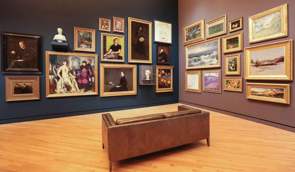
Jouw Kunstzinnige Muse Vinden: Een Praktische Gids (Door Mijn Ogen)
Dus, met het 'waarom' stevig vastgesteld, laten we ons verdiepen in het praktische 'hoe' van het samenstellen van je eigen kunstzinnige kantoor – een proces dat ik ben gaan zien als zowel een kunst als een wetenschap, vol heerlijke ontdekkingen en, toegegeven, een paar (humoristische) misstappen. Kunst kiezen voor je thuiskantoor, zo heb ik ontdekt, is veel genuanceerder dan simpelweg iets uitkiezen wat je 'mooi' vindt. Het gaat over het bewust inrichten van je omgeving, een vorm van strategische plaatsing ontworpen voor enhanced creativiteit, haarscherpe focus, en duurzame algehele productiviteit. Dit is niet zomaar interieurontwerp; het is een investering in je mentale landschap en zelfs een subtiele weerspiegeling van je persoonlijke waarden. Hier is wat ik heb geleerd – sometimes through delightful discovery, sometimes through slightly embarrassing missteps – op mijn kronkelige artistieke reis:
1. De Kracht van Kleur: Mijn Persoonlijke Palet voor Vooruitgang
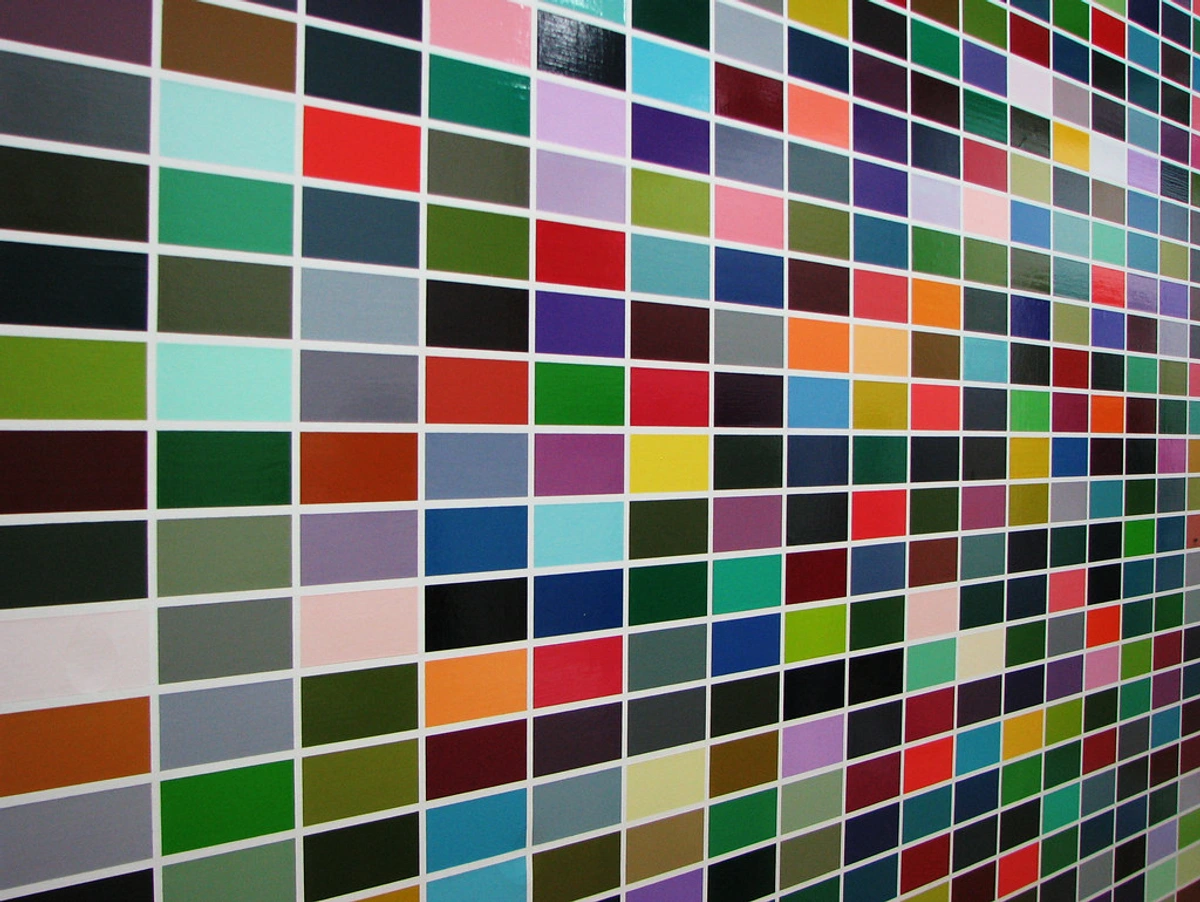
Klaar om de kracht van kleur in je werkruimte te ontsluiten? Ik ben altijd al aangetrokken geweest tot kleur, maar ik heb geleerd dat 'levendig' niet gelijk hoeft te staan aan 'chaotisch' of 'overweldigend' – een les die ik met vallen en opstaan heb geleerd bij een eerdere, nogal neongeladen poging tot een 'energieke' kantoorruimte die less like a refuge and more like a permanent disco rave, leaving me more agitated than inspired. Een zorgvuldig gekozen vleugje blauw, groen, geel of zelfs een genuanceerd roze kan energie geven zonder te overstimuleren. In mijn eigen bureauhoek transformeerde een stuk met subtiele blauw- en groentinten de ruimte volledig; het is als een mini-mentale vakantieplek die ik met een blik kan bereiken. Ik herinner me een bepaald abstract stuk, voornamelijk diep indigo met smaragdkleurige streken, dat mijn focus echt verlegde. Het was niet alleen 'mooi'; het was een aardende aanwezigheid die de mentale ruis deed verstommen.
Wat ik heb ontdekt, is dat koelere tinten – think the soothing depths of blues and the refreshing calm of greens – uitstekend zijn voor het bevorderen van focus en een serene gemoedstoestand. Ze zijn like visual anchors in a sea of tasks. Omgekeerd kunnen warmere accenten, such as soft yellows or gentle oranges, creativiteit en optimisme opwekken zonder agressief veeleisend te zijn. De kleurtemperatuur (the perception of warmth or coolness of a color) speelt hierbij een belangrijke rol: cool colors tend to recede and calm, while warm colors advance and energize. Hoewel persoonlijke resonantie van het grootste belang is, is het ook fascinerend om op te merken hoe some color associations are culturally widespread, while others are deeply individual. Always trust your gut, but be aware of these subtle influences. De sleutel zit in de nuance: consider the saturation (how pure or muted a color is) and brightness (how light or dark) as much as the hue itself. Een diep, gedempt blauw biedt rustige contemplatie, while a bright, highly saturated yellow can be a jolt of joyful inspiration. Vermijd overdreven intense rood- of paarstinten als je gevoelig bent voor stress, unless they are used sparingly and intentionally to add a dynamic, purposeful edge – perhaps on an adjacent wall, rather than directly in your line of sight. Het draait allemaal om intentionality. Welke kleuren domineren momenteel je werkruimte, en hoe voel je je daarbij? Ondersteunen of belemmeren ze je dagelijkse flow? Voor meer inzichten in hoe kunstenaars kleur hanteren, I find hoe kunstenaars kleur gebruiken een eindeloos fascinerende leeservaring.
https://live.staticflickr.com/4073/4811188791_e528d37dae_b.jpg, CC BY-SA 2.0 license
Kleur | Primaire stemming/effect | Beste voor |
|---|---|---|
| Blauw | Kalmte, Focus, Sereniteit | Taken die concentratie vereisen, lange werksessies |
| Groen | Balans, Harmonie, Verfrissend | Verminderen van oogvermoeidheid, creatieve probleemoplossing |
| Geel | Optimisme, Creativiteit, Energie | Brainstormen, opbeurende sfeer, incidentele boosts |
| Oranje | Enthousiasme, Warmte, Stimulatie | Sociale interactie (indien van toepassing), ideeën opwekken |
| Rood | Passie, Energie, Urgentie | Spaarzaam gebruikt voor accenten, stimulerende doorbraken |
| Paars | Luxe, Creativiteit, Mysterie | Spaarzaam gebruikt, for a touch of sophisticated inspiration |
https://live.staticflickr.com/3173/2971037978_95f41144d3_b.jpg, CC BY 2.0 license
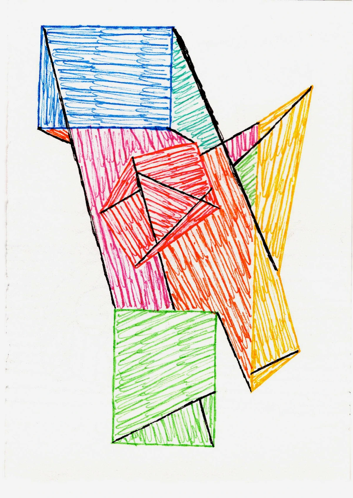
2. Onderwerp: Waarom Abstracte Kunst Mijn Thuiskantoor MVP is
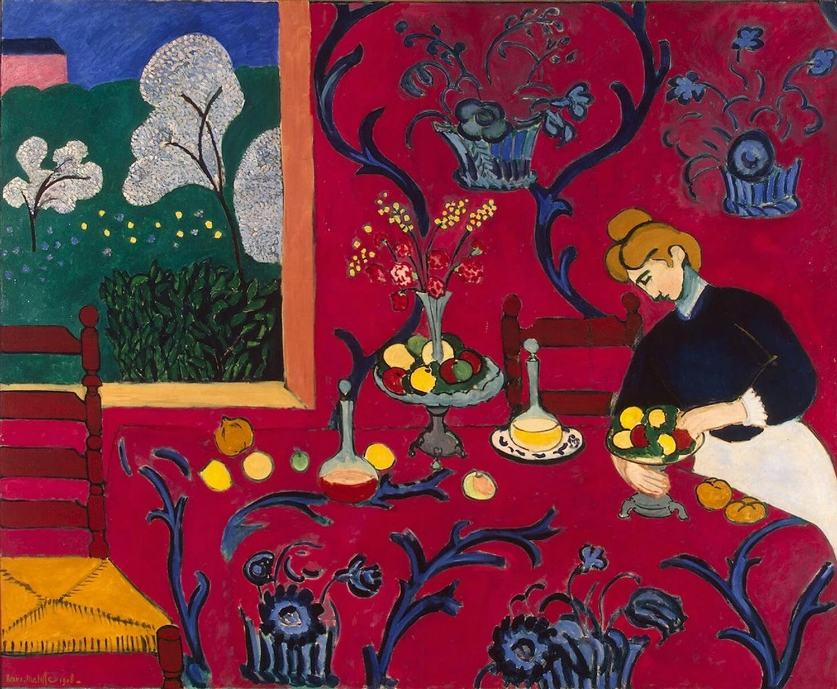
Vraag je je af welk soort beelden een creatieve geest echt dient? Hier vindt mijn artistieke ziel echt zijn thuis op kantoor: ik leun sterk naar abstracte kunst. Realistische landschappen of portretten? Die zijn ongetwijfeld prachtig. But in an office environment, my mind, ever the storyteller, starts spinning narratives, getting lost in the depicted scene rather than focusing on the task at hand. Abstract pieces, however, offer a different kind of engagement – a visual puzzle, yes, but one without a single, dictated solution. They're like a sophisticated jazz improvisation – complex, intriguing, full of unexpected turns, but they don't demand a literal story. They just are. They invite you to bring your own interpretation, your own questions. For boosting creativity? They are, in my experience, unparalleled. Take the works of Mark Rothko, for instance, whose large color fields invite deep emotional introspection without dictating a narrative, their immersive quality allowing the mind to quiet and focus on feeling rather than deciphering. Or Piet Mondriaan, wiens precieze geometrische abstracties demand an appreciation of balance and order, stimulating a different kind of mental engagement – a calm, analytical focus on structure, which can be incredibly grounding and conducive to structured problem-solving. Voor een kalmerende, meditatieve kwaliteit, consider Agnes Martin's minimalistische rasters, which offer subtle shifts in texture and tone, inviting quiet contemplation and a gentle, restorative focus. Her pursuit of perfection and subtle variations in repetition can be deeply grounding, guiding the eye without demanding overt interpretation. Als je geïntrigeerd bent door haar unieke benadering, offers de ultieme gids voor Agnes Martin fascinerende inzichten.
Abstracte kunst moedigt je geest actively aan om te dwalen, to make novel connections, to engage your subconscious in a playful dance of pattern recognition and meaning-making, all without being tied down to a specific, limiting interpretation. It's a mental playground that keeps the creative juices flowing without overwhelming your conscious focus. This process is essentially divergent denken in actie – the ability to generate multiple solutions or ideas for a given problem, a crucial element in innovation and problem-solving. Hoewel mijn hart zingt voor abstracte kunst, it's worth acknowledging that for others, a calming landscape, a serene seascape, or a minimalist sculpture might offer a different pathway to focus, providing a gentle, non-demanding visual escape that soothes the mind, especially for those who benefit from literal grounding. Daarnaast kan kunst dienen als een subtle conversation starter, or a reflection of your personal values, adding another layer to its purpose beyond pure productivity. Om de kracht hierachter echt te begrijpen, I often find myself revisiting kunst kiezen voor productiviteit in het thuiskantoor to refine my own approach. Welk onderwerp wekt jouw nieuwsgierigheid zonder je focus te kapen?
Zenmuseum, CC BY 2.0 license
3. Grootte en Plaatsing: De Goldilocks Zone
Hoe zorg je ervoor dat je gekozen kunstwerk niet overweldigt of verdwijnt? Ah, de Goldilocks Zone – een concept waar ik intiem mee vertrouwd ben geraakt door trial, error, en een paar onhandige her-ophangingen. Een veelvoorkomende fout die ik zie (and definitely made myself, more than once) is te klein gaan, of juist te groot. Ik hing eens een commanding, hyper-detailed landscape zo hoog aan een verre muur dat to truly appreciate its nuances, I needed binoculars – which rather defeated the purpose of a quick, effortless visual break. Of, omgekeerd, een piepklein, exquise abstract kunstwerk was utterly swallowed by a vast wall, whispering its beauty to no one. Het draait allemaal om visueel gewicht en balans – how different elements in a space pull the eye. For example, a heavy, dark frame adds more visual weight than a light, minimal one, and dense patterns or highly saturated colors will command more attention than sparse, muted ones. Vergeet ook het belang van negatieve ruimte rondom je kunstwerk niet; it provides visual breathing room, allowing the piece to stand out and preventing the wall from feeling cluttered. Ik wil dat mijn kunst zichtbaar is, to command attention in a gentle way, but never to be domineering. It should feel like a companion, a silent witness to your thoughts, not a competitor for your precious mental energy. Overweeg de grootte van de muur, the size of your desk, and your own eye-line. Overweeg de schaal van het kunstwerk ten opzichte van your typical viewing distance; a very detailed, intricate piece might need to be closer for engagement, while a larger, bolder abstract provides broader visual impact from further away. Typically, eye-level placement, where the center of the artwork is around 57-60 inches from the floor, works best for most seated positions, offering a natural visual break without craning your neck. Maar don’t be afraid to break that rule slightly if it feels right for your space and your posture. Ook, think about how the art defines the space. A large piece behind your desk can act as a visual boundary, signaling 'this is where work happens,' helping your mind transition into focus mode when you sit down. En overweeg de oriëntatie: a horizontal piece can make a small room feel wider and calmer, while a vertical piece can add height and dynamic energy. Als je worstelt met limited space, a strategically placed smaller piece, perhaps a triptych or a bold diptych, can still make a surprisingly significant impact. For a detailed guide on maximizing artistic impact in compact areas, abstracte kunst voor kleine ruimtes biedt onschatbare inzichten. Hoe past jouw kunst in je werkruimte – is het 'precies goed' of zoekt het nog steeds naar zijn perfecte plek?
https://mastersatart.com/, CC BY-NC 4.0 license
4. Lijsten Doen Ertin: De Onbezongen Held van Presentatie
En lijsten! Oh, de subtiele, often underestimated magie van een goede lijst. Het is alsof je een briljant, slightly unruly idee een perfect passend pak aantrekt – it elevates, it defines, it gives it gravitas. Zelfs als ik sometimes too impatient ben om dingen zelf in te laten lijsten (the creative urge often outpaces the practicalities, a familiar artist's dilemma!), I always, always appreciate the finished, polished look. Een eenvoudige, strakke lijst kan een visuele grens creëren die de kunst laat opvallen, drawing your eye precisely where it needs to be and keeping your focus on the piece itself, rather than the wall behind it. Voor kunst op canvas, consider a sleek gallery wrap, where the canvas extends around the sides of the stretcher bars, offering a contemporary, frameless look that emphasizes the art itself, making it feel more integrated with the wall. Voor levendige abstracties, a sleek black or white frame often provides a contemporary edge without competing. Voor zachtere, meer genuanceerde stukken, a natural wood frame can add warmth and an organic feel, while a brushed metallic frame can introduce a touch of modern sophistication. Een sierlijke, traditionele lijst, conversely, can add a sense of history and gravitas, influencing the perceived formality of the piece and the room. The frame essentially acts as a deliberate transition from the everyday to the artwork, subtly influencing its overall aesthetic or stylistic character – be it modern, traditional, minimalist, or dramatic. Overweeg ook de breedte en diepte van de lijst: a wider, deeper frame often adds more presence and a sense of importance, whereas a very thin, shallow frame can create a more delicate, understated effect. Onderschat de kracht ervan niet om the aesthetic te voltooien, protect your investment, and profoundly enhance the art's presence and perceived value. Welke lijst zou het verhaal dat jouw kunst wil vertellen het beste aanvullen?
5. De Stille Verhalenverteller: Hoe Textuur Diepte Toevoegt
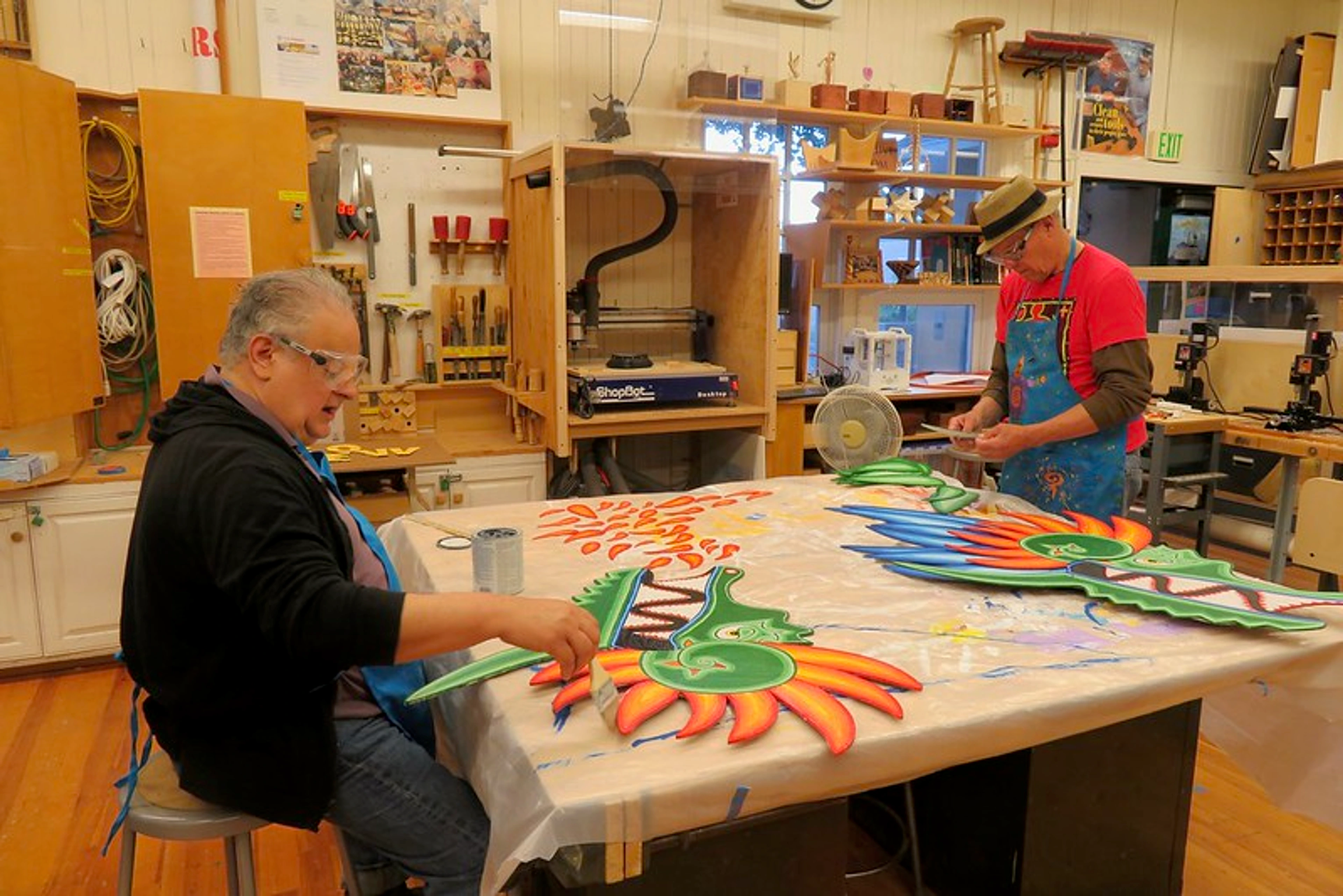
Naast kleur en vorm is er een tactiele dimensie aan kunst die often goes unnoticed, especially in our screen-dominated lives: textuur. Voor mij wordt een stuk met tastbare textuur – be it the luscious, thick impasto of acrylics that create miniature, light-catching mountain ranges on the canvas, the subtle, organic weave of linen, the delicate grain of watercolor paper absorbing pigment, or the smooth, almost glassy finish of a resin coat – een stille uitnodiging om te pauzeren, to look closer, to almost feel the artist's hand at work. Verschillende media bieden inherent different textural qualities: the rich, buttery feel of oil paint versus the translucent layers of watercolor, the stark flatness of a digital print, or the multi-layered depth of mixed media. Het offers a refreshing break from the flat, backlit uniformity of digital displays. Deze zintuiglijke rijkdom kan subtiel contribute to a more grounded, present feeling in your workspace, anchoring you in the physical world even as your mind explores abstract concepts. Soms kan een ruwe, gelaagde textuur (think thick impasto, like a topographical map of emotions) speak of resilience and history, grounding you and fostering a sense of strength, while a smooth, reflective surface might evoke calm, precision, and clarity. The subtle variations in depth and light across a textured surface offer a mini-escape for your eyes, a refreshing pause from the flatness of digital interfaces. It’s a stille verhalenverteller, adding depth without demanding conscious interpretation. Om this often-overlooked element echt te waarderen, exploring de definitieve gids voor het begrijpen van textuur in kunst kan ongelooflijk inzichtelijk zijn. Welke texturen zou jij in je kantoor willen uitnodigen om een andere dimensie toe te voegen aan je dagelijkse ervaring?

https://live.staticflickr.com/65535/53064827119_1b7c27cd96_b.jpg, CC BY-NC-ND 2.0 license
6. De Onzichtbare Hand: Je Kunst Verlichten
Het is gemakkelijk om te overzien, but how your art is lit can profoundly change its impact, shifting it from a quiet background element to a captivating focal point, or vice-versa. Natuurlijk licht is always a gift, but supplementing it with strategic artificial lighting can truly make your art sing. Ik herinner me a vibrant, moody piece that, when initially placed under harsh overhead office lighting, felt flat and uninspired. But with the addition of a soft, focused picture light, it literally came alive, revealing hidden depths and colors I hadn't seen before – it was like the art finally found its voice. Omgekeerd, I’ve also learned the hard way that a poorly aimed spotlight can create more glare than glory, turning a reflective piece into a dazzling distraction rather than a soothing focal point. Consider accentverlichting – a small, focused spotlight (like a picture light or track lighting) can highlight textures and colors, drawing the eye precisely where you want it, much like a stage light on an actor. This differs from ambient verlichting, which provides general illumination for the whole room, like your main overhead light or a soft desk lamp. Integrating gallery lighting or track lighting can truly make your art sing, creating an ambiance that enhances both the art and your productivity. Be mindful of glare on glossy pieces and avoid harsh, overhead lights that can flatten the art's depth. The goal is to illuminate, not overpower, creating an ambiance that enhances both the art and your productivity. A well-lit piece can provide that extra 'oomph' of inspiration, making your visual breaks even more effective. Voor een diepgaande verkenning van dit cruciale aspect, de kunst van het exposeren: hoe abstracte kunst te belichten en te plaatsen voor maximale impact biedt uitgebreide begeleiding. Hoe zul je jouw gekozen meesterwerk verlichten om het volledige potentieel ervan te onthullen?
De 'Kantoorsaaiheid' Vermijden: Mijn Humoristische Misstappen & De Valkuilen van 'Zomaar'
Maar deze reis is niet zonder hobbels en blunders geweest. Oh, de 'Kantoorsaaiheid.' I've navigated those murky waters, often with a good dose of self-deprecating humor. Mijn allereerste poging tot 'kantoorkunst' was een framed print of a cat playing the cello. Don't ask. Seriously, don't ask. Every time my eyes drifted to it, my mind would immediately spin a narrative: 'Is the cat practicing for a concert? What's its backstory? Does it prefer Bach or Beethoven?' I just wanted to nap, or perhaps listen to classical music and write a sonnet to feline musical prowess. Definitely not ideal when staring down a looming deadline. That’s when the stark realization hit me: 'art I like' isn't always 'art that works in my office.' It needs to serve a deeper purpose beyond mere aesthetic pleasure; it needs to be a silent, supportive partner in productivity. The line between 'inspiring' and 'distracting' is surprisingly thin. I also once tried a piece that was just too stimulating – a hyper-bright, incredibly intricate abstract with so many competing elements it felt less like inspiration and more like a visual alarm clock, jarring my focus instead of resetting it. It was a beautiful piece, no doubt, but utterly wrong for my workspace. And then there was the elaborate, hyper-realistic still life of a bowl of fruit – meticulously rendered, no doubt, but every glance became a mental grocery list, not a creative spark. Another common pitfall? Opting for art that’s too trendy or generic, chosen more for its current popularity than any genuine personal resonance. Such pieces often fail to offer that crucial deeper engagement, leaving you with little more than a placeholder. A playful piece can indeed be great, but ensure it encourages the right kind of mental activity – a burst of creative energy, not a full-blown daydream about anthropomorphic animals or a descent into existential angst. Soms kan een vleugje gecureerde chaos – a carefully selected collection of smaller, visually diverse but thematically connected pieces – actually be stimulating. The key, however, is 'gecureerd'; it’s intentional visual richness, not accidental clutter. Welke stille saboteurs loeren er in jouw eigen gezichtsveld?
Zenmuseum, CC BY 2.0 license
Snelle Tips voor het Samenstellen van Je Creatieve Ruimte
Om je te helpen navigeren op je eigen artistieke kantooravontuur – a journey, I might add, that often involves me talking to myself in my head, weighing the pros and cons of a particular brushstroke's psychological impact – hier is een gedistilleerde versie van mijn persoonlijke 'aha!'-momenten en herinneringen:
- Reflecteer je doelen: Does this piece encourage the mood I want for a particular task – calm for deep work, energy for brainstorming? Always consider if it combats burnout or supports your mental well-being and offers a source of comfort during challenging work periods. Because I learned the hard way that a piece that looks great but makes me feel anxious during a deadline is a terrible office companion.
- Persoonlijke resonantie & Intentie van de kunstenaar: Does it genuinely speak to your soul, sparking an intuitive connection that transcends mere aesthetics? And can understanding the artist's intent or the story behind the piece deepen that connection? (Zie ook: Onderwerp: Waarom Abstracte Kunst Mijn Thuiskantoor MVP is)
- Overweeg je ooghoogte: Will it offer a refreshing visual break without being overly distracting? Aim for that Goldilocks Zone. (Zie ook: Grootte en Plaatsing: De Goldilocks Zone)
- Omarm het Abstracte: If creativity and divergent thinking are your goals, let abstract forms be your guide. They're like mental playgrounds without fixed rules.
- Grootte doet ertoe (en plaatsing & oriëntatie): Not too big, not too small; let it complement the room, not overwhelm or disappear. Think about vertical vs. horizontal impact and the importance of negative space. Consider its schaal relative to your typical viewing distance. And remember, a poorly scaled piece can feel like a visual shout or a barely audible whisper. (Zie ook: Grootte en Plaatsing: De Goldilocks Zone)
- Vergeet de lijst niet: A good frame is the art’s best advocate, elevating its presence and defining its style. Consider its width and depth. It’s the tailored suit for your visual idea. (Zie ook: Lijsten Doen Ertin: De Onbezongen Held van Presentatie)
- Aanraken en Voelen (Textuur & Medium): If possible, consider the texture and the artist's medium. Does it add another layer of sensory richness to your environment, a break from the digital? Because in a world of flat screens, tactile richness is a grounding balm for the senses. (Zie ook: De Stille Verhalenverteller: Hoe Textuur Diepte Toevoegt)
- Verlicht het: How will lighting enhance or diminish the art's impact? Can you optimize it to create the perfect ambiance, differentiating between accent and ambient lighting? The right light can make it sing, the wrong light can leave it muted. (Zie ook: De Onzichtbare Hand: Je Kunst Verlichten)
- Overweeg de levensduur: Does this piece have staying power for you, or is it just a fleeting trend? Your art should ideally grow with you, not just for a season, though occasionally a temporary 'flirtation' with a piece can be fun too, I suppose.
Mijn Persoonlijke Zen Zone: Een Casestudie in Productiviteit
Lange, lange tijd voelde mijn werkplek tijdelijk aan, een bijzaak. Nu, dankzij de bewuste infusie van kunst, is het een toegewijde, almost sacred space. It’s a reflection of intention. Ik herinner me het moment dat ik het stuk vond: an abstract geometric marvel pulsing with blues, reds, and yellows, which I call "Organized Chaos". It's a curious paradox; it reminds me of the organized chaos of my own creative thoughts – the interwoven ideas, the dynamic tensions, the search for a harmonious resolution – yet somehow, paradoxically, brings a profound sense of clarity. The rhythmic interplay of cool, calming blues and vibrant, energizing yellows creates a dynamic balance, while the geometric order provides a mental anchor amidst the creative dynamism. It's a visual metaphor for the very process of problem-solving: finding harmony within complexity, and for me, it consistently encourages fresh perspectives, helping to untangle knotted thoughts. Ik creëerde het tijdens a particularly productive, yet chaotic, period of my own artistic journey, so it carries a piece of that focused energy. The process of its creation, mirroring my own work ethic, imbued it with an even deeper meaning, transforming it from a mere object into a personal talisman. It has become mijn constante visuele anker – a point of stability and beauty in a frequently shifting mental landscape. When I'm really stuck, that familiar, almost instinctive feeling of creative block descends, I don't force it. Instead, I just let my gaze drift to "Organized Chaos", letting my mind wander freely through its intricate lines and vibrant colors. It’s my little creative escape hatch, a private moment of introspection that, without fail, resets my focus and often sparks a new pathway forward. It's truly a testament to how the right piece of art, especially one with a personal story or connection, can be a silent, powerful partner in your daily work. Welk stuk heeft een vergelijkbare kracht voor jou?

Zenmuseum, CC BY 2.0 license
Verbinding Maken met de Creatieve Geest: Voorbij de Muren van Je Kantoor
Voorbij de loutere plaatsing van objecten, there’s a deeper connection to be forged—a connection to the essence of creation itself. Wat als je kantoor niet alleen een plek was om te werken, but a living testament to the creative journey, inspiring you even when you're not actively creating? Nadenken over de rauwe inspiratie die flows into the creation of art often helps me connect more profoundly with my own work. Mijn reis als kunstenaar, for instance, is a winding path of exploration, discovery, and sometimes delightful imperfection – much like what you're doing now, trying to curate your own inspiring and deeply personal space. Understanding the artist's process, their struggles, breakthroughs, and choices, often provides a potent mirror for my own creative challenges; for instance, seeing Wassily Kandinsky's early explorations, moving from representational forms to pure abstraction – his early, almost lyrical landscapes and figures slowly dissolved into pure color and form – reminds me that true breakthroughs often come after periods of intense experimentation and even perceived failure, encouraging me to push through my own creative blocks. De werken van kunstenaars als Hilma af Klint of Kandinsky, who explored abstraction not just aesthetically but spiritually, have profoundly shaped my own understanding of art's deeper purpose and its ability to transform inner landscapes. Moreover, engaging with art, even as a viewer, can offer therapeutic benefits, providing a sense of calm, introspection, and emotional processing. Als je nieuwsgierig bent naar the 'how' and 'why' behind my own artistic evolution, you can read more about it on mijn tijdlijn. Bovendien kan het begrijpen van the rich lineage of artistic thought can profoundly enrich your appreciation. Ik verlies mezelf vaak in de histories of movements; consider exploring de ultieme gids voor abstracte kunstbewegingen to deepen your own perspective and perhaps find echoes of your creative spirit. En, if you're moved to invest in art, consider the ethical implications: supporting living artists, understanding the provenance of a piece, and ensuring your choices reflect a conscious engagement with the art world. En als je reis je ooit naar 's-Hertogenbosch brengt, I'd be honored if you visited mijn museum to see more of the art that inspires me daily. Hoe zul je je own connection to the vast, inspiring world of art verdiepen?

Printerval.com, CC BY-NC 4.0 license

https://www.flickr.com/photos/fabola/41351098495/, CC BY-SA 2.0 license
Veelgestelde Vragen (FAQ) Over Kunst in het Thuiskantoor
V: Welke kleuren zijn echt het beste voor focus en productiviteit? A: Voortbouwend op wat we bespraken, zijn koele tinten zoals blauw en groen consequent uitstekend voor het bevorderen van kalmte, helderheid en aanhoudende focus – think of them as visual meditations. Research in environmental psychology often highlights these hues for their ability to promote a sense of tranquility and concentration. Aardetinten dragen also contribute to a grounded, serene workspace. Gelen, mits doordacht gebruikt (considering saturation and brightness), can indeed boost creativity and optimism, but I'd caution against overstimulation by using them in moderation or as accents. Uiteindelijk is het diep persoonlijk; the 'best' color is how that color makes you feel, deep down, though individual responses can vary significantly. It's about finding your perfect visual companion.
V: Moet mijn kantoorkunst perfect bij mijn inrichting passen? A: Absoluut niet! In fact, as someone who loves a dash of unexpected flair, I find that sometimes the most compelling and engaging spaces arise from intentional contrasts. Hoewel cohesie prettig kan zijn, a strategically contrasting piece, like a bold abstract against a traditional backdrop, can add immense visual interest, depth, and personality. For me, it's less about perfect matching and more about creating a dynamic dialogue within the space, a visual conversation that keeps the eye (and mind) engaged. The most important thing is that the art speaks to your soul and actively enhances the room's purpose – to support your work – rather than just blending into the background. Laat het een statement zijn, a conversation starter, a complementary force, even if it doesn't perfectly match the sofa.
V: Waar is de absoluut beste plek om kunst in een thuiskantoor op te hangen voor maximale impact? A: The classic choice, and for good reason, is directly above your desk, ideally within your natural line of sight when you glance up from your screen. This provides those crucial, refreshing visual micro-breaks. If space is generous, a compelling piece on an adjacent wall can also work wonders, offering a different perspective and expanding the visual dialogue of the room. Always consider the natural light; you want the art to be beautifully illuminated, not glaringly reflective or cast in perpetual shadow. And remember, art can also define a space, acting as a soft boundary, helping your mind differentiate work from other aspects of life. For more detailed guidance, consider de kunst van het exposeren: hoe abstracte kunst te belichten en te plaatsen voor maximale impact.
V: Kan abstracte kunst echt de creativiteit stimuleren, of is dat slechts een kunstwereldmythe? A: Zonder twijfel, it's not a myth – it's a profound, lived truth! Abstracte kunst, by its very nature, frees your mind. Unlike representational art, which often dictates a narrative, abstract pieces don't impose a specific story or literal interpretation. This delicious open-endedness actively encourages your mind to make its own novel connections, fostering divergent denken – the ability to generate multiple solutions or ideas – imaginative problem-solving, and a free flow of ideas. It's a visual playground for your imagination, inviting exploration rather than demanding understanding, and I've found it incredibly effective in helping to overcome creative blocks by offering a fresh, non-linear perspective.
V: Hoe kan kunst helpen bij burn-out of mentaal welzijn in een thuiskantoor? A: Kunst offers a crucial escape from the relentless demands of digital work. By providing a non-digital focal point, it encourages micro-breaks that allow your eyes and mind to rest, reducing cognitive fatigue. The right piece can act as a visual 'reset button,' shifting your mental state from stress to calm, or from stagnation to inspiration. Specific colors and forms can evoke tranquility, reduce anxiety, and foster a sense of psychological safety and presence in your workspace, directly combating the mental drain that often leads to burnout. It's a silent, constant companion promoting a healthier, more balanced work environment – a visual balm for the digital soul.
V: Hoe kies ik kunst als ik verschillende soorten werk (bijv. analytisch vs. creatief) of verschillende persoonlijkheidstypen heb? A: This is a fantastic question that really gets to the heart of intentional curation! If your work varies, consider rotating smaller pieces or using art on different walls to support different moods. For analytical tasks, opt for art that promotes calm and focus: cool colors, minimalist compositions, or subtle geometric patterns can be incredibly effective. Think of a serene landscape or a structured abstract piece. For creative work, you might crave something that sparks imagination and divergent thinking: vibrant abstracts, dynamic forms, or art with rich textures can be invigorating. Uiteindelijk is je personality key: if you thrive on order and structure, lean towards harmonious, precise pieces. If you're a free spirit who embraces ambiguity, bolder, more expressive art might fuel you. Experiment! Your office can be a dynamic gallery reflecting your work's ebb and flow and your unique character.
V: Hoe begin ik als ik helemaal nieuw ben in het kiezen van kunst voor mijn kantoor? A: Don't overthink it! Mijn beste advies is om klein te beginnen en op je intuïtie te vertrouwen. Begin met het observeren van je current workspace: what mood do you crave more of? Calm? Energy? Inspiration? Then, simply explore. Visit local galleries, browse online art platforms, or even look at prints. Pay attention to what genuinely resonates with you, even if you can't articulate why. You don't need a curator's eye; you need an open heart. Consider a smaller print or a piece by an emerging artist to begin, and allow your taste to evolve. And don't worry about making the 'perfect' choice right away; part of the fun is the discovery, and sometimes a 'misstep' can teach you more about your preferences than a flawless pick. It's a journey, not a destination, and the most important thing is to find something that sparks joy and purpose for you.
V: Is goede kantoorkunst altijd duur? Hoe kan ik kunst aanschaffen met een beperkt budget? A: Absoluut niet! The beauty of art is its accessibility. While original masterpieces can be significant investments, there are countless ways to acquire inspiring art without breaking the bank. Consider high-quality prints (like giclées), limited edition prints (which offer a blend of exclusivity and affordability), works by emerging artists through online platforms or local art fairs, or even creating your own small pieces. The "value" in office art isn isn't just monetary; it's the personal connection and the positive impact it has on your workspace. Mijn advies? Start by exploring what truly resonates, then seek out options that fit your budget. Remember, even a beautifully framed, high-quality print of a piece you love can be incredibly powerful.
V: Zijn digitale kunst of prints net zo effectief als originele fysieke kunst voor het stimuleren van productiviteit? A: Hoewel er een unique magic to an original physical piece, especially with its tangible texture and history, high-quality digital prints and limited edition prints can be incredibly effective! The core benefits – psychological engagement, color influence, visual reset – are largely derived from the visual information itself. What truly matters is the quality of the image, the intentionality of your choice, and your personal connection to the piece. A vibrant, well-chosen print can offer just as much inspiration and calm as an original, especially if you prioritize excellent printing and thoughtful framing. It's about the connection you forge, not necessarily the price tag or the medium's rarity.
Conclusie: Je Kantoor, Jouw Meesterwerk
Dus ja, alles komt terug op deze diepe waarheid: choosing and placing art in your home office is vastly more than mere decorating. It's a deliberate, introspective investment in your well-being, your unwavering focus, and the boundless potential of your creative spirit. It's about intentionally shaping your environment, curating a personal sanctuary that doesn't just hold your desk, but actively supports your best, most productive, and most inspired self. And crucially, it fosters a more fulfilling and sustainable work-life balance, transforming your daily grind into a rich, creative experience. Dus ga ervoor. Neem even de tijd. Kijk naar je muren. Geef ze een purpose beyond simply holding up the roof. Start by observing your current workspace – what mood do you need more of? Then, explore art that speaks to that need. Give them art – art that speaks to you, art that challenges you, art that calms you. If you're ready to find your own visual anchor, your own escape, and perhaps even a piece of my own creative journey for your space, I invite you to take a peek at mijn kunst te koop. Elk piece tells a story, or rather, allows you to find your own narrative within its forms and textures. And then, watch your workspace – and by extension, your work, your thoughts, your very self – transform into your own vibrant masterpiece. Perhaps share your newly transformed space on social media with #MyArtfulOffice and inspire others. Welk meesterwerk wordt jouw kantoor? Met een touch of intention, your office can become a gallery of your own making, reflecting the unique brilliance within you.


