Grisaille: Unveiling the Enduring Power of Monochromatic Mastery in Art
Dive deep into grisaille, the foundational monochromatic painting technique. Explore its rich history, crucial role in artistic training, innovative modern applications, and how mastering value, light, and shadow creates profound depth, weight, and captivating illusions in art.
Grisaille: Unveiling the Enduring Power of Monochromatic Mastery in Art
I'll admit it. For the longest time, when I heard the word grisaille, my mind immediately pictured dusty, monochrome paintings, probably tucked away in some forgotten museum corner, quietly begging for a splash of vibrant color to rescue them. It sounded, frankly, a bit… dry, didn't it? Honestly, I pictured something far less thrilling than what it actually is. But as I've found with so many things in art (and, let’s be honest, in life), first impressions can be wonderfully, deliciously misleading. What I eventually discovered about grisaille didn't just shift my perspective; it revealed one of the most powerful, insightful, and frankly, ingenious painting techniques you could ever encounter. This isn't just a historical footnote; it’s a foundational skill, a quiet architect, the "secret weapon" behind some of art history's most luminous and vibrant masterpieces. Stick with me, because I think you'll find it's far more captivating than just "grey on grey." This isn't just a deep dive; it's an exploration into why this seemingly simple technique—a painting executed entirely in shades of a single neutral color, usually grey but sometimes browns, sepia, or even muted greens—is, in fact, one of art's most profound and enduring foundations, touching on its rich history, modern relevance, and the rewarding challenges it still presents to artists today.
Beyond Just Grey: The Essence of Grisaille
As I mentioned, grisaille means painting with a single neutral color. While grey is often the go-to for many, artists have always bent the rules a little, reaching for browns, sepia, or even muted greens. And I love that flexibility! Why these alternatives, you ask? Well, it often comes down to the subtle magic they bring to the finished piece. A warm sepia, for instance, instantly evokes an antique, almost melancholic feel, like an old photograph whispering stories of bygone eras. Imagine the quiet drama this brings to a portrait, suggesting age and narrative without a single vibrant hue, much like those dramatic chiaroscuro woodcuts. Or take terre verte, a muted green, valued for its cool transparency. Medieval and early Renaissance painters often used it under flesh tones to subtly counteract ruddy undertones, giving figures a serene, almost naturalistic pallor that I find utterly captivating. Some even opted for a muted blue-grey, a cool and receding hue, to create a profound sense of atmospheric distance in landscape underpaintings or an ethereal, almost otherworldly mood perfect for celestial or shadowy scenes. The core idea, though, remains consistent: choosing a color that forces the artist to focus entirely on value – the lightness or darkness of a tone. The true magic lies not in the specific neutral hue, but in how this limitation forces us to master the fundamental building blocks: form, light, and shadow.
I often think of it as the artistic equivalent of flipping off the color filter on your phone to truly see the underlying composition – stripping away vibrant distractions to reveal the raw structural beauty. Or, perhaps, a single spotlight on a dark stage; it doesn't add color, but it dramatically defines forms and textures, creating depth and mood purely through illumination. It's a bit like a sculptor meticulously shaping clay before casting it in bronze. They aren't worried about the final metallic sheen yet; they're completely absorbed in volume, contour, and how light dances across the surface. Grisaille painters do exactly the same, painstakingly building up an image using only tonal values. Every curve, every plane, every bit of texture must be defined, and crucially, objects must be imbued with a palpable sense of weight and solidity. This isn't just about rendering; for me, it’s a profound study of how light actually interacts with objects, forming the very bedrock of how we perceive three-dimensionality on a flat, two-dimensional surface. This painstaking process of defining form purely through light and shadow is why grisaille is so crucial, demanding a keen eye and a steady hand to capture the most subtle tonal shifts.
When you see a grisaille master at work, it’s incredible the range of textures they can conjure with such a limited palette: the cold, reflective gleam of polished metal, achieved by sharp contrasts between highlight and shadow; the gentle, almost imperceptible gradients that capture the soft, yielding quality of silk; the intricate, tactile surface of rough-hewn stone by varying granular tonal shifts; or even the shimmering, fleeting translucence of rippling water through fluid, overlapping tones. Each of these demands a deep, almost intuitive, understanding of how light behaves on that specific surface. If you're as fascinated by this as I am, I've got a whole piece diving into understanding light in art.
The real genius here, I believe, is that by removing the distraction of color, grisaille forces us to engage with art on a more primal level. Our brains are hardwired to process spatial information and depth cues even without color; think of it as our ancestral visual system, honed to interpret shapes and forms for survival, long before we started appreciating a sunset. It's almost as if the absence of color creates a direct, unfiltered channel to our perception of reality, stripping away the cultural or emotional associations that colors often carry. This allows us to see the world's structure with stark, undeniable clarity. Imagine how a master of grisaille can make a simple sphere look perfectly round and solid: they map the lightest highlight, the core shadow, the reflected light, and the cast shadow with such precision that your eye knows it's a three-dimensional object, even if it's just grey. This kind of monochromatic focus isn't just an academic exercise; it's a direct route to unlocking incredible visual depth and feeling. If you can make an object look real, weighty, and tactile in shades of grey, you've established the fundamental structure that color will then enhance. This underpins how you’d render a shiny red apple or the voluminous folds of a blue velvet cloak by providing the essential light and shadow blueprint. Ultimately, grisaille is a profound, almost spiritual, study of how light shapes our perception of reality, providing the essential blueprint for all visual art. So, what raw visual truths do you think are revealed when color steps aside?
A Journey Through Time: Grisaille's Historical Footprint
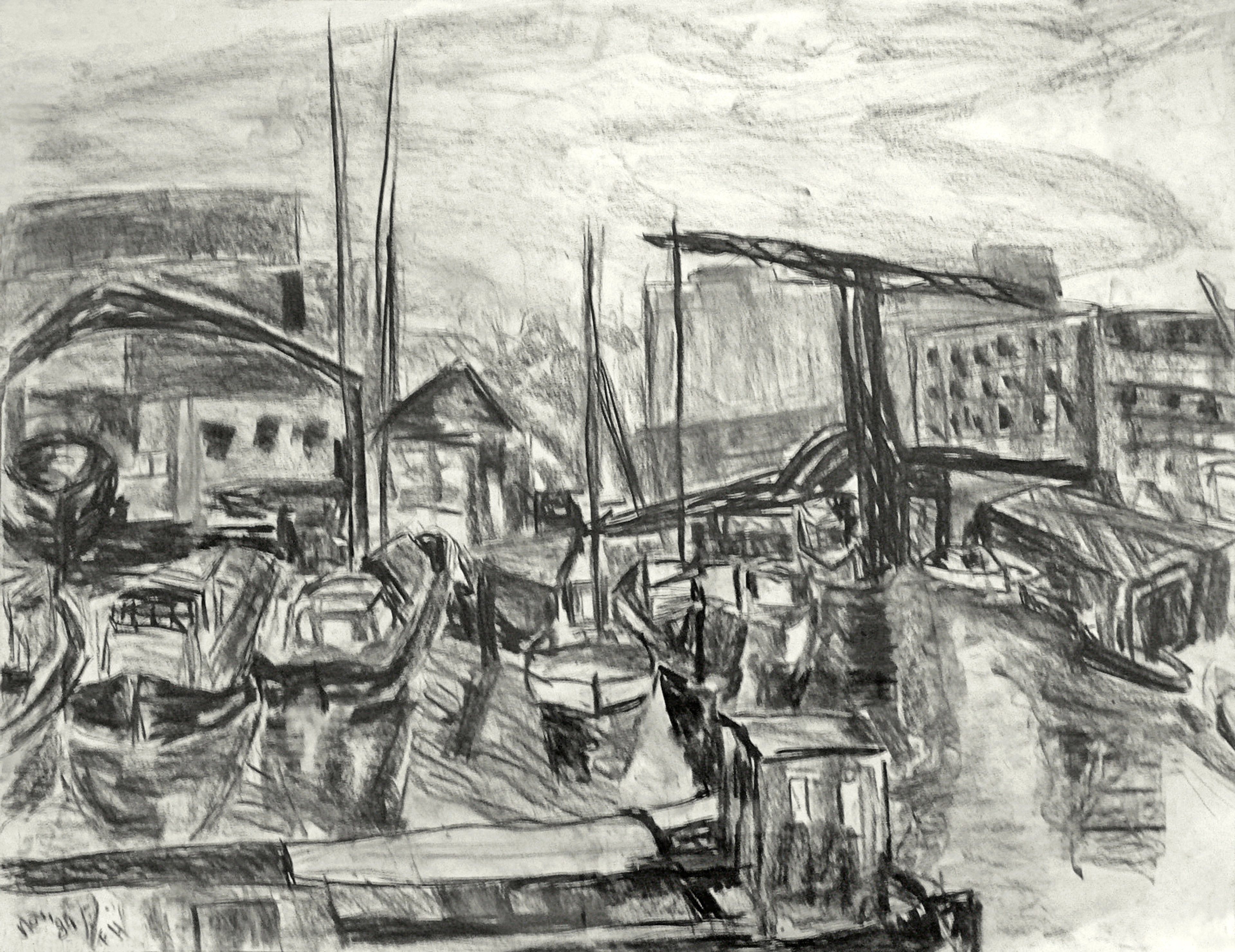
Moving from the abstract understanding of value, it’s truly fascinating to see how this conceptual tool became a cornerstone of artistic practice across centuries, shaping everything from subtle visual depth to profound emotion. It’s almost as if artists throughout time intuitively grasped the power of simplifying, of taking a step back from color, to truly master the visual world. Grisaille's origins, or at least grisaille-like practices, stretch back much further than the medieval era. While not explicitly termed "grisaille," ancient Egyptian tomb paintings and Roman frescoes frequently utilized monochrome underpaintings or flat tonal renderings. Why? Often, it was to swiftly establish figures, scenes, and architectural elements, or to test out complex compositions and perspectives before committing to more expensive, vibrant pigments like tempera or encaustic. This approach ensured structural integrity and a solid tonal blueprint from the outset. Honestly, I find it quite clever how artists centuries ago were already exploring such sophisticated visual tricks, making flat surfaces appear to have depth and form! Its principles were even applied in illuminated manuscripts, where initial monochromatic renderings defined figures and scenes before rich colors and gilding were added, ensuring a robust structure beneath the decorative surface. You can even spot hints of grisaille's influence in early Gothic art, where sculptors used strong contrasts and deep carving to create dramatic plays of light and shadow, making stone figures feel almost alive.
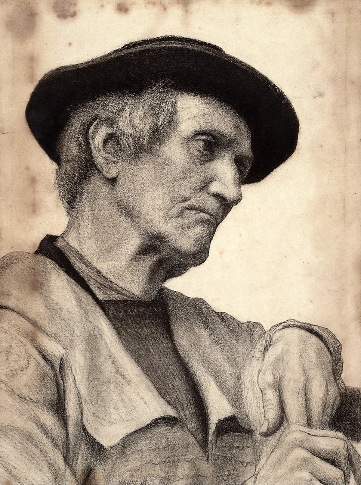
But for me, it was truly in the Renaissance, particularly with the advent of oil painting, that grisaille blossomed into a critical underpainting technique. This wasn't a coincidence; the unique properties of oil paint – its glorious slow drying time and ability to be layered transparently – were absolutely crucial. I often think of it as laying down the precise blueprint for a grand cathedral before even considering the stained-glass windows! This monochromatic foundation allowed masters like Jan van Eyck, who famously used grisaille to depict highly realistic, sculpture-like figures on the exterior panels of his Ghent Altarpiece. He tricked viewers into believing they were carved stone rather than painted wood, a testament to his mastery. This technique was also prevalent among other Flemish masters, whose meticulous layering relied heavily on robust tonal underpaintings. Peter Paul Rubens, for example, frequently employed vibrant grisaille underpaintings, often with warmer earth tones, for the dynamic figures in his large-scale works like The Descent from the Cross. These provided a sturdy tonal structure, allowing him to layer translucent glazes of rich color, giving his figures their characteristic luminosity and depth. Even masters of color like Titian or Giorgione, while not always using a strict grisaille, built their vibrant palettes upon meticulous tonal understandings, a direct lineage from these foundational grisaille principles. The Dutch Golden Age saw masters like Johannes Vermeer achieve incredible effects of light and form through meticulous tonal control in their interiors, a direct descendant of grisaille thinking, where every subtle shift in light creates palpable atmosphere. And Andrea Mantegna's incredible illusionistic frescoes, such as those in the Camera degli Sposi, are masterpieces of grisaille-derived illusionism, blurring the line between painted surface and three-dimensional space. These masters also used grisaille extensively in portraiture, ensuring a perfect likeness and understanding of the sitter's features before any vibrant flesh tones were applied. And later, in the Baroque era, artists like Caravaggio and Rembrandt, though perhaps not always with explicit grisaille underpaintings, were absolute masters of chiaroscuro – the dramatic use of light and shadow – and sfumato – subtle, gradual transitions between tones. While distinct techniques, they are, in essence, speaking the same foundational language that grisaille teaches, building upon its mastery of value to create profound visual depth and emotional resonance. It's genuinely humbling, isn't it, to consider the sheer dedication and methodical planning these masters poured into their work, meticulously structuring entire complex compositions through tone alone before a single vibrant hue touched the canvas?
The inherent translucent qualities of oil paint were absolutely crucial here. I always tell people to imagine the grisaille as a perfectly sculpted, three-dimensional form, built purely from light and shadow. Then, think of applying a sheer, jewel-toned fabric over it. The underlying form still shines through, but now it glows with color! That, in essence, is what happened: artists could build up luminous layers of vibrant color over a grisaille underpainting using glazes – those thin, transparent layers of colored oil paint mixed with a slow-drying binder like linseed oil. The underlying grey tones would subtly shine through, creating an unparalleled sense of deep, internal glow, luminous shadows, and realistic volume that would be far harder to achieve without this meticulously planned tonal foundation. It's like the grisaille provided the bone structure, giving the painting its fundamental anatomy, and the glazes added the living flesh and radiant skin, truly bringing it to life. And what pigments did they work with for these underpaintings? They were like alchemists, selecting exactly the right ingredients for their subtle magic, considering not just the color, but also the binder they were mixed with – typically oil or tempera – and its impact on application and drying time:
- Lamp Black: A deep, cool, soot-based black. Its lean, fast-drying quality and high tinting strength (often mixed with oil for underpaintings) were ideal for initial layers, allowing artists to rapidly establish strong value distinctions without waiting ages for paint to dry. This pigment creates crisp, defined shadows and can be very opaque when used thickly.
- Bone Black: A warmer, richer black derived from animal bones. Its slightly slower drying time and higher oil absorption (when mixed with oil) allowed for more subtle blending and gradual transitions, particularly useful for delicate areas like skin or drapery where soft edges were desired. This black often has a slightly brownish undertone and is known for its deep, velvety quality.
- Raw Umber: An earthy brown pigment. Its transparency and quick drying properties (especially in oil or tempera) made it useful for initial laying-in of warmer subjects or skin tones, as it wouldn't muddy subsequent color layers and provided a warm, transparent undertone. It's excellent for creating warm, subtle shadows and is known for its stability.
- Terre Verte (Green Earth): A muted green pigment. Valued for its transparent, cool qualities, it was particularly effective for flesh tones (often in tempera or lean oil), as it could subtly cool down warm glazes applied over it, making the skin appear more lifelike by counteracting ruddy undertones. Its relatively fast drying nature and low tinting strength also made it practical for underpainting without overpowering subsequent layers.
Seeing how methodical and skilled these masters were, planning out every single nuance of composition and value before touching a single vibrant hue, is a truly fascinating slice of art history. From early architectural planning to the luminous glazes of the Renaissance, grisaille consistently proved its indispensable value in shaping the visual world. So, what do you find most impressive about grisaille's journey through art history?
Period/Movement | Primary Use & Purpose of Grisaille | Key Artists (Examples) |
|---|---|---|
| Ancient World | Preparatory underpainting for frescoes/tomb paintings; establishing form, perspective, and composition efficiently. | Egyptian, Roman artisans |
| Medieval/Gothic | Illuminated manuscripts, preparatory sketches, early panel painting; defining figures and scenes, ensuring structural integrity beneath color. | Anonymous manuscript illuminators, Giotto |
| Renaissance | Underpainting for oil glazes (creating luminosity and depth); sculptural illusionism; foundational portraiture; architectural studies. | Jan van Eyck, Andrea Mantegna, Peter Paul Rubens, Titian (tonal principles) |
| Baroque/Rococo | Chiaroscuro foundation; finished illusionistic decorations (trompe-l'œil); dynamic figures in large-scale works. | Caravaggio, Rembrandt (principles), Gerard de Lairesse, Tiepolo |
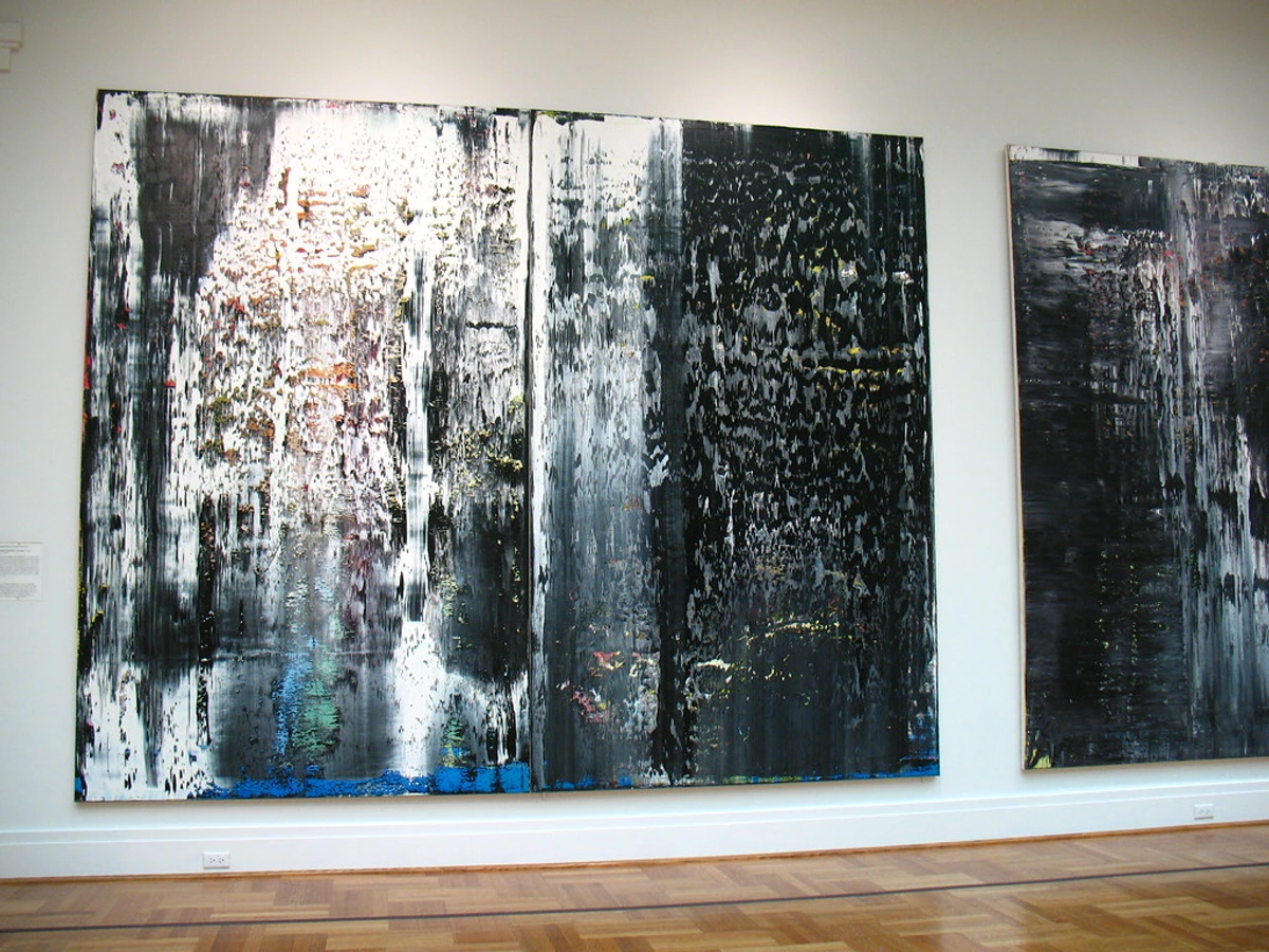
| Contemporary | Value studies for digital concept art, 3D modeling (clay renders); abstract monochrome finished works; conceptual architectural visualization; technical problem-solving. | Concept artists, Christopher Wool, Agnes Martin, Gerhard Richter |
Grisaille as Finished Art: The Illusionist's Secret
This deep dive into grisaille's enduring relevance provides a perfect segue into its captivating power as an illusionist. Ever been completely fooled by a painting? Grisaille might just be the culprit, proving that sometimes, the greatest illusions are born from simplicity. Sometimes, grisaille wasn't just an underpainting; it was the finished work itself. This is where the mastery of value, light, and shadow, honed through grisaille, finds one of its most compelling and delightful applications. Think of illusionistic architectural elements on walls or ceilings, where painted moldings or statues looked incredibly real – a technique known as trompe-l'œil. I'm always captivated by those moments where you stop and stare, genuinely wondering, "Is that carved or painted?" That's the pure power of grisaille at play, a testament to the mastery of value and contrast, even without the allure of a full spectrum of hues. Historically, artists used this technique to paint elaborate architectural details – imagine a flat wall suddenly appearing to have intricate stone carvings, deep niches with painted statues, or even a window peering out into an imaginary landscape. A prime example is the work of Andrea Mantegna, whose incredible illusionistic frescoes in the Camera degli Sposi (Palazzo Ducale, Mantua) use grisaille-derived techniques to create painted architecture and figures that feel astonishingly real, blurring the line between painted surface and three-dimensional space. Other notable examples include the grisaille panels by Giotto in the Scrovegni Chapel, where virtues and vices are rendered with sculptural precision, and the intricate, seemingly three-dimensional architectural elements painted by artists like Peruzzi, Gerard de Lairesse, or Tiepolo in their grand Baroque and Rococo ceilings.
Beyond grand murals, grisaille also subtly wove its way into more intimate decorative arts. Think of painted furniture, ceramics, and even fine textiles, where monochromatic designs could add a sense of refined elegance or intricate detail, mimicking materials like carved wood, delicate lace, or even precious metals purely with paint. I've always found it fascinating how its influence extended to highly intricate forms like miniature painting and ivory carving, where the artist would meticulously render depth and form in monochrome before applying delicate washes of color, creating incredibly lifelike small-scale works. In early printmaking, too, techniques like mezzotint and aquatint relied entirely on manipulating tonal values to create rich, atmospheric images, echoing the core principles of grisaille. And it wasn't just on canvases or permanent walls; I'm always fascinated by how it even extended into stage design. Early theatrical set designers, before modern lighting effects were common, used grisaille to create incredibly convincing illusions of architectural depth on flat backdrops, essentially conjuring entire worlds out of shades of grey for the audience. It's also worth noting its critical role in the planning stages of architecture and sculpture, where grisaille was used in models or maquettes to convey scale, weight, and form, allowing patrons and builders to visualize the volumetric presence of a structure long before a single stone was laid. This incredible ability to create a compelling optical illusion, making two-dimensional surfaces convincingly three-dimensional, is one of grisaille's most enduring and impressive applications. It’s not just a painting; it’s a visual puzzle, a silent dare for your eyes, and a profound testament to the power of manipulating value. If you're as fascinated by this as I am, you'll want to dive into my article on what is trompe-l'œil for more depth. This mastery of illusion, while captivating in itself, also serves a deeper purpose in an artist's development, revealing why grisaille continues to reign supreme as a foundational artistic tool. Can you think of any modern illusions that rely on similar monochromatic principles, perhaps even without you realizing it?
The Enduring Power: Why Grisaille Still Reigns Supreme
After all that history, you might wonder: why did this method stick around? Why go through all this trouble, sometimes painting something twice? For me, it boils down to focused problem-solving and profound control – a way to tackle complex visual challenges one deliberate step at a time. It's truly an artist's secret weapon, teaching fundamental principles that transcend medium, style, and even the march of time.
The Contemporary Edge: Beyond the Old Masters
You might think grisaille is stuck in dusty old master studios, a quaint relic, but I'd argue that would be completely wrong. In the digital art world, especially for concept artists in gaming, film, or even architectural visualization, creating a grisaille-like value study is often the first, most crucial step. They're quickly sketching out the mood, the drama, the spatial relationships of a scene or character, long before they even think about the final color scheme. For instance, when designing a fantastical creature's armor, a concept artist will almost certainly use grisaille first to define the hard, reflective planes of metal against the softer, shadowed crevices of muscle and joints. This allows them to ensure the armor feels three-dimensional and functional, and that light catches it realistically, before ever deciding if it's going to be gleaming gold or rusted iron.
This approach solves critical problems like ensuring readability of a scene at a glance (crucial for quick visual information in games), establishing a strong silhouette for characters or environments, defining the primary light source and its impact, and crafting a clear narrative through light and shadow. It's about getting the big picture right, structurally, and solving problems efficiently across different screen types or animation pipelines where color might be applied later by various artists. I often find myself doing quick monochromatic sketches when planning a new piece, trying to figure out the composition and balance of light and dark before committing to my vibrant palette.
And for contemporary painters, a grisaille underpainting can still provide an incredibly stable and logical foundation for complex works, allowing transparent glazes of color to be built up without muddying the forms. While traditional grisaille often involved specific pigments like bone black, lamp black, raw umber, or terre verte mixed with oil or tempera binders, contemporary artists enjoy a broader palette and a wider array of mediums, from acrylics and gouache to charcoal and ink, or even sophisticated digital brushes and software like Photoshop, Procreate, or Blender. In Photoshop, for instance, a concept artist might start with a simple round brush and a gray canvas, using layer modes like 'Multiply' for shadows and 'Screen' or 'Overlay' for highlights to build up shadows and highlights non-destructively, mimicking traditional layering. Even 3D modeling software, vital in architectural visualization or character design, often starts with 'clay renders' – essentially a grisaille rendering of the sculpted form – to evaluate light and shadow before applying textures or colors. This means architects can present a building's mass and how light interacts with it, or a game designer can evaluate a character's silhouette and form, long before expensive texturing and coloring. The medium changes, but the underlying principle – the focused study of value, light, and form – remains constant. This systematic approach to problem-solving, breaking down complex visual tasks into manageable steps, is something I find incredibly valuable even in my own abstract work, where the interplay of light and dark forms the silent scaffolding for vibrant hues. Artists like Agnes Martin, known for her minimalist grid-based paintings, or even sculptors who rely on light to define their forms, all operate within the same monochromatic language. Have you ever noticed how the core principles of art transcend different tools and technologies?
Grisaille as the Foundation of Artistic Training
For centuries, grisaille has been an absolute cornerstone of academic training for artists, and for excellent reason. I think of it like learning scales before you play a symphony, or mastering basic carpentry before building a complex piece of furniture. In traditional art academies, grisaille typically progresses from rendering simple geometric forms to complex drapery studies, then to anatomical drawings, and finally to portraiture and figure studies. Each stage meticulously builds the student's ability to perceive and render light and shadow with increasing precision, laying a robust foundation before the glorious complexities of a full color palette are introduced. It’s a bit like learning to play chess; you master the individual piece movements and the forces at play before tackling grand strategies, focusing only on the underlying mechanics without the added "distraction" of color. By strictly limiting the palette, students are compelled to truly understand how light falls on form, how shadows define space, and how tonal values create the illusion of depth and texture. If you can make an object look three-dimensional, weighty, and tactile in shades of grey, imagine the sheer power you'll wield when you finally add the full spectrum of color! This mastery of value and form is the bedrock upon which all successful color application is built, a fundamental understanding of how to describe the world visually that translates across every single medium and style.
What's more, grisaille lays crucial groundwork for understanding color temperature and harmony. Once you've truly mastered light and shadow relationships in monochrome, applying warm or cool colors consistently becomes far more intuitive. For example, if you've meticulously rendered a sphere in grisaille, you already understand exactly where the cool, diffused light hits and where the warm, reflected light bounces up from the surface, creating subtle shifts in perceived temperature. When you then introduce color, you know precisely where to apply cooler blues or warmer yellows to maintain that realistic light interaction, making your colors work with the form, not against it. By perfecting these value relationships in grisaille, I've found that you can actually make your later colors appear more vibrant and luminous. The muted, carefully structured underpainting allows subsequent transparent glazes to sing, creating a captivating depth and glow that truly brings the forms to life. I remember struggling with this early on in my own journey, trying to get the color just right before I'd even nailed the underlying structure. Grisaille teaches discipline, a quality I admit I sometimes lack, but one that always, always pays off in art.
This fundamental focus on underlying structure also allows grisaille principles to be a potent tool for color correction or color harmony studies. By evaluating a color painting in a desaturated, monochromatic view (either mentally or digitally), artists can quickly identify if the tonal values are working correctly, independent of the color choices, thus ensuring a strong foundation for any final palette. This provides a master key for understanding why some paintings possess an inherent visual harmony, regardless of their palette. And it’s not just painting: even in early photography, the use of sepia toning and the stark emotional clarity of black and white images demonstrated grisaille's lasting impact. Photographers, much like grisaille painters, had to master how to manipulate light and shadow to create compelling compositions, describe textures, and convey mood, relying purely on tonal relationships rather than color. It’s a direct visual lineage, a shared language of form and light. What fundamental skill do you think is most profoundly unlocked by limiting your palette to monochrome?
The Paradox of Color's Absence: Enhancing Emotional Impact
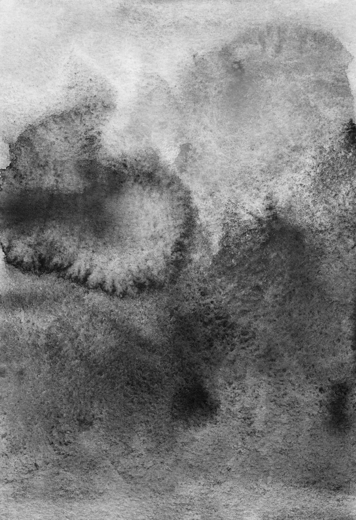
It's a strange paradox, but by removing the riot of color, grisaille can often amplify emotional resonance and create a powerful sense of atmosphere. When color is present, it carries its own psychological weight – reds for passion or danger, blues for calm or melancholy. But in monochrome, these specific color associations are stripped away, forcing the viewer to engage with the raw form, contrast, and implied texture. It's like listening to a song without lyrics: the pure melody and rhythm carry the emotional weight, unfiltered by the specific narrative a vocalist might impose. This allows the listener to connect directly with the raw emotion conveyed by the music itself, and similarly, in grisaille, the viewer connects with the pure visual language of light and shadow, often on a deeper, more introspective level. This can also create a sense of unity or cohesion that vibrant, disparate colors might struggle to achieve, allowing the subtle nuances of light and shade to take center stage. Moreover, by stripping away culturally specific color associations, monochromatic art often achieves a sense of timelessness and universality, connecting with themes of minimalism or even a stark, existential truth. This quiet power challenges any notion that art needs color to be profound. Think of the stark, powerful charcoal drawings of Käthe Kollwitz, which evoke solemnity and empathy, or the dramatic black and white woodcuts of Albrecht Dürer, conveying gravitas and narrative weight purely through tone. Even contemporary abstract painters like Christopher Wool, whose large-scale word and pattern paintings often rely purely on monochrome, achieve striking visual impact and emotional gravity. They leverage the psychological power of value to speak volumes without uttering a single hue, often forcing an introspection or conveying a sense of stark unease that vibrant colors might dilute. You can even see this principle at work in the dramatic lighting of classic film noir cinematography, where the absence of color amplifies tension, mystery, and deep emotional conflict, crafting a unique and often unsettling atmosphere.
Ultimately, grisaille's silent strength lies in its ability to strip away distraction, revealing the profound structural and emotional truths of visual art. It reminds us that often, less is truly more. How do you think monochromatic art communicates emotion differently than colorful art, especially when it comes to crafting a specific mood or atmosphere or conveying a particular artistic intent?
The Rewarding Rigor: Navigating the Challenges of Monochrome
Now, let's be real. Grisaille isn't some magical cheat code; it comes with its own demanding set of challenges, and trust me, I've certainly faced them. The biggest one? Achieving truly subtle, nuanced tonal shifts. This is precisely where grisaille truly tests your mettle. Without color to help differentiate planes or objects, every single transition from light to dark simply has to be perfect. Too abrupt, and your form looks flat. Too gradual, and it loses all definition. The challenge lies in accurately perceiving and then creating those minute differences in value that our eyes discern, consistently, and with such a limited palette. Mixing pigments to get precisely the right shade of grey, or laying down glazes so thin they barely register, demands intense control and an almost superhuman level of patience. It's a genuine test of skill that, I think, truly separates the masters from the merely proficient.
The Technical Hurdles of Nuance
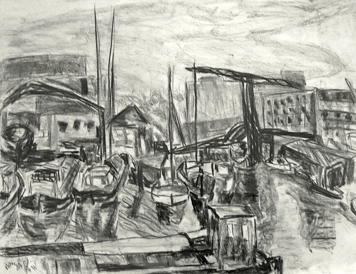
I vividly recall one particularly stubborn project: a still life featuring an old, weathered wooden box and a piece of crumpled velvet. Without the luxurious richness of the velvet's blue or the inherent warmth of the wood, rendering them purely in grey felt, frankly, excruciating. The wooden texture, with its subtle grain and imperfections, demanded dozens of almost imperceptible tonal shifts, and the velvet's plush depth initially felt flat and lifeless. Historically, artists also grappled with the inherent properties of pigments; some early blacks, for instance, had a tendency to fade or shift to an unwanted hue over time, making consistent tonal control a historical nightmare for old masters. I remember feeling a genuine frustration, as if the scene itself was actively resisting my attempts to capture its essence – a real "why did I sign up for this?" moment. It was only after stepping away, taking a few deep breaths, and then returning with a fresh eye – and a tiny, almost dry-brushed layer of subtle highlight on the velvet folds – that the piece finally clicked, gaining that elusive tactile quality. This struggle with subtle tonal shifts is precisely why, in my own abstract work, I often build up layers of translucent color to create a similar sense of depth and form, even without explicit grey. Trying to capture the subtle gleam of a satin ribbon or the intricate texture of tree bark can be particularly difficult without the assistance of color, relying instead on incredibly precise edge control and nuanced value relationships. This relentless struggle for value control, by the way, is also why grisaille techniques are invaluable in other monochromatic art forms like sculpture, where the play of light on carved surfaces creates all the drama, or in printmaking, where etching, lithography, or woodcuts rely entirely on variations in line and tone to create depth and texture, mirroring the challenges and triumphs of a grisaille painting.
The Psychological Gauntlet
Beyond the purely technical hurdles, there's also a significant psychological challenge. Working solely in monochrome, especially on a large or complex piece, can feel incredibly relentless. I remember another particularly stubborn still life – a bowl of fruit and a crumpled cloth. Without the vibrant reds of an apple or the rich blues of velvet, the process felt... well, a bit monotonous, I confess. I'd often find myself staring at it, thinking, "Wouldn't a touch of cadmium red just pop here?" There's a constant mental battle against the temptation to rush to color, to add that instant 'pop' that we're all naturally drawn to. It demands a different kind of artistic endurance, a deep, almost stubborn trust in the process, and the mental fortitude to delay the immediate gratification of seeing vibrant hues. Sometimes, the sheer absence of color can even lead to a feeling of detachment, pushing the artist to inject more personal emotion and intention into the quality of the brushwork itself, making every single stroke count for expressing mood and atmosphere. You're constantly walking a tightrope, trying to avoid a dull, flat appearance, making sure there's enough contrast to keep the eye moving, but not so much that it becomes harsh or loses its essential subtlety. Look, my discipline is a mess on most days, but learning to embrace the long game with grisaille has been a profound lesson in patience – a lesson I still revisit regularly!
Limitations and When to Choose Color
While grisaille is undeniably a powerful tool, it's certainly not always the best approach. There are inherent limitations to working without color. Subjects that rely heavily on specific hues for their identity or emotional impact—think of a vibrant rainbow, a breathtaking sunset, the ethereal bioluminescent glow of deep-sea creatures, or complex cultural symbols where color is intrinsically linked to meaning—might lose their very essence or even their primary informational content in monochrome. Grisaille excels at form and light, yes, but sometimes color is the primary information. For instance, capturing the shimmering iridescence of a hummingbird's feathers or the nuanced glow of a stained-glass window would be incredibly difficult, if not impossible, to convey purely through value. Moreover, without incredibly careful handling, grisaille can sometimes feel cold or clinical, struggling to convey the warmth of a sunny landscape or the passion of a fiery portrait. Artists, of course, overcome this by employing warmer neutral tones (like sepia or raw umber in their underpaintings), or by using dynamic compositions and expressive brushwork to inject vitality and emotional warmth. In cases where color is paramount, starting directly with color might simply be more efficient and true to the subject, acknowledging that grisaille is a tool in the artist's vast toolkit, not a dogma to be adhered to at all costs. What kind of artistic subject do you think must be rendered in full color to truly capture its essence, its very soul?
Conquering the Monochrome: Strategies for Success
To conquer these challenges, beyond the layering and squinting I mentioned earlier, I've found a few practical strategies truly help. It's about setting yourself up for success, even when the greys feel like they're conspiring against you:
- Start with a limited value range: Establish your major forms using perhaps three to five distinct values first. This simplifies the initial blocking-in process and helps you see the big shapes before getting lost in distracting detail. Think of it as mapping the continents before drawing the cities.
- Build up gradually with thin glazes: Use highly diluted paint or washes, applied in multiple transparent layers, to create very gradual tonal build-ups. This prevents abrupt jumps and helps achieve those delicate transitions that define smooth surfaces. For oil painters, this often means using a medium that extends drying time slightly, allowing for seamless blending.
- Focus on relationships, not isolated tones: This is a big one for me. It's not just about how dark one spot is, but how dark it is compared to its neighbor. A mid-tone grey, for example, can appear surprisingly light when placed next to a very dark shadow, and conversely, look much darker when next to a bright highlight. Understanding this relative nature of value is absolutely crucial. Constant comparison is key. I often use techniques like squinting to simplify the scene, or even a digital value picker (a handy little tool that samples the precise lightness/darkness of a pixel on screen) to isolate and compare tones accurately, removing the distraction of specific color.
- Step away and return with fresh eyes: This is a classic trick, but immensely effective. A brief break can reset your perception and reveal areas needing adjustment that you completely missed while in the thick of it. Sometimes, just walking away for five minutes changes everything.
- Embrace monochromatic studies in other mediums: Exploring understanding and using charcoal for drawing or graphite can provide a different perspective on value control and texture, reinforcing the same principles in a new way. Each medium forces a slightly different problem-solving approach, deepening your overall understanding of tone.
Conquering grisaille's challenges demands patience and keen observation, but the triumphs elevate an artist's skill to new heights. Have you ever faced an artistic challenge that felt insurmountable until you broke it down into simpler steps, perhaps one value at a time?
My Final Take: The Unseen Architect of Art
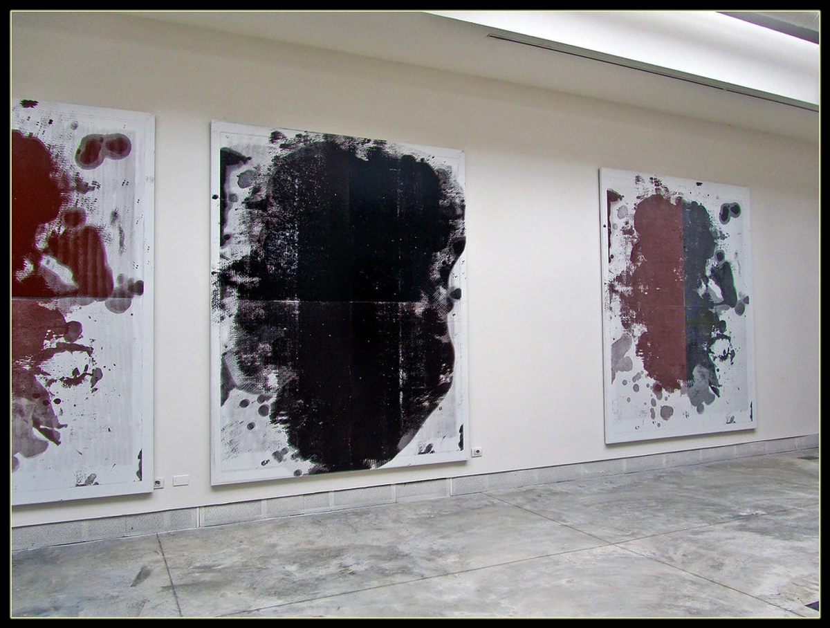
So, after all this talk, why should you care about a technique that often feels like "colorless painting"? Well, for me, it all boils down to seeing beyond the obvious. Grisaille isn't just a historical footnote or a dusty academic exercise. It's a masterclass in the absolute fundamentals of art – a powerful reminder that light, shadow, form, and value are the true, silent architects of all visual reality. It’s an artist's secret weapon, allowing for focused problem-solving and a profound understanding of visual structure before the alluring complexity of color is even introduced. This deep dive into foundational techniques, I think, is precisely why I, as an artist, find myself so drawn to the timeless principles of light and form, even in my own vibrant, contemporary abstract art. Every bold brushstroke, every subtle gradient in my pieces, is silently underpinned by the principles of value and form that grisaille so elegantly teaches. If you ever visit my museum in Den Bosch, you’ll see how these classic ideas of structure and light manifest in abstract forms, giving even the most vibrant compositions a quiet, powerful depth that anchors them firmly in reality.
Next time you're gazing at a painting, take a moment. Can you imagine the underlying grisaille? Can you see the value structure holding the vibrant colors together, even in masterpieces like Rembrandt's rich portraits or the luminous works of the Flemish Primitives? It's a subtle secret, a whisper beneath the surface, but once you know it, you'll find it everywhere, quietly orchestrating the beauty you see. Perhaps it might even inspire you to pick up a single pencil or tube of grey paint and try a monochromatic study yourself – you might be surprised by the incredible insights you discover. If you're looking for art that explores these foundational elements in a more contemporary, vibrant context, I invite you to check out my own collection of abstract art prints, or dive into my journey as an artist on my timeline. I'd love to hear your thoughts too – what aspects of grisaille resonate most with your artistic eye, and how do you think it influences the way you perceive art or even your own creative practice?


