Pastel Power: The Modern Artist's Ultimate Guide to Vibrant, Expressive Art
Uncover the dynamic world of pastels! This definitive guide by a contemporary artist explores soft, hard, oil, and pan pastels, essential techniques like layering and blending, ideal surfaces, proper framing, and safety tips for creating luminous, modern art.
Pastel Power: The Modern Artist's Ultimate Guide to Vibrant, Expressive Art
Alright, confession time. For years, pastels and I had a rocky relationship. I dismissed them—too dusty, too fragile, a little too 'old-school' for my taste, especially when compared to the bold declarations of acrylics or the serene whispers of oils. I imagined elegant ladies in bonnets sketching genteel landscapes, a far cry from the vibrant, often chaotic energy I crave in my own abstract art styles. But then, a friend practically shoved a box of soft pastels into my hand and said, "Just try them." And you know what? My entire perspective shifted. It was like discovering a secret language of color, raw and direct. This medium, I've found, is a beautiful chaos, intensely rewarding in its vibrant, tactile mess. And yes, the mess is part of the charm; my studio often looks like a rainbow exploded, but that's a small price for such immediate joy. My goal with this guide? To demystify pastels and show you their incredible, modern potential, especially for artists like us who love to push boundaries. This isn't your grandma's pastel guide; this is about getting intimately acquainted with a medium that can whisper or shout, all at once. Ready to dive into the vibrant world of pastels? Let's unlock their luminous secrets together! We'll cover everything from their fascinating history and diverse types to essential techniques, surfaces, and vital tips for framing and preservation.

A Brief History of Pastel's Luminous Journey
But before we get lost in the vibrant chaos, it's worth understanding where this incredible medium comes from. Pastels aren't some newfangled invention; they have a rich, often overlooked, history. Emerging around the 15th century, they truly flourished in the 17th and 18th centuries, becoming the darling of portrait artists like Rosalba Carriera, Maurice Quentin de La Tour, and Jean-Étienne Liotard. Imagine the powdered wigs and aristocratic faces rendered with incredible softness and luminescence, all thanks to these humble sticks. Think of Élisabeth Vigée Le Brun, too, whose pastel portraits captured the gentle spirit of her subjects. I can only imagine the struggle these early masters faced in preserving their delicate works. Back then, they might have used simple glazes or rudimentary frames to protect against smudging, but it was a constant battle.
This very struggle, ironically, pushed the medium forward, inspiring new techniques and archival solutions over centuries. For instance, techniques like scumbling (lightly dragging pastel over a textured surface to create a broken color effect), hatching (using parallel lines), and stippling (using dots) emerged as ways to build up color and texture while minimizing smudging. These innovations also led to the development of better binders and a wider range of pigments, expanding the artist's palette. Pastels then saw a powerful resurgence with Impressionists and Post-Impressionists in the 19th century, with masters like Edgar Degas pushing the boundaries of what pastels could achieve, often layering and blending dry pastels to capture movement and light with unprecedented immediacy. It's a journey from genteel portraits to explosive abstract expressions; who knew a little stick of pigment could hold so much history? And while often associated with fine art, pastels have also played a subtle role in other fields, from detailed scientific illustrations to vibrant botanical studies, proving their versatility across diverse artistic and academic disciplines.
Unpacking the Rainbow: Different Flavors of Pastel
So, you're ready to dive in? Excellent. But first, let's talk about the 'pastels' umbrella, because it's wider than you might think. It's not just one thing, you see. Each type has its own personality, its own quirks, its own strengths and... let's be honest, its own mess potential. The fundamental difference lies in their binder – the substance that holds the pigment particles together. Different binders mean different textures, drying times, and handling characteristics. It's like the secret sauce that dictates how the color feels and behaves on your surface. Crucially, the pigment load – the concentration of pure color versus filler and binder – is what truly defines a pastel's vibrancy and opacity.
Soft Pastels: The Velvety Dream
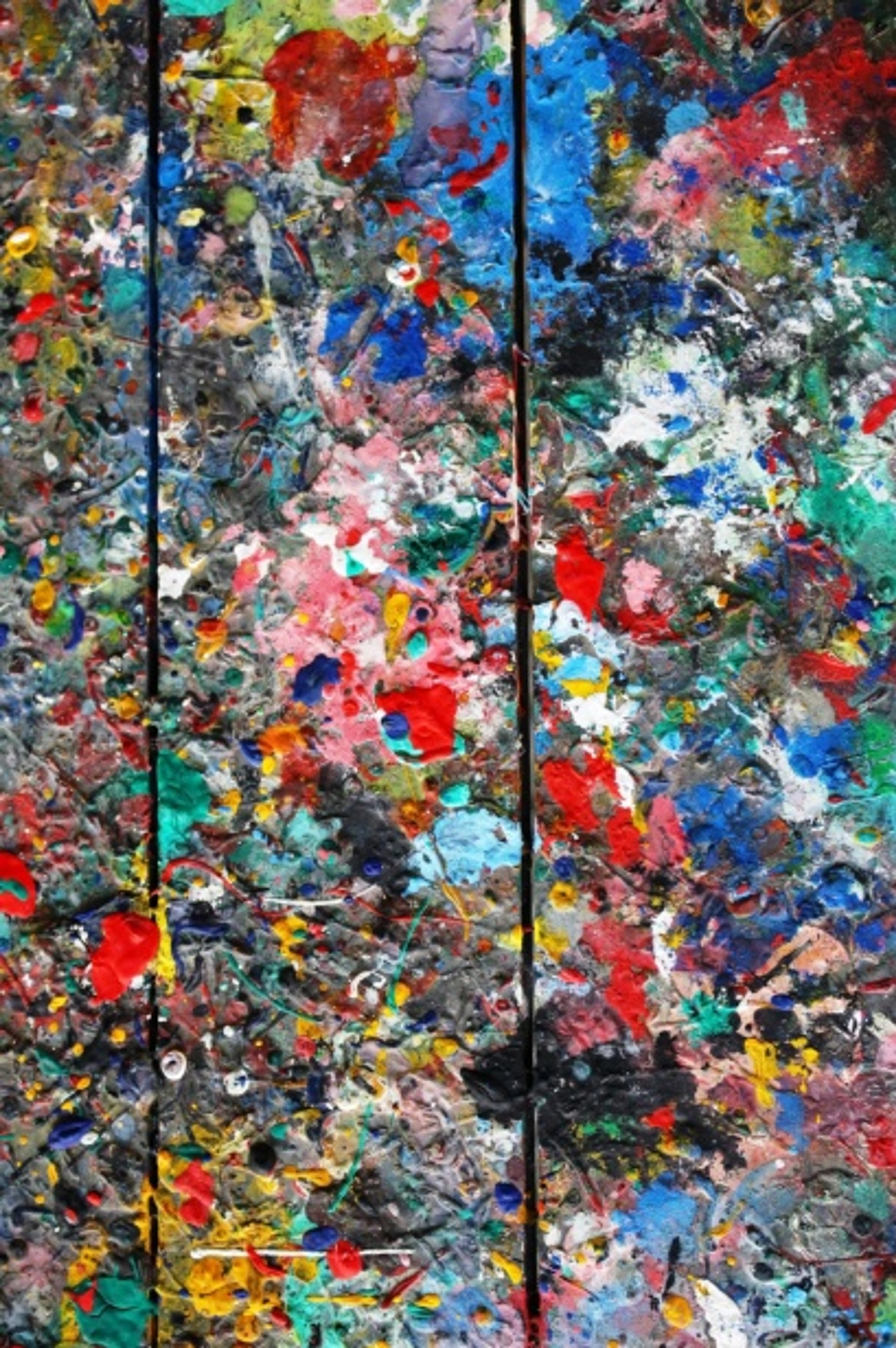
These are probably what most people think of. High pigment, minimal binder (often a gum arabic or methylcellulose base with a chalk or kaolin filler). They're soft, buttery, and leave a trail of glorious, intense color. I mean, truly vibrant. When I first felt that creamy laydown of pigment, it was an almost visceral joy, like painting with pure color. This minimal binder is also why they're so dusty – the pigment particles are less locked down, making them incredibly easy to blend and layer, offering that "velvety" blend and unparalleled pigment load. This high pigment concentration is key to their luminous, opaque quality and allows for rich, vibrant layering. They're fantastic for broad strokes, rich layering, and blending that feels like a dream under your finger. In my experience, they're incredibly expressive, great for capturing immediate feeling, much like the spontaneous gestures in abstract expressionism. The downside? Oh, the dust. It gets everywhere. Seriously, wear gloves or prepare for colorful fingertips for days. I've even found pastel dust sparkling in my hair weeks later! They also need careful handling and fixing. For serious work, always look for artist-grade soft pastels, which boast a higher pigment load and superior lightfastness (resistance to fading) compared to student grades, ensuring your vibrant creations last. And sometimes, artists even embrace the fine pastel dust itself, moving it around the paper with a soft brush for atmospheric effects or subtle color fields, turning a potential mess into a unique texture.
Hard Pastels: The Edgy Rebels
Imagine a soft pastel that went to the gym. More binder (often the same type as soft pastels, but in higher proportion), less pigment, so they're firmer, squarer, and hold a sharper edge. Great for details, crisp lines, and underpaintings. You won't get the same rich, buttery blend as soft pastels because the increased binder creates a less yielding stick, resulting in a medium-low pigment load, but for initial sketches, adding fine textures, or creating distinct linear elements, they're indispensable. I use them when I need to define a shape before letting loose with softer hues or when I want to scratch into a layer of soft pastel to reveal colors beneath, creating dynamic texture in my abstract work. They're less dusty, which is a bonus when I'm feeling particularly lazy about studio cleanup. Like their soft counterparts, artist-grade hard pastels offer better lightfastness and consistency.
Oil Pastels: The Creamy Contradiction
Now these are a whole different beast. They use an oil and wax binder, which means they never fully dry. Yes, you heard that right, never. This is both their superpower and their Achilles' heel. They're creamy, intense, and can be blended like paint using solvents (like odorless mineral spirits, turpentine, or even specialized oil pastel blenders) or even just heat. They feel more like drawing with a crayon but with way more pigment punch and a high pigment load. I love them for their painterly quality, for manipulating pigment around, and for creating bold, textural effects, sometimes mimicking the impasto of oil paintings. Because they don't dry, you can work into them endlessly, or blend wet-on-wet. They don't smudge like dry pastels, but they can still transfer. They also play surprisingly well with other mediums – I've done some wild things combining them with thin washes of acrylics or using them to add impasto textures over dried washes. For abstract art, their non-drying nature allows for continuous reworking and building thick, sculptural surfaces. A small caveat: while they remain workable, some brands can become slightly brittle or develop a waxy bloom (a whitish haze) over time or with extreme temperature fluctuations. This bloom occurs when uncombined wax rises to the surface. To avoid this, store them in a stable environment, away from direct sunlight or extreme cold, and frame under glass with a mat or spacer. Choosing higher quality, artist-grade oil pastels also significantly reduces the likelihood of bloom, as student-grade versions often have more filler and less stable binders, making them more prone to this issue.
Pastel Pencils: The Surgeons of the Pastel World
Think of these as your precision instruments. A stick of pastel encased in wood, just like a colored pencil. Perfect for tiny details, crisp lines, and for artists who want the pastel effect without the immediate mess of sticks. They offer a medium pigment load. I reach for these when I need to define the edge of something, add fine highlights, or do intricate cross-hatching. For abstract pieces, they're ideal for sharp contrasts or introducing a fine, controlled line amidst broader, blended fields. They're less messy, very controllable, and a great bridge between drawing and painting. Professional pastel pencils, like other artist-grade pastels, prioritize lightfast pigments for lasting results.
Beyond the Sticks: Pan Pastels
While sticks are the traditional form, you might also encounter Pan Pastels. These are professional quality, ultra-fine pastel colors packed into a pan, like a makeup compact. Applied with special sponges or brushes (like Sofft Tools), they offer a very different experience – almost painterly, allowing for broad, smooth applications of color with minimal dust and a high pigment load. Because they're applied with tools, you get exceptional control over subtle gradients, soft washes, and large background areas without the heavy texture or dust of stick pastels. Imagine creating a vast, atmospheric sky in an abstract landscape with seamless color transitions using Pan Pastels before bringing in sticks for more precise, energetic marks. They're a fantastic addition to the pastel family, especially for artists looking for clean, wide washes of color or creating smooth, layered color fields as a foundation for more expressive marks. What's your favorite type of pastel? Each offers a unique artistic voice!
Pastel Type Summary
Type | Binder | Texture | Pigment Load | Best For | Downsides |
|---|---|---|---|---|---|
| Soft | Minimal gum/methylcellulose | Buttery, velvety | High | Broad strokes, rich layering, blending | Lots of dust, fragile, needs fixing |
| Hard | More gum/methylcellulose | Firmer, chalky | Medium-Low | Details, crisp lines, underpaintings | Less blending, less intense color |
| Oil | Oil and wax | Creamy, waxy | High | Painterly effects, bold texture, blending with solvents | Never fully dries, can transfer, can become brittle/bloom |
| Pencils | Gum/methylcellulose | Controlled, firm | Medium | Fine details, precise lines, cross-hatching | Less expressive for broad strokes |
| Pan Pastels | Minimal binder (compressed) | Ultra-fine powder | High | Smooth washes, backgrounds, subtle gradients | Requires specific applicators |
Specialized Pastel Accessories and Tools: Elevating Your Workflow
When I first started exploring beyond the sticks, I discovered a few other tools that truly elevate your pastel journey. Don't underestimate how much the right accessories can transform your creative process!
- Pastel Boards and Primers: Consider investing in a pastel board or pastel primer (a gritty medium you can apply to almost any surface) to create your own textured canvases. Brands like Ampersand Pastelbord offer a rigid, pre-sanded surface perfect for heavy layering, available in various grit levels from fine to coarse. A finer grit allows for smoother blending and more delicate details, while a coarser grit provides exceptional grab for multiple layers and vibrant impasto effects. Colourfix primers are versatile liquid acrylic grounds that allow you to add tooth to almost any substrate, from watercolor paper to wood panels. These surfaces aren't just for texture; they provide crucial mechanical adhesion for the pigment, allowing you to build up significantly more layers without the paper quickly saturating or the color looking muddy. You can also find specialized pastel grounds or gels which are essentially primers in a different form, offering unique textures and preparation possibilities for various substrates.
- Easel Choice: For the truly dedicated, a specialized pastel easel that tilts significantly can make a world of difference, not just for allowing dust to fall away (thank you, gravity!), but also for providing a better ergonomic angle for detailed work and observing your piece from a distance. Even a simple table easel on an incline can help immensely.
- Dust Management Tools: And for handling that beautiful dust, a small, soft brush, a micro-fiber cloth, or even a specialized vacuum attachment is often better than blowing, which can embed dust into your paper. I've even experimented with specialized dust extraction hoods, especially when working on larger pieces or with very soft pastels – anything to minimize the colorful residue on my clothes (and in my lungs!).
[credit](Zen Dageraad), licence
Surface Matters: Where Your Pastels Will Live
Now that we've explored the different personalities of pastels and the tools that assist them, let's talk about the stage they perform on – the surface. This is where many beginners stumble, myself included. You can't just slap pastels on any old paper and expect magic. The tooth of the paper—its texture—is crucial. It's not just about grip; it's about providing mechanical adhesion for the pigment. The tiny peaks and valleys of a textured surface physically trap the pastel particles, allowing you to build up many layers without the pigment simply sliding off or saturating the paper too quickly. Think of it like a micro-mountain range waiting to be filled with glorious color. A surface with good tooth is paramount for achieving the luminous, multi-layered effects pastels are known for. So, how does this choice affect your ability to layer and blend, which we'll dive into next?
The Good Stuff: Textured Papers
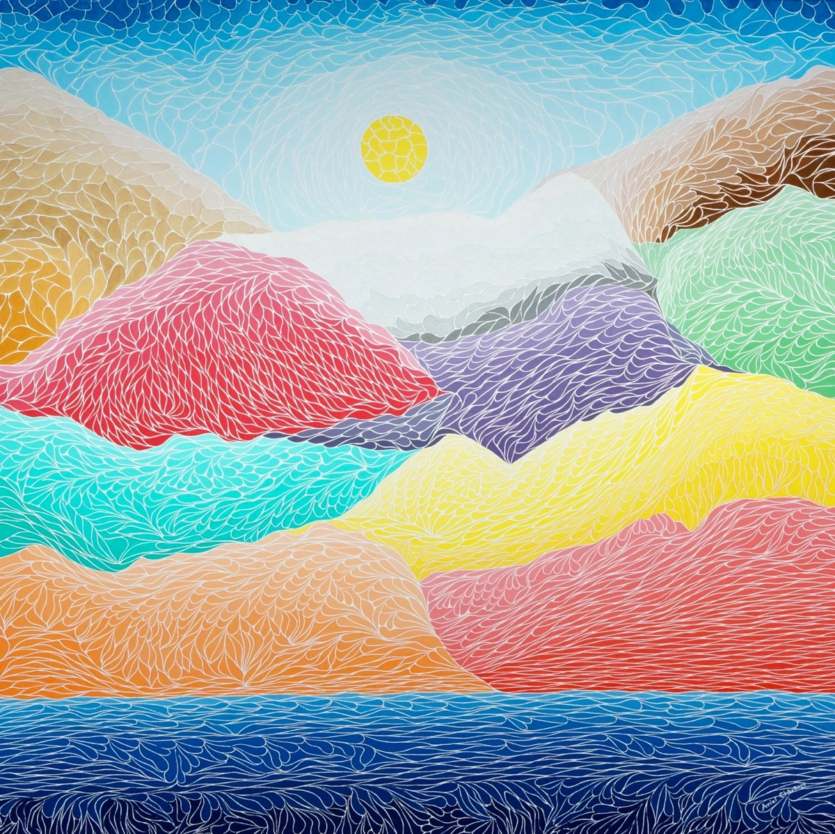
My favorites include sanded pastel paper (like UArt or Wallis) or papers with a pronounced 'tooth' like Canson Mi-Teintes. These papers, especially the heavier weights (e.g., 160gsm or 300gsm for Canson Mi-Teintes), hold many layers of pastel, allowing for incredible depth and vibrancy. Canson Mi-Teintes is particularly versatile, often having a different texture on each side – one side with a honeycomb pattern for more tooth, the other smoother for finer work. They're a game-changer, honestly. Don't skimp here; it makes all the difference. For oil pastels, you can even explore more rigid surfaces like good quality cold-press watercolor paper or gesso-primed wood panels, which offer a firm support for the wax/oil binder and can handle solvents well. And don't forget about the color of your surface! A toned paper (grey, brown, or even a vibrant hue) can greatly influence the mood and luminescence of your final piece, acting as a mid-tone or a vibrant underpainting. This works beautifully because the paper color peeks through subtle layers of pastel, contributing to the overall optical mix and preventing a flat appearance. A deep blue paper, for instance, can make warm yellows and oranges pop with an almost electric glow, or a subtle grey can unite a riot of color, acting as a sophisticated mid-tone. This interplay between the paper color and the pastel creates a deeper visual resonance, much like how artists use color in their paintings.
The 'Just Starting Out' Stuff: Sketch Paper
While you can use regular sketch paper, especially with hard pastels or pastel pencils, don't expect too many layers or deep saturation. It's fine for practice, but for serious work, you'll feel the limitations quickly. It's like trying to hike in flip-flops; technically possible, but not ideal. The fine, smooth surface just doesn't have the micro-texture to hold enough pigment, leading to flat, overworked results. You'll quickly hit the paper's "saturation point" where no more pigment will adhere, leading to frustrating "burnishing" (where the surface becomes shiny and impermeable) or "ghosting" effects.
The Dance of Color: Layering and Blending Like a Pro (Or at least, like me)
Ready to make these colors sing together? This is where the real fun begins, and where you start to see why pastels are like a whisper and a shout all at once, dancing across the page with unparalleled grace and vibrancy. They layer beautifully to create optical mixes and blend in ways other mediums can only dream of.
Layering for Depth and Wow Factor
The beauty of pastels is building up color. Start light, then add darker values, and finally highlights. You can layer complementary colors and blend them optically for incredible vibrancy. This optical mixing is where the magic truly shines: instead of physically mixing colors on a palette, you apply distinct colors adjacent to or on top of each other, and the viewer's eye does the blending from a distance, creating a more luminous and vibrant result. It's as if the colors are having a subtle conversation, and your eye is the translator. For instance, laying down a warm yellow under a cool blue can create an ethereal green that seems to glow, or a rich red under a violet for an almost jewel-like depth. Try a subtle warm grey under a cool grey for unexpected dimension and nuanced depth, or a vibrant orange under a deep red to make a flame truly flicker. Or what about a cool green layered over a warm green to create incredible botanical depth without mixing? This technique works best with soft pastels, which tend to be more opaque, allowing for richer layering. It's like building a painting, stroke by stroke, without needing to wait for anything to dry. For more on creating stunning compositions, you might explore how artists use color in their work.
Blending Techniques
Fingers are your first and best tool, honestly. Your body heat helps melt and merge the pigments. But for clean blends or avoiding finger fatigue, tortillons (paper blending stumps), cotton swabs, foam applicators, or even soft brushes work wonders. I even use a small, stiff brush sometimes to push pigment around or lift excess dust. Experiment! There's no one 'right' way, only your way. I often blend a base layer and then add crisp strokes on top to retain that vibrant, unblended pop of color, especially in my abstract compositions. For truly seamless gradients, use the side of a soft pastel and blend with a tortillon or your finger in small, circular motions. Build up color gradually, layer by layer, rather than pressing hard from the start. A light, delicate touch is key here, almost like coaxing the colors to merge. How will you make your colors dance?
[credit](Zen Dageraad), licence
The Great Fixation Debate: To Spray or Not to Spray?
Ah, fixative. The villain and hero of every pastel artist's story. It's designed to lock your delicate pigment particles in place, protecting your work from smudging, but it can also be a sneaky culprit, dulling your glorious colors and darkening your values. It’s like a magic spell that sometimes backfires, leaving a slightly dull or 'waxy' film, especially if over-applied, and potentially altering the delicate surface texture of the pastel. This fixative is a temperamental friend.
There are generally two types: workable fixatives and final fixatives. Workable fixatives allow you to continue layering pastel after application, providing a light protective layer and adding back a bit of tooth. Final fixatives are meant to be the last step, offering more robust protection. Brands like Spectrafix or Sennelier D'Art are often recommended for their minimal impact on color, though even these can cause a subtle color shift, where the hues might appear slightly darker or duller than before application, impacting the delicate interplay of optical mixing you worked so hard to achieve. It’s truly a delicate balance.
Pros and Cons
Pros: Protection, reducing smudging, making framing easier, especially if not under glass. Cons: Can change colors (the dreaded color shift!), darken the piece, often smells awful (seriously, ventilate!), and can create a slightly 'waxy' look, reducing the delicate texture of the pastel. My advice? If you must fix, use it sparingly, in multiple light coats from a distance, and test it on a scrap first. For most of my pieces, especially the ones I intend to frame under glass, I'm actually a bit of a minimalist with fixative. I prefer to let the raw pigment shine and just be extra careful. Sometimes the subtle surface texture of unfixed pastel is part of its charm. Ultimately, the decision is often a balance between preservation and maintaining the artwork's original vibrancy. Are you a fixer or a minimalist?
Pastels for the Abstract Artist: Unleashing Expressive Potential
As someone who thrives in the realm of abstract art, pastels quickly became a secret weapon in my arsenal. Their immediacy and tactile nature lend themselves perfectly to the spontaneous, emotional resonance that defines much of my work. Here's how I often approach them in an abstract context:
- Gestural Marks and Raw Energy: Forget precision. I love using soft pastels to make bold, sweeping gestures, capturing a raw burst of energy on the paper. The way the pigment smears and blends directly from the stick creates a powerful, untamed line that feels alive, conveying immediate emotion. It's about channeling pure emotion onto the surface, much like the process of creative flow.
- Layering for Dynamic Texture: Abstract art often benefits from rich, varied texture. Pastels excel here. I'll layer different colors, sometimes complementary, sometimes harmonious, allowing the undertones to peek through. This creates a visually complex surface that invites the eye to explore. Hard pastels can then be used for scratching into soft layers, revealing colors beneath, adding a sculptural quality.
- Impasto with Oil Pastels: While not traditionally associated with impasto, oil pastels, with their creamy, non-drying nature, can achieve fantastic thick textures. I often build up areas of rich color, pushing and pulling the pigment with a palette knife or even my fingers to create actual relief on the surface. This adds a sculptural dimension, especially when combined with thin washes of acrylics or other mediums.
- Controlled Chaos and Color Fields: Even in abstract work, control has its place. Pan Pastels are fantastic for creating large, smooth fields of color that can serve as a serene backdrop, over which I then unleash the more chaotic marks of soft and hard pastels. This interplay between smooth and textured, quiet and loud, creates a compelling visual dialogue. For me, pastels offer a direct, unmediated conversation with color and form, making them an ideal partner for abstract exploration.
Troubleshooting Common Pastel Quibbles & Safety First
Even with all the right tools and techniques, pastels can throw you a curveball. We've all been there, staring at a patch of color that's gone from vibrant to 'meh'. Don't worry, it's part of the journey. Here are a few common issues and how I tackle them:
- Overworking: Too many layers can lead to muddy, lifeless colors, especially if you're blending excessively. I've been there, staring at a dull patch thinking, "Where did the magic go?" My trick? Step back. Sometimes less is more. Or, if it's already muddled, try lifting some pigment with a kneaded eraser or a stiff brush before starting anew. Embrace the vibrancy of fewer, bolder strokes.
- Underworking: On the flip side, sometimes you just haven't applied enough pigment. Your colors might look thin, weak, or the paper's texture shows through too much. Don't be afraid to build up layers gradually. Gentle pressure and multiple applications, tapping off excess dust between layers, will create that rich, saturated look pastels are known for. Think of it as coaxing the color out, not burying it.
- Muddy Colors: This often happens when blending too many complementary colors without enough tooth to separate them, or when using an inadequate surface. It's also often a result of pigment particles breaking down and filling the paper's tooth, leaving no room for light to reflect purely. Ensure your colors are clean, and consider the 'less is more' approach to blending. Sometimes a vibrant undertone helps prevent this. Also, be mindful of your layering order; applying lighter, warmer colors over darker, cooler ones can help prevent muddiness. Another common culprit is dirty blending tools – keep those tortillons clean!
- Chalkiness: If your soft pastels look dull or chalky, it might be due to a poor quality pastel (too much filler), or overworking, which grinds the pigment into the paper's tooth without allowing the light to refract effectively. Try working in lighter layers, tapping off excess dust, and ensuring you're using artist-grade pastels on a surface with good tooth. Sometimes a very light touch of workable fixative can help revive deeper tones.
- Burnishing: This happens when too much pressure or excessive blending compacts the pigment into the paper's tooth, creating a smooth, shiny surface that can no longer accept more pastel. It's frustrating because it essentially means you've hit a dead end in that area. To avoid it, work in light layers, use a light touch, and choose surfaces with ample tooth. If you've already burnished, try gently lifting pigment with a kneaded eraser; very light gentle scratching with a sharp tool might re-expose some tooth, but it's often best to work around it or restart if possible.
- Achieving Smooth Gradients: For truly seamless transitions, use the side of a soft pastel and blend with a tortillon or your finger in small, circular motions. Build up color gradually, layer by layer, rather than pressing hard from the start. A light touch is key here, almost like coaxing the colors to merge.
Safety First: Dust Inhalation and Environmental Impact
As much as I love the messy magic, pastel dust can be a concern. I always make sure to work in a well-ventilated area, sometimes even using a small desk fan to direct dust away from my face. Don't blow on your artwork, as this sends fine particles airborne and can embed them into the paper. Tapping excess dust into a trash bin or onto a newspaper is a better strategy. For extensive work, wearing a particulate mask (N95 or similar) isn't overkill, especially if you have respiratory sensitivities. Keep your studio clean, but smartly so! And when disposing of pastel dust, consider wetting it down before discarding to prevent it from becoming airborne again. Prioritize your well-being, even amidst the colorful pandemonium!
As a modern artist, I also try to be mindful of my environmental footprint. Look for brands that offer ethically sourced pigments or utilize sustainable packaging. Disposing of pastel dust by wetting it down before throwing it away helps prevent airborne particles from entering water systems, making a small but important difference. Every little bit counts, right?
Framing Your Pastel Masterpiece: Protection and Presentation
So you've poured your heart onto the paper, battled the dust, and created something truly vibrant. Now what? Protecting your pastel artwork, particularly dry pastels, is paramount due to its delicate nature. Proper framing isn't just about aesthetics; it's about preservation. This is non-negotiable for me.
- The Power of the Mat / Spacers: Always, always use a mat board or hidden spacers. For dry pastels, a mat board creates a crucial space between the pastel surface and the glass, preventing the delicate pigment from smudging or sticking to the glass. Choose an archival, acid-free mat to prevent degradation over time. Acidic materials can leach into your artwork, causing yellowing and brittleness over the years, compromising your artistic legacy. If a mat isn't part of your aesthetic vision, you can use hidden spacers (thin strips of plastic or wood) to create the necessary gap between the artwork and the glass. The principle is the same: keep the pastel from touching the glass.
- Shadow Boxes/Pastel Frames: For pieces with heavy impasto or where you want a more pronounced sense of depth, a shadow box frame can provide ample space. Some specialty "pastel frames" are designed with built-in spacers for convenience.
- Glass Selection: Regular picture frame glass offers good protection, but consider UV-protective or museum glass for pieces you want to last for generations. These options minimize fading from light exposure and reduce glare, enhancing the viewing experience. Remember that even artist-grade pastels can fade over very long periods with direct UV exposure.
- Archival Backing: Use acid-free foam core or other archival backing materials behind your artwork to provide stability and protection from environmental pollutants. In fact, ensure all materials coming into contact with your artwork – mat, backing, hinges, and tape – are of archival quality to safeguard its longevity.
- Framing Oil Pastels: While dry pastels must be kept off the glass to prevent smudging, oil pastels, which don't dry, present a different challenge. They won't smudge against glass in the same way, but direct contact can still lead to transfer over time or potential adhesion. Therefore, a mat or spacer is still highly recommended to allow for air circulation and prevent any contact that could lead to the dreaded waxy bloom against the glass. Always store and frame oil pastels to allow for air movement.
- Framing Without Glass (A Risky Aesthetic): For certain heavily textured pieces, some artists choose to frame without glass to allow the surface texture to be fully appreciated. However, this dramatically increases the risk of damage, smudging, and environmental degradation. If you opt for this, a specialized, archival varnish or sealant (designed for pastels and tested on a scrap) is absolutely essential, and the artwork must be displayed in a protected, low-traffic environment. I personally wouldn't recommend it for most pieces, as glass is truly the safest bet for long-term preservation.
Storing Unframed Pastel Art & Environmental Display Considerations
For unframed works, gently lay a sheet of archival, acid-free glassine paper (a smooth, semi-transparent, non-stick paper) over the pastel surface before stacking them horizontally. Never use regular tissue paper or newsprint, as these can lift pigment or be acidic. Store flat to prevent shifting or pressure points. Framing can feel like a big step, but it transforms your delicate piece into a lasting treasure, ready to be admired without fear of damage.
Beyond the frame itself, consider the environment where your pastel artwork will live. Avoid hanging pieces in direct sunlight, near heat sources, or in areas with high humidity, as these can accelerate fading, cause brittleness in the pastel layer, or encourage mold growth. A stable, moderate environment is ideal for long-term preservation.

The Pastel State of Mind: Creativity and Well-being
Beyond the techniques and materials, there’s something uniquely satisfying about the tactile nature of pastels. The direct connection between your hand, the pigment, and the surface creates an almost meditative experience. It’s a wonderful way to unwind, to get lost in color, and to express emotions without the fuss of drying times or extensive cleanup (well, beyond the dust, anyway). For me, it's a direct line to my creative flow, a way to quiet the noise and just be with the color, exploring how artists use color in the most direct way possible. It’s a medium that truly encourages spontaneity and intuitive mark-making, offering a refreshing break from other mediums that demand more structured planning. Embrace the beautiful, dusty chaos!
FAQ: Quick Answers from My Studio Corner
- Q: Are pastels messy?
- A: Oh, absolutely! It's a glorious, vibrant mess, and honestly, that's part of the magic! My studio floor often sparkles with a colorful residue, and my hands are usually stained. Just keep a damp cloth handy and don't wear your best white shirt when you're really getting into it. Embrace the dust, it means you're making art!
- Q: Do I need a special easel?
- A: Not necessarily, but working on a slight incline helps dust fall away from your drawing, keeping your colors cleaner. A simple table easel works fine. Gravity is your friend here.
- Q: Can I mix different types of pastels?
- A: Yes, but with caveats! Soft and hard pastels are great together, and you can layer them freely. Oil pastels are a bit different; they can be layered over fully dried, thin dry pastel layers, but applying dry pastel over oil pastel is usually a no-go as the oil repels the dry pigment. For optimal results, think 'dry on dry, or dry then oil'. Sometimes, if you're feeling adventurous, you might use dry pastels to add fine details on top of a very thin, firm layer of oil pastel, but it's a delicate balance. Experimentation is key!
- Q: How do I store pastel artwork?
- A: Carefully! Place a sheet of archival, acid-free glassine or wax paper over the surface, then store flat to prevent shifting. Avoid rubbing the surface. Framing under glass with a mat (to keep the pastel off the glass) is the ultimate protection. For unframed work, stack them horizontally with glassine in between.
- Q: How important is lightfastness?
- A: Crucially important if you want your artwork to last! Always choose artist-grade pastels, which use high-quality, lightfast pigments that resist fading over time. Student-grade pastels often use less expensive, less permanent pigments, meaning your beautiful colors might dull or shift in color after prolonged exposure to light. It's an investment in your artistic legacy, truly.
- Q: What's the cost difference between student and artist-grade pastels? Is it worth it?
- A: Artist-grade pastels are significantly more expensive, but absolutely worth the investment for serious work. They contain a higher concentration of pure, lightfast pigment and less filler, resulting in richer, more vibrant colors that blend beautifully and last for generations. Student-grade pastels are good for practice but tend to be chalkier, less vibrant, and more prone to fading. Think of it as investing in the longevity and quality of your artistic legacy – a true professional tool.
- Q: What should I look for in a beginner pastel kit?
- A: For starters, I'd recommend a small set of artist-grade soft pastels and perhaps a few hard pastels or pastel pencils for details. Look for a basic range of primary and secondary colors, plus some neutrals. Don't go overboard on quantity; focus on quality over quantity initially. A kneaded eraser, a few tortillons, and some textured pastel paper (even a small pad) are essential accessories. You don't need to break the bank to begin, but a solid foundation of quality materials will make your learning experience far more rewarding.
- Q: Are pastels considered drawing or painting?
- A: This is a fun debate! Because pastels are applied directly as pure pigment and often layered and blended like paint to create optical mixes, many artists (myself included) consider working with them a form of painting, even though you hold a stick like a drawing tool. Ultimately, it's a versatile medium that blurs the lines, offering the immediacy of drawing with the rich color and expressive potential of painting.
- Q: What's the difference between soft pastels and chalk pastels?
- A: This can be confusing! Essentially, most "chalk pastels" are a lower-quality, student-grade version of soft pastels. They contain more filler (like chalk or gypsum) and less pure pigment, making them feel harder, less vibrant, and chalkier. Soft pastels, especially artist-grade ones, have a much higher pigment load, a creamier texture, and superior lightfastness, offering far richer color and blending capabilities. If you're serious about pastels, always opt for soft pastels over generic chalk pastels.
- Q: Do oil pastels have a shelf life? How should I store them?
- A: While oil pastels don't "dry out" in the traditional sense, their binder can harden over many years, making them less creamy. Store them in a cool, stable environment away from extreme temperature fluctuations or direct sunlight. Keep them in their original boxes or dedicated trays to protect them from dust and physical damage. This helps maintain their creamy consistency for as long as possible.
Embracing the Dust and the Dream
Ultimately, pastels are about embracing the directness, the tactile experience, and the sheer joy of working with pure color. They're a medium that truly connects you to the pigment, almost literally. That initial dismissal I felt? Completely gone, replaced by a deep appreciation for their vibrant, chaotic charm and their boundless potential for expressive, contemporary art. So, go on, get your hands dirty, make some vibrant art, and maybe, just maybe, you'll fall in love with them just as I did. If you're looking to deepen your skills, consider joining a local pastel workshop – nothing beats hands-on learning! Or perhaps explore the journey of my artist timeline or visit my museum in 's-Hertogenbosch to see how my own explorations evolved. And if you're ready to bring a piece of vibrant chaos into your own home, perhaps you'll find inspiration in some of the pieces available for purchase! Embrace the beautiful, dusty chaos, and let your colors sing!


