The Profound Psychology of Blue in Abstract Art: From Tranquility to Torment
Blue. It's a color that often feels like a quiet sigh, a vast, unexplored ocean, or the endless canvas of the sky above. We instinctively associate it with everything from serene skies to profound sadness. In the world of abstract art, blue isn't just a hue; it's a profound language, a spectrum of emotions, a universe waiting to be explored. As an artist who sometimes finds words clunky and inadequate, I've discovered that blue speaks with an eloquence few phrases can match. It simply is, without awkward pauses or fumbling for clarity, a testament to its innate power. And in abstract art, where literal representation is stripped away, blue is unleashed from any earthly tether, free to whisper universal truths or roar silent emotions directly into the viewer's soul.
The Emotional Spectrum of Blue
When you close your eyes and think of blue, what emerges? For many, it's an immediate sense of calm and peace, perhaps intertwined with notions of wisdom, stability, or spiritual depth. As a cool color on the spectrum, blue naturally tends to recede visually, creating illusions of vastness and distance. This intrinsic optical property links it to the expansive deep sea and the endless sky, universal symbols of tranquility and infinitude, reflecting a deep-seated human connection to natural elements – a concept often termed biophilia. It's almost as if our brains are wired to find solace in the blue of a clear horizon or the quiet depth of a lake.
Yet, blue is a masterful paradox. It holds a profound melancholic side, doesn't it? 'Feeling blue' isn't exactly a phrase conjuring images of joyous celebration. This is the blue of introspection, quiet contemplation, and sometimes, a poignant solitude. It's a testament to blue's incredible versatility that it can simultaneously offer the serene embrace of a clear morning and the profound, almost aching, introspection of a rainy afternoon. Think of it like that rare friend who's equally adept at cheering you up with a joke and letting you sit in comfortable silence when you desperately need it after a week of trying to coax a reluctant cat into a carrier for a vet visit.
This duality, common across many cultures, allows blue to become a vessel for complex human experiences, from the profound peace of meditation to the quiet ache of longing. Indeed, while universally calming, blue's specific symbolism can shift dramatically; in some Asian cultures, it's associated with mourning (perhaps linking to the cold, quiet stillness of night), while in ancient Egypt, it signified divinity and protection (evoking the clarity of the daytime sky or precious lapis lazuli). It’s this rich tapestry of global interpretations that makes its presence in abstract art so compelling.
Shade of Blue | Common Associations / Optical Properties |
|---|---|
| Cerulean Blue | Bright, airy, sky-like; often associated with clarity, lightness, freedom. |
| Ultramarine Blue | Deep, intense, luminous; linked to spirituality, wisdom, profound depth, night sky. |
| Phthalo Blue | Vibrant, strong tinting; can be energetic, intense, sometimes overwhelming. |
| Indigo | Dark, mysterious, contemplative; often associated with introspection, melancholy, the subconscious. |
| Teal/Aqua | Combines blue's calm with green's balance; fresh, restorative, peaceful. |
Blue's Dual Nature in Abstraction
In abstract art, this dual nature of blue is often amplified, stripped of literal representation. It’s not depicting a specific sky or ocean; instead, it leverages the essence of blue to evoke. A deep, rich indigo might pull you into a void of self-reflection or profound mystery, while a vibrant, electric cerulean could lift your spirits, reminding you of boundless possibilities. Here, it's less about what the color is and more about the visceral, emotional response it evokes within you. An artist might even juxtapose these contrasting blues within a single piece – a serene patch of light blue dissolving into a turbulent, dark indigo – to tell a complex narrative of hope and struggle, or of calm yielding to chaos. If you're curious about how other colors play their part, check out The Emotional Language of Color in Abstract Art.
How Artists Unleash Blue's Power in Compositions
So, how do abstract artists, myself included, wield this incredible color? We use it for depth, for space, for creating an atmosphere that resonates without needing a recognizable form. As a receding color, blue is perfect for creating a sense of infinite horizons, deep, swirling vortexes, or expansive voids. It's the visual equivalent of looking up at the night sky and feeling utterly insignificant, yet strangely connected to something much larger than yourself.
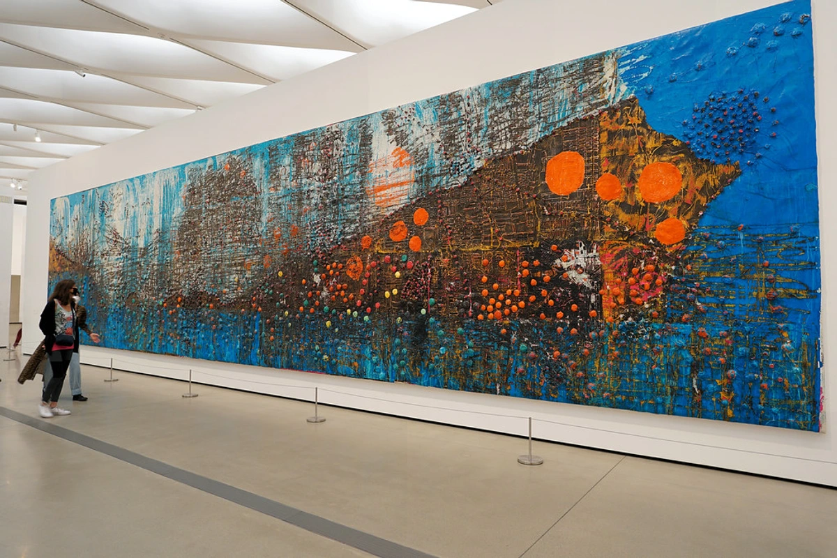
Artists achieve this profound depth and atmosphere through various techniques. For example, I often find myself drawn to the intense depth of Ultramarine blue, with its granular texture, or the vibrant energy of Phthalo Blue, known for its high tinting strength. We might layer translucent glazes of blue to build a sense of infinite, ethereal space, mimicking the feeling of looking into a deep pool where light slowly dissipates. Varying opacity and value (lightness/darkness—think of it like a dimmer switch for light, from bright white to deep black) is crucial: lighter, desaturated blues can recede, giving the impression of distant horizons, while darker, richer blues suggest profound, almost tangible depth. The tactile quality of blue—whether a thick impasto that catches light and shadow, or a smooth, translucent wash—further amplifies its emotional impact and perceived depth. The interplay with complementary colors like orange can make blue vibrate with energy, enhancing its emotional impact or creating dynamic tension. Beyond depth, artists also manipulate blue to suggest the play of light itself—its luminosity or absorption—or to create a sense of movement or profound stillness. Think of a shimmering sapphire blue that seems to shift before your eyes, or a vast, flat expanse of matte blue that arrests all motion.

Think about visionary artists like Wassily Kandinsky, who famously used blue to convey spiritual and transcendental concepts, seeing it as the color of profundity and infinite calm. Or Piet Mondrian, whose stark blue squares contributed to a sense of universal harmony and balance within his geometric abstractions. Beyond these pioneers, blue also holds a powerful place in movements like Color Field painting, where vast expanses of saturated blue by artists such as Mark Rothko or Barnett Newman can envelop the viewer in pure emotional immersion, creating monumental, meditative experiences. Or in Abstract Expressionism, where spontaneous blue gestures by Jackson Pollock or Willem de Kooning might convey raw emotion, explosive energy, or a sense of boundless, untamed space. More contemporaneously, artists like Mark Bradford utilize layered paper and found materials to create vast, textured blue cityscapes that evoke complex social narratives while still possessing immense visual depth. They weren't just painting blue things; they were painting with blue, using its inherent properties to speak volumes without a single literal image. It's a masterclass in decoding abstract art: a guide to finding meaning in non-representational works.

My Brush with Blue: A Personal Canvas of Emotion
For me, blue is often where my mind goes when I need a moment of quiet rebellion or profound stillness on the canvas. Sometimess, when my creative process feels like controlled chaos (and, let's be real, sometimes just plain chaos), a vast wash of blue brings an anchor. It’s like hitting the mute button on the world, a visual exhale that allows other colors to sing or whisper against its backdrop. It grounds the wildness, reminding me of the calm eye of a storm. Blue's inherent coolness and deep receding quality provide a stable, almost infinite backdrop against which more turbulent or vibrant colors can truly express themselves, preventing the composition from becoming overwhelming. It's the steadfast friend who doesn't mind being in the background, making everyone else shine. I might layer translucent blues to build depth, mimicking the feeling of looking into a deep, shifting pool, or use bold, opaque strokes to assert its undeniable presence, like a steadfast mountain range against a storm-laden sky.
There's this one time I was working on a piece, feeling utterly restless, pacing my studio like a caged tiger. Nothing felt right. The composition was a mess, the colors fighting. Then, almost impulsively, I picked up a massive brush loaded with cerulean and just slashed it across the canvas. It wasn't planned; it certainly wasn't thoughtful. But that single, bold stroke of blue suddenly pulled everything else into focus. It gave the chaos a sense of purpose, a quiet strength, a direction. It's these moments of intuition, chaos & creative flow that truly define my work. If you’re ever near 's-Hertogenbosch, you might even see some of these blue-centric pieces at my artist's museum. Sometimes, I wonder if the blue is just quietly judging me, like 'Are we really doing this again? Another chaotic moment?' But then it just gets on with it, grounding the piece, without a single judgmental splat.
Beyond the Canvas: Blue and Your Well-being
But what about your experience with blue? Have you ever felt its quiet power beyond the canvas, even without a canvas in sight? Perhaps you've noticed how gazing at a deep blue sky or a calming body of water can just… physically lower your shoulders a few inches? This isn't just anecdotal; it's a phenomenon supported by concepts like chromotherapy and general psychological associations. Blue light, for example, is known to influence circadian rhythms and promote relaxation. When you engage with an abstract piece rich in blue, you’re not just seeing paint; you’re engaging with those primal associations, tapping into a subtle, subconscious impact that can feel like a cool breeze, a vast silence, or the expansive deep breath of the ocean.
I've personally found that incorporating abstract art into my living space, especially pieces with dominant blues, has a subtle yet profound effect on my daily well-being. It's like having a quiet, ever-present friend who reminds you to breathe, to pause, to simply be—perhaps without the need for a sarcastic eye-roll, which is always a plus. If you want to explore this more, consider mindful viewing: how abstract art can enhance your daily well-being.
Engaging with Blue Abstract Art: A Viewer's Guide
Now that we've meandered through blue's artistic and psychological landscape from my perspective, let's turn the canvas around. The beauty of abstract art, and especially of blue's role within it, is how it invites your personal journey. So, how can you, the viewer, deepen your connection with a blue abstract piece?
- Allow for Quiet Contemplation: Find a blue-dominant piece and simply observe it without expectation. Let your gaze wander, allowing the color to wash over you. Notice how your body responds.
- Embrace the Ambiguity: Resist the urge to 'find' something literal. Instead, ask yourself: What emotions does this shade of blue evoke? Does it feel vast or confined? Serene or unsettling?
- Consider the Artist's Hand: How is the blue applied? Is it layered and translucent, or thick and opaque? Does the brushwork feel calm and flowing, or energetic and chaotic? These technical choices dramatically shape the emotional message. Furthermore, consider the medium itself – the luminous transparency of watercolor blue is vastly different from the dense, textured richness of oil paint, each lending its own unique character to the emotional impact.
- Notice the Neighbors: How does the blue interact with surrounding colors? Does a touch of orange make it pop, or a muted grey create a sense of quietude? The dialogue between colors is key.
- Try a 'Blue Immersion': Find a blue-dominant piece, spend a moment letting your eyes adjust, close them for a few seconds, take a deep breath, and then reopen them, noticing your immediate, unfiltered, almost visceral response to the color. What new sensations emerge?
Frequently Asked Questions
Here are some common questions I get about blue in abstract art, probably from people who, like me, are trying to make sense of the beautiful chaos.
Why is blue so commonly used in abstract art?
Blue's universal versatility and innate optical properties make it a staple. As a cool color, it naturally recedes, making it ideal for creating depth, space, and atmospheric effects. Its profound psychological associations (calm, depth, spirituality, introspection, even melancholy) make it an unparalleled vehicle for abstract expression, allowing artists to convey complex emotion and boundless atmosphere without literal representation.
Does blue always signify calmness in abstract pieces?
Not at all! While often associated with calm, the specific shade, its context with other colors, and the artist's intent can drastically alter its meaning. A stark, dark indigo might convey mystery, profound introspection, or even a sense of foreboding. A vibrant electric blue, conversely, could suggest raw energy, excitement, or even tension. It’s all about the conversation blue has with its surroundings, its texture, its value, and ultimately, with you, the viewer.
Are there any common misconceptions about blue in abstract art?
One common misconception is that blue in abstract art always represents water or sky. While it draws on these associations, in abstraction, blue operates on a purely emotional and optical level, divorced from literal depiction. Another is that blue is solely passive; it can be incredibly dynamic, especially when combined with vibrant complements or applied with energetic brushstrokes, challenging its traditional serene image. A third might be that all abstract blue is 'sad'; while it carries melancholic tones, it also embodies profound peace, infinite possibility, and spiritual depth.
How do artists create depth with blue in abstract art?
Artists ingeniously use blue to create depth by manipulating its value (lightness/darkness) and intensity (saturation). Lighter, desaturated blues can convincingly recede, giving the impression of distance or infinite space, while darker, richer blues can suggest profound, cavernous depth. Layering translucent blue glazes is a common technique that builds a sense of shimmering, infinite space, much like trying to find the bottom of a truly deep, clear pool – visually, at least. Additionally, placing warm colors adjacent to blues can create a push-pull effect, enhancing blue's receding quality and thus the illusion of depth.
What are some lesser-known or surprising uses of blue in abstract art?
Beyond calm and depth, blue can be surprisingly disruptive or energetic. Artists might use a jarring electric blue to introduce tension or discord into a composition, creating a visual 'shout' rather than a whisper. It can also be employed to suggest ephemeral light phenomena, like the shimmering iridescence of a bird's feather or the elusive glow of a distant nebula, moving beyond simple sky or water. And sometimes, it's used simply for its pure, unadulterated optical punch, a vibrant anchor that arrests the eye and forces a momentary, delightful pause.
Where can I find abstract art with blue?
Well, for starters, you're in the right place! My collection often features pieces where blue plays a significant role in setting the emotional tone, acting as a grounding force or a source of vibrant energy. You can explore a variety of pieces and discover one that resonates with you on my art for sale page.
Conclusion: The Enduring Mystery of Blue
So, there you have it. Blue in abstract art isn't just a color; it’s a silent symphony, a vast landscape of emotions, and occasionally, a comforting blanket on a stormy day. It’s a color that invites you to look deeper, not just at the canvas, but within yourself. It challenges you to feel, to ponder, and perhaps even to get a little lost in its profound depths.
As an artist, my journey with blue is far from over. Each time I pick up a tube of indigo or phthalocyanine blue, it’s a new conversation, a fresh mystery to unravel. And just like understanding emotions, it's a journey, not a destination. Maybe someday I'll truly 'get' blue, but until then, I'm happy just swimming in its beautiful, enigmatic waters. And perhaps, when you encounter a powerful blue piece, you’ll join me for a contemplative dip, discovering your own hidden depths within its hue. What new feeling or forgotten memory might blue unlock for you?