How to Photograph Your Art at Home: The Ultimate No-Nonsense Guide
Master art photography at home with this comprehensive guide for artists and collectors. Learn about gear, lighting, camera settings, and editing to capture stunning, accurate digital images of your artwork.

How to Photograph Your Art at Home: The Ultimate No-Nonsense Guide to Stunning Digital Images
Okay, let's be honest. For artists, taking a truly good photo of your artwork can feel like a final, cruel boss battle after you've already poured your soul onto the canvas. For collectors, it's that nagging task you need to do for insurance or your digital archive. You take a snap with your phone, and the photo that appears looks... well, sad. The colors are off, there's a weird glare, and it has all the vibrancy of a wet piece of cardboard. It's frustrating, right? Because a bad photo does a huge disservice to the real thing.
I've definitely been there. My early attempts at documenting my work looked like they were taken with a potato in a dark cave. It felt like my digital handshake for my art was more of a soggy high-five, and I wanted it to be a firm, confident grip.
So, I'm going to walk you through it. Not with a bunch of overly technical jargon that only makes sense to camera nerds (no offense, camera nerds, you do you!). This is stuff that actually works, whether you're using a fancy DSLR or just the phone in your pocket. By the end of this guide, you'll have the confidence and practical knowledge to capture your art in its best digital light, whether you're a seasoned pro or just starting out.
Why a Good Photo Isn't Just "Nice to Have"
Before we dive into the how, let's quickly touch on the why. Because, believe me, understanding the stakes will motivate you to move that lamp one more time, or spend an extra five minutes on color correction. A good photo is your art's most eloquent ambassador in the digital world. It's not just a bonus; it's a fundamental requirement in today's visual landscape.
- Selling Your Work: This is non-negotiable. Whether it's on your own site or an online platform, the photo is the product to an online buyer. I've heard countless stories (and experienced it myself) where a buyer chose a lesser-known artist's work simply because the photos were superior. It’s the deciding factor between a click and a scroll, and ultimately, a sale. When you see a great piece of art you love online, your first thought is usually "I want to buy it" – and a clear photo makes that possible.
- Archives & Insurance: A clear, color-accurate record of your collection is absolutely crucial. Think of it as building your personal art history, akin to maintaining a detailed artistic /timeline. For insurance claims, merely identifying a piece isn't enough; accurate color representation is vital for proper valuation, especially if colors have faded over time or if the original hues are central to its value. Our guide to art storage solutions for collectors offers more insights into protecting your treasures.
- Submissions & Portfolios: Galleries, competitions, grants, and even collaborations will almost always ask for digital images first. A fuzzy, poorly lit image can get your application dismissed before anyone even sees your original work. It’s your digital first impression.
- Sharing Online: You want your work to look its absolute best on social media, your website, or even in emerging digital spaces like those occasionally involving NFTs. While I remain cautiously skeptical about the long-term artistic value or environmental impact of blockchain-based art, it's undeniable that high-quality digital images are paramount for any form of online presentation. A good photo stops the scroll and demands attention. You've poured your soul into it; let it shine!
The Tools of the Trade: What You Actually Need (and What You Don't)
You might be picturing a sterile studio with more lights than a Hollywood movie set. Relax. The most important tool you have is your brain, and a good dose of patience. But a few other things certainly help. Here's a breakdown of what can make a difference, from budget-friendly options to professional-grade setups:
Item  | Good Enough (Budget-Friendly) | Better (Serious Hobbyist) | Best (Professional Results) |
|---|---|---|---|
| Camera | Your smartphone (any modern one is surprisingly capable) | An entry-level DSLR or Mirrorless camera with a kit lens | A full-frame DSLR/Mirrorless with a 50mm prime lens |
| Lighting | A large, bright window with indirect sunlight (it's free!) | Two identical lamps/lights with daylight-balanced bulbs | Two studio strobes or continuous LED panels with softboxes |
| Support | A stack of books, a steady hand (if you really must) | A basic tripod (seriously, get a tripod – it's a game-changer) | A sturdy tripod with a bubble level and remote release |
| Background | A neutral-colored wall (grey, white, or black) | A large roll of seamless paper or a clean, ironed bedsheet | A professionally painted wall or a dedicated backdrop system |
| Extras | Your camera's built-in timer | A remote shutter release, gray card for white balance | A color checker passport, polarizing filter, light meter |
| Software/Apps | Phone's built-in editor, Google Photos, GIMP (free desktop) | Affinity Photo, Luminar Neo (affordable desktop options) | Adobe Lightroom, Photoshop (industry standard) |
Lights, Camera, Artwork! Your Step-by-Step Photography Process
Alright, grab another coffee. We're doing this together. This isn't just about photographing artwork for web and print in a generic sense; this is about doing it right, in your space, with your art.
Step 1: Prepare Your Artwork for its Debut
First things first. Make sure your art is ready for its close-up. Dust it off meticulously. If it's a painting, check for any stray pet hairs that have decided to become one with the varnish (it happens to the best of us). If it's a recent piece, ensure it's completely dry – wet paint can reflect light differently and smudge. And a small but crucial tip: handle your art with clean hands, or even cotton gloves, to avoid transferring oils and fingerprints.
Place it on an easel, or hang it perfectly straight and perfectly vertical on your neutral wall. Use a spirit level app on your phone if you don't have a real one. The goal is a perfectly flat, perfectly aligned surface facing your camera.
Step 2: Master Your Lighting (The 90% Battle)
Lighting is, without exaggeration, 90% of the battle. Your goal is soft, even light across the entire piece. You are fighting two arch-enemies here: harsh shadows and distracting glare.
- Using Natural Light: The best free light source there is. Place your artwork a few feet away from a large window, but never in direct, harsh sunlight. You want that bright, overcast-day kind of light – soft and diffused. The art should face the window, and you should stand with your back to the window to take the photo. This creates even illumination and minimizes shadows from your camera or body.
- Using Artificial Light: This gives you maximum control. The magic formula is the two-light, 45-degree setup. Place one light on the left and one on the right, each pointing at the artwork at a 45-degree angle. This setup is the secret to killing shadows and minimizing glare, especially on glossy paintings or framed pieces. Why 45 degrees? If the lights are too close to the artwork (say, 30 degrees), they'll create harsh highlights. If they're too far to the side (say, 60 degrees), they'll cast shadows from any texture or frame edges. The 45-degree sweet spot provides consistent, even light.Crucially, use daylight-balanced bulbs (often marked as 5000K or 5500K). These mimic natural daylight and ensure your colors are accurate. Standard household bulbs (often 2700K-3000K, or "warm white") will cast a yellow tint, making your blues look dull and your whites look jaundiced. No one wants jaundiced art.
Step 3: Position Your Camera for Perfection
This is where your tripod becomes your absolute best friend. Seriously, invest in one.
- Position: Place the tripod so your camera lens is aimed squarely at the center of the artwork. The back of your camera should be perfectly parallel to the surface of the artwork. If it's tilted up, down, or sideways even slightly, you'll get distorted shapes (called keystoning), where the top and bottom or sides appear to converge or diverge, making your perfectly rectangular canvas look like a trapezoid. Use the grid lines on your camera's screen (if available) to ensure perfect alignment.
- Lens Height: The middle of your lens should be at the exact same height as the middle of the artwork. This also helps prevent keystoning.
- Fill the Frame: Zoom in so the artwork fills most of your camera's viewfinder, but leave a little bit of the background visible around the edges. You can crop it perfectly later in post-processing. Trying to get it too perfect in-camera often leads to accidentally clipping edges.
Now for the settings. If you're using a DSLR or mirrorless, switch to Manual (M) or Aperture Priority (A/Av) mode. If you're on a phone, use an app that allows manual control (more on that later).
Setting | Recommended Value | Why It Matters |
|---|---|---|
| ISO | 100 (or the lowest your camera goes) | Lower ISO means less digital "noise" or grain, resulting in a cleaner, sharper image. Think of ISO as your camera's sensitivity to light; we want it minimally sensitive for maximum clarity. |
| Aperture (f-stop) | f/8 to f/11 | This is the 'sweet spot' for most lenses, ensuring the entire artwork is in sharp focus, from corner to corner. A wider aperture (smaller f-number like f/2.8) would create blurry edges (depth of field), which is great for portraits but terrible for documenting flat art. |
| Shutter Speed | Varies (e.g., 1/60, 1/15, 1/8) | Adjust this until your exposure looks correct. Because you're on a tripod, a slower speed is perfectly fine and often necessary to get enough light with a low ISO and high aperture. Don't worry about blur from camera shake. |
| White Balance | Match your light source (Daylight, Tungsten, Custom) or use Auto with a gray card. | This tells your camera what 'true white' looks like, ensuring your colors are accurate and not tinted. If you have a gray card or a piece of white paper, take a custom white balance reading from it. |
| File Format | RAW (if available) | RAW files capture way more data than JPEGs, giving you vastly more flexibility when editing exposure, colors, and shadows without losing quality. It's like having the full recipe instead of just the finished cake. |
After setting up, make sure your camera's focus point is locked directly onto the surface of the artwork. Avoid letting it focus on the wall behind or the frame.
Step 4: The Moment of Truth: Taking the Shot
Use your camera's 2-second timer or a remote shutter release. Why? Because even the tiny motion of you pressing the shutter button can cause a little bit of blur, especially with slower shutter speeds. It's a subtle but important detail that distinguishes a good photo from a great one.
Take a shot, then use the playback function to zoom in, really zoom in. Check the focus on the details – does it look sharp from corner to corner? Is the exposure right? It's better to take 10 shots and get the perfect one than to go through this whole setup and realize later that your one shot was slightly blurry or the colors were off. Experiment a little. Nudge a light, adjust the camera slightly. The physical setup is the hardest part; getting multiple takes is easy now.
Step 5: Post-Processing: The Art of Digital Polish
The goal of editing is not to make the artwork look better than it is; it's to make the digital photo look identical to the real thing. Our eyes are amazing at adapting, but cameras often need a little help to translate reality accurately. Don't skip this step!
Crop & Straighten
This is your first move. Crop out any visible background and make sure the edges of your artwork are perfectly straight and parallel to the image frame. Most editing software has excellent tools for this, often with guides that pop up to help.
Exposure & Contrast
Adjust the brightness (exposure) and contrast so that the whites in your artwork are truly white (but not "blown out" to pure white pixels with no detail), and the blacks are truly black (without losing detail in the shadows). Look at your camera's histogram if your software has one – a good image will generally have information spread across the entire graph without spiking dramatically at either end.
Color Correction
This is often the trickiest part but the most important for accuracy. First, get your white balance right. If you used a gray card or custom white balance in-camera, this should be close. Otherwise, adjust the temperature (warm/cool) and tint (green/magenta) until the colors on your screen match the colors on the physical artwork as closely as possible. If you captured in RAW, you have immense flexibility here without destroying image quality. Be mindful of your monitor's calibration – a poorly calibrated screen will make accurate color correction impossible. Briefly, most web-based applications assume sRGB color profiles, so ensure your final export is in sRGB for consistent viewing across devices; avoid wider gamuts like Adobe RGB unless you know your audience's display capabilities.

Sharpening
Finally, a subtle touch of sharpening can make a huge difference, especially if you shot in RAW. Digital cameras often apply a slight blur to avoid noise, so a little sharpening helps bring back crisp details. Be careful not to over-sharpen, as it can introduce unnatural halos or noise.
Step 6: File Management: Taming Your Digital Archive
This step is often overlooked but is crucial for long-term organization. After all that work, you don't want to lose track of your files or struggle to find the right version.
- Naming Conventions: Develop a consistent naming system. For example:
[ArtistName]_[ArtworkTitle]_[Year]_[SizeInCm]_[Medium]_[Version].jpgor[YourName]_[CollectionName]_[YYYYMMDD]_[Original/Print].tif. The key is consistency. - Folder Structure: Create a logical folder structure on your computer or cloud storage. Perhaps
Artworks/Originals/Paintings/2023/orArtworks/Prints/Abstract/. - Backups: Always, always, always back up your files! To an external hard drive, a cloud service, or both. Imagine losing all those perfectly photographed images.
Your Art Photography Questions, Demystified
I know you've probably got questions swirling, because I certainly did when I first started. Let's tackle some of the most common ones:
How do I photograph artwork behind glass?
This is the ultimate challenge. The 45-degree lighting setup (Step 2) is your absolute best weapon against reflections. The goal is to ensure no light source (or anything reflective) is directly bouncing back into your lens. If you still see your camera or distracting reflections, you may need a polarizing filter, which screws onto your lens and can cut out reflected light. It feels like magic when it works! If a polarizing filter isn't an option, try moving yourself and your camera slightly to an angle where reflections are minimized, or use large black or white foam core boards to block or bounce light strategically from the sides of your setup. Sometimes, simply draping black fabric over your camera and yourself can block unwanted reflections.
Can I really just use my phone?
Absolutely, you really can! Modern phone cameras are incredibly capable. The principles of good lighting and positioning are exactly the same. The key is to move beyond the default point-and-shoot mode.
- Use a Tripod Adapter: Get a cheap adapter that lets you mount your phone to a standard tripod. This is crucial for sharpness, especially in lower light.
- Manual Camera Apps: Download a third-party app that gives you manual control over ISO, shutter speed, and white balance. Apps like Halide (iOS), Moment (iOS/Android), or even the Pro modes built into many Android phones offer this. This lets you apply the camera settings from our table in Step 3.
- Shoot RAW: Many advanced phone camera apps now allow you to shoot in RAW format (often DNG). This gives you vastly more editing flexibility, just like with a DSLR.
- Avoid Digital Zoom: Always move your phone physically closer to fill the frame rather than using digital zoom, which degrades image quality.
How do I capture texture in a painting?
To emphasize texture (like impasto or thick brushstrokes), you'll need to adjust your lighting. Instead of the perfectly even 45-degree setup, move one of your lights to a more severe, shallower angle (more to the side, maybe 15-20 degrees). This will create tiny shadows across the textured surface, making it pop and giving it a beautiful three-dimensional quality. I often take two photos of textured work: one with even, flat lighting for accurate color, and another with dramatic side lighting for texture. Sometimes, you can even composite the best parts of both in editing software.
What's the biggest mistake people make?
Using uneven, terrible lighting. Hands down. A photo taken in a dimly lit room with a single overhead light will always look yellow and sad. And using the camera's built-in flash is the absolute worst thing you can do—it creates a harsh, bright hotspot, deep, unflattering shadows, and often terrible red-eye effects on any reflective surfaces. Just... don't. Seriously. The next biggest mistake is not using a tripod, leading to blurry images.

How important is the background?
Very. A busy or distracting background pulls focus from the art itself. Even if you plan to crop it out later, a neutral background (grey, white, or black) helps your camera's sensor get a more accurate reading of color and exposure for the artwork. It provides a clean canvas, both literally and figuratively, allowing your art to be the star. It's a simple thing that makes a huge difference, whether you're trying to figure out how to decorate a house or just document a single piece. If you're photographing art in situ as part of a room, then the background becomes part of the composition and needs to be styled thoughtfully, but for pure art documentation, keep it neutral and unobtrusive.
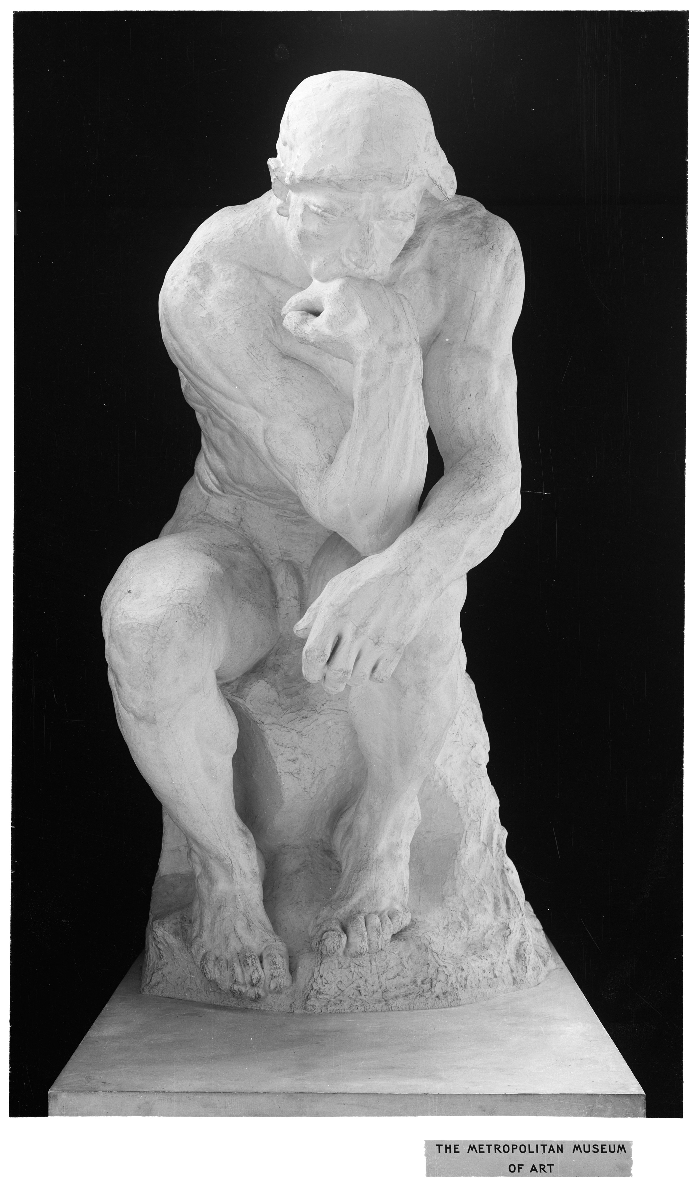
How to photograph sculptures or 3D artwork?
Photographing three-dimensional art requires a slightly different approach to lighting and angles, as you need to convey form and volume.
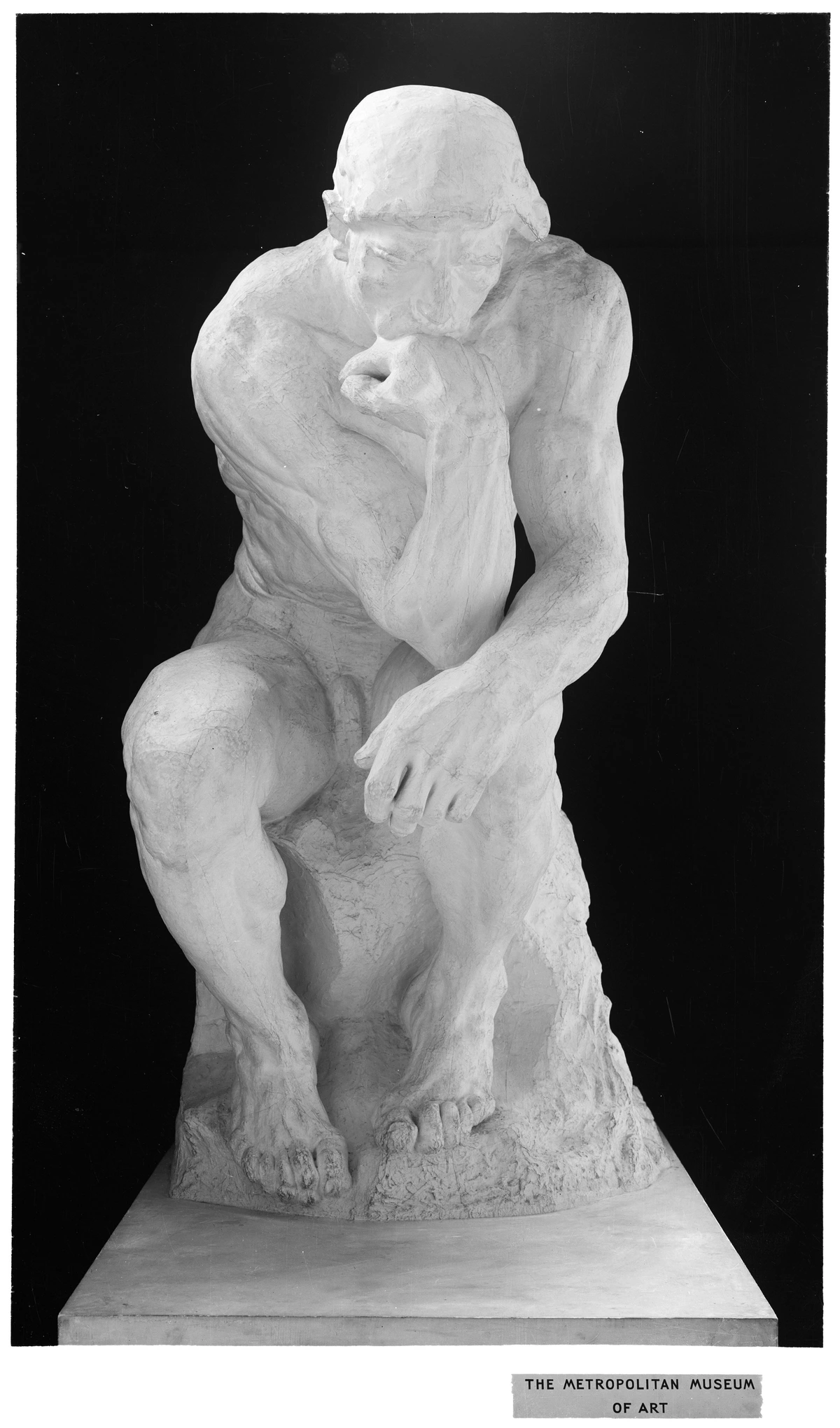
- Multiple Angles: Don't settle for just one front-on shot. Take photos from several angles (front, back, sides, 3/4 views, close-ups of details). Imagine someone trying to understand the piece without seeing it in person.
- Main Light + Fill Light: Use a primary light source (your 'key light') to define the main form, and a weaker 'fill light' on the opposite side to gently lift shadows without flattening the form. Backlighting can also create dramatic silhouettes.
- Softboxes/Diffusers: Soft, diffused light is paramount to avoid harsh shadows and reflections, especially on glossy or metallic sculptures. Softboxes, umbrellas, or even DIY diffusers (like a white bedsheet) over your lights are essential.
- Neutral Background: Use a seamless paper backdrop (white, grey, or black) that extends from the wall onto the floor to create a clean, uncluttered look with no visible horizon line. This makes the sculpture appear to float.
What about photographing drawings or prints on paper?
These can be deceptively tricky due to the flatness and potential for subtle textures.
- Absolute Flatness: Ensure the drawing or print is perfectly flat. Use archival tape to secure it to a board, or place a clean, heavy sheet of glass over it (ensuring the glass itself doesn't cause reflections).
- Even Lighting: As with paintings, even, diffused lighting is key to avoid hot spots or shadows that might obscure fine linework or subtle tones. The 45-degree two-light setup works wonderfully here.
- Polarizing Filter (Again!): Even matte paper can have a slight sheen that causes glare. A polarizing filter on your lens can make a noticeable difference in cutting out these subtle reflections and ensuring true black values and rich colors.
- Capture Detail: Use a high resolution and a sharp lens. If it's a very detailed drawing, consider taking a few close-up shots of key areas, in addition to the full shot, to showcase the intricacies.
Final Thoughts: Your Art Deserves to Shine
There you have it. A no-nonsense, practical guide to capturing your art in a way that truly honors the effort and passion you pour into it. It might seem like a lot at first, but each step builds on the last, and with a little practice, it becomes second nature. Think of it as another artistic skill, one that bridges the gap between your physical creation and its digital representation.
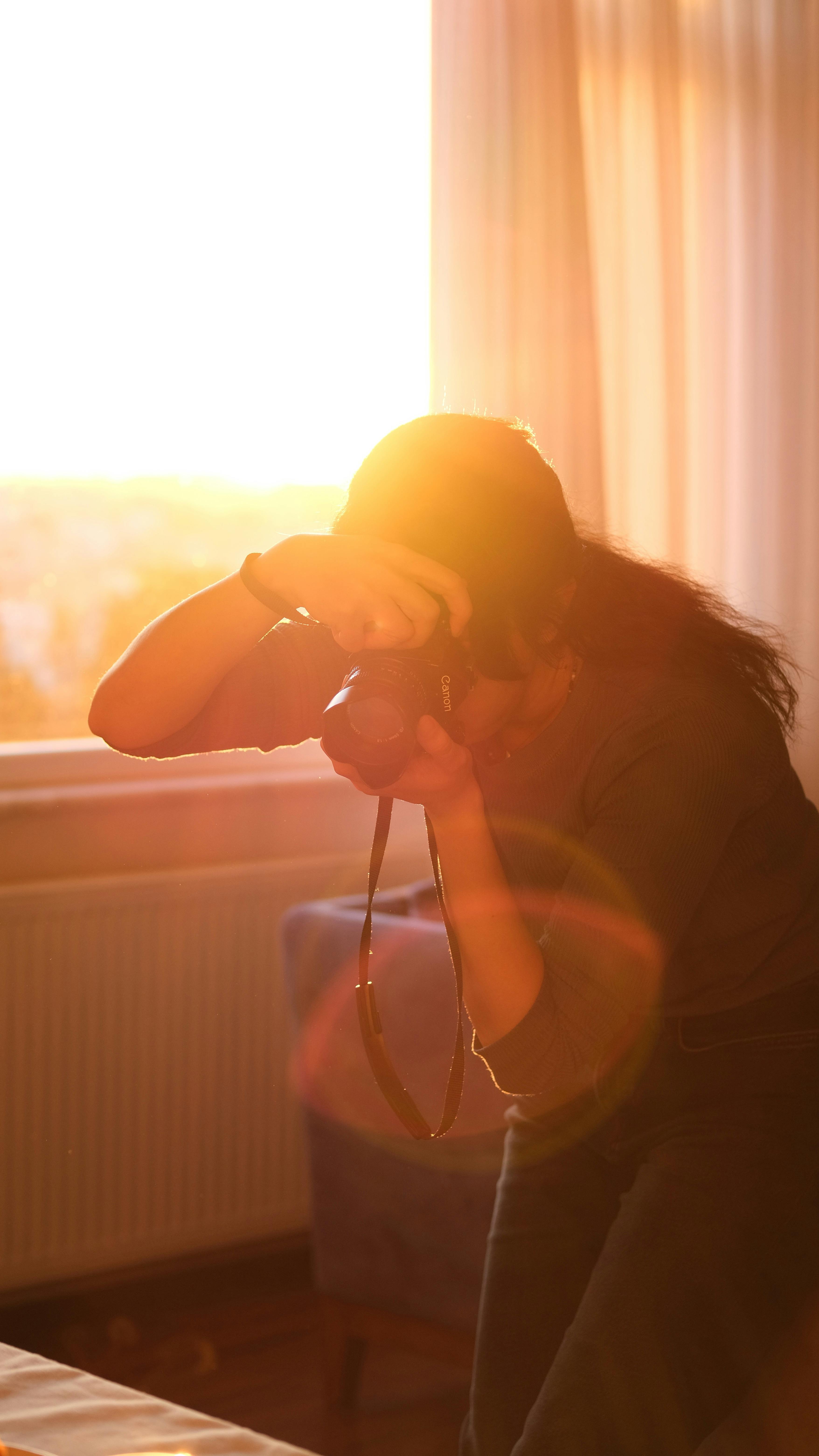






Mastering art photography isn't just about technicalities; it's an investment in your art's visibility, its legacy, and your ability to connect with a wider audience. So go forth, experiment, make mistakes (we all do!), and let your art shine through every single pixel. It deserves nothing less.