Exploring Art Mediums: Your Evolving Creative Journey Through Paint, Pixels, and Purpose
Choosing an art medium can feel like trying to pick a favorite star from the night sky—each one captivating, unique, and holding endless possibilities. Or, if I'm being brutally honest, it can feel like a slightly overwhelming speed-dating session with a bunch of demanding personalities, each wanting your full attention and commitment. Yet, amidst the initial chaos, there's also the thrilling potential of discovery, of finding that unexpected connection. I've been there, staring at a blank canvas or pristine paper, wondering where to even begin. What tool will best tell this story? What pigment will capture that fleeting emotion? This isn't just a technical guide; consider it an invitation into my own studio and process, a journey through the tactile world of traditional paints and dry media, into the boundless realm of digital creation, and even touching upon the thoughtful choices required for a sustainable artistic practice. Beyond mere technique, we'll explore how selecting a medium isn't just about the 'what' but the 'why' – how it shapes your artistic purpose and the very message you wish to convey.

I'm not here to lecture you with a dry textbook explanation of every medium under the sun. Instead, consider this an invitation into my often messy, always evolving journey with various materials. It's about finding that creative chemistry, that unspoken dialogue between your hand, the medium, and the canvas. Because in the end, it's not just about the paint or the pencil; it's about what they allow you to express, and the story they help you to tell. It's a journey, much like my own evolving artist's timeline, filled with discovery and constant evolution.
The Curious Case of Creative Chemistry: Why Mediums Matter
Think of art mediums like ingredients in a grand, delicious meal. You wouldn't use flour for a soup, or water for bread (unless you're an avant-garde baker, and in that case, kudos to you!). Each ingredient—each medium—has its own unique flavor, texture, and cooking time. It has its quirks, its strengths, and its absolute deal-breakers. And just like a chef learns to coax the best from their ingredients, an artist learns to understand the soul of their medium.
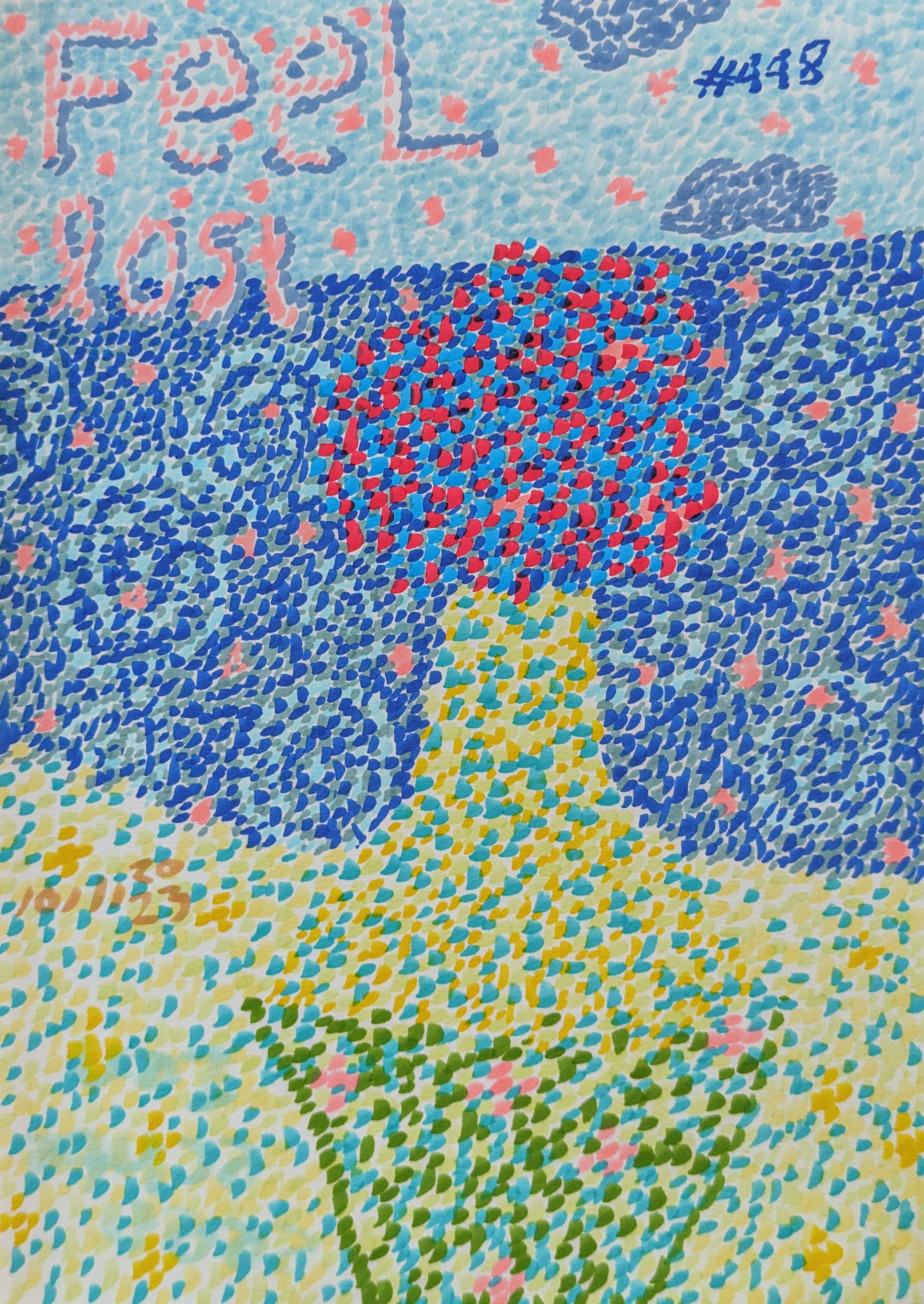
For me, this understanding has been less about rigorous study and more about playful experimentation, punctuated by moments of utter frustration, accidental brilliance, and the occasional paint-splattered shirt that I just can't bring myself to throw away. It's a journey, not a destination, and it profoundly shapes not just the final piece, but also the very act of creation itself. The tools you choose don't just determine the path you walk; they fundamentally alter how you walk it, the sensations along the way—the smell of turpentine, the gritty whisper of charcoal, the smooth glide of a stylus—and the discoveries you make. The medium becomes an extension of your own evolving perspective, a true creative companion, even influencing your mood and the rhythm of your creative flow. Sometimes, the slow drying of oils offers a meditative peace, while the quick action of acrylics can match a burst of restless energy.
The Tactile Realm: My Enduring Connection to Traditional Painting
Oil Painting: The Grand Old Dame of the Art World
Ah, oil paint. For me, it's the medium that whispers tales of the Renaissance, conjures images of masters, of dramatic chiaroscuro and luminous portraits, and truly demands respect. Dabbling in oil feels like stepping into a slow, elegant dance. It's rich, buttery, and utterly luxurious. The colors are deep, the blending is a dream, and you can push and pull the edges, blend the transitions, and refine the details often for days. Its notoriously slow drying time can be a blessing and a curse.
Historically, the use of linseed oil as a binder (the substance that holds the pigment particles together and allows them to adhere to the surface), and pigments derived from natural minerals, gave early oil paintings their unique depth and resilience, often allowing for incredible longevity. Think of the vibrant blues from lapis lazuli or the earthy reds from Venetian red. Beyond these, the history of oil painting is rich with pigments like radiant vermilion, the historically precious ultramarine (derived from lapis lazuli, once more valuable than gold!), earthy ochres and siennas, or even historically significant but now recognized as toxic lead white. Good ventilation is crucial when working with oils, as many solvents can be strong and their fumes potent.
I remember my first serious attempt with oils: I had this grand vision, a swirling abstract landscape. I'd lay down a vibrant red, then gently try to merge it with a deep blue. The process was intoxicating, but my impatience was a real obstacle. I'd go for a coffee, come back, and it would still be wet, taunting me to blend just a little more. It taught me patience, a virtue I'm not always blessed with, both in art and in life. But the depth and luminosity you achieve with layers, often through historic techniques like glazing (applying thin, transparent layers of paint over a dried opaque layer) and scumbling (dry-brushing opaque paint over a dried layer for a broken color effect), are unparalleled. Once fully dry, a layer of varnish can protect the painting from environmental factors and enhance the vibrancy of the colors, giving it a final, lustrous finish.
It's no wonder artists like Willem de Kooning masterfully wielded this medium to create such powerful abstract expressionist works, or how Rembrandt achieved his incredible luminosity through layered glazes, or Van Gogh conveyed raw emotion with thick, expressive impasto. Does this slow, deliberate dance appeal to your creative spirit, or does the thought of a two-week drying time make your inner impatient artist scream? I know mine occasionally does.

Acrylic Painting: The Speedy Chameleon
If oil paint is the grand dame, then acrylic is the energetic, ever-adaptable modern chameleon. This is often my go-to for my vibrant, abstract art. It dries fast—sometimes too fast for my slower brain to keep up, leaving me scrambling to blend before it's set—but that speed also means you can layer, experiment, and completely change direction without waiting days.
Acrylics, essentially plastic polymer emulsions, use an acrylic polymer as their binder, offering incredible versatility. Developed in the mid-20th century, acrylics quickly gained traction among artists for their rapid drying and adaptability, breaking free from the traditional constraints of oils. Early pioneers embraced their fluid and immediate qualities, forever changing the landscape of modern art. They can mimic the buttery texture of oils when used thickly (often with a gel medium), or achieve the transparent washes of watercolors when thinned. They're versatile, vibrant, and forgiving, which is perfect for my sometimes-impulsive creative urges. Want to explore bold color theory with quick results? Acrylics are your friend.
A quick note on cost: artist-grade acrylics offer superior pigment concentration and lightfastness (resistance to fading when exposed to light) compared to student-grade, which often use more fillers. Artist-grade acrylics use higher quality binders resulting in better adhesion and flexibility, but student-grade is excellent for experimentation and learning without a significant initial investment, and perfect for large-scale practice pieces where cost is a factor. Remember to prepare your surface with a suitable primer or gesso for optimal adhesion and longevity. For finished pieces, applying an appropriate acrylic varnish can offer protection against UV light and dust, preserving your vibrant work for years.
Beyond just paint, the real magic of acrylics often lies in their accompanying mediums. Want to extend your paint, increase transparency without losing adhesion, or create a thick, sculptural effect? Gel mediums (gloss, matte, heavy body) can thicken paint and add texture, while flow improvers (also called pouring mediums) reduce viscosity for smooth, watercolor-like washes or impressive pours. A retarder can be added to slow down drying time, giving you more blending opportunities, though never quite matching oils. I love how I can build up layers of transparent glazes, creating depth and luminosity, or apply thick, impasto strokes for incredible texture. There's a playful freedom with acrylics that I find incredibly liberating. It’s like being able to sprint through an idea, a restless thought finding its form in vivid color, rather than having to walk. I once accidentally splattered a vibrant yellow across a dark blue background, and instead of trying to fix it, I leaned into the chaos, turning it into a dynamic focal point. And sometimes, a sprint is exactly what the creative muse demands, especially when I'm trying to capture that fleeting moment of inspiration before it vanishes like a dream upon waking. Artists like Jackson Pollock and Helen Frankenthaler pushed the boundaries of abstraction with acrylics, reveling in their fluid and immediate qualities, while others like Mark Rothko used them for their expansive color fields. For a deeper dive, explore the history of acrylic painting. Are you ready to embrace its dynamic pace?

Watercolor: The Dance of Transparency and Control
Watercolor… now this is a medium that truly feels like chasing a dream. It's delicate, luminous, and often unpredictable. The magic of watercolor lies in its transparency and the way pigments flow and mingle with water, creating soft washes and ethereal effects. It’s also famously unforgiving; once it dries, it's hard to make changes. This requires a certain surrender, an acceptance of what the water wants to do, rather than forcing your will upon it. Which, let's be honest, is a life lesson for us all. I once thought a little 'dab' would fix a slightly-too-dark area, only to watch the pigment spread like a watercolor-fueled wildfire, obliterating my delicate sky. Lesson learned: sometimes, you just have to start over. This makes it less ideal for absolute beginners who might find its steep learning curve frustrating before they've built basic confidence.
Historically, artists ground pigments with gum arabic, and sources varied widely from botanical extracts to ground minerals, each offering unique hues and behaviors. Beyond fine art, watercolor was crucial for scientific illustrations, botanical studies, and travel journals, where its portability and quick drying time were invaluable for capturing observations on the go. The quality of your paper is paramount here; it dictates how the water behaves, how the pigments spread, and ultimately, the luminosity of your finished piece. For instance, cold-press paper offers a textured surface that grabs pigment and water beautifully, while hot-press paper is smoother, allowing for fine detail but less diffusion. Rough paper provides an even more pronounced texture, often preferred for expressive landscapes. And don't underestimate the impact of water quality; purified or distilled water can prevent mineral deposits from marring your delicate washes. The learning curve for watercolor can feel steep because mistakes are hard to hide, but this challenge often cultivates precision and thoughtful planning.
When working with watercolor, the tools are as important as the pigment. Different brush types—from the fine point of a round brush for details, to the broad strokes of a flat brush for washes, or the thirsty capacity of a mop brush for large, even coverage—all influence the outcome. A key technique unique to watercolor is lifting, where you use a damp brush or sponge to remove dried pigment, creating highlights or softening edges. This requires delicate timing and a light touch. My relationship with watercolor is one of awe and slight intimidation. I admire artists who master it, creating incredible depth and vibrancy with such a delicate touch. For me, it’s a lesson in letting go, embracing the happy accidents, and finding beauty in the subtle nuances. I remember one time, a drop of water fell onto a half-dried wash, blooming into an unexpected, delicate starburst that completely transformed the landscape into something more magical than I'd intended. It's less about bold statements and more about gentle whispers, creating a light and airy feel. Artists like J.M.W. Turner and John Singer Sargent are legendary for their watercolor mastery, capturing light and atmosphere with breathtaking skill, or even the contemporary, vibrant works of Agnes Cecile. Are you willing to surrender to its beautiful unpredictability, where even a single drop can transform a scene?

Beyond the Brushstroke: Expanding My Artistic Horizons
As much as I love the fluid dance of paint, sometimes the creative impulse demands a more direct, grounded approach. This is where the tangible immediacy of dry media, and the crisp clarity of ink, truly shine. It's a reminder that not all artistic expression needs the splash and flow of liquid color; sometimes, a whisper of graphite or the decisive stroke of ink is all you need to capture a fleeting thought.

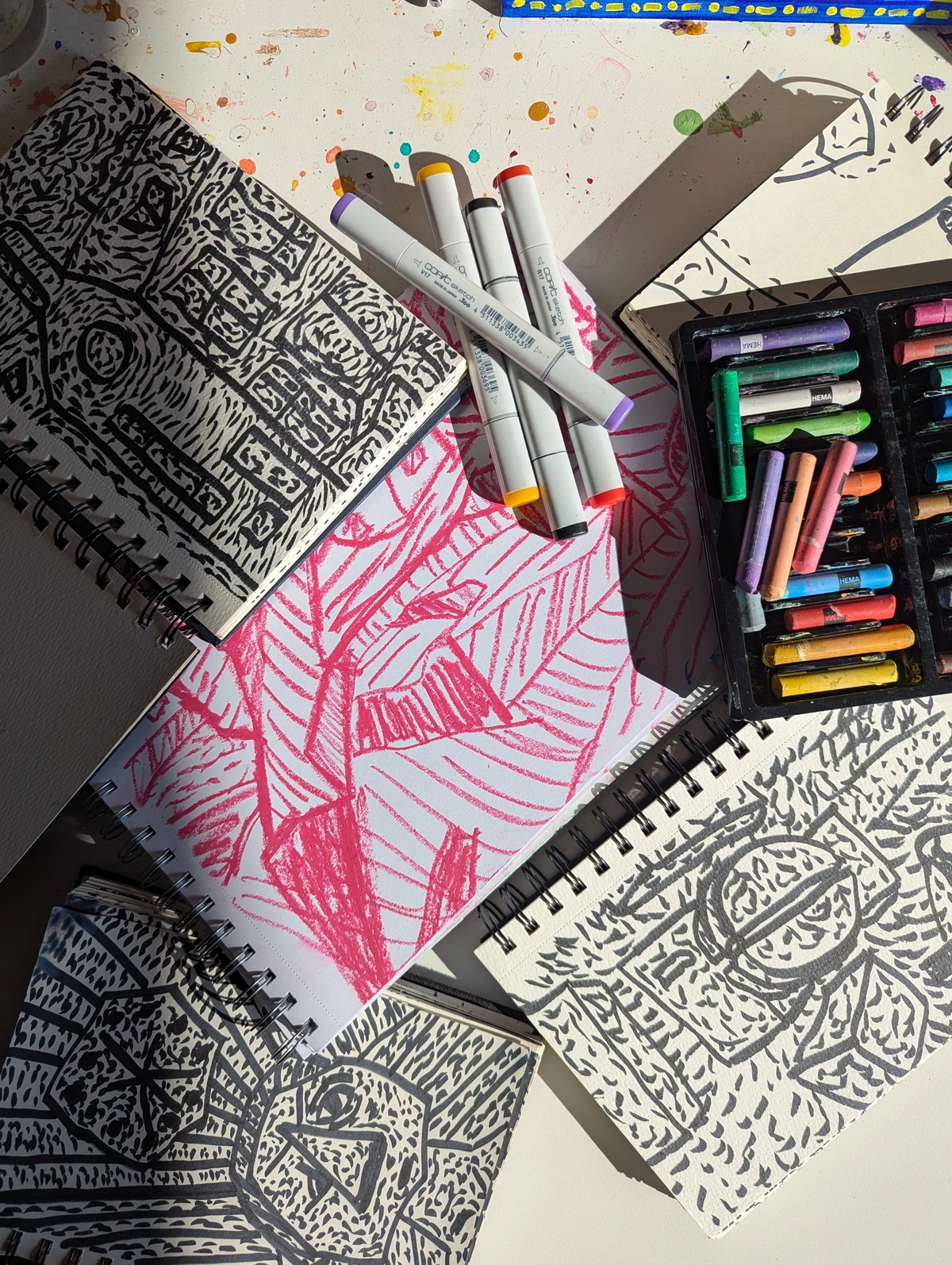
Dry Media: From Whispers to Shouts
When the urge to create strikes with immediate force, or when the subtle nuances of line and tone are paramount, dry media offer a direct and unadulterated path to expression. Sometimes, the simplest tools hold the most profound power. This is where dry media comes in: pencils, charcoal, pastels, markers, and even colored pencils. There's a raw honesty to a pencil line, an immediacy that connects directly from thought to paper. Historically, masters like Leonardo da Vinci and Michelangelo utilized charcoal and graphite extensively for their preliminary sketches, demonstrating the foundational importance of these mediums in planning complex compositions.
Graphite pencils offer precision and a wide range of tonal values, from light whispers to deep shadows. Artists like Ingres were masters of graphite for precise portraiture, while others like Paul Cadden achieve hyperrealism. Charcoal can create dramatic, atmospheric effects with its rich blacks and smudgy textures, perfect for expressive figure studies like those by Käthe Kollwitz. There's vine charcoal, light and easily erasable for initial sketches, and compressed charcoal, offering intense blacks and less dust. Pastels (both soft and oil) offer a vibrant, painterly quality without the liquid mess, feeling almost like drawing with pure pigment, and colored pencils provide intricate detail and smooth blending for rich, layered color work. Additionally, Conte crayons, a square stick medium made from compressed powdered pigment, can also create rich, bold lines and tones, often preferred for their earthy palette and graphic quality. When working with dry media, understanding the tooth of your paper—its surface texture, much like tiny hills and valleys—is crucial, as it dictates how much pigment the paper can hold and how the medium will adhere and blend. Think of it like a micro-landscape for your pigments to cling to. A final layer of fixative is often used to prevent smudging and preserve the artwork.
I find immense joy in sketching. It's a direct conversation, unburdened by drying times or complex mixtures. There's something incredibly satisfying about the drag of graphite on paper, the soft release of charcoal dust that clings to your fingers, or the vibrant bloom of pastel pigments, feeling the subtle resistance and texture of the surface. It's about capturing a gesture, an idea, a feeling with pure, unadulterated line. And let's be honest, sometimes you just need to draw something out, literally, to figure out what's rattling around in your brain. Artists like Jean-Michel Basquiat and Egon Schiele showcased the power of drawing and graphic elements within complex compositions, blurring lines between street art and fine art, and raw expression. What story will you tell with the raw honesty of a simple line?

Ink and Pen Work: The Art of Deliberate Lines
If dry media offers whispers and shouts, then ink and pen work provides a precise, often elegant dialogue. From the delicate lines of a fine-nib pen to the broad, expressive strokes of a brush pen, ink allows for incredible versatility. Its historical roots are deep, being fundamental to calligraphy, technical drawings, and traditional illustration across many cultures. From ancient iron gall ink, known for its deep, permanent black and propensity to corrode paper over centuries, to the sophisticated carbon-based and acrylic inks of today, the evolution of ink is a story of permanence and expression. Similarly, nib technology has progressed from quills and reeds to precise metal points, each offering a distinct mark and allowing for varied expressive potential. Beyond fine art, ink was indispensable for cartography, creating detailed maps, and for early scientific documentation, providing clear and lasting records. Modern artists use it for everything from intricate cross-hatching to bold washes, creating stark contrasts and dynamic compositions. Different types of ink, like lightfast India ink or vibrant acrylic inks, offer varying permanence and color saturation, while tools from dip pens to technical pens and even natural materials allow for diverse expressive marks. Understanding line weight – how thick or thin a line is – is paramount in ink work, as it can define form, create depth, and convey emotion, much like a carefully modulated voice.
There’s a beautiful finality to an ink line; it demands confidence, much like an unblended brushstroke. I’ve found that working with ink is a meditative practice, forcing me to commit to each mark, a stark contrast to the forgiving nature of digital tools or blendable paints. The graphic novels of Frank Miller or the detailed botanical illustrations of Maria Sibylla Merian demonstrate the incredible range possible with ink. Have you ever felt the satisfying glide of a fresh pen on paper, transforming a thought into an undeniable mark? This commitment to line can also serve as a powerful foundation, often becoming the skeletal structure upon which mixed-media explorations begin.
Mixed Media: The Grand Experiment
Now, if you're like me and have a penchant for bending (or outright shattering) a few artistic rules, then mixed media is your playground. This is where different art forms and materials come together in a glorious, sometimes chaotic, symphony. Think painting combined with collage, drawing with found objects, or digital elements fused with traditional techniques. The possibilities are truly limitless, and it’s a fantastic way to explore different textures and layers. Found objects can range from old photographs and fabric scraps to natural elements like leaves or sand, or even everyday detritus. They don't just add texture; they can introduce narrative elements, symbolic meaning, or a sense of history to a piece.
When combining disparate materials, however, it's wise to consider archival stability to ensure your creation stands the test of time – some combinations might react poorly over time, leading to yellowing, cracking, or deterioration. For instance, applying oil paint directly over water-based mediums like watercolor or unsealed paper can lead to degradation over time if not properly isolated, or using non-archival glues may result in yellowing and brittleness. A robust approach often involves creating layers, perhaps starting with acrylic gesso, then building up with water-based layers, sealing, and finally introducing oil or found objects with archival adhesives. Compatibility is key here; some mediums simply don't play well together, but discovering which ones do can lead to exciting breakthroughs. A successful mixed-media combination I often enjoy is layering acrylics over a watercolor base for atmospheric depth, then adding intricate ink details on top for definition and narrative.
My journey into mixed media felt like stepping into an art supply store with no budget and no rules—pure bliss! It's where chaos meets cohesion, where unexpected combinations spark entirely new ideas. I remember gluing down an old map fragment into a painting, initially just for texture, but it ended up influencing the entire narrative of the piece. It allows for a richness and complexity that a single medium often can't achieve on its own. It's embracing the 'what if?' and running with it, which, let's face it, is a pretty good motto for life itself. Artists like Robert Rauschenberg revolutionized art with their "combines," pushing the boundaries of what art could be, and Joseph Cornell created intricate box assemblages that redefined collage. If you're interested in diving deeper, our guide on mixed media in abstract art is a fantastic starting point. How will you combine disparate elements to forge something entirely new?
Exploring Beyond the Familiar: Digital Art & Conscious Creation
While the physical world of paint and paper holds immense appeal, the artistic landscape is also being dramatically reshaped by the digital realm. The artistic landscape is ever-evolving, and as much as I adore the tactile intimacy of traditional mediums, I've also found myself drawn to the boundless potential of digital creation. Initially, I approached it with a mix of curiosity and skepticism, wondering if it could ever truly capture the soul of hand-touched art. My fear was that it would feel cold, sterile, or even "less authentic." But the allure of an 'undo' button, an endless palette, and effects mimicking everything from oils to watercolors was too strong to resist. It's a contemporary frontier, merging the precision of technology with the freedom of artistic expression, often complementing traditional work rather than replacing it. It's a space where ideas can be rapidly prototyped, iterated, and refined before ever touching a physical canvas.
Digital Art: A New Frontier of Imagination
Digital art isn't just about efficiency; it opens up entirely new creative avenues. Fundamentally, digital art involves either raster graphics (pixel-based, like photos, ideal for painting and detailed imagery in Photoshop or Procreate) or vector graphics (mathematically defined lines and shapes, infinitely scalable, perfect for logos and illustrations in Adobe Illustrator). The evolution of digital art tools and software, from early bitmap painting programs on personal computers to the sophisticated tablet technology and pressure-sensitive styluses of today, has rapidly expanded artistic possibilities. Software like Adobe Photoshop or Procreate (for iPad) allow for non-destructive editing, meaning you can adjust elements without permanently altering the original pixels, while Adobe Illustrator is perfect for vector-based graphics and precise designs. The use of layers transforms the creative process, enabling complex compositions and intricate details that would be immensely challenging in physical form. I've found that digitally sketching out compositions or experimenting with color theory has profoundly influenced how I approach my acrylic paintings, bringing a new sense of structure and intention. When working digitally, considerations like resolution (the detail level of an image, crucial for print quality) and DPI (dots per inch, specifically for print output) become vital. A low-resolution image might look fine on screen but pixelate horribly when printed large. Understanding appropriate file formats (e.g., TIFF for high-quality printing, JPEG for web sharing, PNG for transparency) is key for preserving the integrity and versatility of your artwork, as is saving working files in formats like PSD (Photoshop Document) to retain all your layers and editing capabilities. The technical skill required to master various software and tools, often involving a completely new workflow, can indeed present a steep learning curve for many.
Sustainability in Practice: Creating Consciously
But as our tools evolve, so too must our consciousness. The environmental impact of our creative pursuits is something that increasingly occupies my thoughts, not just as a responsibility, but as an opportunity for innovation. From the solvents used in oil painting to the plastics in some acrylics, and even the sourcing of natural pigments, each medium carries its own footprint. This has led me to explore more sustainable practices, from using water-soluble oils and eco-friendly acrylics to responsibly sourced paper and repurposing materials in my mixed media work. Even our beloved digital art, seemingly clean, has its shadow: e-waste from discarded devices and the significant energy consumption for powerful computing, constant rendering, and cloud storage for large art files contributes to its environmental footprint. Even seemingly 'clean' digital art requires a conscious approach to energy use and hardware longevity.
For me, embracing sustainability is about aligning my creative practice with my values, knowing that my art can be beautiful and responsible. For example, I've switched to water-miscible oil paints which clean up with soap and water, eliminating harsh solvents. For acrylics, I look for brands using plant-based binders or those with a strong commitment to reducing plastic microparticles. I also prioritize recycled or sustainably forested paper and regularly explore found objects for my mixed media pieces, giving new life to forgotten items. There's a growing trend, too, of artists exploring the circular economy in art supplies, even creating their own pigments from natural, local sources, a fascinating revival of historical practices. Proper disposal is key: I always take my hazardous materials (like used turpentine or oil paint sludge) to designated waste facilities. Even DIY methods, like using biodegradable soaps for brush cleaning and repurposing old containers for water, make a difference. It's a slow shift, a continuous learning process, but a vital one for any artist navigating the modern world. How can your art not only speak to the world but also respect it? I've found these small changes bring a quiet satisfaction, knowing my art aligns more closely with my values, adding another layer of purpose to my creations.
Finding Your Creative Companion: A Gentle Nudge
So, with all these incredible options, how do you choose? My advice: don't try to choose the "best" medium, choose the "best for you" right now. It's like finding a favorite coffee shop—sometimes you want the bustling energy, sometimes the quiet corner. Your creative needs will change, and your preferred medium might too. What truly resonates with you at this moment?
To help you find your artistic match, consider these factors based on my own trial-and-error:
Consideration | Description | Examples of Relevant Mediums |
|---|---|---|
| Personality | Are you patient and meticulous, thriving on slow refinement? Or do you crave instant gratification, adaptability, or beautiful, spontaneous accidents? | Oils (patient, meticulous); Acrylics, Dry Media (instant, adaptable); Watercolor (spontaneous accidents) |
| Goals | What do you want to achieve? A detailed portrait, a large-scale abstract, a quick expressive sketch, or a digital concept piece? | Oils, Dry Media (detailed); Acrylics, Mixed Media (large-scale abstract); Pencils, Ink (quick sketch); Digital Art (concept piece) |
| Time & Space | How much time and dedicated space do you have? Some mediums require more setup, ventilation, and cleanup. Oils and their solvents aren't ideal for a tiny apartment with no open windows (trust me on this one!). | Oils (more time/space); Acrylics, Dry Media, Digital Art (less demanding) |
| Budget | What's your initial investment comfort level? Starting with high-quality oils can be an investment. Pencils and paper are much friendlier on the wallet, making them perfect for initial exploration. Consider the long-term cost vs. longevity. | Pencils, Student Acrylics (budget-friendly); Artist Oils, Professional Digital Software (higher investment) |
| Inspiration & Subject Matter | Does your inspiration call for the delicate washes of a misty landscape, the bold strokes of an expressive portrait, the crisp lines of architectural design, or the infinite possibilities of a purely imaginative digital world? | Watercolor (misty landscape); Oils/Acrylics (expressive portrait); Dry Media, Ink (crisp lines); Digital Art (imaginative worlds) |
| Learning Curve | How comfortable are you with a steep learning curve versus something more forgiving for beginners? | Watercolor (steep); Acrylics, Dry Media (more forgiving); Digital Art (can be steep due to software complexity) |
| Sensory Experience | Do you love the smell of paint, the gritty feel of charcoal, the smooth glide of a stylus, or the tactile layering of collage? | Oils (smell, buttery feel); Charcoal (gritty feel); Digital (smooth stylus); Mixed Media (tactile layers) |
| Accessibility/Portability | Do you need to easily transport your art supplies for plein air painting, travel, or working in different locations? | Dry Media, Watercolor (highly portable); Digital Art (portable with a tablet); Oils, Mixed Media (less portable) |
Ultimately, the only way to truly know is to experiment. Play. Make a mess. Don't be afraid to try something new, even if it feels intimidating. That first brushstroke or pencil mark is a step on your unique artist's journey, and it might just lead you to discover a passion you never knew you had. My own evolving style, which you can explore in my art for sale, is a direct result of these countless experiments and evolving relationships with different mediums.

Frequently Asked Questions About Art Mediums (And My Honest Answers)
To help you navigate these exciting possibilities, I've compiled some of the questions I hear most often from fellow explorers of the art world. Let's demystify a few things!
Q: Which art medium is best for beginners?
A: Hands down, I'd suggest starting with acrylics or dry media like pencils, charcoal, or pastels. Acrylics are water-soluble, clean up easily, and dry quickly, letting you build confidence fast. Dry media offers immediate results and minimal fuss, allowing you to focus on form and line without the added complexity of paint. They allow for low-stakes experimentation, which is crucial for building a foundation. Watercolor, while beautiful, can be less ideal for absolute beginners due to its notoriously unforgiving nature and the delicate balance required for water control, which can be frustrating before basic skills are established.
Q: Which art medium is the most difficult to master?
A: 'Difficulty' is incredibly subjective, often depending on your personality and what you're trying to achieve, but some mediums definitely present a steeper learning curve. Many artists would agree that watercolor and oil painting are often considered challenging. Watercolor is famously unforgiving due to its permanence once dry and the delicate balance required with water control. Oil painting, while offering incredible blendability and depth, demands patience with its slow drying times and a nuanced understanding of layering and various painting mediums. Digital art can also be challenging due to the technical skill required to master various software and tools, often involving a completely new workflow and interface that can feel alien to traditional artists. Ultimately, true mastery in any medium takes dedication, practice, and a willingness to embrace mistakes, but the path to proficiency might feel longer with some than with others. Student-grade materials are often more forgiving and less of an investment for beginners across all mediums, though artist-grade often offers superior performance and longevity.
Q: What are the essential basic supplies I need to start?
A: For acrylics:
- A basic set of paints (primary colors plus black and white) because they allow for extensive color theory exploration.
- A few brushes (a flat for coverage and a round for detail).
- A small palette knife for mixing and adding texture.
- A palette (an old plate works!).
- A canvas or thick paper.
For dry media:
- A graphite pencil set (HB, 2B, 4B) for a range of tones.
- A sketch pad.
- An eraser.
For watercolor:
- A small pan set for convenience.
- A round brush for versatility.
- Dedicated watercolor paper (at least 140lb/300gsm).
- Two jars for water.
The most important supply, though, is your curiosity and a willingness to simply begin!
Q: How do I choose the right paper for my artwork?
A: Choosing the right paper is crucial and depends entirely on your medium! For watercolor, always use dedicated watercolor paper of at least 140lb (300gsm) to prevent buckling and allow proper water absorption. Cold-press has a textured surface ideal for washes and granulation, while hot-press is smoother, allowing for fine detail. For dry media like pencils and charcoal, a paper with some 'tooth' (texture) is ideal to grab the pigment and prevent smudging, such as drawing paper or bristol (which is smoother, good for fine detail). Paper weight (e.g., 60lb/90gsm for sketching, 90lb/180gsm for light drawing) also matters for stability. For acrylics, canvases are common, but heavy paper (e.g., 90lb/180gsm or more) or wood panels primed with gesso also work beautifully. Each paper type has a unique feel and will significantly impact your final piece, so don't be afraid to experiment to find your preference! For more detail, you might explore our museum in 's-Hertogenbosch, where material choices are often highlighted in historical works.
Q: Why is lightfastness important in art materials?
A: Lightfastness refers to how resistant a pigment is to fading or discoloration when exposed to light over time. It's incredibly important because it dictates the longevity and archival quality of your artwork. Imagine spending hours on a vibrant painting, only for the colors to dull or change after a few years on display! To check for lightfastness, look for a rating on the paint tube or product packaging—artist-grade paints typically list their lightfastness (often ASTM ratings like I, II, or III, with I being excellent). Resources like pigment databases online can also provide detailed information. Using materials with good lightfastness ensures that your art remains as beautiful and true to your original intent for generations to come. It's about respecting your hard work and the future of your creation.
Q: How can I effectively combine different art mediums in one piece?
A: Combining mediums effectively, especially in mixed media art, is an exciting challenge! The key is to consider compatibility, layering, and intention. Generally, start with water-based mediums (like watercolor or acrylic washes) and then layer oil-based or dry mediums on top once dry. Use appropriate sealants or primers between incompatible layers (e.g., gesso before oil on paper). Think about how each medium contributes a unique quality—texture, transparency, line—to the overall narrative or aesthetic. A successful mixed-media combination I often enjoy is layering acrylics over a watercolor base for atmospheric depth, then adding intricate ink details on top for definition and narrative. Don't be afraid to experiment on scraps first to see how materials interact, and always prioritize archival glues and papers if you want the piece to last. It's less about strict rules and more about finding a harmonious dialogue between disparate elements.
Q: How do I manage the mess and cleanup associated with certain art mediums?
A: Ah, the artist's eternal struggle with chaos! While dry media are relatively clean, paints can be messy. For oils, good ventilation is key, and dedicated, sealed containers for solvent-soaked rags are a must (many are flammable and require careful disposal). Specific brush cleaning solutions designed for oils can also make a big difference. Acrylics clean up easily with soap and water, but avoid letting paint dry on brushes; a jar of water nearby to rinse them immediately is helpful. For watercolors, simply rinse brushes thoroughly; a dedicated brush soap can help maintain bristles. Always protect your workspace with drop cloths or old newspapers, and consider repurposing old containers for water or pigment sludge. Embrace the occasional splatter; it's part of the creative process, but thoughtful preparation and immediate cleanup can save you a lot of headache. A well-organized studio, even a small one, is a happy studio!
Q: What's the difference between artist-grade and student-grade materials?
A: This is a crucial distinction! Artist-grade (or professional) materials contain a higher concentration of pure pigment, resulting in richer, more vibrant colors, better lightfastness, and smoother consistency. They often use higher quality binders and fillers. Student-grade materials, on the other hand, contain more fillers, less pigment, and may use less expensive binders, making them more affordable but with less intense color and potentially lower lightfastness. For beginners, student-grade is excellent for practice and experimentation without breaking the bank. It's also perfect for large-scale practice pieces or studies where cost is a significant factor. As you develop your skills and want your work to last, investing in artist-grade materials for your final, archival pieces is a worthwhile step. It's about finding the right tool for your current stage of the journey.
Your Artistic Adventure Awaits
The world of art mediums is vast and wonderfully diverse, a testament to humanity's endless drive to create and communicate. From the slow, deliberate dance of oils to the immediate sprint of acrylics, the meditative precision of ink, or the boundless frontiers of digital tools, each medium offers a unique path to expression. After all this exploration, I've come to embrace a kind of creative promiscuity. I don't believe in monogamy when it comes to art mediums; each offers a different language, a unique way to communicate. While my heart often leans towards the vibrant immediacy of acrylics and the freedom of mixed media, I still find solace and challenge in the traditional dance of oil, the raw honesty of dry media, and the expanding horizons of digital art. Engaging with art communities or online forums can also provide invaluable insights and encouragement as you explore, connecting you with fellow artists on similar journeys. My confession? I'm still learning, every single day. Mastery is a continuous pursuit, not a destination, and that, I've realized, is the most exciting part of being an artist. The mediums are simply the vehicles for our imagination, and the journey of discovering them is as rewarding as the art they help create. So, take a deep breath, pick up a tool, and let your curiosity lead the way. The most exciting masterpieces are often those we never expected to create, born from a fearless willingness to explore, to play, and to connect with the materials that whisper to our souls. What will you discover next?