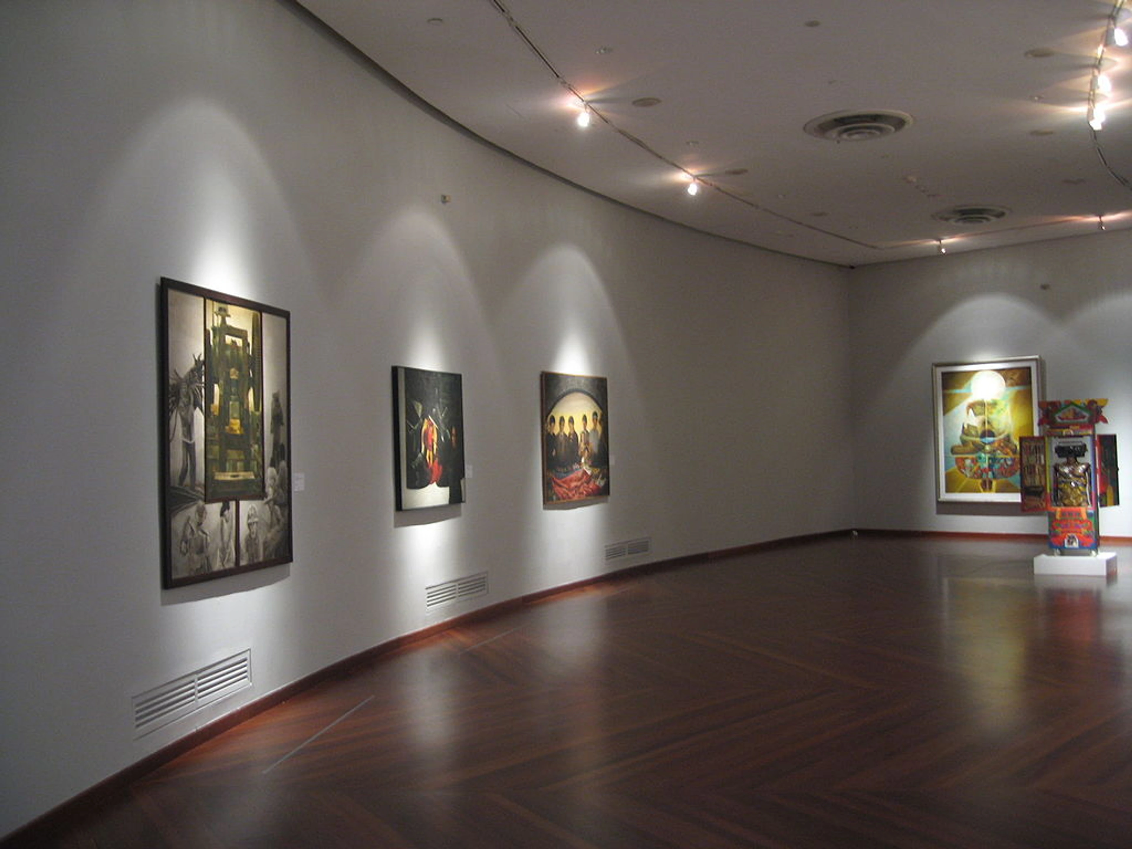
A Practical Guide to Creating a White Cube Art Display at Home
Learn the secrets of creating a clean, powerful 'white cube' art display in your home. I’ll guide you through minimalist principles, lighting tricks, and common mistakes to avoid.

Creating a White Cube Art Display at Home Is a Terrible, Brilliant Idea. Here’s Why.
I have a confession to make. I used to think the white cube was the enemy. You know the type: those stark, cavernous gallery spaces with white walls, polished concrete floors, and a single, achingly expensive artwork that you’re terrified to stand too close to. It felt sterile, elitist, and completely disconnected from the joyful, cluttered reality of a home. Why would you ever want to bring that energy into your space?
And then, one rainy Tuesday, I tried it.
I have a confession to make. I used to think the white cube was the enemy. You know the type: those stark, cavernous gallery spaces with white walls, polished concrete floors, and a single, achingly expensive artwork that you’re terrified to stand too close to. It felt sterile, elitist, and completely disconnected from the joyful, cluttered reality of a home. Why would you ever want to bring that energy into your space?
And then, one rainy Tuesday, I tried it.
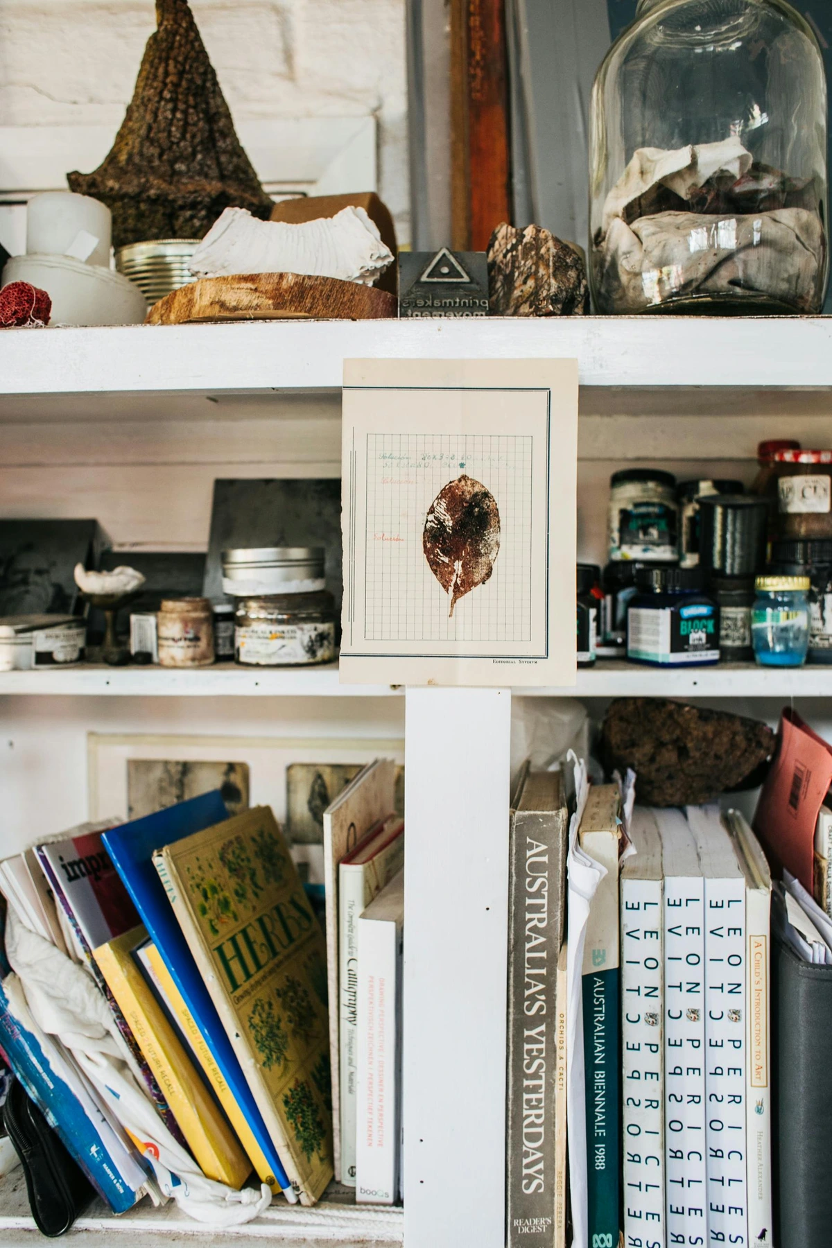
(For a deeper dive into gallery aesthetics, I've found our article on the white cube concept really insightful.)
Not the whole house, of course. That would be madness (and a nightmare to keep clean). I’m talking about one wall. One single, dedicated wall in my living room, cleared of family photos, shelves, and the random decorative plate my aunt gave me that’s been there since 2018. I painted it a crisp, clean white—and I learned the hard way it’s not just any white, but we'll get to that later. I shifted the furniture. I rethought the lighting. And when I hung the first piece—a small, vibrant abstract print—something shifted. The art didn't just sit on the wall; it crawled out of it. I wasn't just looking at a picture; I was having a conversation, one where the art got to speak first.
This is the terrible, brilliant truth I discovered: the white cube isn't about being cold or minimalist for its own sake. It's about control. It's about forcing your eye to focus, like a mental lockdown. It's about creating a neutral container so the human-made object within it can scream its lungs out in glorious, unfiltered color. And you can absolutely steal this power for your own home. The brilliance is in what it reveals about the art. The terror is what it reveals about your depth perception when you try to hang it.
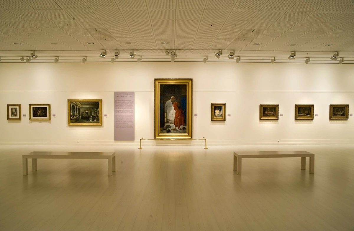
The Psychology of the Void: Why It Actually Works
Our brains are in a perpetual state of information triage. That collage of postcards, the TV screen, the pile of books on the side table—they’re all screaming for your attention. The white cube, even a sliver of it at home, works by deliberately becoming a bouncer for your eyeballs. It creates a moment of visual silence. It's the one place in your house where your overstimulated neurons can finally exhale.
It’s not about being lifeless; it’s about being aggressively intentional. Think of it like a pause in a piece of music. It’s the silence between the notes that gives the notes their power. When you isolate one piece of art, you’re creating a visual pause. You’re telling your brain, “Pay attention to this, and only this.” The effect is almost Pavlovian. Your brain learns that this specific corner of the room is for looking, for thinking, for feeling something other than the daily grind. It transforms the art from mere decoration into an event—a private viewing, just for you.
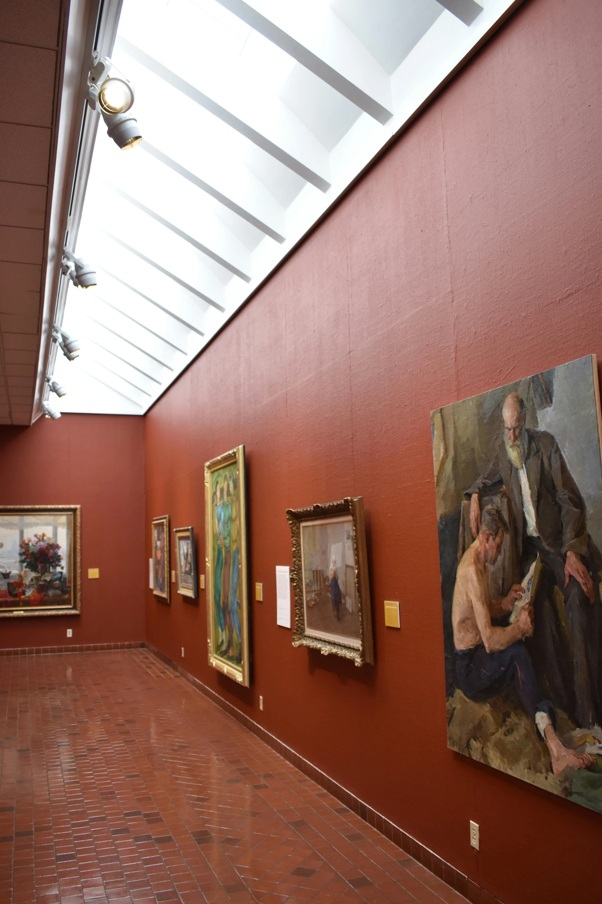
And here’s the funny part: this "void" is actually incredibly active. It’s filled with potential. It frames the artwork not just visually, but conceptually. By stripping away the context of your cozy, lived-in home, you allow the artwork to create its own context. That abstract print isn’t just a colourful pattern; in the void, it becomes a mysterious landscape, an emotional state, a question. The white space is the amplifier for that question.
A No-Nonsense Guide to Your First White Cube Wall
So you've decided to do it. To create a moment of visual silence in a home that probably contains a laundry basket teetering on the edge of collapse. It's a noble goal. The theory is lovely, but how do you actually build the thing without turning your living room into a surgical theatre?
Let's strip this down to the essentials: the wall, the paint, and the art. These are the three pillars that everything else rests on.
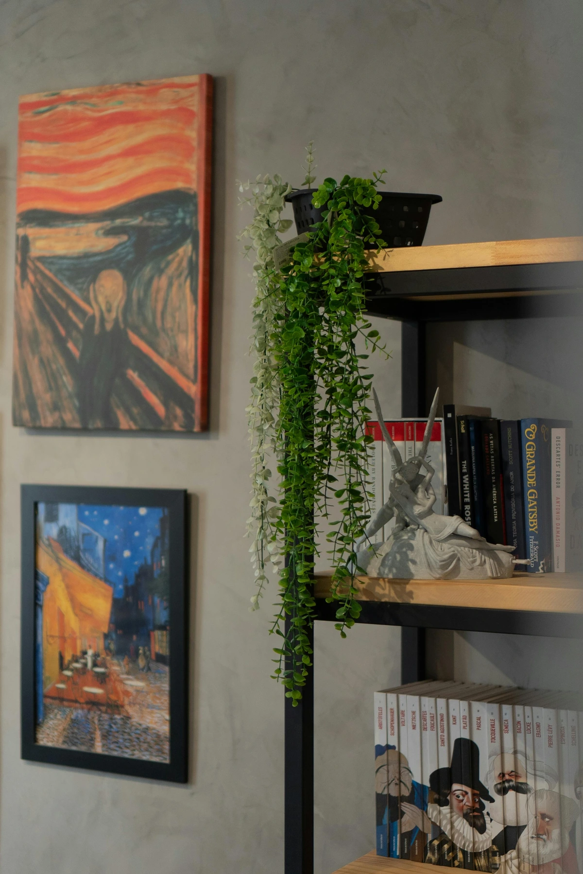
Alright, theory is great, but how do you actually build the thing? Let’s strip this down to the essentials: the wall, the paint, and the art.

Step 1: Choosing Your Wall (The Stage)
Your first instinct will scream at you to choose the biggest, most prominent wall, the one above the sofa. It's the logical centrepiece, right? Wrong. Resist this impulse with every fibre of your being. That wall is a target for everything else in the room—lamps, plants, people's heads. The goal is isolation, and you can't isolate something in the middle of Grand Central Station. Look for a secondary wall instead, the shy one in the corner.

- The Accidental Corner: This is your prime candidate. A wall that’s naturally set back or tucked into a corner is ideal. It’s like a small stage, already slightly separated from the main flow of the room. It invites a quiet, one-on-one conversation rather than a public address.
- The End of a Hallway: A blank wall at the end of a hallway is a perfect, ready-made gallery space. Think of it as creating a moment of arrival, a reward at the end of a journey down a corridor. It is a natural focal point that feels earned.
- The Room-Dividing Wall: A short wall that helps define a room (like a half-wall between the living room and dining area) can be a fantastic choice. It forces the art to be seen from multiple angles, activating it within the space without competing with a central piece of furniture like a sofa.
- Avoid TV Walls: This is non-negotiable. Don’t create a visual duel. The screen’s flickering light, the constant draw of entertainment—it will always win, making your art feel like an afterthought, a screensaver on a brick wall. They can never be equals.
Once you’ve chosen your stage, it’s time for a ruthless clearing. Take everything off it. Everything. Shelves, mirrors, thermostats (if possible), clocks. Become a minimalist tyrant for a day. Sand and fill any holes until the surface is perfectly smooth. This part is boring. It feels like prep work. But here’s the secret: the preparation is 80% of the magic. A perfect white wall is an illusion, and the illusion rests on this flawless, invisible foundation.
Step 2: The Hunt for the Perfect White (The Illusion)
Forget "white." There is no such thing. There are only shades of not-yellow, not-grey, and not-pink. Your choice here is more psychological than you think, and the wrong one can make your wall look like a sad patch of curdled milk.
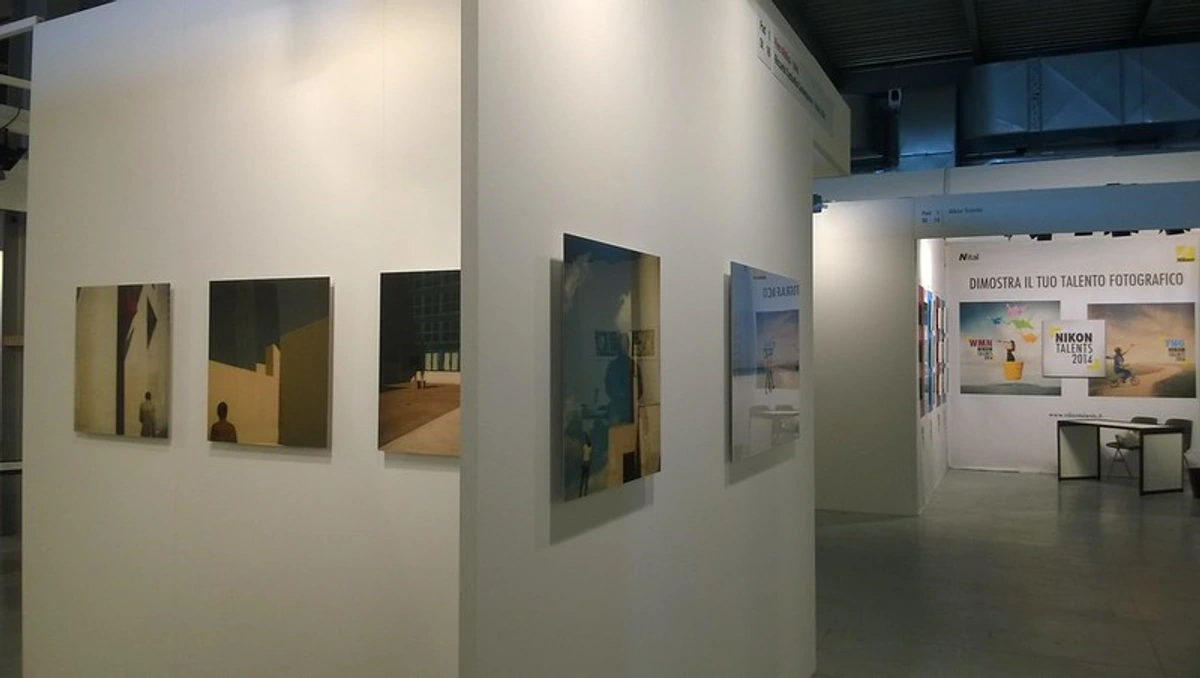
- Gallery White (Cool Undertones): This is the real deal. These are your cement-grey-tinged whites, the colour of an overcast sky reflecting off a concrete pavement. They feel crisp, modern, and slightly aloof. Perfect if you want a contemplative, almost formal mood. They're the closest to a real gallery aesthetic and will make your abstract print pop with a cool, sharp contrast. Popular examples include Farrow & Ball's 'All White' or Dulux's 'Timeless'. They can feel a bit unforgiving and cold if your room gets very little natural light.
- Designer White (Warm Undertones): These have a whisper of yellow, pink, or beige in them. They feel softer, more inviting, and tend to play well with textiles like rugs and sofas. Think cozy Scandinavian living room, not metropolitan art fair. This is the safe choice if you're worried the look will feel too sterile or if your space is dominated by warm woods and fabrics. A classic off-white like Benjamin Moore's 'Simply White' is a favourite for a reason. It provides a gentle backdrop without the starkness of a true cool white.
- The Optical White (No Undertones): This is the holy grail for the purist. Paint makers have spent decades and probably millions trying to create a white without undertones, one that simply reflects the maximum amount of light. These paints often contain minuscule amounts of blue or violet pigment to optically cancel out any warmth or coolness. They are spectacularly neutral. The effect can be almost shocking—a void that truly feels like a hole in the wall. Behr's 'Ultra Pure White' is a popular and accessible choice that comes close to this effect.
Go to a paint store and get sample pots of at least three different types. Paint big swatches (at least two feet square) on your chosen wall. Live with them for a few days. See how the light from your window changes them in the morning and at night. Does your north-facing light make the designer white look sickly? Does the gallery white look brutal in the warm glow of your evening lamps? The right white won't even feel like a painted wall. It will feel like a blank canvas that just happens to be the same colour as the wall.
Pro-level tip: This is the real insider move. Paint the ceiling for six inches down over the wall, and use the same white on the skirting board. This eliminates the harsh line where the wall meets the ceiling and floor, destroying shadows and creating a seamless, floating effect that makes the wall itself seem to disappear.

Step 3: Hanging the Art (The Final Test)
If the wall is the stage and the paint is the set, the hanging is the final performance. This is where it all comes together, or where you end up with a crooked picture and a lot of new holes in your plaster. The pressure is immense. Get it wrong, and the whole performance falls apart.
The industry standard, the one you'll see in every article and museum guide, is to hang the center of the artwork at 57 inches (145 cm) from the floor. This number is treated with the reverence of a religious text, the 'one rule to rule them all.' It aligns with the average human eye level, creating a comfortable viewing experience for the mythical 'average person'. While 57 inches is a fine starting point—a suggested retail price, if you will—it's not a sacred height. In fact, for a home, it can often feel slightly high and detached, like a public announcement rather than a quiet conversation.
For a single piece on a dedicated white wall, the art of hanging is about making it feel integrated, not institutional. I find the 57-inch rule often feels a bit stiff. I often hang mine with the center around 55 inches—low enough that it feels grounded and present, like a real object in your space, not a painting curated for a hypothetical crowd. My general rule of thumb: the bottom of a medium-sized framed piece should be somewhere around 12-15 inches above your tallest piece of furniture. This anchors it to the room, not the architecture.
But the height is only half the battle. The straightness is what separates the amateurs from the pros. The one-hook method is a lie told by hardware manufacturers to sell more picture wire. It never works. The piece will always, always tilt. Please, use two hooks. It keeps the piece level and prevents it from constantly shifting. It is a small, almost invisible detail that screams intentionality and prevents you from developing a nervous tic every time you glance at the wall. If your frame uses a wire, make sure the wire is taut between the two D-rings on the back; a loose, sagging wire is an invitation for disaster.
Hanging Method  | Pros | Cons | Best For |
|---|---|---|---|
| Single Hook & Wire | Quick, easy, forgiving for initial height adjustment. | Prone to tilting, can be unstable. Sagging wire is common. | Very lightweight pieces or temporary display. |
| Two Hooks & Wire | Extremely stable, horizon line will be perfect. Still allows for small adjustments. | Slightly more work to measure and place both hooks. | Most framed prints and canvases, the standard for a reason. |
| French Cleat | The strongest method. Frame sits flush against the wall, no visible wire. Feels very professional. | More complex to install, can be hard to remove the frame. | Heavier original artworks, or for a frameless canvas look. |
| Keyhole Bracket | Simple and secure, allows for a very flush hanging look as the frame can sit right up against the hook. | Requires more precise pilot holes in the wall, less forgiving of adjustment. | Frames with keyhole fittings, ready-made canvases. |
Lastly, let's talk about the unseen hero: the hook itself. Plastic anchors and flimsy nails are for hanging calendars, not art. Invest in proper steel picture hooks. They come in weight ratings. Check the weight of your framed art and buy hooks rated for at least double that. This ensures that when someone slams a door upstairs, your precious print doesn't end up on the floor next to the thermos you forgot to take this morning.
The Unsung Hero: Lighting the Art (Everything Hangs on It)
If the white wall is the stage, lighting is the spotlight. A badly lit artwork on a perfect white wall is a ghost. It’s a whisper in a hurricane. You can have the most perfect wall, the most expensive art, hung with the precision of a NASA engineer, but without good lighting, it all just… disappears into the void it was meant to command.
Strategy 1: Harness Natural Light (The Free Option)
This is your best, cheapest, and most unpredictable tool. We call it 'the gallery in the sky' because when it's right, it's perfect. North-facing windows are the holy grail, the gold standard. They provide a soft, indirect, shadowless, and surprisingly consistent light throughout the day, almost like a giant softbox in a photography studio. If you’re lucky enough to have a room with a north-facing wall, you've already won half the battle—that's your prime real estate.
For everyone else, you need to manage the light.
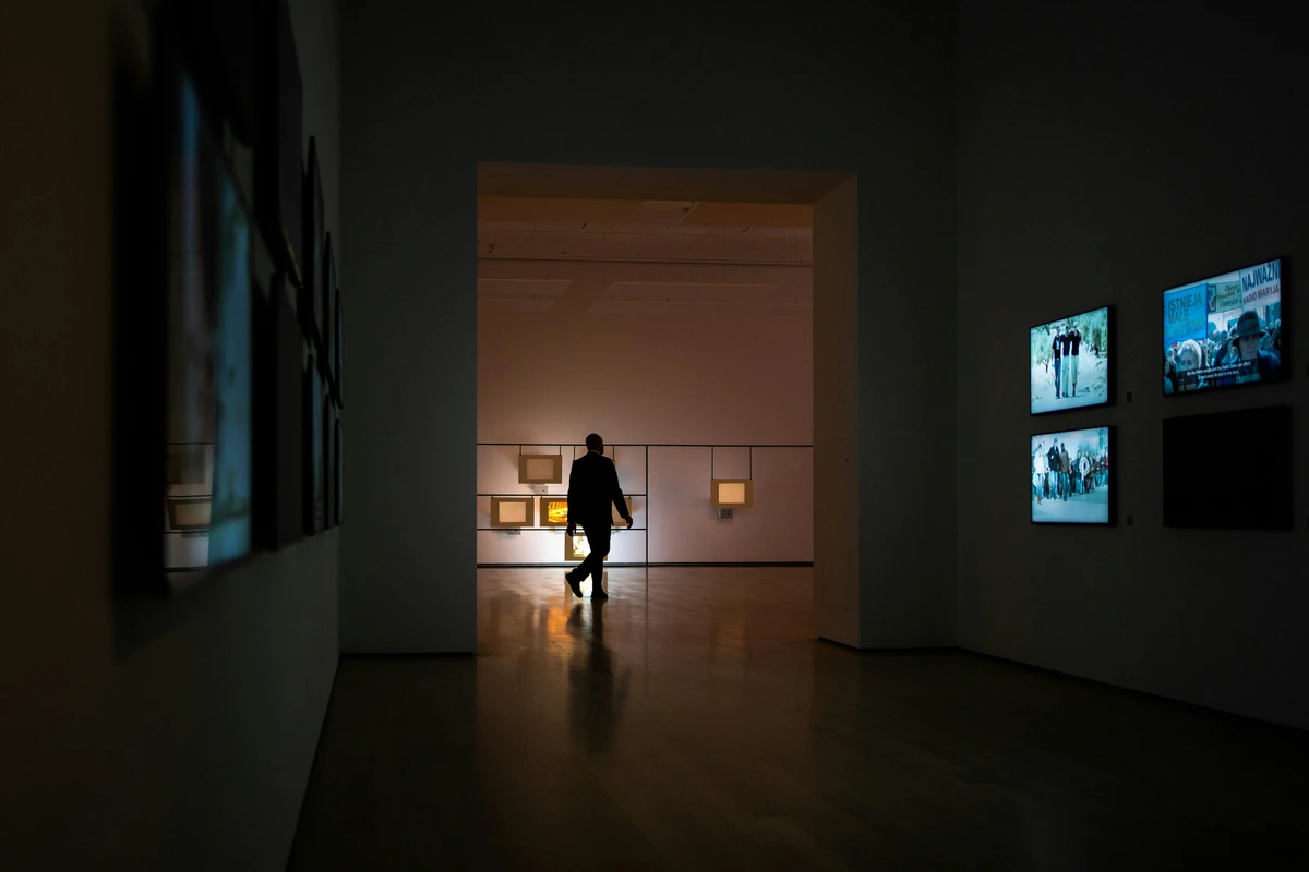
- Avoid Direct Sunlight Like the Plague: This is the art's mortal enemy. Never, ever hang art—especially works on paper like prints or watercolours—in direct, unfiltered sunlight. The UV rays are a slow-acting bleach that will fade and deteriorate your art with the quiet patience of a glacier. I've seen prints go from vibrant to ghostly in a few short years. It's heartbreaking.
- Become a Master of Diffusion: A simple, gauzy white curtain or a roller blind is not just a curtain; it's a magic trick. It acts as a massive diffuser, taking that harsh, angry, directional sunlight and transforming it into a beautiful, soft, ambient glow. It's like turning a spotlight into a large, luminous blanket for your wall. This single piece of fabric cuts glare, kills UV, and creates the perfect gallery-quality light for a few pounds.
- Embrace the Change (The Philosophical Part): Unlike a sterile museum, your home’s light is alive. It changes. The colour temperature shifts from the cool, pale blue of a winter morning to the golden honey haze of a summer evening. The light at 3 PM on a Tuesday is not the same as the light at 8 PM on a Saturday. Learn to appreciate this. It isn't a flaw; it’s a feature. Your art will reveal different aspects of itself depending on the time of day. It keeps the relationship fresh. That painting you've seen a thousand times can still surprise you.
The enemy here is the single, harsh overhead light in the middle of the room—the dreaded "ceiling eyeball." You know the one. It’s the default for most homes, and it is the sworn enemy of art. It casts terrible shadows, usually creating a dark spot or a harsh glare right across the middle of your masterpiece. It flattens everything, making the art look as interesting as a spreadsheet under fluorescent office lighting.
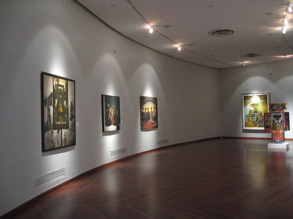
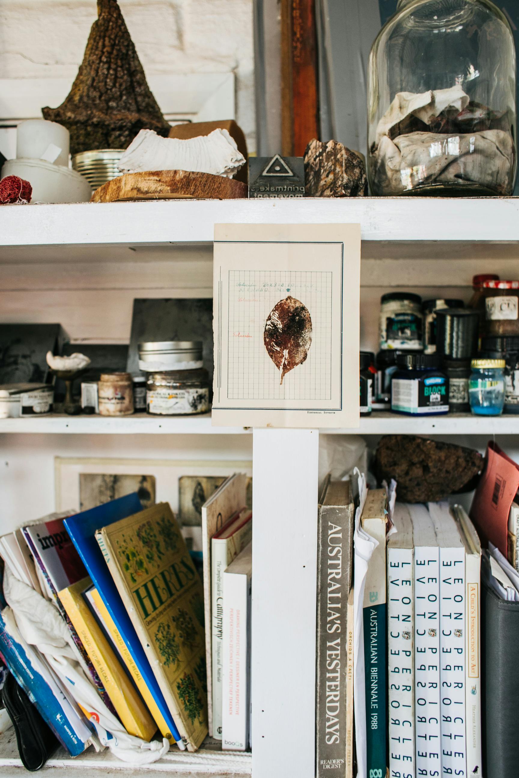
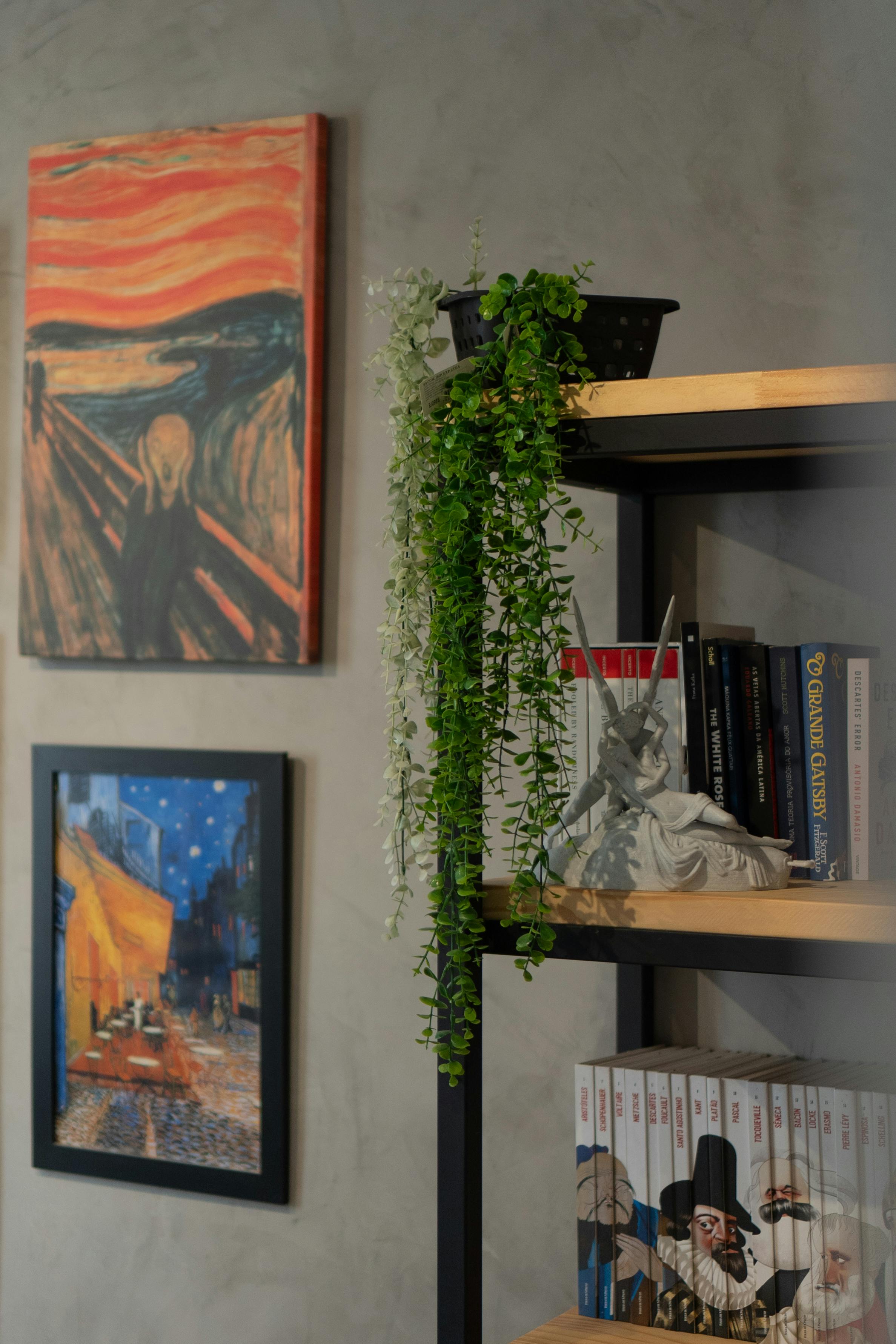


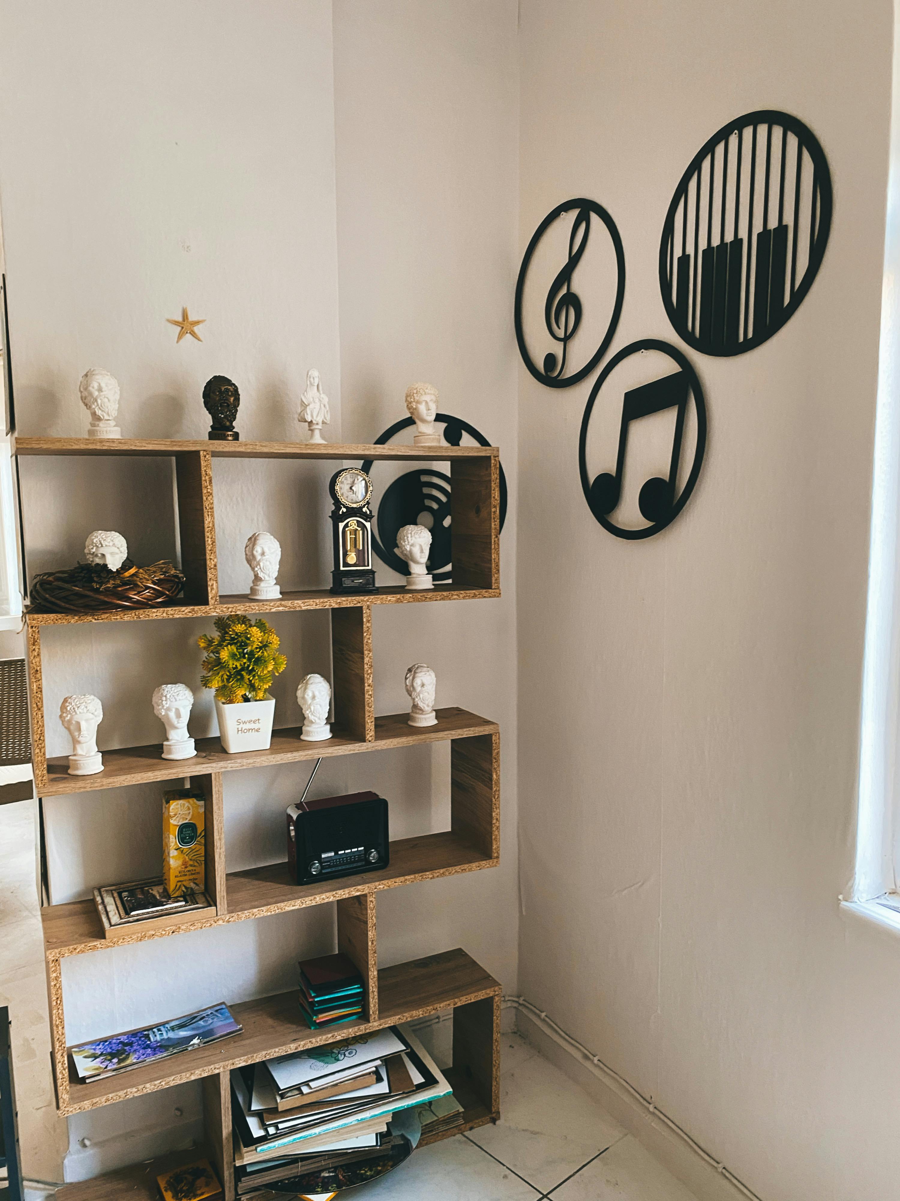


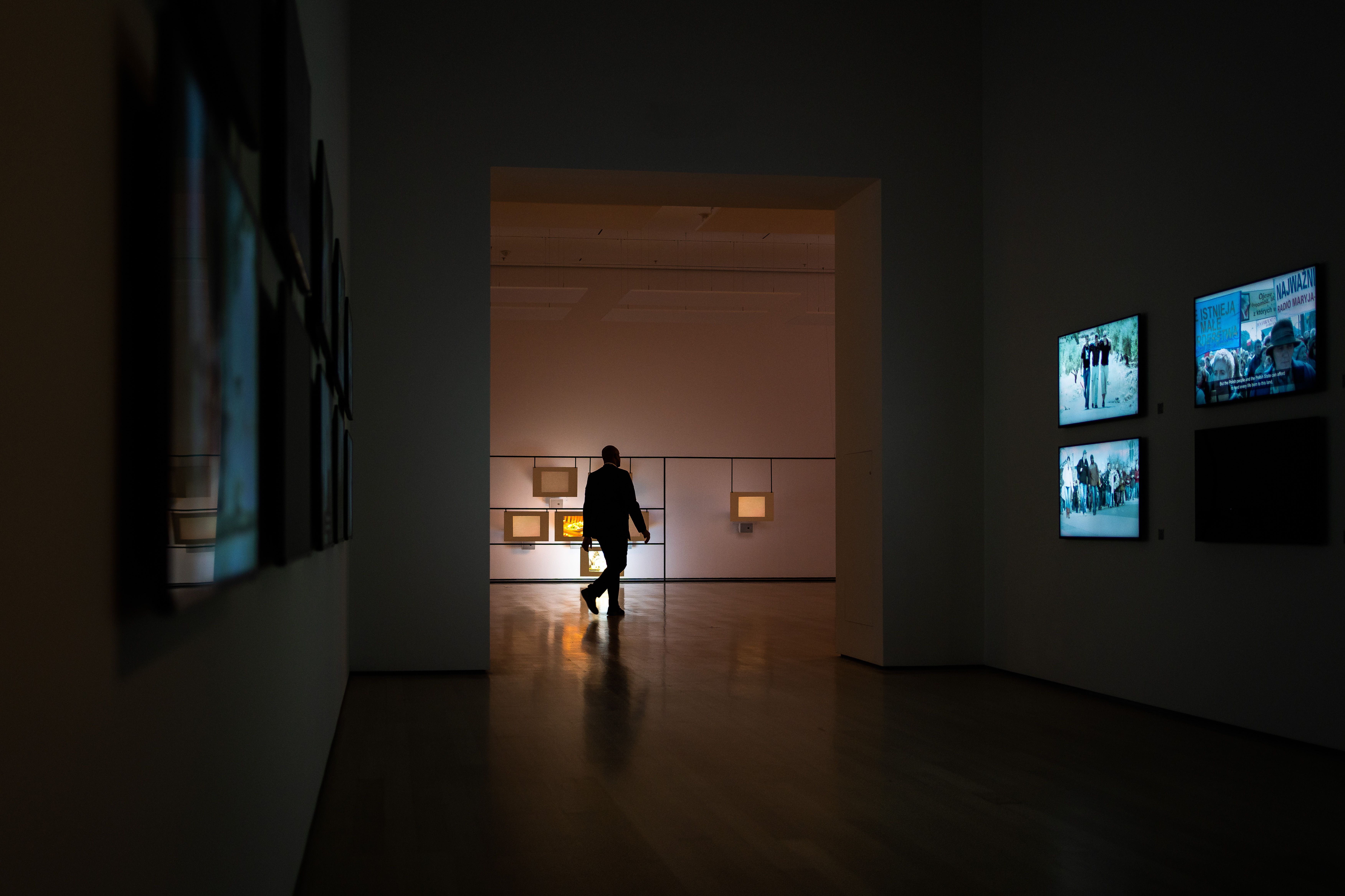

This image shows the goal perfectly: light that defines the space but does not overpower it.
The Goal (and it's harder than it sounds): You want light that appears to come from nowhere and everywhere at once. You want to illuminate the art without illuminating the source, like a sort of benevolent visual magic. You're aiming for clarity, for revelation, not drama (at least, not the kind of drama that requires a follow spot). You want the art to look like it's glowing from within, not like it's being interrogated.