# Master Your Sketchbook: The Ultimate Guide to Paper, Binding & Artistic Freedom
Dive into the definitive sketchbook guide! Learn to choose perfect paper, binding, and size for your art. Overcome blank page fear, explore mixed media, and unleash your unique creative voice with expert tips and personal insights.
Master Your Sketchbook: The Ultimate Guide to Paper, Binding & Artistic Freedom
I guess this is a love story, of sorts. For an artist, a sketchbook is rarely just a book of blank paper; it's a living, breathing extension of the creative mind. It's a confidant for raw ideas, a laboratory for daring experiments, and a visual diary of thoughts both brilliant and, let's be honest, utterly bonkers. I've certainly had my share of pages buckle under the enthusiastic — and often excessive — application of watercolor, resulting in what looked more like a topographical map than a finished piece. Believe me, I've learned the hard way. So, if you're tired of fighting with flimsy paper or a stiff spine, this guide is your quest map. We'll dive into the profound why a sketchbook is indispensable and the practical how of choosing your perfect creative companion, exploring everything from the very soul of the paper to the practicalities of binding, ensuring your artistic journey is supported at every turn. This article aims to be your definitive guide, blending personal experience with practical advice to help you truly master your sketchbook and unleash your creative potential and unique artistic voice. Along the way, I bet you’ll even uncover some unexpected discoveries about your own creative process.
Why a Sketchbook is More Than Just Paper
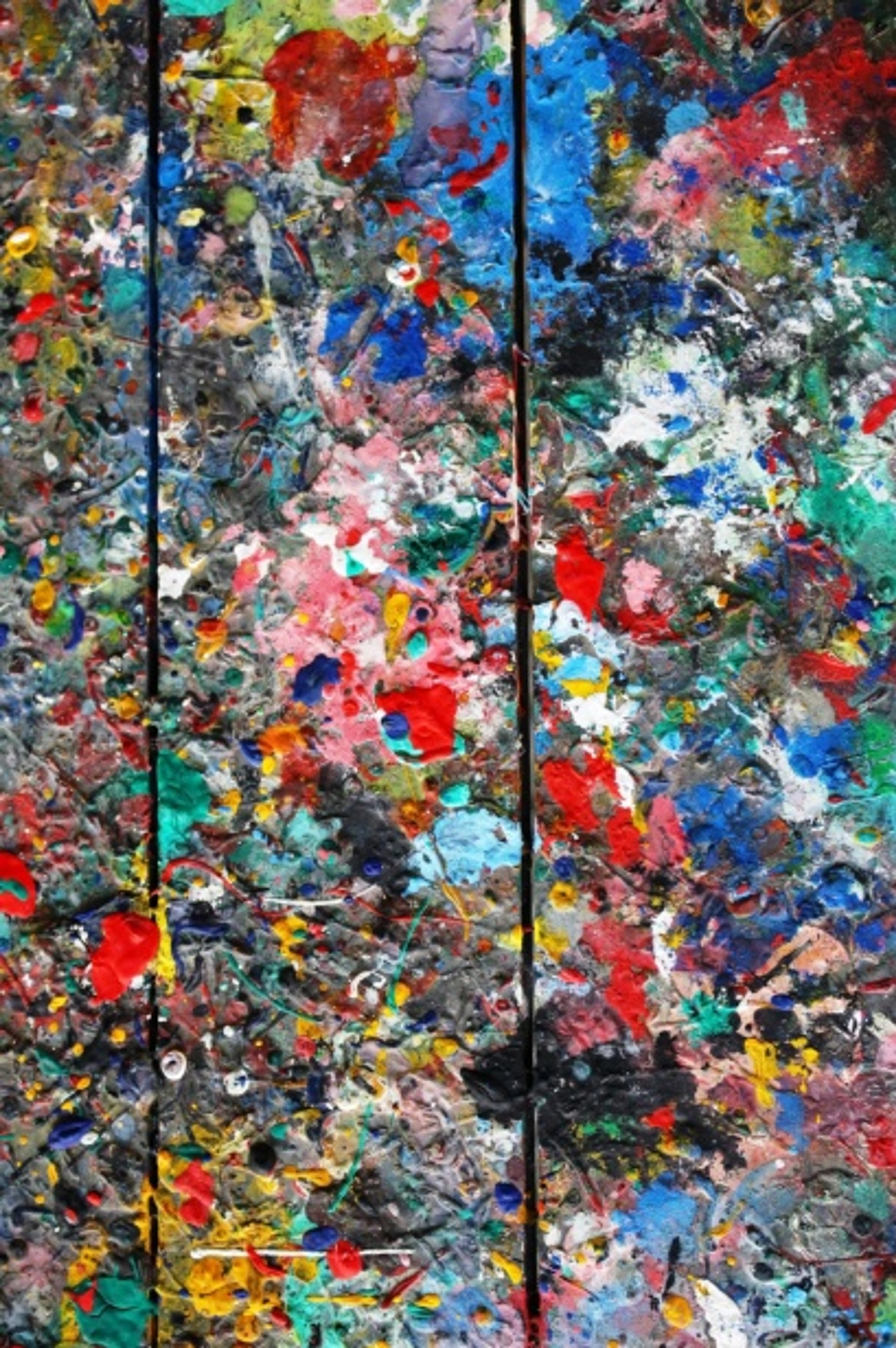
Before we get lost in the wonderful weeds of paper weights like GSM (Grams per Square Meter) and the myriad binding types, let's pause and consider the soul of a sketchbook. For me, it’s a sacred, judgment-free zone where the rawest, most unpolished ideas dare to live. There’s an incredible freedom in knowing that what happens on these pages doesn't have to be 'good' or 'finished'; it's simply practice, a playground for artistic exploration. It's where I can experiment with new techniques, explore color palettes, or just vent visually when the world feels a bit too much. In a world increasingly dominated by glowing screens and fleeting digital interactions, there’s something profoundly grounding about the physical act of putting pen to paper. It’s a quiet rebellion against the ephemeral, a tangible anchor in the digital storm. This tactile engagement isn't just comforting; it actively engages different parts of your brain, fostering a deeper form of learning and helping to solidify muscle memory and conceptual understanding far more effectively than passive digital consumption. Unlike undoing a stroke with Ctrl+Z, a physical mark carries the weight of commitment, encouraging a different kind of deliberate practice and presence. This physical engagement is key for building vital muscle memory that refines your hand-eye coordination and visual recall over time. It's a key arena for deliberate practice, where focused repetition of specific techniques or observations strengthens artistic skills far beyond what passive learning can achieve. Beyond skill development, the consistent, low-stakes act of filling pages is also where your unique artistic voice begins to truly emerge and solidify, as you refine your personal language of mark-making and composition without external pressure. This low-stakes environment is also where you can truly enter a state of creative flow, losing yourself in the process, much like a meditative practice. Beyond generating ideas, the consistent, low-stakes act of filling pages offers immense psychological benefits—think stress relief, a mindful escape, and a powerful way to build creative resilience against self-doubt. It's a place to cultivate self-compassion, improve focus, and quiet the ever-present inner critic. I vividly recall one frantic afternoon, convinced I had no new ideas, when I simply started making random, energetic lines in my journal. What began as a seemingly nonsensical scribble, a pure act of release, slowly started to suggest form and movement, eventually evolving into the foundational structure for a complex abstract piece I later titled 'Urban Rhythm.' It was a vital step in my journey from a mere concept to a canvas ready for sale in my /buy, a testament to my creative flow in action.

This profound understanding isn't new; many of the great masters intuitively grasped it. When I pore over Leonardo da Vinci's notebooks, I see his genius literally spilling onto the page, crammed with anatomical studies, engineering designs, and keen observations of the natural world—directly informing the lifelike precision of his figure paintings like the Mona Lisa and acting as a formative influence on his masterpieces. And it's inspiring to consider Vincent van Gogh's prolific sketches, capturing the essence of landscapes and figures long before they ever touched a canvas, serving as immediate records of fleeting light and atmosphere that shaped his later iconic works, notably his vibrant Arles landscapes. Or Frida Kahlo's intricate visual diaries, filled not just with self-portraits but with her inner turmoil, dreams, and political observations, blending text and image into a powerful narrative that illuminated her later iconic works. And then there's the vibrant sketchbooks of J.M.W. Turner, where he captured fleeting light and atmospheric effects, using them as living references for his monumental, light-filled paintings, truly bringing his seascapes to life. Even the Impressionists, with their focus on capturing fleeting moments, often relied on quick plein air sketches to inform their luminous canvases. Their pages weren't just preparatory; they were integral to their artistic identity and development, serving as early training grounds for their unique visions. The act of filling multiple sketchbooks over time also offers a powerful psychological impact: they become a tangible, personal history, a timeline of your artistic evolution that you can literally hold in your hands. A stack of completed sketchbooks is, in essence, a visual autobiography, a testament to countless hours of focused passion and persistent growth. It's truly inspiring to flip back through those early, tentative pages and see how far your unique hand has come.
credit, licence
Beyond these titans, sketchbooks have long served as the silent partners in artistic education, guiding generations from the Renaissance masters practicing anatomy to the contemporary artist. For them, and for us, the sketchbook is where the real work, the real thinking, happens. It's a place where you can nurture your creative flow without external pressures. Beyond the intellectual and emotional benefits, there's also the pure, unadulterated pleasure of the tactile. The whisper of graphite on toothy paper, the satisfying drag of a brush loaded with watercolor, the smell of paper itself – these sensory inputs are often lost in the digital realm, yet they form a fundamental part of the creative ritual for many of us, myself included. It’s a conversation between your hand, the tool, and the raw material. If you're anything like me, you probably have moments where you feel stuck, or perhaps just a little intimidated by a blank canvas. That's precisely where the sketchbook truly shines. It’s a low-stakes environment, perfect for just making art regularly without the crushing weight of expectation. Sometimes I'll just open a page and start applying paint, just to see what happens, letting the materials guide me. It’s a beautiful dance of intuition and exploration, where even perceived 'mistakes' become invaluable stepping stones rather than soul-crushing roadblocks. This kind of uninhibited exploration is a cornerstone of my entire artistic timeline. So, the sketchbook isn't just a tool; it's a vital sanctuary for artistic growth and a tangible record of your creative spirit.
Navigating the Sea of Options: What to Look For
Having explored the profound 'why' behind these humble books, let's roll up our sleeves and tackle the practical how – navigating that often bewildering sea of options on the store shelf. Okay, confession time: for years, I just grabbed whatever sketchbook was on sale, often leading to more frustration than inspiration. Oh, and believe me, I've had my share of 'great deals' on sketchbooks that turned out to be little more than glorified notepads, where every brushstroke bled through and every page warped into a sad, soggy mess. Those were the days I questioned my sanity, not my supplies! I've learned the hard way that the right sketchbook can genuinely elevate your practice and save you a lot of headaches. Beyond its role as a creative sanctuary, the very fabric of your sketchbook – its paper and its binding – plays a crucial, often unseen, role in how your ideas come to life. I once bought a huge, beautiful sketchbook on impulse, only to realize its sheer size intimidated me into rarely using it for fear of 'wasting' space. Sometimes, the right choice isn't the obvious one, and even a 'wrong' choice can lead to interesting, unexpected creative detours. Here's what's on my mental checklist now before I commit to a new companion:

Size and Portability: Matching Your Lifestyle
This factor is purely personal, dictating whether your sketchbook is a studio fixture or a constant travel companion. Do you sketch predominantly on the go, or do you prefer a dedicated studio space? Beyond mere portability, the size you choose can actually profoundly influence the scale of ideas you explore and even the type of marks you make. A smaller book might encourage quick, gestural studies and intimate detail, perfect for capturing fleeting moments or developing small compositional thumbnails, often leading to more precise, controlled strokes. A larger one, conversely, invites more expansive movements, broader brush strokes, and allows for much more ambitious, developed compositional explorations, pushing you to truly fill the space and think grander with sweeping, uninhibited marks. And don't forget orientation – a landscape-format sketchbook might naturally lend itself to sweeping vistas or panoramic abstract compositions, while a portrait format often feels more suited to figure studies or vertical explorations. My advice? Don't be afraid to have a few different sizes for different purposes – it's all about matching the tool to the task and your lifestyle. Oh, and for a travel companion, a durable cover is non-negotiable; it needs to withstand being tossed into bags and enduring the bumps of daily life.
The Paper: The Heart of Your Sketchbook
This is, without a doubt, the most critical factor. Different mediums demand different paper characteristics, and understanding this can literally transform your artistic experience. But what truly makes one piece of paper sing while another just... disappoints? I’ve learned that a paper's temperament can be as unpredictable as my own creative whims!
Paper Composition: The Foundation
First, let's talk about the distinction between artist-grade and student-grade paper. Artist-grade sketchbooks typically boast higher quality pulp, superior sizing (which we'll get to in a moment), and often a truly archival, acid-free composition. Most paper is made from wood pulp, but artist-grade often features cotton rag, linen, or other plant fibers like bamboo or hemp. Cotton and linen, for instance, have longer, stronger fibers, making the paper more durable and incredibly absorbent – perfect for wet media without breaking down or pilling. Wood pulp papers, while more affordable, are less durable and can contain lignin, which breaks down over time, releasing acids and causing yellowing (a concern we'll address with acid-free paper!). This fundamental difference in fiber composition is why some papers truly sing, while others merely exist. While some higher-end student-grade papers might offer decent durability and even be acid-free, they generally won't match the performance or longevity of true artist-grade options. Investing in artist-grade paper is almost always worth the extra pennies if you're seeking longevity, vibrant color retention, or simply a more satisfying and forgiving drawing experience. It’s the difference between a reliable commuter car and a high-performance sports car, designed for precise handling and endurance, allowing your pigments to truly fly and resonate, blending seamlessly, and holding their vibrancy. Artist-grade paper offers a much richer journey and a more satisfying 'destination' for your art.
Another subtle but impactful factor is the paper's brightness or whiteness. A brighter white paper can make colors appear more vivid and true to life, which is especially important for abstract art where color relationships are paramount, giving your vibrant pigments a luminous stage to truly pop. Think of it as the canvas for your colors; a dull base will absorb their life, while a bright one will amplify it. And speaking of paper, you'll inevitably hear the term 'sizing' tossed around. This isn't about physical dimensions but rather a chemical treatment applied to paper during manufacturing. Imagine it like a gatekeeper for your pigments, carefully controlling how much liquid (water, ink) the paper absorbs and how quickly. Without it, your paint would just sink in and feather out uncontrollably, or worse, the paper would disintegrate. Too much, and your colors would sit on the surface like defiant, unblended puddles. It's a delicate balance, and artist-grade papers usually get it just right, allowing pigments to truly sing without over-saturating the fibers.
Beyond composition and sizing, consider paper grain or tooth. This refers to the microscopic peaks and valleys on the paper's surface, which you'll feel in how your pencil glides or how smoothly your brush strokes land. A rougher tooth effectively 'grabs' pigment, making it ideal for layering charcoal, pastels, or building texture with watercolor granulation. A smoother surface, conversely, allows for fine lines, precise blending with graphite, or achieving smooth ink washes. It's a subtle detail, but one that can influence your tactile comfort and the final appearance of your marks. So, from its core fibers to its textured surface, the paper itself is where the magic truly begins to unfold. And all these characteristics, of course, are profoundly impacted by the paper's weight, which we'll discuss next.
Paper Finish: The Surface Story
Beyond texture, paper also comes with different finishes, which can profoundly affect light reflection and how mediums interact. Most sketchbooks lean towards a matte or vellum finish, designed to reduce glare and allow for consistent pigment absorption, which is ideal for most drawing and painting. However, some specialized papers might offer a satin-like sheen, particularly for certain ink or marker applications where you want colors to sit brightly on the surface, or even a glossy finish for specific mixed media techniques involving photo transfers or heavy ink applications. The finish impacts color vibrancy and archival quality, particularly regarding UV light's interaction with pigments. On a more conscious note, consider sustainable paper choices. Many admirable brands now offer recycled sketchbooks or those made from alternative fibers like bamboo or hemp, allowing you to create beautiful art while being mindful of your environmental footprint. It’s a small change that can significantly reduce your environmental footprint without compromising your artistic output – a thoughtful choice that feels good for both your art and the planet.
Paper Weight: The Substance of Your Art
Beyond the surface texture and finish, the very substance of the paper, its weight, plays a critical role in its performance. This isn't about how heavy the book feels, but rather how dense the paper itself is, typically measured in GSM (Grams per Square Meter) or lbs (Pounds). Higher numbers mean thicker, more durable paper, which is crucial for handling wet media without buckling or bleed-through. To help you visualize these differences, here's a breakdown:
Characteristic | Type/Range | Ideal Use Cases | Notes |
|---|---|---|---|
| Weight (GSM - Grams per Square Meter / lbs - Pounds) | 50-90 GSM (30-60 lbs) Lightweight | Pencil, charcoal, quick dry sketches | Prone to bleed-through and severe buckling with wet media. Paper feels thin and can easily tear under pressure. Best for pure dry media or very light applications. |
| 100-160 GSM (60-100 lbs) Mediumweight | Most dry media, some pens, light markers | Handles some light washes, but exercise caution with heavy water application. Good for everyday drawing where you might occasionally experiment. | |
| 180 GSM+ (120 lbs+) Heavyweight | Mixed media, markers, light watercolor | Great for mixed media art. Provides enough thickness to prevent bleed-through with most inks and some markers. | |
| 200 GSM+ (140 lbs+) Watercolor Specific | Dedicated watercolor, heavy washes | Often textured, designed for optimal water absorption without buckling or becoming 'pulp.' Essential for watercolor supplies as it allows pigments to sit beautifully and water to soak evenly. | |
| Texture (Tooth) | Smooth (Hot-press) | Fine detail with pens, markers, graphite | Pigment sits on the surface; less grabbing. Ideal for crisp lines, precise blending with graphite, or achieving smooth ink washes. |
| Medium (Vellum) | Good all-rounder for dry media | Offers enough tooth without being overly bumpy. Provides a slight 'grab' for pencils and pastels while still allowing detail. A versatile choice. | |
| Rough (Cold-press/Rough) | Charcoal, pastels, watercolors | Grabs pigment beautifully, ideal for layering and adding character, creating a painterly effect. Excellent for textural contrast and lifting techniques with watercolors. |
So, in essence, the paper is the soul of your sketchbook, dictating how your mediums will behave and how your art will feel. Getting this right is like choosing the perfect stage for your artistic performance. Still wondering what paper truly feels right for your unique touch?
credit, licence
The Binding: How Your Book Holds Up (Literally)
But the paper is only half the story; how your book holds together is equally important, almost like choosing the right frame for a masterpiece. The way your sketchbook is bound profoundly impacts its durability and how easy it is to actually work in. It's a small detail, but one that can make a huge difference to your creative process – believe me, fighting with a stiff spine that refuses to lay flat is no fun! For thicker mediums like gouache or acrylics, a lay-flat binding is still immensely helpful, allowing for even application and preventing paint from pooling awkwardly in the gutter. However, unlike watercolors which soak in, these thicker paints sit more on the surface, so a stiff spine might make it harder to prevent cracking or flaking of the paint layer along the crease if the book is repeatedly bent, especially with thick impasto applications. Here's a quick rundown of common binding types:

- Spiral/Wire-bound: My go-to for practicality. These beauties lay perfectly flat, which is a dream for working seamlessly across two pages or for hassle-free scanning. Pages can tear out, a blessing for sharing or scanning, but a curse for long-term archiving due to potential loss or damage. This trade-off between complete lay-flat convenience and archival security is something to weigh based on your primary use. Generally not considered ideal for truly archival purposes, as the spiral can distort pages or even rust over many years in damp conditions, though this is rare with modern materials.
- Perfect-bound (Glued): Common for cheaper sketchbooks, pages are simply glued together at the spine. The big drawback here is that this glue can degrade over time, leading to pages literally falling out – definitely the least archival option. Plus, they rarely lay flat, making it a bit awkward for larger pieces or scanning, almost like trying to paint on a perpetually closing door. While some modern perfect-bound books use more durable, flexible glues, the inherent risk for long-term archival stability remains. Not ideal if you're hoping to revisit your artistic timeline decades from now, or if you plan on applying very thick, textured paint that might stress the spine.
- Stitched/Case-bound: More durable and often looks more elegant, akin to traditional journals or hardcover books. They can feel stiff initially but will usually lay flatter with consistent use. Some stitched bindings are specifically designed to be lay-flat (like Smyth-sewn books), offering the best of both worlds with superior long-term stability and protection for your pages – truly the gold standard for archival quality. Archival here means the binding materials themselves are acid-free and designed for longevity, resisting degradation over decades or even centuries.
- Accordion/Leporello: A fun, less common, and deeply intriguing option that unfolds into one long continuous surface. Brilliant for sequential art, panoramic studies, creating a visual poem, or even conceptualizing large, flowing abstract pieces, almost like a mini-mural unfurling before your eyes. I adore these for their narrative potential, like storyboarding a feeling or a complex visual journey. Ultimately, the right binding is like a silent partner, supporting your movements and ensuring your artistic visions are not only captured but also beautifully preserved for years to come. It's the unsung hero of your creative process.
Beyond the Basics: Sketchbooks as Problem-Solving Tools
Beyond being a space for practice and personal expression, sketchbooks are incredibly powerful tools for visual problem-solving. Need to work out a challenging composition for a large abstract painting? Sketch it out in your book. Wondering how certain color harmonies will play together? Create quick color swatches and test combinations on a page. It's a low-risk environment to iterate and refine ideas before committing them to a larger canvas. Think of it as your visual laboratory, where you can dissect complex artistic challenges into manageable experiments like value studies, perspective exercises, or even character design iterations. Furthermore, they serve as invaluable visual research archives. You can gather references, color swatches, compositional ideas, and even document specific textures encountered, light conditions observed, plant structures, or emotional responses to a scene that might later inform an abstract piece. It's a treasure trove of stimuli, waiting to be rediscovered and reinterpreted. The very act of engaging with a physical sketchbook can also be a profound form of visual meditation. The rhythmic sound of pencil on paper, the focused observation required for a quick study, or the uninhibited flow of abstract mark-making can lead to a mindful state, offering a quiet escape and a way to reconnect with yourself amidst the daily chaos. It’s a unique form of self-care for the artist.
The Rise of Digital Sketchbooks: A Complement, Not a Replacement
In today's hybrid creative landscape, it's worth acknowledging the role of digital sketchbooks. Apps like Procreate or Adobe Fresco, paired with a tablet and stylus, offer unparalleled portability, endless layers, and the ability to instantly undo or experiment with color without material cost. They can be particularly useful for animation storyboarding, rapid iteration of complex designs, or even offering accessibility for artists with certain physical limitations. While they excel at precision and digital exploration, they inherently lack the tactile feedback and grounding presence of physical paper. For many artists, myself included, digital tools serve as a powerful complement rather than a replacement, often used for initial concepting or refining ideas before bringing them to life on tangible surfaces. They can also offer a welcome respite from the 'digital fatigue' many of us experience from endless screen time, reminding us of the unique joy of physical creation. And while this article champions the physical, it's worth noting that for some digital artists, a finished digital drawing or painting in a digital sketchbook is the final piece, a complete work of art in itself. It just depends on your medium and intent.
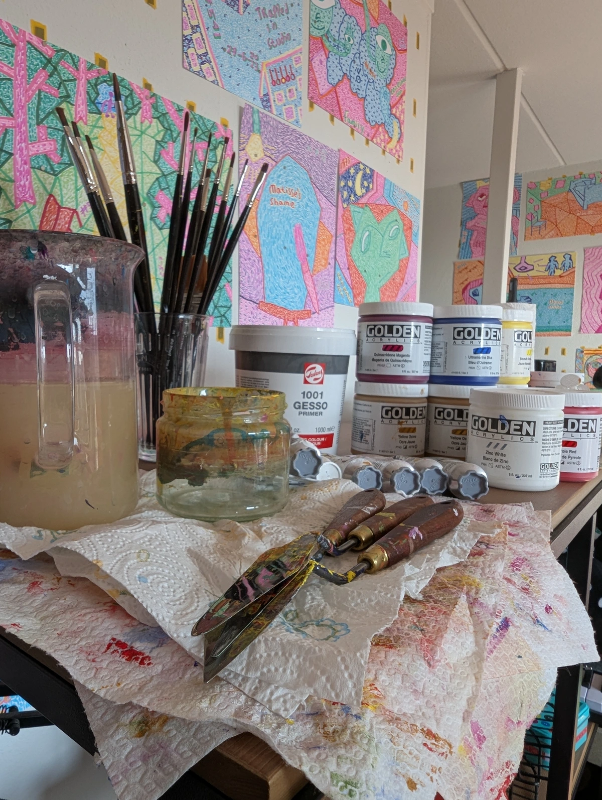
My Personal Kit: Sketchbooks I Swear By
Okay, so after all that talk about theory and technicalities, you're probably wondering what I actually put into practice. What are the sketchbooks I personally swear by? Remember, this is my personal preference, born from years of trial and error (and a fair few buckled pages that taught me hard lessons!), but perhaps my journey will offer a valuable starting point for your own experimentation. Don't be afraid to try different brands and types until you discover your own 'holy grail' – the one that truly clicks with your creative rhythm.
- For Everyday Dry Media & General Brain Dumps (A5, 120-160 GSM / 80-100 lbs): My consistent choice here is a simple, hardbound sketchbook featuring a mediumweight, slightly textured paper. I often reach for options like a Moleskine Art Sketchbook (though, to be honest, its paper sometimes feels a tad thin for my taste, tending to buckle slightly with even light washes due to its lower absorbency, which can create an uneven surface and be distracting, causing colors to pool rather than spread smoothly; however, its portability and durable cover remain a strong draw for many artists on the go) or, more reliably, a Stillman & Birn Beta series. The hard cover is non-negotiable for surviving its journeys tossed into my bag, and the paper is wonderfully versatile—perfect for pencils, charcoal, pastels, colored pencils, and even some very light ink washes. The Stillman & Birn Beta series, in particular, boasts a beautiful natural white color and takes ink exceptionally well without much feathering or bleed-through, feeling substantial without ever being overwhelming. It's just a joy to work on for those daily explorations, offering a reliable surface for the spontaneous sparks of inspiration. This is my steadfast companion for capturing the magic in the everyday. What's your daily go-to?
credit, licence
- For Watercolor Explorations (A5/A4, 200 GSM+ / 140 lbs+, Cold-Press): When it comes to dedicated watercolor work, a spiral-bound sketchbook is my absolute non-negotiable. The ability to lay perfectly flat is paramount for watercolors, ensuring even washes and minimal buckling, which elegantly prevents those annoying puddles from pooling in the spine. Brands like Hahnemühle or Etchr Labs are fantastic choices here, known for their specific paper formulations that genuinely enhance the watercolor experience. Hahnemühle's papers, for example, often possess a unique 'bite' and feel that allows the water to sit and evaporate more slowly, giving you more time to work and blend, and its subtle texture effectively ' grabs' and holds pigment, allowing for exquisite granulation and better control over water flow, almost inviting the water to dance and the pigments to truly shine. The cold-press texture is key; its subtle peaks and valleys effectively 'grab' and hold the pigment, allowing for exquisite granulation—where pigments separate into beautiful flecks—and rich layering without colors turning muddy. And, of course, the heavy GSM is utterly essential to prevent the paper from warping, pilling, or degrading into a pulpy mess under repeated wet applications. This is where colors truly come alive for me. What watercolor sketchbook gets your pigments singing?
- For Ink & Markers (A5/A4, 180 GSM+ / 120 lbs+, Smooth/Vellum): For ink work and markers, my priorities shift. I seek out smooth, bleed-proof paper – meaning it's specifically treated with a robust internal sizing or coating to prevent ink from spreading uncontrollably or soaking through to the next page – coupled with a heavier weight to emphatically avoid bleed-through—especially crucial with alcohol markers, which tend to soak through thinner paper much more aggressively than water-based inks. Canson XL Mix Media or a smooth Stillman & Birn Alpha series usually fit this bill perfectly. The Alpha series, in particular, offers a crisp, bright white surface that makes colors pop and ensures lines are razor-sharp without sacrificing controlled absorbency. It’s like working on a pristine canvas, but in miniature, offering the perfect arena for precision and vibrancy. What's your choice for sharp lines and vibrant markers?
- For Travel & Quick Ideas (Pocket-sized, durable cover, 100 GSM+ / 60 lbs+): This is my "always with me" sketchbook, a true companion for the spontaneous spark. I need something robust that can handle being jostled around in a bag without complaint, so a durable, hard cover is paramount. A small, hardbound book from brands like Field Notes (their larger art books) or a Rhodia Webnotebook are perfect. These are about capturing those fleeting moments and observations – a specific color combination I glimpse in a bustling market, an intriguing architectural shape, a powerful feeling evoked by a sound, a stranger's captivating gesture, or the rapid changes of light in a landscape. These often become the embryonic seeds for my larger abstract paintings, little whispered inspirations from the world around me, waiting patiently to grow into something magnificent. It’s where the world around me effortlessly translates into art. Which pocket pal do you carry for on-the-go inspiration?
Embracing the Imperfect: Your Sketchbook, Your Rules
The most important thing to remember, above all else, is that your sketchbook is utterly and completely yours. It's not a portfolio destined for public display (unless, of course, you choose it to be!). It’s a sanctuary for growth, a safe haven for glorious mistakes, and a crucible for raw, uninhibited creativity. Please, don't be afraid to make a mess. Don’t burden yourself with the pressure of filling every page with masterpieces.
Some of my absolute favorite pages are the ones where I tried something new and, frankly, failed spectacularly – because even those spectacular failures taught me something invaluable about materials, color theory, or simply the unpredictable nature of my own artistic impulses. It's a reminder that every mark, every attempt, is a step forward in your unique artistic timeline.
Overcoming the Blank Page & 'Precious Sketchbook' Syndrome: Oh, the dreaded blank page! It often feels like this pristine, judgment-filled void, doesn't it? That anxiety of not wanting to 'ruin' a beautiful, new book is real. Here are my tried-and-true tricks:
- Break the Page: Don't start on page one – boldly skip ahead to page five or ten. Or, even simpler, just make a small, random mark, a scribbled line, or a single color wash to deliberately "break" the page. I often just draw a big 'X' and then work around it, or perhaps fill a corner with a mindless scribble. Once, I even spilled coffee on a fresh page (a genuine accident, I swear!), and instead of despairing, I made it part of the initial texture for a spontaneous abstract.
- Blind Contour Drawing: This fantastic technique involves drawing without looking at your paper, focusing purely on the subject's outline. It immediately removes the pressure of perfection by shifting your focus to pure observation and tactile sensation, rather than accurate reproduction.
- Abstract Sections: Take a reference image – maybe a photo of a striking texture, a complex botanical form, or an interesting architectural detail – and instead of trying to replicate the whole thing perfectly, commit to only sketching a small, abstract section of it, or focusing solely on its dominant color palette. This shifts your focus to interpretation.
- Copy Cat Exercise: Pick a favorite artist and try to mimic their mark-making or compositional style for a page, not to plagiarize, but to learn their visual language and push your own boundaries.
- Doodle Challenge: Pick a random shape or mark from a magazine, glue it onto the page, and then create something around or from it. This provides an instant starting point.
- Timed Sketching: Forcing yourself to do speed drawing (e.g., 30-second gestures, 5-minute studies) can effectively reduce overthinking and encourage spontaneous, uninhibited mark-making.
The goal, always, is to remove the pressure. It's just paper, after all, and every single mark, even a "mistake," is a step forward in your unique artistic journey. For the 'precious sketchbook' syndrome – that fear of messing up a new, beautiful book – I recommend intentionally defacing the first page (or even a few pages in). A big, bold abstract mark, a chaotic scribble, a vibrant swatch of color, or even tearing a small corner. The point is to obliterate that pristine, intimidating perfection. Alternatively, try preparing a few pages with a thin wash of diluted gesso or a neutral watercolor; it creates a subtle base that’s less intimidating than stark white. Once it's "ruined," the psychological pressure is off, and you're truly free to experiment without the burden of creating a masterpiece on every single page.

It also serves as an invaluable visual research archive, a place to gather references, color swatches, compositional ideas, but also to document textures encountered, light conditions observed, specific plant structures, or even emotional responses to a scene that might later inform an abstract piece. It's a treasure trove of stimuli, waiting to be rediscovered and reinterpreted.
credit, licence
It's more than just paper; it’s a tangible, physical record of your artistic exploration and evolution, a true chronicle of your unique artistic timeline. It allows you to literally see your progress over weeks, months, or years. Maybe one day, someone will visit my museum in 's-Hertogenbosch and glimpse these humble beginnings, these private musings that eventually blossomed into finished works. Or maybe not. Either way, the journey contained within those pages is what truly matters, both to your artistic development and to your soul. So, I wonder, what unexpected discoveries have you made, or are you about to make, in your own creative companion?
Keeping Your Creative Companion Happy: Sketchbook Maintenance & Care
Ah, the often-overlooked practicalities that can make all the difference! To protect your creative endeavors and ensure their longevity, consider a few simple, yet vital, habits. If you use dry media like charcoal, soft pastels, or graphite that easily smudges, placing a sheet of glassine paper (or even tracing paper) between pages can effectively prevent transfer and preserve your work. For wet media, always allow pages to dry completely before closing the book tightly to prevent pages from sticking together or, even worse, encouraging mold growth. Also, protect your sketchbooks from excessive moisture or humidity, as these can cause warping and mold growth over time. If you're using charcoal or pastels, a light application of fixative spray can help prevent smudging, but do a test patch first, as some fixatives can slightly darken colors or alter the paper's texture. Always ensure good ventilation when using aerosols like fixative sprays. Store your cherished sketchbooks flat or upright in a cool, dry place away from direct sunlight, which is notorious for causing fading and paper degradation. If you accidentally spill something (it happens to the best of us!), blot gently with an absorbent material and then allow the page to air dry naturally. Finally, if you're adding notes or finished details, consider using archival pens that are waterproof and lightfast; they won't fade or bleed through over time, ensuring your annotations are as enduring as your art. And for any additions like pasted-in images or ephemera, always opt for acid-free glues or tapes to ensure the long-term archival integrity of your entire sketchbook.
Frequently Asked Questions About Sketchbooks
Q: Can I use different mediums in one sketchbook?
A: Absolutely! Many artists, myself included, revel in the freedom of mixed media sketchbooks. Just be mindful of the paper's weight and texture, and understand the inherent limitations. A heavyweight (180 GSM+ / 120 lbs+) paper with a medium tooth is usually a versatile bet for combining dry media with light wet media—think very diluted watercolor washes, delicate ink lines, or a single, thin layer of gouache. However, for truly heavy, vibrant washes, like multiple layers of highly pigmented watercolor or thick acrylics, you'll still undeniably want watercolor-specific paper, because it's engineered to handle water without becoming a pulpy, disheartening mess. And a crucial warning: be extremely cautious with alcohol-based markers on non-bleed-proof paper, as they are notoriously aggressive and will often soak right through, leaving ghosting or full bleed-through on subsequent pages. Also, be aware that fountain pen inks, particularly, can feather (where ink spreads along the paper fibers, creating fuzzy lines) extensively on papers not designed for them, even if the paper weight is sufficient. This is distinct from bleed-through, where the ink completely penetrates the paper to the other side. Pro tip: always let wet media dry completely before applying dry media. Layering dry over dried wet is generally more successful than the reverse, which can cause smudging or disturb underlying layers.
Q: Should I organize my sketchbooks by topic or date?
A: That's entirely up to you and your personal workflow! Some artists, like myself, prefer a mostly chronological order to effortlessly track their progress and see their artistic timeline unfold organically. This approach allows for a natural visual diary of evolution. Others consciously dedicate specific sketchbooks to particular projects, themes (like 'cityscapes' or 'color studies'), or even specific mediums. I do sometimes keep a separate, smaller one for a specific series I'm developing, especially if it demands a unique paper type. Ultimately, whatever system helps you stay creative, engaged, and efficiently able to find what you need, is unequivocally the right one for you. For me, a hybrid approach often works best: I usually keep a mostly chronological order for my main, daily sketchbooks to track my overall artistic journey, but I might dedicate a smaller, project-specific sketchbook to a particular series or theme if it requires a unique paper type or focused exploration.
Q: How do I handle 'finished' or 'important' sketches within a practice sketchbook?
A: That's a great question, and it brilliantly speaks to the dual nature of sketchbooks – simultaneously a laboratory and a potential, nascent portfolio. My advice: don't overthink it within the sketchbook itself. If you create a piece you truly love and want to preserve, consider carefully removing it (if the binding allows, like spiral-bound) and framing it, or at the very least, digitally scanning it at high resolution for archival purposes. Alternatively, within the book itself, you might designate specific sketchbooks purely for 'finished' concepts, or use specific pages for those, perhaps marking them subtly with a different colored pen, a small symbolic sticker, or even signing and dating them with an archival, lightfast marker to indicate their special status. Another powerful approach is to create a dedicated "highlight reel" section, perhaps at the very back of the sketchbook, where you paste in smaller versions of your most successful studies or create a visual index of your favorite pieces with page numbers. This acts as a mini-portfolio of your breakthroughs within the larger experimental journey. However, if your intention is to showcase work for display or sale, I'd honestly recommend maintaining a separate, dedicated portfolio sketchbook or digital portfolio. This way, your practice sketchbooks remain a truly free space for uninhibited experimentation, while your portfolio can be curated specifically for presentation without the pressure of having to extract pages or navigate through unfinished work. The key is to let your primary sketchbook remain a place of utter freedom and exploration, but to have a clear system for elevating the gems that inevitably emerge from that beautiful chaos.
Q: What is 'sketchbook journaling,' and is it just for artists?
A: Sketchbook journaling is a wonderfully expansive practice that transcends purely visual art. It’s about using your sketchbook as a holistic personal journal, incorporating not just drawings and paintings, but also writing, collage, collected ephemera (like ticket stubs or pressed leaves), thoughts, reflections, and even daily plans. It's a rich, multi-sensory way to document your life, ideas, and observations. While artists naturally gravitate towards it, anyone seeking a creative outlet for self-expression, mindfulness, or simply a way to process the world around them can wholeheartedly embrace sketchbook journaling. For example, designers might use it for visual note-taking to brainstorm concepts, researchers to illustrate complex ideas, or even business professionals for creative problem-solving and ideation. It can be a powerful tool for mental well-being, helping to organize thoughts, express emotions visually when words fail, and foster self-discovery through consistent, creative engagement. It becomes a unique tapestry of your inner and outer worlds, a truly personal art form.
The Last Word
In the grand scheme of things, a sketchbook might seem like a small, unassuming detail in an artist's vast arsenal, but I promise you, its impact is profound. It's the silent witness to every flicker of inspiration, the birthplace of bold ideas, the sacred space where 'mistakes' are not just tolerated but genuinely celebrated, and where the messy, glorious journey of creation truly begins. It is, in essence, your personal universe, intimately contained within a collection of pages. Moreover, the very act of engaging with it can be a beautiful form of visual meditation, a quiet way to cultivate mindfulness in your artistic practice. And as materials and digital tools evolve, who knows what new forms the sketchbook will take, continuing its vital role as the artist's most intimate companion. So please, go forth. Embrace the beautiful chaos that is creativity, embark on the quest to find your truly perfect companion, and then, with boundless joy, fill its pages with your singular, unique vision. Don't just dream about the art you want to make – grab that sketchbook and let your creativity explode onto the page today! It's waiting for you.


