My Go-To Oil Pastels: A Personal Review for Artists
Curious about which oil pastels truly shine? I'm sharing my personal journey and honest review of top brands, blending techniques, and how these vibrant sticks seamlessly fit into my abstract art practice. Discover your next favorite medium and add some delicious texture to your work!
My Go-To Oil Pastels: A Personal Review for Artists
I have a confession to make. For years, I was a bit of a snob when it came to certain art supplies. Oil pastels? Pfft. I thought of them as a child's crayon's slightly more sophisticated, but still unserious, cousin. You know, something you'd give a budding artist to doodle with, but not a medium for 'serious' work. Oh, how wrong I was! And honestly, admitting when I'm wrong is part of the fun of growing as an artist, isn't it?
It wasn't until a particularly frustrating week in the studio, where my usual paints just weren't giving me the spontaneity I craved, that I remembered a forgotten box of oil pastels tucked away. I pulled them out, half-heartedly, and started making some marks on a canvas. What happened next was... well, let's just say it was a revelation. The immediacy, the luscious texture, the sheer joy of pushing that pigment around! It completely transformed my creative flow, and now, they're an indispensable part of my toolkit, especially for adding those delicious, tactile elements to my abstract pieces. That's the funny thing about art materials, isn't it? Sometimes the least expected ones become your most treasured allies.
What's the Deal with Oil Pastels? And Why I Initially Overlooked Them
So, what exactly are oil pastels? Unlike soft pastels, which are pure pigment with a gum binder, oil pastels use a non-drying oil and wax binder. This gives them a unique consistency – creamy, almost lipstick-like, but with a firm core. They don't dry out (like, ever), and they can be blended, layered, and scraped in ways traditional crayons just can't dream of. They have this amazing ability to bridge the gap between drawing and painting, offering both linear precision and broad, painterly strokes. I think I initially dismissed them because they felt a little too 'easy' or 'informal' compared to the more 'structured' mediums I was used to. But that's exactly where their power lies, isn't it? Their unpretentious nature invites a freedom that can be incredibly liberating.

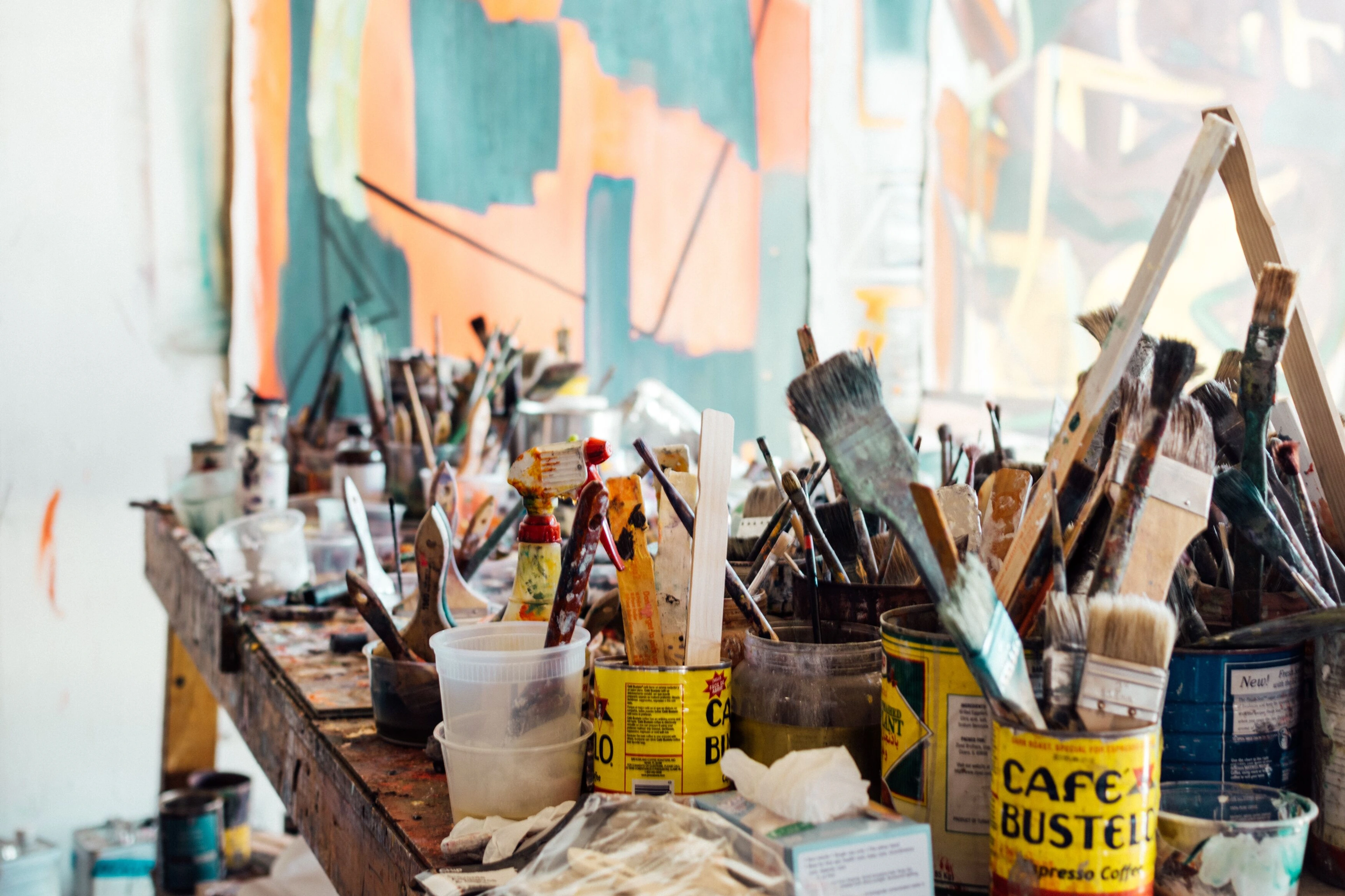
Why I've Fallen for Them: The Unsung Hero of My Studio
Honestly, these little sticks of joy have become one of the unsung heroes in my studio. Their versatility is just incredible. I can use them to sketch out initial ideas with raw energy, add bold lines and expressive marks that pop, or build up rich, impasto-like textures that you just want to reach out and touch. For an abstract artist like me, who often lives for the interplay of texture and color, they're a dream come true. They allow for an immediacy that painting with brushes sometimes lacks. Sometimes you just want to get your hands directly on the surface, pushing and pulling color, and oil pastels let you do just that. They scratch that itch for raw, unfiltered expression, creating incredible depth and vibrancy that I find hard to achieve with other mediums alone. And let's be honest, sometimes I'm just a little lazy to clean brushes, so these are a perfect go-to! If you're looking to really dive into adding exploring texture in your work, oil pastels are an excellent choice.
Navigating the Pastel Aisle: What to Look For
When you're standing in front of that dazzling array of colors, it can feel a bit overwhelming, right? My advice? Don't just grab the cheapest set. Think about what you want to achieve. Here are a few things I always consider:
- Pigment Load: This is the big one. Higher pigment load means more vibrant, intense colors that stand out. It also generally means better lightfastness (how resistant the pigment is to fading over time). You want your art to last, after all! Cheaper pastels often have more filler and less pigment, resulting in duller colors and less longevity. While a comprehensive guide to eco-friendly art supplies might focus on other aspects, choosing higher quality materials often leads to less waste in the long run as they perform better and last longer.
- Binder Quality: The binder (oil and wax) determines how creamy, soft, or firm the pastel is. A good binder means smooth application, excellent blendability, and fewer crumbs. Some brands feel like butter, others are firmer and hold an edge better. It really depends on your personal preference and how you like to work.
- Lightfastness: As I mentioned, this is super important if you want your art to be archival. Look for lightfast ratings on the packaging, usually indicated by symbols like stars or numbers. Artists' quality pastels will almost always provide this information.
- Texture and Hardness: This is where individual brands really differentiate themselves. Some are incredibly soft and buttery, perfect for rich layers and blending, but can be messy. Others are firmer, excellent for drawing, sharp lines, and fine details. I tend to prefer a mix, allowing me to build up my pieces with different qualities.
My Top Picks: Brands I Actually Use and Recommend
After much experimentation (and a few disappointments, let's be honest), I've settled on a few brands that consistently impress me. Each has its own personality, and I find myself reaching for different ones depending on the effect I'm after. It's like having a diverse group of friends, each bringing something unique to the table.
Sennelier Oil Pastels: The 'Cadillac' of Creaminess
Oh, Sennelier. Where do I even begin? These are the pastels that famously captivated Picasso, and for good reason. They are, without a doubt, the creamiest, most luscious oil pastels I've ever had the pleasure of working with. The pigment load is insane, the colors are incredibly vibrant, and they blend like a dream. If you want rich, buttery layers that feel almost like painting with solid oil paint, these are your guys. They're a bit softer, so they can be a bit crumbly, but the payoff in intensity and blendability is absolutely worth it. Perfect for those bold, expressive strokes in abstract art.
Holbein Oil Pastels: The Reliable Workhorse
Holbein pastels are fantastic, a true studio staple. They're a bit firmer than Sennelier, which means they hold their shape better and are excellent for both fine detail and broad applications. Their color range is expansive and the pigments are strong. I find them incredibly versatile – they layer beautifully, blend well, and create a lovely, consistent texture. If Sennelier is the luxury car, Holbein is the incredibly reliable, high-performance SUV that can handle any terrain.
Caran d'Ache Neopastel: The Versatile Friend
Caran d'Ache Neopastels strike a wonderful balance. They're soft enough to blend easily but firm enough to maintain good control. The colors are brilliant and lightfast, and they play particularly well with other mediums, which is crucial for my mixed media explorations. They're a solid all-rounder and a great choice if you're looking for quality and flexibility without quite the buttery richness (or price tag) of Sennelier.
Mungyo Gallery Artists' Soft Oil Pastels: The Budget Champion
I know, I know. "Budget" and "artist quality" don't always go hand-in-hand. But Mungyo Gallery pastels are a delightful exception. For their price point, they offer surprisingly good pigment, decent blendability, and a soft texture that rivals some more expensive brands. They might not have the extreme lightfastness or ultra-smoothness of Sennelier or Holbein, but for practice, sketches, or even finished pieces where archival qualities aren't the absolute top priority, they are an absolute steal. I keep a set for quick studies and just pure playful exploration.
Getting Your Hands Dirty: Tips and Tricks I've Learned
Working with oil pastels isn't just about the tools; it's about the dance you do with them. Here are a few things I've picked up along the way that might help you avoid some of my early frustrations:
- Surface Selection is Key: Oil pastels love a bit of tooth. That's artist-speak for texture. Paper with a slight grain, sanded pastel paper, canvas, or even wood panels work wonderfully. Smooth paper just won't grab enough pigment, and you'll end up with a sparse, frustrating application. Think about it like a grater – you need something for the pastel to catch on! For abstract work, I often use sturdy paper or canvas boards.
- Layer, Don't Press (Initially): My initial instinct was to press hard for intense color. Bad idea. Start with light layers, building up the intensity. This allows for much better blending and layering without muddiness. You can always add more, but taking away is a pain. This is also how you can start to create incredible depth, much like when you're learning how to abstract art – build it up, layer by layer.
- Blending is Your Friend: Fingers are fantastic. Seriously. Your body heat helps melt the wax just enough for seamless blending. But you can also use paper stumps, cotton swabs, or even a soft cloth. For some truly interesting effects, I sometimes use a palette knife or even a stiff brush with a tiny bit of mineral spirits or turpentine to dissolve and spread the pigment, creating painterly washes. Just be careful with solvents – a little goes a long way!

- Consider Fixatives (Carefully): Oil pastels never truly dry, so they can remain smudge-prone. A workable fixative can help, but test it first! Some fixatives can darken or alter the colors. I often prefer to frame my finished oil pastel pieces under glass to protect them, or just embrace their slightly delicate nature as part of their charm.
- Clean Up Isn't Glamorous, But Necessary: Your hands will get messy. Your pastels will get mixed. Keep a rag handy. For the pastels themselves, gently wipe off any transferred colors with a clean cloth or even scrape the surface lightly with a blade if needed. It's a small price to pay for the expressive freedom they offer, if you ask me.
Oil Pastels in My Abstract World
For my abstract work, oil pastels are like a secret weapon. They allow me to inject raw energy and a tangible sense of gesture into a piece. I love using them for their capacity to create:
- Vibrant, Uninterrupted Color Fields: Their high pigment concentration means I can lay down intense color that truly sings.
- Expressive Line Work: From thick, sculptural lines to delicate scribbles, they offer a dynamic range for drawing directly into my compositions.
- Rich, Impasto Textures: By building up layers, I can create surfaces that have a wonderful, almost sculptural quality, adding a tactile dimension that invites the viewer to look closer and feel the depth.
- Spontaneous Mark-Making: They encourage a playful, experimental approach. There's less overthinking and more doing, which is perfect for capturing the fleeting moments of intuition that often guide my abstract creations.
They're a bit like having a spontaneous conversation with your canvas – direct, uninhibited, and full of surprising turns. Just look at the vibrancy and interplay of colors in some abstract art pieces (if you'd like to see some of my work, you can always explore my abstract art).
Frequently Asked Questions About Oil Pastels
Got questions? I bet you do. Here are a few I often hear, and my two cents on them:
Are oil pastels the same as oil crayons?
Mostly, yes! The terms are often used interchangeably. Generally,


