Calligraphy's Unexpected Gift: Unlocking Abstract Art's Deepest Expression
My journey into calligraphy revealed a surprising path to disciplined freedom and profound insight. Discover how this ancient art transformed my abstract work, shaping my understanding of line, form, and emotional expression.
Calligraphy's Unexpected Gift: Unlocking Abstract Art's Deepest Expression
Hello, fellow art enthusiasts and curious souls! There's something inherently captivating about calligraphy, isn't there? For years, I admired it from a distance, envisioning it solely for elegant invitations or ancient scrolls. It felt a bit stuffy, frankly – tied to meticulous rules and historical associations. Oh, how delightfully, gloriously wrong I was! This wasn't just a fleeting thought; this surprising journey unexpectedly reshaped my entire artistic approach, turning my wild creative spirit towards a new kind of disciplined liberation. The true gift of calligraphy, I discovered, was a profound new lens for understanding line, form, and expression, fundamentally enriching my contemporary abstract art. Join me as we explore its historical roots, its meditative power, and how its silent language has reshaped my own abstract canvases.
The Enduring Line: Calligraphy Through the Ages
To truly appreciate calligraphy's profound impact on art and my own practice, it helps to glance back at its enduring journey through human history. From the intricate hieroglyphs of ancient Egypt, where form carried sacred meaning and early brushes of reeds or animal hair were used with pigments, to the sweeping brushstrokes of Chinese and Japanese masters who elevated writing to a spiritual and philosophical practice using flexible bamboo brushes and sumi ink, the deliberate line has always been a powerful vessel. Think of the Roman Capitals, carved in stone, embodying stability and imperial authority, often created with chisels and later broad-edged pens. Then came the ornate illuminated manuscripts of medieval Europe, where scribes painstakingly married text with intricate imagery, transforming books into objects of art and devotion, typically using quills on vellum.
As writing tools and surfaces evolved, so too did the artistic potential. The shift from papyrus to parchment and then paper, alongside advancements in ink composition, constantly influenced how lines could be formed and perceived. For example, the emergence of Carolingian Minuscule in the 8th century, with its clear, rounded forms typically written with a broad-edged pen, dramatically improved legibility and became the blueprint for our modern lowercase alphabet. Later, the angular, compressed forms of Gothic Blackletter emerged, reflecting the architectural styles of the High Middle Ages, each character a dense, textured block of ink often crafted with broad-edged pens. The invention of the printing press in the 15th century didn't diminish calligraphy's allure; instead, it liberated it from its purely communicative function, allowing it to evolve into a pure art form, a dance of ink and intention, foreshadowing the later move towards abstraction.
Beyond these traditions, the elegant sweep of Arabic calligraphy also offers profound insights. Developing alongside the spread of Islam, it transformed writing into a revered art form, where letters themselves became intricate designs. Unlike Western forms, which often focused on legibility, Arabic calligraphy prioritized spiritual and aesthetic perfection, utilizing a vast array of fluid, geometric, and decorative scripts (like Kufic, Naskh, Thuluth) often crafted with reed pens (qalam) and rich inks. Its influence extends from architecture to textiles, demonstrating how the deliberate line can create complex patterns and convey spiritual depth, even without direct textual translation, resonating deeply with the principles of abstract art composition and repetition.
Style | Era | Key Tools | Characteristics | Philosophical Context (examples) |
|---|---|---|---|---|
| Egyptian Hieroglyphs | Ancient Egypt | Reed brushes, animal hair | Sacred, symbolic forms, early writing system | Religious, spiritual meaning |
| Roman Capitals | Ancient Rome | Chisels, broad-edged pens | Majestic, formal, stable, imperial | Law, authority, empire |
| Carolingian Minuscule | 8th-12th C. | Broad-edged pen | Clear, rounded, highly legible, foundational | Christian scholarship, education |
| Gothic Blackletter | 12th-15th C. | Broad-edged pen | Angular, compressed, dense, architectural | High Middle Ages, religious texts |
| Chinese/Japanese Calligraphy | Ancient to Modern | Flexible bamboo brush | Expressive, fluid, spiritual, philosophical | Taoism, Zen Buddhism, Confucianism |
This rich tapestry of historical styles, each born from specific tools, cultural needs, and philosophical underpinnings, underscores calligraphy's universal appeal and its consistent ability to convey more than just words. It was also a critical step in separating form from literal meaning, paving the way for later abstract art forms. But beyond history, what silent language does calligraphy speak that transcends even these rich forms and cultural contexts?
The Meditative Ritual: Finding Focus in Every Stroke
This unexpected journey began not with a grand revelation about form, but with a quiet, almost secret discovery of inner calm. After grappling with the elegant control calligraphy demands, a surprising side effect emerged: an unparalleled sense of peace. Beyond the mental calm, I found subtle physical benefits too, a refinement of fine motor skills and hand-eye coordination that quietly strengthened my artistic hand. In the whirlwind of my studio, where paint splatters often mirror my mental state – a chaotic symphony of ideas, sometimes – calligraphy offers a different kind of solace. It demands a particular kind of focus, a quietude that feels almost sacred, pulling me entirely into the present moment. I often think of my process when creating mindful moments and abstract art.
The Art of Presence
The simple act of preparing my tools becomes a profound meditative ritual. The quiet unfurling of the paper, the earthy, slightly metallic scent of ink – a smell that now instantly triggers a quiet calm for me, almost like that specific aroma of freshly tilled earth from my grandfather's garden, now long gone – the satisfying clink of a nib finding its holder, and then the subtle scratch of metal on textured paper as the ink begins to flow. Each sensory detail deepens the experience, anchoring me firmly in the present. There's a deliberate, almost ceremonial preparation that sets the stage for genuine presence, often accompanied by a conscious focus on posture and breathing. I find myself inhaling as I prepare my hand, exhaling as the ink flows, sometimes accompanied by the soft, satisfying scratch of the pen on textured paper, a quiet hum in the studio. It's an antidote to the endless pings and distractions of the digital world, a deliberate withdrawal into a space of singular focus. Each stroke is a mindful moment, a tiny anchor in the present, demanding my full, undivided attention. This heightened focus, I've noticed, allows me to perceive subtle color shifts and nuanced textural interactions in my abstract work that I might have otherwise overlooked, leading to richer, more considered compositions.
If you've ever felt the profound peace that comes from focusing entirely on a creative act – the world falling away, time seeming to slow – then you understand this pull. It’s a powerful gateway to inner calm, much like the process I explore in mindful moments and abstract art. I've often found myself turning to my calligraphy pen after a particularly exasperating email chain, just to find my center again. It rarely fails. This quiet discipline, it turns out, is the most effective chaos-tamer I know. But the stillness it cultivates is just the beginning; the real revolution for my art began when I looked beyond inner calm to the profound lessons in form and intention hidden within each stroke. What hidden structures, then, did this quiet discipline reveal, and how did they resonate with my wild creative spirit?
Beyond Letters: Calligraphy as Pure Form and Intention
Having found a surprising solace in the rhythmic dance of the pen, I began to look beyond the surface, realizing that calligraphy was far more than mere elegant script; it was a profound study in form and intention. Initially, the idea of calligraphy felt a bit… restrictive. All those rules, those precise strokes! As someone who thrives in the freedom of abstract expression, it felt counterintuitive, almost like a straightjacket for my wild painter's spirit. Yet, the more I delved, the more I realised that what appears as rigid discipline is, in fact, an incredible exercise in control, rhythm, and nuanced composition. It's not just about forming legible letters; it's about the dance of the brush or pen across the page, the weight of the ink, the subtle pressure changes that give a line its life.
The Language of Lines and Space
Each calligraphic style, shaped by its unique tools and historical context, powerfully demonstrates how structure dictates expression. Consider the sweeping elegance of a Copperplate flourish, demanding meticulous control with a pointed flexible nib and flowing iron gall ink, or the stark, deliberate weight of a Gothic Blackletter – often crafted with broad-edged pens and opaque black ink. Western calligraphy also offers the rounded, majestic forms of Uncial script, typically written with a broad-edged pen for early Christian texts, or the clear, structured simplicity of Carolingian Minuscule, which laid the groundwork for modern lowercase letters using a broad-edged quill or reed pen. Even the seemingly rigid rules of historical Western scripts, such as the architectural precision of Roman Capitals, reveal profound lessons in geometric harmony and structural integrity. These principles, when stripped of their literal meaning, become powerful tools for abstraction, teaching how to command attention and convey solidity or movement through the deliberate arrangement of forms and voids, directly influencing even the most modern geometric abstraction.
And across oceans, the profound philosophical depth of Eastern calligraphy, particularly Chinese and Japanese forms, reveals a different dimension. Here, each brushstroke with a flexible brush and sumi ink is not just a mark, but a meditation, a single breath encapsulating a universe of meaning. Rooted in Taoism and Zen Buddhism, the practice emphasizes the concept of Qi – vital energy or life force. This vital energy flows from the calligrapher's core through the brush, visibly manifesting as the dynamic power of a sudden, strong flick of the wrist or the grounded strength from sustained, even pressure. For example, a quick, almost explosive downward stroke can embody raw power, while a slow, controlled curve might convey serenity and wisdom. Each character thus becomes a direct reflection of the artist's spirit and intention. In Zen, this often connects to Ma, the concept of 'negative space' or 'emptiness,' which is not merely void but full of potential, a deliberate pause that allows forms to breathe and interact, creating visual harmony and rhythmic balance, much like the silence between musical notes. Imagine a bold character on a page; the 'Ma' is the space around it, shaping its impact and allowing its energy to reverberate, often more powerful than the stroke itself. Each tradition, in its own vibrant way, elevates mere text to a visual spectacle, a true art form born from intentionality.
Calligraphy also taught me the crucial role of negative space. This isn't just the 'empty' area; it's a crucial counterpoint, a dynamic area that actively shapes and defines the positive forms. Just as a well-placed pause in a conversation allows words to resonate, negative space allows shapes and lines to sing, creating a visual dialogue. This exploration of how elements interact within a given space is a core principle in abstract art composition.
Consider the simple elegance of a foundational stroke in Italic script: a precise angle for the nib, a thick, confident downstroke, the subtle lift and twist that forms a delicate serif. There's a particular satisfaction in that crisp beginning and graceful end, a micro-composition that feels both powerful and refined. This precision in every mark, the push and pull, the thick and thin, resonated deeply with my desire to make every mark in my abstract pieces meaningful, not just random, accidental gestures. These aren't just lines; they are carefully orchestrated movements, each telling a story, much like the intentional placement of a single, deeply considered mark in an abstract piece. For me, this transformed my understanding of what a line can be. It’s a complete story in itself, a testament to intention and grace. You see, the art of calligraphy, in its essence, has always been about elevating written language to a visual art form, where the beauty of the mark often transcends the literal meaning. A single thick, slow stroke can convey immense weight or sorrow, while a quick, thin flourish suggests joy or fleeting thought. This deep dive into the essence of lines, their inherent emotional weight and compositional power, remarkably enhanced how I approach line work in my own pieces, moving beyond mere decoration to profound expression. If you're as fascinated by the power of single marks as I am, you might find my thoughts on understanding line in abstract art equally intriguing.
Calligraphy's Silent Language: Expressing the Unseen
If 'Beyond Letters' taught me the power of a line's structural form, then this silent language revealed its soul – its incredible capacity for expression without explicit meaning. Think about it: a single brushstroke can convey immense power, fragility, speed, or serenity. It’s a language of feeling, understood instinctively, bypassing the need for words entirely. A sharp, angular, almost aggressive stroke might scream urgency or conflict, like a sudden storm, while a flowing, expansive curve whispers calm or boundless energy, much like a tranquil river. I remember once, after a particularly draining day, making a series of short, choppy, almost jagged marks, and realizing in that moment that I was physically manifesting my internal frustration – a spontaneous, wordless self-portrait of a mood.
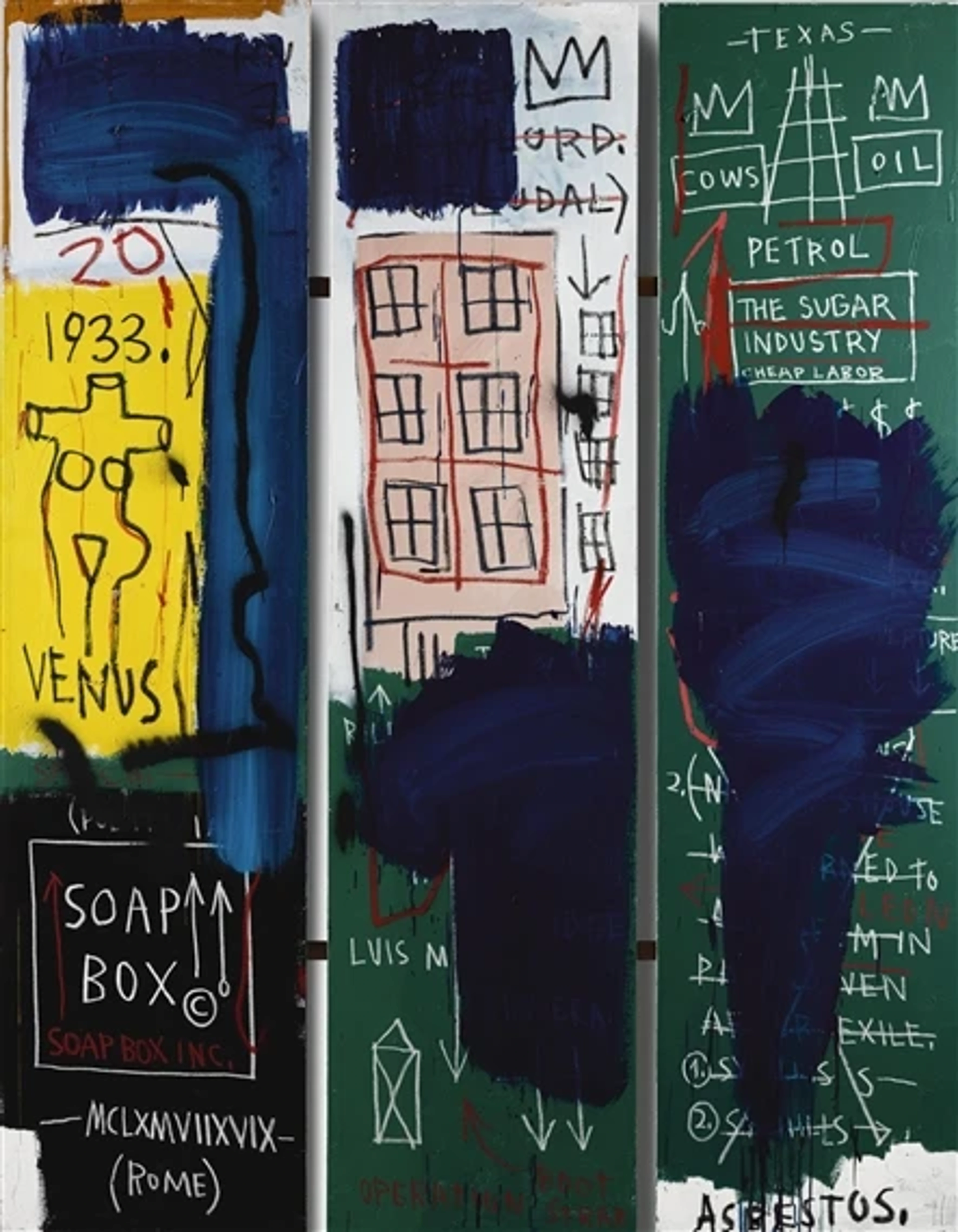
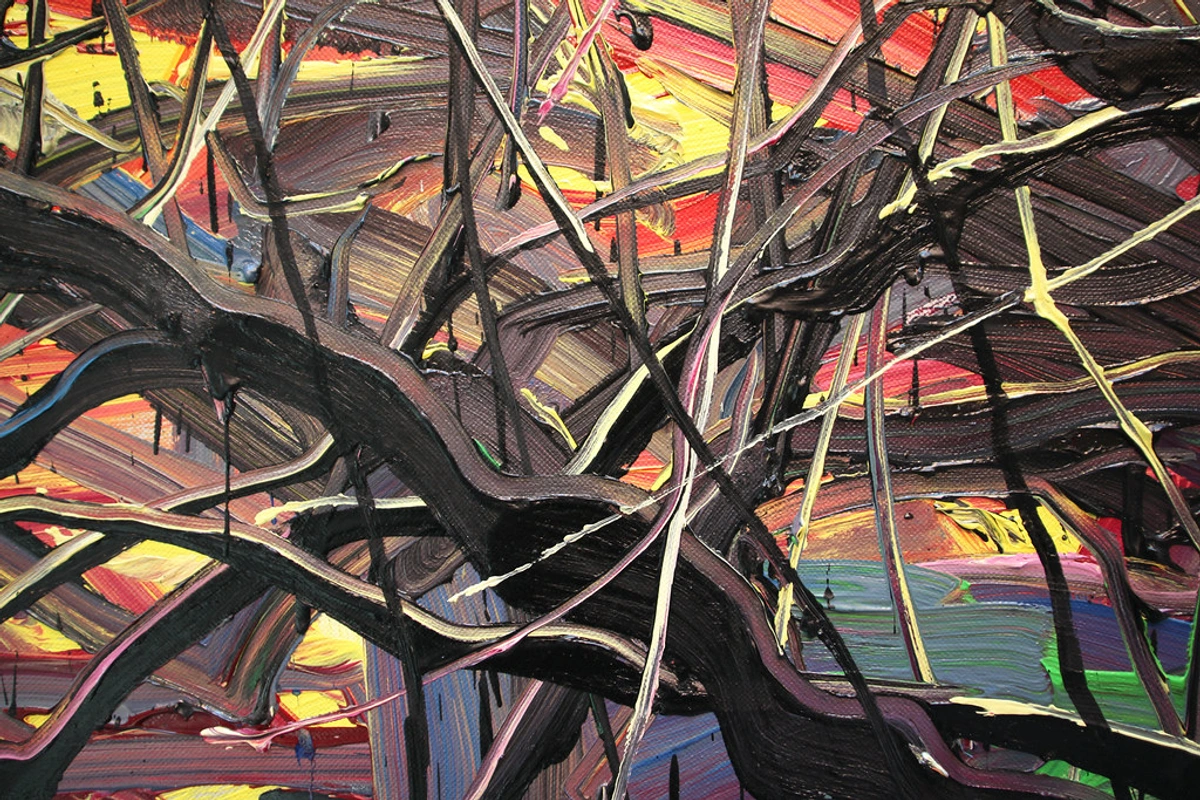
Calligraphy offers a spectrum of expressive power. The precise, almost architectural lines of Roman Capitals evoke stability and grandeur. In contrast, the spontaneous, broken strokes of gestural calligraphy capture raw, untamed emotion, a direct precursor to some of the most dynamic movements in abstract art. Consider the visceral energy in Willem de Kooning's bold, slashing brushstrokes, where his raw application of paint echoes the spontaneous, almost violent calligraphic gestures, capturing untamed emotion. Or the lyrical flow in a Joan Mitchell painting, where her expansive, overlapping lines and vibrant color fields mirror the continuous, flowing movements and delicate ink variations of Eastern grass script, suggesting rhythm and transient beauty. Artists like Cy Twombly, with his unique blend of calligraphic scribbles and graffiti-like marks, and Franz Kline, whose monumental black and white strokes resonate with Japanese sumi-e, show profound calligraphic influence in their abstract works. Mark Tobey's 'white writing,' a dense, all-over calligraphy, also demonstrates this lineage, creating intricate webs of meaning through abstract marks. In many Eastern traditions, specific brushstrokes or characters are imbued with intrinsic meanings, conveying concepts like 'strength,' 'emptiness,' or 'harmony' through their very form, not just their literal translation. For instance, a single, deliberate downward stroke in kaisho (Japanese block script) can convey unwavering strength, often executed with a powerful, unhesitant descent of the brush. While a fluid, trailing brushstroke in sosho (Japanese grass script) evokes transient beauty or the fleeting nature of thought, characterized by continuous, flowing movements that often leave a delicate, wispy trail as the ink thins. The deliberate placement of an empty space – Ma – around such a stroke further amplifies its poetic resonance.

It taps into the very core of what abstract art strives to achieve – communicating emotion and energy directly, bypassing the literal, speaking soul-to-soul. When I look at a powerful, gestural abstract painting, I feel its impact before I intellectualize it – much like feeling the weight of sorrow in a slow, thick calligraphic line, or the joy in a quick, light flourish, without needing to read any words. This is precisely where the ancient art form of calligraphy truly resonates with modern abstract expressionism. The raw energy of a spontaneous brushstroke, the deliberate weight of a heavy line that feels almost sculptural, the delicate flourish that seems to float – these are all tools for conveying a narrative that transcends words. It becomes a silent, powerful conversation between me and the observer, a shared experience of pure visual impact, a journey into unspoken feelings. This profound connection is especially evident in gestural abstraction and lyrical abstraction, where the emphasis is on the expressive potential of the mark itself, echoing calligraphy's inherent power. If you're curious about how different styles convey meaning, you'll love my guide to abstract art styles and their meanings. How, then, does one even begin to tame such expressive power in a personal practice, letting it flow into their own unique artistic voice?
My Calligraphic Practice: A Peek into the Process
My own calligraphy practice isn't some grand, formal affair, nor does it involve ancient secret scrolls (much to my occasional disappointment). It's usually tucked into quiet moments – an hour before the world wakes up, or a stolen afternoon between more demanding abstract pieces. I started simply, with basic tools: a cartridge pen, some smooth practice paper, and a desire to make a decent "o" shape. My first attempts? Oh, they were a spectacle! Let’s just say they looked less like elegant script and more like a frantic spider had been let loose with an inkwell after too much coffee, causing shaky, inconsistent lines, blotchy ink flow, and a general lack of control. I still chuckle recalling the sheer exasperation of trying to master the 'o' shape in Copperplate, which for weeks stubbornly resembled a potato with a slight wobble. But the beauty, I quickly learned, isn't in immediate perfection; it's profoundly in the practice, in the delightful, sometimes infuriating, process itself.
From Frustration to Flow: My Learnings
I quickly learned that the interaction of different materials is a journey of discovery itself. The absorbency of a good cotton-rag paper, the deep sheen of an iron gall ink, the crisp flexibility of a pointed G-nib – each plays a crucial role. This tactile exploration, the subtle differences in how a specific material responds, is much like experimenting with new paints and canvases in my abstract work; it constantly informs and inspires. It's also where muscle memory begins to develop, where the physical act of repetition becomes embodied knowledge, allowing for more intuitive expression later.
It's about showing up, making the effort, and allowing yourself to experiment without judgment. I love to fill pages with repetitive strokes, focusing purely on the movement and the mark, almost like a musician practicing scales, or a dancer refining a step. It’s not always about creating a masterpiece; sometimes, it’s just about connecting with the materials and surrendering to the meditative rhythm. Through this consistent engagement, even in brief doses, I discovered profound lessons that fueled both my calligraphy and my abstract work:
- Embracing Imperfection as Progress: Every wobbly line, every ink blotch, became a step towards understanding control, not a failure. It was less about rigid rules and more about learning the dance between intention and outcome.
- Deepening Sensory Connection: The tactile feedback of paper, the exact weight of the pen, the subtle drag and flow of the ink across the page – these weren't just details; they were my anchors, connecting me physically and mentally to the creative act.
- Cultivating Rhythmic Flow: Developing a natural cadence in my hand and breath with each deliberate stroke, a silent, internal song that resonated with the larger, sweeping movements I craved in my abstract work.
- Developing Brush Control: Beyond simple repetition, I focused on varying pressure and speed on a single, continuous line, learning to dictate its thickness and flow with subtle shifts of my hand, much like a musician learning to control dynamics in a melody. This tactile mastery became crucial, translating directly into my ability to make bold, expressive gestural marks in my paintings, where the weight and velocity of a brushstroke convey specific emotion.
How do these seemingly small, disciplined movements, born from frustration and refined through practice, translate into the grand, often spontaneous gestures of abstract art?
Integrating Calligraphy into My Abstract Art
You might wonder, how exactly does this ancient craft, with its emphasis on precision and structure, influence my vibrant, contemporary abstract paintings? It's all about the underlying principles, the silent lessons embedded in every curve and angle. Calligraphy has fundamentally sharpened my eye for composition, teaching me how to guide the viewer's gaze with the intentionality of a single, elegant line. It's made me deeply conscious of the weight, rhythm, and direction of my strokes, transforming what might otherwise be a random splash of paint into a deliberate, expressive gesture, a controlled burst of energy.
For instance, consider the counter-form, the negative space within and around a beautifully formed letter. Calligraphy taught me that this 'empty' space is anything but passive; it's a crucial counterpoint, a dynamic area that actively shapes and defines the positive forms. This profound appreciation of negative space has directly translated to how I consider the unpainted areas within my abstract compositions. They aren't just 'nothing'; they are active, breathing voids that create a dynamic dialogue between presence and absence, much like the negative space around a sculpture defining its form, or the 'breathing room' around a focal point in a painting. I often think of my large-scale 'Urban Rhythms' series, where the sharp, almost architectural calligraphic lines, perhaps reminiscent of a bold Roman Capital's strong verticality or a Blackletter's dense block, are not just painted, but are defined as much by the surrounding unpainted canvas – the 'negative space' – as by the paint itself. These bold, sweeping gestures and their deliberate voids create a dynamic dialogue between striking presence and thoughtful absence, a direct application of the calligraphic principle that empty space is an active compositional element, like the silence that gives power to a word. Another example is how the subtle rhythmic repetition and the controlled energy I learned from practicing foundational calligraphic strokes now informs the layering and interplay of lines in my 'Echoes of Script' series, creating a visual cadence that guides the eye through the abstract forms, almost like a visual chant, with each stroke carrying its own weight and direction, much like the varied pressure in an Italic script creates a flowing, rhythmic texture.
The understanding of negative space, the delicate balance between filled and empty, the dynamic tension created by contrasting lines – these are not merely aesthetic preferences; they are profound compositional lessons I've absorbed from calligraphy and now consciously apply to my abstract works. This is particularly relevant in geometric abstraction, where the precise placement and interaction of lines and shapes create a sense of balanced order derived from calligraphic principles. If you're interested in how these elements combine, my article on abstract art composition offers a deeper dive into these principles. What other questions do you have about this unexpected artistic fusion, and how it continues to evolve?
Calligraphy Curiosities Answered (My Way)
So many of you have reached out with questions about my journey with calligraphy, or perhaps find yourselves with similar curiosities, so I wanted to address some common inquiries here, infused with a bit of my own perspective. Hopefully, these insights shed some light on this surprising artistic path!
- Q: Is calligraphy just about beautiful writing?
- A: My first thought too! But no, certainly not. For me, it's about so much more: the meditation, the profound discipline, the pure aesthetic of the line, and the subtle ways it can convey emotion without words. It's a powerful art form in its own right, a silent language for the soul, and a surprising teacher for my abstract spirit. It's also been an unexpected source of psychological well-being, grounding me in focused presence and reducing mental clutter, which in turn fuels my broader creative output.
- Q: Do I need special tools to start calligraphy?
- A: Oh, absolutely not! While dedicated calligraphy pens, fine inks, and specialized papers are wonderful, you can absolutely start exploring the principles of line, pressure, and form with just a regular pen or brush and paper. The key is to begin, to feel the flow, and to simply allow yourself the freedom to experiment. Don't let the quest for "perfect" tools become a barrier to starting – the real magic is in the doing, not the gear.
- Q: What type of calligraphy best informs abstract art, or how can I experiment without formal training?
- A: While all calligraphy offers profound insights, for abstract artists, focusing on the inherent movement and structure is key. I'd particularly recommend exploring:
- Early German Blackletter: Its dense, angular, and often fragmented forms, emphasizing the sheer weight and texture of the mark, directly influences powerful, structured abstract expressionism.
- Chancery Italic: Known for its lively, fluid, yet controlled motion and elegant flourishes. This style teaches a balance of discipline and freedom, directly informing lyrical abstraction where graceful, sweeping lines are paramount.
- Eastern Grass Script (Sōsho): This highly abbreviated, flowing Japanese script is almost pure gesture, focusing on continuous movement, energy (Qi), and the transient beauty of the stroke. It's a direct route to understanding gestural abstraction, where the hand's motion directly conveys emotion. Here are a few ways to experiment:
- Vary Line Weight & Speed: Try using a broad brush or a felt-tip pen. Experiment with pressing harder for thick lines and lighter for thin ones. Change your speed – quick, energetic strokes versus slow, deliberate ones – to see how it affects the emotional resonance of the mark. This directly feeds into gestural abstraction or lyrical abstraction.
- Repetitive Marks for Texture: Fill a page with only vertical strokes, then horizontal, then diagonal. Focus solely on the movement of your hand and the resulting mark. Observe how repeating simple marks builds complex textures and patterns, a technique often seen in abstract expressionism or even minimalist abstraction.
- Deconstruct & Reconstruct: Choose a historical script (like Blackletter or Chancery Italic). Instead of trying to form perfect letters, isolate individual elements – a specific curve, an ascender, a descender. Practice these elements repeatedly, exaggerating them, breaking them apart, or combining them in new ways. Focus on the weight distribution of a Blackletter stroke or the fluidity of a Chancery Italic flourish. This process is akin to the deconstruction seen in Cubism or the analytical approach of geometric abstraction.
- Unconventional Tools: Don't limit yourself to traditional pens. Try sponges, sticks, twigs, or even your fingers with ink or paint. This forces you to think differently about how marks are made, pushing towards raw abstract expressionism. The goal is exploration, discovery, and embracing the unexpected, not replication. And don't forget the physicality of it all – how your whole arm moves, the posture, the quiet engagement of your body. That mindful physical connection alone can be a game-changer for your abstract practice.

- Q: Are letterforms themselves considered abstract art in calligraphy?
- A: Absolutel y! Even when intended to be read, the beauty and complexity of individual letterforms or characters in calligraphy often transcend their literal meaning, becoming abstract shapes in their own right. Consider the pure form of a capital 'R' or the elegant swoop of a Japanese Hiragana character – when viewed solely for their line, curve, and balance, they are powerful abstract compositions. This perspective was a revelation for me, allowing me to see the inherent abstract potential in every mark, regardless of its original communicative function. It's a direct bridge from the structured world of writing to the free realm of abstract art.
- Q: How does the physicality of calligraphy influence abstract art?
- A: This is a fantastic question! In calligraphy, the entire body is often involved – from the grounded posture to the controlled movement of the arm, not just the wrist and fingers. This develops a deep awareness of your physical self in relation to the mark-making process. For my abstract art, this translates into a more intuitive, embodied approach to painting. My larger gestures become more intentional and powerful because I've trained my body to connect breath, focus, and movement directly to the canvas. It's about channeling a raw, internal energy through a disciplined physical act, making every stroke feel more authentic and impactful.
- Q: Does color play a role in calligraphy, and how does that connect to abstract art?
- A: Traditionally, black ink on white paper has been dominant, emphasizing form. However, contemporary and experimental calligraphers often embrace color. For me, exploring colored inks opened up new dimensions of expression, much like choosing a specific hue to evoke a mood in an abstract piece. A vibrant red stroke can feel entirely different from a subdued blue one, even with the same form. It’s about understanding how color can amplify or alter the emotional weight of a line, adding another layer of visual narrative that directly informs my color choices and interactions in abstract compositions, allowing for lyrical abstraction to truly sing.
- Q: How long until I'm 'good' at it?
- A: Ah, the eternal, slightly exasperating question! "Good" is so delightfully subjective, isn't it? Calligraphy, like any deep artistic pursuit, is a lifelong journey. Embrace the process, celebrate small improvements, and enjoy the act of creation itself. Don't let the pressure of perfection steal your joy; the true reward is always in the doing, in the quiet unfolding of discovery.
Ultimately, these curiosities reveal a deeper truth: calligraphy is less about perfection and more about presence, practice, and the boundless potential of a single, intentional mark. So, what, then, is its ultimate legacy in the grand tapestry of art, and how does this ancient discipline truly shape the vibrant world of abstract expression?
Final Stroke: Calligraphy as a Universal Art Form
From ancient scribes painstakingly illuminating manuscripts to modern abstract artists pushing the boundaries of expression, the art of calligraphy speaks a universal language. It’s a testament to the enduring human desire to create, to express the ineffable, and to find profound beauty in the deliberate mark. For me, it has been an unexpected, yet incredibly enriching, part of my artistic journey. It has not only refined my technique but subtly shifted my identity as an artist, reminding me that sometimes, the most rigid-looking disciplines can paradoxically open the doors to the greatest freedom and the deepest insight. Calligraphy's legacy in the broader art world lies in its unparalleled ability to distill emotion and energy into the purest form of the line, directly prefiguring and profoundly influencing movements like abstract expressionism and lyrical abstraction.
In fact, if you visit my museum in 's-Hertogenbosch, you'll see large-scale pieces like 'Echoes of Script,' where the monumental power I found in a single, deliberate calligraphic stroke is echoed in the bold, sweeping gestures that define the composition, such as a dominant, thick line that traverses the canvas with a clear calligraphic flourish. The piece 'Urban Rhythms' further exemplifies this, with its sharp, almost architectural calligraphic lines creating a dynamic dialogue between striking presence and thoughtful absence, directly applying the principles of negative space learned from this ancient craft, where unpainted sections are as vital as the painted forms, often evoking the structured voids of a Blackletter script or the deliberate spacing in a formal Roman Capital. These works are a testament to how ancient forms continue to inform contemporary abstraction, celebrating the journey of the line.
So, perhaps it's something you'd like to explore yourself – to pick up a pen, feel the scratch of nib on paper, and allow the quiet rhythm to guide you towards a new artistic understanding. Or perhaps you'd simply like to experience the vibrant spirit of deliberate line and expression manifested in my latest artworks. I invite you to explore how these principles manifest in my latest collection, where the echoes of script meet the vibrant pulse of abstract expression. Either way, I hope this little peek into my world of pens, inks, and abstract lines has sparked a bit of curiosity, a whisper of potential, within your own creative spirit. Keep creating, keep exploring, and let the lines lead the way! The canvas, after all, is just another page waiting for your story to unfold.


