Mastering Linocut Printing: The Ultimate Guide for Beginners & Advanced Artists
Unlock linocut printmaking with this ultimate guide. Explore essential tools, expert carving techniques, inking secrets, multi-color methods like reduction printing and Chine-Collé, and advanced troubleshooting for stunning, archival art.
Mastering Linocut Printing: The Ultimate Guide for Beginners & Advanced Artists
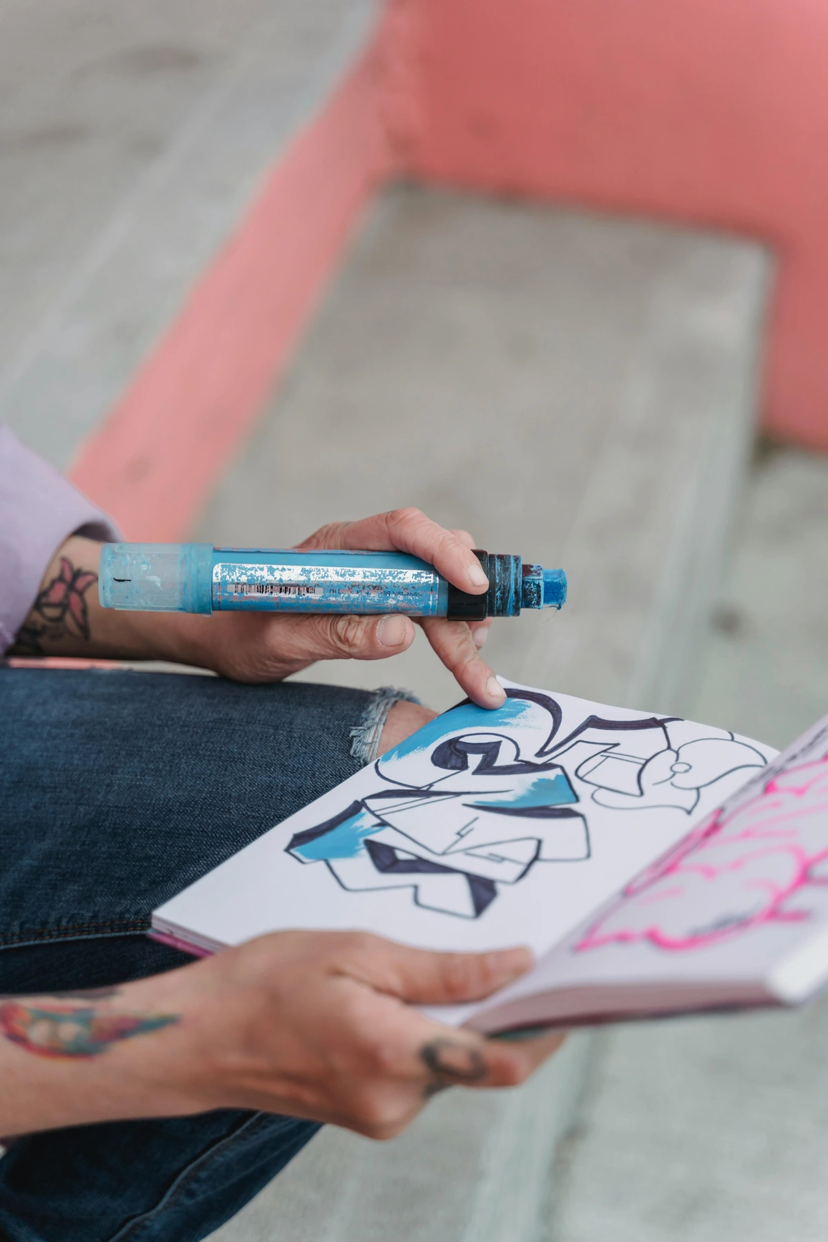
I remember the first time I truly dove into linocutting. My initial attempts were, let's just say, more enthusiastic than skilled. I envisioned a grand botanical print, and what actually emerged was a smudgy, rather hacked-up piece of lino and ink... everywhere. It was a beautiful, chaotic mess, and a humbling reality check. But oh, was I instantly hooked. There’s something undeniably primal, almost ancient, about carving away a design, rolling on that sticky ink, and then peeling back the paper to reveal your creation. It’s a direct, tangible mark-making experience that completely bypasses the digital noise that often surrounds us. This hands-on process fosters a unique meditative state, a profound connection to the artwork that digital mediums often struggle to replicate. My journey into linocut, much like my artistic practice, started with a blend of ambitious dreams and messy realities, teaching me how to translate raw emotion and observation into physical form. It’s a bit like sculpting an image in reverse, where every removed chip of linoleum defines the light and shadow of your emerging vision.
So, if you’re here, you’re probably curious. Perhaps you’ve been captivated by those satisfying carving videos online, or maybe you’re just searching for a new creative outlet that doesn’t involve another screen. If you've ever wondered how to craft your own unique stamps, create stunning art prints, or simply immerse yourself in a tactile creative process that could eventually lead to exploring advanced techniques like Chine-Collé or even monoprinting, then consider this your personal launchpad. Forget the dry, instructional manuals; this is more of a conversation about how you can transform a simple block of linoleum into something uniquely yours. We're going to dive deep into turning that blank slate into a captivating print, covering everything from selecting your very first gouge to exploring those more complex methods. Think of this as your definitive guide, your go-to resource for linocut printing for beginners and beyond. Now, let’s make some beautiful messes together.
What is Linocut Printing? A Relief Printmaking Deep Dive
At its heart, linocut is a relief printing technique, meaning you print from a raised surface. The simplest way I can describe it is to imagine a rubber stamp, but one you design and carve yourself. You meticulously carve a design into a block of linoleum (or a softer, more modern equivalent like rubber or vinyl – fantastic for intricate detail and ease). The crucial part is this: whatever you don't carve away – the raised parts – are what will get inked and, consequently, what will print onto your paper. Conversely, whatever you carve away will remain the color of your paper (often white, but of course, your paper color can vary!). It's an incredibly direct and engaging way to make a mark, where every carved line and cleared area becomes a deliberate, thoughtful decision. Think of it like a cookie cutter: the parts you remove won't print, while the raised surface holds the ink and creates your image.
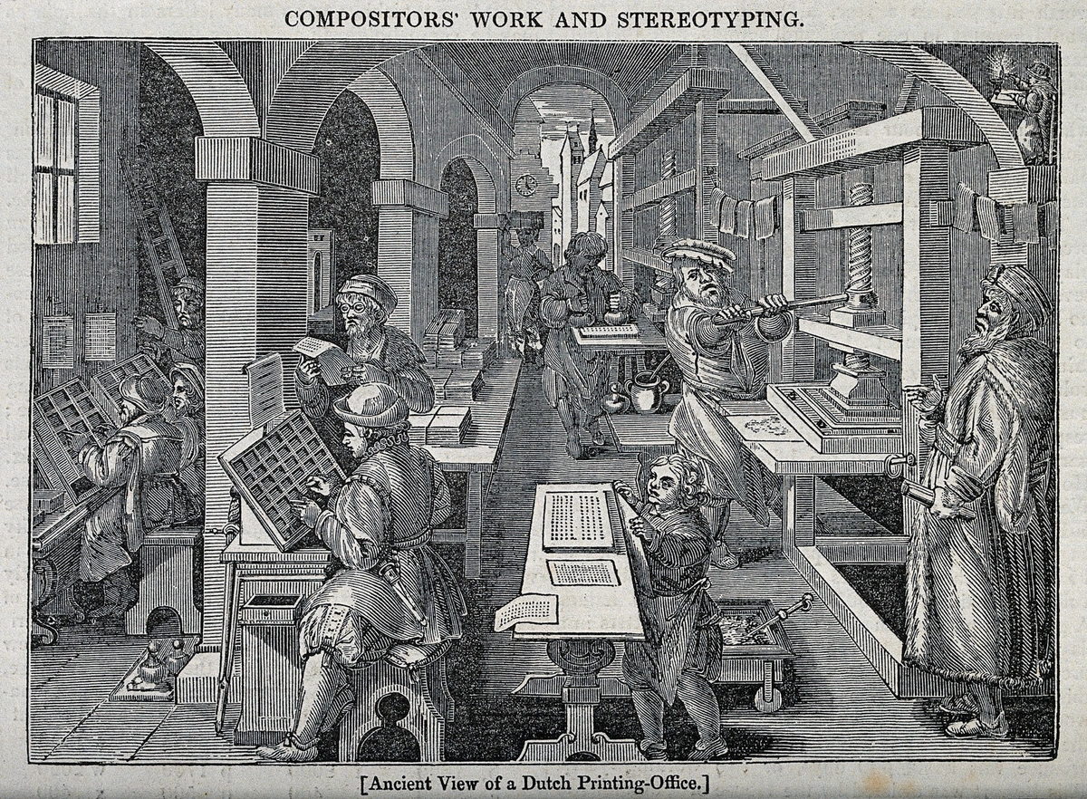
Linocut is a fascinating cousin to the much older art of woodcut printing. While woodcut roots stretch back centuries, notably in Japan with the intricate Ukiyo-e woodblock prints that captured everything from everyday life to dramatic landscapes, linocut arrived much later, in the early 20th century. Think of the intense, expressive lines you see in historical pieces, like the powerful woodcuts by Edvard Munch, which conveyed profound emotion.

But here's where linoleum (originally invented as a flooring material in the 1860s) offered a game-changer: unlike wood, which has a stubborn, directional grain that artists often had to incorporate into or fight against in their designs (sometimes leading to splintering or resistance, especially when carving against the grain), linoleum provides a smooth, grain-free surface. Artists quickly realized this made it perfect for carving in any direction, allowing for incredibly fluid, sweeping lines and intricate details that were much harder to achieve with wood. This smooth surface immediately democratized printmaking, taking it out of specialized workshops and bringing it into art schools and even kitchen tables across the globe.
Its accessibility and affordability of materials and less specialized tools made it a potent democratizing force in printmaking by the early 20th century. It became a favorite in art schools and featured prominently in early Expressionist works; artists like Ernst Ludwig Kirchner, Emil Nolde, Henri Matisse, and Pablo Picasso embraced its versatility for their bold forms and vivid expressions. Consider the raw power and social commentary in prints by Käthe Kollwitz, who used relief printing to depict human suffering and social injustice with stark, compelling lines. During wartime, its affordability and ease of use even saw it employed for propaganda posters by organizations like the WPA (Works Progress Administration), conveying public health messages, promoting national unity, or encouraging specific behaviors, cementing linocut's role not just as 'art' but as a powerful medium for communication and social commentary.
In recent years, linocut has experienced a massive resurgence in popularity, especially with the rise of DIY culture and online art communities. It offers a tangible, hands-on counterpoint to our increasingly digital lives, and for me, that connection to the physical process is incredibly appealing.
Your Linocut Launchpad: What You Actually Need (And What Can Wait)
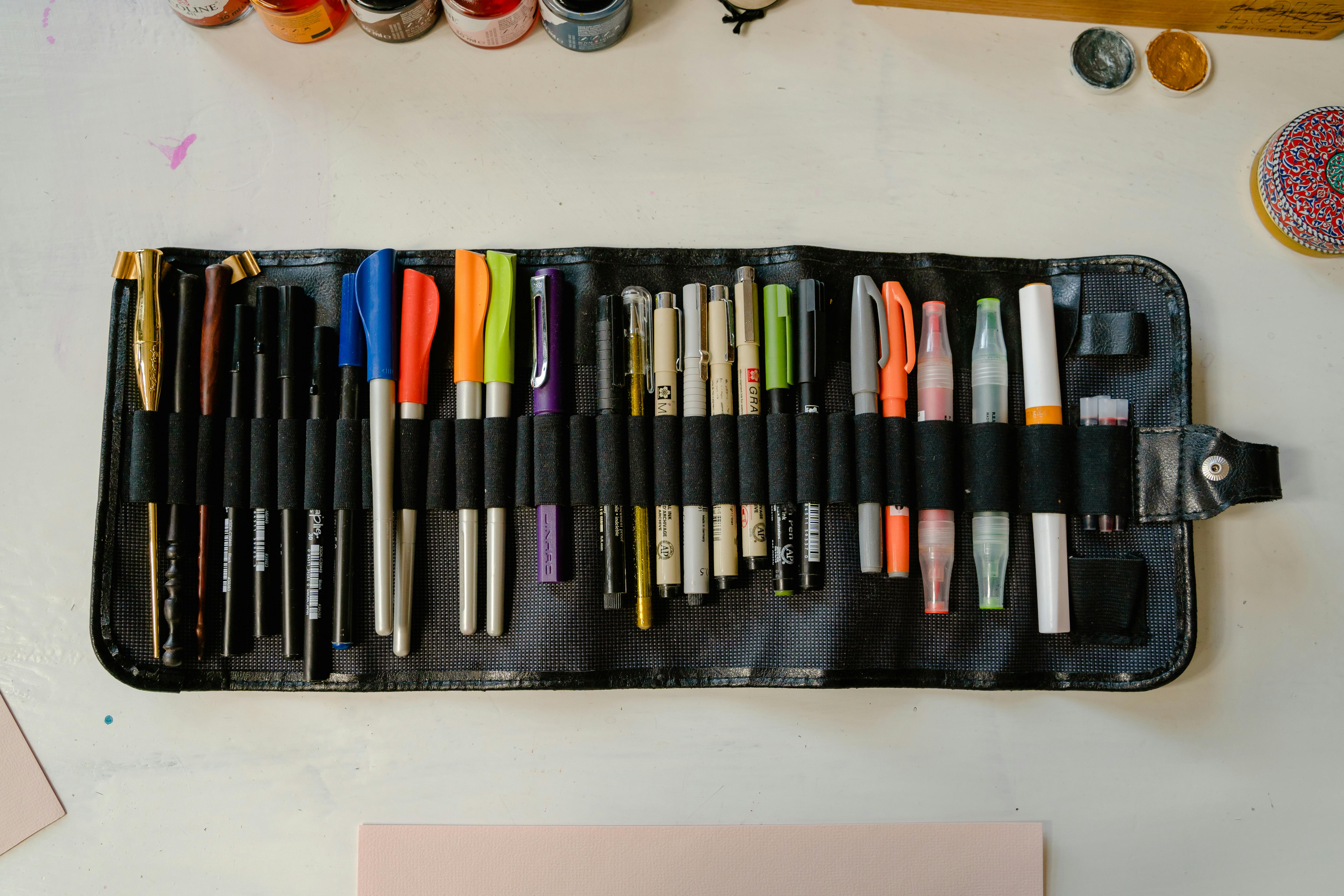
Walking into an art store can feel utterly overwhelming, I know. It's like a siren song of endless possibilities and immediate budget concern. Let's cut through the noise and get you started on your linocut journey without breaking the bank. Here’s a breakdown of what you absolutely need versus what’s nice to have later, with some insights I've gathered over the years while wading through my own piles of supplies. Remember, for a more comprehensive list of tools beyond just linocut, check out my guide on essential supplies for relief printmaking.
Item | Must-Have or Nice-to-Have? | My Two Cents | Where to Find It |
|---|---|---|---|
| Linoleum Block | Must-Have | For your first prints, absolutely start with a soft-cut block (often light grey, pink, or blue, sometimes called 'easy-carve' or 'speedy-carve'). They carve like butter, are incredibly forgiving, and reduce hand strain, making them ideal for beginners. If you skip this, you’ll likely be fighting your material rather than creating. Traditional brown linoleum is durable and can hold intricate detail, but it’s much tougher to carve and often requires gentle warming to soften (it can be brittle when cold). Many seasoned artists appreciate its slight resistance and durability for archival works. Consider rubber or vinyl blocks for ultimate ease and fine detail; they are exceptionally soft but may not offer the same traditional feel or long-term archival quality (resistance to fading, yellowing, and deterioration over time, ensuring your prints last for decades or centuries). Blocks can be mounted on wood or unmounted; mounted blocks offer stability, while unmounted are more flexible and often cheaper. | Art Supply Stores, Online |
| Carving Tools (Gouges) | Must-Have | A basic starter set, usually with a comfortable handle and interchangeable V- and U-shaped blades, is perfect. These are essential for cutting into your block; without them, there's no print! As you progress, you might explore specialized gouges like wider U-shapes for clearing large areas, or spoon-shaped tools for smooth, shallow cuts. Look for carbon steel blades for durability and sharpness – dull tools are actually more dangerous as they demand more force and are prone to slipping. For beginners, a comfortable, ergonomic handle can prevent fatigue. Traditional mushroom-shaped handles offer great control but require more wrist strength. And please, please, learn how to sharpen your tools regularly; it truly makes all the difference in control, precision, and safety! I've learned this the hard way more times than I care to admit. | Art Supply Stores, Online |
| Relief Printing Ink | Must-Have | For beginners, water-based ink is your absolute best friend. It’s non-toxic, water-soluble (meaning super easy cleanup with just soap and water!), and dries quickly (touch-dry in minutes, fully cured in a day or two). Using regular paint won't work well; it often won't adhere or transfer properly. Oil-based ink provides richer pigments, exceptional lightfastness (resistance to fading), and longer open times (dries through oxidation, not evaporation, giving you more working time), making them the choice for professional, archival prints. However, they require mineral spirits or specialized cleaners for cleanup and have a longer drying time – sometimes days or even weeks for a full cure. Brands like Caligo Safewash offer oil-based inks that clean up with soap and water, bridging the gap. If you opt for traditional oil-based inks and find them too stiff, a 'softening medium' or a tiny drop of linseed oil can help. Look for inks labeled 'lightfast' if longevity is important. | Art Supply Stores, Online |
| Brayer (Ink Roller) | Must-Have | A small, hard rubber brayer is your essential tool for applying a thin, even layer of ink to your block. Get one that’s roughly the width of your block. Without it, you'll inevitably end up with patchy prints or details filled with too much ink. A brayer that’s too hard or too soft can also lead to uneven ink distribution and that dreaded 'speckled print' effect. Experiment with different durometers (hardness levels) as you advance; a softer brayer might pick up more texture from the block, while a harder one gives a smoother application. | Art Supply Stores, Online |
| Inking Plate | Must-Have | This is simply a non-porous, perfectly flat surface to roll your ink on. A sheet of glass (with sanded edges!), plexiglass, or even a smooth ceramic tile works perfectly. Trying to roll ink on paper or a porous surface will waste ink, make consistent application impossible, and generally be a sticky nightmare. I've even used an old, clean cookie sheet in a pinch! | Hardware Store, Art Supply Stores |
| Paper | Must-Have | You don't need fancy paper to start, but the right paper significantly impacts your print. A smooth, medium-weight paper (around 80-120 gsm, sometimes labeled 'text weight' or 'cover weight') works well for practice. Even good quality copy paper can be surprisingly effective for initial tests. For finer prints, explore high-quality options: Japanese papers like Kozo or Gampi (known for their delicate texture from long fibers, exceptional strength, and excellent ink absorption without bleeding), or heavier cotton rag papers like Stonehenge or Rives BFK (for rich ink absorption and durability, thanks to their absorbency and subtle tooth). The key is finding a paper that readily picks up ink without tearing or losing detail, and for archival prints, ensuring it's acid-free to prevent yellowing or deterioration over time. | Art Supply Stores, Craft Stores, Online |
| Barren or Wooden Spoon | Nice-to-Have | A barren (a Japanese tool) is designed to apply even pressure to the back of your paper during printing, distributing pressure consistently over your image. Honestly, the back of a sturdy wooden spoon works just as well when you're starting out; many seasoned artists still prefer its tactile feedback and affordability, though a barren does provide more uniform pressure for consistency across an edition. It's not strictly necessary for a first print but makes the process cleaner and more consistent. | Art Supply Stores, Kitchen |
| Bench Hook | Nice-to-Have | This ingenious device is a game-changer for safety. It holds your block steady while you carve, keeping it from slipping and crucially directing your carving tools away from your body. You can use a non-slip mat, but a bench hook offers superior stability and comfort, making carving significantly safer and more comfortable. If you’re serious about protecting your fingers, this is a wise investment – trust me, a trip to the emergency room isn't part of the creative process you want! | Art Supply Stores, Online |
| Transfer Paper or Stylus/Pencil for Transfer | Must-Have | Essential for accurately transferring your intricate designs or text to the block. You can use graphite transfer paper (carbon paper for artists), rub the back of your printed design with a soft pencil or charcoal and then trace over it, or even use spirit gum for a more durable, permanent transfer. The pencil/charcoal method is great for testing as it's erasable, while graphite paper offers clean lines. Spirit gum is fantastic for complex designs you don't want to smudge. Without it, you’re freehanding everything, which is fine for abstract marks, but challenging for precision. | Art Supply Stores, Online |
| Ink Scraper/Palette Knife | Nice-to-Have | For efficiently gathering ink on your plate, spreading it, and cleaning it off later. A basic plastic scraper or an old credit card works wonders. It makes cleanup much easier and minimizes ink waste, which (trust me) you want to do! | Art Supply Stores, Online |
With your essential tools in hand, you're now truly ready to embark on the exciting journey of transforming a blank block into a captivating print. This is where the magic really begins to unfold, and your vision starts to take tangible form. Let's make some art!
The Linocut Process: From Idea to Impression
Alright, let’s get our hands dirty. This is the fun part, the meditative journey where your vision begins to take tangible form. We're going to break it down into four simple stages, each with its own rhythm and focus.
Preparing Your Block for Action
Before you even think about your design, a quick check of your linoleum block can save you a lot of headaches later. Is it warped? This can happen due to temperature or humidity changes, leading to uneven ink transfer and patchy prints. You can often flatten it by placing it under heavy books for a day or two. If you're using traditional brown lino, which can be quite hard and brittle, a common trick is to gently warm it (e.g., on a heating pad, a warm window sill, or even with a hairdryer on a low setting for a few minutes). The goal is to make it slightly pliable, not hot to the touch, which makes carving smoother and less prone to chipping. Just don't overheat it, as it can melt or distort! If your block has any minor surface imperfections or isn't perfectly flat, a light sanding with fine-grit sandpaper (around 220-400 grit) can help ensure a truly smooth and receptive surface for carving and even ink distribution. Once your block feels right, it’s time to bring your creative vision to life on its surface.
Step 1: The Idea and the Sketch – Designing Your Vision
Every print begins with an idea. For your first print, please don't overthink it. Simple, bold shapes work best. Think about easy botanicals, simple animal silhouettes, abstract geometric patterns, or bold letters. Remember, and this is crucial for linocut, you are carving away what won’t show up, and the raised parts are your image. The interplay of positive and negative space is absolutely key here – it’s a concept that will truly transform your printmaking. Think of the shape you draw as the positive space, and the background around it as the negative space. In linocut, you're carving away the areas you don't want printed (the negative space), leaving the raised areas as your image. A good way to visualize this is to imagine your lino block as a cookie cutter: what you remove is what will remain the color of your paper, and what you leave is what will hold the ink. Good composition and understanding design principles are vital, even on a small block.
Design Considerations for Linocut Beginners
- Simplicity is Your Superpower: For your initial prints, embrace bold shapes and clear, defined lines. Intricate details can be frustrating and overly time-consuming when you're just starting out. Try a simple geometric pattern, a single large leaf, or a clear silhouette of an animal.
- Contrast is Your Best Friend: Focus on creating strong visual differences between the inked (printed) and un-inked (carved away) areas. High contrast makes your image pop and is significantly easier to achieve with fewer carving variations.
- Mind the Edges: How will your design interact with the edge of the block? Will it bleed off the page, or will there be a clear border? Planning this early will save you re-carving frustration.
- Text and Asymmetrical Designs – The Mirror Rule: Always, always remember the mirror image rule! Any text or designs that are not symmetrical must be transferred onto the block as a reverse (mirror) image, or they will print backward. I once carved a beautiful block only to realize (after the first print) that it said "EMOH" instead of "HOME". Now it hangs in my studio as a permanent (and slightly embarrassing) reminder of that fundamental rule. Seriously, if you want your 'P' to look like a 'P', you need to carve it backward on the block. Think about what your image will look like when it's flipped horizontally.
Once you have a sketch you're happy with, you need to transfer it to the block. You can draw directly on the lino with a pencil, or use transfer paper (like graphite transfer paper). Another method is to print your design (reversed!) onto thin paper, then rub the back of the print with a soft pencil or charcoal, and finally trace over it with a stylus or firm pencil to transfer the image. For very intricate designs or text, spirit gum can provide a very durable transfer. Many artists also use digital tools like Procreate or Photoshop to finalize their design before printing it out as a mirror image for transfer.
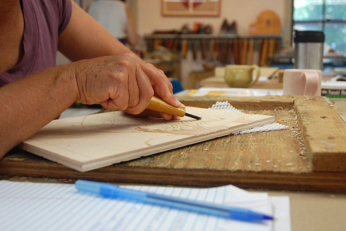
Step 2: The Art of the Carve – Letting Your Image Emerge
This is the meditative, almost surgical part, where the block slowly reveals your image from beneath the surface. But first, safety is paramount. Always, always carve away from your body, and keep your non-carving hand behind the tool's path. A slip can result in a nasty cut, trust me; I've had my share of minor mishaps! If you have a bench hook, use it; it dramatically increases stability by providing a lip for your block to brace against, keeping it steady while you push your gouge. And honestly, it’s never a bad idea to keep a small first-aid kit nearby, just in case. Consider protective eyewear when carving fine details, especially with brittle lino, as small chips can fly.
Your carving tools do different things, and mastering their nuances is key to expressive carving:

- V-gouge: This is your detail specialist, excellent for sharp, fine lines, precise outlines, and delicate details. Think of it like a fine-point pen or a scalpel. You can use its sharp edge for cross-hatching (parallel lines that create tonal variation, mimicking shading) or stippling effects (dots). Experiment with varying the angle at which you hold the V-gouge; a steeper angle creates a deeper, narrower line, while a shallower angle yields a wider, more delicate cut. Play with varying pressure for dynamic lines. Varying the depth of your V-gouge cuts will also dramatically impact the visual weight of your lines.
- U-gouge: Best for clearing larger areas of negative space and creating bolder, broader marks. Different sizes of U-gouges allow for varying widths of cleared space. A wider, lobed, or spoon-shaped gouge is fantastic for smoothly hollowing out bigger sections, removing large swathes of negative space with efficiency. You can also use a small U-gouge for stippling or dot patterns. Experiment with tilting the U-gouge slightly for a scraped texture versus a direct, smooth plunge – these subtle variations add character to your prints.
Start by outlining your main shapes with a V-gouge. This sets the boundaries for your image. Then, use the U-gouge to clear away the negative space. The goal is to carve away the areas that will remain the color of your paper. Don't worry about making every carved area perfectly smooth; the texture of your carving marks can actually add character and visual interest to your prints. As you gain experience, you'll discover how varying carving depth and leaving subtle textures can add complexity and visual interest. Shallower cuts can create lighter tones or more subtle textures, while deeper cuts will result in stronger shadows and more pronounced white space. Finding the rhythmic scrape of the gouge through the lino can be incredibly meditative – a true escape.
Remember, sharp tools are crucial. Dull tools require more force, leading to slips and frustration, which are both dangerous and counterproductive. Make sure to sharpen your tools regularly – it's a small investment of time that pays off hugely in control, safety, and the quality of your cuts! And don't forget to take frequent breaks to avoid hand fatigue and potential repetitive strain injury (RSI).
Step 3: Inking Up – Getting Ready to Print
Squeeze a small, pea-sized amount of ink onto your inking plate. Now, take your brayer and roll it through the ink—up, down, left, right, in figure-eights, or overlapping strokes—until you have a thin, even, slightly tacky layer on the roller. You're listening for a specific, satisfying sound: a gentle hiss like frying bacon, fresh Velcro, or the subtle whisper of ink distributing evenly. If it’s too sticky and makes a squelching sound, you likely have too much ink. If it sounds silent or looks patchy, you need more. Believe it or not, the weather plays a role! Hot or humid days can make your ink a bit too runny or sticky, potentially requiring more rolling to thicken it slightly or adding a touch of magnesium carbonate for oil-based inks. On very dry days, water-based inks might dry on your block too quickly. This is where intuition and practice truly come into play – you'll learn to feel when the ink is just right. A quick tip: roll your brayer onto a scrap piece of paper to check for consistency before applying to your block.
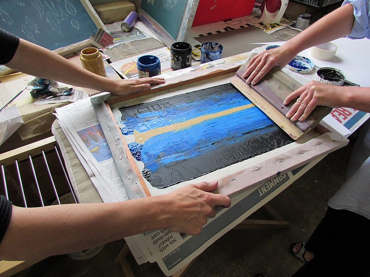
Once your brayer is evenly coated with that perfect, thin layer, roll it across your carved block. Apply gentle, even pressure and roll in a few different directions (horizontally, vertically, diagonally) to ensure the entire raised surface of your design is covered. The goal is a uniform, thin layer of ink – enough to transfer vibrant color, but not so much that it fills your delicate carved details. It’s a delicate balance, but oh so satisfying when you get it just right.
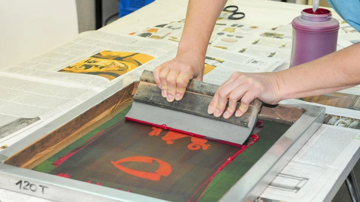
Step 4: The Moment of Truth – Pulling Your Print
Carefully place your chosen paper on top of the inked block. Now, you need to transfer the ink from the block to the paper. Using your barren (a domed, flat-bottomed tool designed to apply even pressure) or the back of a sturdy wooden spoon, rub the entire surface of the paper in small, circular, overlapping motions. Apply medium-firm, consistent pressure – think of a steady, even rub rather than a forceful, uneven press – across the entire surface of the paper. You’ll often start to see the faint impression of your design coming through the back of the paper, which is a good sign that enough pressure is being applied. This tactile, physical process is part of the magic of relief printmaking; you’re physically coaxing the image onto the page. For multi-color prints, establishing registration marks is crucial. These are simple guides, like pencil lines on your printing surface or small paper tabs, that help you align your paper perfectly for each subsequent layer, ensuring your colors don't shift.

When you think you're done, take a deep breath. Gently peel one corner of the paper back to check your progress. If it looks good, peel the whole thing off slowly and deliberately. And there it is. Your first print! Don't expect machine-like perfection. Expect character, expect the unique trace of your hand. The slight imperfections are what make it handmade and beautiful, a true reflection of the process. I remember the sheer delight of pulling my first 'decent' print, flaws and all – it was pure magic! That first reveal is often a mix of triumph and slight surprise, and it's a feeling you'll chase forever.
Once you’ve made your first successful print, you might be tempted to make more – and you should! This is where the concept of an edition comes in. Artists often create a series of identical prints from a single block, each numbered (e.g., 1/10, 2/10, indicating the print number out of the total edition size) and signed. To ensure consistency across an edition, artists often use registration marks – small, simple guides on the paper or printing surface (like pencil lines or corner guides) that help align each subsequent print perfectly. You might also create 'Artist's Proofs' (AP), which are initial prints kept by the artist, often outside the numbered edition, used to test colors or techniques before committing to the full edition. Aim for consistency across your edition, but always appreciate the unique, subtle variations that make each handmade print truly special. Proper drying and curing are also essential; water-based inks typically dry to the touch in minutes but take a day or two to fully cure, while oil-based inks can take days or even weeks to fully dry through oxidation, requiring prints to be laid flat in a dust-free environment.
Common Mistakes I've Made (So You Don't Have To)
We all make mistakes, especially when venturing into a new craft. I've certainly had my fair share of linocut mishaps, from ink on the ceiling to designs that looked completely alien on paper. Here’s a table of common linocut troubles and how to troubleshoot them, all learned through personal experience and a fair bit of trial and error (and a lot of soap and water).
Mistake | What it Looks Like & Likely Cause(s) | Solution(s) |
|---|---|---|
| The Speckled Print | Tiny, unwanted dots of ink appearing in carved-out (negative) areas. Caused by too much ink, brayer not perfectly clean, ink filling fine details, or ink being too thick. | Use less ink and roll it thoroughly on your inking plate until you hear that consistent hiss. Ensure your brayer is spotless. If using oil-based ink that's too fluid, a tiny bit of magnesium carbonate can stiffen it, but usually, it's an inking technique issue – aim for a very thin, even layer. |
| The Patchy Print | Areas of your design are missing ink, appearing faded or entirely white where they should be printed. Caused by not enough ink, insufficient or inconsistent pressure during printing, warped block, or paper not making good contact. | Apply more ink (aim for the 'hiss'!). Rub harder and more consistently with your barren/spoon, ensuring pressure across the entire print area. Always check that your block is flat before you start carving. Lightly dampening certain papers can sometimes aid ink pickup, but test first, as over-dampening can cause sticking. |
| "Islands" Left Behind (Unwanted Spots) | Small, uncarved bits of linoleum appearing as dark spots within what should be the white (negative) space of your print. Caused by small bits of linoleum missed during carving, or areas not carved deep enough. | Scrutinize your block before inking with good light. If small, carefully trim with a craft knife after a test print. Ideally, catch these during the carving phase by holding your block up to the light to spot uncarved areas. |
| Paper Sticking to the Block | Your paper adheres to the inked block and resists peeling off cleanly, sometimes tearing. Caused by highly absorbent paper, too much ink, block not fully dry after cleaning, or high humidity. | Try less absorbent paper. Use less ink. Ensure your block is completely dry after cleaning. Some papers benefit from very light pre-dampening (not soaking!) to aid ink pickup, but overdoing it can exacerbate sticking. Work in a less humid environment if possible. |
| Uneven Inking on the Brayer | The brayer shows areas with too much ink and others with too little, leading to inconsistent ink transfer to the block. Caused by not rolling evenly on the inking plate, or not enough ink initially spread. | Practice rolling until you hear that consistent 'hiss' across the entire width of the brayer. Start with enough ink to cover the brayer evenly and work it back and forth in multiple directions on the inking plate. |
| Faint Prints Despite Pressure | The printed image appears weak or translucent even after applying significant pressure. Caused by too little ink, paper not making good contact, paper type unsuitable for printmaking, or ink being too thick/old. | Ensure absolutely even and sufficient ink application. Apply consistent, firm pressure. Consider lightly dampening (not soaking) certain papers to help pick up ink better. If using oil-based ink that's too thick or old, a single drop of linseed oil (or a dedicated ink extender) can thin it slightly. |
| Muddy Prints (Multi-color) | Colors bleed into each other or create dull, unintended mixtures in multi-color prints. Caused by over-inking, mixing too many colors on the block without adequate cleaning, poor registration, or ink drying too slowly between layers. | Use thin, even layers of ink. Ensure each layer is completely dry before adding the next. Improve registration precision (more on this in the FAQ below) to prevent colors from overlapping unintentionally. Learn basic color theory to avoid colors that create mud when combined (e.g., mixing too many primaries without intent). |
| Smudging or Blurring | The lines or details of your print appear fuzzy, smudged, or indistinct. Caused by moving the paper during printing, insufficient drying time before handling, rubbing too hard or unevenly. | Ensure your paper is perfectly still once placed on the block. Allow prints to dry completely before stacking or handling (this can take days for oil-based inks!). Apply pressure evenly with your barren/spoon, avoiding horizontal drags or shifts. |
Frequently Asked Questions (FAQ)
Linocut often sparks a lot of questions, especially for those just starting out. Here are some of the most common ones I hear, and my best attempts at straightforward answers.
Is linocutting difficult for beginners? Not at all! Linocut is widely recognized as one of the most accessible forms of printmaking, and that's precisely why I love it. The initial learning curve is mostly about getting a feel for the tools and the right pressure. Start simple, focus on bold shapes, and you'll build confidence quickly. Don't aim for machine-like perfection right away; aim for the joy of creation! It's truly about the process, the tactile connection, not just the pristine result. You’ll be surprised how quickly you develop a knack for it.
What's the difference between linoleum and woodcut? The main difference lies in the material. Lino is typically softer, denser, and, crucially, doesn't have a grain. This makes it much easier to carve smooth, flowing lines and intricate details in any direction without resistance. Wood is harder, and its natural grain can be incorporated into or dictate the design, creating directional marks and giving prints a more rustic, organic feel. Lino is generally more beginner-friendly due to its forgiving nature and lack of grain, making it easier to achieve precise lines without fighting the material. Historically, woodcut predates linocut by centuries, with woodcut printmaking having a rich tradition.
How do I clean my linocut supplies? If you're using water-based ink (and I really, really recommend this for beginners!), it's a breeze. Just wash your block, brayer, and inking plate with warm water and a little dish soap right after you're done. Don't let the ink dry on your tools, as it becomes much harder to remove. For oil-based inks, you'll need mineral spirits or a specialized printmaking cleaner (some newer oil-based inks are water-washable, like Caligo Safewash). Always use plenty of rags and dispose of solvent-soaked rags properly according to local guidelines, usually by soaking in water and then air-drying outdoors before discarding to prevent fire hazards. And hey, consider wearing gloves to keep your hands clean from oil-based inks – my nails have seen better days from neglecting that advice!
Can I make multi-color linocut prints? Absolutely, and it's incredibly rewarding! The most common method for multi-color linocut is the reduction method (also known as 'suicide printmaking' because you irreversibly carve away the block). Here, you carve and print your first (often lightest) color from a single block. Then, you carve more away from that same block, and print the next color on top of the first layer, on the same paper. This progressive carving away demands meticulous planning, often mapping out color layers from lightest to darkest, and utilizing precise registration marks for accurate alignment of each layer. Crucially, once you carve away a section in the reduction method, you cannot go back and add detail from that layer. You can also use multiple blocks, one for each color (this is often simpler for beginners learning multi-color printing), though it still requires accurate registration and, of course, more blocks. Another method is key block printing, where a single block (the key block) outlines the main design, and separate blocks are carved for each color, typically printing after the key block.
What's the difference between water-based and oil-based ink, and when should I use each? This boils down to preference and project needs. Water-based inks are quick-drying (usually touch dry in minutes, fully cure in a day or two), non-toxic, and clean up easily with water, making them ideal for beginners, classroom settings, and casual projects where quick turnaround is desired. Their lightfastness (resistance to fading) can vary, so check the label if archiving is a concern. Oil-based inks offer longer working times (important for complex layering or large prints), richer pigments, and superior lightfastness, making them the preferred choice for professional, archival prints that need to last centuries. They require mineral spirits or specialized cleaners for cleanup, typically have a more intense odor (ensure good ventilation!), and a significantly longer drying/curing time (days to weeks). Your choice depends on your project's longevity needs, cleanup preferences, desired working time, and budget.
How do I choose the right size linoleum block for my project? Start small, seriously! A 4x6 or 5x7 inch block is absolutely perfect for a first project. It's manageable for carving, uses less paper and ink (reducing waste), and allows you to practice without a huge commitment of time or materials. As you gain confidence and skill, you can definitely move on to larger sizes. Always consider the final size of your desired print and how it will be displayed; a series of small, well-executed prints can be far more impactful than one large, unfinished piece.
Can I carve on the back of a linoleum block? Yes, absolutely! Especially with traditional brown linoleum, both sides are often identical and equally carvable. This is a fantastic way to get two distinct prints from one block or to experiment without immediately buying a new block. Soft-cut blocks are usually only meant to be carved on one side (they often have a sticker or a different color backing), but it never hurts to check. Just make sure it’s a completely fresh, unblemished surface.
How do I store my linocut prints and blocks? Once your prints are thoroughly dry (water-based inks dry to the touch in minutes but cure in a day or two; oil-based can take days or even weeks!), store them flat in an archival portfolio or box. Separate each print with glassine paper or acid-free tissue paper to prevent sticking, smudging, and protect them from dust and light. Avoid direct sunlight and extreme humidity to prevent fading and warping. For your carved blocks, wrap them in acid-free paper or cloth, store them flat, and keep them away from extreme temperature or humidity fluctuations to prevent warping, cracking, or deterioration of the lino. Label them clearly with the design name and date; future you will thank you!

What are the safety considerations when carving linoleum? This is crucial, so listen up! Always carve away from your body. Keep your non-carving hand behind the tool, never in front of the blade's path – I can't stress this enough. Use a bench hook or a non-slip mat to keep your block steady and secure. Sharp tools are inherently safer than dull ones, as they require less force and are less likely to slip. Take frequent breaks to avoid hand fatigue and the risk of repetitive strain injury (RSI), which will lead to slips. If you’re using oil-based inks and solvents, ensure good ventilation in your workspace (open windows, use a fan). Consider wearing protective eyewear, especially with traditional linoleum, as small, brittle chips can fly. And yes, as I mentioned earlier, a small first-aid kit nearby is always a good idea, just in case!
How do I achieve different textures in my prints? Experimentation is your best friend here! Your V-gouge can create fine lines, cross-hatching (parallel lines for tonal variation, mimicking shading), or stippling (dots with a sharp point or small U-gouge for a grainy effect). A U-gouge can create broader textures or clear larger areas. You can also use the side of a U-gouge for a scraped or brushed texture. Leaving some carving marks visible adds a rustic, handmade feel, while meticulously clearing areas creates smooth, stark whites. Varying carving depth also profoundly influences texture; shallower cuts leave a subtle tone, while deeper cuts will result in stronger shadows and more pronounced white areas. Even the texture of your brayer and the subtle pressure you apply can influence the final print's texture. It’s all about playing with your tools and seeing what happens!
What is a relief printing press, and do I need one? A relief printing press applies consistent, even pressure to transfer the ink from block to paper, resulting in very uniform prints. They are especially useful for larger editions, complex multi-color work, or if you experience hand fatigue from hand-rubbing. While professional printmakers often use them, for linocut, a barren or even a sturdy wooden spoon works perfectly well for beginners and small editions. You absolutely don't need one to start, but it can be a rewarding upgrade later on if you're looking for ultimate consistency, speed, and reduced physical effort. Many beautiful linocuts have been made with just a spoon!
Beyond the Basics: Advanced Techniques and Inspirations
Once you’ve mastered the fundamentals of carving and printing, a whole new world of linocut possibilities opens up. You’ve already touched on multi-color prints with the reduction method (also known as 'suicide printmaking' because you irreversibly carve away the block). This method demands meticulous planning, often mapping out color layers from lightest to darkest, and utilizing precise registration marks for accurate alignment. But there's so much more to explore!
Chine-Collé: This elegant technique involves adhering a thin, often delicate piece of paper (like Japanese tissue paper, colored craft paper, or even newspaper clippings) to your main printing paper during the printing process itself. It adds subtle texture, color, and depth, allowing you to incorporate different surfaces and visual elements into a single print. The magic happens because the thin paper, combined with a thin layer of adhesive (like wheat paste, PVA glue, or a glue stick), the ink, and the pressure of printing, all bond it to the heavier printing paper in one go. It’s a beautiful way to add unexpected elements and nuanced layers to your work, and truly expands the possibilities of mixed media printmaking.
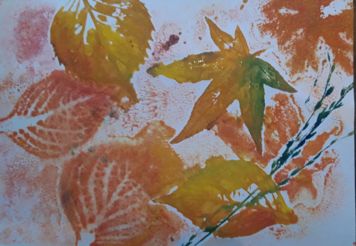
Monoprinting with Linoleum: Your carved block doesn't just have to produce identical editions. It can also become a starting point for unique, one-of-a-kind monoprints. Instead of just inking the raised surface, you might ink the entire block and wipe away areas to create painterly effects, or paint directly onto it using oil pastels, acrylics, or ink washes. This allows for spontaneous color blending and unique textures that can never be exactly reproduced. It's a fantastic way to blend printmaking with the spontaneity of painting and drawing. You could even explore related techniques like collographs (prints made from collaged plates, where textures are built up) or monotypes (one-off prints where the image is painted directly onto a non-absorbent surface and then transferred to paper).
Thinking in Negative Space: As you grow as a printmaker, you'll find yourself consciously designing not just the shapes you want to print, but the shapes you carve away. The negative space becomes just as powerful as the positive, often defining the rhythm, tension, and overall impact of your piece. It’s a mental shift that truly elevates your printmaking, allowing you to see and utilize the dynamic white space you create around your forms as an active contributor to the overall composition.
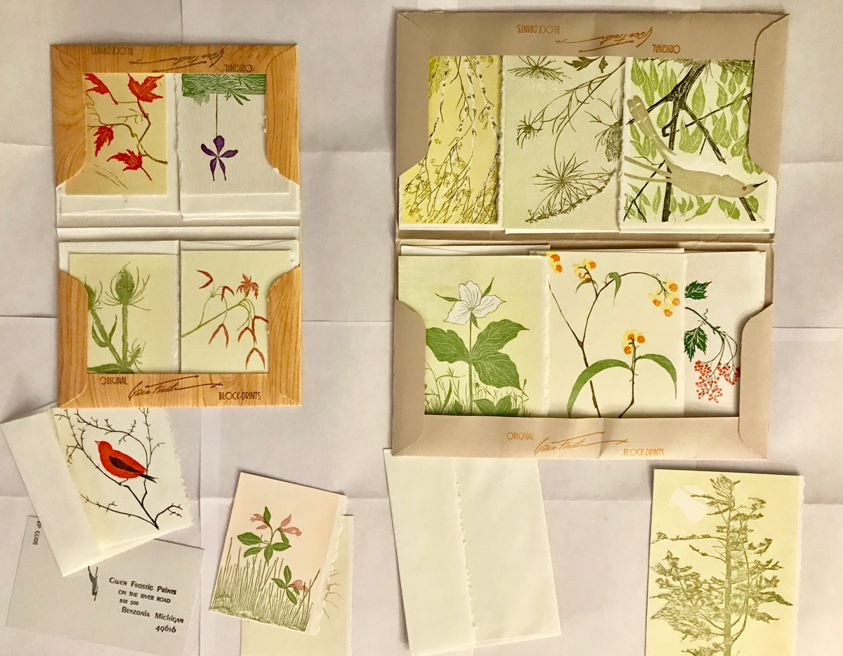
Linocutting for Specific Purposes: Beyond fine art prints, linocut is incredibly versatile. You can create unique stamps for personalizing stationery or fabric, design bold textile prints on clothing or home goods, or even produce distinctive book illustrations and greeting cards. Each application encourages a slightly different approach to design and technique, opening up endless creative avenues.
The tactile nature of linocutting, the very act of carving and pressing, offers a unique and grounding counterpoint to our increasingly digital world. While many artists (myself included!) use digital tools for planning and design mock-ups, the physical connection to the material is what makes linocut so profoundly rewarding. It's a truly hands-on mixed media experience, allowing for a depth of engagement that a screen simply can't replicate.
A Final Thought: The Enduring Appeal of the Handmade
Linocut printing isn't about achieving machine-like perfection. In fact, if you're chasing flawless, sterile outputs, you might find yourself frustrated. Instead, it's about the process itself – the satisfying scrape of the tool in your hand, the gentle hiss of the brayer, the anticipation, and the little surprise (sometimes a glorious one, sometimes a comical one!) every time you pull a print. Each print will be slightly different, a unique record of that specific moment, a tangible piece of your creative journey. It’s a beautiful dance between control and letting the material surprise you, a raw, honest conversation with your chosen medium.
This embrace of imperfection, of the inherent mark of the hand, is something I deeply value in my own artistic practice. It's this direct, unmediated connection to the material that flows through the vibrant, often abstract work that emerges from these hands-on processes. Mastering linocut, as this guide has hopefully shown, is a journey of exploration, balancing technical understanding with pure intuition. Don't be afraid to experiment, try different tools, and let your unique vision guide your hand.
In a world increasingly focused on transient digital experiences, creating something physical, something that holds the undeniable trace of your hand, is a powerful act. And while the digital realm has introduced concepts like NFTs for authenticating digital art, the enduring appeal of a physical, handcrafted print remains timeless – accessible, tangible, and deeply personal. The value of a linocut lies firmly in its physical presence and the artist's hand, offering a distinct counterpoint to the often ephemeral nature of digital marketplaces. It also means you can create multiple original artworks (an edition!), making your art accessible to more people, much like a limited edition print series. The beauty of linocut lies not just in the final image, but in the compelling story of its making.
These hands-on techniques, with their imperfections and directness, are what inspire my own approach to art. If you get hooked and want to see how these kinds of tactile processes influence my own vibrant, abstract work, you can explore some final pieces over on my buy page or delve into my artistic timeline on my timeline page. I truly hope this guide helps you on your own linocut adventure – welcome to the world of printmaking!
credit, licence
credit, licence