
The Painter's Guide to ASTM: Make Your Art Last
Learn how ASTM guidelines empower you to protect your art. A practical, personal guide on storage, handling, and display based on concrete conservation science.
Your Art Isn't Fragile. You Just Need the Right Rules: A Painter's Guide to ASTM
I tripped over a plastic bucket of iridescent white many years ago and sent a half-finished canvas skidding into a puddle on my studio floor. In that moment I learned the first rule of art preservation: gravity is a constant. But the second rule? It took me another decade to learn that decay is just as much a constant, a slow-motion chemical reaction that begins the moment you declare a work finished. Most people look at a vibrant canvas and see color. I look at it and see oxygen whispering to the binder, humidity making the entire surface breathe. Ignore those silent conversations, and your bold reds turn to rusty whispers, your crisp whites become the color of old newspapers. The good news? We don't have to guess how to stop it. We have a playbook, and it's called the ASTM standards.
Most people look at a vibrant canvas and see color. I look at it and see a slow-motion chemical reaction. It's a living thing, you know. The light hits a pigment, oxygen whispers to the binder, and humidity makes the whole surface breathe. Ignore that, and your bold reds turn to rusty whispers, your crisp whites become the color of old newspapers. The good news? We don't have to guess how to stop it. We have a playbook, and it's called the ASTM standards.
This isn't just another layer of bureaucracy. It's a profound shift from creating something beautiful for today to engineering an object that will remain beautiful for generations. Consider the difference between a Polaroid and a platinum print, or an mp3 and a vinyl record. The intent may be the same, but one is an ephemeral record while the other is a deliberately crafted, enduring artifact. ASTM standards are the technical specifications for that artifact. They aren't limitations; they are the tools of time travel.

It’s about moving from the mindset of a weekend hobbyist to the disciplined practice of a professional archivist. When you use these standards, you’re not just painting a picture; you’re constructing an artifact meant to outlive you. You begin to think like a chemist, a conservator, and a future curator all rolled into one. Every choice, from the pigment you squeeze onto your palette to the backing board behind your frame, becomes a deliberate act of preservation. This is where art meets archaeology—you are literally encoding longevity into your work, layer by layer. It forces a fundamental shift in perspective: the moment you finish a piece, you must instantly become its first and most critical conservator. I began to see my own practice differently. Instead of just buying "red," I was sourcing a stable, proven chemical compound. I wasn't just "stretching a canvas"; I was engineering a stable substrate. This shift in mindset is the single most important step an artist can take.
The first time someone mentioned ASTM D4303 to me, my eyes glazed over. It sounded like something you'd find on the bottom of a spaceship's instruction manual. It felt cold, impersonal, completely detached from the passion of creation. But the truth, I've learned, is the exact opposite. These standards are the deepest expression of care an artist can offer their work. They are a formalized language of respect for the materials, the process, and the future viewer who will encounter your art long after you're gone. Adopting them is like learning a secret code—one that allows you to speak directly to the future stewards of your work.
The key insight, the one that transformed my entire practice, is realizing these standards are the ultimate form of artistic generosity. You are actively removing uncertainty for collectors and conservators who will steward your work. You are proving that your art isn't just an emotional outburst, but a considered, archival-grade object worthy of serious investment and preservation. It tells a collector, 'I built this to last, and I'm giving you the documentation to prove it,' which fundamentally changes the relationship from a simple transaction to a long-term partnership in preservation. In a world awash with transient digital content, the physically enduring object becomes a radical statement. Using these standards is a way to declare that your work is not content; it is an artifact.

This article is your translator for that language. Think of me as your guide through the unglamorous, essential lab coat territory of the art world—the place where passion meets permanence. We'll move from the lofty goal of preservation to the gritty, practical details of how it's done. We'll look at the science, the specific standards, the common mistakes, and the simple choices that separate a fleeting image from an enduring object. By the end, you won't just know what to do, you'll understand the fundamental physics and chemistry of why it matters, transforming you from a casual creator into a conscious guardian of your work. We'll even touch on digital considerations, like SEO for artists, because a lasting physical legacy deserves a lasting digital footprint.
Why Should I Listen to a Bunch of Technical Standards? (The Hidden History of Failure)
Let's clear something up. These standards weren't written by a committee of people in lab coats trying to take the 'art' out of 'artist'. They were written by a committee of people in lab coats who spend their lives doing autopsies on dead paintings. They're the forensic scientists of the art world, figuring out exactly why a vibrant canvas from 1950 is now flaking off its stretcher bars, or why that beautiful alizarin crimson is slowly eating itself from the inside out. This forensic science has catalogued every imaginable way art can "die," giving us a comprehensive playbook of failure so we can engineer success.
I once visited a conservation lab and saw a painting from the 1980s that looked like it had been left in a desert. The ultramarine blue had faded to a powdery gray, and the medium had yellowed, making the entire scene look jaundiced and sick. The artist had used a then-popular medium containing safflower oil, unaware that it was notoriously unstable. That single painting did more to convince me of the importance of these standards than a dozen textbooks ever could. Standards like ASTM D4303 exist precisely because of these public failures. The history of art conservation is, in many ways, a long and expensive public service announcement about material failure. This growing library of failures, codified by volunteers in the ASTM committees, gives us an invaluable gift: we don't have to learn these brutal lessons ourselves.
They are driven by failure. Each standard is a headstone for countless failed artworks, marking a particular way a material has learned to die. Think of them as a collective wisdom, a library of what not to do, compiled and cross-referenced over decades. For more on art's rich and complex history, you can explore the history of art guide. The standard itself, like ASTM D4236 for labeling hazardous materials, often comes from an incident where an artist suffered health problems because a manufacturer failed to disclose a dangerous ingredient. Another example is ASTM F2271, which governs the stability of digital prints, born from the heartbreak of early inkjet prints fading in just a few months, shattering the dream of digital permanence.
The entire endeavor is built on a foundation of failure. ASTM standards aren't abstract theories; they are direct, documented responses to specific, heartbreaking disasters. Every test for lightfastness exists because countless paintings faded into ghosts. Every rule about acid-free materials exists because generations of prints and drawings were destroyed by the very frames meant to protect them. Ever heard of "foxing," those ugly brown spots on old paper? It's often caused by metal particles and acidity in the paper. ASTM standards are how we fight back. This isn't about gatekeeping. It's about a community of experts codifying the hard-
won lessons of loss so the rest of us don't have to fall into the same traps. Part of this involves learning to see and define art objects more precisely, moving beyond subjective impressions.
There's a powerful economic incentive here too. A painting created with archival, rated materials commands a higher price because it carries less risk for the collector. When you adhere to these standards, you're not just ensuring longevity; you're demonstrating a professional practice that directly enhances the investment value of your work. It's a virtuous cycle: materials you can trust lead to art people want to buy and preserve. This assurance becomes an integral part of your brand as an artist.
The goal is prevention, not prescription. The standards don't tell you what to paint. They tell you how to ensure that whatever you paint will survive your great-grandchildren. It’s about giving you, the artist, complete creative freedom within a framework of enduring materials. You can paint the wildest, most chaotic abstract piece imaginable, but if you build it on a stable, archival foundation, you guarantee its survival without compromising your vision. They are guardrails, not chains.
The organization behind it all is ASTM International, a global body that creates a mind-boggling number of standards for everything from steel beams to skateboards. To the uninitiated, it can seem comically bureaucratic. But in our corner of the world, it's about one thing: creating a shared, unshakeable reality for art preservation. This global consistency is critical for artists whose work travels.
These standards are a common language of quality and stability for artists, conservators, and galleries. When a museum says a material is 'museum-grade,' what they often mean is that it conforms to the rigorous, long-term aging tests outlined in these very documents. Think of a museum curator shopping for a new work to add to their collection. They don't have time to run a fifty-year fade test. They rely on that ASTM designation as a pass-fail signal of a material's integrity. It's a handshake of trust between the maker, the seller, and the guardian of cultural heritage, ensuring professional art handling and storage practices.
This is your primary tool for professionalization. When you submit work to a gallery or an archive presents your portfolio to a client, being able to state that your materials are certified to ASTM standards instantly elevates your practice. It separates you from the hobbyist who buys whatever is on sale at the local craft store. It signals that you have thought through the entire lifecycle of your art, not just its immediate aesthetic impact. It shows you understand the business of art, not just the passion.
Here's the insidious part: the degradation is often invisible until it's too late. The lignin in cheap wood-pulp paperboard slowly oxidizes, releasing acid. This acid migrates into the paper fibers of your artwork, breaking down cellulose chains—a process you won't see for years, but by then the paper's strength is gone. The ASTM standards are the silent contract that guarantees the future you can't yet see. They are what separate the work that fades and cracks in five years from the one that remains vibrant for fifty, the decoration from the heirloom. This is essentially a form of preventive art conservation. I think of it like the difference between a cheap paperback and a well-made hardcover. Both can hold the same story, but only one is built to be passed down through a family. ASTM standards are the engineering specs for that hardcover.
It's a bit like compound interest, but in reverse. A tiny, invisible amount of damage accrues every day, compounding over years until the artwork is beyond saving. The standards are the firewall that stops this creep. They force you to confront the reality that while your vision might be eternal, the physical object needs a carefully engineered environment to even have a chance at longevity. This can be emotionally difficult for artists, who often neglect their own artistic well-being in the same way.
Your Studio's Secret Weapon: ASTM D4303 for Artist Paints
There's a saying in engineering: "The standard is the spec." For artists, ASTM D4303 is the spec. Every artist has a favorite paint. Mine was a particular brand of ultramarine blue—it had this incredible depth, a rich darkness that felt almost infinite. I loved it. My wallet, not so much. So, like any stubborn artist, I started experimenting with cheaper alternatives. Some were okay, most were disappointing, and one was a complete disaster. Each failure taught me that price is often a proxy for pigment load and stability, a lesson D4303 formalizes into hard data.
It's a classic artist dilemma: we're told to buy "artist grade" paints, but the price difference between those and "student grade" can be staggering. This is where understanding the why behind ASTM D4303 becomes your most powerful financial and artistic tool. You stop seeing price tags and start seeing a direct correlation between cost, pigment load, and documented longevity. The "grade" of a paint is not just marketing; it's a technical specification with tangible chemical and physical properties.
This one tube I brought home, a different brand's version of ultramarine, seemed fine at first. But after a few months on the canvas, it developed a strange, oily sheen on the surface, a phenomenon called efflorescence. Another brand's 'alizarin crimson' didn't just fade; it turned a sad, muted purple when it dried, losing all of its deep crimson fire. That's when the abstract concept of ASTM D4303 became very, very real. It wasn't a set of rules; it was the only thing standing between my art and a slow, chemical death. These invisible chemical breakdowns can affect any material, highlighting the importance of rigorous art accreditation for paints and canvases. The efflorescence, I later learned, was likely free stearic acid migrating to the surface, a sign of a poorly formulated or improperly refined binder—something proper quality control and testing would have caught.

The experience was a revelation. I realized I wasn't just a colorist; I was a material scientist, and my ignorance was destroying my work. This alizarin crimson, for example, was probably a 'toner'—a dye-based pigment with no real permanence, a cheap imitation of the historic, lightfast color. Without a standard like ASTM D4303, how would any artist know the difference? The tube might say 'Alizarin Crimson,' but without the testing, the name is basically a lie. This is one small part of what it means to develop a deeper understanding of art institutions, who demand such standards.
This standard is titled "Standard Test Methods for Lightfastness of Pigments Used in Artist Paints." In plain English, it's a set of brutal exams that a paint manufacturer can (and should) put their products through. The tests are gloriously unsubtle. The most critical test involves blasting paint samples with insane amounts of light—we're talking the equivalent of decades of museum lighting in a matter of weeks (using xenon-arc lamps that simulate full-spectrum sunlight). But it's not just light. The endurance race also includes tests for humidity and heat, because a pigment might be lightfast in a desert but fail in a tropical climate. They check for fading (a pigment losing its color), darkening (an oil binder yellowing or a pigment oxidizing), and chalking (the paint film breaking down entirely, turning to powder). It is a closely linked, equally critical standard to ASTM D4303 for ensuring art safety for artists and viewers.
Here’s the part that’s not widely understood: D4303 isn't just one test; it's a suite of them, allowing manufacturers to simulate an artwork's entire life cycle. One test, for example, called the "Blue Wool Scale," rates lightfastness by comparing a pigment to standardized dyed wool samples. A rating of "I" (Excellent) means it's more lightfast than the notoriously difficult-to-fade Blue Wool L2 control. Any paint that earns this rating has essentially been tortured and survived, making it a material you can genuinely trust. This kind of rigorous testing is what ultimately gives your work the potential to become part of a future art gallery timeline. The test also allows for a Rating "II" (Very Good), which is often acceptable for interior work not exposed to direct light, and a Rating "III" (Good). Anything less is, frankly, not suitable for professional work destined for sale or exhibition. The British Standard (BS 1006) and the similar ISO 105 blue wool scales are the international equivalents to this American standard.
Here’s how I started using this knowledge. I stopped just looking at the color in the tube. I started reading the test results. It was like switching from reading poetry to reading the ingredients on a prescription bottle—less romantic, but infinitely more responsible.
Property Tested | What It Means for You (The Artist) | What It Means for Your Buyer |
|---|---|---|
| Lightfastness | Your painting won't look like a faded postcard in 5 years. This is non-negotiable. | They are buying an heirloom, not a temporary decoration. |
| Permanence Rating | A grade (I, II, III, etc.) for how well the color holds up over time. | A promise of longevity and a mark of professional quality. |
| Binder Stability | Ensures the glue holding the pigment together won't yellow, crack, or become brittle. | The physical integrity of the artwork is secure. |
| Pigment Load | Higher quality paints have more pigment and less filler, leading to richer color. | They get more visual impact and better value for their money. |
| Viscosity & Consistency | Predictable paint behavior makes advanced techniques possible and less frustrating. | They can trust the technical execution matches the artistic vision. |
| Drying Time & Chemistry | Stable, predictable drying prevents cracking and ensures long-term structural integrity. | The artwork has been engineered to last, not just slapped together. |
| ASTM D4236 (LHAMA) | Ensures the product is properly labeled with any hazardous components and safe for use. | The artist's health and safety are taken seriously, reflecting on the brand's integrity. |
| Opacity/Transparency | Knowing a pigment's behavior allows for intentional glazing and layering techniques. | The resulting painting has greater depth and luminosity. |
| Drying Time & Chemistry | Stable, predictable drying prevents cracking and ensures long-term structural integrity. | The artwork has been engineered to last, not just slapped together. |
When you pick up a tube of paint that says "ASTM D4303 Lightfastness I," you're not just buying a color. You're buying a guarantee that the manufacturer has done the hard work of stress-testing their product. You are investing in the future of your art. No respectable Den Bosch Museum would accept a work for its collection without such assurances. This is why artist-grade paints cost more; you're paying for the extensive testing that ensures a pigment like Quinacridone Gold (a modern, lightfast replacement for older, fugitive yellow lakes) will behave predictably and endure.
I started thinking of my palette not as a set of colors, but as a team of players, each with a documented track record of endurance. Why would I build a legacy on the back of a player—a pigment—that I knew would fade in the first quarter? This mindset shifts the entire creative process from the immediate present to a timeline of centuries. The standard also touches on test methods for relative tint stability—how a pigment behaves when mixed with white. A pigment might be lightfast at full strength but fade or shift when diluted. A notorious example is the historic Carmine lake pigment, which can be remarkably stable in a dense glaze but bleaches out almost entirely when used as a light tint. ASTM D4303 helps manufacturers—and informed artists—spot these subtle weaknesses long before they become a disaster on a finished canvas. It's a mental discipline, as crucial as any technical skill, and integral to your artist identity. You can find this data on the manufacturer's website, often in a PDF chart that lists every pigment they use, its chemical identity (e.g., PY154, PR122), and its specific lightfastness rating. This is your playbook.
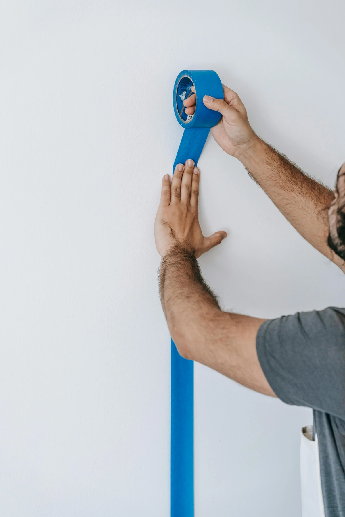
The Art of Letting It Breathe: Framing and Storage Guidelines
So you've painted your masterpiece with lightfast, stable paints. Congratulations! You've built a fortress. Now for the truly terrifying part: you're going to hand the keys to a frame and a cardboard box. This is where the silent killers live. The enemy shifts from the painter to the environment. Not dramatic, explosive disasters, but the slow, invisible rot that happens in the dark. It's a different kind of challenge, one of patience and material science.
This is the part of preservation that feels most unfair. You can do everything right in the studio, but one wrong move post-production can undo it all. It's a lesson in humility. The enemy is no longer your own skill, but the invisible chemistry of your storage environment. Humidity, temperature, acidity—these are the variables that determine if your work survives the next hundred years. And these factors are never static; they fluctuate seasonally, daily, and even hourly. I learned this the hard way when a print I'd made faded significantly in a cheap frame. It wasn't the ink—it was the acidic paper I'd used for the backing, which, over a year, off-gassed and discolored the print along the edges where it made contact.
I have a confession. For the first few years of my career, I stored my finished works on paper in a cheap portfolio with those black, plasticky pages. I thought the dark, rigid case was a vault. In reality, it was a chemical slow cooker, marinating my drawings in acids and plasticizers leaching from the cheap plastic and adhesives. The damage was invisible, cumulative, and irreversible. It's a deeply cringeworthy memory, but it taught me a lesson that now defines my entire practice: archival framing and storage isn't a luxury for the elite; it's the fundamental logistics of professional art-making. It’s as crucial as choosing the right paints. I now use only portfolios with non-reactive polypropylene pages and archival board.
When we think of archival materials, we often think of them as passive, inert containers. This is dangerously wrong. Non-archival materials are actively destructive. The off-gassing from cheap plastics, the acid from wood-pulp paper, the unstable compounds in non-archival tape—they are all engaged in a slow-motion chemical attack on your art. If you wouldn't store your food in a lead-lined container, why would you store your art in an acidic one? The plasticizers in PVC, for instance, are volatile and will actively migrate into your paint or paper over time. This is why the standards exist: to identify and categorize the truly inert materials, creating a defensive wall around your art using science.
The relevant standard here is ASTM D3298, which covers adhesive-backed mats and mats made from paper-based materials. It essentially sets the bar for what can be called "archival" or "museum-quality" mat board. The goal is simple: prevent acid migration. The lignin (a natural polymer in wood pulp) in cheap paper is acidic. Over time, that acid migrates into your artwork, making the paper brittle and discolored, creating those ugly brown "mat burn" lines. This standard is the scientific basis for a professional archival framing practice.
It’s a bit like being on a diet but drinking a soda with every meal; the good you’re trying to do is immediately cancelled out by a hidden source of decay. Fabriano, one of the oldest paper mills in Europe, knows this all too well. Their museum-grade papers are made from pure cotton linters, a nearly lignin-free cellulose, and are often buffered with calcium carbonate to create a "reserve" that actively neutralizes any future acids that might attack the paper. This buffer is like a chemical shield embedded in the board itself.
Your Action Plan for Framing and Storage:
- Demand 100% Rag Mat Board: This is non-negotiable for paper. The board must be made from cotton fibers or purified wood pulp (alpha-cellulose), with a neutral or alkaline reserve (like calcium carbonate). This reserve actively neutralizes any acids that try to form. No lignin, no acid. When in doubt, look for the designation "Buffered" or "pH Neutral." But a word of caution: don't use buffered board for silk, cyanotypes, or other alkali-sensitive materials—it can cause discoloration. For works on canvas that are being float-mounted, ensure the contacting surface is also acid-free. This single choice eliminates the most common source of "mat burn," that ugly brown line that appears on old framed prints.
- Use Archival Mounting (or None at All): The best mounting is often no mounting. Hinging with Japanese kozo paper and wheat starch paste is the gold standard because it's strong and fully reversible. If that feels too daunting, simple acid-free photo corners are a great alternative. Avoid spray adhesives and regular tape as if they carried the plague. Modern "archival" foam boards from brands like KAPA® are excellent for creating a firm, stable backing that won't warp or release harmful gases. This is the principle of reversibility—the conservator's most important tool.
- Embrace the Spacer: This is a hill I will die on. Never, ever let your artwork directly touch the glass. Use a mat board window or purpose-made plastic spacers to create a tiny air gap. This cavity prevents condensation from being trapped against your art, which leads to mold, tide lines, and the paper eventually fusing to the glass itself. I've seen it happen, and it looks like the paper is growing roots. For acrylic paintings under Plexiglas, the spacer is equally critical to prevent the paint film from eventually sticking to the plastic. This gap is like the airspace in a double-paned window—it's a critical zone for moderating temperature and humidity.
- Choose the Right Backing: The back of the frame is your artwork's last line of defense. Use another piece of 100% rag board or an inert corrugated plastic board like Coroplast. Seal the edge where the backing meets the frame with an acid-free framing tape, such as Filmoplast P or Lineco's self-adhesive tapes, to create an airtight seal against dust and airborne pollutants. This sealed package is often called a "micro-climate," and it's the single best thing you can do for work on paper.
For storage, the rules are just as simple. They are designed to slow down the natural processes of decay as much as possible.

- Flat is Best: Store works on paper flat in acid-free boxes or folders, interleaved with glassine paper if needed. Rolling or folding paper creates physical stress that weakens the fibers over time, and can lead to cracking and flaking of the media.
- Cool, Dry, and Dark: The ideal storage environment is a consistent 68-72°F (20-22°C) and 45-55% relative humidity, with minimal light. I know, that's not always possible in a home studio. But a cool, dry closet is far better than a hot, humid garage or a sun-drenched wall. For canvas, store them upright, separated by sheets of acid-free tissue, in a rack that doesn't put pressure on the painted surface.
Let There Be (The Right) Light: Displaying Your Work Without Damaging It
Light is both the artist's muse and our greatest nemesis. It’s a cruel irony, really. We spend our lives trying to capture it, and then spend the rest of our lives trying to protect our work from it. The very photons that allow us to see our work also carry enough energy to systematically unravel it. It's a slow, relentless process called photochemical degradation, and it's the reason a newspaper left on a porch turns yellow and brittle in a week. It is, without a doubt, the most significant environmental threat to any artwork. For artworks, this damage is cumulative and irreversible. Every second a piece is exposed to light, a tiny bit of the lightfastness warranty is used up.
I once saw an original poster from the 1960s that had hung in a sun-drenched kitchen for thirty years. The vibrant reds of the original had vanished entirely, leaving behind a sickly yellow. The blues and greens on the unexposed portion, protected by the frame rabbet, were still brilliant. This stark contrast—a historical record of light exposure—is the most powerful illustration of this destructive power I've ever witnessed. It's a permanent, irreversible record of neglect, like a shadow fossilized onto the paper. The red pigments, often organic, are particularly vulnerable. This is why many contemporary landscape painters have shifted entirely to modern, synthetic, and highly lightfast reds and yellows, leaving the more romantic but fragile pigments to history.
It's inevitable, but it is also wildly, almost comically manageable. The key isn't to live in a cave; it's to understand the simple math of destruction and then to stack the odds overwhelmingly in your favor. The science of light damage is predictable, and therefore controllable.
The science behind it is simple: photochemical degradation is dose-dependent. The 'dose' is measured in lux hours—the intensity of light multiplied by the duration of exposure. A high-intensity light for a short time can be as damaging as a low-intensity light for a very long time. Your job is to minimize the total lux hours your artwork accumulates over its lifetime. Framing with UV-filtering glazing (which can block up to 99% of the most damaging wavelengths) and keeping lights low or off are the most effective ways to radically extend your art's lifespan. This is the core principle of art conservation.
While there's a whole suite of standards for measuring light's effect, the most relevant is ASTM D5383, which is used to determine and quantify the color change of materials. Another crucial one is ASTM D6789, a standard guide for acheiving specific chromaticity of mixed coating colors. It helps ensure consistent, repeatable color even under varying light sources. The practical takeaway from all this science isn't about living in fear. It's about control. For the next few minutes, I need you to forget you're an artist or a collector and start thinking like a museum curator.
Museums use a principle called the reciprocity principle: they reduce light levels to the absolute minimum required for viewing and use motion sensors or timed lighting in galleries to reduce cumulative exposure. In many modern museums, light-sensitive objects like drawings, textiles, and watercolors are displayed at 50 lux or less. For more robust objects like oil paintings, they may allow up to 200 lux. But the key is duration: those lights are often only on during visiting hours. This isn't just about protecting a single piece; it's about managing the light dose (the total lux hours) for tens of thousands of objects, a logistical puzzle on a massive scale. The goal is to keep the total light exposure over the object's life as low as possible, effectively 'budgeting' its life.
Every type of light has two components that matter: how bright it is, measured in illuminance (lux), and how much destructive energy it contains, measured by its spectral power distribution (especially UV content). Think of it like this: lux is the quantity of light, and the spectrum is the quality of its punch. You need to control both to ensure your work's longevity. It was a revelation for me to realize that two light sources could have the same lux reading but cause vastly different amounts of damage if one emitted more UV radiation. This is why you can't just rely on brightness; you have to consider the source.
UV Output | Heat Output | Energy Use | Color Rendering (CRI) | Verdict for Art | |
|---|---|---|---|---|---|
| Incandescent/Tungsten | Low | Very High | Inefficient | Excellent (~100) | Beware of heat damage. Good for temporary viewing. |
| Halogen | High | Very High | Inefficient | Excellent (~100) | Can be used with a mandatory UV filter. Excessive heat is a problem. |
| Fluorescent | High | Low | Moderate | Poor to Fair (varies) | A common but poor choice unless UV-filtered. Can distort colors. |
| LED (High CRI, >90) | Very Low | Negligible | Efficient | Excellent (90-98+) | The modern standard. Safe, cool, and shows true color. |
LED technology has genuinely revolutionized art display, allowing us to have high-quality, cool light without the destructive energy of older technologies.
The golden rule for displaying any artwork is deceptively simple: Use as little light as necessary for as short a time as possible. That's it. That's the whole secret. Every other rule is just a variation on this theme. This principle directly impacts the "art market price" and value retention of your work over time.
This leads to a practical, almost philosophical question: Where do you hang your most valuable, most light-sensitive work? The answer is almost never the sun-drenched living room wall. It's the hallway, the bedroom, the office—places where the light can be controlled and minimized without sacrificing the viewing experience. It's a strategic decision, not just an aesthetic one. It requires seeing your own living space with the critical eye of a gallery technician.
Here are some practical, non-negotiable steps you can take right now to protect your work:
- Measure Your Light: Go buy a cheap light meter (or even use a surprisingly accurate app on your phone). I did this, and I was horrified. You'd be amazed how much light is really hitting your walls. For delicate works (watercolors, drawings, prints), aim for a maximum of 50-100 lux. For sturdier oil and acrylic paintings, you can go up to 200 lux. For context, a brightly lit office blasts out 500 lux. Most living rooms, I've found, are borderline dangerous for permanent display.
- Filter the UV: No matter what light source you use, fit your frames with UV-filtering glass or acrylic (like Plexiglas UF3 or UF5). This single step can block up to 99% of the most energetic, damaging wavelengths. It's not cheap, but it's one of the most effective preservation tools you can buy. The film on UV-filtering acrylic can degrade, so keep it out of direct light when not in use.
- Dimmer Switches are Your Friend: The ability to turn the room's lighting down to a low, ambient level when you're not actively viewing the art dramatically multiplies its potential lifespan. This is about managing the 'cumulative light dose'—a concept borrowed directly from museum science. Half the brightness means double the life.
- Rotate Your Collection: If you have a lot of work, don't leave it all on display permanently. Treat it like a museum does and rotate pieces seasonally. Give your art a well-deserved 'time out' in a dark, stable storage space. It's the closest we can get to hitting a 'pause' button on the aging process. I now date my paintings on the back and keep a simple log of how long each has been on display.
- Mind the Environment: Use a basic hygrometer to monitor relative humidity. Sudden shifts are often more damaging than a consistently "wrong" level. If the environment is too unstable, consider using silica gel packets in your storage areas to buffer the humidity, but be sure to regenerate them regularly.
Putting It All Together: From Studio to Future
This can feel like a dizzying amount of information. So here's a distilled, action-oriented checklist. Treat it as your final quality control, a ritual of care you perform before your art leaves the studio or enters a collection. This is where theory becomes practice, and where good intentions become a lasting legacy. I printed this out and taped it to the inside of my studio cabinet. It's a constant reminder that the final 10% of the work—the preservation steps—is what separates a hobby from a legacy.
For the Artist (Before the Art is Even Finished):
- Am I using paints tested to ASTM D4303? (Check the tube for a Lightfastness rating of I or II). Small brands often won't list this; always ask.
- Is my paper or canvas acid-free and lignin-free? (Look for '100% cotton rag,' 'alpha-cellulose,' or 'museum-grade' labels). Canvas should be primed with multiple coats of gesso to create a proper barrier.
- Am I using a stable ground like Gesso? (Never paint directly on raw canvas—the acidic oils in paint can rot the fabric over time).
- Have I checked the binder quality? (For acrylics, insist on a 100% acrylic polymer; for oils, use stable mediums like cold-pressed linseed or stand oil).
- Are my final varnishes removable and UV-filtering? (A removable varnish is essential for future conservation. A non-removable final layer is a permanent problem).
For Framing and Storing:
- Is my mat board 100% rag or alpha-cellulose (acid-free)? (If framing textiles or cyanotypes, use unbuffered board to prevent damage).
- Is my framing method reversible? (Hinging with wheat starch paste on kozo paper is the gold standard. Avoid dry-mounting).
- Is there a spacer? (No exceptions. Never let art touch the glazing).
- Is my backing board acid-free and are the edges sealed with archival tape to create a microclimate?
- Is my storage box acid-free, and is the space cool, dark, and dry (68-72°F / 20-22°C, 45-55% RH)?
For Displaying:
- Is my framing glazing UV-filtering?
- Do I have controls (dimmer switches, timers) to manage light duration and intensity?
- Am I rotating my most light-sensitive pieces regularly?
- Is the artwork hung away from direct sunlight, heat sources, and exterior walls prone to condensation?
- Have I used a light meter to ensure the display area stays within the recommended lux levels?
Following these guidelines isn't about being paranoid. It's about respecting the craft. It's the difference between creating a beautiful picture and creating a lasting object. It sends a message to everyone who sees your work: This was made to be cared for. This was made to last. It's a deeply satisfying feeling, knowing that you're not just an artist for today, but a steward for the art of the future. Every piece you create with these principles is a statement of intent, a flag planted in the ground that says, 'This matters. This will endure.'
This mindset fundamentally changes your relationship with the art you create and collect. You begin to see every object not just as it is, but as what it might become. You become a conservator in the broadest sense—conserving not only the physical object, but the intention, the emotion, and the skill embedded within it for the next person who will encounter it. And in doing so, you contribute to a cultural continuum that stretches back centuries and, with a little care, will stretch far into the future.
Frequently Asked Questions
What does ASTM stand for, and what do they actually do?
ASTM stands for the American Society for Testing and Materials, though it's now known globally as ASTM International. They are a globally recognized organization that develops and publishes voluntary consensus technical standards for thousands of products and processes. Think of them as a massive, neutral meeting ground for producers (like paint manufacturers) and users (like museums and conservators) to agree on a common set of rules. For art, their most famous guidelines (D4303 for paints and D3298 for mat boards) provide scientifically-backed methods for testing material stability and longevity. They are the rulebook that helps us separate professional, archival-quality materials from those that will degrade over time. Their work ensures that when a manufacturer says 'lightfast,' there's a rigorous, reproducible test backing up that claim. Standards are developed by committees of volunteers—scientists, engineers, manufacturers, and end-users—who dedicate their time to creating these vital documents.
How can I find out if my paints are lightfast?
Look at the tube first. Reputable manufacturers (like Winsor & Newton, Gamblin, Daniel Smith) will often list the ASTM rating directly on the label (e.g., 'ASTM D4303, Lightfastness I'). Many also use a system of stars (*****) or proprietary letter grades (AA, A, B). If you can't find it, check the manufacturer's website for detailed pigment information, which often requires downloading a PDF or searching by pigment code. Never hesitate to email the manufacturer directly; a company confident in its products will be transparent about their testing methods.
The absolute best resource I've found for an independent, deep dive is Bruce MacEvoy's Handprint.com, specifically his watercolor pigment analysis. While he focuses on watercolors, the underlying pigment data is relevant across mediums. If a manufacturer doesn't provide this data, or worse, doesn't know what you're talking about when you ask, consider it a massive red flag. A company that hasn't tested its paint's longevity has no business selling it to professionals. In such cases, it's safer to assume the paint is fugitive and should only be used for studies or sketches, never for finished, sellable work. This also highlights the importance of proper art licensing that protects your intellectual property regardless of physical degradation.

I use acrylic paints. Are they more stable than oils?
That's a fantastic question, because it highlights a crucial distinction. Generally speaking, the binder of an acrylic paint is more stable than the traditional oils and resins in oil paint. The cured acrylic polymer is incredibly durable, flexible, and far more resistant to yellowing over time.
However—and this is a huge 'however'—the long-term stability of an acrylic painting depends heavily on the pigments used. The binder is just the glue holding the colorant. A painting made with cheap, fugitive (non-lightfast) pigments will fade just as quickly in an acrylic binder as it would in an oil binder. The key is still the lightfastness of the color itself. The superior binder just ensures the faded pigment will stay stuck to the canvas better.
What is the biggest mistake people make when framing art?
Hands down, it's treating the frame as a decorative afterthought rather than a life-support system. The single biggest error is using non-archival materials: an acidic cardboard backing, a wood-pulp mat board, and cheap plastic tape. Putting a valuable piece of art into a frame like that is like locking it in a room with a slow, invisible gas leak. The damage is cumulative and, by the time you see it—usually as a permanent, ugly yellow stain on the paper—it's irreversible. I've seen original 19th-century prints almost destroyed by acidic mats from the 1970s.
But I think the number two mistake is subtler: bad hinging. Using acidic masking tape, or even 'acid-free' tape that isn't truly reversible. The gold standard is Japanese kozo paper and wheat starch paste for a reason: it's strong, yet it can be dissolved with a bit of moisture, leaving the art unharmed. Using a modern 'archival' PVA glue makes future conservation a nightmare. The corner-cutting you do to save $30 today will cost you the value and integrity of the art in ten years. I've seen collectors have to pay hundreds of dollars to have a piece professionally 'un-framed' because of this. It's the ultimate false economy.

Is it okay to hang my art in a room with a window?
Yes, absolutely. Art is meant to be seen, and life without natural light is pretty grim. The key is to be strategic, not to live in a cave. The goal is to manage light exposure, not to eliminate it entirely.
Never hang a sensitive work (like a watercolor, pastel, or drawing) in direct, unfiltered sunlight. The combined ultraviolet radiation and heat from direct sun is incredibly destructive. For walls that get strong indirect light from a window, you can mitigate the risk. Use curtains or UV-filtering blinds to control the intensity, and insist on UV-filtering glazing in the frame itself. Think of it like sunscreen for your art: UV-filtering glazing and window treatments block the most harmful rays, while still letting you enjoy the view. Remember the mantra: low light, for short periods. It's about managing the cumulative dose of light energy the artwork receives over its lifetime.

Think in 'art hours' like an engine has 'engine hours'. A painting on a wall with bright indirect light for 8 hours a day is aging much faster than one in a dimly-lit hallway. The goal is to keep the total 'lux hours' of bright light exposure as low as possible. If the wall gets hit with direct sun for even 30 minutes a day, that's a serious problem. Sunlight streaming through a window can exceed 10,000 lux; even brief exposure is a massive dose. Use a compass app on your phone to understand the sun's path throughout the day and across seasons, so you can identify which walls are safest. North-facing walls in the northern hemisphere are often the most stable.
Conclusion: Beyond the Rules
At the end of the day, these standards aren't meant to be shackles. They're a gift of certainty in a world of artistic chaos. When you understand why a material needs to be acid-free (because lignin is slowly releasing acid like a battery leaking), or how light breaks down a pigment (by exciting electrons and snapping chemical bonds), you stop seeing preservation as a chore and start seeing it as the final, crucial part of your artistic process. It becomes a conversation with physics.
You learn to work with the chemistry, not against it. You build a relationship with time. You're no longer just an artist; you're a steward for the future of your own work. And that's a role I've learned to embrace, one archival mat board at a time. Because the best art isn't just seen—it's seen, again and again, by generations we'll never meet. It becomes a part of history, and you, the artist, become the first link in that long, unbroken chain of preservation.