
Alizarin Crimson: The Artist's Guide to a Timeless Red
Discover the history, chemistry, and artistic magic of alizarin crimson. From medieval madder roots to modern abstractions, unlock this pigment's secrets.
Alizarin Crimson: The Artist's Guide to a Timeless Red
You know that moment when you mix a color that just sings? For me, it’s always alizarin crimson—a red that’s both sultry and defiant. Not the brute-force blast of cadmium red, nor the shy whisper of rose madder. Alizarin crimson is the charismatic storyteller of the palette. Let’s unpack its secrets together.

So, What Actually IS Alizarin Crimson?
At its heart, alizarin crimson is a synthetic organic pigment (a naphtol-based anthraquinone, if you must know). But that sounds like a chemistry lecture, doesn’t it? Let’s rephrase: it’s like medieval madder dye had a genius scientist baby.
For centuries, painters crushed the madder root (Rubia tinctorum) to get warm, earthy reds. Then in 1868, German chemists Carl Liebermann and Carl Graebe figured out how to replicate madder’s magic molecule—alizarin—in a lab. Suddenly, artists had a pure, intense red without wrestling with temperamental plant extracts.
credit, licence
Why Does It Behave So? The Chemistry (Without the Headaches)
Unlike mineral pigments (say, iron oxide reds), alizarin crimson doesn’t “sit flat” on your canvas. It has this addictive transparency. Why? Because its molecules are like tiny prisms that interact with light differently when mixed with oils or acrylics.
- In oil paints: Dries with a slight transparency, almost like stained glass. Perfect for glazing.
- In watercolors: Separates into gorgeous violet-pink washes when thinned.
- In acrylics: Looks more opaque due to binder properties. Add flow medium for translucency.
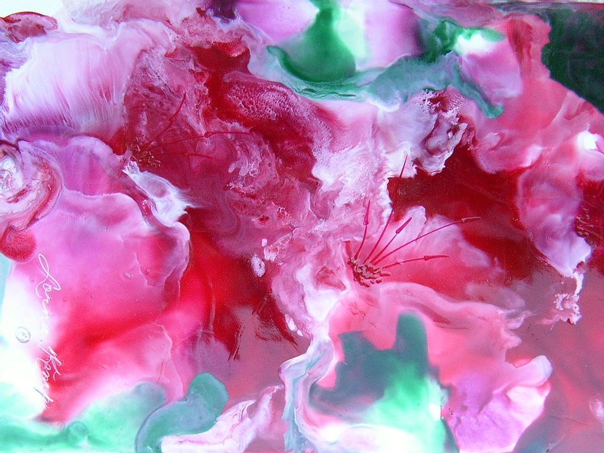
I once spent three hours trying to replicate a sunset glaze with this one pigment—layering it over ochre and indigo. Pure magic. And yes, my discipline failed me after the first hour, but the result was worth it.
But what's really fascinating is how alizarin crimson responds to different painting surfaces. I did an experiment where I painted the same composition on canvas, wood panel, and paper. On canvas, it absorbed differently, creating softer edges. On wood panel, it remained more vibrant and crisp. And on watercolor paper? It granulated in these beautiful, textural patterns that almost looked like they were growing organically. The same pigment, completely different personalities depending on where you put it.
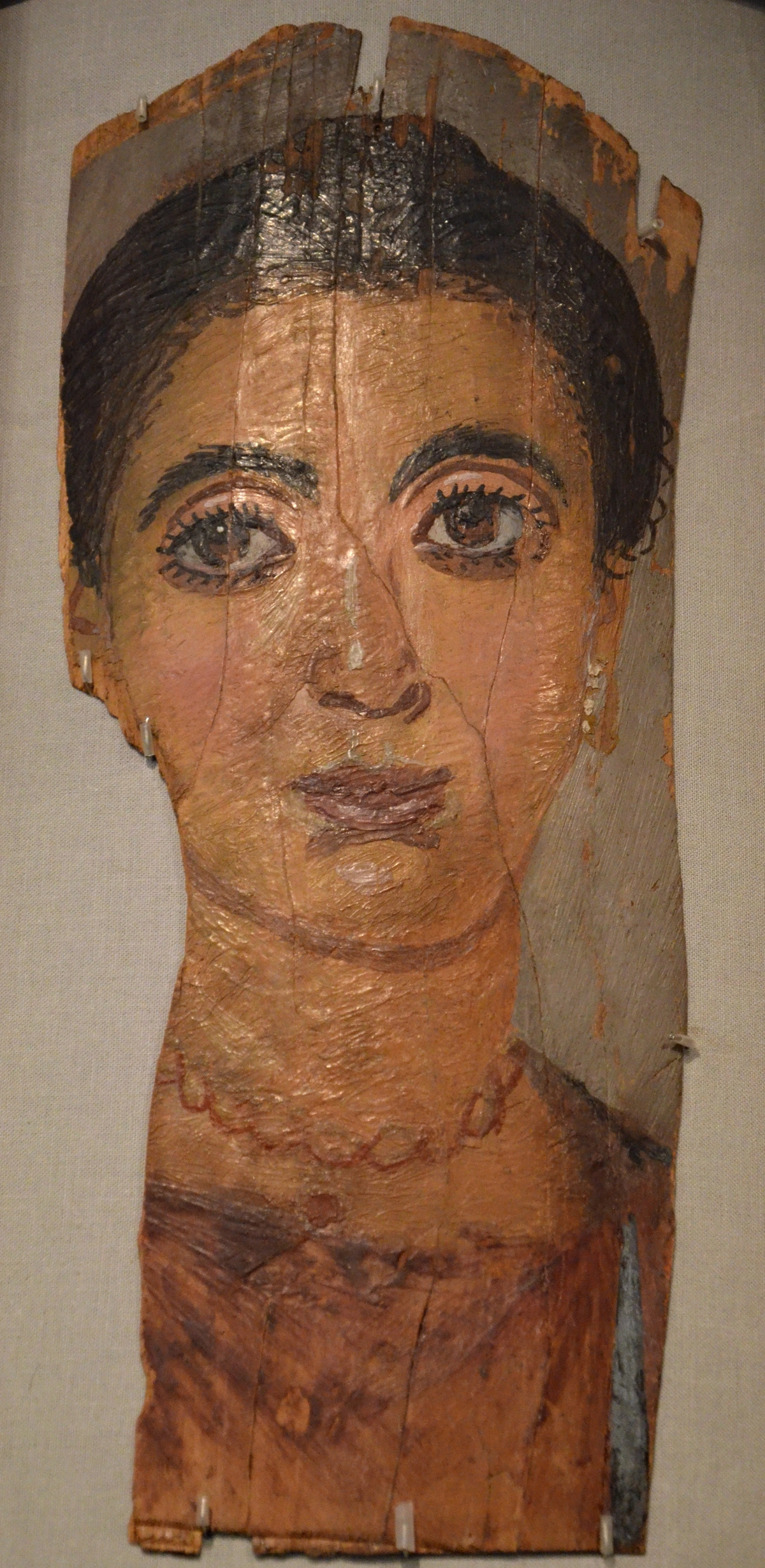
A Trip Through Art History: From Vermeer to Cy Twombly
Alizarin crimson didn’t just appear—it replaced madder lacquer in most artist palettes by the 1890s. Suddenly, Impressionists had a red that wouldn’t turn brown in six months.
- Pre-Lab Era: Medieval manuscripts used madder alizarin for robes—until the color faded to beige.
- Golden Age Glory: Vermeer’s Woman with a Pearl Earring? The drapery hints at madder-based reds. Imagine if he’d lab-grade alizarin crimson!
- Modern Rebels: Mark Rothko’s glowing rectangles often relied on alizarin’s translucency. Cy Twombly’s scribbles? He’d thin it to ink-like watercolor washes.
Why It’s Still Irreplaceable (Even With "Cadmium-Free" Options)
Modern chemistry gives us “hues” and alternatives. But alizarin crimson? It’s a cult favorite for a reason. Here’s why artists keep coming back:
Feature | Alizarin Crimson | Modern Alternatives |
|---|---|---|
| Transparency | High | Low (cadmium alternatives) |
| Mixing Range | Violets/pinks | Limited to warm reds |
| Lightfastness | ★★☆☆☆ (Moderate) | ★★★☆☆ (Better) |
| Emotional Resonance | Deep, moody | Flat, synthetic |
The Lightfastness Trap
Let’s be real: Alizarin crimson fades in direct sunlight. That poor lightfastness (grade II on most scales) is its flaw. But here’s my unpopular take: embrace it. That fading quality makes it feel alive. Like memories that soften over time.
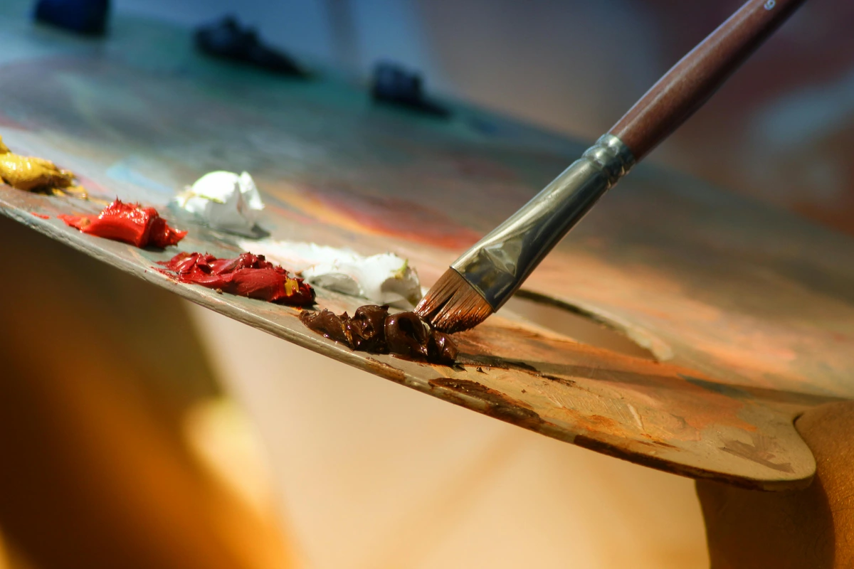
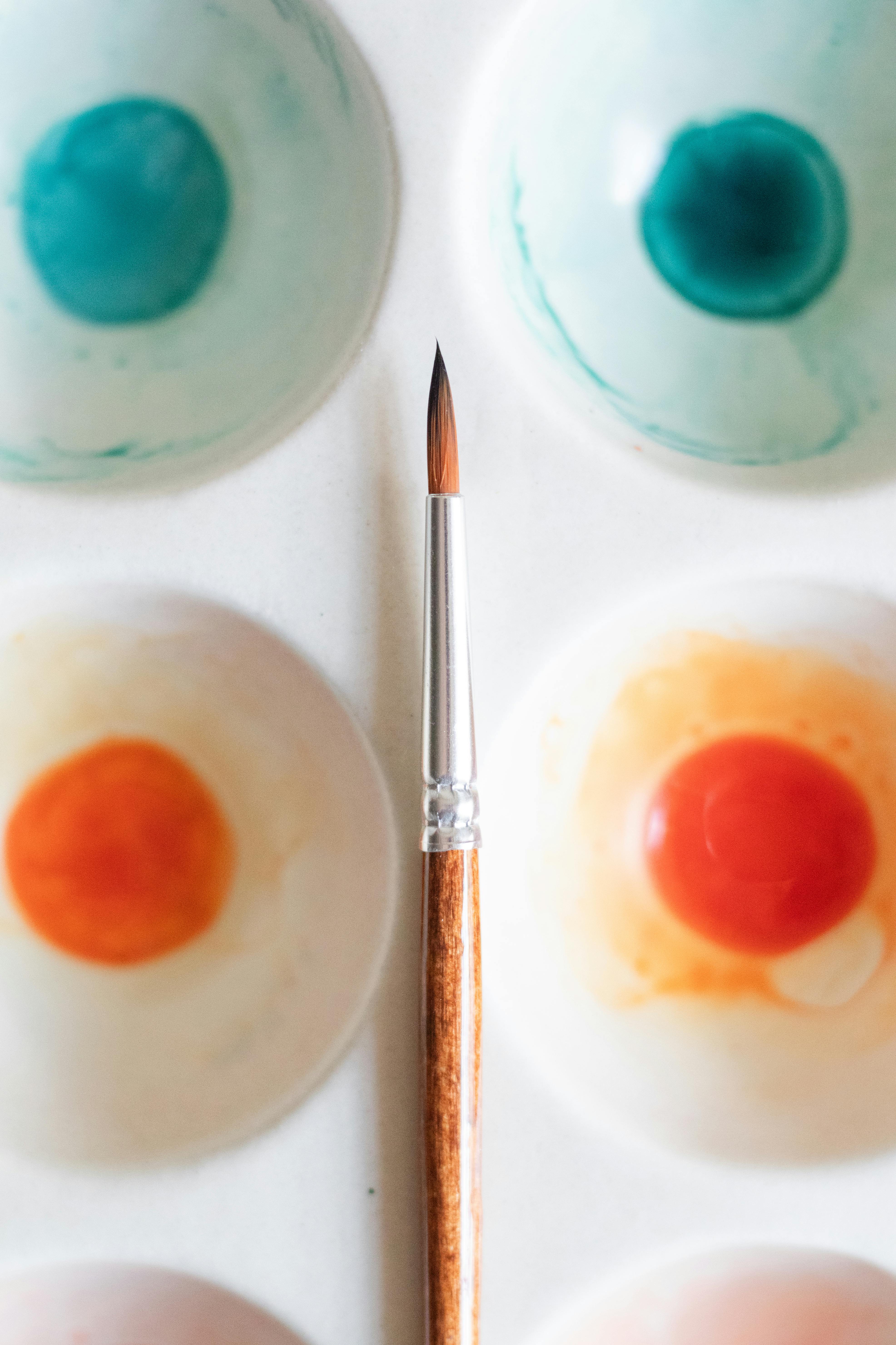
Mixing Your Magic Potion
Want to make alizarin crimson sing? Pair it with:
- Cool blues: Ultramarine blue → beautiful violets
- Warm blues: Cerulean blue → soft lavenders
- Warm yellows: Cadmium yellow → tomato-reds
- Cool yellows: Lemon yellow → coral-pinks
- Earths: Burnt sienna → muted burgundies
- Earths: Raw sienna → warm terracottas
- Whites: Titanium white → faded-rose pinks
- Whites: Zinc white → cooler pinks
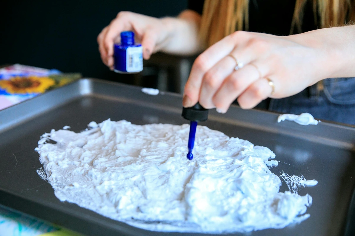
Color Mixing Ratios and Recipes
Let's get really specific about mixing ratios. Here are some tried-and-true recipes:
Perfect Violet: 1 part alizarin crimson + 2 parts ultramarine blue Deep Burgundy: 1 part alizarin crimson + 1 part burnt sienna + tiny touch of ultramarine Warm Rose Pink: 4 parts titanium white + 1 part alizarin crimson + tiny touch of yellow Cool Lavender: 2 parts alizarin crimson + 3 parts cerulean blue + 1 part titanium white Rich Tomato Red: 1 part alizarin crimson + 1 part cadmium yellow + tiny touch of burnt sienna Earth Terracotta: 1 part alizarin crimson + 2 parts raw sienna + tiny touch of burnt umber
What's interesting is how these ratios change slightly depending on the medium. In watercolors, you need less pigment because of the transparency. In oils, you might need a bit more to achieve the same saturation. And in acrylics, the white pigments can affect the final color differently than in other mediums.
Pro tip? Thinning it with water or solvent creates ink-wash effects. I once dripped diluted alizarin crimson onto a wet canvas and let it bleed like blush. No brushes needed. Surrender to the pigment!
Ink and Wash Techniques
For those who love the spontaneity of ink-and-wash painting, alizarin crimson is perfect. When heavily diluted with water or ink medium, it behaves like traditional Chinese ink but with that beautiful red hue.
- Sumi-e style: Create those beautiful expressive brushstrokes with alizarin crimson ink.
- Pouring techniques: Pour diluted pigment onto paper and let it flow naturally.
- Resist effects: Use wax or oil as a resist, then apply alizarin crimson washes.
- Collaborative layering: Combine with black ink for stunning contrast.
I did a series called "Red Memories" using these techniques—pouring diluted alizarin crimson onto watercolor paper, letting it create these organic shapes, then adding black ink details with a brush. The results looked like memories partially fading, with the red representing emotional warmth and the black representing the passage of time.
But let's get really specific about mixing ratios. For that perfect violet, try mixing 1 part alizarin crimson to 2 parts ultramarine blue. For deep burgundy, 1:1 with burnt sienna works beautifully. And for those romantic rose pinks, start with 4 parts white to 1 part alizarin crimson, then adjust from there. I keep a little mixing journal where I document these ratios—when you find that perfect combination, you want to remember it!

One fascinating mixing behavior: alizarin crimson has this tendency to separate when mixed with certain pigments. When you mix it with cerulean blue, you get these beautiful granulating effects where the crimson particles settle differently than the blue, creating this lovely textured appearance that's almost like looking at geological strata.
Practical Guide: Getting Started
Brand Comparison: Alizarin Crimson Across Manufacturers
Not all alizarin crimson pigments are created equal. Different manufacturers use slightly different formulations, dispersion techniques, and even sometimes different pigment variants. Here's how some popular brands compare:
Brand | Medium | Transparency | Granulation | Lightfastness | Price Point | Best For |
|---|---|---|---|---|---|---|
| Winsor & Newton | Oil/Watercolor | High | Low | Moderate | Mid | Traditional glazing |
| Daniel Smith | Watercolor | High | High | Moderate | High | Granulating effects |
| Gamblin | Oil | Medium-High | Low | Moderate | Mid-High | Versatile oil work |
| Golden | Acrylic | Medium | Low | Moderate | Mid | Acrylic techniques |
| Old Holland | Oil | High | Low | Moderate | Very High | Professional oil work |
| M. Graham | Watercolor | High | Medium | Moderate | Mid | Natural binders |
The key takeaway? Experiment to find which brand speaks your artistic language. Some artists swear by Winsor & Newton's consistency, while others prefer Daniel Smith's granulating effects in watercolor. There's no "best"—only what works best for your particular style and technique.
Step 1: Choose Your Medium
- Oils: Best for glazing. Winsor & Newton’s Professional Series has a gorgeous transparent version.
- Watercolors: Daniel Smith’s Genuine Alizarin Crimson granulates beautifully.
- Acrylics: Golden Heavy Body offers rich body. Add airbrush medium for spray effects.
Step 2: Avoid Common Pitfalls
- Don’t use white with it—unless you want that baby-rose vibe. It can look sickly otherwise.
- Store tubes horizontally to prevent pigment separation.
- Test lightfastness: Paint a swatch and tape it to a sunny window for a week. See if it sings or gets mute.
Step 3: Beyond the Canvas
Printmakers: This pigment loves etching inks. Bookbinders use it for dyeing leather. Even potters can mix it into glazes (fire to cone 6–10 for best results).
Conservation and Restoration
For art conservators, alizarin crimson presents both challenges and opportunities. Its tendency to fade means conservators have developed special techniques to stabilize and preserve works containing this pigment. UV-filtering glass, climate-controlled environments, and sometimes even inpainting with more stable pigments are all part of the conservator's toolkit.
I had the chance to observe a conservator working on a 19th-century painting with alizarin crimson. She used magnification to examine the paint layers, then carefully applied a specialized varnish that would protect the pigment without altering its appearance. It was like watching a surgeon perform delicate surgery on a work of art.
Digital Age Applications
Even in the digital realm, alizarin crimson finds new life. Digital artists often try to replicate its unique transparency and mixing properties. Some painting software includes specific brushes that simulate granulation and staining behaviors characteristic of the pigment. And 3D artists use alizarin crimson shaders to create materials that mimic the way real paint interacts with light.
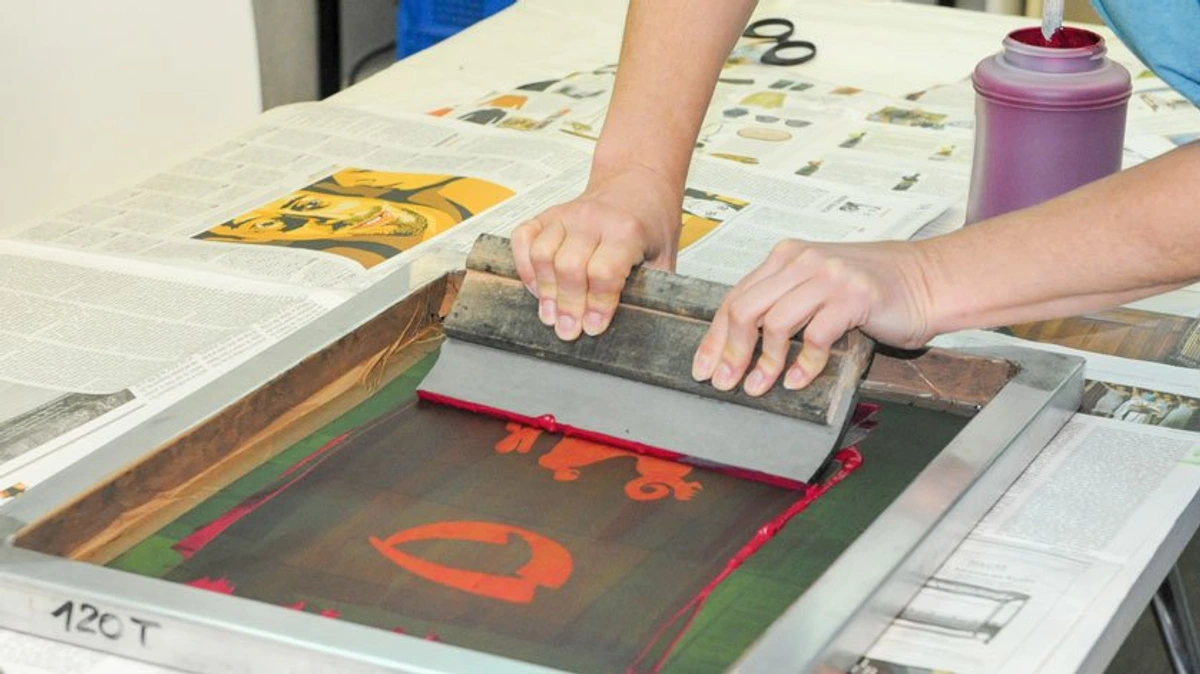
Printmaking Applications
For etchers and lithographers, alizarin crimson is a dream. It produces rich, velky blacks when mixed with black ink, and those beautiful transparent layers when used alone. I once did a series of botanical prints using only alizarin crimson and black ink—the results were like looking through stained glass.
Intaglio techniques: Alizarin crimson works beautifully in etching, creating those rich, deep tones when printed multiple times. The transparency allows for incredible depth when layering plates.
Lithography: On limestone, alizarin crimson produces this lovely greasy quality that's perfect for lithographic printing. The key is balancing the pigment with the right amount of gum arabic to achieve the perfect tonal range.
Screen printing: When mixed with the right screen printing base, alizarin crimson creates sharp, vibrant prints. It's particularly effective for posters and limited edition prints where you want that rich red quality.
Monotype: For monoprints, alizarin crimson's transparency allows for beautiful ghost images and layered effects. I love rolling it out on the plate with a brayer, then wiping away areas to create highlights before running it through the press.
Textile Arts
Natural fiber artists love alizarin crimson for dyeing. Wool and cotton take this pigment beautifully, creating rich, lasting colors. The medieval dyers were onto something—madder root (the natural precursor to synthetic alizarin) produces gorgeous reds on natural fibers. Modern synthetic versions offer more consistency but retain that same beautiful quality.
Natural dyeing: For those who prefer natural methods, madder root dyeing is a fascinating process. It involves multiple steps—mordanting the fiber, then simmering with the root extract. The results are more variable than synthetic dyes but have this beautiful, organic quality.
Synthetic dyeing: Modern fiber artists use synthetic alizarin crimson for consistency and control. It can be applied to various fibers using different dyeing techniques—immersion, painting, printing. The results are predictable and long-lasting.
Shibori techniques: When used in shibori (Japanese tie-dye), alizarin crimson creates these incredible patterns where the dye penetrates differently in tied versus untied areas. The results look like blood vessels or geological formations.
Batik and wax resist: For batik work, alizarin crimson behaves beautifully with wax resist techniques. The wax prevents the dye from penetrating certain areas, creating crisp white lines against the rich red background.
Pottery and Ceramics
When mixing alizarin crimson into ceramic glazes, you get these incredible deep reds that fire to beautiful burgundies. The key is firing to the right temperature—cone 6-10 is ideal. Too low and the color stays flat; too high and it can burn out. I've seen potters get stunning results by layering glazes: a base of transparent gloss over an alizarin crimson underglaze creates depth that's simply breathtaking.
Glaze formulation: Alizarin crimson can be mixed into various glaze bases—transparent, matte, or crystalline. Each base produces different effects. In a transparent base, it remains vibrant; in a matte base, it becomes more subdued earthy tones.
Underglaze vs. overglaze: As an underglaze, alizarin crimson maintains its intensity through the firing process. As an overglaze, it can create interesting effects where it interacts with the underlying glaze colors.
Raku firing: For raku pottery, alizarin crimson creates these incredible, unpredictable effects when exposed to post-fire reduction. The colors can shift dramatically, creating metallic sheens and crackle patterns that are never quite the same twice.
Low-fire vs. high-fire: In low-fire ceramics (cone 06-04), alizarin crimson tends to stay more pinkish. In mid-fire to high-fire ranges (cone 5-10), it develops those deep, rich burgundy tones that potters love.
FAQ: Your Alizarin Crimson Questions Answered
Q: Is alizarin crimson toxic? Not really. Avoid inhaling the dry powder, but tube paint is low-risk. Wear gloves if you have sensitive skin.
Q: Can I make it with natural pigments? You can use madder root (historical method), but expect muddier results. Synthetics rule for precision.
Q: Why do some brands call it "Permanent Alizarin Crimson"? They probably added lightfast stabilizers. Check the pigment index number: genuine is PR83; alternatives like PR177 or PR206 may be more permanent but behave differently.
Q: How do I clean brushes with alizarin crimson? For oils, use mineral spirits or turpentine. For acrylics, soap and water works fine. The pigment can be stubborn, so let brushes soak briefly before cleaning.
Q: Can I use alizarin crimson for skin tones? Absolutely! It's fantastic for creating realistic skin tones when mixed with ochres and whites. Many portrait artists consider it essential for believable flesh tones.
Q: What's the shelf life of alizarin crimson paint? Properly stored, oil paints last decades. Acrylics can dry out if not sealed, but they're usually good for 2-5 years unopened. Watercolors last practically forever if kept dry.
Q: Why is alizarin crimson sometimes more expensive than other reds? The manufacturing process is more complex than many other pigments. Higher-quality versions often use purer raw materials and better dispersion techniques, affecting both price and performance.
Q: Can I mix alizarin crimson with digital paints? While digital painting software doesn't use actual pigments, you can create similar effects. Use colors with similar transparency and mixing properties to replicate traditional alizarin crimson behavior.
Q: What's the difference between genuine alizarin crimson and "hues"? Genuine alizarin crimson contains the actual pigment PR83. "Hues" are approximations using other pigments that mimic the color but may behave differently in mixing and transparency.
Q: How should I store alizarin crimson paint? Store tubes horizontally to prevent pigment separation. Keep them away from extreme temperatures and direct sunlight. For long-term storage, unopened tubes can last decades if stored properly.
Q: Will it fade in my framed painting? If kept away from UV-light (no direct sun!), it should last decades. Museum conservation teams are wizards at stabilizing these reds.
Q: What’s the difference between alizarin crimson and quinacridone magenta? Quinacridone is a vibrant, transparent hot pink. Alizarin is cooler and leans toward violets. Think quinacridone as pop magenta, alizarin as wine-stained silk.
Final Thoughts: More Than Just a Color
The Cultural Significance of Alizarin Crimson
Throughout history, red has carried immense cultural and symbolic weight. In Western art, alizarin crimson represents passion, love, and sometimes danger or warning. In Eastern traditions, red symbolizes luck, prosperity, and celebration. This cultural richness adds another layer to the pigment's appeal.
In medieval European art, red dyes were incredibly expensive and status symbol. Only the wealthy could afford deep reds like those made from kermes insects or later, madder root. When synthetic alizarin became available in the 19th century, it democratized this once-exclusive color, allowing artists from all backgrounds to access its beauty.
Today, alizarin crimson continues to carry this symbolic weight while also representing the intersection of tradition and modernity. It's a color that connects us to centuries of artistic tradition while allowing for contemporary expression. Alizarin crimson is a rebellion. It’s what happens when science meets soul—the defiance of a pure red that won’t submit to permanence. It reminds us that art isn’t about foreverness; it’s about the fire in the moment.

Whether you’re painting a Vermeer-esque velvet robe or a Rothko-esque glow, alizarin crimson asks: What mood will you give it today? Go find your story. It’s waiting in that tube.
Visit the museum to explore pigment history | Shop alizarin crimson paints | Discover pigment timelines | Join our artist community