Victor Vasarely: Op Art's Visionary Architect & Master of Illusion
Dive into the mind of Victor Vasarely, the father of Op Art. Explore his scientific approach, 'Plastic Alphabet,' and dream of a 'Polychrome City.' Uncover how his optical illusions redefined perception, shaping art, design, and even digital aesthetics.
# Victor Vasarely: Op Art's Visionary Architect & Master of Illusion You know that feeling when you look at something, and your brain just… twitches a little? Like your eyes are playing tricks on you, but in the most delightful way? That, my friend, is often my first reaction when I encounter the work of **Victor Vasarely**, the undeniable father of **Op Art**. For me, it was never just about seeing; it was about *feeling* the visual, a profound, almost primal engagement that still sparks that delightful bewilderment in my mind. Honestly, it took me a while to truly 'get' it beyond the initial visual shock – a bit like finally understanding a complex visual riddle. How can static lines and colors make me feel like I need to adjust my spectacles, or like the wall itself is breathing? It’s a bit of a magic trick, isn't it? My brain certainly thinks it is, and I love that playful challenge. Today, we'll dive deep into the mind behind the magic, exploring his journey from scientific curiosity to visual revolution, dissecting his ingenious system for creating optical art, and celebrating his enduring legacy in art, public life, and even how it influences artists like me. It’s a fascinating story of an artist who dared to treat art like science, and in doing so, created a universal language of vision that resonates to this day. ## What Exactly *Is* Op Art? (And How it Differs from Kinetic Art) Before we delve into Vasarely's unique system, it's crucial to understand the very art form he helped define. **Op Art** (short for Optical Art) is often confused with **Kinetic Art**, but there’s a crucial difference. While Vasarely solidified the term, Op Art draws on a longer history of artists experimenting with perception, from Neo-Impressionism's color theories to the geometric explorations of Constructivism. It's not an isolated phenomenon, but a logical evolution of art's ongoing dialogue with vision. Other pioneers, like the Venezuelan artists [Jesús Rafael Soto](/finder/page/what-is-kinetic-art-movement-in-modern-sculpture) and [Carlos Cruz-Diez](/finder/page/what-is-kinetic-art-movement-in-modern-sculpture), also pushed the boundaries of perception, each adding their unique systematic approach to the movement, furthering its reach and sophistication. But here's the kicker: their approaches, while equally systematic, often leaned into *physical* motion, which is where Op Art carves out its distinct niche. * **Op Art** (like Vasarely’s) creates the *illusion* of movement, vibration, or pulsating depth on a static, two-dimensional surface. It tricks your eye and brain, making you *perceive* motion where there is none. It's geometry with a heartbeat, a visual riddle that your brain tries to solve. Think of it as a carefully orchestrated dance between patterns, colors, and the very mechanics of your own sight. It often exploits psychological and physiological principles like **Gestalt principles** (how our brains group visual elements), **afterimages** (the lingering impression of an image after looking away), and **simultaneous contrast** (how adjacent colors affect each other's perceived hue and intensity) to create its dazzling effects. Vasarely, armed with his early medical insights, understood these phenomena implicitly. For example, **Gestalt principles** like 'figure-ground' dictate how our brains separate an object from its background, and 'grouping' explains how we perceive elements close together or similar in appearance as belonging to a set. Vasarely meticulously manipulated these innate perceptual tendencies, making figures and grounds swap roles or causing disparate elements to group into perceived moving forms. * **Kinetic Art**, on the other hand, involves objects that *physically move*, often powered by motors, wind, or touch. While both play with motion, Op Art's magic lies entirely in its optical deception, engaging your brain in a playful challenge. When I think of Op Art, the mesmerizing work of [Bridget Riley](/finder/page/ultimate-guide-to-bridget-riley-op-art-master-illusion) immediately comes to mind. She's another absolute master of the craft, often using repetitive lines and waves to create shimmering effects, a contrast to Vasarely’s often more block-like geometric deformations. But Vasarely truly laid the systematic groundwork, setting the stage for a whole generation of artists. 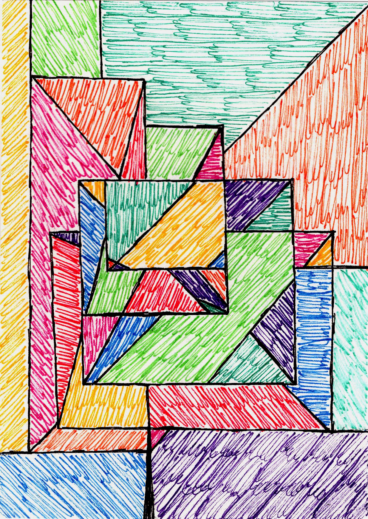 [credit](https://images.zenmuseum.com/art/253/scan.jpeg), [licence](https://images.zenmuseum.com/art/253/scan.jpeg) Understanding these distinctions is crucial to appreciating how Vasarely, a man with an almost scientific mind, would go on to define this very movement. He literally engineered perception. But how did this scientific inclination translate into artistic innovation? ## From Graphic Precision to Visual Revolution How did a medical student become the father of Op Art? Vasarely's journey started far from the psychedelic vibrations his later work would become known for. Born in Pécs, Hungary, in 1906, his early foray into medical studies wasn't just a brief academic detour – it was a foundational period. It instilled in him a deep curiosity about human anatomy, especially the intricate mechanics of vision and how our brains process sensory input. Think about it: studying the retina's photoreceptors, understanding retinal fatigue (the temporary desensitization of photoreceptors after prolonged stimulation, which he leveraged to create afterimages or shimmering effects), or how our brains 'fill in' gaps or misinterpret patterns – these weren't abstract theories for him, they were blueprints for his art. He delved into phenomena like **refraction** (how light bends through different mediums, influencing perceived shape) and the neural pathways that process visual information. This scientific grounding was less about *what* to paint and more about *how* the painted image would be 'seen' by the viewer, and critically, *what it would do* to their perception. For me, this is where the magic truly started, connecting the dots between science and profound visual impact. The Hungary of his youth, undergoing significant cultural and political shifts in the interwar period, also fostered an environment where avant-garde ideas were beginning to take root, subtly influencing his nascent artistic leanings. This scientific lens would later prove crucial, as he sought to understand and manipulate optical phenomena directly, almost like a visual engineer. He eventually shifted to art, soaking up the rigorous, systematic approaches of the **Bauhaus school** in Budapest – which, to be clear, operated under the principles of the German Bauhaus but adapted to a Hungarian context, with a particular emphasis on functional art and graphic design – especially under the tutelage of Sándor Bortnyik. Bortnyik, a former student of the Weimar Bauhaus himself, imparted a strong emphasis on practical application, geometric abstraction, and the integration of art into daily life, principles that deeply resonated with Vasarely's later vision for a "Polychrome City." It was here he began to understand art as a language of pure visual elements, a precursor to his 'plastic alphabet.' I mean, imagine the exercises! He likely engaged in studies exploring how different colors affected perceived depth, or how simple geometric forms could be combined to create complex patterns, all foundational lessons for his future optical illusions. It was less about expressing emotion and more about solving a visual problem, a mindset that would define his entire career. This disciplined approach, nurtured at the Bauhaus and honed during his early career in graphic design in Paris, proved foundational. From the late 1920s into the 1940s, he meticulously crafted advertising posters, typography, and commercial graphics for clients across Europe. This wasn't just commercial work; it was a laboratory for his artistic ideas. Imagine iconic department stores like Printemps with their precise, impactful visuals, or pharmaceutical companies conveying clarity through bold geometry and stark contrasts. For instance, his early designs for the Nicolas wine company didn't just label bottles; they created a visual 'pop.' He'd use clever juxtapositions of bold typography, strategic layouts, and stark geometric shapes to make the product jump off the page, hinting at depth and dynamism on a flat surface. This experience taught him the power of **visual communication** through minimal means. He learned to control the viewer's eye, guiding it through a composition, and understanding how subtle shifts in form or color could convey movement and impact a perception. He honed his ability to craft an experience that was both immediate and impactful, lessons he’d later apply to tricking the eye rather than selling a product. It just goes to show, sometimes the most 'indirect' paths are actually laying crucial groundwork, don't you think? Imagine a billboard designer, years of tweaking fonts and layouts, suddenly realizing those same principles could make a flat canvas pulse with life. That's Vasarely. And if I’m honest, my own studio, for all its creative chaos, thrives on having a few foundational ‘rules’ – a sort of mini ‘plastic alphabet’ of my own – to build from, much like he did. It’s hard to build chaos without structure, I’ve found. 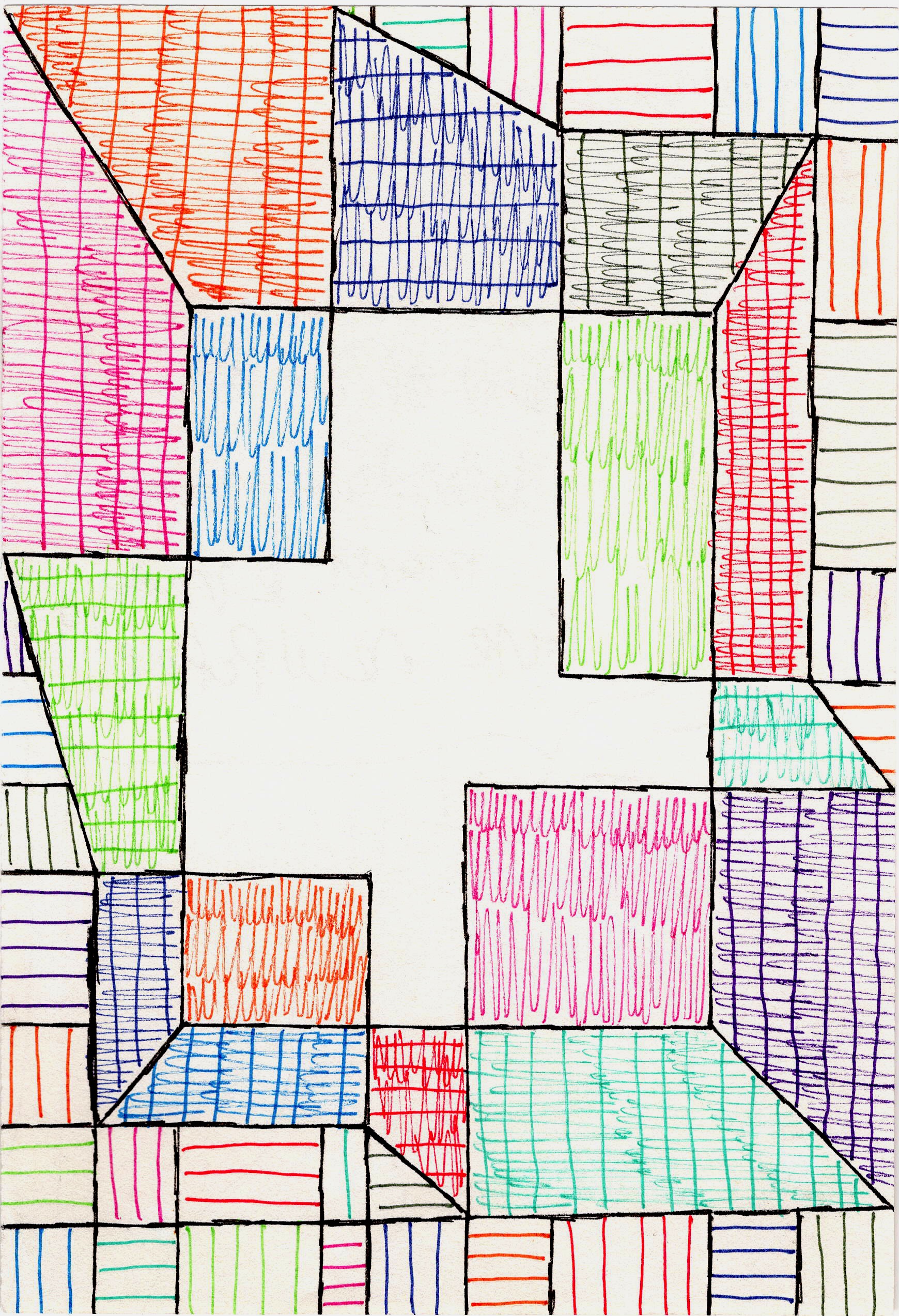 [credit](https://images.zenmuseum.com/art/161/scan.jpeg), [licence](https://images.zenmuseum.com/art/161/scan.jpeg) ## The 'Eureka!' Moment: The Birth of Op Art It was this foundation in precision and systematic thinking that eventually paved the way for Vasarely's most revolutionary insights. His time in graphic design, meticulously crafting visual communication, led him to a profound realization about art's potential. I like to imagine Vasarely having a series of small ‘eureka’ moments, perhaps observing patterns in everyday life – the subtle undulations in textile designs, the optical play of light on water, the repetitive forms of pebbles on a beach, or the shimmering effect of sunlight on a grid of skyscraper windows. One famous story tells of his fascination with the distorted appearance of patterns behind a bus window, or the way a tiled wall seemed to bulge when viewed at an angle. Another anecdote describes his observation of how the lines of a railway track appeared to converge and distort with distance, or how the repeating elements of a chain-link fence created moiré patterns. His scientific mind, ever analytical, was perfectly primed to not just *see* these phenomena, but to *dissect* them and understand their underlying principles. These everyday observations sparked a profound realization: art didn’t have to be *about* something emotional or narrative, but could *do* something to your perception. It could engage the viewer directly, playing with the very mechanics of sight. Imagine him staring intently at a checkerboard floor, noticing how the squares at the periphery seemed to distort, and then thinking, "What if I could make that happen on purpose?" He became obsessed with the idea of **pure plastic invention** – an art derived solely from basic visual elements like shapes, lines, and colors, rather than representing objects or narratives. This was revolutionary because it shifted the focus from interpreting what art *represented* to experiencing what art *did* to our eyes and brains. Unlike earlier forms of [geometric abstraction](/finder/page/the-definitive-guide-to-the-history-of-abstract-art-key-movements-artists-and-evolution) that often carried spiritual or utopian ideals (think of the structured harmony of De Stijl or the spiritual purity of Suprematism), and certainly in stark contrast to the emotional gesturalism of Abstract Expressionism that dominated much of the mid-20th century, Vasarely's 'plastic invention' was about the *phenomenon of seeing itself*. It meant creating art with intrinsic meaning, where the visual itself was the subject, free from external references. This was an art based on simple geometric forms and bold colors that would create the illusion of movement, depth, and vibration. This wasn't just a stylistic choice; it was a profound philosophical statement. Vasarely envisioned art as a universal language, a form of visual Esperanto, accessible to everyone regardless of cultural background or artistic education. He aimed to democratize art, stripping away subjective narratives and emotional interpretations in favor of a direct, undeniable optical experience. And honestly, isn’t there something incredibly democratic about art that doesn't require a degree in art history to appreciate its immediate impact? I think so. It truly is art for all, engaging the eye and the brain directly – a philosophy that deeply resonates with my own mission to make [my art accessible](/buy) to everyone, because I believe art should be a dialogue, not a lecture. 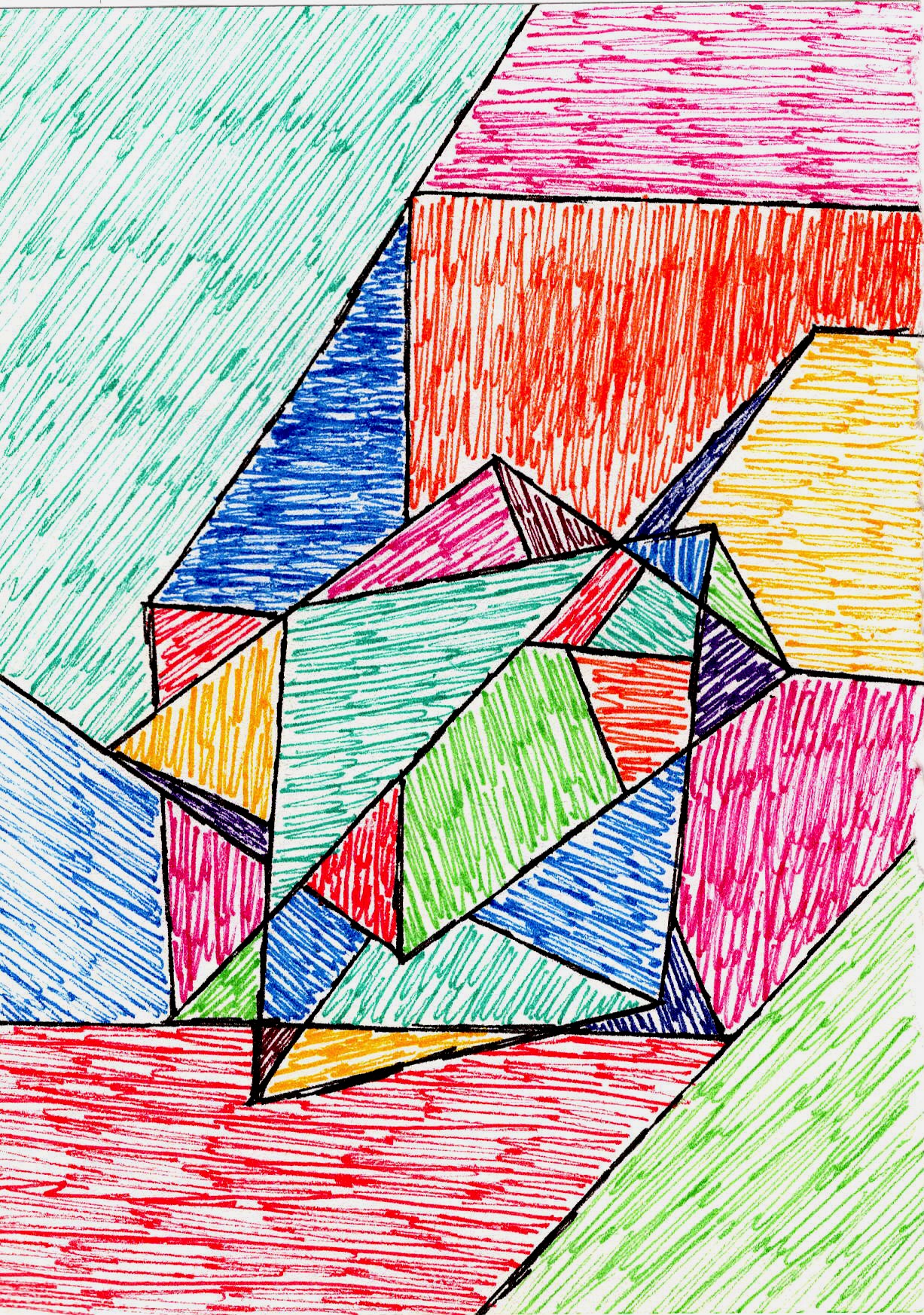 [credit](https://images.zenmuseum.com/art/263/scan.jpeg), [licence](https://images.zenmuseum.com/art/263/scan.jpeg) ## The Vasarely System: A Scientific Approach to Art But how did he actually *engineer* these mind-bending illusions? It wasn't magic, though it often feels like it. It was a rigorous, almost scientific methodology. Vasarely wasn't just painting; he was essentially coding visual effects. He developed what he called his **'Plastic Alphabet'** – a vocabulary of basic geometric forms in various colors – and a systematic approach to manipulate them. His 'Plastic Alphabet' wasn't just a theoretical concept; it was a practical toolset for creating his optical illusions, often starting with small, meticulous paper studies before scaling up. Imagine a palette of basic geometric forms – squares, circles, triangles, rhomboids, hexagons – each assignable to a specific color (often employing primary and secondary hues, alongside stark black and white contrasts). Think of it as his visual grammar, a set of rules and building blocks that allowed him to construct complex visual sentences. By meticulously combining and permuting these 'units' on a grid, much like a musician composes with notes, he could 'write' visual symphonies. For instance, transforming squares into rhomboids, and then subtly altering their size and color, creates a striking illusion of bulging or recession. Applying these techniques to circles might produce swirling vortexes or pulsating spheres. It’s all about precise manipulation. His systematic approach involved:<table><thead><tr><th>Component</th><th>Function in Optical Illusion</th><th>Perceived Effect</th></tr></thead><tbody><tr><td>**Grids**</td><td>Underlying structure for systematic placement and manipulation of forms.</td><td>Creates perceived spatial order, distortion, or a sense of undulation on a flat surface, leading to visual deception.</td></tr><tr><td>**Geometric Units**</td><td>Basic shapes (squares, circles, rhomboids) that form the 'plastic alphabet' and are the building blocks of the illusion.</td><td>Acts as the fundamental element whose precise transformation leads to visual deception, creating the sensation of movement or depth.</td></tr><tr><td>**Systematic Deformations**</td><td>Subtly altering size, shape, or position of units within the grid, often through gradual transitions.</td><td>Generates perceived movement, bulging, recession, or undulation on a flat surface, tricking the eye into seeing dimension where there is none, essentially creating a trompe l'oeil of motion.</td></tr><tr><td>**Color Theory**</td><td>Masterful use of complementary and contrasting colors to amplify optical effects, leveraging properties like simultaneous contrast and afterimages.</td><td>Creates vibrations, shimmering effects, and suggests depth without actual dimension, intensifying the illusion.</td></tr></table>For instance, in his iconic **'Vega' series** (like 'Vega-Pal' or 'Vega-Kontosh'), a striking spherical deformation is achieved by gradually elongating squares into rhomboids and subtly shifting their colors. This is where his mastery of **Systematic Deformations** and **Color Theory** truly shines. For example, moving from a brighter, warmer hue (like a fiery orange) at the perceived center of a bulge to a darker, cooler hue (like a deep violet) towards the edges dramatically enhances the illusion of a form expanding towards you or receding away. This transformation, when combined with precise color gradients, tricks the eye into perceiving a curved surface where none exists. Or, using strong complementary pairs, like a vibrant orange against a deep blue, can create a shimmering, vibrating edge that further intensifies the illusion of movement or depth. This careful manipulation of scale, orientation, and color values – leveraging each component in his table – creates the powerful illusion of a bulging or receding form, even though the surface is perfectly flat. When I look at 'Vega-Pal,' I feel this incredible sense of expansion and contraction, almost like my own studio space is breathing. It’s that direct, visceral reaction that I strive for in my own work. It wasn't random; it was highly calculated, almost like visual coding. I mean, who *doesn't* love a good system? My own studio, I'll admit, is often a beautiful disaster, a chaotic explosion of ideas, but I have a profound admiration for this kind of structured brilliance. He was a scientist with a paintbrush, meticulously planning each visual effect. His meticulous process often involved extensive sketches and graph paper, sometimes even exploring early forms of computer-aided design principles to test and refine his visual algorithms – essentially, the step-by-step rules for creating his optical effects. It's important to note that for Vasarely, "computer-aided design" in the mid-20th century referred more to the *concept* of algorithmic, systematic generation of forms and variations, rather than actual software. He envisioned the potential for machines to execute these optical "recipes" on a grand scale, much like a programmer writes code. It's like a visual recipe for tricking the eye, and the fact that he was so intentional about it is, frankly, mind-blowing. I often think about the sheer patience and precision required to execute these works without digital tools. It makes my own experiments with [geometric abstraction](/finder/page/the-definitive-guide-to-the-history-of-abstract-art-key-movements-artists-and-evolution) feel almost casual by comparison, yet it also inspires me to think more systematically about the visual impact of color and form in [my art](/buy). His methodical approach, turning abstract ideas into tangible visual effects, profoundly shapes my own commitment to creating art that *does* something to the viewer, rather than simply representing something. It's why I focus on deliberate color juxtapositions and compositional structures to evoke energy and movement in my abstract pieces. 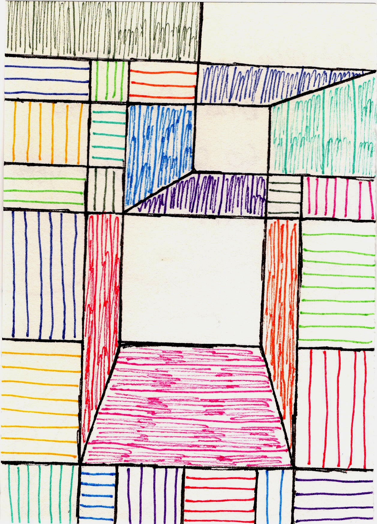 [credit](https://images.zenmuseum.com/art/182/scan.jpeg), [licence](https://images.zenmuseum.com/art/182/scan.jpeg) ## Signature Works and Phases: A Journey Through Illusion Vasarely's artistic journey saw several distinct phases, each building on his core principles of optical illusion and universal aesthetics, demonstrating a clear evolution in his mastery of perception. * **Pre-Op Art Experiments & Early Black and White Period (1930s-1950s):** Even before the term **Op Art** existed, Vasarely was experimenting with the fundamentals of perception. His famous **'Zebra' (1937)**, often cited as one of the earliest examples of Op Art, features undulating black and white stripes that create the distinct illusion of a three-dimensional form or a moving animal, purely through contrasting lines and precise curvature. Other notable works from this period include 'Cheyt-K' (1951), where tessellated black and white squares seem to ripple and flow, and the 'Supernovae' series (1959-61), which hinted at cosmic explosions through stark contrasts and radiating geometric patterns that appeared to pulsate outwards from a central point, mimicking stellar phenomena. This period especially focused on stark black and white contrasts, which are incredibly effective in creating dizzying effects and a sense of movement. Without the distraction of color, the eye is forced to contend solely with form and line, amplifying phenomena like **afterimages** and **retinal fatigue**, where the brain struggles to stabilize the image, leading to a profound perception of motion or depth. It really laid the groundwork for his later colorful explorations, showing just how powerful pure contrast can be. And honestly, there's something so visceral about how those black and white lines play with your vision; it's almost unsettlingly beautiful, a challenge I still find myself drawn to in my own monochrome studies. * **Kinetic Period (1960s):** This phase was defined by the active integration of the viewer's movement with static art, a concept he termed "Cinétisme." He wanted the perception to change as you walked past – think of it less like a lenticular card and more like how architectural elements can appear to shift and dance as you move through a city square, subtly changing their relationship to each other. So, while a true Kinetic Art piece might have spinning motors or physically moving parts, Vasarely's "Cinétisme" relied entirely on *your* physical interaction with a static piece to create the sensation of movement and dynamic shifts in perception. His method involved meticulously arranging lines and geometric forms to create specific visual effects that would only fully reveal themselves as the viewer shifted their position. Works from his 'Gestalt' and 'Vonal' series, such as 'Vonal-KS' (1968), exemplify this interaction, where these carefully constructed forms seem to vibrate and shift with your changing viewpoint, inviting a truly immersive experience. 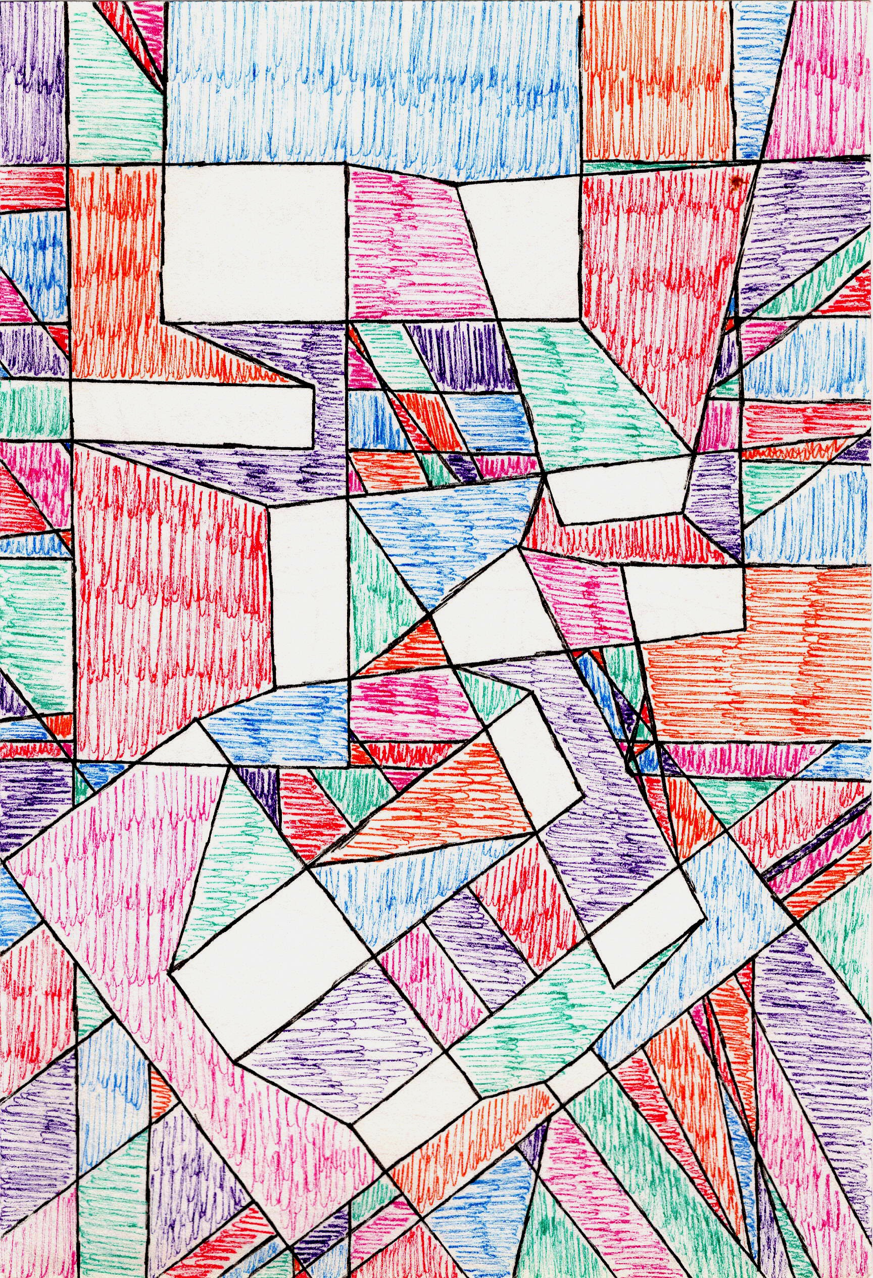 [credit](https://images.zenmuseum.com/art/136/scan.jpeg), [licence](https://images.zenmuseum.com/art/136/scan.jpeg) * **Vibrant Color and Deformations (1960s-1970s):** This is perhaps what most people associate with Vasarely – the explosive colors, the **'Vega' series** (e.g., 'Vega-Pal', 'Vega-Kontosh') where grids seem to inflate or collapse, creating powerful sensations of three-dimensionality and dynamic motion. In 'Vega-Pal', for instance, the systematic elongation of squares into rhomboids, combined with subtle color transitions from light to dark or vibrant complementary hues like electric blue against searing orange, conjures a startling spherical bulge that seems to push out from the flat surface. It’s a masterclass in how to manipulate light and shadow through pure color juxtaposition, essentially painting with perception. Works like his 'Hexagone' series and 'Gestalt-Rug' (1970) also exemplify this period, showcasing his mastery of color to amplify optical effects, creating deeply immersive and often disorienting visual fields. These works are playful, bold, and incredibly immersive. It's like a glitch in the matrix, but in a totally deliberate, awe-inspiring way that still feels fresh to me. What a thrill, right? To look at a flat surface and genuinely feel it push and pull!By the 1970s, Vasarely’s vision had truly taken hold, pushing the boundaries of what art could be and how it could interact with the world around us. This expansive vision naturally led to a monumental legacy. ## Impact and Legacy: Art for the Polychrome City Vasarely’s influence stretches far beyond the canvas. He envisioned a **'Polychrome City'** – a vibrant urban environment where art and architecture were seamlessly integrated, making aesthetic experiences a part of daily life for everyone. This wasn't just an abstract dream; it materialized in public art installations, architectural collaborations, and even commercial applications. A prime example is his monumental kinetic façade for the French station **Montparnasse** (1969-71), where geometric elements shifted perception as viewers moved past, making the building itself an Op Art experience. He also designed the integrated art for the RTL headquarters in Paris, and his principles found their way into textile designs, car paint schemes, logos, and even furniture. Think of his large-scale tapestry for the Olympic Games in Munich (1972) or the integrated artworks at the Université de Paris VIII in Vincennes, where his geometric rhythms transformed concrete spaces into vibrant, dynamic environments. He even collaborated on designing elements for the Caracas Museum of Fine Arts and the Pécs Vasarely Museum. This truly democratic approach meant art wasn’t just for the elite, but a vibrant, integrated part of daily life. This philosophy makes me reflect on my own artistic journey and how I strive to make [my art accessible](/buy) to everyone, not just those who frequent galleries. In a way, his vision paved the path for how we engage with visual design in our digital world, from user interfaces to interactive art and even modern generative art algorithms. During its heyday in the 1960s, **Op Art** captivated the public and permeated popular culture, from fashion (think of Paco Rabanne's iconic geometric designs or Yves Saint Laurent's Op Art dresses, where patterns didn't just decorate but *transformed* the wearer, creating optical illusions that seemed to move and reshape the body itself) to advertising and album covers. This was a decade marked by optimism, technological advancements, and a desire for accessible, modern aesthetics. Op Art's clean lines, vibrant colors, and mind-bending effects resonated perfectly with this era's spirit, becoming a visual shorthand for modernity and progress, almost like a visual soundtrack to the Space Age. While some critics initially dismissed it as merely 'decorative' or a 'gimmick,' arguing it lacked emotional depth or traditional artistic merit, Vasarely vehemently countered these claims. He saw the intellectual rigor of its systematic creation, its direct engagement with universal visual perception, and its ability to provoke a primal, undeniable response in the viewer as profound artistic merits. For him, the art *was* the experience, a direct exploration of visual phenomena rather than a vehicle for narrative. He argued that the new art for a new age should be objective, universal, and engage the modern scientific mind. Its undeniable visual power and intellectual rigor eventually earned it a significant place in [art history](/finder/page/the-definitive-guide-to-the-history-of-abstract-art-key-movements-artists-and-evolution), proving its lasting impact beyond initial critical skepticism. Vasarely, ever the democrat, embraced its widespread appeal, seeing it as proof of art's universal language. Other notable Op Art pioneers like [Jesús Rafael Soto](/finder/page/what-is-kinetic-art-movement-in-modern-sculpture) and [Carlos Cruz-Diez](/finder/page/what-is-kinetic-art-movement-in-modern-sculpture) also pushed the boundaries of perception, each adding their unique systematic approach to the movement. While Vasarely created illusions of movement on a static surface, Soto and Cruz-Diez often incorporated actual physical elements or relied on the viewer's movement more overtly with suspended rods or chromatic structures that truly *physically* shifted in appearance, yet all shared that core fascination with viewer perception and systematic visual play. Later in his career, Vasarely established the **Vasarely Foundation** in Aix-en-Provence in 1976, dedicated to promoting his 'Polychrome City' concepts and integrating art into architecture and urban planning. This was his enduring testament to art as a public, rather than private, experience. 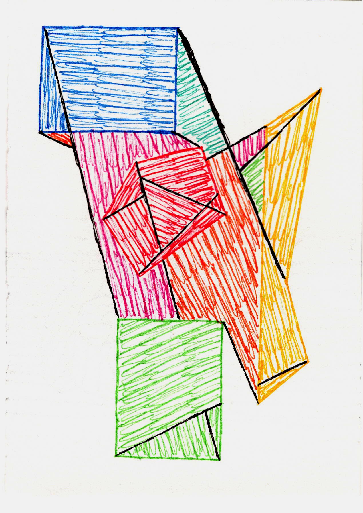 [credit](https://images.zenmuseum.com/art/281/scan.jpeg), [licence](https://images.zenmuseum.com/art/281/scan.jpeg) His systematic approach also deeply influenced subsequent movements exploring [geometric abstraction](/finder/page/the-definitive-guide-to-the-history-of-abstract-art-key-movements-artists-and-evolution) and the [psychology of color](/finder/page/the-psychology-of-color-in-abstract-art-beyond-basic-hues). It makes me think about my own [timeline](/timeline) as an artist, and how every step, every experiment, contributes to a larger vision. But let's not get ahead of ourselves; perhaps some common questions can shed more light on his incredible journey. --- ## Frequently Asked Questions ### What is Victor Vasarely famous for? Victor Vasarely is widely recognized as the 'father of **Op Art**'. He is famous for pioneering a style of abstract art that uses geometric shapes, lines, and colors to create illusions of movement, depth, and three-dimensionality on a flat surface, directly engaging the viewer's perception. ### What are the key characteristics of Op Art? **Op Art** is characterized by its reliance on optical illusions and scientific principles of vision. Key elements include: * **Geometric Abstraction:** The use of precise, often repeated geometric forms. * **Color Contrast:** Employing complementary or sharply contrasting colors to heighten visual effects, leveraging simultaneous contrast and afterimages. * **Line Manipulation:** The systematic alteration of lines to create perceived movement or depth. * **Visual Vibration:** Creating a sense of shimmering or pulsating motion that tricks the eye. * **Perceptual Engagement:** Deliberately challenging the viewer's visual processing and engaging their brain in resolving optical paradoxes. ### Where did Op Art originate? **Op Art** developed primarily in the 1960s, with Victor Vasarely being its primary pioneer and theoretician. While other artists explored similar ideas, Vasarely's systematic approach and extensive body of work positioned him at the forefront of the movement. His early experiments in black and white geometric abstraction laid the crucial groundwork for its later vibrant expressions. ### What was Vasarely's philosophy on art's role in society? Vasarely believed that art should be a universal language, accessible to everyone regardless of their cultural background or artistic education. He advocated for a **'Polychrome City'** where art would be seamlessly integrated into urban environments, architecture, and daily life, making aesthetic experiences a democratic and vital part of society. He saw art as having the power to enrich public spaces and engage the masses directly through optical phenomena. ### What was Victor Vasarely's personal artistic philosophy? Beyond his vision for societal integration, Vasarely’s personal philosophy centered on making art an objective, universal experience rooted in visual perception itself. He sought to strip away subjective narratives and emotional interpretations, focusing instead on the scientific manipulation of visual elements to directly engage the viewer's eye and brain. He believed in art as a reproducible, almost industrial product, which would make it universally available and understandable, transcending cultural barriers. His goal was to create art not *about* something, but that *does* something to the viewer's perception, a kind of 'visual phenomenon' in itself. ### How did Vasarely make his illusions? Vasarely meticulously planned his compositions, often starting with precise sketches on graph paper and creating numerous variations of a single concept before settling on the final composition. He used grids as a base and then systematically altered the size, shape, or orientation of geometric units (his **'plastic alphabet'**) within those grids. This careful manipulation, combined with his understanding of color theory and sometimes even early computer-aided design principles, created the powerful optical effects his work is known for. It wasn't random; it was highly calculated, almost like visual coding or a visual recipe for perception. ### What materials did Victor Vasarely use? Vasarely was incredibly experimental with materials. While he started with traditional painting, he embraced new industrial materials and techniques to achieve his precise effects. He frequently used acrylic paints – a relatively new medium at the time that offered vibrant, consistent colors crucial for optical effects and consistency across multiples. He also utilized screen printing (**serigraphy**) extensively, which allowed for precise, repeatable geometric forms and mass production, aligning perfectly with his philosophy of art democratization and reproducibility. His works were often executed on canvas, wood panels, or even aluminum, demonstrating his ambition to integrate art into diverse contexts and scales, from smaller canvases to large-scale architectural installations. ### What is the psychological impact of Op Art on viewers? The psychological impact of **Op Art** is profound. It directly engages the viewer's perception, creating a sense of visual instability, excitement, or even disorientation as the brain attempts to resolve the conflicting visual information. This can lead to feelings of fascination, challenge, and a heightened awareness of the mechanics of one's own sight. It's a playful yet powerful exploration of how the mind interprets visual stimuli, sometimes even triggering a mild sense of motion sickness or visual fatigue for some individuals. For Vasarely, this intense physiological reaction wasn't a negative side effect but rather a testament to the art's direct, visceral engagement with the viewer's perception, pushing the boundaries of how art can interact with the human body and mind. ### Did Vasarely intend for Op Art to be mass-produced? Yes, absolutely. Vasarely was a strong advocate for the reproducibility and mass production of art. He believed that art should be democratized and accessible to everyone, not confined to exclusive galleries or the homes of the wealthy. He actively created multiples, prints (especially screenprints), and integrated art into public spaces, seeing industrial production as a means to achieve his vision of a **'Polychrome City'** where art was a ubiquitous part of daily life. For him, the intrinsic value of the art lay in its concept and visual impact, not in its unique handcrafted origin. ### Can Op Art cause visual discomfort or motion sickness? For some viewers, **Op Art** can indeed cause visual discomfort, headaches, or even a mild sense of disorientation or motion sickness. This is a testament to its powerful optical effects, which deliberately challenge the brain's visual processing. While not universally experienced, Vasarely likely viewed this intense physiological reaction as a *success* of his art – a direct, visceral engagement with the viewer's physiology, proving the power and immediacy of his engineered perception. It pushed the boundaries of how art could interact with the human body and mind. ### How did technology influence Vasarely's systematic approach? Vasarely's systematic approach to art, akin to "visual coding," naturally led him to explore early forms of technology and computation. He was fascinated by the potential of machines to generate complex patterns and variations from basic geometric units. While he primarily used manual methods like meticulous sketches and graph paper, his theoretical framework for the "plastic alphabet" and systematic deformations paralleled computational thinking. For him, "computer-aided design principles" in his era referred more to the *concept* of algorithmic generation and systematic variation rather than actual digital tools. He wasn't just using tools of his time; he was *envisioning* a future where art could be generated and multiplied using automated processes, making aesthetic experiences accessible on an unprecedented scale. This forward-thinking perspective underscored his belief in art as a science, capable of being systematized and scaled, paving the way for digital art and generative design. ### How was Op Art received by critics and the public? Op Art's reception was initially mixed, especially among traditional art critics. While the public and popular culture enthusiastically embraced its vibrant, mind-bending effects – seeing it as fresh, modern, and perfectly aligned with the technological optimism of the 1960s – some critics dismissed it as merely 'decorative' or a 'gimmick.' They argued it lacked emotional depth, narrative, or the traditional artistic merit of gestural abstraction. However, Vasarely and other proponents countered that its intellectual rigor, systematic creation, and direct engagement with universal visual perception were profound artistic merits. Its undeniable visual power and intellectual challenge eventually secured its significant place in [art history](/finder/page/the-definitive-guide-to-the-history-of-abstract-art-key-movements-artists-and-evolution), proving its lasting impact beyond initial critical skepticism. Vasarely, ever the democrat, embraced its widespread appeal, seeing it as proof of art's universal language. --- ## Final Thoughts on a Visionary If you haven't really taken a moment to let Vasarely's work play with your perception, I truly encourage you to do so. It's a journey into the mechanics of sight, a playful challenge to your brain, and a testament to how profoundly simple shapes and colors can evoke complex sensations. He dared to make art that moved us, without ever actually moving itself. What a legend, right? His vision for art as a universal, integrated part of daily life truly resonates with my own mission to make [my art accessible](/buy) and engaging. It reminds me that every stroke, every decision in my [timeline](/timeline) as an artist, contributes to a larger conversation about how art connects with us and shapes our visual world. Standing before a Vasarely piece, I still get that little brain twitch, that delightful bewilderment, and it reminds me that art, at its core, can be both profoundly intellectual and wonderfully, viscera-lly immediate. He proved that art could be systematic and emotional, scientific and playful all at once. And that, I think, is a legacy worth celebrating – a legacy that continues to inspire much of what I aim to achieve in my own vibrant abstract creations, where I seek to invite a direct, optical dialogue, proving that art doesn't always need a narrative to stir the soul or a complex backstory to engage the mind. It just needs to *do* something. ### Keep Exploring! If you're inspired by Vasarely's systematic approach and vision for accessible art, you might also find value in exploring the mesmerizing work of [Bridget Riley](/finder/page/ultimate-guide-to-bridget-riley-op-art-master-illusion), another incredible **Op Art** master, or delve into the broader [history of abstract art](/finder/page/the-definitive-guide-to-the-history-of-abstract-art-key-movements-artists-and-evolution) and its various [abstract art styles](/finder/page/the-definitive-guide-to-the-history-of-abstract-art-key-movements-artists-and-evolution). You can also discover [my own art collection](/buy) inspired by geometric abstraction and vibrant colors. And if you're ever in ['s-Hertogenbosch](/den-bosch-museum), you know my own museum is there to dive deeper into art too!


