# The Colorful Confessions of an Abstract Artist: My Emotional Palette Have you ever felt a color speak to you? A silent whisper, or perhaps a sudden shout, that bypasses your logical brain and goes straight to your gut? You know, sometimes I look at a finished painting, and it's almost like it painted itself, a spontaneous dance of hues. Other times, it's a battle, a wrestling match with pigments and brushes, trying to coax out a feeling I can't quite articulate. The truth is, for me, as an abstract artist, color isn't just a choice; it's the very heartbeat of the work. It's how I whisper (or sometimes shout) what's going on inside, without ever needing to draw a single recognizable thing. It's personal. Deeply personal. And honestly, a bit messy sometimes, much like life itself. My studio floor can attest to that. The real confession? It's often terrifying to put such raw emotion out there, hoping someone, anyone, will feel the hum of it. I remember exhibiting a series of particularly raw, dark pieces once, filled with tumultuous reds and blacks. I braced myself for confusion or even discomfort from viewers, but instead, one woman simply nodded, tears welling, and said, "You painted exactly what my heart feels." That connection, born from pure vulnerability, is everything. I've always been fascinated by how a splash of cerulean blue next to a fiery cadmium red can make your stomach drop, or how a soft, muted beige can feel like a quiet Sunday morning. It's not just theory; it's a visceral, human response. My journey with color in abstract art has been less about following strict rules and more about chasing that raw, often unexplainable, **emotional resonance**. It’s a pursuit that has defined my artistic path, evolving as I have. ## The Unspoken Language of Color: Personal Interpretations & Universal Echoes Have you ever walked into a room and felt an immediate shift in your mood, simply because of the colors on the walls? That's the power I'm talking about. In abstract art, where there's no landscape to recognize or portrait to analyze, color takes center stage as the primary communicator. It's the silent narrator, telling a story without words. While some color associations are universal – a passionate red, a calm blue – others are deeply personal, rooted in individual memory, or culturally specific. For instance, while red often screams passion or anger to many in Western contexts, for me, a particular muted red might whisper of my grandmother's quiet strength, or the subtle warmth of a childhood memory. And in some cultures, red might signify prosperity or celebration, a layer of meaning I've come to appreciate through my travels and interactions. It’s rarely just one thing, which is why it’s so compelling; a single hue can hold a multitude of narratives. I recall visiting a friend's home in Japan where a single, stark white scroll hung on a wall. In my Western upbringing, white often signifies purity or peace, but my friend explained that in their culture, it also deeply symbolizes mourning and transition. This shifted my perspective on how even the "absence" of color can carry profound cultural weight, informing my later use of negative space. Similarly, encountering vibrant greens in Islamic art, often symbolizing paradise and new life, deepened my appreciation for the diverse emotional landscapes colors inhabit globally. For me, understanding this silent language has been a process of intense listening – and, I confess, quite a few delightful misunderstandings along the way. I remember one piece where I *thought* I was going for a sense of serene calm, using lots of cool blues and greens. But by the time I was done, it looked more like a restless storm at sea. Turns out, my "calm" was actually a simmering anxiety about a deadline! It's these kinds of delightful (or sometimes terrifying) self-discoveries that make the artistic process so endlessly compelling. Artists throughout history have wrestled with this same enigma. I'm fascinated by how masters like [Henri Matisse](/finder/page/ultimate-guide-to-henri-matisse) managed to infuse a whole room with an almost palpable warmth in "The Red Room (Harmony in Red)," making it *scream* comfort without a single recognizable human figure. Or how [Gerhard Richter](/finder/page/ultimate-guide-to-gerhard-richter), despite his often systematic and almost clinical approach to abstraction, still manages to evoke profound feeling with his colors through sheer scale, unexpected juxtapositions, or the visceral impact of his chosen hues, creating an almost overwhelming emotional experience even without a narrative. Their work constantly reminds me that color's power transcends representation. A particularly poignant example of emotion purely through color is found in the work of Mark Rothko. His large, layered color fields, like those in his [Seagram Murals](https://www.tate.org.uk/art/artworks/rothko-seagram-murals-t01166), don't depict anything recognizable, yet they envelop the viewer in deep contemplative or melancholic states, purely through the interaction of hue, saturation, and scale. 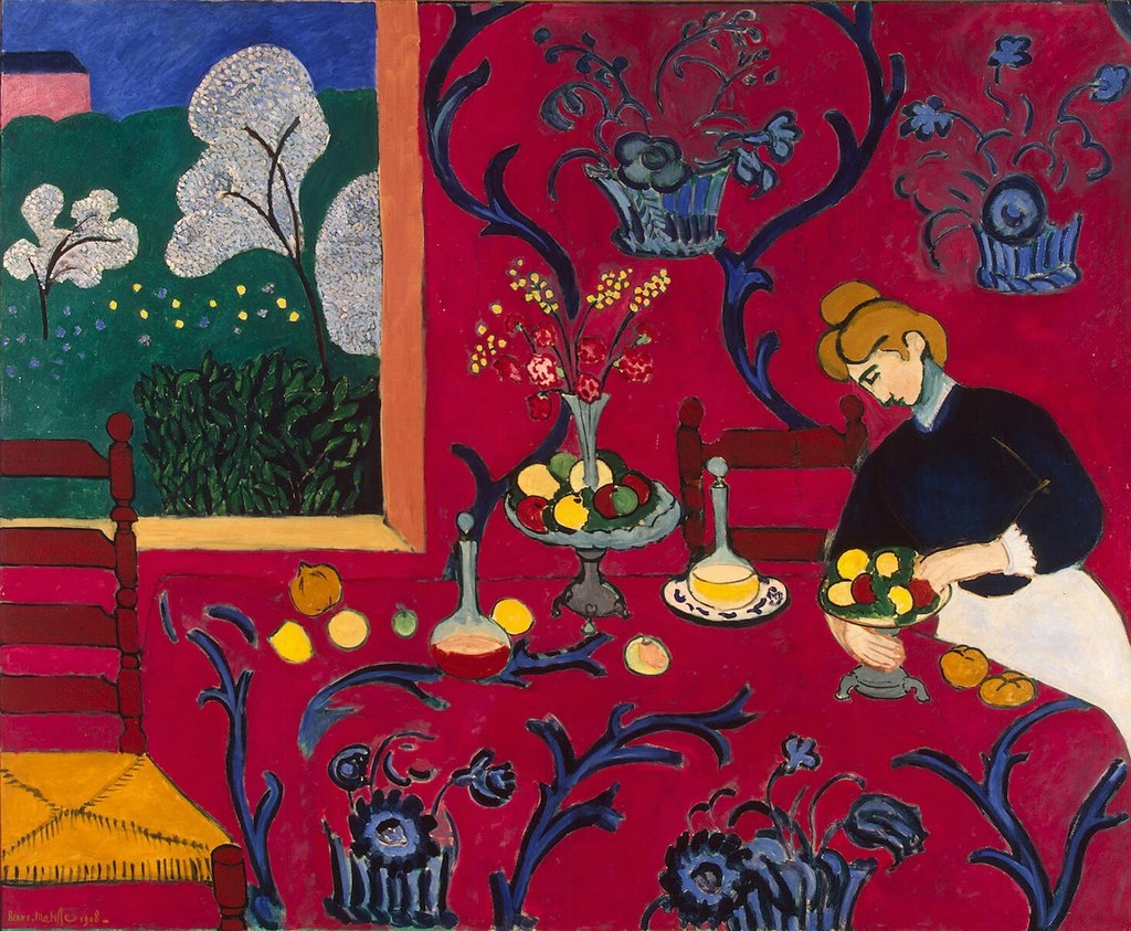 [credit](https://live.staticflickr.com/4073/4811188791_e528d37dae_b.jpg), [licence](https://creativecommons.org/licenses/by-sa/2.0/) It's this emotional weight that makes color so much more than just a visual element. It's an entry point into a dialogue, a bridge between my internal world and yours, and it's a big part of [what makes abstract art compelling](/finder/page/what-makes-abstract-art-compelling). If you're curious about the general psychology behind this, there's a fascinating dive into the [psychology of color in impressionist painting](/finder/page/psychology-of-color-impressionist-painting) that might give you some insights! For a broader view, you can explore [how artists use color](/finder/page/how-artists-use-color) in general. ### My Personal Color Associations vs. Common Interpretations | Color | My Personal Interpretation | Common Association | | :--------- | :------------------------------ | :------------------------ | | Red | Grandmother's quiet strength | Passion, Anger, Danger | | Muted Blue | Quiet acceptance, introspection | Calm, Sadness, Serenity | | Yellow | Ephemeral joy, fleeting ideas | Happiness, Energy, Caution | | Green | Growth, complex relationships | Nature, Harmony, Envy | ## My Palette: The Intuitive Dance of Color and Chance Ever wonder how an abstract artist actually *chooses* their colors, or if there's a secret formula? Choosing a palette... ah, the eternal question. Do I meticulously plan every hue, calculating temperature and saturation? Or do I just grab whatever tube looks inviting that day? The honest answer is: it’s a chaotic dance between the two, often leaning heavily towards the latter. I find my inspiration isn't limited to the visual realm; sometimes, a particular piece of music sparks a color combination, or the way light filters through the trees during a walk dictates a new direction. This **intuitive approach**, deeply connected to my sensory experiences, is at the heart of my process. ### The Intuitive Spark Often, a color just *calls* to me. Like a whisper from the canvas saying, "I need more yellow!" And who am I to argue? I might start with a single dominant color, one that captures a mood I'm feeling or want to explore. From there, it's a conversation. What does this blue need? Perhaps a sharp orange to create tension, or a gentle green for harmony. It's rarely a scientific process; it's more like trying to find the right conversational partners for a lively debate. The true emotional impact of my canvases often reveals itself to me only once I'm already deep into the process, not through pre-planning. It's like unpacking a surprise present, layer by layer. Sometimes it's stepping back, letting my eyes unfocus, waiting for a color to 'pop' or a void to 'call out' for a specific hue. It's like the canvas itself is making a subtle request, and I'm just trying to be a good listener. ### The Physicality of Color: Application as Emotion It's not just *what* colors I choose, but *how* I apply them that contributes to the emotional language. I often layer thin glazes of translucent colors to build a sense of quiet contemplation or a dream-like state, allowing light to play through the successive washes. Conversely, when expressing more visceral or tumultuous emotions, I might turn to thick [impasto](/finder/page/what-is-impasto-painting), applying paint with a palette knife or directly from the tube, allowing the raw texture and immediate physicality to convey a scream, a struggle, or an urgent thought. The physicality of the medium itself becomes part of the raw feeling. 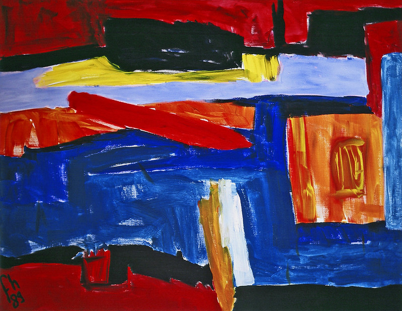 [credit](https://www.flickr.com/photos/abstract-art-fons/30634352376), [licence](https://creativecommons.org/licenses/by/2.0/) ### Embracing Happy Accidents & Overcoming Color Fatigue Sometimes, a color choice is purely accidental. I might mix too much of something, or grab the wrong brush, and suddenly, a new, unexpected hue emerges that *works*. These "**happy accidents**" are often the best ones because they challenge my preconceptions and push me into new visual territories. For instance, I once mistakenly mixed a vibrant magenta into a deep indigo, expecting a muddy mess, but instead, it sparked a whole new series exploring iridescent purples that I never would have conceived intentionally, proving that sometimes the 'wrong' move is exactly right. Cultivating this intuition means giving myself permission to just *play*, to observe, and to simply stare blankly at a wall until an idea clicks. (Yes, part of my artistic process involves a lot of wall-staring. My cat thinks I've lost my mind, but sometimes the answer comes when you least expect it.) Despite this intuitive freedom, I also face periods of intense **color fatigue**. It's not just exhaustion from looking at vibrant hues, but a deep frustration when the pigments on the canvas don't yet resonate with the emotion stirring within me. It’s like trying to have a profound conversation, but everyone keeps speaking different languages. To combat this, I often step away for a while, immerse myself in nature, or simply switch to working with only neutral tones for a bit to reset my visual palette. Sometimes, I'll spend a day sketching only in charcoal, focusing on form and shadow without the distraction of color, or visit a botanical garden to absorb natural color combinations without the pressure of painting, letting my eyes rest and reset. Sometimes, the solution comes not from adding more color, but from taking a pause. Consider the stark contrast between a piece like [Gerhard Richter's 1024 Colors Artwork](/finder/page/ultimate-guide-to-gerhard-richter), which embodies a systematic exploration of color, and the more gestural, intuitive approach often seen in [abstract expressionism](/finder/page/ultimate-guide-to-abstract-expressionism). 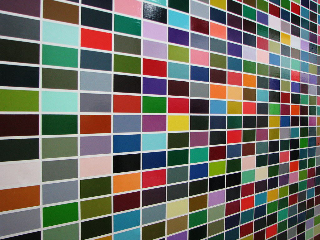 [credit](https://live.staticflickr.com/3173/29710630194_95f41144d3_b.jpg), [licence](https://creativecommons.org/licenses/by/2.0/) While understanding basic [color theory](/finder/page/what-is-a-color-wheel-how-to-use-it) is foundational – knowing, for instance, that complementary colors like blue and orange create tension – for me, the real magic happens when I step away from the color wheel. I might intentionally choose analogous colors to create a subtle, unsettling harmony that feels more true to a complex emotion, rather than strictly following rules. It’s about what *feels* right. Does this vibrant pink make the red sing, or does it clash like a bad karaoke night? It’s about creating a mood, a vibration, a conversation that transcends the visual. This is also where the [emotional language of color in abstract art](/finder/page/the-emotional-language-of-color-in-abstract-art) truly shines. ## Emotion on Canvas: When Color Becomes the Storyteller When you stand before an abstract painting, especially one that heavily relies on color, you're not just seeing pigments. You're experiencing a distillation of emotion. A deep indigo might evoke solitude, a burst of yellow, pure joy. It's less about the artist dictating a feeling and more about opening a portal for your own feelings to emerge. My relationship with color and its expression has also evolved over the years. Early in my career, I found myself drawn to bold, primary colors to convey straightforward emotions like anger or elation. But with time and introspection, I've discovered a deeper appreciation for more nuanced, muted tones, and complex layering to express intricate feelings – the quiet ache of longing, the fragile beauty of a memory, or the subtle tension of anticipation. This evolution mirrors my own personal journey, as my emotional landscape has become richer and more layered. The physicality of the paint itself also plays a silent role. Thick [impasto](/finder/page/what-is-impasto-painting) might convey a raw, immediate emotion – a visceral scream or a desperate struggle – while thin, layered washes can feel like a whispered secret, a fleeting thought, or a quiet acceptance. For instance, in one of my recent pieces, 'Crimson Echoes,' I used heavy impasto with deep reds and blacks to capture the tumultuous feeling of grief and release, while 'Ephemeral Blue,' another recent work, employs thin, translucent layers of cerulean blue to convey the delicate, ephemeral nature of a dream or a fleeting moment of peace. And speaking of whispers, it's worth noting the power of what *isn't* there. The absence of color, or the strategic use of neutral tones and negative space, can be just as impactful as vibrant hues. A stark white void surrounded by subtle grays can create a profound sense of emptiness or anticipation, allowing the viewer's imagination to fill the quiet spaces. Sometimes, the most powerful statement is made not by what you add, but by what you hold back. This often relates to [the role of texture in abstract art](/finder/page/the-role-of-texture-in-abstract-art:-a-sensory-exploration) as well. I find that the most impactful abstract pieces are those where the colors feel... honest. They don't try to be something they're not. This means resisting the urge to 'fix' a color that initially feels jarring if that jarring quality is part of the raw emotion I'm trying to convey. Or allowing a muddy mix to stay if it truly reflects a muddled, uncertain feeling. They just *are*. And in that raw honesty, they create a resonant frequency that can stir something deep within you. It’s a wonderful challenge, trying to capture that elusive honesty with just a few strokes of color. This is part of [finding your abstract voice](/finder/page/finding-your-abstract-voice:-exercises-for-intuitive-painting). 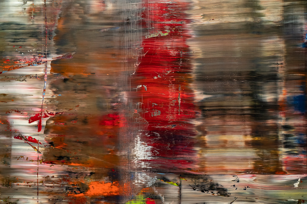 [credit](https://live.staticflickr.com/65535/53064827119_1b7c27cd96_b.jpg), [licence](https://creativecommons.org/licenses/by-nc-nd/2.0/) Consider the vibrant abstract landscape below. Does it *look* like mountains? Perhaps not literally, but the *feeling* of a vast, colorful, almost spiritual landscape? Absolutely. The colors do all the heavy lifting, inviting you to project your own sense of awe and wonder onto the canvas, transforming it into a personal experience. 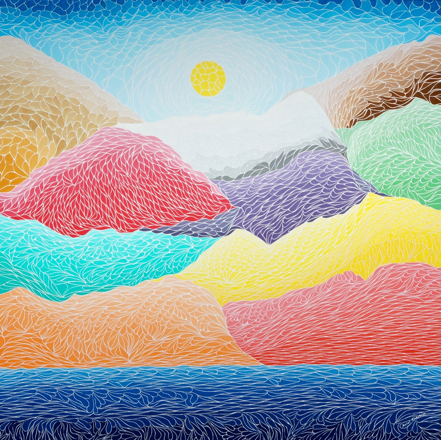 [credit](https://commons.wikimedia.org/wiki/File:The_Creation_Of_The_Mountains.jpg), [licence](https://creativecommons.org/licenses/by-sa/4.0/deed.en) Ultimately, for me, the goal isn't to create a perfect representation of something, but a perfect representation of a feeling. It's a bit like trying to bottle sunshine or capture the feeling of a sudden downpour. Impossible, really, but the attempt is the art. For those looking to gain a deeper appreciation, a [guide to finding meaning in non-representational works](/finder/page/decoding-abstract-art:-a-guide-to-finding-meaning-in-non-representational-works) can be quite helpful. ## My Work & Your Connection: A Shared Visual Journey Every piece I create, whether it's a large canvas or a smaller print, is a fragment of this ongoing dialogue with color and emotion. It's me trying to pour a piece of my internal world onto the external canvas, a visual diary of sorts. And the most rewarding part? When someone else looks at it and finds a piece of their own world reflected back. I remember one woman at an exhibition who burst into tears looking at a particularly stormy blue and red piece, telling me it perfectly captured the chaos of her own year. I hadn't consciously intended that, but the colors *spoke* to her, and that's the real magic. It's proof that this silent language truly connects us. If you're curious to see how my approach to color manifests, I invite you to explore my [art for sale](/buy) or, if you're ever in the Netherlands, consider visiting my museum in ['s-Hertogenbosch](/den-bosch-museum). It's always a treat to see how people connect with the work in person, sometimes finding an emotion I didn't even realize I'd embedded. You can also trace the evolution of my artistic path through my [timeline](/timeline). --- To distill these colorful confessions and the evolving journey of my palette, here are the core beliefs that guide my artistic path: > ### Key Takeaways from My Colorful Confessions: > * **Color is Emotion:** For me, it's the primary language of feeling in abstract art. > * **Intuition Over Rules:** While theory helps, the gut feeling often dictates the most impactful color choices, leading to profound **emotional resonance**. > * **Honesty Resonates:** The most powerful pieces are those where colors are unapologetically authentic, embracing both harmony and dissonance. > * **Shared Journey:** My goal is to create a space for *your* emotions to emerge, guided by my palette, fostering a deeper connection. > * **Evolution is Key:** My artistic language, much like my life, is constantly evolving, with new colors and forms emerging from introspection and experience. --- ## FAQ: The Colorful Queries I Get You've got questions, I've got (sometimes messy) answers! Here are some common queries I hear about my approach to color in abstract art: **Q: How do you choose your colors for a new piece? Is it planned?** A: Honestly, it's rarely a precise plan. I often start with a core emotion or a single color that's been resonating with me. From there, it's an intuitive conversation with the canvas. Colors are added, layered, and mixed based on what feels right in the moment, responding to the emerging composition. It’s less like following a recipe and more like an improvisational jazz session, full of unexpected harmonies and dissonances. **Q: Can abstract art really convey emotion without recognizable subjects?** A: Absolutely, and in many ways, it does so more directly! Without a literal subject to distract, color becomes the primary language. The vibrations, contrasts, and harmonies of hues speak directly to our subconscious, bypassing the logical mind and tapping straight into our emotional core. It's pure feeling, distilled. **Q: How do you know when a piece is 'finished' in terms of color?** A: Ah, the million-dollar question! It's less about "knowing" and more about "feeling." A piece feels finished when the colors on the canvas achieve that **emotional resonance** I'm chasing – when they hum together, or clash intentionally, in a way that truly reflects the initial impulse or the evolving feeling. Sometimes it's a sudden click, other times it’s a slow realization. It's a moment of quiet satisfaction, where I feel the piece has said what it needed to say, and adding anything more would diminish its truth. It's subjective, personal, and sometimes, I'm still asking myself that question years later about an older work! **Q: Is there a "wrong" color to use in abstract art?** A: "Wrong" is a strong word, and one I try to avoid in art. What might be "wrong" for one artist's vision or one specific piece could be perfectly "right" for another. It's less about universal rules and more about intent, context, and whether the colors serve the emotional message you're trying to convey. Experimentation is key – sometimes the most unexpected combinations lead to the most powerful results. **Q: How can I, as a viewer, better understand the colors in abstract art?** A: My best advice? Don't overthink it. Let yourself *feel*. Look at the colors and notice what sensations, memories, or emotions they evoke in you. There's no single "correct" interpretation. Engage with the intensity, the softness, the contrasts. It's a personal journey for both the artist and the viewer, and the colors are your guide. **Q: What advice do you have for aspiring abstract artists struggling with color?** A: My main advice is to simply *start*. Don't wait for perfection. Pick a few colors that excite you, or even just one that feels like your current mood, and see where it leads. Embrace the **happy accidents** – they often reveal new paths. Paint without judgment, and allow yourself to make "mistakes." That's where the real learning, and the most authentic expression, happens. And don't be afraid to stare at a wall for inspiration; sometimes the answer comes when you least expect it. --- ## Conclusion: A Never-Ending Exploration of Color The power of color in abstract art, for me, lies in its boundless capacity for expression. It's a thrilling, sometimes frustrating, but always deeply rewarding journey. Every new canvas is an invitation to explore a new facet of feeling, a new conversation between pigment and soul. It's about letting go of what's expected and embracing what *is*, allowing the colors to speak their unvarnished truth. The challenge of capturing an elusive emotion with just a few strokes remains, and that's precisely what keeps me coming back to the easel, day after day. So, next time you encounter an abstract piece, whether it's mine or another artist's, pause for a moment. Don't ask "What is it?" Ask, "How does it make me *feel*?" Because often, the answer to that question is precisely what the colors are trying to tell you. And trust me, they have a lot to say. What colors whisper (or shout) to *you*? Share your own color confessions, or tell me which abstract pieces have moved you most deeply – I'd truly love to hear your perspective.