Linocut for Beginners: Your Comprehensive Guide to Joyful Printmaking
Ah, linocut! The very mention still sends a little shiver of creative excitement down my spine. There’s a raw, almost primal joy in transforming a simple block into a repeating image, a magic that still captivates me years after my first clumsy cuts.
Linocut for Beginners: Your Comprehensive Guide to Joyful Printmaking
Ah, linocut! The very mention still sends a little shiver of creative excitement down my spine. There’s a raw, almost primal joy in transforming a simple block into a repeating image, a magic that still captivates me years after my first clumsy cuts. I remember discovering it ages ago, probably while deep-diving into some art rabbit hole online (you know how that goes – one minute you're researching Renaissance, the next you're arguing about archival charcoal). What immediately drew me in was the tactile nature of it – carving something with my hands, then the magic of revealing an image through ink and pressure. It felt honest, a little like playing in the mud, but in a sophisticated, artistic way that doesn't demand a master's degree or a sprawling studio. It's a journey into making something truly tangible, where every deliberate cut becomes a part of your unique artistic statement. This guide is designed to be your comprehensive, beginner-friendly companion into this incredible art form. By the end, you'll have the confidence and knowledge to carve your first linocut and embark on your own printmaking adventure, experiencing that same simple, profound pleasure I found. We’ll start by demystifying what linocut is, then dive into the essential tools, the step-by-step process, how to embrace happy accidents, troubleshoot common issues, and finally, explore avenues for deeper artistic expression. So, if you're ready to get your hands gloriously dirty, let's dive in.
If you’ve ever felt that tug, that curious spark about making prints, but perhaps thought it looked too complicated, too messy, or too 'professional', then, my friend, you're in the right place. This isn't some dry, academic treatise; it's more like we're sharing a coffee, and I'm rambling about why I think linocut is an absolutely brilliant starting point for anyone yearning to make art with their hands – especially if you, like me, appreciate the beauty of a well-defined line and the satisfying thwack of a brayer. I'm here to demystify the process and show you just how accessible this incredible art form truly is, while also encouraging a mindful approach. So, let's peel back the layers and discover the simple, profound pleasure of printmaking together.
What Even Is Linocut, Anyway? (And Why You'll Love It)
At its heart, linocut (often referred to more broadly as linoleum block printing) is a form of relief printing. Think of it like a big, grown-up stamp. You carve away the parts of a lino block that you don't want to print, leaving the image you do want to print raised. Then, you roll ink onto those raised areas, press paper onto the inked block, and voilà! An impression of your design appears. It's truly as simple and as profound as that. Typically, linocut blocks come in a range of sizes, from small A6 or A5 formats perfect for greeting cards, up to larger A3 or even custom sizes for ambitious projects, giving you plenty of room to experiment. When carving, an unmounted block feels more flexible and can sometimes shift if not properly secured, while a mounted block (adhered to a wood backing) offers greater stability, giving you a firmer surface and often a sense of more control.
Linocut is just one fascinating member of the relief printing family, which also includes its older, more traditional cousin, woodcut (for a deeper dive into that fascinating history, you might enjoy reading about the enduring legacy of ukiyo-e: Japanese woodblock prints and their global impact). Other relatives include wood engraving (a finer, more detailed technique using the end grain of wood, capable of incredibly intricate lines), linoleum engraving (which, unlike linocut, often involves specialized tools for finer, incised lines rather than broad carving, creating a different textural quality), and even simple rubber stamping (which is essentially linocut's playful little cousin). What differentiates relief printing from other major printmaking categories is its directness: in intaglio methods (like etching or engraving), the image is incised into the surface and holds the ink, while in planographic methods (like lithography or monotyping), the printing and non-printing areas are on the same plane. With relief, it's all about what's raised. The texture of a linocut print often feels smoother and more uniform than a woodcut, which can show the wood grain, giving each material a distinct character.
While woodcut has been around for centuries, linocut truly emerged in the early 20th century as a more accessible and forgiving alternative, a democratic medium born from industrial necessity. This shift was crucial, opening direct and versatile avenues for artistic expression at a time when artists were actively seeking new forms. Its rise coincided with artistic movements like German Expressionism, where artists such as Ernst Ludwig Kirchner and Käthe Kollwitz embraced its bold, graphic qualities for powerful social commentary. They were drawn to its directness, its suitability for expressing raw emotion, and its affordability, which made it an effective medium for reaching a broader public. Even Futurism and Constructivism artists found it a compelling medium for conveying dynamic, modern themes. Beyond fine art, linocut also found historical use in commercial applications such as posters, book illustrations, and even textile patterns, thanks to its ease of reproduction. The beauty was that it didn't require expensive, specialized equipment like a large press or rare wood, unlike more traditional methods. Even modern masters like Picasso and Matisse famously experimented with it; they appreciated how linoleum, unlike wood, has no grain, allowing for smooth, fluid cuts in any direction.
This grainless nature makes it far more forgiving for beginners (and, frankly, a joy for seasoned artists too). Imagine trying to carve a delicate curve into wood only for the grain to resist or splinter – with lino, you don't have that battle. You can achieve smooth, flowing lines and curves with much less effort, and the material won't fight back, making it ideal for those just starting out who want to focus on their design rather than material resistance. It was a liberation, really, offering a direct avenue for creative vision without the material's inherent resistance.
Linoleum itself has a fascinating history, actually. Originally patented in the 1860s as a flooring material – yep, the stuff your grandma might have had in her kitchen – its industrial production made it widely available and affordable, allowing artists to experiment with it as an accessible new medium. Artists quickly realized its potential due to its uniform texture and relative softness compared to wood. Composed primarily of solidified linseed oil, cork dust, wood flour, and tree resins, it's these natural materials that give linoleum its unique pliancy and smooth carving properties. This practical origin story always tickles me a bit; it's like finding artistic gold in the most mundane places, which, if you ask me, is where some of the best art originates anyway.
The beauty of it, for me, lies in its directness. There's no hiding. Every line you carve, every decision you make with your gouge, shows up in the final print. It forces you to simplify, to think about positive and negative space in a whole new way, which, let's be honest, is a fantastic exercise for any artist, abstract or otherwise. The positive space is your actual image, the part that will be inked. The negative space is everything around it, the material you carve away, which remains the color of your paper – much like the light in a room defines the objects it illuminates. Another way I like to visualize it is like a cookie cutter: the part of the dough that remains is your positive space, and the dough you remove from around it is your negative space, defining the form that's left. Learning to see in terms of these two opposing forces is a fundamental skill in linocut, and it will radically change how you approach design. It also forces you to consider light and shadow, as the raised areas will be dark (inked) and the carved areas light (paper color), creating contrast. (Speaking of simplifying, if you're interested in how artists generally approach visual elements and line, you might find my thoughts on the definitive guide to understanding line in abstract art from gestural marks to geometric forms insightful.)
So, linocut is not just a technique; it's a conversation with your material, leading to unique and satisfying results.
The Linocut Mindset: Cultivating Patience and Presence
Before we dive into the nitty-gritty of tools and techniques, I think it's important to touch on the underlying philosophy of linocut. For me, it's more than just a craft; it's a practice in mindfulness and patience. In a world that constantly demands instant gratification, linocut asks you to slow down. Each cut is deliberate, each roll of the brayer a conscious action. You're physically engaged with the material, feeling the resistance, seeing the shavings curl away. This direct connection to the creative process offers a welcome respite from our digital lives, almost like a meditation. It teaches you to accept imperfections, to problem-solve in real-time, and to find joy in the journey, not just the destination. It's about being present, which, if you ask me, is one of the most valuable lessons any art form can teach.
This mindful approach beautifully complements the practical aspects of linocut, setting the stage for a truly rewarding artistic experience. Now, with that philosophy firmly in mind, let's talk about getting started with the right gear.
Gearing Up: What You'll Need to Start (Don't Overthink It!)
Okay, so you're intrigued. Now for the practical bit. You might imagine needing a whole studio full of fancy equipment, but to start, it's surprisingly minimal. Trust me, I'm a big believer in just getting started with what you have, then figuring out what you actually need. My creative sanctuary wasn't built in a day, after all! (And yes, I've definitely fallen for the trap of buying that 'essential' tool only to use it once and relegate it to the back of a drawer – we've all been there!). Here's the thing: printmaking, in its simplest form, is incredibly democratic. You don't need a press or an art degree to get started. Just a few basic supplies and a willingness to make a delightful mess.

Here’s my personal 'must-have' list for diving into linocut, focusing on tools that prioritize ease of use and immediate gratification. A little word on safety before we dive in: beyond just a bench hook, always carve away from your body, keep your workspace clear, and ensure good ventilation, especially if you ever branch out into oil-based inks (though water-based are usually fine, it's a good habit to develop). Printmaking can be messy, but it shouldn't be dangerous! And seriously, make sure you have a good, consistent light source; it's a game-changer for seeing your cuts clearly and preventing eye strain.
- Lino Blocks: For beginners, I strongly recommend soft-cut lino (sometimes called "easy-cut" or "safety-cut"). It's much, much easier to carve than traditional grey lino, which can be tough on the hands, crumbly, and unforgiving due to its firmer composition and sometimes aged state. Think of soft-cut as the training wheels of printmaking – smooth, pliable, and kind to your tools. Popular options include Speedball Speedy-Carve, Essdee Softcut, or Blick Ready-Cut. While traditional grey lino offers sharper edges and durability, it's a battle for your first few tries. Its denser composition, typically made from solidified linseed oil, cork dust, wood flour, and tree resins, allows it to hold fine details incredibly well and withstand numerous impressions, making it a favorite for experienced printmakers creating larger editions. There are also newer options like Japanese vinyl (very soft, great for fine details), or battleship grey lino (a firmer option, holds up to many impressions). Each type has its own feel and allows for different marks. Soft-cut, for instance, encourages a more fluid, organic line and deeper, easier cuts, while traditional lino allows for very crisp, delicate details. But seriously, start soft. And if you're feeling a bit eco-conscious, keep an eye out for recycled or biodegradable lino alternatives as you delve deeper. Many brands are now creating blocks from natural rubber, cork, or even recycled linoleum scraps, offering a greener way to create without compromising quality. Also, consider if you want a mounted block (lino adhered to a wood backing for stability) or unmounted lino (just the lino sheet, often cheaper and more flexible, but requires a non-slip mat or bench hook for stable carving).
Lino Type | Carving Feel | Best For | Beginner Friendly |
|---|---|---|---|
| Soft-Cut | Very soft, pliable | Smooth, fluid lines; deep, easy cuts | High |
| Traditional | Firmer, crumbly | Crisp, fine details; intricate designs | Medium-Low |
| Japanese Vinyl | Soft, smooth | Fine lines, delicate details | High |
| Battleship Grey | Firm, durable | Sharp lines, holds up to many impressions | Medium |
- Carving Tools: You can get a basic set of lino cutting tools for very little money. These typically come with a comfortable handle and several interchangeable blades, including different sizes of V-shaped gouges (for fine lines and details) and U-shaped gouges (for clearing larger areas and softer curves). For beginners, a Speedball cutter set is a common and affordable starting point, offering a good range of interchangeable blades. More professional sets might have fixed blades and ergonomic handles, but they're not necessary for your first steps. Start with one of these basic sets; you'll soon figure out which ones you prefer for different lines and clearing areas. You'll find them in various widths – a fine V-gouge is perfect for intricate hair-thin lines, defining crisp edges, or adding delicate textures like the fine veins on a leaf. A wider V-gouge can define more substantial contours. U-gouges vary from shallow curves for softer lines and subtle textures to deeper scoops for quickly clearing large areas. A shallow U-gouge, for instance, is excellent for creating textured backgrounds, subtle shading through parallel lines, or for wider, soft curves. A deeper U-gouge is your workhorse for quickly clearing larger negative spaces. Beyond standard gouges, some artists experiment with rotary tools for faster clearing of large areas (use with extreme caution!) or even unconventional household items like knitting needles for specific textures – though for safety and predictable results, I recommend sticking to purpose-built tools initially. A sharp tool is a safe tool, so learning to hone your blades will be a game-changer for smooth cuts. Seriously, a well-honed gouge glides through the lino like butter, making carving a pleasure and preventing slips. Dull tools tear the lino, make carving a frustrating battle, and can lead to slips. You'll find various sharpening tools available, from fine-grit sharpening stones to leather strops with honing compounds, which can help maintain that razor-sharp edge. Remember that the angle at which you hold your gouge profoundly affects the depth and character of your cut; a shallow angle creates a fine, delicate line, while a steeper angle digs deeper for bolder marks or to remove more material.
- Water-Based Inks: Crucial for beginners! They clean up with water, dry relatively quickly, are low-odor, and generally non-toxic, making them far less intimidating than oil-based inks. The viscosity of water-based inks is also generally easier to manage, being less sticky than some oil-based varieties. While I still mostly use them, it's worth knowing that oil-based inks do offer richer, more vibrant colors and a longer 'open time' (meaning they stay wet longer on the block, giving you more time to print, but also require solvents for cleanup), which advanced printmakers often appreciate. But for now, stick to water-based. Black is a classic for a reason, but feel free to grab a primary color or two if you're feeling adventurous.
- Brayer (Roller): This is how you get the ink onto your block. A simple rubber brayer will do the trick. Don't cheap out too much here; a good brayer makes a difference in even ink application. You're aiming for that satisfying "tacky" sound when rolling, which signals a thin, even film of ink. You'll find different types, like soft rubber brayers (ideal for delicate papers, provide more even ink application), harder rubber brayers (can pick up more texture from the block's surface), or acrylic brayers (firm, good for smooth surfaces). For starters, a general-purpose soft rubber brayer is perfect, offering a good balance of ink transfer and flexibility. Its hardness (often measured as durometer, though you don't need to get technical with that!) impacts how much ink it picks up and how precisely it transfers to the raised areas of your block.
- Paper: Any relatively smooth, slightly absorbent paper will work for practice. Printer paper is fine for testing. Once you're feeling confident, try some slightly heavier art paper for your 'final' prints. Consider the paper weight, often measured in GSM (grams per square meter) – this signifies the density of the paper, so generally, anything from 120gsm (think thick cardstock) to 300gsm (heavy watercolor paper) is excellent for printmaking. Heavier paper not only feels more substantial but can also withstand the pressure of printing better without warping. For best results, look for papers specifically designed for printmaking, like Stonehenge, Rives BFK, or even some delicate Japanese Kozo or Washi papers. These papers often have ideal absorbency and just the right amount of 'tooth' to pick up ink beautifully. What's 'tooth'? It's that subtle surface texture, like the microscopic fibers on a fresh sheet of drawing paper, that allows the ink to gently adhere. A paper with more tooth (like a watercolor paper with a slight texture) will often result in a slightly more textured, matte print, as the ink settles into the tiny valleys and peaks. Conversely, a super smooth paper (like Bristol board) will give you a crisper, perhaps more uniform impression with sharper lines. The right paper also tends to be pH-neutral or archival, meaning your prints will last longer without yellowing, fading, or degrading over time due to acid content. This is crucial for preserving your masterpieces for years to come, preventing that slow, silent decay that can plague non-archival materials. Experiment with different textures and finishes – a slightly toothy paper can pick up ink differently than a super smooth one, and matte finishes will absorb ink differently than a satin or semi-gloss, impacting how the color appears and feels. Matte papers tend to offer a deeper, more absorbed color, while satin or semi-gloss can give a slight sheen and make colors pop more intensely. It's all about finding what works for your aesthetic.
- Bench Hook (Optional, but highly recommended for safety!): This simple device holds your lino block still while you carve, keeping your hands away from the sharp tools. Seriously, invest in one or make a simple version. Safety first, always! I've had my share of minor mishaps, and let me tell you, a band-aid isn't quite the artistic statement you're aiming for.
- Sketching Supplies: Pencil, paper, eraser for designing your masterpiece.
- Cleaning Supplies: Soap, water, and an old rag or sponge. Because art is messy, and that's half the fun – embracing the chaos is part of the creative process.
So, with your essential tools gathered, you're ready to embark on the tangible journey of creating your first linocut print!
The Linocut Process: From Idea to Impression (My Step-by-Step Journey)
Alright, this is where the magic truly begins to happen, and where your hands get gloriously dirty. I'll walk you through my typical process, keeping in mind that there are a million ways to do this, and you should absolutely find what works for you. That's the beauty of art, isn't it? It's your journey, your rules.
1. The Idea & The Sketch: Your Vision Takes Shape
Before you even touch a carving tool, you need a design. And here's the tricky bit: whatever you carve will print in reverse. So, if you want text, you need to carve it backward. My brain still struggles with this sometimes, even after all these years! Have you ever tried to write something backwards? It’s a hilarious challenge, and honestly, a bit of a brain-bender.
- Start simple: For your first few prints, think about strong, clear lines and bold shapes. Don't try to recreate the Mona Lisa just yet. A simple leaf, a silhouette of a cat, an abstract pattern – these are your friends. Focus on the interplay of those positive and negative spaces we talked about earlier, and crucially, how the light (paper) and shadow (ink) will define your image. Consider the contrast inherent in your design.
- Consider the scale: Think about the size of your lino block and how your design will translate. A design that looks great on a small sketchpad might lose impact or become overly fiddly if scaled down too much for a tiny block, or conversely, feel sparse on a very large block. Consider the scale and, for softer blocks, the texture of the lino block itself and how its inherent pliability might interact with your design; some designs might benefit from the smooth, fluid lines that soft lino allows.
- Draw it out: Sketch your design on paper first. Refine it. Then, transfer it to your lino block. You can do this efficiently by tracing with carbon paper, or simply drawing directly onto the block with a soft pencil if your design is straightforward. For more intricate designs, you can even print your image onto paper and transfer it using a solvent, or project the image onto your block for tracing. I sometimes just freehand it, embracing the imperfections from the start – after all, a little wonkiness can be charming.
Once your vision is firmly on the block, it’s time for the meditative work.
2. The Carving: Letting the Light In
So, how do we begin to transform this blank canvas into our vision? This is, for many, the most meditative part. It's also where you realize just how much you value your fingertips. Remember, anything you carve away will be white (or the color of your paper), and anything you leave raised will be inked. What kind of mark will you leave today?
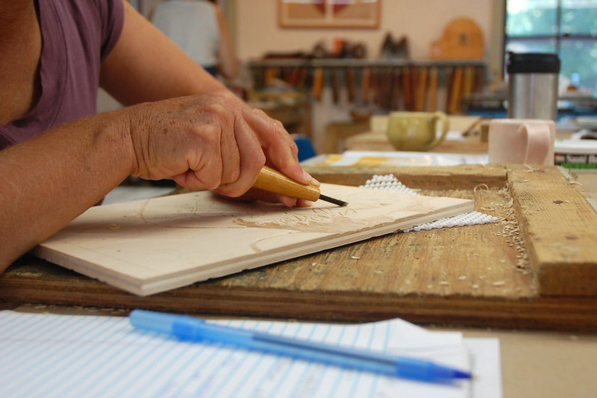
- Hold your tools correctly: Always carve away from your body. Use your non-carving hand to hold the block steady, but keep it behind the cutting edge. This is where that bench hook comes in handy! I once slipped trying to get a particularly tricky detail, and while no major damage was done, the shock was enough to reinforce the 'safety first' mantra. My fingers still remember that little jolt!
- Vary your cuts: Use the V-gouge for fine lines, crisp edges, and delicate details. You'll find them in various widths – a fine V-gouge is perfect for intricate hair-thin lines, while a wider V can define more substantial contours. I love the precision a V-gouge offers, allowing me to define edges and add delicate textures, like the fine veins on a leaf or the strands of hair; it's like drawing with a tiny scalpel, but in a good way. The U-gouges (available in various sizes, from shallow curves for softer lines to deeper scoops for clearing large areas) are great for clearing larger areas, creating softer, more rounded lines, or building up texture through hatching – that's when you carve parallel lines close together. In your print, these lines will show up as a series of parallel ink marks, creating a lighter tonal value and simulating shading, much like lightly shading with a pencil. Cross-hatching, where you create intersecting parallel lines, can deepen those shadows and add a wonderful textural complexity, giving the impression of even darker tones because more ink is laid down. Don't be afraid to experiment with the depth of your cuts – shallow cuts can give a different texture, almost a whisper of an impression, while deeper cuts create crisp, bold lines and stronger contrast. Deeper cuts also ensure that unwanted areas are truly removed and won't pick up ink. You can also use a small U-gouge to create stippling (a pattern of dots) for subtle texture, or a larger U-gouge to quickly clear big areas, leaving behind a slightly textured background rather than a perfectly smooth one. Every choice with your gouge dictates the final character of your print – intention is everything. This reminds me of how subtle changes in the definitive guide to understanding line in abstract art from gestural marks to geometric forms can dramatically alter a piece.
- Sharpen those tools! A sharp tool is a safe tool, and it will glide through the lino, creating clean, crisp lines with minimal effort. Dull tools tear the lino, make carving a frustrating battle, and can lead to slips. Invest in a honing stone and learn how to keep your gouges razor-sharp – it’s a game-changer for both safety and the quality of your cuts.
- Clear the decks: Once your main design is carved, make sure to clear away any unwanted lino around the edges or in large negative spaces. These bits can pick up ink and create unsightly smudges – and trust me, there's nothing quite like the 'oops' moment when a stray blob ruins an otherwise perfect print because you got a bit too eager to start inking!
With your block carved and cleaned, the next step is perhaps the most satisfyingly tactile.
3. The Inking: The Satisfying Roll
This step is all about getting an even, thin layer of ink onto your raised surfaces. It's also incredibly therapeutic, the rhythmic sound of the brayer on the slab – that gentle, reassuring 'tacky-tacky' sound that tells you the ink is just right. Just don't let the ink dry out too fast on the block; if you're working in a warm, dry environment, consider working a little faster or, for water-based inks, adding a tiny drop of retarder to slow the drying time. The ink's viscosity and how it behaves can be quite sensitive to ambient humidity and temperature – something I learned the hard way with a very patchy first print!

- Squeeze a little ink: A pea-sized or almond-sized dollop is usually enough for a small block. Put it on a smooth, non-absorbent surface (a piece of glass, an old tile, or a plastic plate works well).
- Roll it out: Use your brayer to roll the ink back and forth until it’s evenly distributed on the brayer. You want a consistent, slightly sticky sound as you roll – a gentle 'tacky-tacky' rather than a wet 'squish' – indicating a thin, even film. This distinct sound is your cue that the ink is perfectly distributed for transfer. Not too wet, not too dry. This is where you develop a feel for the ink's viscosity, understanding how thick or thin it needs to be.
- Apply to the block: Gently roll the inked brayer over your carved lino block, making sure to cover all the raised areas. The goal here is to "kiss the block" – apply just enough pressure to evenly coat the raised surfaces without pushing ink down into your carved-out areas. If you press too hard, you'll get smudges where you don't want them.
4. The Printing: The Grand Reveal!
This is the moment of truth! It's like unwrapping a gift you made yourself. Once your masterpiece is revealed, the process isn't quite over, but this is definitely the most exciting part of the linocut dance. The anticipation is half the fun, and then that satisfying moment of peeling back the paper... pure magic.

- Position your paper: Carefully lay your paper over the inked block. You might want to use some registration marks if you're trying to be super precise – these are simple guides, like drawn lines or taped-on paper corners on your printing surface, primarily crucial for multi-color prints where layers need to align perfectly for accurate alignment. But for a first go, just centering it by eye is fine. My brain still struggles with aligning multi-color prints, to be honest; it's a puzzle every time!
- Apply pressure: If you have a press, great! If not (like most of us starting out), you can hand-print. Use a baren (a smooth, hard disc, often with a handle, used to apply even pressure by rubbing), the back of a wooden spoon, or even just your clean palm to rub firmly and evenly over the back of the paper. A baren or spoon is generally more effective than just your palm, as its smooth, firm surface allows you to distribute consistent, direct pressure across the entire block, ensuring even ink transfer without tearing the paper. Work from the center outwards, making sure you cover every part of the image.
- The Peel: The most exciting part! Gently peel back the paper, starting from one corner, to reveal your print. Don't be disheartened if the first one isn't perfect; remember, the first few are often called 'proofs' for a reason! Embrace the slight variations; they make each print unique. This is where the magic really happens, and sometimes a 'mistake' can lead to an even more beautiful result.
5. Drying & Cleanup: The Less Glamorous, But Essential Bits
Let your prints dry flat on a clean surface. Water-based inks dry fairly quickly, but give them a good few hours. While they're drying, clean your block, brayer, and ink slab with soap and water. Don't let the ink dry on your tools – it's a nightmare to remove, and nobody wants to battle dried ink when the creative spark hits again! And trust me, you'll want those tools clean and ready for your next session of creative exploration; a well-maintained kit is a happy, productive kit that brings its own quiet satisfaction.
Embracing the Journey: Beyond Perfect Prints (Because Art is a Conversation, Not a Command)
Look, I've had more 'oops' moments in my art career than I care to admit. The block slips, the ink smudges, a line goes awry. But here's the secret: these aren't failures; they're invitations. Linocut, with its very manual and tactile process, is ripe for what I like to call 'happy accidents.' I remember once trying to carve a delicate leaf pattern, and my V-gouge slipped, creating an unexpected, bolder line. Instead of redoing it, I leaned into it, echoing that stronger line in other leaves, which gave the final print a dynamic, almost windswept feel that was completely unplanned and surprisingly beautiful. It really showed me the magic of responding to the material, rather than just forcing my will upon it.
This process teaches you to dance with the unexpected, to see beauty in the unique character of a handmade mark. It's not about achieving robotic perfection, but about the story each print tells – a story that includes your process, your choices, and yes, your delightful little detours. So, as we dive into troubleshooting, remember: these are just minor bumps on a wonderfully creative road. They’re part of the fun, part of the learning, and often, part of what makes your art truly yours. I even wrote a whole piece on the power of imperfection embracing accidents and evolution in my abstract art.
Troubleshooting for Beginners (We've All Been There!)
Let’s be real, things won't always go perfectly. I've had my fair share of 'oops' moments, like when I tried to print with ink that was clearly too dry and ended up with a patchy, ghost-like image. Learning from these little frustrations is part of the process – and honestly, sometimes the 'failures' teach you the most! Here are a few common beginner frustrations and how to tackle them:
- Tools Slipping: This is a safety issue!
- My go-to fix: Use that bench hook! Seriously, it's saved my fingers more times than I can count. Always carve away from yourself. Sharpening your tools can also help them glide through the lino more smoothly. (Yes, you can sharpen lino tools! A sharp tool is a safe tool. Look up videos on how to hone your gouges; it's a game-changer for carving ease and precision.) Keep those fingers safe, please!
- Uneven Ink Coverage: You see patchy areas or too much ink in others.
- My go-to fix: Roll your brayer more thoroughly on the slab to ensure an even coating before applying to the block. You want that consistent, slightly sticky sound. Practice makes perfect! Sometimes the ink is too cold or too thick; try warming it slightly or adding a tiny drop of water (for water-based inks). This is a common learning curve, and once you get the hang of it, you'll be rolling ink like a pro!
- Ink Smudging into Carved Areas: Your "white" areas have smudges of ink.
- My go-to fix: You're probably pressing too hard with the brayer, or the areas you've carved out simply aren't deep enough to escape the roller. Carve deeper, or be gentler with the roller. Also, ensure you've cleared out all the unwanted lino around your design. Don't worry, we all learn the hard way how much carving depth is just right!
- Fuzzy Edges/Loss of Detail: Your lines look blurry.
- My go-to fix: The ink might be too wet, or you might be using paper that's too absorbent. Also, make sure your carving cuts are clean and crisp. Dull tools can lead to ragged edges – remember to sharpen your tools! A clean cut makes for a clean print.
- Ghosting (Faint Impressions): You see a faint outline of a previous print or a shadowy residue.
- My go-to fix: This usually happens if you haven't cleaned your block thoroughly enough between printing sessions or if ink has dried in shallow carved areas. Ensure your block is spotless before re-inking. Sometimes a very light layer of ink can cause this; ensure you're applying a good, even coat for the current print. A little extra cleaning now saves headaches later.
- Ink Drying Too Quickly on the Block: The ink gets tacky or dry before you can print.
- My go-to fix: If you're using water-based inks, try adding a tiny amount of a water-based retarder to your ink to slow its drying time. Working in a slightly cooler, more humid environment can also help. For oil-based inks, some mediums can extend open time. A swift workflow is also key here; sometimes you just need to develop that rhythm from inking to printing a bit faster!
- Inconsistent Ink Density/Transparency: Your prints are too dark, too light, or not uniformly opaque.
- My go-to fix: For water-based inks, you can dilute them slightly with water for a more transparent effect, or apply more layers (with drying time in between) for greater opacity. Experiment with the amount of ink you roll onto your brayer – a thinner layer will often result in a lighter print, while a slightly thicker, evenly distributed layer will appear denser. Also, ensure consistent pressure during printing. Finding that sweet spot for ink and pressure takes a bit of practice, but it's worth it.
- Ink Not Adhering to Block: The ink seems to bead up or resist coating the lino.
- My go-to fix: Ensure your lino block and, crucially, your brayer are completely clean and dry. Any residue (dust, oil from your hands, old dried ink) on either surface can prevent fresh ink from sticking. Give them a gentle wash and dry before you start. Also, check the ink itself – is it too old or degraded? Sometimes inks, especially if not stored properly, can lose their optimal viscosity and adherence over time. A quick stir or a tiny adjustment in consistency can sometimes make all the difference. Patience, my friend, patience.
- Block Warping or Cracking: Your linoleum block isn't staying flat or is developing splits.
- My go-to fix: Linoleum can react to changes in temperature and humidity. Store your blocks flat, ideally between sheets of paper or cardboard, in a cool, dry place away from direct sunlight or extreme temperature fluctuations. This will help preserve its integrity for many prints to come!
What's Next? Exploring Beyond the Single-Color Print
So, you've pulled your first perfect (or perfectly imperfect) single-color print, and you're hooked. What now? Once you've conquered those initial hurdles and are feeling confident, the world of linocut truly opens up, inviting you to explore more complex and colorful creations! The wonderful thing about linocut is that the possibilities only expand from here!
One of the first exciting frontiers is multi-color printing, which can be achieved in several ways. You can use separate blocks for each color (which introduces the challenge of precise registration to align them perfectly), or by delving into the fascinating technique of reduction linocut. This is where you use a single block and progressively carve away more from it for each successive color layer, gradually 'reducing' the printable area and building up your image. It’s a bit like carving yourself into a corner, creatively speaking, because once you carve away material for a color, you can’t go back to print that color again – the block is permanently altered, making the process irreversible for that edition. This irreversibility means careful planning of your colors and edition size is paramount before you even make your first cut for this technique; I always recommend a detailed plan, perhaps even a practice run on a simpler design, before tackling a complex reduction print. Let me walk you through a simple example of how this might work to create a multi-color print of, say, a red apple with a green leaf:
- First Carving (Whites/Paper Color): You would first carve away only the parts of the block that you want to remain white (the color of your paper).
- First Ink & Print (Lightest Color - Green): Then, you'd ink the entire remaining raised block with your lightest color, say green (for the leaf and the underlying color of the apple). At this stage, you'd print all copies of your edition before proceeding to the next carving. This is crucial because once you carve more away, you can never go back to print this layer again. This ensures every print in your series gets this first layer.
- Second Carving (Green Areas): Next, you'd clean the block and carve away all the areas you want to remain green (the leaf). These areas will no longer pick up ink in subsequent steps.
- Second Ink & Print (Next Color - Red): Now, the remaining raised areas are only those that will be part of the apple. You'd ink these with your next color, red, and print directly over your previous green prints, aligning them carefully using your registration marks.
- Repeat as needed: This process of carving, inking, and printing repeats, gradually reducing the block and building your image with layers of color. It's a challenge, but immensely rewarding, like a puzzle you solve with your gouge!
Beyond multi-color, you can also explore the concept of editioning – that's the practice of creating a limited number of identical prints from a single block. Each print in an edition is typically signed, numbered (e.g., 1/50, 2/50), and titled by the artist. This tradition adds value and authenticity to each artwork, making each impression a unique part of a finite series.
You can also experiment with different types of paper – from delicate Japanese papers to heavier printmaking stock – each offering a unique texture and ink absorption quality. Beyond paper, why not try printing on textiles like t-shirts or tote bags, or even alternative surfaces like prepared wood panels or specially treated ceramic tiles? With the right surface preparation and inks, the possibilities are truly endless, and the journey of discovery is just beginning! For more advanced explorations, you might even look into monoprinting with linocut (using the block as a base for unique, one-off prints), or Chine-collé (a technique where thin, delicate papers are adhered to a heavier printmaking paper during the printing process itself, often used to add unique colors, textures, or even metallic sheens to specific areas of a print), adding even more layers of texture and depth.
There's a whole world of linocut techniques waiting for you to discover!
My First Project Ideas (Keep it Simple, Silly!)
I'm all for ambitious goals, but when you're starting with a new medium, nothing builds confidence like a successful, simple project. These are your 'quick wins' that prove to yourself, 'Hey, I can actually do this!' This reminds me of my early abstract work; sometimes the simplest gestures hold the most power, and starting small allows you to build a foundation for greater creative exploration.
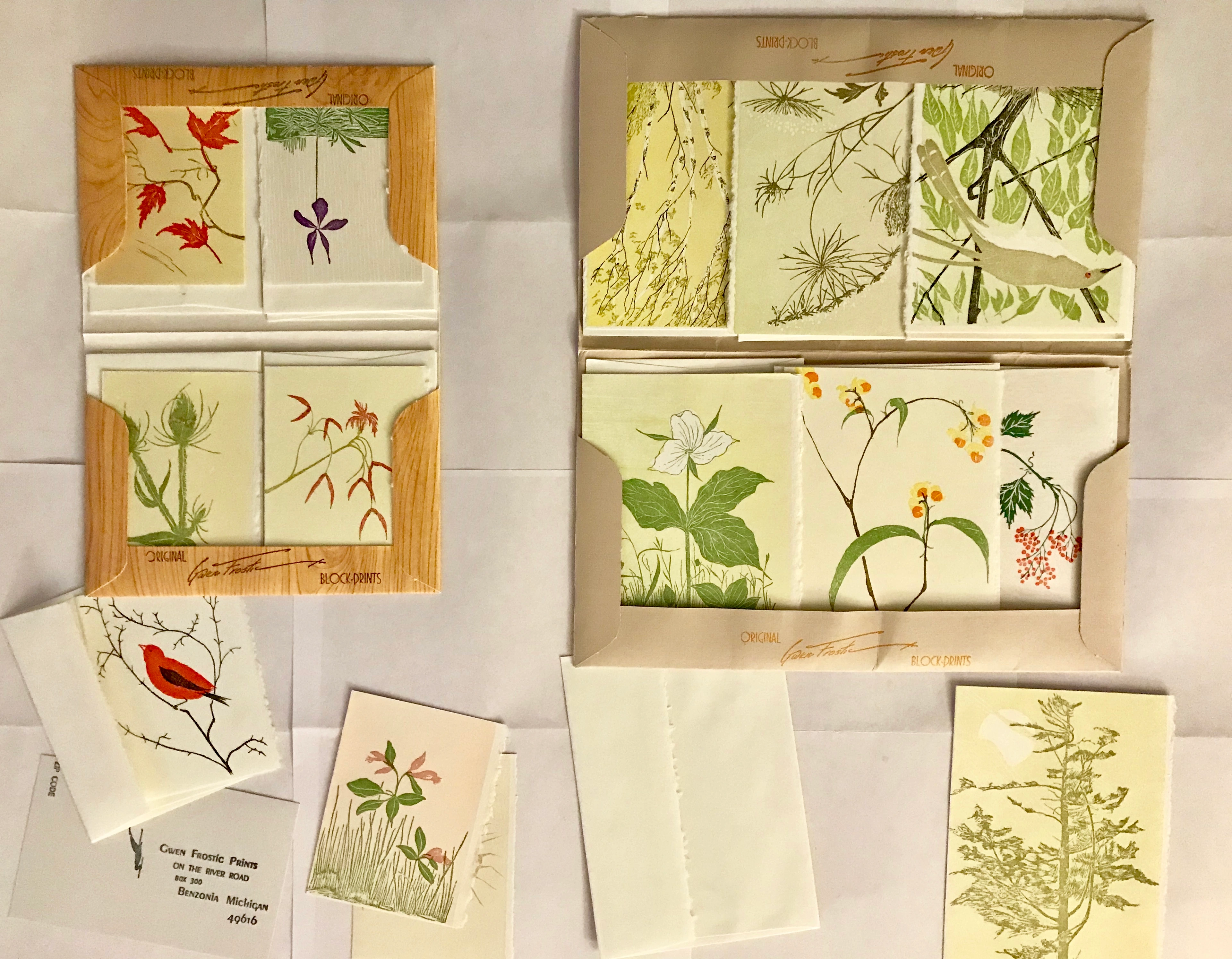
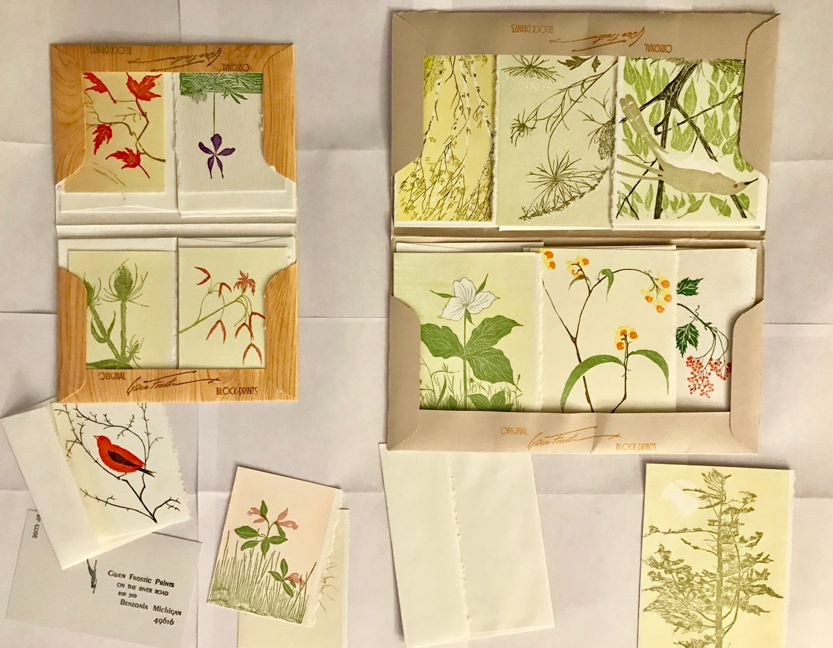
- Greeting Cards: A small, simple design can be printed onto blank cards. Imagine sending out handmade cards – instant cool points! This is exactly how Gwen Frostic, a famous linocut artist, built her empire. Her nature-inspired cards, characterized by their bold, organic lines, minimalist charm, and often limited color palettes, are a testament to the enduring appeal of simple, effective linocut. Her work, often featuring local flora and fauna, is a brilliant example for beginners because it shows how focusing on strong, recognizable forms – often inspired by nature – and clear, confident cuts (rather than intricate detail or many colors) can create powerful and beloved art. She understood the power of a single, well-crafted image, often producing thousands of cards from a single design, showing how a simple start can lead to mass appeal and production.
- Personalized Tags: Think gift tags, bookmarks, or even little labels for homemade jams. These small projects allow for quick carving and printing, providing immediate satisfaction.
- Simple Art Prints: Just a small, framed print of your first design. It’s a wonderful feeling to create something tangible and hang it up. Maybe it'll inspire you to eventually explore my own collection of abstract art prints for sale! For me, this journey often begins with a single, clear line or a bold shape, just like a linocut.
And once you're comfortable, think about larger ambitions! Linocut is also fantastic for creating repeating patterns – imagine designing your own fabric prints for a tote bag, creating custom wallpaper designs, or even stamping a unique pattern onto a scarf. The possibilities are truly endless.
Key Takeaways: Your Linocut Checklist for Success
Before you embark on your joyful printmaking adventure, let's quickly recap the absolute essentials. Think of this as your personal checklist for a smooth and satisfying linocut experience:
- Start Soft: Begin with soft-cut lino for an easier carving experience. Your hands will thank you!
- Safety First: Always carve away from your body, use a bench hook, and keep those tools sharp (a sharp tool is a safe tool!).
- Design Smart: Plan your design with positive and negative space in mind, remembering it will print in reverse. Keep it simple for your first tries.
- Ink Evenly: Roll your water-based ink onto a slab until you hear that consistent 'tacky-tacky' sound, ensuring a thin, even layer on your brayer and then on your block.
- Press Firmly & Evenly: Whether by hand or with a press, consistent pressure is key for a clear impression.
- Clean Up Promptly: Don't let ink dry on your tools or block; soap and water are your best friends for water-based inks.
- Embrace Imperfection: Happy accidents are part of the charm! Learn from every print, perfect or not.
- Experiment: Don't be afraid to try different papers, colors, or printing surfaces as you gain confidence.
Remember, linocut is a journey of discovery. Enjoy every cut, every roll, and every print!
Frequently Asked Questions About Linocut Printmaking
Got more questions buzzing around? You're not alone! Here are some I hear a lot, and my quick take on them:
Q: Is linocut printmaking expensive to start? A: Oh, you'd be surprised! Not at all. You can get a basic beginner kit for a very reasonable price, often under $50. It's one of the more accessible printmaking methods for your wallet, especially compared to screen printing or lithography. It’s a fantastic entry point into art-making without breaking the bank.
Q: Can I use regular house paint as ink? A: I'd strongly advise against it. House paint isn't formulated for printmaking; it lacks the specific binders, pigment load, and viscosity needed for an even roll, proper adhesion, and crisp transfer to paper. It will likely result in an uneven, muddy, or unappealing print, and may even damage your brayer or block over time due to different drying properties. Stick to dedicated printmaking inks for the best results; they're designed for this purpose, and trust me, you'll be happier with the outcome.
Q: How do I transfer a complex design to the lino block? A: Carbon paper is your best friend! You can also draw your design in pencil on paper, then lay it face down on the block and rub the back of the paper with a spoon or your finger to transfer the pencil lines. For very intricate designs, a digital projector can be used to cast your image onto the block for easy tracing. Precise transfer is key for complex designs, so take your time with this step.
Q: What's the difference between linocut and woodcut? A: Both are relief printing methods, but the material is different. What differentiates linocut is its consistency; unlike wood, which has a distinct grain that can resist carving and appears in the final print, linoleum offers a smooth, uniform surface allowing for fluid cuts in any direction. This makes it generally more forgiving for beginners. In terms of sustainability, woodcut often uses sustainably sourced timber, while traditional linoleum is made from natural materials like linseed oil and cork dust, making both potentially eco-friendlier than synthetic alternatives, depending on the sourcing and production. I personally find lino much more beginner-friendly due to its forgiving nature.
Q: How many prints can I typically get from one linocut block? A: With proper care, a linocut block can yield hundreds of prints! Soft-cut lino might show wear after many impressions, but traditional grey lino is quite durable. The longevity of your block also depends on the complexity and depth of your carving – very fine, shallow lines might wear more quickly than bold, deep cuts. The key is to clean and store your block properly after each use, avoiding scratches or prolonged exposure to direct sunlight.
Q: How do I clean my carving tools? A: For water-based inks, simply wash them with soap and water immediately after use, making sure to get into any crevices. For oil-based inks (if you ever venture there!), you'll need specific solvents like mineral spirits or vegetable oil, followed by soap and water. Don't let ink dry on your tools; it's a nightmare to remove and can damage them.
Q: How should I store my finished linocut prints? A: Once your prints are completely dry (give them ample time!), store them flat in a portfolio or a box, ideally separated by glassine paper (a smooth, translucent, non-acidic paper that protects artwork from smudging and acidity) or tissue paper to prevent sticking or smudging. Avoid stacking them directly on top of each other, especially if the ink is thick, as this can cause them to fuse over time. Protecting them from direct sunlight will also help preserve their colors.
Q: How can I control the transparency or density of my linocut prints? A: For water-based inks, you can often add a tiny bit of water to make them more transparent, or use a medium designed to thin the ink. To increase density or opacity, apply slightly more ink evenly, or print multiple layers (with drying time in between) for greater opacity. Experiment with ink consistency and printing pressure is key to finding your desired effect.
Q: How should I store my linoleum blocks? A: Store your carved blocks flat, ideally between sheets of paper or cardboard, in a cool, dry place away from direct sunlight or extreme temperature changes. This helps prevent the lino from drying out, cracking, or warping, ensuring it stays in good condition for future prints.
Q: What kind of surfaces can I print on besides paper? A: The possibilities are quite broad! Beyond paper, you can print on textiles like t-shirts, tote bags, or fabric art (using fabric-specific inks). You can also experiment with wood panels, ceramic tiles (after appropriate surface preparation), or even smooth, untreated leather. Just make sure the surface is relatively flat and absorbent enough to take the ink.
Q: Is linocut only for black and white prints? A: Absolutely not! While black and white prints are classic and powerful, linocut lends itself beautifully to color. You can use multiple blocks for different colors, or explore techniques like reduction printing (as discussed earlier) to create multi-color images from a single block. The world of color awaits!
Q: How do I know when my print is dry enough to handle or stack? A: This really depends on the ink and paper you're using. Water-based inks on absorbent paper can be dry to the touch in a few hours, but I usually recommend giving them at least 24-48 hours to fully cure before handling them extensively or placing them in a portfolio. Oil-based inks, conversely, can take significantly longer to dry, sometimes days or even weeks, depending on the specific ink and environment. Heavier papers, or those with less absorbency like coated papers, might also take longer. If the ink feels cool or slightly tacky, it's probably not fully dry yet. When in doubt, give it more time – patience is definitely a virtue in printmaking!
Q: What's the typical shelf life of printmaking inks, and how should I store them? A: Most printmaking inks, especially if stored correctly, can last for several years. For water-based inks, keep them in airtight containers, away from extreme temperatures (and definitely avoid freezing!), and direct sunlight, to prevent them from drying out. Oil-based inks, similarly, benefit from airtight storage to prevent a skin from forming on top. Always make sure lids are tightly sealed, and for tubes, squeeze out excess air before capping. A little care goes a long way in preserving your precious colors!
Q: Beyond cleanup, what are the main differences between water-based and oil-based inks? A: Ah, the great ink debate! While water-based inks are fantastic for beginners due to their easy cleanup and quicker drying times, oil-based inks often offer a richer, more vibrant color payoff and a longer 'open time' – meaning they stay wet longer on the block, giving you more time to work and pull prints. This can be great for complex projects or when you're working in a warm environment. However, oil-based inks typically require solvents for cleanup, which can be a consideration for ventilation and environmental impact. Many artists eventually experiment with both to see which best suits their style and workflow.
Q: What about the environmental impact of linocutting? Are there eco-friendly options? A: That's a great question, and I'm glad you asked! Many artists are becoming more conscious about their materials. You can certainly make linocut more eco-friendly. Opt for natural, biodegradable lino blocks (made from cork, natural rubber, or recycled materials) and stick to water-based, non-toxic inks with low VOCs (Volatile Organic Compounds), such as those from Akua or Speedball's Professional Relief Inks, which means easier, safer cleanup without harsh chemical solvents. Some brands also offer "plant-based" or "soy-based" oil inks that are easier to clean up and have a lower environmental footprint. Reusing paper for proofs, properly disposing of ink waste, and exploring natural pigments are all steps you can take to make your practice greener. It's all about mindful making!
Q: What's the difference in marks between soft-cut and traditional lino? A: Soft-cut lino, being much more pliable, tends to allow for smoother, more fluid, and bolder lines, making it easier to achieve deep cuts with less effort. Traditional grey lino, on the other hand, is firmer and can be a bit crumbly, but it excels at holding very fine, crisp details and intricate lines, which can be more challenging to achieve with softer materials. Each offers a distinct aesthetic to your prints.
Q: What's the difference in results between using a soft rubber brayer and a harder one? A: Ah, the brayer choice makes a difference! A soft rubber brayer (lower hardness) is fantastic for beginners and general printmaking. It's more forgiving, conforming slightly to the block's surface, which helps achieve a more even ink application, especially on slightly uneven blocks or delicate papers. This generally results in a smoother, more uniform print. A harder rubber brayer (higher hardness) picks up less surface texture from the block itself. It's excellent for very smooth blocks and can help achieve crisper, sharper lines by applying pressure more directly to the raised areas, but it's less forgiving on textured surfaces and might require a bit more skill to get an even roll without leaving roller marks.
Q: What is 'editioning' and why is it important in printmaking? A: Editioning refers to the practice of creating a limited number of identical prints from a single block or plate. Each print in an edition is typically signed, numbered (e.g., '1/50', '2/50' for the first and second print out of fifty), and titled by the artist. This tradition adds value, authenticity, and scarcity to each artwork. It signifies that the artist has overseen the printing process for that specific series, and it's a way to define the finite quantity of prints produced, making each impression a unique part of a finite series.
My Final Thoughts: Just Try It!
Look, the world of art can sometimes feel a bit intimidating, full of rules and 'right ways' of doing things. But linocut, for me, cuts through all that. It’s a wonderfully tactile, immediately rewarding process that connects you directly to the act of creation. It's about getting your hands dirty, embracing a little mess, and finding joy in the simple act of transforming a blank block into a repeating image. There's a deep, almost meditative satisfaction in the rhythmic carving and the focused application of ink, offering a welcome respite from the digital world and a wonderful way to practice mindfulness. It’s a process I’ve come to cherish in my own artistic journey, finding parallels in the way I build layers and express myself through abstract forms. The accessibility of linocut, both in terms of cost and skill level, truly makes it an art form for everyone.
Whether you go on to create complex, multi-color prints or just enjoy making a few quirky greeting cards for friends, the experience of bringing a linocut to life is uniquely satisfying. So, what are you waiting for? Grab some lino, a few tools, and just start carving. You might just discover your next creative obsession, a passion for the direct, tangible joy of making art. And hey, don't be shy – share your first creations! The linocut community is incredibly supportive. Tag them with #LinocutJoy or #PrintmakingBeginner on your favorite social platform; there's a wonderful community out there eager to celebrate your artistic journey. If you ever feel inspired to see how I play with lines and layers in my own work, feel free to pop over to my timeline or explore my art in the Den Bosch museum. You might even find some abstract art prints for sale that started with a similar spark of creative joy. Happy carving!


