
Burnt Sienna: The Warm Heart of Your Palette
Unlock the magic of burnt sienna paint in landscapes, portraits & abstracts. Master mixing, glazing & emotional depth with this versatile earth tone.
Burnt Sienna: The Warm Heart of Your Palette
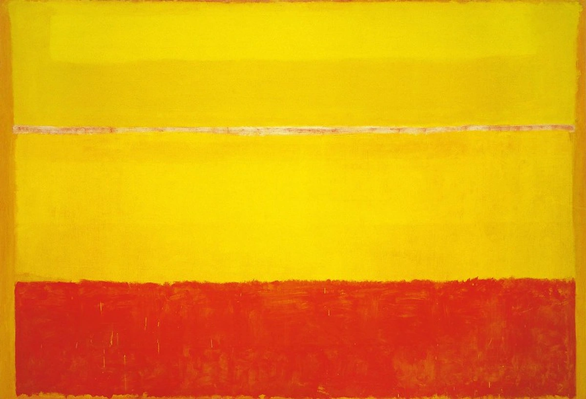
There’s a specific moment in almost every painting session where I find myself reaching for that tube. Not vibrant ultramarine or flashy cadmium, but the humble, warm embrace of burnt sienna. It doesn’t shout, it whispers depth into the canvas – the reddish-brown pigment that can evoke everything from sun-baked earth to antique warmth in a single stroke. I remember agonizing over landscapes early on, trying to force perspective with harsh lines, until I realized burnt sienna was my ally in creating atmosphere. This isn’t just about mixing colors; it’s about storytelling through temperature.
The Alchemy of Burnt Sienna
Let’s clear the air: burnt sienna isn’t some magical potion. It’s iron oxide hydrate heated to transform its raw cousin (raw sienna) into a deeper, warmer, more translucent version. What makes it indispensable?
- Temperature Anchor: Cools down blues/greens instantly for natural shadows
- Versatile Mixology: Darks neutrals, rusty reds, and spicy oranges live here
- Glazing Power: Thin layers create depth without muddying what’s underneath
- Natural Authenticity: Evokes rust, soil, wood, and human warmth instantly
Burnt Sienna vs. Its Earth Tone Cousins
Pigment | Base Color | Transparency | Mixing Strength | Best For |
|---|---|---|---|---|
| Burnt Sienna | Deep reddish-brown | Half-transparent | Moderate | Warm shadows, aging effects |
| Raw Sienna | Yellowish-brown | Transparent | Strong | Sunlight, sand, highlights |
| Burnt Umber | Dark brown | Opaque | Strong | Deep shadows, soil tones |
| Ochre | Golden-yellow | Opaque | Very strong | Earth fields, foregrounds |
Pigment | Lightfastness | Cost | Historical Use | Emotional Impact |
|---|---|---|---|---|
| Burnt Sienna | ASTM I | $ | Renaissance to present | Warmth, nostalgia, earthiness |
| Raw Sienna | ASTM I | $ | Prehistoric cave paintings | Sunshine, optimism, freshness |
| Burnt Umber | ASTM I | $ | Classical antiquity | Depth, seriousness, antiquity |
| Ochre | ASTM I | $ | Paleolithic era | Stability, permanence, earthiness |
I’ve fought muddy mixes countless times by confusing these. Burnt sienna’s red undertone is your north star – it’s warmer than umber, brighter than ochre, and less fiery than raw sienna. Use our color theory guide for deeper dives.
Practical Mastery: Techniques That Sparkle
Special Effects & Textures
Beyond basic applications, burnt sienna excels at creating special effects and textures:
Aging & Patina Effects:
- Create aged metal by mixing burnt sienna with burnt umber and dry-brushing over metallic underpainting
- For rust effects, use a combination of burnt sienna, alizarin crimson, and burnt umber applied with varying brushstrokes
- Natural patina on bronze can be achieved with thin glazes of burnt sienna mixed with green oxide
Texture Creation:
- Use palette knives to create thick, impasto textures with burnt sienna
- Combine with sand or other texture mediums for rough surfaces
- For wood grain effects, drag a comb through wet burnt sienna mixtures
- Create stone textures by layering different burnt sienna mixtures
Atmospheric Effects:
- Mist effects: Use an airbrush or spray bottle with diluted burnt sienna
- Soft focus: Create atmospheric distance with very thin, transparent glazes
- Misty mornings: Combine burnt sienna with blue and white for dawn/dusk effects
- Stormy skies: Mix burnt sienna with purple and gray for dramatic weather
Advanced Glazing Techniques
Glazing with burnt sienna is where the real magic happens. A good glazing technique can transform a flat painting into something with incredible depth and luminosity.
The Glazing Process:
- Start with a completely dry, lighter base layer
- Mix burnt sienna with your medium (water for watercolor, linseed oil for oils, acrylic medium for acrylics)
- Apply a very thin, even layer – you should still see the base layer underneath
- Let dry completely before adding more layers
- Build up gradually – 5-10 thin layers are better than 1-2 thick ones
Special Glazing Effects:
- Veining: Create natural-looking veins by dragging a brush with slightly thicker mixture
- Bloom effects: Allow salt or alcohol to interact with wet glazes for interesting textures
- Lifting: While still damp, use a clean damp brush to lift some pigment for highlights
- Wet-on-wet glazing: Apply glaze while previous layer is still damp for soft blending
1. The Shadow Whisperer (Landscapes & Portraits)
The art of creating convincing shadows is where burnt sienna truly shines. I've spent countless hours experimenting with shadow techniques, and I've learned that shadows aren't just absence of light – they're active participants in telling the story of your painting.
Imagine painting a portrait with flat blue shadows. No Bueno. Burnt sienna + ultramarine creates instant, convincing shadows that feel human. For a mountain’s shadow: mix burnt sienna into your muted blues, not black – the warmth reflects ambient light beautifully.
Pro Tip: Start shadow layers thin! Glaze burnt sienna over your base colors, then layer darker mixes. Builds depth like sedimentary rock.
There's a rhythm to shadow work that takes time to develop. First, establish your base colors with confidence. Then, using a very diluted burnt sienna (I often mix it with just enough medium to make it flow like water), glaze it over the areas that need shadows. Don't worry about getting it perfect on the first pass – the magic happens in the layering. Let each layer dry completely before adding the next. This technique works beautifully for skin tones in portraits – a thin glaze of burnt sienna mixed with a touch of ultramarine creates natural-looking shadows that don't look muddy or harsh.

2. Aging & Rust Effects
Want a wooden door to look centuries old? Burnt sienna + touches of crimson and raw umber layered vertically screams weathered patina. For rusty metal? Mix with burnt umber and alizarin crimson, then dry-brush over metallic textures.
Aging effects are where burnt sienna becomes a storyteller. I often think about the history embedded in old things – the layers of paint on a door, the rust on a metal fence, the patina on bronze sculptures. Burnt sienna helps me capture that accumulated history. For wood aging, I start with a base layer of burnt sienna mixed with a tiny bit of yellow ochre, then add vertical streaks of burnt sienna mixed with raw umber. For rust effects, I create a mixture of burnt sienna, burnt umber, and just a hint of alizarin crimson, then use a dry brush technique to drag it across the surface, creating those characteristic rust streaks. The key is variation – no two rust spots or weathered areas should look exactly alike.
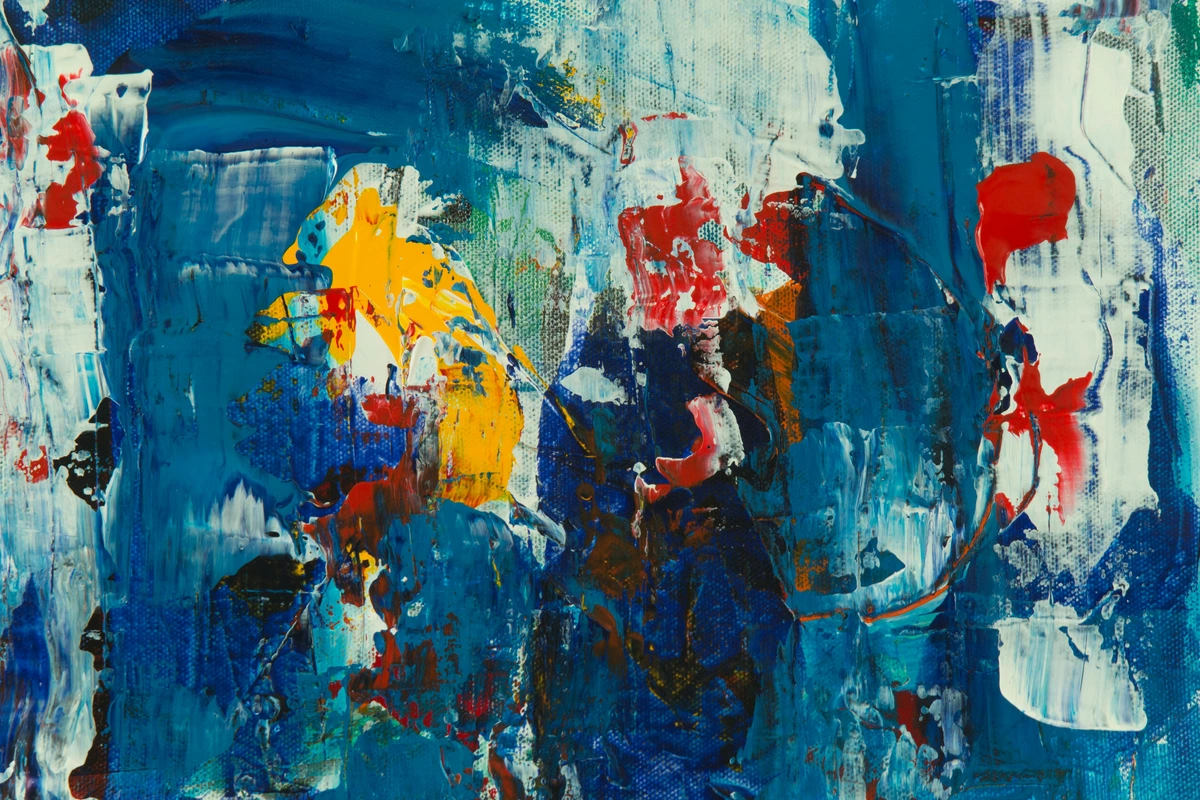
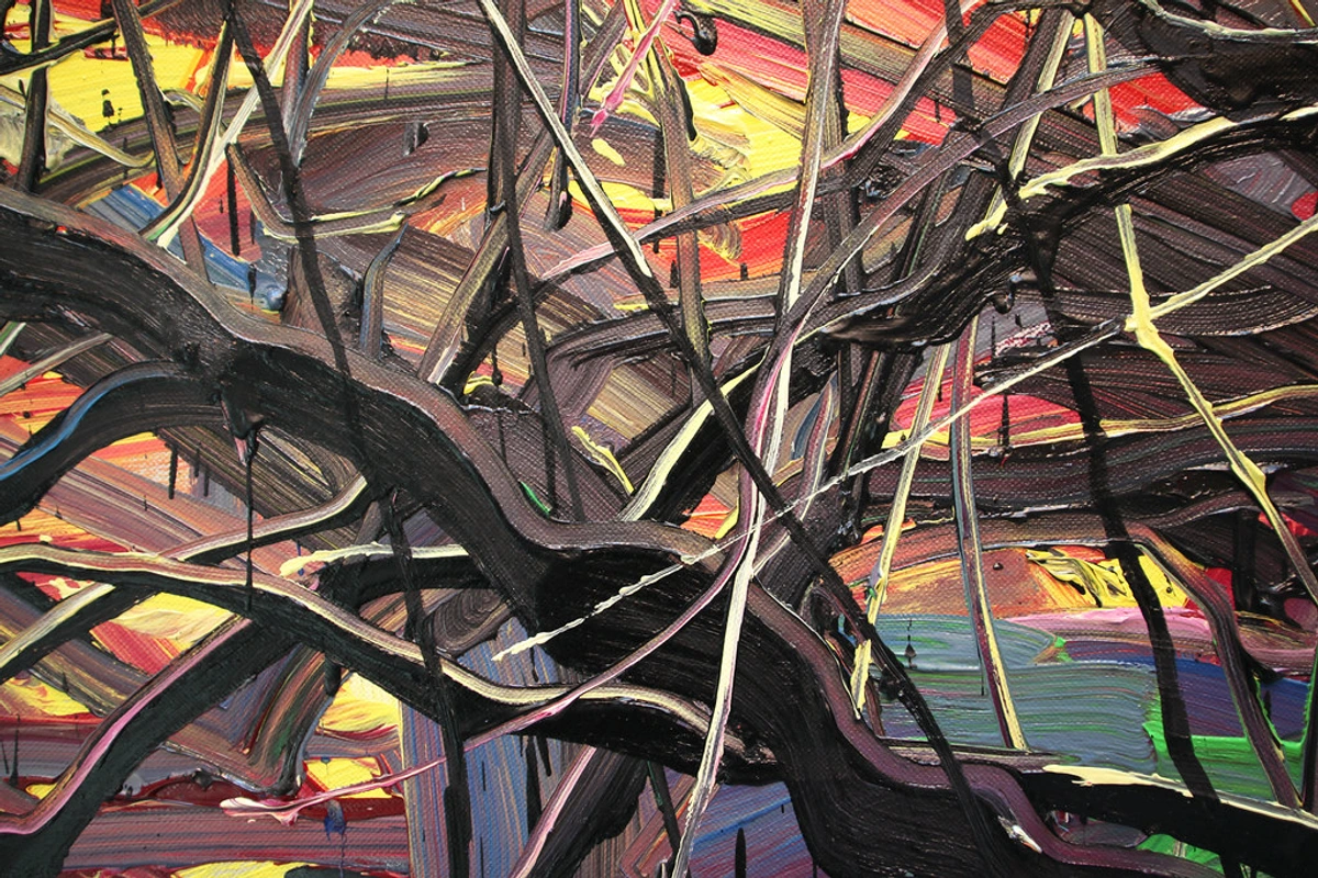
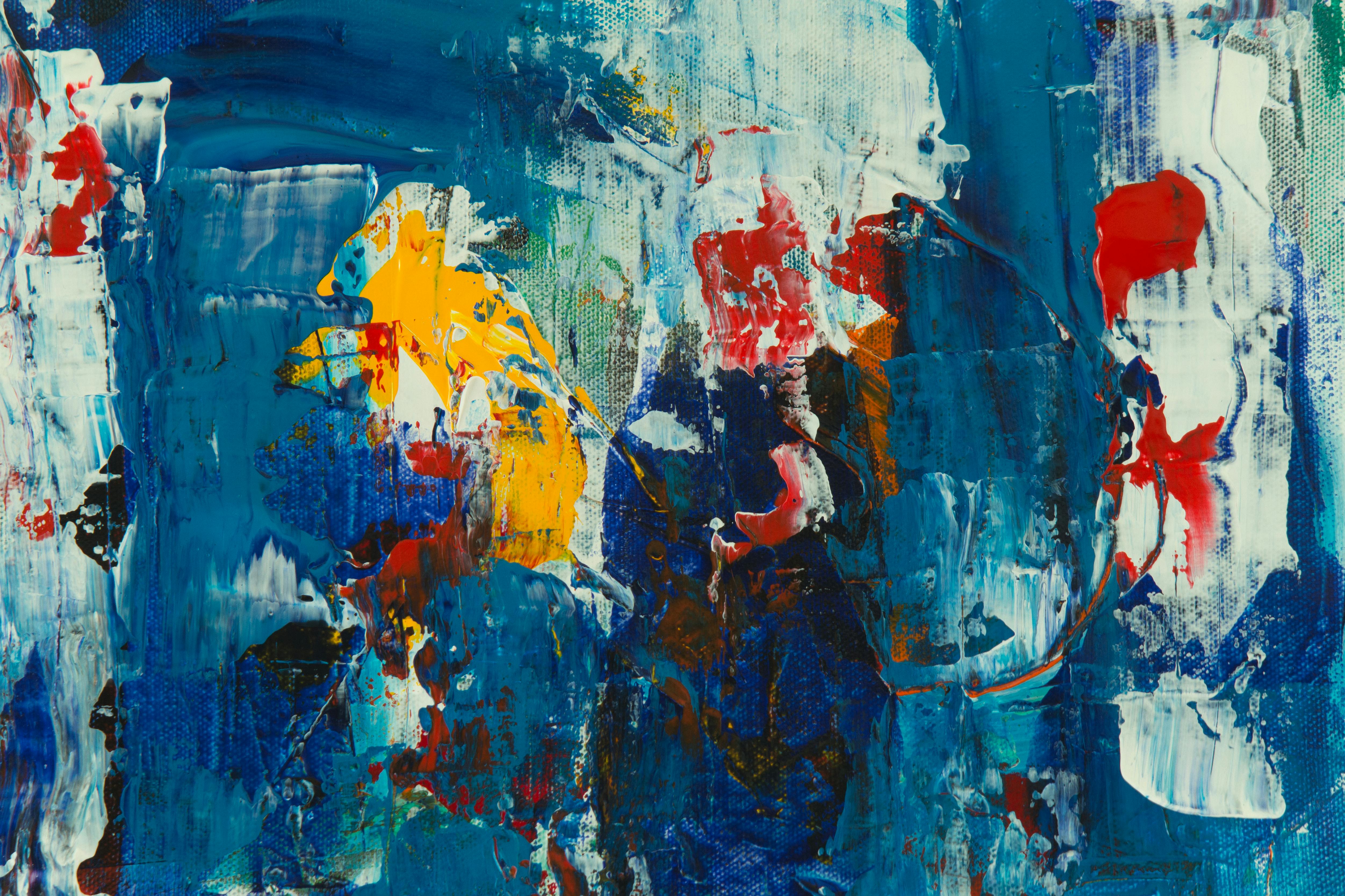
3. Abstract Emotion
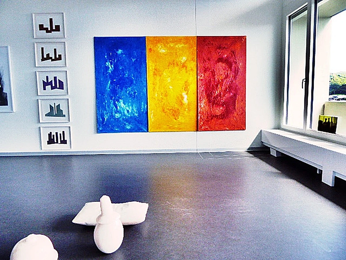
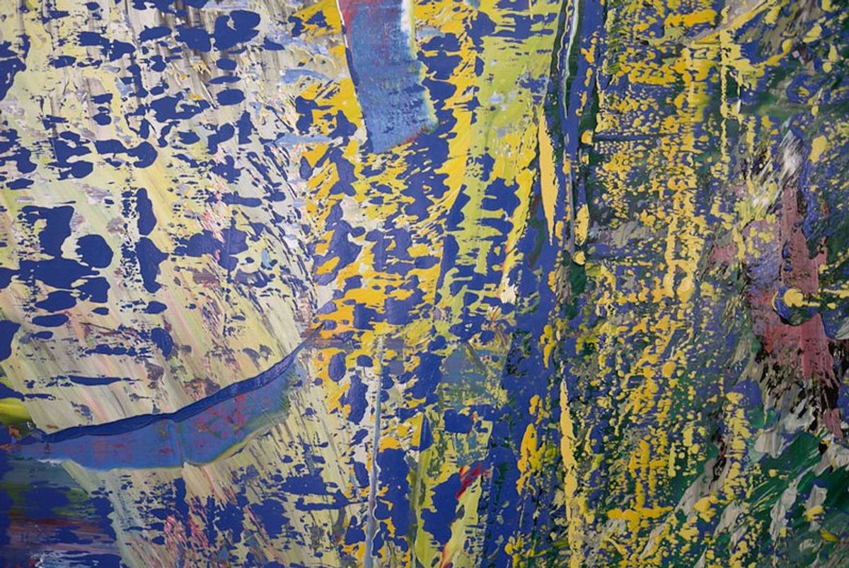
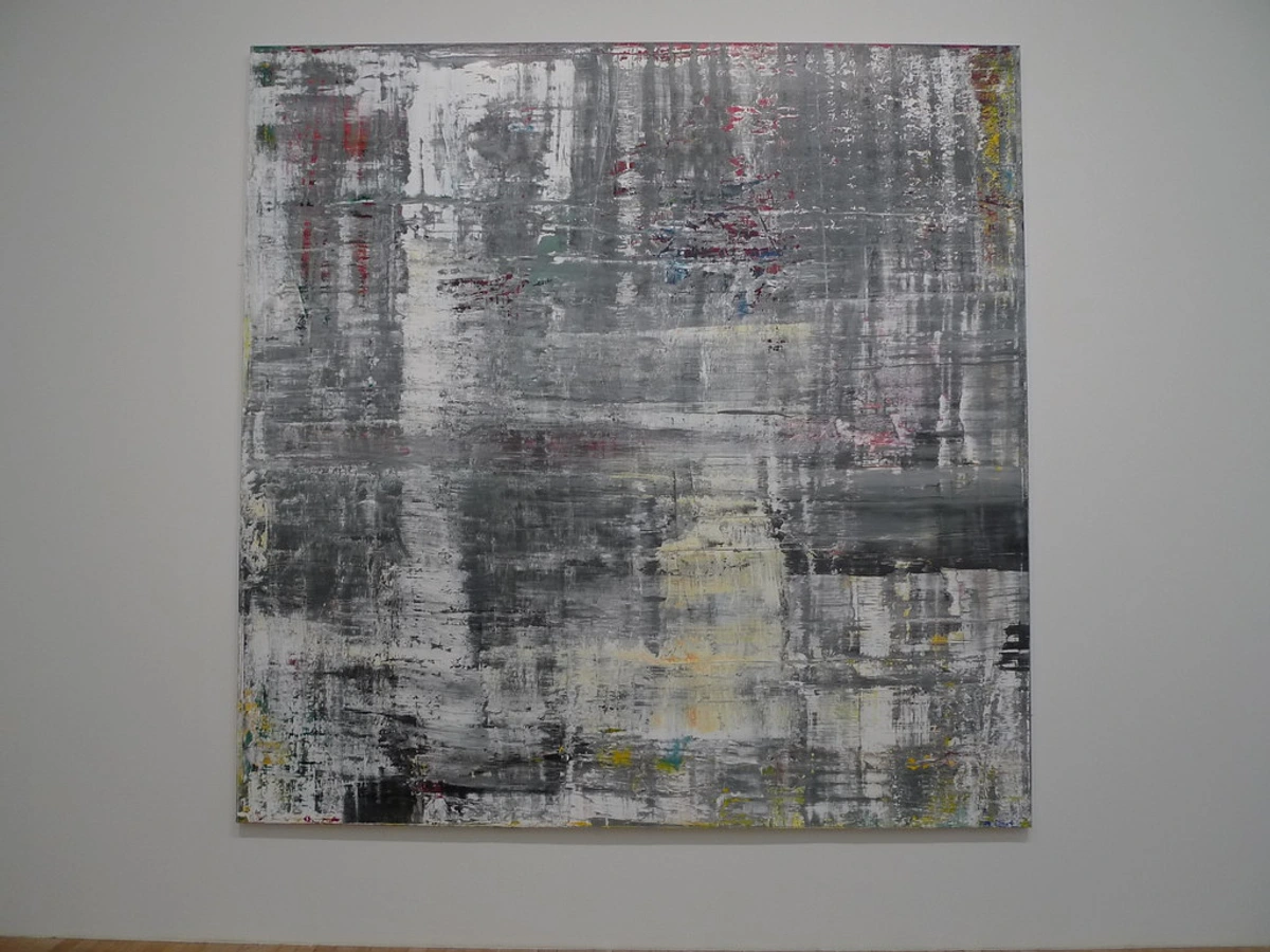
nHere’s where it gets magical: burnt sienna isn’t just for representation. Use gestural strokes in abstracts to convey warmth, decay, or history. I’ve scraped it thickly with palette knives like old paint layers on a ruin, or dripped it wet-on-wet to evoke dried blood in turbulent pieces – think this abstract series that explores emotional landscapes.
Mixing Magic Without Mud
The biggest fear? Getting that ugly brown sludge. Avoid it with these principles:

Advanced Mixing Strategies
Beyond the basic rules, mastering burnt sienna mixing requires understanding some advanced strategies:

The "Mother Color" Approach:
- Keep a pre-mixed "mother color" of burnt sienna with a touch of your most common other pigments
- This provides a consistent base for variations
- Great for maintaining color harmony across a series
Temperature Zones:
- Create a "warm zone" on your palette where burnt sienna lives
- Keep cool colors (blues, greens) in a separate "cool zone"
- Mix across zones carefully, using clean brushes
Layering vs. Mixing:
- Some effects work better with layered applications rather than mixing
- Try glazing burnt sienna over other colors rather than mixing them together
- This maintains the clarity of both colors
Testing Protocol:
- Always test mixtures on scrap paper before applying to your artwork
- Let test patches dry to see the final color
- Make notes about successful combinations for future reference
Understanding Color Mixing Theory
Before we dive into specific rules, it helps to understand why burnt sienna behaves the way it does. The key lies in its color temperature and undertones.
Color Temperature: Burnt sienna is a warm pigment, meaning it leans toward the red/orange end of the color wheel. This warmth makes it excellent for creating natural shadows and earth tones, but it also means it can easily "muddy" when mixed with cool colors (blues and greens).
Undertones: While it appears brown, burnt sienna has distinct red undertones that distinguish it from other earth tones. This red character is what makes it so versatile for skin tones and warm shadows.
Hue vs. Value: Remember that burnt sienna affects both the hue (the actual color) and value (the lightness/darkness) of mixtures. When mixing, consider both aspects – you might be changing the color while also making it darker or lighter.
- Rule #1: Cool colors (blues, greens) kill burnt sienna’s warmth. Add it last to avoid greying.
- Rule #2: Want a terracotta? Mix with white, not yellow. Yellow + burnt sienna → muddy clay.
- Rule #3: Burnt sienna + transparent red oxide creates rich, dark browns perfect for hair.
- Rule #4: Lighten with yellow ochre, not white. White + burnt sienna → chalky fog.
I keep a cheat sheet on my easel for these. Save yourself the frustration!
Troubleshooting Common Burnt Sienna Problems
Problem: My burnt sienna appears too chalky or opaque
Solution: You're likely using too much white or binder. Try using less white, or lighten with yellow ochre instead. You can also add more medium to increase transparency. For watercolor, try using more water in your mixture.
Problem: The color appears muddy or lifeless
Solution: You may have mixed too many colors together, or added cool colors to your burnt sienna. Try creating mixtures where burnt sienna is the dominant color. Also, consider the order of mixing – add burnt sienna to other colors rather than the reverse.
Problem: It's drying too quickly (for oils/acrylics)
Solution: Add a small amount of your appropriate medium (linseed oil for oils, acrylic retarder for acrylics) to slow drying time. Store your palette in a cool, humid environment, or use a palette cover to prevent premature drying.
Problem: It's not granulating as expected (watercolor)
Solution: Make sure you're using a rough paper surface. Granulation is more pronounced on cold-pressed or rough papers. You can also enhance granulation by letting the paint sit undisturbed for a moment before tilting your paper.
Problem: The color seems too red/warm
Solution: Add a small amount of its complement (green-blue) to neutralize the warmth. Just be careful – a little goes a long way. You can also mix with burnt umber for a cooler, more neutral brown.
Brand Showdown: Who Wins?
Brand | Transparency | Granulation | Price Point | Best For |
|---|---|---|---|---|
| Daniel Smith | ★★★★☆ | High | $$ | Watercolor purists |
| Winsor & Newton | ★★★☆☆ | Moderate | $ | Balanced all-media use |
| Gamblin | ★★★★☆ | Low | $$ | Oil painters needing body |
| Sennelier | ★★★★☆ | Moderate | $$ | Rich glazing |
Brand | Drying Time | Staining | Flow | Unique Qualities |
|---|---|---|---|---|
| Daniel Smith | Fast | High | Good | Mineral sediment creates beautiful blooms |
| Winsor & Newton | Medium | Medium | Excellent | Consistent performance across all mediums |
| Gamblin | Slow | Low | Thick | Body perfect for impasto techniques |
| Sennelier | Medium | High | Fluid | Exceptional transparency for glazing |
Gamblin’s version leans slightly more towards red, while Daniel Smith’s granulates beautifully in watercolor. Test a swatch before committing! Find your perfect match in our pigment shop.
Historical Context & Cultural Significance
Burnt sienna isn't just a modern convenience – it's a pigment with a rich history that stretches back to the dawn of art itself. The ancient Egyptians used similar iron oxide pigments for tomb paintings, and Renaissance masters like Titian and Rembrandt relied on earth tones to create depth and atmosphere in their masterpieces.
What's fascinating is how burnt sienna has maintained its relevance across different artistic movements. From the earthy realism of the Baroque period to the atmospheric landscapes of the Impressionists, from the muted tones of Social Realism to the expressive textures of Abstract Expressionism, burnt sienna has been there, providing warmth and grounding.
In many cultures, brown pigments carry symbolic weight. In Western art, they represent earth, stability, and humility. In some Eastern traditions, earth tones are associated with grounding and connection to nature. The fact that burnt sienna appears in art traditions across the globe speaks to its universal appeal – it's a color that transcends cultural boundaries, speaking to something fundamental in the human experience.
Safety & Handling Information
While burnt sienna is generally considered safe for artists, it's important to handle pigments with care. Always work in a well-ventilated area, especially when using dry pigments or working with solvents for oil painting.
For oil painters, be aware that some brands may contain trace amounts of heavy metals, though modern pigments are generally much safer than historical ones. Always check the safety data sheet if you have specific concerns.
When cleaning brushes, avoid letting burnt sienna dry completely in the brush – the iron oxide particles can be quite abrasive and damage brush hairs over time. Clean brushes promptly after use with the appropriate solvent for your medium.
Wear gloves if you have sensitive skin, as some pigments can cause irritation. And always wash your hands thoroughly after painting sessions, especially before eating or touching your face.
Common Burning Questions (FAQ)
Q: Can I use burnt sienna for skin tones?
A: Absolutely! Mixed with white + ochre, it gives Mediterranean or sun-kissed skin tones. Add a tiny touch of alizarin for shadows under the chin – no pink needed.
Q: Can burnt sienna be used for hair colors?
A: Yes! Burnt sienna is excellent for creating natural hair colors. For brown hair, mix with transparent red oxide and a touch of yellow ochre. For redhead variations, add more yellow ochre and a hint of cadmium red. For darker hair, add burnt umber. Always start with lighter mixtures and build up darker tones gradually.
Q: What's the difference between burnt sienna and burnt umber?
A: While similar, burnt sienna has warmer, reddish undertones while burnt umber is cooler and more brown. Burnt sienna is better for warm shadows and skin tones, while burnt umber excels at deep, cool shadows and soil tones. Many artists keep both in their palette for different applications.
Q: How do I create a convincing sunset color with burnt sienna?
A: For sunsets, mix burnt sienna with cadmium red and just a touch of yellow. Create gradients by adding more yellow for the brightest areas and more burnt sienna for the shadows. You can also glaze transparent layers over each other to build depth. For dramatic effects, add a touch of purple or blue in the shadow areas.
Q: Can I use burnt sienna for metallic effects?
A: Burnt sienna alone won't create convincing metallic effects, but it can be part of the mix. For copper and bronze effects, mix burnt sienna with small amounts of gold or copper powder. For aged metal, combine burnt sienna with burnt umber and just a hint of black, then use dry-brush techniques over metallic underpainting.
For different skin tones, adjust the ratios: fair skin might use more white with just a touch of burnt sienna, while deeper skin tones might use burnt sienna as the base with white added to lighten. The key is to avoid using burnt sienna alone for skin – it always needs to be mixed with other colors to achieve the right warmth and naturalness.
Q: Why is my burnt sienna looking muddy instead of rich?
A: You’re likely over-mixing or adding too much white. Remember: less white, more medium transparency. Always mix a test patch on scrap paper first.
Q: Is burnt sienna lightfast?
A: Yes! ASTM I rated for oils/acrylics (fading won’t occur in sunlight). Watercolors can vary – check ratings if outdoor exposure matters.
Q: Can I create burnt sienna from scratch?
A: Only if you’re a pigment chemist! The heating process alters molecular structures. Buy pre-made – your time is worth more.
Q: How do I clean brushes stained with burnt sienna?
A: For oil paints, scrub with mineral spirits. For acrylics, use warm soapy water immediately. If dry, soak overnight. Iron oxide pigments are stubborn – persistence pays off.
Q: What's the difference between student and professional grade burnt sienna?
A: Professional grade burnt sienna typically has higher pigment concentration, better lightfastness, and more consistent color. Student grade may have more fillers and binders, which can affect the texture and mixing properties. Professional grade also tends to have better granulation and transparency. While student grade is more economical, professional grade generally provides better results and more control, especially for important works.
Q: Can I use burnt sienna for printmaking?
A: Yes, burnt sienna can be used for various printmaking techniques. For intaglio methods like etching, it works well for creating warm tones and textures. For relief printing, it can be used for woodcuts and linocuts to create earthy effects. For screen printing, you'll need to use screen printing inks that contain burnt sienna pigment. Always test your techniques on scrap materials first, as printmaking inks behave differently than painting mediums.
For stubborn stains, you might need to use a brush cleaner specifically designed for removing dried oil paint. Some artists also find that a small amount of Murphy's Oil Soap can help break down the dried pigment. Be gentle with your brushes – avoid harsh scrubbing that can damage the ferrule or hair. Prevention is always better than cure – clean your brushes promptly after use, especially when working with earth tones that tend to dry quickly.
The Warmth in Your Toolbelt
nBurnt sienna isn’t just a color; it’s an emotion in a tube. It’s the scent of old libraries, the patina on bronze, the soul of a landscape at dusk. My advice? Don’t save it for “serious” work. Drip it into abstracts, smear it under eyes, let it accidentally mix into your sky. That’s where art magic happens – in the unexpected collisions of pigment and intuition.
So next time you stand before a blank canvas, ask yourself: what warmth does this piece need? Then reach for the tube that answers not with noise, but with quiet confidence.
Final Thoughts: Burnt Sienna as Creative Catalyst
In a world of bright, flashy colors, burnt sienna reminds us of the power of subtlety and depth. It's not the color that shouts for attention, but the one that whispers to your soul. What I've come to appreciate most about burnt sienna is how it teaches patience – you can't rush the layering, you can't force the mixing, you have to let the pigment do what it does naturally.
Some of my most satisfying painting moments have come from experiments with burnt sienna. That moment when you discover just the right mixture for a shadow, when a glazing technique creates depth you didn't expect, when a simple stroke conveys more emotion than you thought possible – these are the magical moments that make painting worth it.
Burnt sienna has been my constant companion through every phase of my artistic journey. It was there when I was struggling with basic color mixing, it helped me develop my understanding of light and shadow, and it continues to inspire me in my abstract explorations. It's more than just a pigment – it's a philosophy, a way of seeing the world in warm, nuanced tones.
So embrace the humble burnt sienna. Let it be your guide to deeper, more meaningful expression. Let it teach you about patience, about subtlety, about the power of quiet warmth in a loud world. And most importantly, let it remind you that sometimes the most profound colors are the ones that don't shout at all – they just speak softly to your heart.
Color Psychology & Emotional Impact
Colors carry emotional weight, and burnt sienna is no exception. This warm, reddish-brown hue triggers a complex range of psychological responses:
- Warmth and comfort: Reminiscent of fire, earth, and home
- Nostalgia and history: Evokes aged materials and memories
- Grounding and stability: Connects us to natural elements
- Sophistication and elegance: Suggests aged luxury and refinement
Different cultures may associate burnt sienna with different emotions. In Western contexts, it often represents warmth and comfort, while in some Eastern traditions, earth tones might symbolize harmony with nature. Understanding these associations can help you make intentional color choices that resonate with your audience.
Cost-Effectiveness & Alternatives
While burnt sienna is relatively affordable compared to many synthetic pigments, there are ways to maximize its value:

- Buy larger tubes: Professional sizes often offer better value per gram
- Mix your own earth tones: Create variations by adding small amounts of other pigments
- Consider student grade: For practice work, student-grade burnt sienna can be more economical
- Look for sales: Many brands offer discounts on specific colors periodically
If you're looking for alternatives or need to substitute burnt sienna:
- For warm shadows: A mix of raw umber + a touch of alizarin crimson
- For aging effects: Burnt umber + a tiny bit of yellow ochre
- For earth tones: Various combinations of ochres, umbers, and siennas
- For warm glazes: Transparent red oxide + a hint of yellow
Environmental Considerations
Modern pigments are generally much more environmentally friendly than historical ones, but it's still worth considering:
- Pigment sourcing: Many earth pigments are naturally occurring and sustainably sourced
- Manufacturing processes: Some brands have more sustainable production methods
- Packaging: Consider brands with recyclable or minimal packaging
- Disposal: Properly dispose of solvents and waste materials according to local regulations
While the environmental impact of individual pigments is relatively small compared to other aspects of art making, being mindful of our choices is always a good practice.
Ready to explore deeper color alchemy? Discover how burnt sienna connects to our museum's pigment history.