The Secret Life of Pigments: Why Particle Size Changes Everything
Ever wondered why some paints are buttery smooth and others are gritty? It all comes down to pigment particle size. A deep dive into how this tiny detail affects transparency, color, and texture.
The Secret Life of Pigments: Why Particle Size Is the Secret Ingredient in Your Paint
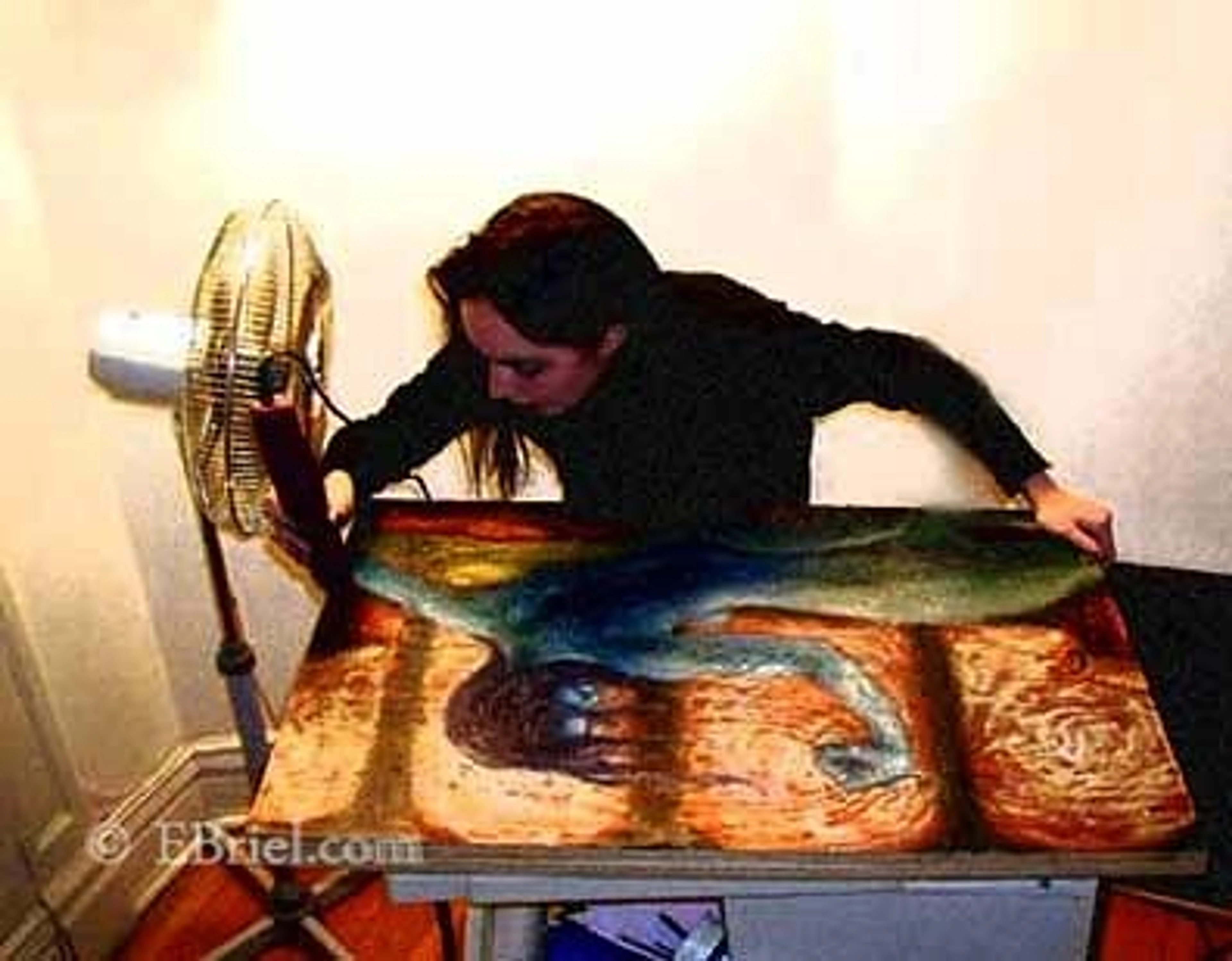
I remember the first time I used a genuine Cerulean Blue. I’d been using a 'hue' version for ages, which was fine, but this was the real deal. I squeezed it onto my palette and it just felt… different. It had a subtle grittiness, a texture that the buttery-smooth hue version lacked. It wasn’t a flaw; it was a feature. That was the day I fell down the rabbit hole of pigment particles, and honestly, my painting has never been the same. It feels like uncovering a secret, one that’s been hiding in plain sight for centuries, and it changes everything you thought you knew about color.
You probably think of paint as just color mixed with a binder, right? And you're not wrong, but that's like saying a book is just words on paper. The real story, the character, is in the details. In paint, one of the most important details is the size and shape of the pigment particles themselves. These aren't just abstract motes of color; they're microscopic crystals, chunks, plates, and spheres. Their physical form dictates how a paint behaves more than almost anything else. It’s this architecture that determines whether your paint will be a shy, gentle glaze or a domineering opaque wall. Over the centuries, artists stumbled upon these properties through trial and error; today, we have the science to understand why. The story of particle size is a tale told in two parts: physics and chemistry. Smaller, finer particles are more opaque but can be less stable over time, while larger particles are often transparent and enduring, holding their color for centuries. It’s the reason a watercolor can feel chalky, why an oil paint can “butter” effortlessly, and why two blues that look almost identical on the swatch chart can tell a completely different story on your canvas. This hidden landscape of particles is the bridge between the physics of light and the poetry of painting.

The Big vs. Small Showdown: How Particle Size Affects Paint Quality
At its core, this is a battle of physics, a quiet riot of molecular geometry. Larger, heavier particles act differently than smaller, lighter ones when suspended in oil or acrylic polymer. This fundamental difference ripples outward, affecting everything from how light bounces off them to that intimate feeling under your brush. It's a cascade of consequences—from transparency to texture, lightfastness to tinting strength—each one traceable back to the simple matter of size.

Transparency & Opacity: The Hiding Game
Let's start with what feels like the most magical property: hiding power. This is the big one. Why does a single stroke of Cadmium Red completely obliterate whatever is beneath it, while a Rose Madder seems to whisper, allowing the layers below to glow through? The answer lies in a microscopic game of light and shadow.
We engaged in a little experiment recently, and it reveals everything. We kept adding finer and finer sand to a beaker of water. Eventually, the water turned into a milky, opaque slurry. You couldn’t see a light at the bottom anymore.
- Small Particles = More Opaque: This is precisely what happens with fine pigment particles. Each tiny particle acts like a microscopic mirror. When you have billions of them crowded together in a paint film, they create a dense, overlapping network. Light striking this surface doesn't have a clear path through the film; it's scattered and reflected back, often multiple times, creating that solid, opaque appearance. This is perfect for blocking out areas, making corrections, or creating a solid foundation in underpainting.
- Large Particles = More Transparent: Conversely, we replaced the fine sand with a handful of small, smooth pebbles and dropped them into a fresh beaker of water. Even when the pebbles settled, we could still clearly see the bottom of the beaker. This is the secret of transparency. Larger pigment particles are like those pebbles; they rest in the binder with significant space between them. Light rays can travel through the clear binder between the particles, deep into the paint layer, striking the canvas or underlayer and then bouncing back through the gaps. This passage of light is what creates that luminous, glowing quality essential for techniques like glazing.
It's a common myth that transparency is simply paint that's been "diluted" by more medium. You can thin an opaque paint until it's sheer, but it will just be a weak opaque wash. A genuinely transparent pigment possesses this physical architecture of spaced, larger particles from the very beginning, allowing it to retain its color integrity while letting light pass through.

Feature | Small Pigment Particles | Large Pigment Particles |
|---|---|---|
| Light Interaction | Scatters and reflects light at the surface | Allows light to pass between particles and reflect back |
| Resulting Property | Opaque, Solid, High Hiding Power | Transparent, Luminous, Low Hiding Power |
| Common Examples | Cadmiums (Red/Yellow), Titanium White, Cobalt Blue, Naples Yellow | Ultramarine Blue, Viridian, Quinacridones, Raw Umber |
| Best Use Case | Base layers, underpainting, covering mistakes, solid shapes | Glazing, deep shadows, luminous skin tones |

Tinting Strength: The Loud vs. Quiet Pigments
Let's talk about the bullies on the palette. Have you ever been humbled by adding what you thought was an insignificant speck of Phthalo Blue to a massive pile of white paint, only to watch it completely devour the mixture in seconds? I certainly have. That's high tinting strength—the pigment's remarkable ability to dominate a mixture. It can feel like dropping a lit match into a haystack; there's no taking it back, and you're left with a color that's an entirely different beast.
Imagine taking a single, large sugar cube and placing it next to a teaspoon of fine table sugar. They might weigh the same, but their surface areas are worlds apart. The countless tiny grains of table sugar have exponentially more surface area exposed to the air.

- Small particles are the table sugar. A small amount by weight contains a staggering number of particles, and each one offers up its surface to interact with light and other pigments. This colossal total surface area is what makes them such powerful tinters. They are the loud, dominant personalities—the Phthalos, the Quinacridones, and the modern Pyrroles.
- Large particles are the sugar cube. Because they're bigger, you have fewer of them for the same weight, leading to a much lower total surface area. They are the quiet, gentle souls of your palette. You need to use a generous amount of a color like genuine Cobalt Blue to see a real shift in a mixture. They are cooperative, gradual, and predictable. Knowing this is a fundamental part of the definitive guide to color theory in art.
Lightfastness & Permanence: Will It Last?
The question of durability is more subtle, a story of surface area and chemical stability. Think of it this way: a big, solid rock can sit in a storm for decades, its core protected. A pile of fine sand, however, gets eroded and washed away grain by grain. The same principle often applies to pigments.
Larger particles tend to be more inherently lightfast. A big, chunky particle—like those found in many natural earth pigments—is structurally robust and has less surface area exposed to the destructive effects of UV light and atmospheric oxygen relative to its total mass. It's just harder to break down. This is a major reason why some of our oldest, most permanent colors, like the Siennas and Ochres, are often composed of these larger, more irregular particles. They are the survivors.
However, this is where modern chemistry truly shines, and it's a crucial caveat. The particle itself is just the colored core of the story. We now have exceptionally stable synthetic pigment families (like Quinacridones and Pyrroles), which are often made from very small particles. While their small size could make them vulnerable, their molecular structure is engineered to be incredibly resistant to fading. It's a trade-off where chemical armor often outweighs physical size.
Still, the underlying physics can't be completely ignored. A super-fine, organic pigment might start with a high permanence rating, but over centuries of exposure, that raw surface area might make it slightly more vulnerable to gradual degradation than a large, inert mineral particle. That's a conversation about archivability, not just next week's gallery opening. It’s like comparing a solid oak table to a perfectly engineered but very thin laminate; the oak might weather centuries, while the laminate is superior until the day it fails. Sturdy might not always mean better, but it often equates to forever.
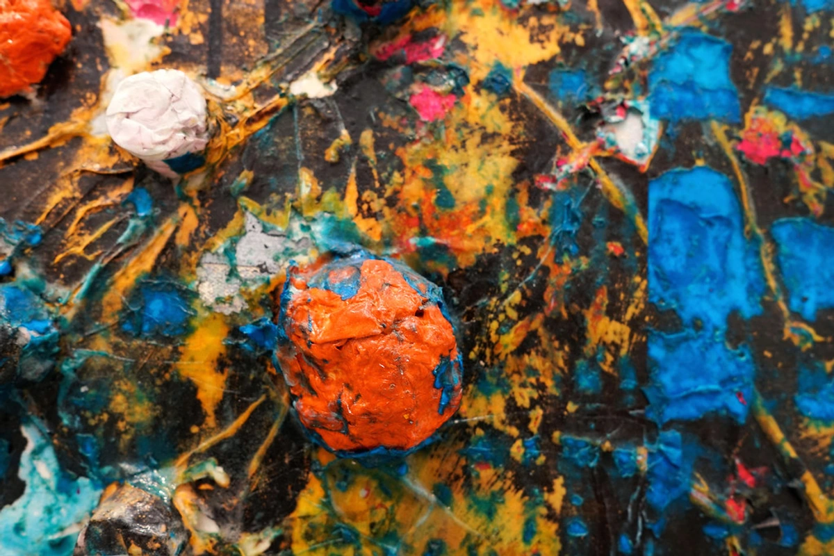
Texture and Handling: The Feel Under the Brush
Back to my Cerulean Blue story. This is where the science becomes visceral; you can literally feel the difference under your brush and in your hands.
- Large Particles: Give paint a noticeable texture. It can feel gritty, sandy, or 'long' (meaning it can be pulled into stringy strokes). This is not a defect! It's the character of the pigment. I love the drag of a good Raw Sienna for this reason; it connects you to the earthy material itself. It's a key part of understanding the elements of art, especially texture.
- Small Particles: Result in that smooth, short, buttery feel that many modern paints have. They glide off the brush with very little resistance. This is fantastic for fine detail, smooth blending, and creating flat, even areas of color.
Neither is 'better'—they're just different tools for different jobs. Some days I want a buttery smooth application, other days I want to feel the grit of the pigment digging into the canvas.
Putting It All Together: From Theory to Practice
Okay, all this science is well and good, but how does it actually help when you're standing in front of a blank canvas with a headache and a deadline?
- Decoding Your Tube: The Hieroglyphics of Purity and Opacity You can't see the particle size, but you can find its footprints everywhere. First, look for the simple opacity symbols on the tube's label: a solid black square for opaque, a half-filled square for semi-transparent, and an empty square for transparent. This is your primary decoder ring. But don't stop there. Look for the pigment index codes (like PB29 for Ultramarine Blue). A paint made with a single pigment (PB29) is often more predictable in its behavior than a "hue" or a mix of pigments (like PB15:1/PV19), which can be a Frankenstein's monster of particle sizes, each one fighting for dominance. For building a clear and reliable system, single-pigment paints are your best friends. Add to this the manufacturer's statements like "Series" or "Permanence Ratings," and you'll start to see the full picture they're providing about how each pigment behaves.
- Strategic Palette Design: Choosing Players for Their Strengths You wouldn't use a sledgehammer to put in a thumbtack. Don't fight your paints' physical nature; use it. Need to establish a composition quickly or cover an unfortunate passage? Bring in your heavy hitters—the opaque Cadmiums, the Titanium White. Their powerful hiding ability is a reset button. Conversely, when you want to build depth, create the illusion of light filtering through a mist, or mix a dark that isn't a black hole, turn to your transparent pigments.
- Embrace the Grit: Making Texture Your Co-Conspirator Don't see a gritty pigment as a flaw to be tolerated. See it as a compositional tool waiting for the right moment. That grainy Raw Umber? It's not just brown; it's textured, ancient rock. I once used a notoriously gritty Cerulean to paint the crumbling facade of an old building, and the pigment did half the work for me—its sandy consistency naturally suggested weathered stone when used dry. Look at your subject and ask: where does the feel of the surface matter?
Ultimately, knowing this stuff deepens your relationship with your materials. You stop seeing your paints as just 'blue' or 'red' and start seeing them as individuals with their own personalities. And when you know their personalities, you know exactly who to invite to the party. When you understand that particle size can subtly influence how paint dries, interacts with mediums, and even how it is perceived by the human eye, you're no longer just painting; you're engineering a sensory experience on your canvas.
Wisdom from the Workshop: Case Studies in Particle Size
Case Study 1: The Luminous Portrait
Consider skin tones. A beginner might reach for a pre-mixed "flesh" tone, which often contains opaque white pigments. The result is flat. A deeper understanding of particle behavior points to a different approach: transparent reds and yellows, like Quinacridone Gold (fine particles, but transparent) or genuine Rose Madder (large particles, transparent). Building a portrait with these allows light to penetrate the paint film, reflect off the canvas, and bounce back through the color. The result isn't just a painted face; it's one that seems to have light emanating from within, capturing the delicate glow of living tissue. It's a technique the Old Masters knew instinctively, layering transparent earths and lakes to build depth we still marvel at today.
Case Study 2: The Atmospheric Landscape
How do you paint a foggy morning, a hazy distant mountain, or the shimmer of heat on a horizon? Opaque pigments will fight you, creating hard, solid shapes that look solid and close. The solution lies in your transparent and semi-transparent pigments – often those with larger particle sizes. A wash of Ultramarine Blue or Viridian over a sky base creates an effect that feels like atmosphere, not just blue paint. The larger particles settle, leaving microscopic "gaps" for light to travel through, creating that subtle, veiled quality that pushes a landscape deep into the pictorial space. The fog itself seems to be made of the very paint you've layered.
Case Study 3: The Layered Abstract
In abstract art, where there’s no "correct" representation, particle physics becomes a primary player. An artist might use highly opaque Titanium White to completely obliterate a previous layer, creating a clean slate. Next, they could use a transparent Phthalo Blue glaze to create a deep, luminous blue without obscuring the underlying texture. The interplay between these two – one a blocker of light, the other a conduit for it – allows an abstract artist to build intricate layers of space and history, creating a luminous depth that invites the viewer to look "into" the painting rather than just at it.
The Particle Spectrum: A Practical Chart
This table isn't just a chart; it's a guide to the personalities on your palette, helping you anticipate a paint's behavior beyond just its hue.
Pigment (Common Examples) | Typical Particle Size | Opacity Behavior | Tinting Strength | Best For | Lightfastness Note | |
|---|---|---|---|---|---|---|
| Titanium White | Very Fine | Opaque / High Hiding | Powerful | Smooth, Buttery | Mixing, Base Layers, Corrections | Excellent (Inorganic) |
| Cadmium Red/Yellow | Fine | Opaque / High Hiding | Very Strong | Smooth, Stiff | Base Layers, Covering Mistakes, Vibrant Opaque Color | Excellent (Inorganic) |
| Cobalt Blue | Medium | Semi-Opaque / Medium Hiding | Moderate, Gentle | Slightly Short | Skies, General Use | Excellent (Inorganic) |
| Viridian | Large | Transparent / Low Hiding | Moderate | Gritty, Long | Glazing, Shadows, Atmospheric Effects | Excellent (Inorganic) |
| Ultramarine Blue | Large | Transparent / Low Hiding | Moderate | Gritty, Can be "Long" | Glazing, Deep Blues, Atmospheric Effects | Very Good (Inorganic) |
| Raw Umber/Sienna | Large & Irregular | Semi-Transparent / Medium Hiding | Moderate to Low | Gritty, Sandy | Under-painting, Textured Earth Tones, Glazing | Excellent, Enduring (Natural Earth) |
| Quinacridone Red/Gold | Fine (but Transparent!) | Transparent / Low Hiding | Strong (a "Quiet" Dominator) | Smooth | Glazing, Luminous Color, Special Effects | Excellent (Modern Synthetic) |
| Phthalo Blue/Green | Very Fine (but Transparent!) | Transparent / Low Hiding | Extremely Strong (The "Loudest" Dominator) | Very Smooth | Intense Glazing, Powerful Mixtures | Excellent (Modern Synthetic) |
| Rose Madder (Genuine) | Large | Transparent / Very Low Hiding | Low, Gentle | Can be Gritty | Luminous Skins, Delicate Glazing | Fair to Poor (Fugitive Natural Lake) |
This table demonstrates a crucial point: "fine" doesn't always mean "opaque," and "strong" doesn't always mean "large." Modern chemistry, as seen with Quinacridones and Phthalos, can create incredibly small particle pigments that maintain transparency and pack a powerful tinting punch, defying simple historical rules.
The Science Behind the Magic: A Deeper Dive
For those who want to understand the "why" behind the "what," this section is for you. Understanding this won't necessarily make you a better artist, but it will make you a better craftsman, and that's a distinction worth exploring.
The Role of Surface Area
This is the most fundamental concept. Imagine a single, large pigment particle is a sugar cube. It has a fixed surface area. Now, imagine you take that exact same amount of sugar and grind it into a fine powder. The individual grains are tiny, but their total combined surface area is vastly greater than the single cube.

- Small Particles: This massive surface area means more light can bounce off them, making them more opaque. It also means there's more "real estate" for the pigment's color molecules to influence a mixture, resulting in higher tinting strength.
- Large Particles: Less total surface area means less light is interrupted, allowing for transparency. They have fewer "touchpoints" to influence a mixture, hence their gentler tinting strength.
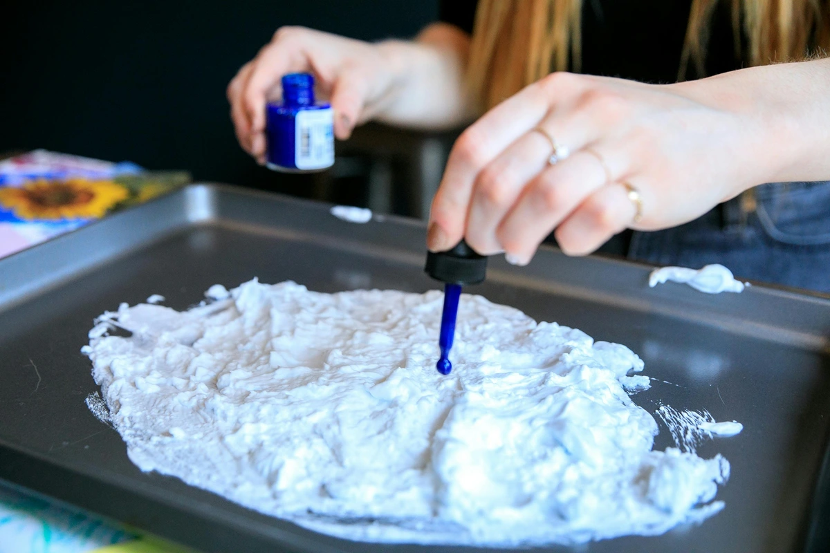
Particle Size Distribution: The "Secret Ingredient" in Paint Formulation
The particle behavior isn't just about an average size; it's also about the distribution of those sizes within a single pigment batch. Paint manufacturers often blend particle sizes to achieve specific effects. A paint might have mostly large particles for transparency but include a percentage of very fine particles to slightly boost its body or provide a specific texture, creating a "semi-transparent" or "semi-opaque" effect. This is one of the reasons two different brands of the "same" pigment can feel and behave so differently on your palette.
The Physics of Light Scattering (Mie vs. Rayleigh)
How light interacts with pigment particles is a branch of physics called scattering theory.
- Small Particles (much smaller than the wavelength of light, roughly < 50 nanometers) tend to engage in Rayleigh Scattering. This is the same phenomenon that makes the sky blue. It scatters shorter (bluer) wavelengths of light more effectively than longer (redder) wavelengths. While most artist pigments are larger than this, this principle governs the behavior of certain modern dyes and helps explain why some very fine pigments have unique optical qualities.
- Larger Particles (comparable to or larger than the wavelength of light) engage in Mie Scattering. This type of scattering is less dependent on the wavelength and scatters all colors of light more or less equally. An opaque pigment like Titanium White is a master of Mie Scattering; its particles are perfectly sized to bounce white light back at you, creating that solid, non-transparent effect.
The Binding of It All: How Mediums Interact with Particles
The binder—linseed oil, acrylic polymer, gum arabic—isn't just a neutral carrier. It's an active participant.
- Wetting and Dispersion: Different binders "wet" pigments differently. A good binder will coat each particle evenly, preventing them from clumping together (a process called "flocculation"). Clumped particles can change the effective particle size, making a paint appear grainier or even more transparent than it should.
- Refractive Index (RI): This is a measure of how much a substance bends light. For maximum transparency, you want the refractive index of the binder to match the RI of the pigment as closely as possible. When they match, light passes through the pigment-binder interface without scattering, seeming to "ignore" the particle. When they differ, light is scattered, increasing opacity. This is a critical factor in formulating a truly transparent paint.
These scientific underpinnings are what separate a "premium" artists' paint from a student-grade one. The manufacturer isn't just grinding rocks; they're engineering a complex optical system.
Frequently Asked Questions (FAQ)
Q: Does smaller pigment size always mean better quality paint?
A: Absolutely not. 'Quality' depends on the intended use. For a transparent glaze, a high-quality paint will use larger (or naturally transparent) pigment particles. For a powerful, opaque covering color, a high-quality paint will use very fine, small particles. It's all about fitness for purpose.
Q: How can I tell the particle size of the paint I'm buying?
A: You can't directly, as it's not listed on the tube. However, you can make very educated guesses. Check the opacity symbol (the little square), feel the paint's texture (is it buttery or gritty?), and notice its tinting strength. A super high-strength, opaque, smooth paint almost certainly has a very fine pigment grind. Think of it as detective work; you're piecing together clues the manufacturer left behind to understand its true nature.
Q: Does particle size affect the drying time of paint?
A: In a very minor, technical way, yes, but in practice, no. The type of binder (linseed oil vs. safflower oil in oils, or the specific acrylic polymer) and the additives used by the manufacturer have a vastly greater impact on drying time. It's not something you'd ever notice as a painter.