Digital File Formats for Artists: The Essential Guide
Navigate the maze of digital file formats for artists. From TIFF to JPEG, learn which format preserves your art's soul and which one to avoid.
The Definitive Guide to Digital File Formats for Artists (And Why Your Art Deserves Better Than a JPEG)
Ever had that nightmare where you finish a piece, export it as your usual file type, and then—months later—you open it to reprint, only to find your vibrant purples have turned into a murky, pixelated mess? Or you upload what you think is a perfect image, only to discover Instagram has crushed your shadows into a black hole and turned your delicate gradients into a blocky, digital bruise? This isn't about boring technical specs. This is about choosing the right vessel for your work. Your art deserves to be seen as you intended, whether it's on a billboard, a business card, or a pixel-perfect screen. It's equally about building a professional workflow that protects your creative legacy. Just like a painter invests in acid-free paper and light-fast inks, a digital artist must invest in understanding the tools that preserve their work. So, let's clear up the confusion and find the digital home your creations deserve.
The Artist's Dilemma: To Share or To Preserve?
Have you ever stopped to think about the digital afterlife of your art? It's a strange question, but a vital one. Every time you save a file, you're making a decision about its future. We're constantly caught between two opposing forces. We need formats that are lossless, meaning they keep every single pixel exactly as you created it. But we also need formats that are compressed—small, fast, and easy to share. The problem? Often, what makes a file small and shareable is a process that literally throws away visual information forever. It's the digital version of making a photocopy of a photocopy, a stuttering game of telephone where each step loses the original message. Eventually, the soul of the piece gets lost. This distinction isn't just an academic detail; it defines your entire digital strategy. The shareable image is fleeting, a quick hello. The preserved one is the durable record, your creative passport for the future.
I learned this the hard way, by the way. I once saved an entire series of digital sketches as high-compression JPEGs, thinking the small file size was a win. It was a disaster. When I tried to go back and rework them, the details I needed were just… gone. Eaten by the algorithm in the name of efficiency. It was a heartbreaking lesson in digital entropy, that slow, invisible decay of data. You don't realize how much you'll change as an artist in a year. That piece you're "done" with today might be the one a future client asks you to modify, or the one you suddenly see a way to improve. If all you have is a flattened, lossy JPEG, you're locked out of your own past. You've essentially thrown away the key to that creative room.
The most dangerous part? It's a silent degradation. You don't get a warning box that says, "Your highlights are about to be permanently flattened." It just happens, bit by bit, every time you hit "Save As." It's like leaving a beautiful painting in a sunlit room. You don't see it fading day by day, until one day you do, and it's too late. This is why for any original, editable work, a lossy format is a digital dead-end. It's a destination that slowly erases the road that led you there.
But the dilemma runs deeper than just saving a file. It forces you to answer a question about the very nature of your art. Is it a fleeting digital performance, optimized for the dopamine hit of a social media feed? Or is it an object of lasting value, a digital relic meant to outlive its pixels? I think most of us want both—the immediate connection and the enduring legacy. Navigating file formats is the practical art of serving these two masters without letting one destroy the other. That’s why understanding the difference between your main options isn't just helpful—it's essential for preserving the integrity of your work.
The Heavy-Hitters: An Honest Breakdown of Key Formats
Let's walk through the core players in the artist's toolkit. Think of them less as abstract acronyms and more as different types of canvas, different materials with unique strengths and weaknesses. It's a surprisingly emotional choice, really. Handing your work over to a file format is like trusting a courier to deliver a priceless manuscript. Some couriers are built like armored trucks, protecting every word. Others are speedy little scooters that might get it there faster, but you can't help but worry that a few pages might blow away in the wind. We're about to look at the armored trucks, the scooters, and everything in between.

1. TIFF (.tiff): The Indestructible Archive
Thought of as: The museum vault. The single source of truth.
If you ever want to be 100% certain that you have an exact, perfect copy of your work, TIFF (Tagged Image File Format) is your best friend. It's a lossless format, a format of zero compromise. I use it as my digital negative—a pristine, master file that I can always go back to. While others are built for speed or size, the TIFF is built for fidelity, a digital vault designed for the long haul. When I finish a piece, the TIFF is the first thing I create from my working file. It's the digital equivalent of developing a film negative and locking it in a fireproof safe before you even think about making a print.
So what is it, technically? A TIFF file isn't just a single thing; it's a flexible container. This "tagged" structure is what gives it its power. It can store multiple images within a single file, along with layers, transparency data, and, crucially, ICC color profiles. An ICC profile is like a set of instructions for how to interpret the colors in your file, ensuring they look the same across different devices and printers. When you save a TIFF for archival, embedding your monitor's ICC profile (like sRGB or Adobe RGB) is a non-negotiable step for maintaining color accuracy for decades to come. It's the difference between a vague description of a color and its precise scientific definition.
There are actually a couple of TIFF variants to be aware of. The standard TIFF uses lossless compression, like zipping a file—the data is perfectly preserved, just packed more efficiently. If you use software like Photoshop, you'll also see the option to save as a PSB (Photoshop Big). This is essentially TIFF's brawnier cousin, designed specifically to handle gargantuan files—we're talking images over 2 gigabytes and dimensions exceeding 30,000 pixels. You'll probably never need it, but it's good to know it exists if you ever paint a digital mural the size of a building.
A critical decision you'll face when saving a TIFF is the compression method. You'll have options like LZW, ZIP, and JPEG. Here's the catch: LZW and ZIP are lossless, meaning they shrink the file size without touching a single pixel. The "JPEG" option, however, is a trap door. It turns your pristine TIFF into a lossy file, defeating the entire purpose. Always, always choose LZW or ZIP. Think of it like packing a delicate sculpture for shipping. LZW and ZIP are like using custom-cut foam. The "JPEG" option is like just cramming it into a box with some loose newspaper—it might arrive looking okay, but why risk it?

The key takeaway is that TIFF isn't just one thing; it's a family of formats built around a single promise: your art, exactly as you made it, with zero compromises.

Diagram illustrating the master file workflow, CC BY-SA 4.0
The Good:
- Flawless Preservation: It saves every pixel. Your file is perfect for archiving your creative work. It's the one true source of your creative vision.
- Layers & Transparency: Most software lets you save TIFFs with layers intact, making them editable in the future. This is a game-changer. It's the difference between having a physical print of the Mona Lisa and having Leonardo's original wooden panel with all its underpainting still visible. If a client asks for a change a year from now, a layered TIFF means you can dive right back in instead of starting from scratch. This single feature can save you hundreds of hours of rework over your career.
- Flexible Compression: You can choose different compression methods within the TIFF family.
LZWandZIPare lossless, whileJPEGcompression for TIFF is (confusingly) lossy. Stick to the lossless options. Even compressed, a TIFF is still lossless, which is a beautiful thing. - Professional Standard: It's the expected format for high-end printing and archiving. Serious institutions demand it.
- A True Digital Negative: As a lossless format, it allows you to create new derivatives (like JPEGs for the web) at any point in the future without ever degrading the quality of your master.
- High Bit Depth Support: TIFF can handle 16-bit or even 32-bit color per channel, capturing an enormous range of tones and preventing posterization in smooth gradients. For high-quality scans, giclée prints, or future-proofing, this bit depth is an insurance policy.
The Bad:
- File Size: These files are enormous. They will fill up your hard drive faster than you can say 'terabyte.' This means you absolutely need a serious storage strategy—a cheap external drive isn't going to cut it for a professional practice. I'm talking network-attached storage, cloud backup, the whole deal.
- The Web Hates It: A TIFF will either not display on web browsers or will take an eternity to load. It's the digital equivalent of trying to mail a grand piano. Don't even think about uploading one to social media.
My Verdict: Use TIFF exclusively for your master, high-resolution archives. Never use it for sharing. It is the ultimate act of respect for your future self. Think of it like this: your working file (.PSD, .KRA) is the messy, wonderful studio. The TIFF is the perfectly catalogued, archival-quality, framed masterpiece locked in a climate-controlled vault. The JPEG is the postcard you send to friends. All three serve a purpose, but you don't mail the vault. When you're exporting, think of it like this: your working file is the messy studio, the TIFF is the perfectly catalogued, framed masterpiece, and the JPEG is the postcard you send to friends.
A Quick Guide to TIFF Settings:
- Bit Depth: 16-bit for maximum quality; 8-bit is acceptable for most web derivatives.
- Compression: LZW or ZIP. Never JPEG.
- Layers: Check the box to preserve them. It's the whole point of using it as a master file.
- ICC Profile: Always embed your working color profile (e.g., sRGB, Adobe RGB).
2. JPEG (.jpg or .jpeg): The Flawed Everyday Champion
Thought of as: A disposable camera. Great for a quick snapshot, but you wouldn't use it for a gallery show.
JPEG (Joint Photographic Experts Group) is the most common image format in the world. And therein lies the problem. It's ubiquitous because it's a lossy format, meaning it dramatically reduces file size by permanently deleting data the algorithm deems "less important." Every time you open and re-save a JPEG, it compresses again, losing more quality. This process, called 'generation loss,' is a one-way street to a pixelated graveyard. It's a deal with the devil—incredible convenience in exchange for a little piece of your art's soul every single time. The JPEG was created to solve a very specific problem: how to make a photograph small enough to transmit over the slow dial-up modems of the 1990s. It was never designed to be a professional archive for graphics or fine art. It has somehow become the universal default, a legacy decision we're all still living with.
But let's be fair to the format—it has a specific genius. The JPEG algorithm is a master of psychovisual redundancy. This fancy term means it excels at throwing away data that your eyes and brain are least likely to miss, particularly in complex, "busy" images like photographs. It works best where there are no hard edges, where slight color variations can be smoothed out without much notice. This is why a JPEG of a sunset can look fantastic while a JPEG of a logo with solid colors and sharp text looks like a pixellated disaster. It's a specialist, not a generalist, and knowing its specialty is key to using it correctly.
Think of the JPEG algorithm like a hyper-efficient but slightly tone-deaf archivist, a bureaucrat with a giant 'CONFIDENTIAL' stamp made of a blurry sponge. It was designed specifically for complex, 'noisy' images like photographs, where small changes in color and detail aren't always obvious to the human eye. It cleverly identifies and discards information we're less likely to notice. This is why it's a terrible choice for images with sharp lines, text, or solid blocks of color—in those cases, its data-scrapping becomes brutally apparent. For artists, this is the fundamental trap. What looks 'good enough' on a screen at 90% quality can become a blurry mess when a collector wants to print it on a large canvas. The algorithm that makes JPEGs great for holiday photos is the same one that can silently butcher the carefully rendered textures in your digital painting.
The "Quality" slider is your point of control. An image saved at 100% quality is almost indistinguishable from the original but results in a large file. An image at 60% is tiny but often visibly degraded. The sweet spot for most web use is between 80-90%. But "good enough" for a screen is not good enough for an archive. Never let a JPEG be the only copy of your work. That quality slider is a dial for temporary convenience, not permanent preservation.
The Good:
- Universal Compatibility: Every device and platform on earth can open a JPEG. It's the digital communication standard, the English of the internet. No gatekeepers, no special software needed.
- Tiny File Size: Perfect for sending quick proofs, posting on social media, or building a fast-loading website gallery. This is why your website loads in under two seconds.
- Targeted Optimization: Social media platforms perform their own additional compression, so giving them a small, high-quality JPEG to start with gives your art the best possible fighting chance. You can optimize for the algorithm, turning your art into a lean, mean, sharing machine. It's a direct line to the eyes of the world.
The Bad:
- The Quality Degradation: The more you edit and save it, the worse it gets. This is called "generation loss." This is often misunderstood, it's not just re-saving the same file that does the damage, but the process of decompressing and re-compressing it all over again. It's a one-way ratchet towards lower quality, a slow creative amnesia.
- No Transparency: JPEGs don't support a transparent background, which is a huge limitation for artists. The format forces a solid background, which feels incredibly restrictive if you're used to working with layers. It's a format that imposes its own will on your composition.
- Compression Artifacts: Ever notice those weird, blocky blurs in darker or smoother areas of an image? Those are JPEG artifacts, and they're a sign that the compression has been too aggressive. They are particularly cruel to smooth gradients and shadow details, leaving your subtle highlights looking like a dirty window.
- Limited Bit Depth: JPEGs are typically 8-bit, capping the total number of colors at around 16.7 million. While that sounds like a lot, it can lead to "banding," where you see visible steps in what should be a smooth gradient. This butchers the subtle color transitions that give digital art its depth. It's the difference between a real sunset and a paint-by-numbers kit.
My Verdict: Use JPEGs for final, web-ready images where file size matters more than perfect quality. For any original work you might edit again, never use JPEG. Think of it as the paperback novel you buy at the airport, not the original manuscript. It's for consumption, not creation. When you do export a JPEG, always save it from your TIFF or native working file. You're essentially taking a photo of the gallery piece, not re-painting it. When you do export a JPEG, always save it from your TIFF or native working file. Don't use JPEG as an intermediate step in your editing process. It's a final output format, not a working format. Think of it as the published book, not the working manuscript.
A Quick Guide to JPEG Settings:
- Quality: For web and social sharing, start at 85% and see if it's acceptable. For archiving, use 100%, but really, just don't use JPEG for archiving.
- Color Space: Embed the sRGB profile for the web to ensure colors are interpreted correctly by browsers.
- Progressive vs. Baseline: Progressive JPEGs load from blurry to sharp, which can make a large image feel faster on a website. Baseline is simpler and loads top-to-bottom. For art, Baseline is often better as it avoids the initial blurry stage.
3. PNG (.png): The Web Artist's Superhero
Thought of as: The perfect glass frame — it preserves the image and you can see right through the background.
PNG (Portable Network Graphics) was created as a superior, open-source replacement for GIFs, the digital equivalent of replacing a horse-drawn carriage with a car. For artists, its killer feature is its ability to save images with a transparent background, a superpower that JPEG completely lacks. It's also lossless, so it preserves all the detail without introducing JPEG-style artifacts. It was a revolution for web designers and remains the undisputed champion for graphics.
It's important to understand how PNG achieves its lossless compression, because it explains its quirks. While JPEG is great for complex photos, PNG excels at images with large areas of a single, flat color and sharp contrasts. It cleverly finds and encodes repeating patterns. This is why a logo with a transparent background will be smaller as a PNG than a JPEG of the same image with artifacts. However, this also means that a photograph, with its millions of subtly different pixels, will often result in a much larger PNG file compared to a high-quality JPEG. Imagine you're zipping a document. A list of 10,000 names all starting with "Smith" compresses beautifully. A list of 10,000 completely unique names does not. PNG is the digital-art equivalent of the first list, and JPEG is for the second. Knowing this simple difference will help you make smarter, faster decisions about your web assets.
The Good:
- Perfect Transparency: The definitive choice for logos, graphics, and layered art intended for the web. It's why my entire website's UI is built on PNGs. This is the feature that sets it apart and makes it indispensable for digital design. It allows your art to float on any background, free from a constricting white box.
- Lossless Compression: The quality is crisp, without the artifacts you get from a JPEG. What you save is what you get, every single time. This predictability is a huge relief when you need a reliable output.
- Sharp Detail: Its compression method preserves sharp lines and text immaculately, making it ideal for screenshots of your workflow or UI mockups. If an image has sharp edges, PNG is almost always the better choice over JPEG. It's the scalpel to JPEG's butter knife.
- High Bit Depth Support: PNG supports up to 48-bit images, making it excellent for preserving extreme detail in both highlights and shadows without banding. This is a level of quality that JPEG simply cannot touch, perfect for pieces where subtle gradients are key.
The Bad:
- Larger Files: It's bigger than an equivalent JPEG for photographic content. Not as huge as a TIFF, but still noticeable. This can slow down your website if you overuse it for large, complex images, a common pitfall for beginners.
- No CMYK Support: PNGs are locked to the RGB color space. This is fine for screens but makes it unsuitable for professional print production, where CMYK is the industry standard. You can't 'convert' a PNG to a proper print file without starting from a source that has more color data. If you hand a printer a PNG, they'll have to convert it, and you lose all control over how the colors shift, often with muddy or dull results. It's a screen-native format, born of light, not ink.
My Verdict: PNG is the king of the web for any image that needs a transparent background. It's your go-to for overlays, digital stamps, logos, badges, icons, or showcasing artwork on your site without a distracting white box around it. It's the special ingredient in your website's design recipe. For photorealistic paintings intended for the web, a high-quality JPEG is often a better balance of size and quality, but for all sharp-edged graphics, PNG is undisputed. I use it for every single UI element on my website that isn’t a final piece of painted art. It securely bridges the gap between the perfect quality of a TIFF and the small size of a JPEG specifically for graphics, text, and anything with a sharp edge. For photographic art, JPEG is usually the better web choice, but for everything else, PNG reigns supreme.
A Quick Guide to PNG Settings:
- Bit Depth: For complex artwork, PNG-24 or PNG-32 is best as it supports 16.7 million colors and full alpha transparency. For simple graphics with few colors, PNG-8 is a much smaller option.
- Interlacing: This allows the image to load progressively (like a progressive JPEG). For most websites, it's unnecessary and can slightly increase file size.
4. PDF (.pdf): The Storyteller's Canvas
Thought of as: Not just a file, but a self-contained, interactive presentation.
PDF (Portable Document Format) is in a league of its own, defying simple categorization as just an image format. It's a container that can hold text, images, and even interactive elements. For an artist, this is incredibly powerful. It allows you to create a document that tells a story—your story—with the confidence that it will look identical on every device that opens it. This concept, called WYSIWYG (What You See Is What You Get), is a superpower in a world of ever-shifting screen sizes and browser quirks. It's like a gallery that fits in an email and arrives exactly as you intended it, a mini-exhibition that you can disseminate with a click.
But not all PDFs are created equal, especially when it comes to printing. If you dig into the advanced settings of your export dialog, you might see options like PDF/X-4. This is the gold standard for sending files to a professional printer. PDF/X is a special subset of the PDF standard designed to be foolproof for print production. It embeds all fonts, ensures images are high-resolution, and locks the color space to CMYK, preventing a million potential headaches at the press. For anything that will be commercially printed, from a gallery invitation to a high-end art book, PDF/X is the only professional choice. It's the difference between mailing a postcard with your art on it and sending a professionally packaged, gallery-ready print. It tells the printer you know what you're doing and that they can trust the file to produce a perfect result.
Sample layout for an art portfolio in PDF format, Public Domain

The Good:
- Vector and Raster: You can embed both vector graphics (which scale infinitely without losing quality) and raster images. This makes it incredibly powerful for artists who combine hand-painted textures with clean vector shapes. The flexibility is astounding.
- Professional Presentation: It's the standard for digital portfolios, client presentations, and sending art to print shops. It's how you present your timeline of work professionally. It signals that you take your work seriously.
- Interactive Elements: You can embed links, making a portfolio PDF that's clickable, which is a wonderful user experience. You can guide a client through your work like a guided tour.
- Universal, Locked-in Look: When you send a PDF, you can be sure it will look exactly the same on the recipient's screen as it does on yours. This is called WYSIWYG (What You See Is What You Get) and it's a superpower in a world of incompatible browsers and software.
- Print-Ready Perfection: Using the PDF/X standard ensures your art prints will match your vision perfectly. It removes all the guesswork for the printer.
The Bad:
- Can Be Complex: Creating a well-formatted PDF, especially a print-ready one, requires attention to detail and can be intimidating for beginners. It's different from just "saving as." You need to think about bleeds, fonts, and color profiles, which can be a deep rabbit hole.
- Inherently Raster for Images: While PDF can contain vector graphics, most artists embed their raster artwork. This means your carefully crafted 300 DPI image is trapped inside the PDF. If a printer claims their machine can't handle a PDF and asks for a TIFF, this is often why. It's less flexible than the raw master TIFF it might have been created from.
- Not a Simple Image: For simple image sharing on the web, a PDF is overkill. Its strength is its formal, document-like nature, which is a mismatch for the immediacy of social media. You wouldn't send a PDF to a friend to show off a quick sketch.
My Verdict: Use PDFs for your professional portfolio, for sending multi-page documents to clients, and especially for preparing files to be professionally printed. It's the ultimate 'serious business' format that signals you know what you're doing. It's a container, a presentation, and a delivery mechanism all in one. For casual sharing, it's too formal. For professional delivery, it's the only way to fly.
Beyond the Big Five: A World of Digital Oddities
While TIFF, JPEG, PNG, and PDF handle 99% of an artist's needs, a handful of other formats pop up in specific scenarios. It's worth knowing what they are so you're not caught off guard. The world of file formats is vast and strange, and these are the fascinating oddballs, the promising newcomers, and the digital relics you might stumble across.

6. RAW (.cr2, .nef, .arw, .dng): The Photographer's Negative
Thought of as: The unprocessed film, direct from the camera sensor.
RAW files are not a single format but a category. They are uncompressed, unprocessed dumps of the data captured by a digital camera's sensor. Every camera manufacturer has its own proprietary RAW format (Canon's .CR2, Nikon's .NEF, Sony's .ARW). Adobe's DNG (Digital Negative) is an attempt to create a universal, open RAW format.
The Artist's Take: If you use photography as a base for your digital paintings (a technique known as photo-bashing or digital collage), working from RAW files gives you maximum flexibility. You have complete control over exposure, white balance, and color grading before you even start painting. For a pure digital painter, the native application format (PSD, KRA, etc.) is the equivalent of the RAW file—your starting point. This is the professional starting point for any work that incorporates photography. It's the digital equivalent of having the film negative instead of a processed print—all the original information is there for you to develop as you see fit.
7. GIF (.gif): The Ancient Animated King
Thought of as: The flickering, pixelated flipbook.
GIF is the original format for simple animations on the web. Its one and only trick is looping a sequence of frames. While iconic, it is technically a dinosaur. It is limited to a palette of just 256 colors, making it a terrible choice for preserving quality art. Its compression is also lossless in a way that's uniquely inefficient for complex images, often leading to huge file sizes for mediocre results.
The Artist's Take: The only real use for an artist is sharing short, simple, looping animations on social media where the charm of the format outweighs its technical limitations, a low-fidelity aesthetic choice. For any high-quality work, you should be exporting animated sequences as MP4 or WebM video files instead, which offer vastly better compression and quality, true modern solutions. Using a GIF is purely for the novelty and compatibility of its ancient format. It's the vinyl record of digital animation.
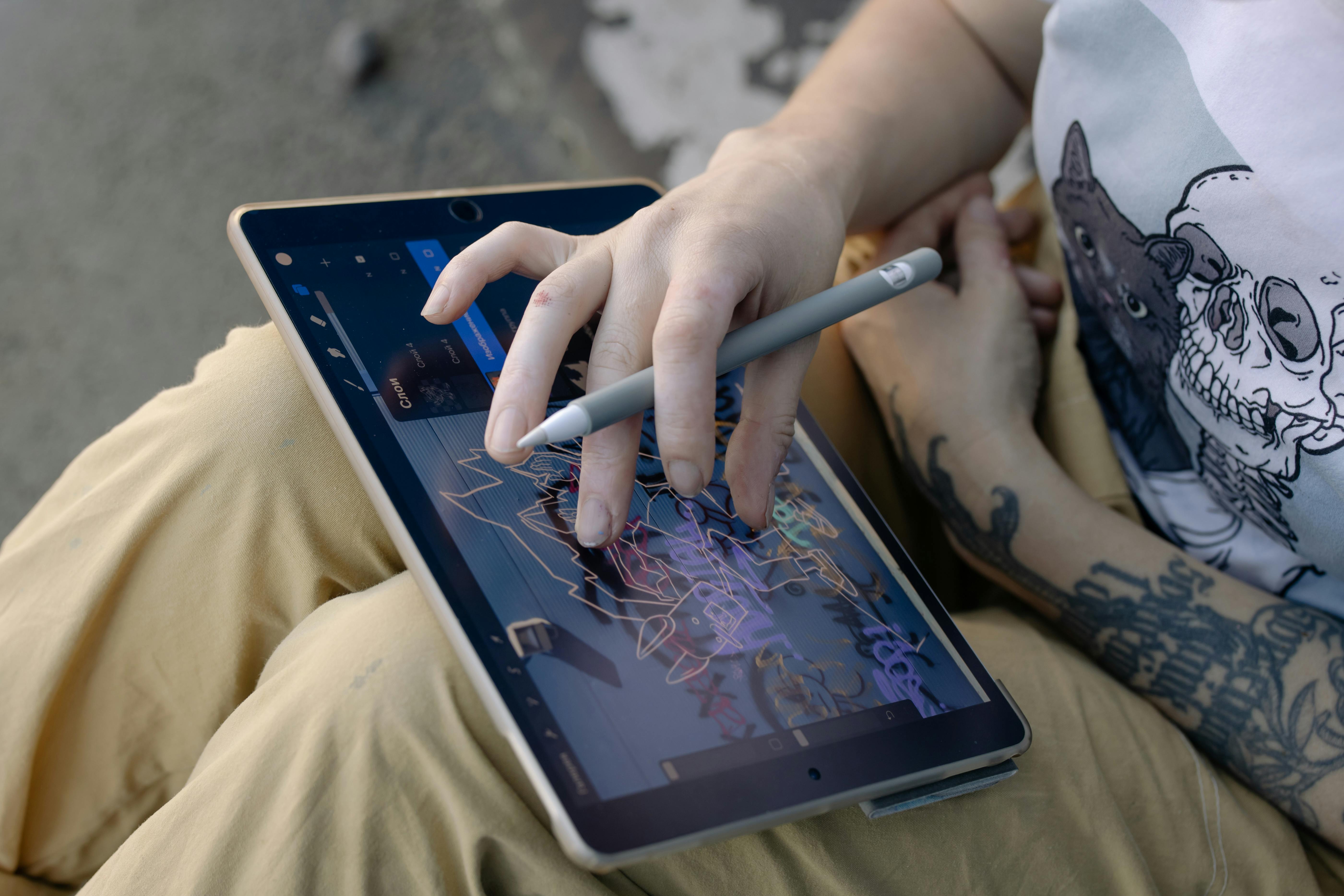
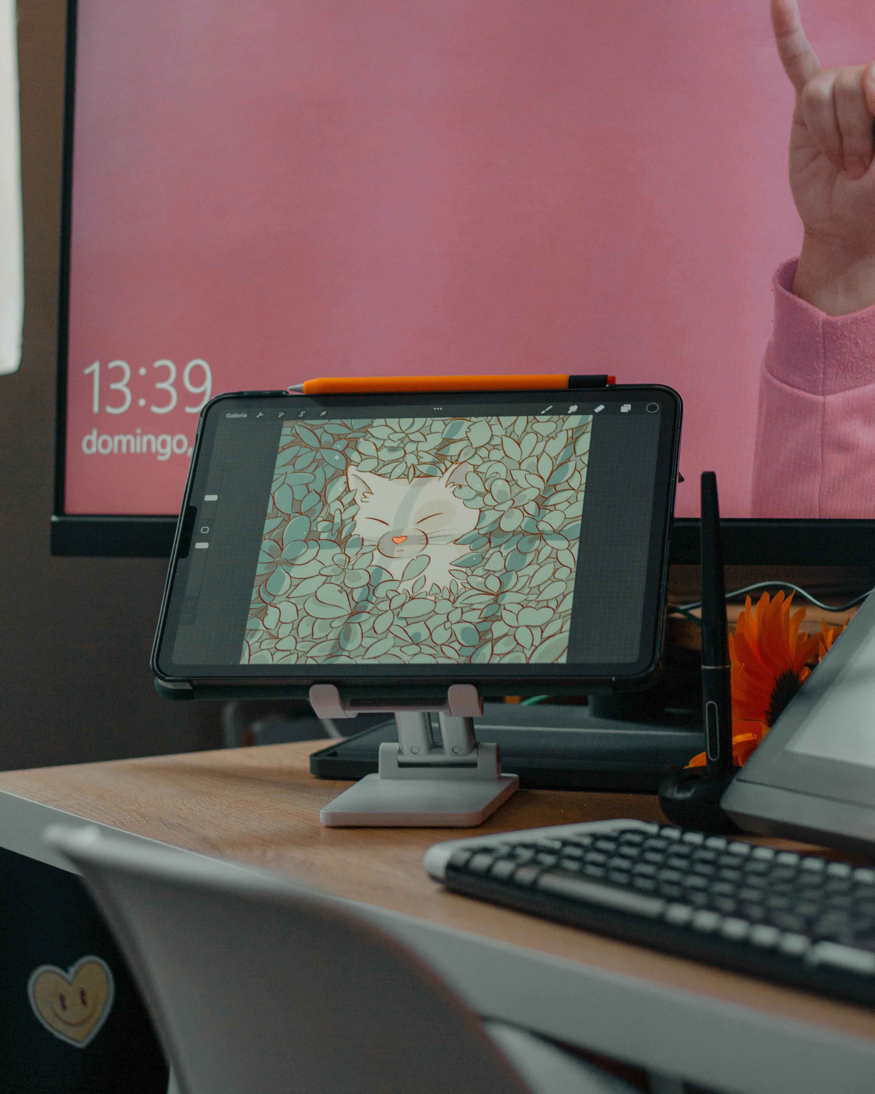
5. PSD/AFF/CLIP: Your Living Studio
Thought of as: Your messy, brilliant, chaotic studio before you tidy up for guests.
These aren't delivery formats; they're your working environments. PSD (Photoshop Document), Affinity's .afphoto/.afdesign, and Clip Studio Paint's .clip are your native project files. They are the digital equivalent of the painter's actual canvas, with all the wet paint, underpainting, and sketches still visible. They are, by design, cumbersome, feature-rich, and contain all the editable information about your piece.
The critical rule is simple: These are for you, not for sharing. You would never send your physical canvas to a client; you send a high-quality print or a scan. Similarly, you should never send your .psd file to a client or treat it as a final delivery format. It's the source of truth from which all other formats are born. I keep my .psd files indefinitely, organized in a hierarchy that would make a librarian weep with joy. They are the first and most important link in my archival chain.
Workflow Integration: Think of it this way: every piece of finished art should exist in at least two forms. The first is the messy, layered native file (.psd, .afphoto, etc.). The second is the clean, exported, lossless master (.tiff). The TIFF is your "digital negative" that you can reproduce from forever. The native file is the "studio" you can always go back to if you need to make fundamental changes. Corrupting a native file is a disaster. Corrupting a TIFF is a problem, but at least you still have the native file to regenerate it from.
Which File Format Should You Use? A Quick Chart
I want to... | Best Format | Why? |
|---|---|---|
| Archive my final, high-res art forever. | TIFF | Lossless fidelity is your top priority. This is for long-term preservation and re-editing. |
| Post my art on my website or social media. | JPEG | Prioritizes small file size and universal compatibility for fast loading and broad reach. |
| Share art with a transparent background. | PNG | Lossless compression and a transparent channel make it the only choice for web graphics and UI elements. |
| Send a professional portfolio to a gallery or client. | PDF | Acts as a self-contained, stable presentation that locks in your layout, fonts, and image quality. |
| Prepare files for a professional print shop. | PDF/X or TIFF | PDF/X is the print-industry standard. TIFF is also widely accepted, but always confirm with your specific printer. |
| Work on my art and keep it editable. | PSD / KRA / Native | This is your source file, your studio. It retains layers and editability, which is not for distribution. |
| Share a digital painting in full, uncompressed detail. | TIFF | The ultimate high-fidelity format for delivering a perfect master file to a client or for archival purposes. |
| Share a simple looping animation. | GIF, MP4, WebM | GIF is for novelty and compatibility, MP4 and WebM are for high quality, offering better results. |
| Start a painting from a photograph. | RAW | Gives maximum flexibility to adjust exposure and color before painting, a must for photo-bashing. |
| Future-proof a camera photo archive. | DNG | An open-source RAW format that prevents your files from being locked into one company's ecosystem. |

FAQ: Your Burning Questions, Answered
What's the difference between lossy and lossless?
It all comes down to data. Lossless formats like TIFF and PNG save all the data of your image. The file is perfectly preserved. Lossy formats like JPEG permanently delete data to reduce the file size. Think of it as a perfect digital scan versus a slightly blurry photo of the original. Every time you save a lossy file, you're taking another photo of that photo, losing more detail each time. This concept is fundamental to digital asset management, and understanding it is the first step to ensuring the longevity of your creative work. It's the single most important concept in this entire article. We've all experienced this degradation, consciously or not.
Technical Tidbit: Lossless compression (like in a PNG) works by finding more efficient ways to describe the same data (e.g., "99 blue pixels in a row" instead of listing "blue, blue, blue..." 99 times). Lossy compression is a destructive act—it literally throws away data it thinks you won't miss. This is why you can't convert a low-quality JPEG back into a high-quality TIFF. The information is simply gone, forever.
What’s the deal with "next-gen" formats like WebP, AVIF, and HEIF?
You might have heard of formats like WebP (from Google), AVIF (based on the same tech as the AV1 video codec), or HEIF (common on iPhones). They are all modern, highly efficient formats that aim to replace JPEG and PNG by offering much better compression (meaning smaller files for the same quality). They can handle both lossy and lossless compression, transparency, and high bit depths all in one package.
So why isn't everyone using them? The short answer is compatibility. While modern browsers now support them, you can't just send a WebP file to a client and expect it to open on any random computer. For archiving, relying on a format that isn't universally readable is a risk. My advice is to use them for your own website to speed up page load times, but always have fallbacks (like JPEGs or PNGs) ready. For sharing and archiving, stick with the classic, boring, universally understood formats for now.
Visualizing the Difference:
- PNG (for graphics): Imagine a logo on a white cup. With a PNG, you can make the white background disappear, placing the logo perfectly on any colored surface. A JPEG would leave an ugly white box around it.
- JPEG (for photos): Consider a photo of a forest. A high-quality JPEG can capture the millions of subtle greens and browns at a manageable file size. A PNG of the same image might be five times larger for a visually imperceptible gain in quality.
Can a JPEG be considered a master file?
Never. A JPEG is a final output format, not an archive. Saving your only copy of a painting as a JPEG is like keeping the receipt of a famous painting but not the painting itself. You've lost the thing that matters. It's a destination, not a starting point. The JPEG compression process is a one-way street designed for final delivery, and treating it as a master is a surefire way to regret it later when you need to make edits. This might be the most important rule in this entire guide.
The 3-2-1 Rule: This is a golden rule of digital archiving that every serious artist should adopt. It states that you should have at least 3 copies of your important data (your master PSD and TIFF files), on at least 2 different media types (e.g., your main computer's drive and an external hard drive), with at least 1 of those copies off-site (like a cloud backup service). This simple rule prevents catastrophic data loss from hardware failure, theft, or fire.
Why doesn't my PNG print look right?
This is the CMYK vs. RGB trap, a fundamental difference that trips up even experienced artists. The colors you see on your screen (RGB) are created with light, while colors in print (CMYK) are created with ink. Because PNGs are locked to the RGB color space, they can't accurately represent the CMYK colors needed for professional printing. The first step is soft proofing in your editing software to see how the colors will shift—the greens might look duller, the blues less vibrant. For print, use a PDF/X-1a or a CMYK TIFF. This is a non-negotiable for professional results. It's one of the most common and heartbreaking mistakes an artist can make, resulting in prints that are a shadow of your digital creation.
A quick primer on color models:
- RGB (Red, Green, Blue): An additive model. You start with black (a dark screen) and add light to create colors. It's the language of monitors, TVs, and digital displays.
- CMYK (Cyan, Magenta, Yellow, Key/Black): A subtractive model. You start with white (a piece of paper) and add ink to absorb light and create colors. It's the language of presses and printers. The RGB color space is actually much larger than CMYK. This means that many of the vibrant, luminous colors you can create on your screen (especially electric blues and vivid greens) are physically impossible to reproduce with standard printing inks. This is why soft proofing—simulating the CMYK output on your RGB screen—is an essential skill for any artist selling prints.
What about vector formats like SVG or AI for artists?
This is for a different type of artist! Vector graphics (SVG for the web, AI for Adobe Illustrator, EPS as a universal exchange format) use math to draw shapes, making them perfect for logos, icons, and illustrations that need to scale to any size—from a business card to a building wrap—with perfect sharpness. My art (which you can see here) is primarily raster, meaning it's made of pixels, so I focus on formats that handle pixels best. If you create crisp, scalable graphics, then vector is your world. It's a fundamental difference: pixels vs. paths. It's like the difference between a photograph and a blueprint. For most illustrators and designers, their master file is a vector file (like Adobe's .AI), which they then export to raster formats like PNG or JPEG for specific uses on the web.
Final Thoughts: Your Art Deserves a Good Home
At the end of the day, choosing the right file format is an act of stewardship and self-respect. It’s about respecting your own creative energy. It’s the difference between scribbling a brilliant idea on a napkin and painting it on a quality canvas, between storing your negatives in a damp basement and keeping them in a climate-controlled archive.
So, let's build a workflow that truly honors your work. I think of it as a pyramid. Your foundation is your native working file—your messy, wonderful .PSD or .KRA studio. The next level up is your pristine archive: the flawless, layered TIFF, your digital negative. From this strong foundation, you then build your public-facing elements. Share the spirit of your work with the world as a beautifully optimized JPEG or a clean PNG. And when you're ready to tell a bigger story, to pitch a gallery or a client, you bind it all together in a professional, print-ready PDF. This structured approach, this digital discipline, is what separates a hobbyist from a professional.

The digital world can feel impermanent, but your art doesn't have to be. By understanding these tools and building a conscious workflow, you're not just saving files; you're building a legacy. You're creating a durable history of your creative journey that will outlive today's fleeting trends. This process is the quiet, necessary work of an artist in the 21st century.