
ASTM Standards for Art Materials: What Artists Actually Need to Know
A straightforward guide to ASTM standards for art materials. Learn why these tests matter for lightfastness, toxicity, and durability—and how to pick paints, pencils, and paper that won’t fade, crack, or harm you.
AST M Standards for Art Materials: What Artists Actually Need to Know
I’ll be honest: the first time I heard the term “ASTM,” I was staring at the back of a tube of paint, feeling a mix of curiosity and fatigue. It looked like something invented to make artists fall asleep—a jumble of letters and numbers in tiny print. But if you’ve ever spent hours on a piece only to watch the colors fade, the paper buckle, or a varnish turn yellow a year later, you start to care. It turns out those little codes aren’t just bureaucratic noise; they’re a surprisingly direct line into the permanence, safety, and performance of your tools.
Think of the ASTM standards as an instruction manual your materials wrote for you. They’re not marketing fluff. They’re the result of controlled, often brutally boring, tests that answer the questions we all have: Will this fade in sunlight? Is this pencil safe to use if I tend to chew on it? Will this canvas crack if I roll it up for a poster? Will this paper crumble into dust in fifty years? These standards give us a shared language to decode durability. They’re what separate a quick sketch that turns into a muddy mess from an artwork built to last, something that feels just as vibrant hanging on the wall years down the line as it did the day you finished it.

The Big Ideas: What ASTM Stands For
The letters stand for the American Society for Testing and Materials, a group now known as ASTM International. For over a century, they’ve been creating a library of voluntary consensus standards—more than 12,000 of them—that cover everything from the steel in bridges to the safety of children’s toys. The key word here is voluntary. No one forces a paint company to adhere to these standards, but the good ones do, because it signals a commitment to quality and transparency that artists like you and me have come to rely on.
ASTM doesn’t invent the art; it invents the yardstick. They develop the specific tests—precise recipes for stress, light, and time—that a manufacturer can use to see how its product measures up. These standards are born from a committee composed of people who know their stuff, including chemists, engineers, professional artists, and conservators. The result is a set of tests that are not arbitrary but are grounded in real-world conditions your art will face, whether it’s hanging in a sunlit room or stored in a basement.
The Global Reach of ASTM
While American in origin, ASTM standards have become a global benchmark. When you pick up a tube of paint made in Europe or Asia, the manufacturer might reference their own local standards (like the German DIN standards or ISO standards), but the core principles of testing durability and safety are universal. Since many art supply brands sell internationally, you’ll often see several different certification marks on the same package. The brilliance of this system is that it creates a common global language for material quality that allows artists worldwide to communicate, regardless of region or brand loyalty.
It’s important to remember these standards are not static texts; they are living documents. Every few years they’re reviewed, updated, or withdrawn based on new scientific findings, technological advancements, and community feedback. So that ASTM D4303 lightfastness test your favorite paint adheres to wasn’t created once and forgotten; it’s continuously refined to better simulate the aging process.

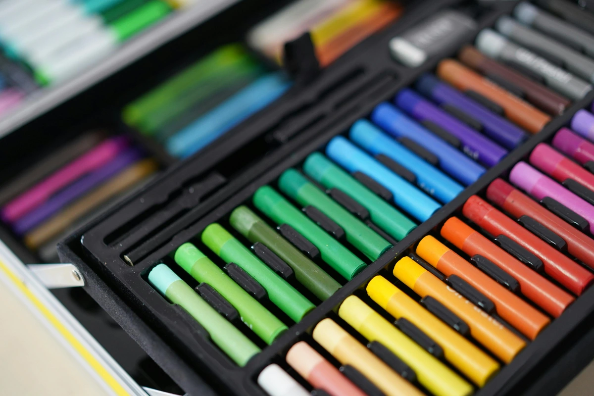
Key Tests for Artists: Decoding the Labels on Your Supplies
Let’s stop talking in the abstract and get to the stuff you can actually use. When you’re standing in an art store, there are a few specific tests and codes that will tell you almost everything you need to know about a product’s quality and longevity.
D4303: The Lightfastness Test
The single most important test for any artist working with color. In simple terms, lightfastness is a material’s superhero power to resist fading when exposed to light. The test, officially known as ASTM D4303, subjects color samples to a high-intensity light source for a set number of hours to simulate years of indoor exposure.
The results are summarized in a simple rating scale:
Rating (ASTM) | Permanence Rating (Commonly Used) | What It Actually Means | Artist Tip |
|---|---|---|---|
| I | Excellent | The color is extremely resistant to fading. Safe for museum-quality work intended to last for centuries. | Use these for your most important pieces where longevity is non-negotiable. |
| II | Very Good / Good | The color is very resistant to fading under normal indoor lighting conditions. A safe bet for most artwork. | This is the sweet spot for most professional and archival work. |
| III | Fair | Moderate resistance to fading. Might show noticeable color shift over several years of bright light. | Best for studies, sketches, or work that will be kept away from direct light. |
| IV / V | Poor / Very Poor | The color is fugitive and will fade significantly, potentially in a short amount of time. Avoid for any serious work you want to last. Useful only for temporary projects. |
(LF stands for Lightfastness.)

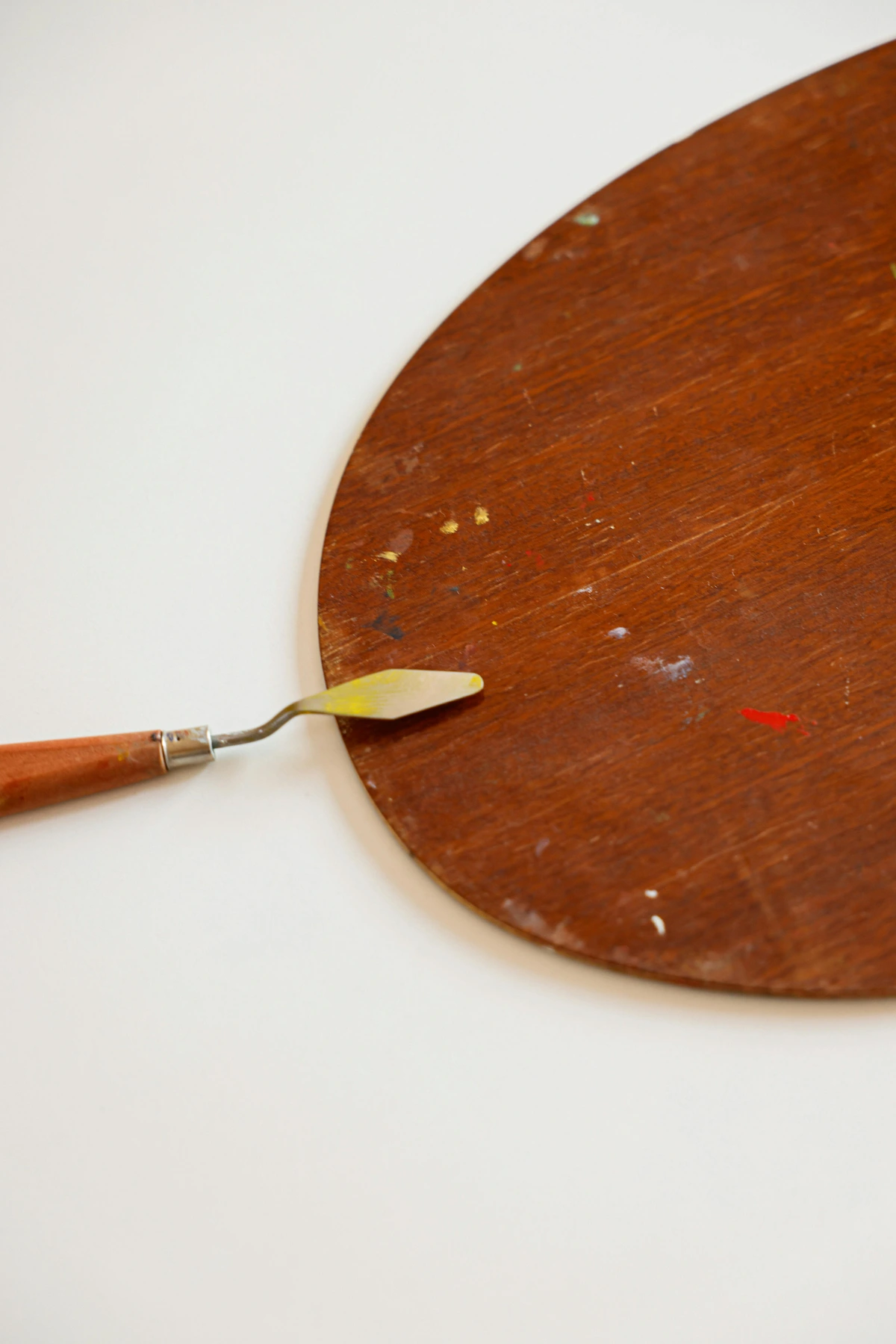
Most high-end professional paints and pencils will proudly display this rating right on the tube or the barrel. If you don’t see it, that’s a red flag worth paying attention to. What’s fascinating is how this test is conducted: samples are exposed to powerful xenon arc lamps, which simulate daylight more accurately than old-fashioned methods. The number of hours they endure determines their rating; a Grade I pigment might withstand hundreds of hours without any perceptible shift in hue or value, whereas a Grade IV pigment might start degrading within just a few dozen hours. This test isolates the pigment from the binder, ensuring you’re testing the colorant itself, not just a durable plastic.
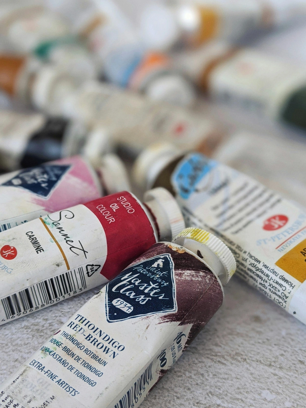
D4236: The Safety Test
The only standard on this list that is actually a legal requirement in the United States. ASTM D4236 is specifically about chronic health hazards. If an art material contains a substance in quantities large enough to be considered potentially toxic over long-term exposure, this standard requires the manufacturer to have a toxicologist review the product and provide a clear hazard warning.
How to read the label:
- “AP Certified” or “CP Certified”: You’ll see this seal from the Art & Creative Materials Institute (ACMI), usually on crayons, markers, and children’s paints. AP (Approved Product) means it’s non-toxic. CP (Certified Product) means it’s non-toxic and meets specific performance standards. This is the highest level of safety assurance.
- “CL” (Cautionary Labeling): This is the little box with text you see on some paints, inks, and solvents. It will contain information required by law, like “WARNING: HARMFUL OR FATAL IF SWALLOWED.” While it looks scary, you shouldn’t necessarily avoid these products. It simply means you need to be a responsible adult and follow the instructions—use them in a well-ventilated area, don’t eat while using them, and keep them away from kids. Some manufacturers will include additional safety information beyond the legally required minimum, which is always a good sign.
D6901: The Quality Test for Artists' Acrylics
For those of us who love the buttery feel of heavy-body acrylics or the flow of a good fluid acrylic, ASTM D6901 is a game-changer. This standard measures the percentage of pure pigment and lightfast polymer in the paint, setting a minimum bar for what can be called an “artist’s acrylic.” Beyond pigment and polymer, this standard also sets limits on the amount of fillers and extenders. Lower-quality paints often bulk up their volume with cheap, inert substances like calcium carbonate or alumina hydrate, which can dull colors and weaken the paint film. By adhering to D6901, a manufacturer commits to minimizing these fillers, focusing instead on the ingredients that genuinely contribute to performance and longevity.
The most important takeaway is the Pigment Volume Concentration (PVC). Think of it like the fruit content in a high-quality jam versus a cheap one: too much fruit and not enough pectin, and your jam won’t set properly. It becomes weak and grainy. Similarly, if you cram too much pigment into an acrylic binder without enough polymer to coat every single particle, the resulting paint film becomes porous, brittle, and highly susceptible to cracking. Professional-grade paints meet ASTM D6901 by ensuring the PVC is low enough (typically below a critical threshold known as the CPVC, or Critical Pigment Volume Concentration) for the polymer to form a continuous, flexible, and durable film. A high-quality artist paint will have a PVC low enough that the acrylic polymer can fully encase every single pigment particle, creating a flexible, durable, and richly colored paint film. Cheaper “student-grade” paints often have a high PVC—they’re stuffed with more pigment and cheap fillers than the acrylic can properly bind, leading to a chalky, brittle, and weak paint film that’s prone to cracking.
This standard also defines the tests for consistency, drying time, and adhesion. If a brand adheres to D6901, you can trust that their “Light Blue” will have the same buttery consistency as their “Cadmium Red.” Consistency matters more than you think when you’re trying to get into a creative flow. For instance, the test for ‘consistency’ involves a precise instrument called a penetrometer, which measures how far a standard weight sinks into the paint in a set amount of time. It’s a quantifiable measure of buttery-ness.

Why You Should Care: The Artist's Perspective
Okay, so we have the technical stuff. But why does this matter when you’re in the middle of a project, covered in paint, and completely absorbed in the work? Because these standards are the invisible foundation of your creative freedom.
Think of it from a different angle: every artist is an alchemist. We take base matter—pigments, oils, solvents, rags—and try to turn it into something that captures a feeling, an idea, a moment of light. The ASTM standards are the underlying recipe, the laws of physics and chemistry that govern our transformation. Ignore them, and your "gold" might turn back into lead over time. Understand them, and you truly begin to master the craft.
Knowledge is power. Understanding these codes means you’re no longer just picking a color because it looks pretty in the tube. You’re making an informed choice about the lifespan of your art. You’re deciding whether that gorgeous but fugitive Dioxazine Purple is worth using for a final painting or if it should be relegated to a practice sketch. It’s the difference between feeling anxious about how your work will age and feeling confident that you’ve built it on a solid foundation. I think of it almost like learning a new dialect; you start to understand the subtle conversations happening between brands, between pigments, even between different production batches. It reveals a hidden world of quality checks and compromises, giving you a much clearer lens through which to view this craft. When you choose a high-rated pigment, you’re not simply avoiding a problem (fading); you’re building a relationship with your work that will outlast your own lifetime.

I think about it like this: using high-quality, well-tested materials is an act of respect. Respect for your own time and effort, and respect for the person who might one day purchase your art, hang it in their home, and live with it for years to come. It’s about building a legacy, one canvas at a time, ensuring the emotions you put into a piece remain visible long after the paint has dried. If you're curious, you can explore some artworks built with these principles on my /buy page. Beyond personal legacy, there are practical benefits. Knowing your materials helps you diagnose issues like cracking, poor adhesion, or premature yellowing. Suddenly, a painting that’s developed tiny cracks isn’t just a mystery; it’s a clear sign that the PVC was probably too high, or the surface preparation was poor. It allows you to spot quality control issues from a brand you might have trusted blindly. And, quite frankly, it’s fun. There’s a deep satisfaction in understanding the molecular underpinnings of the goop you’re smearing on a canvas. It adds another layer of appreciation for the centuries of innovation that led to the incredible tools we have today.
Your Practical Guide: How to Apply This Knowledge
You don’t need to become a chemist. You just need to become a slightly more informed shopper. Here’s what to do right now.
- Read the Labels: This is your new superpower. When you pick up a tube of paint, a set of pastels, or a marker, turn it over. Look for the ASTM D4303 lightfastness rating. A simple “I” or “II” is what you want for anything you intend to last. For colored pencils, many brands have their own internal rating systems (like Faber-Castell’s E.I.V.A. scale or Caran d’Ache’s 1-5 star system) that correlate closely with ASTM principles. Also, check for any other quality claims like ‘acid-free’ or ‘museum-quality.’
- Look for the AP/CP Seal for Safety: Especially if you have a studio where kids or pets are present, or if you just prefer to keep things simple and non-toxic. This seal from the Art & Creative Materials Institute (ACMI) is an easy, no-brainer way to ensure a product is safe. Remember, many professional-grade materials are still perfectly safe and non-toxic without this seal, but for materials used by or around children, it’s the gold standard. Don’t confuse this with a CL (Cautionary Label). If a product is safe and performs well, it gets AP or CP. If it requires a warning, it gets the CL label.
- Invest in Quality for Final Works: This is the most important point. It’s perfectly fine to have a range of supplies. Use your student-grade paints for experimenting and large, quick underpaintings. But when it comes to the final layers of a piece you truly care about, switch to the professional-grade paints that meet these higher standards. The difference in vibrancy and durability isn’t just noticeable; it’s quantifiable. You’ll spend less time fighting the medium—wondering why your glazes are getting murky or your impasto is cracking—and more time actually creating.
Frequently Asked Questions
Let’s clear up some of the most common confusions around this topic.
Is a higher price always an indicator of better quality?
Generally, yes, but with important caveats. Professional-grade paints from reputable brands cost more because they use a higher concentration of expensive pigments and more pure acrylic binder, which directly impacts their performance and lightfastness ratings. However, a student-grade paint rated ASTM I for lightfastness will still outlast an expensive, fugitive “hobby” paint rated ASTM IV. It’s less about the brand and more about the specific technical data on the label. Price can be an indicator, but the ASTM codes and lightfastness numbers are the ground truth. Sometimes you pay for rarity, a brand name, or marketing. The technical data can’t be faked. I’ve fallen into the trap of assuming the most expensive item is always the best, only to find a more reasonably priced brand with a better commitment to transparency and adherence to these exacting standards.
Is it safe to use products with a CL (Cautionary Label)?
Absolutely, if you use them correctly. Many powerful and beautiful pigments have chemical properties that require careful handling. A cautionary label doesn't mean the product is dangerous when used as intended in a professional setting. It just means you need to be an adult about it: work in a ventilated space, don't point your brush at your face, and clean up properly. It's about being informed, not scared. Some of the most historically significant and vibrant pigments, like Cadmiums (used for brilliant reds, oranges, and yellows) or Cobalts (used for stunning blues), will carry warning labels because they are heavy metals and can be toxic if ingested in significant quantities. These aren't inherently dangerous for casual contact, but require responsible studio practices—which is really good advice for all art materials, labeled or not.
Do I need to use top-rated materials for every sketch and study?
Heck no. That would be incredibly expensive and wasteful. The key is matching the material's quality to the purpose. Use your cheaper, less-permanent supplies for your daily practice, color testing, and initial compositional sketches. Save your high-quality, ASTM I/II-rated materials for the final piece. This is the most efficient and intelligent way to manage your supplies and your budget. I keep a separate box of ‘experimental’ or student-grade paints for this exact reason. When I’m in the flow, trying out new techniques or just working through ideas, the last thing I want is to feel precious about every brushstroke. That freedom is worth its weight in gold. Then, when I move to the final painting, switching to my top-shelf materials feels like a celebration, a declaration that this piece matters. It also makes you appreciate the quality difference on a visceral level—the way the professional paint handles, the vibrancy of the color straight from the tube—it’s a masterclass you give yourself.

What about other art supplies, like paper and canvas?
Good question. While there isn’t a simple “ASTM Number” for canvas, quality is still defined by similar principles of durability. Look for the term “acid-free.” This applies to paper, mat boards, and canvas. Acids left over from the manufacturing process will break down the wood pulp in paper over time, turning it yellow and brittle. Acid-free (or lignin-free) papers and canvas are chemically stable and will last for hundreds of years without degrading. The buffer is typically an alkaline substance, like calcium carbonate, that neutralizes any acids that might form later. For cotton fiber paper, you might also see the term ‘rag content’ or ‘100% rag.’ This indicates the paper is made from cotton fibers rather than wood pulp, making it naturally stronger and more resistant to the acids that cause degradation. ASTM has specific standards for paper permanence, including D3290 for buffered and unbuffered folders, D5638 for file folders, and D6819 for paper used in permanent records. Museum conservators insist on acid-free materials because the alternative is watching a work self-destruct over decades. A fun fact to remember: newsprint is the perfect example of an acidic paper; you can practically feel it crumbling in your hands if you find an old newspaper.

Wrapping Up: Buy Good Stuff, Make Good Art
At the end of the day, all this technical data serves one purpose: to free you up to create. It’s about removing the nagging worry that the beautiful piece you just finished will be a faded ghost of itself in a few years. By understanding the basic language of ASTM standards, you make choices that honor your own work. You stop guessing and start building with intention. Trust the science, read the label, and get back to the joyful, messy, frustrating, and wonderful work of making art.
Think of it this way: every artist builds their practice on layers of trust. You trust your eyes to see what’s true, your hands to translate that vision, and your materials to faithfully preserve that translation long after the final stroke. That last layer of trust—in the very stuff we manipulate—is something we can control, verify, and feel confident about. It’s the difference between writing in sand and carving in stone. When you choose materials with robust ASTM certifications, you’re choosing to build that foundation of trust on something concrete—something testable—rather than marketing hype. That peace of mind is priceless.