Painting with Thioindigo Red-Brown: A Mastery Guide
A deep dive into the world of thioindigo red-brown pigment, exploring its unique properties, practical painting techniques, and how to harness its power in your own artwork.

# Mastering the Depths: A Painter's Guide to Thioindigo Red-Brown I remember the first time I squeezed a bit of thioindigo red-brown onto my palette. It felt like I'd discovered a secret someone had hidden in plain sight. We've all been there, reaching for the familiar tube of cadmium red or burnt umber, completely oblivious to the subtle giants standing right next to them on the shelf. Let's get one thing out of the way: I'm obsessed with the colors most people overlook. The murky, complex hues that don't scream for attention but instead whisper secrets. And if there's one pigment that feels like a well-kept secret, a color that holds a universe of depth in its muted tone, it's **thioindigo red-brown**.  [credit](https://images.pexels.com/photos/7218533/pexels-photo-7218533.jpeg), [licence](https://creativecommons.org/public-domain/) Its name might sound intimidating, like something a chemist would keep in a locked cabinet. But once you get past the scientific label, you find a color of incredible subtlety and power, a pigment that can fundamentally change the way you think about shadows, depth, and the emotional temperature of a painting. It's a color for painters who are tired of the obvious, for artists who want to move beyond primary statements and start speaking in nuanced, complex sentences. This guide isn't just about using a color; it's about learning a new way of seeing, a way to find the profound stories hidden in the quiet corners of your palette.  [credit](https://images.pexels.com/photos/6925017/pexels-photo-6925017.jpeg), [licence](https://creativecommons.org/public-domain/)  [credit](https://images.pexels.com/photos/13600524/pexels-photo-13600524.jpeg), [licence](https://creativecommons.org/public-domain/) ## What Exactly Is Thioindigo Red-Brown? Before we dive in, let's talk about where this fascinating pigment comes from. Chemically, thioindigo red-brown belongs to the family of thioindigo dyes. These are synthetic organic compounds, a far cry from the mined earth pigments like umber or sienna that have been on artists' palettes for centuries. Developed in the early 20th century, these pigments offered something new: incredible lightfastness and a unique chromatic character that couldn't be found in nature. The "red-brown" part is the specific shade we're interested in. Unlike its more famous cousins like Thioindigo Violet, which has a brilliant jewel-like quality, or even the classic [Alizarin Crimson](/finder/page/using-alizarin-crimson-in-painting), the red-brown variant has a built-in earthiness. It’s like a fiery red that decided to settle down, grounding itself with a rich, brown undertone that feels more like a natural earth pigment than a laboratory creation. This unique molecular structure is what grants it its remarkable transparency and staining power. When you look at a swatch of thioindigo red-brown, you're seeing light pass through the pigment layer, bounce off the white of the paper or gesso, and come back to your eye through the pigment again. This subtractive process is what creates its incredible depth and luminosity, a quality that's fundamentally different from the more opaque, light-blocking nature of traditional earth pigments. This built-in complexity is what makes it so powerful—it's a ready-made shadow color, a perfect mixer, and a stunning glaze all on its own. To understand its uniqueness, compare it to a classic like [Alizarin Crimson](/finder/page/using-alizarin-crimson-in-painting). Alizarin is a colder, bluer red that produces purples when mixed with blues. Thioindigo red-brown is warmer and earthier, creating more subtle, somber violets and deep, resonant oranges. It sits in a fascinating middle ground, a bridge between the raw energy of crimson and the somber dignity of traditional browns.  [credit](https://live.staticflickr.com/65535/49810080901_2837d157fd_b.jpg), [licence](https://creativecommons.org/licenses/by-nc/2.0/) It shares this family lineage with other remarkable synthetic thioindigo pigments like Thioindigo Violet, each offering unique shifts in hue based on slight variations in their chemical structure. Thioindigo red-brown occupies a unique middle ground between the raw energy of pure reds and the somber dignity of traditional browns. Its low tinting strength means it won't overpower a mixture, but its staining power means once it's down, it's there to stay, allowing for subtle, controlled applications that build dimension rather than dominating it. It's one of the few pigments that can genuinely create a sense of inner light in the darkest passages of a painting. 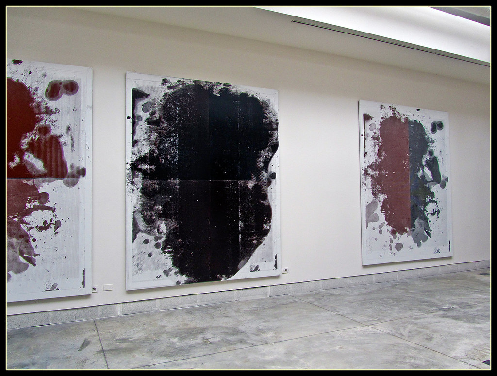 [credit](https://live.staticflickr.com/6195/6087778411_164f0d9a2f_b.jpg), [licence](https://creativecommons.org/licenses/by-nc-nd/2.0/) ## Key Strategies for Harnessing Its Power Once you have this pigment on your palette, the real fun begins. It’s not a one-trick pony. Its versatility is what will make it your new best friend. And, like any good friend, the more time you spend with it, the more you'll discover its unexpected quirks and hidden talents. Let’s dive into the core techniques that will help you become fluent in the language of this incredible color. Think of it like this: most colors are like simple notes on a piano. Thioindigo red-brown is a complex chord, full of overtones. You can use it to build harmony, or you can let it ring out on its own, creating a moment of deep, complex silence. Think of your palette as a stage. You have the lead characters—your bright yellows and pure blues—but what truly makes a play compelling are the supporting roles, the characters who add context, depth, and subtext. Thioindigo red-brown is your most dependable character actor. It won't steal the scene, but it will make every other character look better. It's the foundation of a strong ensemble cast. But before you even dip your brush, there's a crucial first step: understanding your specific tube of [paint](/finder/page/how-to-paint-sharp-edges-in-art). Not all thioindigo red-browns are created equal. You might find it under different names depending on the manufacturer, such as 'Perylene Maroon,' 'Indanthrone Red Brown,' or 'Quinacridone Burnt Scarlet.' While all share some familial traits, the exact chemistry can vary, even if they often fall under the same Color Index designation (like PR 279 or various proprietary blends). Different manufacturers might use slightly different dye variants or additives, which can affect its transparency, granulation (in watercolor), shade (reddish-plum vs. brownish-burgundy), and even its drying time in oils. This isn't just a matter of brand loyalty; it's about finding the specific voice of this color that speaks to you. One might be perfect for glazing in oils, while another might have a beautiful granulating effect in watercolor that's perfect for textural landscapes. I highly recommend doing a little swatch test of your own brand on a scrap piece of paper. [Paint](/finder/page/how-to-paint-sharp-edges-in-art) a thick stroke, a thin wash, and then try mixing it with a bit of white. This little ritual gives you a much more intimate understanding of the specific character of your paint, saving you from surprises later on. It's the first step in building a real relationship with the color, moving it from a stranger on your palette to a trusted collaborator in the studio. This practice isn't just about avoiding surprises; it's about building your personal dictionary of color. Every manufacturer has a slightly different dialect, and this swatching is how you learn to understand it. Is your tube more of a reddish-plum? Or is it a brownish-burgundy? Does it granulate beautifully in watercolor, creating a sandy, textural feel, or does it lay flat and glossy, perfect for deep, transparent glazes in oils? Knowing these quirks *before* you commit to a large canvas can save you hours of frustration and lead you to discoveries you might never have made otherwise. ### 1. Glazing: The Magic of Thin Veils This is where thioindigo red-brown truly shines. Because it's often a very transparent pigment, it's a natural for [glazing](/finder/page/the-art-of-glazing:-adding-luminous-depth-to-my-abstract-acrylics) techniques. Glazing, at its heart, is the application of a transparent film of color over a [dry layer](/finder/page/how-to-layer-colors-in-acrylic-painting) of paint. It's a technique that has been used for centuries, from the luminous skies of Renaissance masters to the rich shadows in a [Rembrandt](/finder/page/ultimate-guide-to-rembrandt-van-rijn) portrait. It works on a principle of optical mixing. Instead of physically blending two colors on your palette (which can lead to a muddy, lifeless result), you layer them on the canvas, allowing light to do the mixing for you. This creates a depth and vibrancy that is simply impossible to achieve any other way. To extend the cooking metaphor, if mixing colors on your palette is like throwing all your ingredients into a pot at once, glazing is like creating a delicate, multi-layered sauce where every ingredient has its own moment to shine. It's a slower process, but the result is an unparalleled complexity and richness that you can see and almost taste. The result isn't just a brownish-yellow. It's a deep, luminous orange or a rich amber, glowing from within. The yellow light reflects off the canvas, passes through the red-brown glaze, and bounces back to your eye, creating a depth that you simply cannot get by mixing the two colors on your palette. This additive color mixing, using [light itself](/finder/page/definitive-guide-to-understanding-light-in-art) as your medium, has a vibrancy that feels almost alchemical. You aren't just mixing paint; you're orchestrating light. And the secret to a successful glaze is the medium, which is often overlooked as just a diluent. A good glazing medium is designed to maintain the integrity of the pigment particles in suspension, prevent them from clumping, and create a stable, transparent film as it dries. This ensures you get pure color without cloudiness. 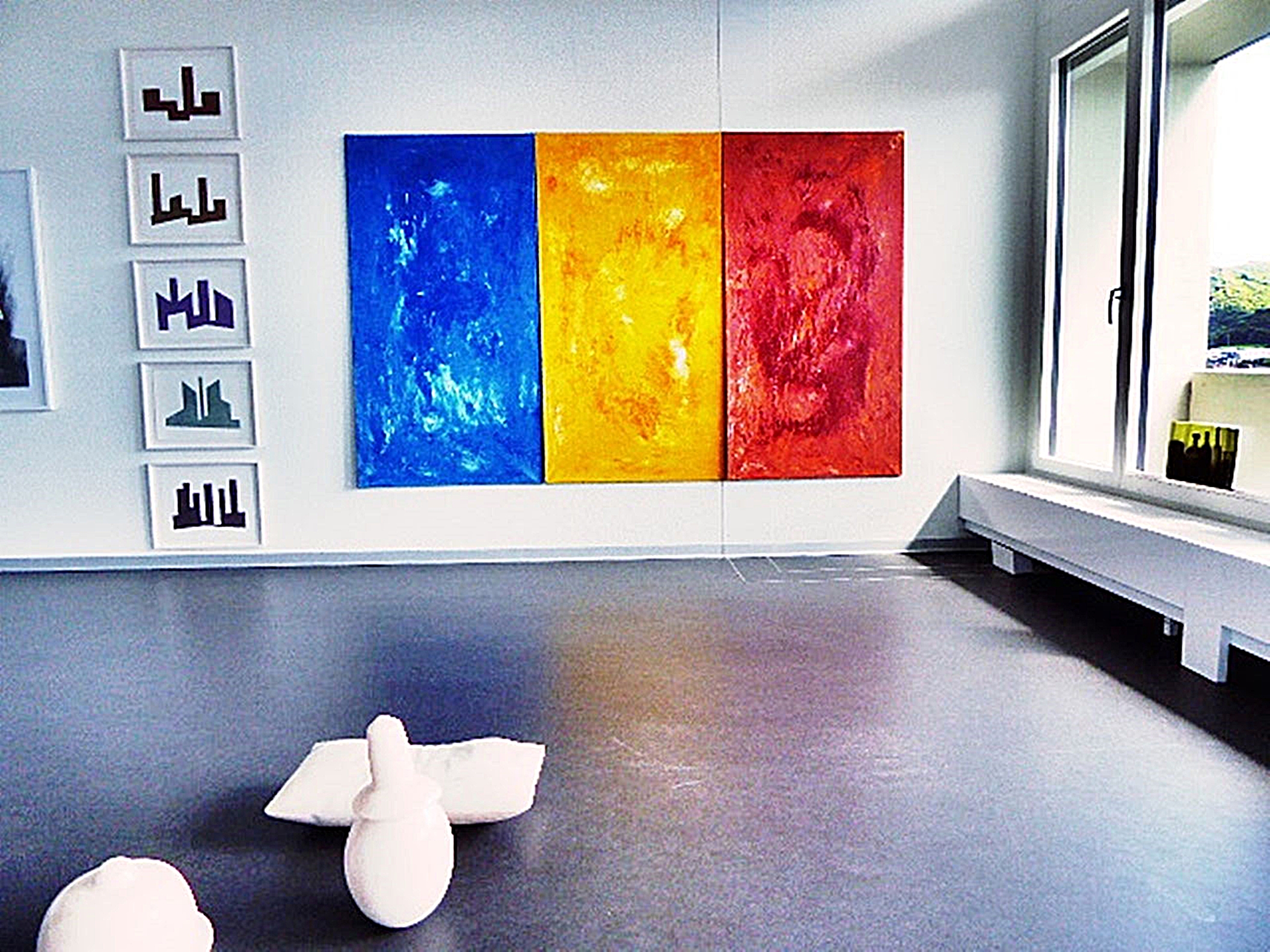 [credit](https://upload.wikimedia.org/wikipedia/commons/9/9f/Pedro_Meier_Stadthaus_Olten_Ausstellung_2016%2C_im_Hintergrund_Triptychon_%C2%BBMetamorphosen_-_Ovid%C2%AB._%C3%96l-Lack_auf_Leinwand%2C_je_150_x_80_cm._Foto_%C2%A9_Pedro_Meier_Multimedia_Artist_Niederbipp.jpg), [licence](https://creativecommons.org/licenses/by-sa/4.0) Imagine you're trying to capture the feeling of a sun-drenched terracotta pot. If you mix brown and yellow on your palette, you'll get a flat, dull ochre. But if you lay down a bright, warm yellow first and then float a transparent veil of thioindigo red-brown over it, the pot suddenly looks like it's holding light. It's no longer just a painted object; it's a source of warmth. Imagine you've painted a base layer of a soft, warm yellow. While it's dry (this is key!), you mix a tiny bit of thioindigo red-brown with a generous amount of a [glazing](/finder/page/the-art-of-glazing:-adding-luminous-depth-to-my-abstract-acrylics) medium. For oils, a medium like Liquin, Galkyd, or even a mix of stand oil and odorless mineral spirits can work wonders. For acrylics, a gloss medium is your best bet for maximum transparency. Then, you float this transparent wash over the yellow, almost like you're looking at the underpainting through a [stained-glass window](/finder/page/why-did-artists-start-signing-their-work). The goal is to create a colored mist, not a layer of paint. If you can see the texture of your brushstroke, your mix is too thick. It should flow onto the surface and level out into a perfectly even, transparent film. Let's consider a more complex scenario. Imagine you're painting a landscape with a base layer of cerulean blue for a sky. A glaze of thioindigo red-brown over this will create deep, somber, violet-ish storm clouds. But if your sky was a warmer underpainting of magenta, that same glaze would yield a completely different, warmer pre-sunset feeling. The base color isn't just a foundation; it's an active participant in the final color you see. This is what makes glazing with such a transparent pigment so exciting—it's a dialogue between layers. I once spent an entire afternoon painting the same small study of a vase, glazing it over different underpaintings. Over cadmium yellow, it became a warm, glowing terracotta. Over phthalo blue, it was a mysterious, deep purple that seemed to absorb light. Over a pale, cool grey, it became the color of a dusty rose, faded by years of sunlight. It was the same pigment, but the conversation it had with the underpainting created three completely different objects. That's the power of glazing. 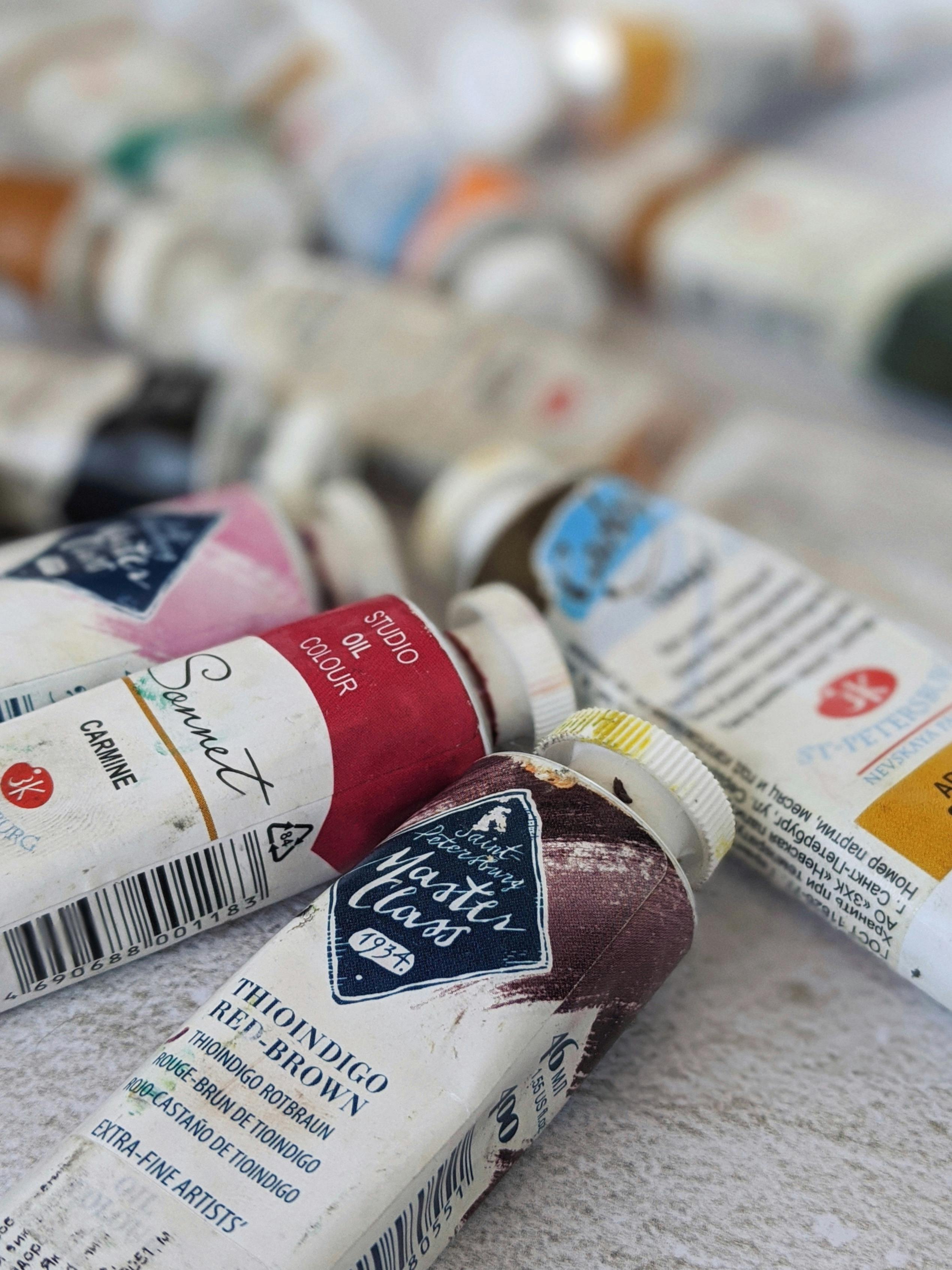 [credit](https://images.pexels.com/photos/4139739/pexels-photo-4139739.jpeg), [licence](https://creativecommons.org/public-domain/) Let's consider a more complex scenario. Imagine you're painting a landscape with a base layer of cerulean blue for a sky. A glaze of thioindigo red-brown over this will create deep, somber, violet-ish storm clouds. But if your sky was a warmer underpainting of magenta, that same glaze would yield a completely different, warmer pre-sunset feeling. The base color isn't just a foundation; it's an active participant in the final color you see. This is what makes glazing with such a transparent pigment so exciting—it's a dialogue between layers. Here's a quick step-by-step guide to mastering the glaze: 1. **Ensure a Bone-Dry Underpainting:** This is non-negotiable. If you glaze over wet paint, you'll just mix the colors physically and make mud. For oils, this can mean waiting days. For acrylics, it might only be 20 minutes, but err on the side of caution. 2. **Prepare Your Mix on a Separate Palette:** Don't mix your glaze directly on your main palette where it can be contaminated. Use a small dish or a corner you can keep clean. 3. **Mix a Tiny Amount of Paint into the Medium First:** Start with a pool of your chosen glazing medium. Then, using the very tip of your brush, pick up a minuscule amount of thioindigo red-brown and mix it into the medium. You only need a tiny dab. The transparency means a little goes a very long way. More is not better here. 4. **Test the Strength on a Scrap Surface:** Before you commit to your painting, brush a small stroke of your glaze on a scrap piece of primed canvas or paper. Hold it up to the light. Is it transparent enough? Can you clearly see the white of the canvas through it? If it's too strong, add more medium. The goal is a colored "soup," not a [thick paint](/finder/page/types-of-paint-brushes-for-artists). 5. **Choose the Right Brush:** A soft, clean brush is best. A sable or soft synthetic like aTaklon works wonders. A coarse bristle brush can disturb the underpainting. For large areas, a soft, flat wash brush is perfect. For details, a small round is ideal. 6. **Apply a Thin, Even Coat:** Load your brush and then gently blot the tip on a paper towel to remove excess. Float the glaze over the area. Don't scrub it in or go back over a section that's starting to dry. Let the medium's flow do the work. Think of it as laying down a colored mist. Work quickly and confidently to avoid overlaps or streaks. 7. **Let it Dry Completely Before Adding Another Layer:** The magic of glazing is in the build-up. Multiple thin, perfect layers will always look better than one thick, struggling one. | Glazing Combination | Base Color | Resulting Effect | | :-------------------------- | :------------------------------ | :----------------------------------------------------------------------------------------------------------------- | | Glazing Combination | Base Color | Resulting Effect & Application Tips | | :--- | :--- | :--- | | **Sunset Glow** | Yellow Ochre, Naples Yellow, Raw Sienna | **Effect:** Deep, burnt oranges, amber tones. <br> **Tips:** For terracotta tones, use a Raw Sienna base. To simulate the last rays of the sun hitting a building, use a very light glaze of red-brown over Cadmium Yellow. | | **Dramatic Storm Clouds** | Cerulean Blue, Phthalo Blue, light Grey | **Effect:** Dusky violets, complex purples. <br> **Tips:** Over Phthalo Blue, this creates almost-black violets that are perfect for the darkest part of a storm. Don't over-blend; let the two colors interact naturally on the canvas. | | **Deep Forest Shadows** | Sap Green, Permanent Green Light | **Effect:** Deep, shady forest tones, mossy river stones. <br> **Tips:** This is ideal for creating receding shadows in a landscape. To paint a dense thicket, layer multiple thin glazes to build up the sense of infinite depth. | | **Unifying Atmospheric Mood** | Apply a very thin wash over final layers | **Effect:** Harmonizes disparate colors, creates an atmospheric mood like a warm sunset glow or a cool evening dusk. <br> **Tips:** This is your final "soupçon". Use an extremely lean mix (1 part paint to 10+ parts medium) and apply it with a large, soft brush over the [entire painting](/finder/page/how-to-varnish-an-oil-painting-a-step-by-step-guide) to tie everything together. | | **Underpainting for Portraits** | Burnt Sienna, Venetian Red | **Effect:** A remarkably deep, blackish brown. <br> **Tips:** This warm, transparent dark is perfect for blocking in shadow shapes for a face or drapery in an [imprimatura](/finder/page/how-to-layer-colors-in-acrylic-painting) or [ebauche](/finder/page/using-alizarin-crimson-in-painting) technique. | | **Aged Textiles and Wood** | Raw Umber, Grey | **Effect:** Somber colors reminiscent of aged leather, old wood, or faded velvet. <br> **Tips:** For a realistic aged textile effect, first establish the base color, then use a dry-brush scumble of the glaze to suggest wear and texture. | | **Rich Burgundy Tones** | Quinacridone Magenta, Cadmium Red | **Effect:** Incredibly deep, resonant reds with a sense of age and dignity. <br> **Tips:** Perfect for painting rich fabrics, red wine, or the heart of a dark flower. For maximum depth, apply over a dry, bright red base rather than mixing them on the palette. | | **Nocturne Sky** | Ultramarine Blue, Ivory Black | **Effect:** A warmer, more atmospheric night sky. <br> **Tips:** Instead of a flat, dead black, this suggests distant city lights or a lingering hint of sunset. It's a subtle effect that makes a night scene feel alive and believable. |  [credit](https://live.staticflickr.com/65535/51304955400_381b7ebb70_b.jpg), [licence](https://creativecommons.org/licenses/by-nc-sa/2.0/) ### 2. Mixing: Creating Sophisticated Neutrals I like to think of thioindigo red-brown as a social color; it gets along with almost everyone. It's not the life of the party, hogging the spotlight, but the one in the corner having a profound conversation with every other guest. Because of its inherent complexity and low tinting strength, it's a perfect mediator. When you start mixing it with the other colors on your palette, you unlock a world of sophisticated, non-muddy neutrals that feel complex and intentional, not accidental. It's like using a fine spice in cooking – a pinch can transform a dish, but it doesn't overpower the other ingredients. At its core, this is because you're adding a color that already *contains* complexity, rather than just mixing primary components and hoping for the best. Here's a fun psychological trick I use: on my palette, I position it right at the intersection of my warm and cool colors, so I'm always reminded of its role as a bridge. Why does it work so well as a mixer? It's all about its position on the color wheel. It's essentially a dark, muted red with strong violet and orange undertones. When you mix it with a color, you're not just darkening it; you're *veiling* it with this complex red-violet, which tends to harmonize rather than just dull. It's the difference between turning down the volume on a song and having a skilled musician play a complementary harmony over it. The result is a quieter, but more interesting, piece of music. It's that harmonic quality, that ability to add richness without destroying the original note, that makes it so indispensable for creating sophisticated color palettes. You're not just making things darker; you're making them deeper.  [credit](https://live.staticflickr.com/2928/14732961196_7ac29ea97a_b.jpg), [licence](https://creativecommons.org/publicdomain/zero/1.0/) This "veiling" quality is particularly powerful when you're painting subjects that require a sense of age, atmosphere, or mystery. For instance, if you're painting an old stone wall, mixing a bit of thioindigo red-brown into your grays won't just make them darker; it will give them a sense of warmth, history, and accumulated grime that a flat black could never achieve. It's the difference between painting an object and painting the story of that object. 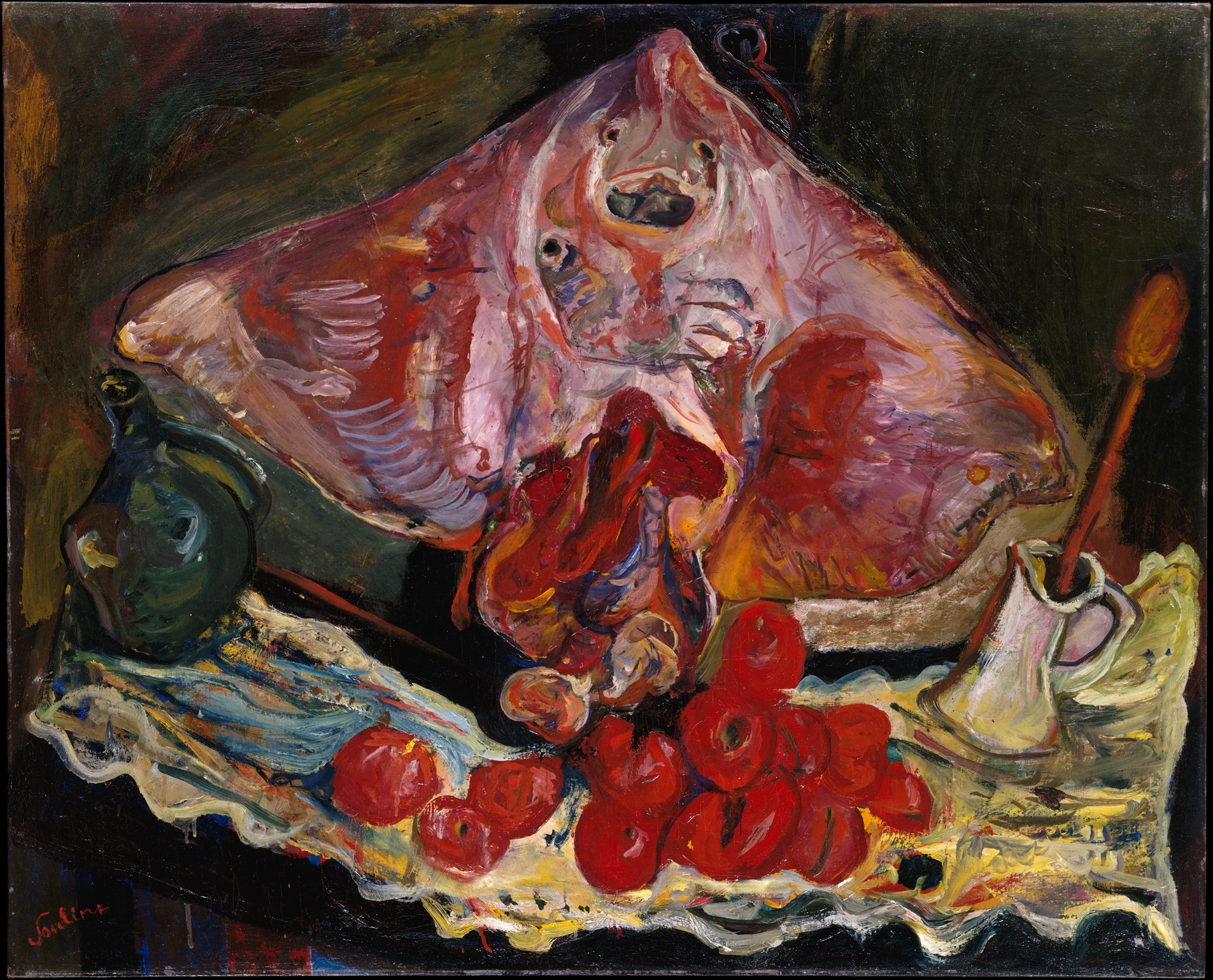 [credit](https://upload.wikimedia.org/wikipedia/commons/b/b5/Still_Life_with_Rayfish_MET_DT4177.jpg), [licence](http://creativecommons.org/publicdomain/zero/1.0/deed.en) Here's a little color-mixing lexicon I've built up over the years, broken down into more detail: - **Mixing with Blues:** This is my favorite trick. Mix it with Ultramarine Blue—a warm, reddish blue—and you get a deep, velvety black that's far more interesting than anything from a tube. It's a living black, a "charged" black that still hums with color. For a slightly less intense dark, try it with Prussian Blue; the resulting black has a subtle greenish cast. Use a cooler blue like Cobalt or Cerulean, and you'll get a range of stormy, purplish-greys that are perfect for overcast skies or the patina on old bronze. What's fascinating here is how the inherent warmth of the red-brown cools down the blue, creating a grey that's much more dynamic than a simple mix of black and white. - **Mixing with Greens:** If you want to paint deep, shady forests or add weight to foliage, try mixing it with Phthalo or Viridian Green. It creates rich, olive-like tones that feel incredibly natural, like the shadow side of a laurel tree. The key here is the complementarity; red-brown is a great near-complement to most greens, so it subdues them naturally without creating a dead, muddy brown. I've found it particularly effective for painting the illusion of deep space in a landscape, creating a sense of receding darkness that's full of life. Adding a touch of it to Hooker's Green, for instance, can create the perfect color for the dark side of a distant tree line. - **Mixing with Yellows:** When you mix it with a [bright yellow](/finder/page/the-psychology-of-yellow-in-my-art-joy-optimism-and-light), you get muted, earthy oranges. But mix it with a cool yellow like a Hansa Yellow or a Naples Yellow, and you start to get those beautiful, dusty amber and ochre tones, the colors you see in autumn leaves or old parchment. It tames the brightness of the yellow without killing its spirit. There's a sweet spot in this mix, a specific ratio where the yellow's vibrancy is perfectly balanced by the earthiness of the brown, creating a color that feels both ancient and alive. It's that balance that makes it so perfect for creating autumnal light in a landscape. It’s a powerful way to create a harmonious palette from just a few colors. Think of it as a tuning fork for your painting, bringing all the other notes into a cohesive chord. I often start a painting with just three or four colors plus white (a [limited palette](/finder/page/mastering-limited-palette-abstract-art)), and thioindigo red-brown is almost always one of them. It acts as the anchor, the ground note that gives the brighter colors a context to sing in. Without it, my palette might feel like a cacophony of bright sounds. With it, everything starts to feel like music—a deep bass note that holds the melody together. None of this works if you're not paying attention to your brushwork. The key when mixing is to mix just enough to know what the color will look like, but not so much that the paint becomes a completely homogenous paste. I like to twist my brush just a few times in the puddle on my palette. This leaves a little bit of the original parent colors visible, which adds a subtle vibrancy and life to the stroke when you apply it. It's a technique known as "broken color," where the mixture isn't fully blended on the canvas, allowing for optical mixing that creates more depth. Over-mixing is the death of interesting color mixtures; it's like overcooking a sauce until all the individual flavors are gone. Let the colors retain a little of their independence; let them dance together on the canvas instead of melting into one. However, while its power is undeniable, it also demands a certain level of patience. Don't expect to become an expert overnight. Like learning a language, fluency comes with practice. Start by setting yourself small challenges. For instance, try creating an entire painting using only thioindigo red-brown, ultramarine blue, and titanium white. This kind of [limited palette](/finder/page/mastering-limited-palette-abstract-art) exercise forces you to explore the full tonal and coloristic range of the pigment, revealing subtleties you might otherwise miss.  [credit](https://live.staticflickr.com/4006/4506421812_6f2874300c_b.jpg), [licence](https://creativecommons.org/licenses/by-nc/2.0/) | Mixing Partner (Primary Color) | Resulting Color Family | Practical Use & Feeling | | :----------------------------- | :-------------------------------------- | :------------------------------------------------------------------------------------------------------ | | **Ultramarine Blue** | Deep, velvety chromatic black / night sky | Creates rich, complex darks without using "dead" black from a tube. Add white to create mysterious greys that shimmer. | | **Cerulean Blue** | Muted dusky purples / stormy skies | Perfect for overcast skies, shadows on snow, or the subtle shifts in a portrait background. This mix feels atmospheric and somber. | | **Viridian Green** | Rich olives / deep forest shadows | Paints naturalistic, weighty shadows in foliage or landscape without resorting to black. Excellent for creating depth. | | **Hansa Yellow** (cool yellow) | Dusty ambers / antique gold | Evokes a sense of age, like gilded frames or aged paper. Wonderful for still lifes with a historical feel. | | **[Cadmium Yellow](/finder/page/using-yellow-ochre-in-art)** (warm yellow)| Muted, earthy oranges / terracotta | Creates warm, naturalistic earth tones and rustic architectural details. The epitome of Mediterranean warmth. | | **Quinacridone Magenta** | Somber, deep bordeaux reds / aged wine | Produces deeply resonant reds for [dramatic effect](/finder/page/dramatic-art-styles), rich fabrics, or portraiture. A truly rich, emotionally resonant red. | | **Burnt Umber** | Deep, warm, reddish black | For when you need an incredibly dark shadow with a warm, earthy base. Perfect for underpaintings and creating powerful value structures. | | **Titanium White** | Muted, dusty rose / faded brick | Use sparingly! This mix can easily go "salmon mousse," but a delicate touch creates beautiful, quiet highlights on red objects. | | **Phthalo Blue (Green Shade)** | Deep, inky chroma black / velvety void | An even deeper, cooler black than the Ultramarine mix. Perfect for the deepest shadows where you want a sense of infinite depth. | ### 3. Layering: The Dry-Brush & Scumbling Technique While it's a fantastic glazer, don't be afraid to use it with a bit more body. Using a dry brush technique, you can drag a small amount of relatively dry paint across a textured canvas. This catches the peaks of the [canvas texture](/finder/page/best-paint-for-canvas), leaving the valleys exposed. With thioindigo red-brown, this creates a beautiful, weathered, textural effect—perfect for painting rusty metal, old bricks, or parched earth.  [credit](https://commons.wikimedia.org/wiki/File:%27Abstract_sky%27,_1993_-_small_acrylic_painting_by_Dutch_artist_Fons_Heijnsbroek;_free_download_abstract_art_image,_CCO.jpg), [licence](http://creativecommons.org/publicdomain/zero/1.0/deed.en) ### 4. Underpainting: The Foundation of Light The color works beautifully for both underpainting (imprimatura or ebauche) and final details. Using it for underpainting is a classic technique for establishing depth from the very beginning. A thin wash, heavily diluted with solvent or medium, can establish your deepest shadows and value structure at the start of a painting. This creates a warm, transparent map of your composition. Later, a thicker application can be used to add crisp, dark accents that bring a painting into sharp focus. This technique, known as "dead coloring" in the Old Masters' tradition, allows you to build your painting from the shadows up. Because thioindigo red-brown is so transparent, even when used in an underpainting, its character will subtly influence every subsequent layer, lending a cohesive warmth to the final piece. It sets the emotional temperature for the entire painting before you even touch your brighter colors. 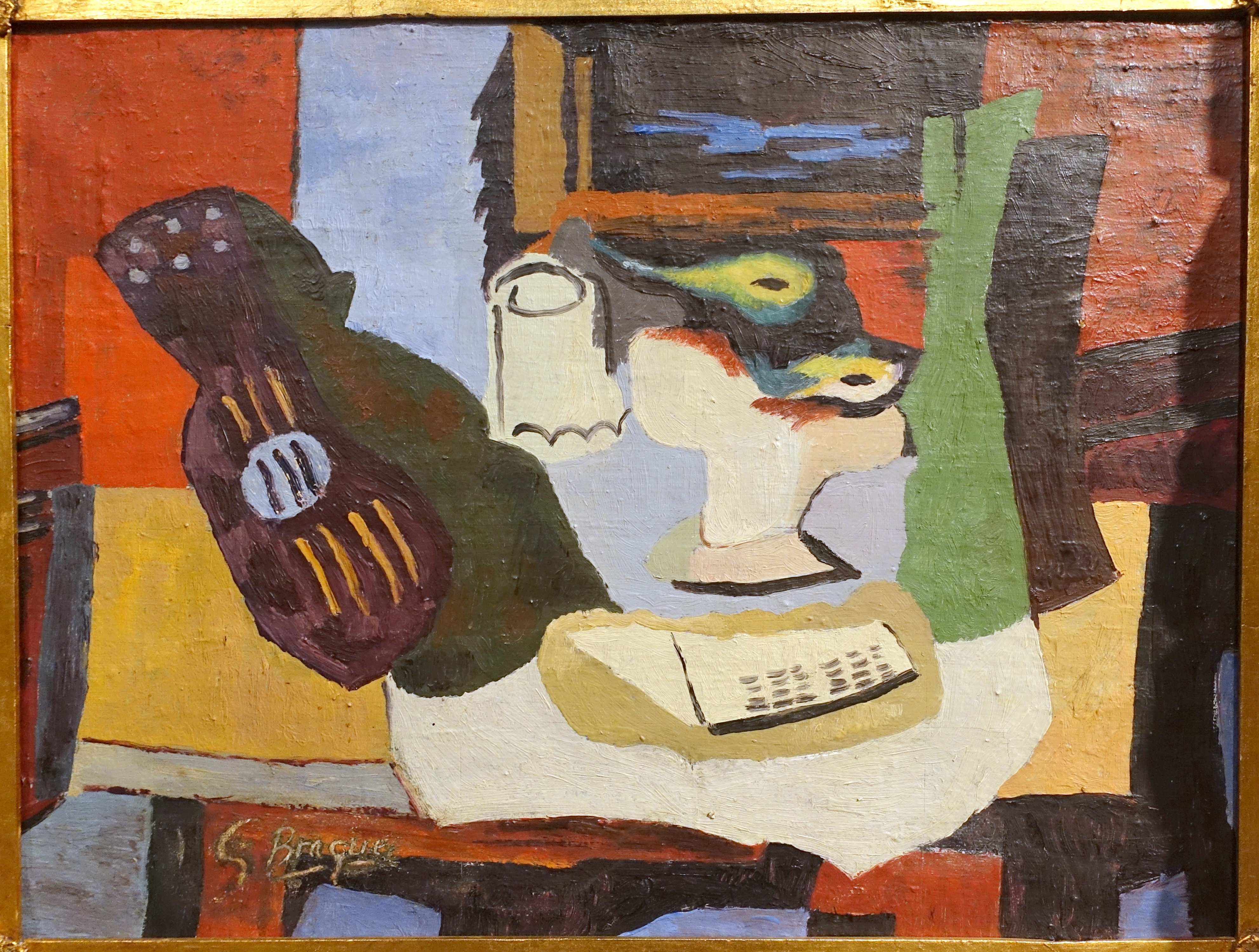 [credit](https://upload.wikimedia.org/wikipedia/commons/1/1e/Still_Life_by_Georges_Braque%2C_1926%2C_oil_on_canvas_-_Kulenovic_Collection_-_Karlskrona%2C_Sweden_-_DSC08493.JPG), [licence](http://creativecommons.org/publicdomain/zero/1.0/deed.en) 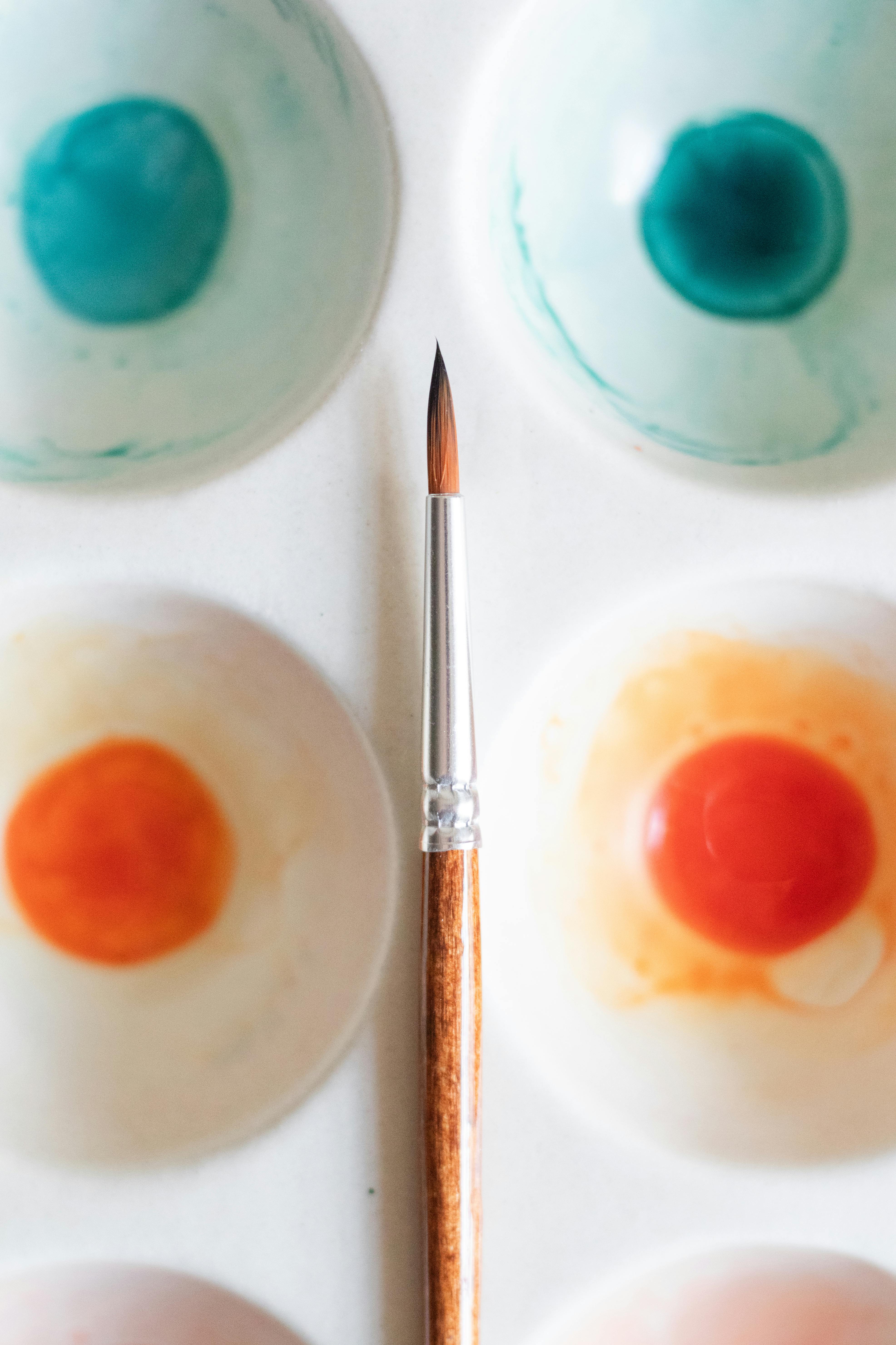 [credit](https://images.pexels.com/photos/17792185/pexels-photo-17792185/free-photo-of-a-palette-with-watercolor-paints-and-a-brush.jpeg), [licence](https://creativecommons.org/public-domain/) ## Which Medium Should You Use? This pigment is a bit of a traveler; it feels at home in many different vehicles. Its behavior, however, will change dramatically depending on the medium you choose, opening up entirely different avenues of expression. Some pigments feel awkward in certain binders; not this one. It's a true universalist, but you need to know how to speak its language in each new environment.  [credit](https://www.flickr.com/photos/24786512@N04/2547373209/), [licence](https://creativecommons.org/licenses/by-nc-nd/2.0/) - **Oil Painting:** In oils, its transparency makes it a phenomenal glazing color. The slow drying time of oils is your friend here, allowing you to seamlessly blend edges and create incredibly subtle transitions. I find it works beautifully for building up deep shadows in portraits or still-lifes, creating a Rembrandt-like chiaroscuro effect. It dries to a lovely, rich film that doesn't become dull. **Pro Tip:** Try mixing it into a "mother mix" at the start of a painting—a large batch of your primary shadow color—to ensure consistency in your darks across the entire canvas. - **Acrylic Painting:** In the fast-paced world of acrylics, it's perfect for creating quick, transparent washes and building up layers without the long wait times of oils. Acrylic mediums are key here. Mixing it with a gloss medium will maximize its transparency for glazing, while a matte medium or an open medium (which slows drying time) will give you more working time for blending. It's also excellent for dry-brush and scumbling techniques on top of dried layers. Because acrylics dry darker, you need to account for that shift when mixing. - **Watercolor:** Here, its staining properties and transparency are on full display. Once it's down, it's incredibly difficult to lift, which makes it perfect for creating deep, dark accents that won't get muddy when you layer over them. It's a [powerful tool](/finder/page/art-as-a-tool-for-social-commentary) for creating crisp lines and shadows. However, be mindful of this staining power when you want to preserve the whites of your paper; you can't simply scrub it out later. **Pro Tip:** Use it in a "wet-on-dry" technique for sharp, controlled marks, and be very cautious with "wet-in-wet," as it can spread and create hard-to-control blooms. ## Common Pitfalls (And How I've Fallen Into Every One of Them) This is a powerful color, and with great power comes great responsibility. Or, at least, a few common mistakes I've made so you don't have to. We've all been there, staring at a painting that's gone terribly wrong and realizing it's because we didn't respect the nature of our materials. Thioindigo red-brown, for all its subtlety, can be a particularly cruel teacher if you don't pay attention to its unique personality.  [credit](https://www.flickr.com/photos/abstract-art-fons/30634352376), [licence](https://creativecommons.org/licenses/by/2.0/) The funny thing about mistakes in the studio is that they're rarely dramatic. There's no explosion, no alarm bell. It's usually just a slow, creeping sense of unease, a feeling that something is "off." You add a little more white to fix it. Then a bit more blue. Then another glaze. Before you know it, your painting is a muddy, overworked battlefield, and the original spark of life is long gone. Most of these disasters can be traced back to one of a few simple misunderstandings about the character of this specific color. Let's talk about them.  [credit](https://live.staticflickr.com/7275/7548168124_243d637c75_c.jpg), [licence](https://creativecommons.org/licenses/by-nc-nd/2.0/) - **The Dusty Pink Trap:** Don't Over-mix It with White to Make a Pink. This is a temptation, I know. You want a muted, dusty rose or a faded terracotta. The problem is, the brown undertone can easily turn your beautiful pink into the color of salmon mousse. It's not appetizing. Its chemical nature means it doesn't tint cleanly to pastel shades. For dusty pinks, you're better off mixing a brighter red like Quinacridone Red with a bit of blue and *then* adding white. Let thioindigo red-brown handle the shadows and the underpinnings of color, not the highlights. It's the bass player, not the lead guitarist. I've seen too many promising studies turn into a pepto-bismol nightmare because someone tried to force this color into a role it wasn't meant for. - **The Heavy-Handed Start:** Start Transparent, Finish Opaque. It's easy to go heavy with a dark color early on. Fight that urge. The beauty of this pigment is in its transparency. Start with your most delicate glazes and washes. You can always add more or go thicker later, but you can't easily take it away. This is especially crucial in watercolor, where its staining properties mean it will permanently stain the paper. I learned this the hard way on a portrait where I blocked in the shadows too thickly and spent the next week trying to lighten them, only to end up with a muddy, overworked mess. Be patient. Thin is your friend in the beginning. The first wash should be so light you can barely see it. Let each layer dry completely before adding the next. The final effect will be a depth that you can literally fall into. - **The Muddiness Miscalculation:** Assuming it's just a fancy brown and treating it like Burnt Umber. If you try to use it exactly like you'd use an earth pigment, it might fight back. It's more transparent and has a different "feel" on the brush. Its staining properties also mean it mixes differently. Where Burnt Umber might sit on top of a mix, thioindigo red-brown will permeate it, changing the character completely. Experiment with it first before committing it to a large area of your painting. This is a lesson in specificity. It's like assuming all spices are interchangeable because they come in similar jars. The result is usually inedible. - **The Binder Blues:** Not adapting your technique to the medium. Thinking you can use it the same way in oils as you do in watercolor is a recipe for frustration. In oils, it's a slow-drying glaze. In acrylics, it's a fast-drying tool for texture. In watercolor, it's a permanent stain. You must adjust your expectations and technique for each. A glaze in acrylics needs a medium to stay workable, while in oils, you might just use a bit of solvent or a lean medium. This isn't a "one size fits all" pigment regarding process. It's a master of disguise, changing its personality to match the environment. Respect that, and it will reward you. - **The Over-blending Menace:** Letting the colors do the work. This is a refinement of the "Muddiness" point. Because thioindigo red-brown is so transparent and active when mixed, it's easy to blend it on the canvas until all its character is gone. The key is to place it with intention and then leave it alone. Let it sit next to another color and interact optically, rather than getting it all mixed up physically. This is especially true for glazing. One confident pass is worth twenty tentative ones. ## Frequently Asked Questions (FAQ) **Is thioindigo red-brown lightfast?** Yes! This is one of its greatest strengths. It's considered extremely lightfast, meaning it won't fade over time like some other organic pigments (I’m looking at you, [Alizarin Crimson](/finder/page/using-alizarin-crimson-in-painting)). Most manufacturers rate it with an ASTM Lightfastness rating of I (Excellent) or II (Very Good), making it a fantastic choice for artwork you want to last for generations without worrying about it turning into a ghost of its former self on the wall. Its synthetic organic nature is what gives it this stability, a huge advantage over its more fugitive historic counterparts. This durability is a primary reason why it's a trusted favorite for professional artists and conservators. **What colors does it pair well with?** It’s an incredible team player. I love pairing it with warmer yellows (Naples Yellow is a dream for creating classical, sun-drenched atmospheres), creating a classical, earthy warmth. For a more dramatic contrast, pair it with cool blues and teals, where it acts as a perfect bridge between the warm and cool halves of your palette. It harmonizes beautifully with the cadmium family, deepens phthalo pigments, and tames the intensity of modern quinacridones. And if you really want to create a vibrant, complex black, mix it with Ultramarine Blue. It also works beautifully as a soloist in a monochromatic painting, mixed with different amounts of white to create a full range of tones from deep maroon to dusty rose. **Can I use it as a direct replacement for Burnt Umber?** Not exactly. While they might seem similar at a glance, Burnt Umber is a much more opaque, earth-toned, and slightly cooler color, mined from natural clay. Burnt Umber is earthy and robust, a workhorse for blocking in shadows; thioindigo red-brown is organic and ethereal, a specialist for creating luminous depth. Thioindigo red-brown has a purer red note and a significantly higher degree of transparency. It's better to think of it as a vibrant, transparent alternative that gives you a different, more luminous set of possibilities, rather than a simple swap. It's like comparing a heavy, opaque curtain to a fine, translucent silk veil. If you need the heavy curtain, use Burnt Umber. If you want the veil, use thioindigo red-brown. **Is it a staining pigment?** In watercolor, absolutely. It's a powerful stainer, so be aware of that if you're trying to lift color back to white—it'll leave a ghost. In oils and acrylics, the staining property is less of an issue on the canvas (though it can stain your brushes if you're not diligent about cleaning them), but its transparency means it can be difficult to cover up if you apply it too heavily, as its influence will show through subsequent layers. This staining power is what makes it so good for glazing into deep, transparent darks. It's a pigment that asks for commitment. **What's the best way to clean brushes after using it?** Be thorough. In all mediums, its staining power means it can linger in your brush hairs and ruin your next color mix. For acrylics, wash thoroughly with soap and water, making sure to work the lather all the way up to the ferrule. For oils, using the 'two-jar' method works well: wipe off excess paint with a rag, then swish in a jar of odourless mineral spirits or a similar solvent, then move to a second, cleaner jar of solvent, and finish with a wash in warm, soapy water (like The Masters' Brush Cleaner). For watercolor brushes, a good rinse and occasional gentle wash in clean water is usually enough, but give the bristles a gentle rub to ensure no pigment is trapped near the ferrule. A clean brush is a happy brush. **Does it contain cadmium or lead?** No. Thioindigo red-brown is a synthetic organic pigment, not a toxic heavy metal-based pigment like cadmium or lead. However, always check the specific manufacturer's safety data sheet (SDS) for the brand you buy, as some formulations may contain fillers or other additives. In general, it is considered far safer than many traditional, heavy metal-based artist pigments. **Where can I buy it?** You can find professional-grade thioindigo red-brown and its equivalents (like Perylene Maroon) from most major artist paint manufacturers. Look for it from brands like **Winsor & Newton** (W&N Artists' Oil Colour, Watercolour), **Daniel Smith** (famous for their watercolors and their 'PrimaTek' series), **Holbein**, **Rembrandt**, and **Old Holland**. Artist forums like WetCanvas and Art Supply reviews are also great resources to see swatches and read user experiences before you buy. ## Conclusion: The Quiet Power of a Well-Kept Secret Thioindigo red-brown isn't a color that shouts. It's a color that invites you to lean in closer. It rewards patience and a willingness to explore the subtle, beautiful world of shadows and depth. It's a tool for creating mood, atmosphere, and a sense of rich history within your work. To truly master it isn't just about knowing a few techniques; it's about understanding a whole philosophy of painting—one that values depth over dazzle, nuance over novelty. Once you learn this language of subdued color, you start to see it everywhere, not just in your studio, but in the world around you. It's the color of the city just after a rainstorm, the color of a good bottle of Barolo held up to the light, the color of a shadow in a forgotten corner of an old building. It's a color for grown-ups, for painters who are done with the obvious and are looking for something a little more complex, a little more true. I think we artists are often drawn to the loudest voices on the palette first—the screaming yellows, the electric blues, the come-hither reds. They're easy to love, easy to use for immediate impact. But the real magic, the real mastery of painting, often lies in learning to listen to the quieter voices, the ones that don't demand attention but instead offer depth, nuance, and complexity to those willing to make the effort. Thioindigo red-brown is one of those quiet voices, a color that offers more questions than answers, more possibilities than prescriptions. It forces you to slow down, to think, and to build color rather than simply apply it.  [credit](https://live.staticflickr.com/4341/36425866604_deb5230c39_b.jpg), [licence](https://creativecommons.org/licenses/by-nc-sa/2.0/) I've often thought that getting to know a pigment like this is a lot like building a friendship. It takes time. There are misunderstandings at first. You try to force it to be something it's not. But if you're patient, if you listen, and if you're willing to meet it halfway, it reveals its true character, its hidden strengths, its particular kind of magic. It goes from being just another tube of paint to an indispensable part of your visual vocabulary, a trusted collaborator in the studio. You find yourself reaching for it without even thinking, and when you're done with a painting, you often find its subtle influence has woven its way through the entire piece, holding everything together from the shadows up. So, my advice? Get a tube. Put it on your palette, right next to your favorite white, and just live with it for a while. Don't try to make a masterpiece with it on day one. Just make some marks. Start with a simple wash. See how it reacts over different colors. Mix it with your blues, your yellows, your greens. Play. Make a mess. That's how you'll truly discover its language. Before you know it, you'll be asking yourself the same question I do every time I start a new piece: "Okay, where does my thioindigo fit into all of this?" And more often than not, you'll find it's the quiet, steady voice that ties everything together. You can explore more of my techniques and works on my [timeline](/timeline).  [credit](https://live.staticflickr.com/65535/52756890827_35815e55cc_b.jpg), [licence](https://creativecommons.org/licenses/by-nc-nd/2.0/) Now, go paint.