Decorating Large Walls with Art: From Blank to Brilliant | Zen Museum
Transform your expansive walls from daunting blank canvases into captivating focal points. Explore dynamic gallery walls, dramatic large-scale art, and clever placement strategies to infuse personality into every corner of your home.
# The Art of the Big Blank Wall: How to Stop Staring at Emptiness and Start a Conversation You know that feeling. You’ve just moved into a new place, or maybe you’ve committed to redoing the [living room](/finder/page/choosing-art-for-your-living-room), and there it is: that impossibly vast, empty wall. It stares. You stare back. The wall always wins, leaving you with an itch you can't quite scratch. The problem isn't really the emptiness itself, but the silence it creates. It's a visual vacuum that can drain the energy from the entire room. This article is for anyone who has ever looked at a large bare wall in their home and felt a mix of intimidation and opportunity. If you've ever wondered how to decorate a [large wall](/finder/page/how-to-decorate-a-large-wall), how to arrange pictures effectively, or how to choose that one perfect piece, you're in the right place. We're turning a blank slate into a breathtaking story. But here's the secret shift in perspective I had to learn the hard way: that intimidating blankness is the most generous gift your home can offer. It isn't a problem to be filled; it's the most exciting creative opportunity you'll have all year. That big, uninterrupted surface isn't just a wall; it's a blank canvas, an empty page waiting for a poem, the perfect stage for a performance. It's a chance to pause before you start, to think about what you truly want to see every day. That initial paralysis isn't a sign you're bad at decorating; it's the necessary pause before creation, the quiet before you decide what story this corner of your world will tell. The trick is not just to fill the space, but to start a dialogue. A conversation between the [art](/finder/page/history-of-art-guide), the wall, and the room itself. This is your guide to starting that conversation, turning a daunting task into a deeply rewarding act of creation. Let’s stop treating large walls as a challenge and start seeing them as the main event. To do this well, you'll need a few key ideas in your back pocket. Let's call them the three pillars of powerful wall design. First is **intentionality**—choosing [art](/finder/page/history-of-art-guide) that genuinely resonates rather than just filling the void. Second is **proportion**—understanding how size, scale, and visual weight dance together to create harmony. And third is **narrative**—curating a collection that tells a story, whether it’s one bold statement or a chorus of smaller voices. This article is your toolkit for mastering all three. 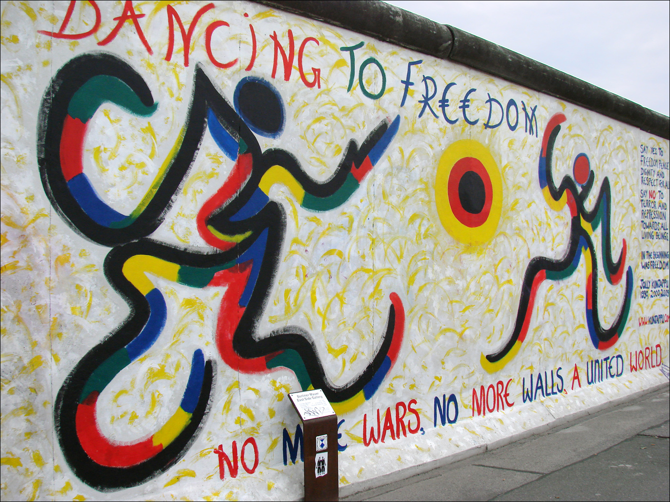 [credit](https://upload.wikimedia.org/wikipedia/commons/0/06/East_Side_Gallery_%28Berlin%29_%286331808119%29.jpg), [licence](https://creativecommons.org/licenses/by/2.0) ## Why That Big Empty Wall Feels So Wrong (And Why It's Actually Perfect) That sense of unease is real, and it has roots deeper than you might think. It’s fascinating how an empty wall can make us so uncomfortable, isn't it? I think it taps into a deep, primal part of our brains that craves pattern and purpose. An [empty space](/finder/page/the-role-of-negative-space-in-abstract-art:-finding-balance-and-focus) feels unfinished, like a sentence without a period. It's waiting for closure. But here’s the radical reframe, and it's one I had to learn the hard way after years of treating walls like a frantic game of Tetris: that emptiness isn't a flaw. It's the best possible starting point you could ask for. It's a blank canvas, a quiet room before the music starts, the deep breath before the plunge. It represents pure potential. This feeling of discomfort with a vacuum is deeply ingrained. Think of it as our brain's pattern-matching software running in the background, constantly scanning our environment for meaning and structure. When it finds a blank spot, it sends up a little flag: something’s missing. What’s powerful is realizing you have the power to decide what that 'something' is, instead of letting the discomfort make you rush into a decision you'll regret six months later. 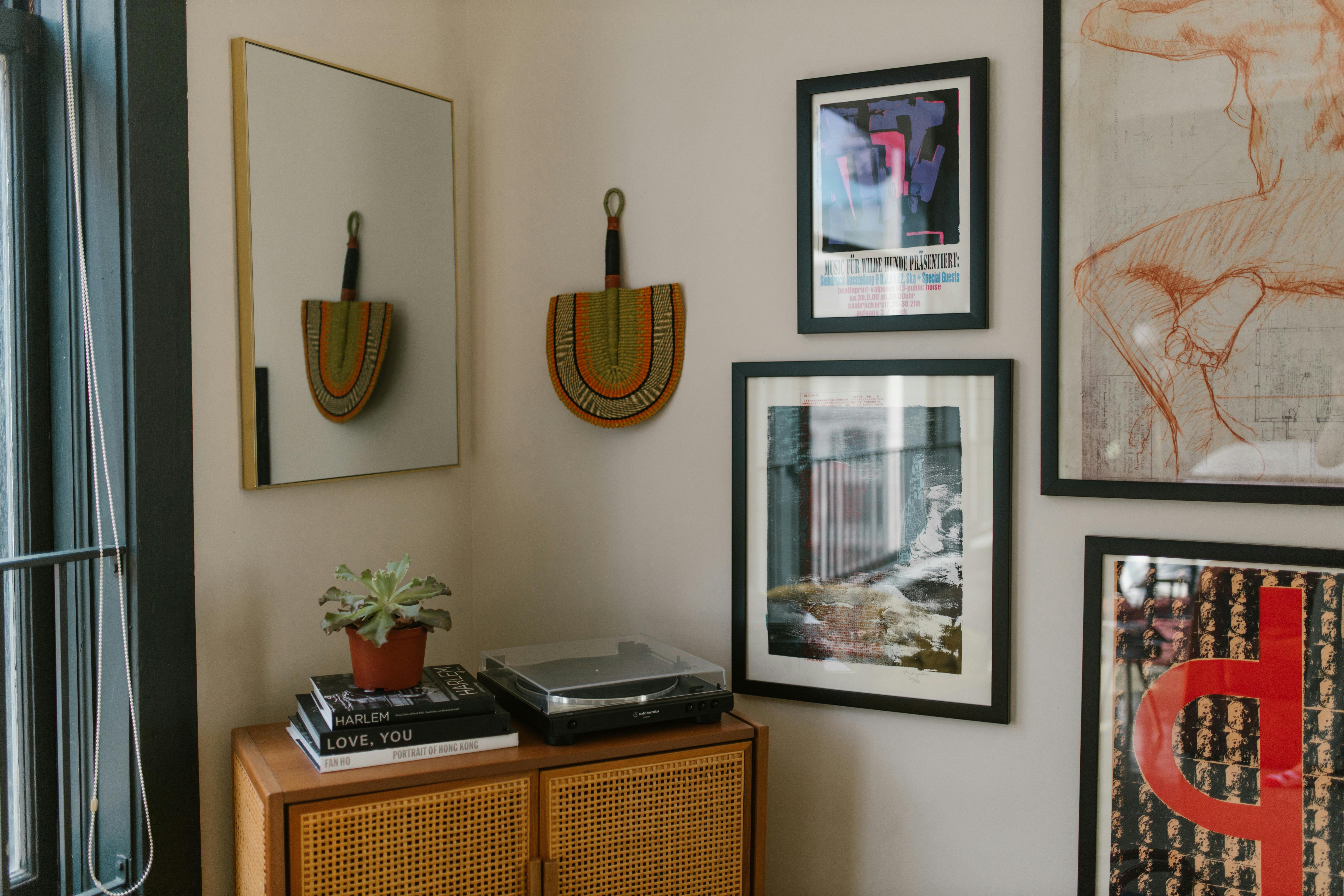 [credit](https://images.pexels.com/photos/8488978/pexels-photo-8488978.jpeg), [licence](https://creativecommons.org/public-domain/) We're surrounded by visual noise every day—screens, signs, clutter. Our eyes are trained to latch onto something, anything. When they find nothing, it creates a mild but persistent cognitive dissonance. You walk into the room and your gaze has nowhere to land, so it just... floats. It's unsettling because we're biologically wired to seek patterns and points of interest.  [credit](https://live.staticflickr.com/4809/44596612920_dbd13d7273_b.jpg), [licence](https://creativecommons.org/publicdomain/mark/1.0/) That void can feel like a to-do list item you haven't checked off, an invitation to a party you haven't attended. And in our eagerness to resolve that tension, we often reach for the quickest fix. I've seen so many people go to a big-box store and buy the first oversized canvas they see, not because they love it, but because it fits. That's how you end up with a collection of random stuff that never quite feels right—a wall of good intentions but no soul. The frustration comes later, when you realize you've traded a blank space for a boring one. A truly great wall isn't filled; it's answered. 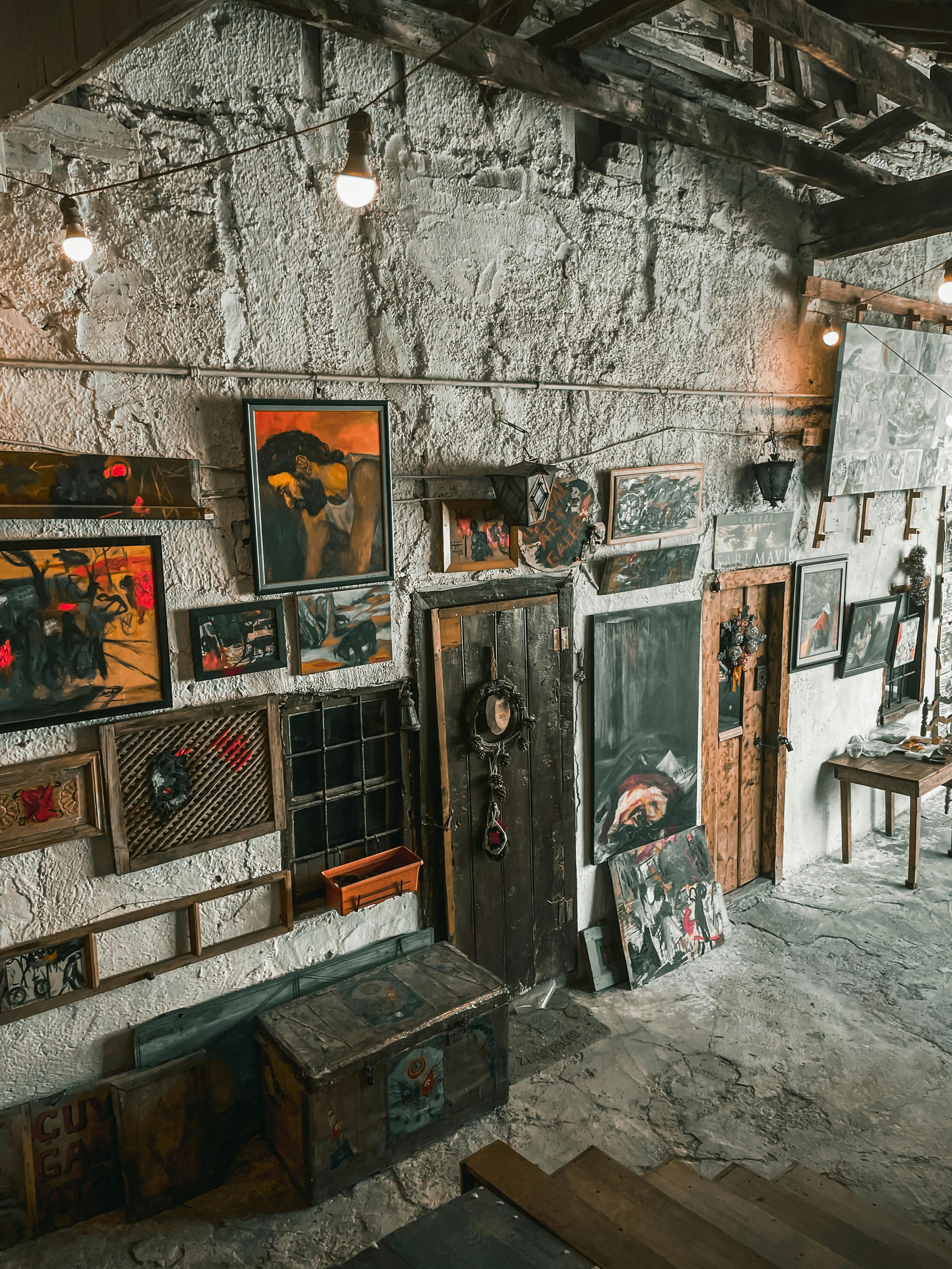 [credit](https://images.pexels.com/photos/11274638/pexels-photo-11274638.jpeg), [licence](https://creativecommons.org/public-domain/) A detailed mural of a woman's face integrated into a wall art design, showcasing creative interior decoration techniques and artistic wall panels. Ideal for modern wall decor inspiration. **Keywords**: wall art mural, interior decor, artistic wall panels, wall art ideas, home decoration.](https://images.zenmuseum.com/article/decorating-large-walls-with-art/7790d1e0-eac2-11f0-b4b8-49b29ea43f10.jpg) [credit](https://live.staticflickr.com/4809/44596612920_dbd13d7273_b.jpg), [licence](https://creativecommons.org/publicdomain/mark/1.0/) A detailed mural of a woman's face integrated into a wall [art](/finder/page/history-of-art-guide) design, showcasing creative interior decoration techniques and artistic wall panels. ### The Art of the Mural: From DIY to Commissioned Masterpiece If you're ready for the ultimate commitment, a mural is the most transformative wall decor possible. It's a permanent—or at least, semi-permanent—piece of art that is inextricably linked to the architecture of your home. It can make a small [room feel](/finder/page/using-art-make-small-room-feel-bigger) infinite or a large, sterile room feel intimate and enveloping. The options range from the accessible to the extraordinary. For the DIY-inclined, there are incredible resources available now. You can find large-scale, paste-the-wall mural papers that create a dramatic effect, or you can purchase hand-painted mural stencils that allow you to create a repeating pattern or image yourself. This hands-on approach means the piece is truly yours, a testament to your own time and effort. At the other end of the spectrum, commissioning a mural from a local artist is a profound collaboration. It allows you to bring a unique vision to life in a way that no mass-produced item ever could. You get to work directly with the artist to create a piece that is perfectly suited to your space, your light, and your story. It's an investment not just in a piece of art, but in a relationship with the creative process itself, resulting in a wall that is a one-of-a-kind masterpiece. The goal isn't to eliminate the emptiness. It's to organize it. To give it shape, rhythm, and meaning. To understand the interplay of positive and [negative space](/finder/page/role-of-negative-space-abstract-art). The wall is the silence; your [art](/finder/page/history-of-art-guide) is the melody. You need both to make music. Think of it this way: you're not just decorating a surface; you're curating an atmosphere. A well-dressed wall does more than just please the eye. It can make a [room feel](/finder/page/using-art-make-small-room-feel-bigger) larger, change the perceived height of the ceiling, or create a focal point that anchors the entire space. You're not just filling a void; you're architecting an experience. Let's pause on that idea for a second: architecting an experience. A single, enormous [abstract painting](/finder/page/how-to-create-a-cohesive-color-palette-for-abstract-painting) with flowing vertical lines can subconsciously make your ceilings feel higher. A wide, horizontal piece can make a narrow room feel broader. A deeply saturated, dark piece can make a wall feel closer and more intimate, perfect for a cozy seating area. It's about using art and its inherent qualities to become an architectural element in and of itself. So the wall isn't your enemy. It's your collaborator. That blank expanse is your best friend, patiently waiting to hold the story you're about to tell. ## The Psychology of Space: Understanding Scale and Proportion Before we hang a single thing, let's talk about the invisible forces at play. Proportion is everything. It's the silent mathematics of visual harmony, the difference between a room that feels effortlessly right and one that feels vaguely... off. You're not just decorating; you're orchestrating a relationship between objects and the space that contains them. It’s the difference between a room that feels effortlessly inviting and one that feels vaguely jarring. Ever walked into a space and felt immediately unsettled, without knowing why? Chances are, the proportions were off. We're going to tap into that deep-seated sense of harmony by understanding the math our eyes already want to do. A huge piece on a tiny wall feels domineering, like an opera singer in a phone booth. A tiny piece on a [huge wall](/finder/page/how-to-arrange-pictures-on-a-wall) looks lonely and timid, like a single pea on a giant dinner plate. The key is visual weight—the perceived heaviness of an object based on its size, color, and density. A large, somber piece has immense visual weight; a small, delicate sketch has very little. Balancing these weights is the core of creating a harmonious composition. It’s a bit like achieving balance on a seesaw: a massive object close to the center can be perfectly balanced by a much smaller object placed far out on the other end. Color plays a role here, too. A small, fiery red painting can hold its own against a much larger, cool-toned piece because warm, intense colors advance toward our eyes, demanding attention and thus increasing visual weight. ### The 60/80 Rule and Visual Weight The golden [rule](/finder/page/the-golden-rule-in-art-composition) I use (and then break constantly, because rules are more like suggestions from a well-meaning friend) is the **60/80 [rule](/finder/page/the-golden-rule-in-art-composition)**. The [art](/finder/page/history-of-art-guide) should occupy roughly 60-80% of the wall's width. This isn't a law carved in stone, it's a starting point for your gut instinct. It ensures the art has enough presence to command the space without overwhelming it. To measure this quickly and with less guesswork, grab a tape measure and a partner. Have one person hold the artwork up against the wall and shift it around at different heights and positions. Have the other person stand back—way back, near the opposite wall—and assess it. You can even snap a quick photo on your phone. Seeing the art's scale within the entire wall through a camera lens can instantly tell you if it's the right fit, often better than just eyeballing it from a few feet away. But how you *perceive* the art's size is what truly matters. This is where visual weight comes in. A large, mostly [white piece](/finder/page/the-serenity-of-white-my-exploration-of-absence-and-presence-in-abstract-art) with a small central subject will feel lighter than a smaller, densely colored, dark piece. The frame—or the deliberate lack of one—also dramatically shifts an artwork's visual weight on the wall. A chunky, ornate frame adds pounds; a thin, light frame or a frameless canvas feels almost weightless. It's not just about the literal size; it's about the physical footprint. A large, mostly [white piece](/finder/page/the-serenity-of-white-my-exploration-of-absence-and-presence-in-abstract-art) with a small central subject will feel lighter than a smaller, densely colored piece. The frame, or the lack of one, also dramatically shifts an artwork's visual weight on the wall. A thick, ornate gilt frame can make a small painting feel monumental and heavy, anchoring an entire corner of the room. Conversely, a frameless canvas or a print with only a subtle white border feels light and contemporary, almost floating on the wall. Even the color of a frame matters: a [black frame](/finder/page/how-to-choose-a-frame-for-abstract-art) can make an image feel contained and deliberate, while a white or natural wood frame might make the same image feel more open and airy. 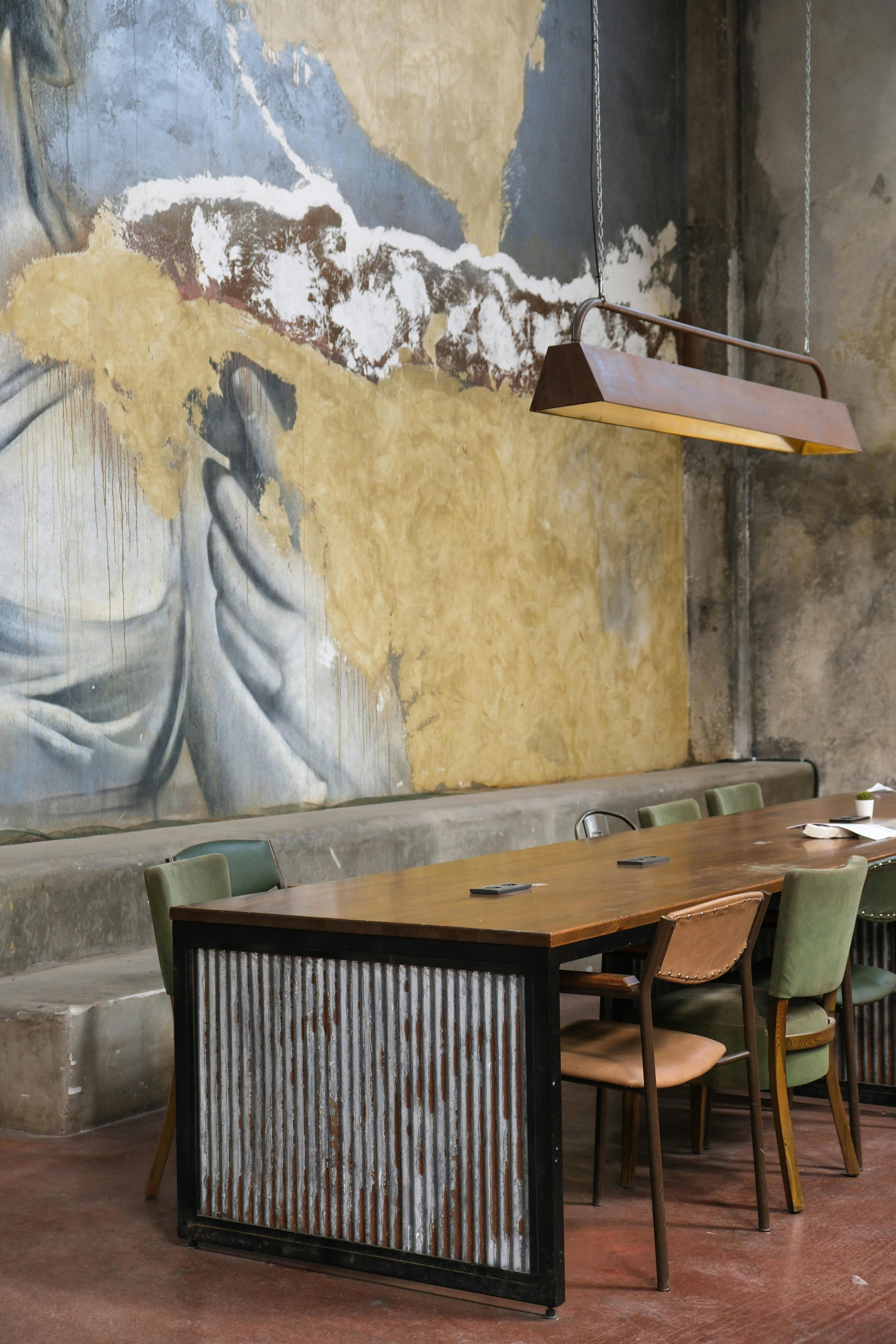 [credit](https://images.pexels.com/photos/17277316/pexels-photo-17277316/free-photo-of-interior-design-with-art-on-wall.jpeg), [licence](https://creativecommons.org/public-domain/) Think of it like a conversation. If the wall is the listener, the art is the speaker. You want the speaker to be engaging and clear, not whispering or shouting. And here's a nuance most people miss: it's not just about the [wall itself](/finder/page/how-to-choose-art-for-a-curved-wall). It's about the 'visual weight' of the furniture below it. A long, low sofa creates a wide, horizontal anchor. A tall bookshelf demands something that can visually balance its height. The art doesn't hang in a vacuum; it hangs in a dialogue with everything else in the room. If you have a low-backed sofa, you have a lot of vertical wall space to work with. You could opt for a very tall, vertical piece that draws the eye up. But if you have a high-backed Chesterfield sofa, you have less wall visible above it. In that case, a wider, more horizontal piece might be the better choice to create a balanced composition that sits comfortably within the available space. It's about reading the room—literally. The furniture is already speaking; the art is your response.  [credit](https://images.pexels.com/photos/35380904/pexels-photo-35380904/free-photo-of-vibrant-butterfly-wall-art-installation.jpeg), [licence](https://creativecommons.org/public-domain/) There's a subtle dance going on in every well-curated space. The proportions of your art need to be in harmony with the proportions of the room itself. A grand, high-ceilinged room can handle—and even demands—a much larger scale than a cozy, low-ceilinged nook. It's all part of that invisible mathematics I mentioned, the kind you feel more than you calculate. One of the most powerful, subconscious effects of art is its ability to alter the perceived dimensions of a room. A piece with strong vertical lines, like a tall abstract painting or a series of vertical photographs, can make low ceilings feel higher. A wide, panoramic piece can make a narrow room feel broader. It’s an architectural illusion, and art is your tool for performing it. ## The Power of a Single Statement Piece: When One is All You Need Let's start with the simplest, and often most powerful, solution: the solo act. One large, incredible piece of art can do the work of twenty small ones. It's a declaration. It says, 'This is important. Look at this.' It commands attention and becomes the undisputed anchor of a room. Everything else in the space—your furniture, your lighting, the color of your throw pillows—can be chosen to complement and serve this one central statement. It’s a confident move, the design equivalent of deciding to have one truly memorable, engaging guest at a dinner party rather than a dozen forgettable ones. It’s not just decoration; it’s an environment you build around a single, powerful idea. There is an undeniable power in singularity. In a world that often feels cluttered and noisy, the choice to feature just one piece of art is a profound one. It’s a statement of confidence. It's a deep breath. It says you trust the work to carry the entire [emotional weight](/finder/page/my-palette-my-story-the-emotional-language-of-color-in-my-abstract-art) of the space, and you trust yourself to make that choice. This is the strategy for the decisive, the confident, the minimalist-at-heart. When you choose one large piece, you're betting everything on a single hand. It requires you to be brave. You're committing to an idea, a color palette, an emotion. There's no hiding behind a crowd of smaller pieces. And that’s what gives it its power. It’s a distillation. It forces you to clarify what you truly want to feel in that room. Do you want it to be energetic or serene? Provocative or comforting? That single, large canvas becomes the definitive answer to that question. It tells the world exactly what you stand for in that particular corner of your life. It's less about filling a space and more about defining it.  [credit](https://images.pexels.com/photos/2079670/pexels-photo-2079670.jpeg), [licence](https://creativecommons.org/public-domain/) The benefits are huge, though. A single statement piece creates instant focus. It defines the room's entire personality. There's a clarity and calmness that comes from one strong visual idea, uninterrupted. It lets the [art itself](/finder/page/how-to-choose-art-for-a-scandinavian-style-home) be the complete story. My own journey to embracing the statement piece was a long one. I used to be a firm believer in the 'more is more' philosophy, covering every inch of wall space in a desperate bid to make my home feel 'finished.' It wasn't until I spent a month living in a nearly-empty apartment with just one, small but powerful painting that I understood. That single piece became my anchor. Every morning, it was the first thing I saw, and its presence offered a unique sense of peace that a cluttered wall never could. It was the whole story, right there, needing no footnotes. The blank space around it wasn't empty; it was a breathing room for my thoughts, a quiet aura around the work. It taught me that sometimes, the most powerful statement is the one you don't crowd with other voices.  [credit](https://images.pexels.com/photos/15988007/pexels-photo-15988007/free-photo-of-man-walking-in-art-gallery.jpeg), [licence](https://creativecommons.org/public-domain/)  [credit](https://images.pexels.com/photos/15138850/pexels-photo-15138850/free-photo-of-exhibition-of-photographies.jpeg), [licence](https://creativecommons.org/public-domain/) ### The Grand Single: Sizing and Hanging for Maximum Impact You've found your piece. Now, how do you hang it for maximum drama? The biggest rookie mistake is hanging art too high. We've all seen it—the lonely picture hovering near the ceiling, leaving a vast, [awkward space](/finder/page/art-for-awkward-spaces) between it and the furniture below. It feels disconnected, aloof, like a bad conversationalist. It’s almost as if the art is actively trying to escape the room. It creates a sort of visual neck ache; you find yourself tilting your head back, straining to connect with it. The art should be part of the room’s ecosystem, not a satellite in a high orbit. The rule of thumb is this: the vertical center of the artwork should be at eye level for an average-height person, roughly 57 to 60 inches from the floor. This works for most people standing and engaging with the art. But here’s a nuance: whose eye level? If you live alone, your own eye level is the right one. If your household has a wide range of heights, aim for the average. The goal isn't mathematical perfection but creating a comfortable zone where the art feels accessible and integrated. It should be a natural part of your line of sight as you move through the room, not something you have to deliberately look up to find. This height creates an immediate and intuitive connection.  [credit](https://images.pexels.com/photos/13558241/pexels-photo-13558241.jpeg), [licence](https://creativecommons.org/public-domain/) But here's where it gets interesting, and where you need to break that rule: when the art is hanging over a piece of furniture. In that case, you want to create a unified grouping. The bottom of the frame should be only 6 to 12 inches above the back of the sofa, console, or mantle. This visually 'ties' the art to the furniture, creating a single, cohesive vignette. Think of the furniture and the art as one unit, an ensemble cast in a play. If you have high ceilings, you might be tempted to hang the art higher to 'fill the vertical space.' Resist that urge! It's a classic mistake. Instead, let the vertical space above the vignette be [negative space](/finder/page/role-of-negative-space-abstract-art), a breath of fresh air that frames the composition from above. The connection with the furniture below is almost always more important than trying to reach for the ceiling. The piece should feel like it's part of the furniture's world, not a satellite in distant orbit. When you sit on the sofa, the art should be in your immediate line of sight, not something you have to crane your neck to see.  [credit](https://commons.wikimedia.org/wiki/File:Singapore_Art_Museum_14.JPG), [licence](https://creativecommons.org/licenses/by-sa/3.0/deed.en) ## The Art of the Salon Hang (or, How to Build a Gallery Wall) If a single statement piece is a powerful soliloquy, a [gallery wall](/finder/page/what-is-a-gallery-wall) is a lively, vibrant conversation. It's a cacophony of voices, all telling different parts of a bigger story. This is where you can get personal, eclectic, and a little bit messy (in a good way). A great [gallery wall](/finder/page/what-is-a-gallery-wall) isn't just a collection of holes in the wall. It's a curated universe. It reflects a life lived, a collection of memories, tastes, and curiosities. It’s how you turn a wall into a visual autobiography. Think of it as your personal museum, showcasing not just what you like, but *who you are*. The quirky postcard from a trip, the [abstract print](/finder/page/10-creative-ways-to-display-abstract-art-in-your-home-office) that you can't explain but can't stop staring at, the small sketch your child made—these are the elements that build a wall with soul. I think of gallery walls in two different flavors. There’s the 'Portrait of a Life,' which is a chaotic, wonderful mix of photos, souvenirs, and found objects that map out your personal history. Then there’s the 'Definitive Collection,' which is more focused—a deliberate assembly of artworks around a single theme, color, or style. Both are valid, but it helps to know which one you're building. 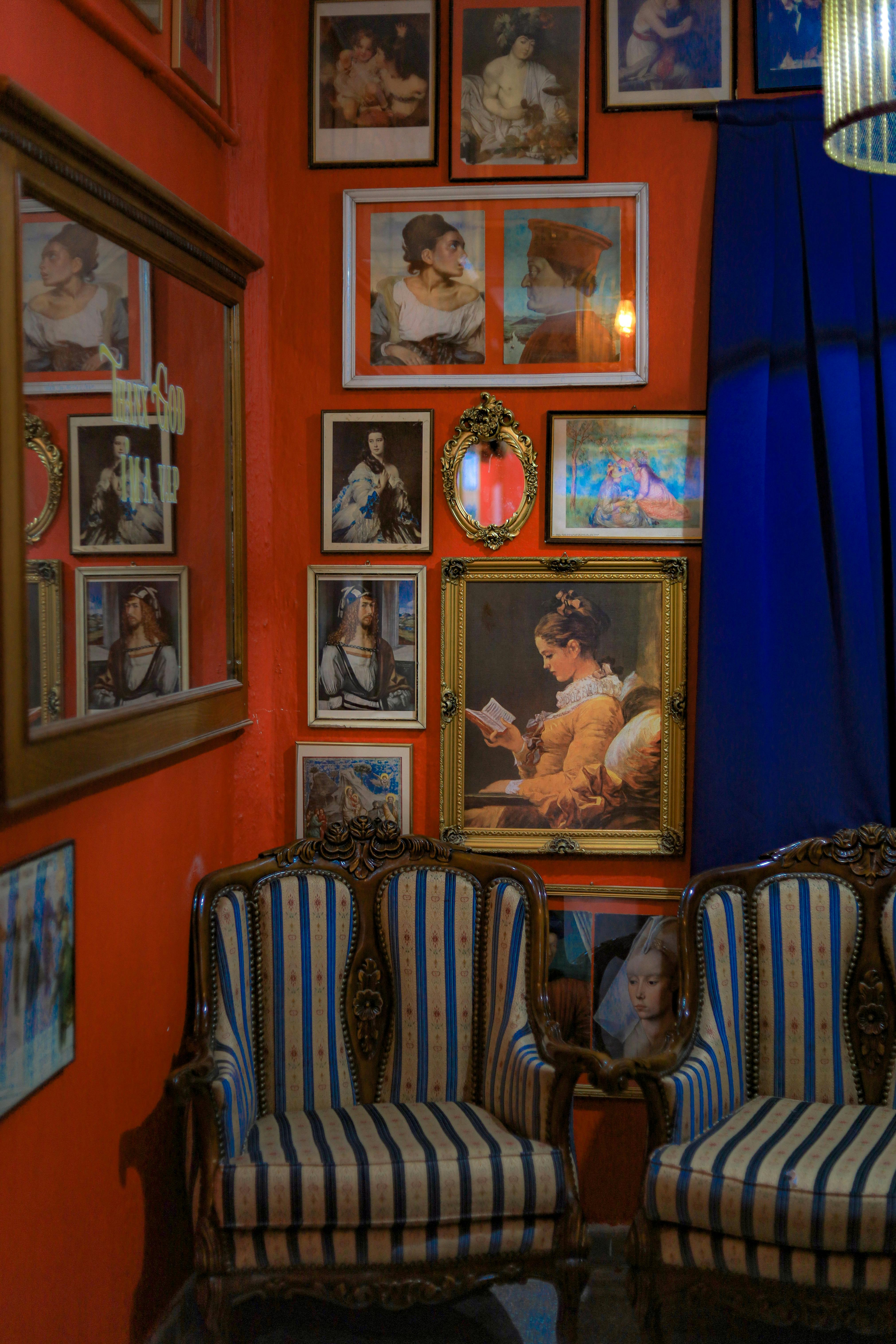 [credit](https://images.pexels.com/photos/14493083/pexels-photo-14493083.jpeg), [licence](https://creativecommons.org/public-domain/) The fear that holds most people back is the fear of commitment—specifically, the fear of putting holes in the wall. It feels so permanent. But let me let you in on a secret: walls are remarkably forgiving. Holes can be filled. It's better to have a wall full of character (and a few spackle marks) than a [blank wall](/finder/page/how-to-arrange-pictures-on-a-wall) full of missed opportunities. What you're really fearing is the permanence of your own taste. What if my style changes? What if I get tired of looking at this? Honestly, you probably will. And that's not a failure of your initial choice; it's proof you're growing. A [gallery wall](/finder/page/what-is-a-gallery-wall) should be a living, breathing thing. It’s not a tattoo. It’s more like a playlist. You can always swap out a track. So, let go of the idea of the 'perfect' wall and embrace the idea of an 'honest' one. There are ways around this fear, too. Before you commit to a permanent arrangement, you can use **picture ledges or floating shelves**. These allow you to create a dynamic, ever-changing gallery without a single nail for your frames. You simply lean your art, layering pieces for a casual, collected-over-time look that you can update whenever the mood strikes. It's the perfect low-commitment gateway into the world of gallery walls. I love this method for one simple reason: it encourages curation. When you can effortlessly swap a piece in or out, you start thinking more like a museum curator. You might change the whole scene with the seasons—lighter, brighter pieces for summer; darker, moodier tones for winter. It keeps your home feeling alive and responsive to your life.  [credit](https://images.pexels.com/photos/4538276/pexels-photo-4538276.jpeg), [licence](https://creativecommons.org/public-domain/) I used to be paralyzed by that fear. I’d measure and re-measure, tap the wall looking for studs, and then just... walk away. The wall would stay empty for months. The turning point was framing a beautiful but inexpensive poster. Once I accepted that the cost of a bit of spackle was nothing compared to the joy the art brought me, I was free. I wish I could give you that same permission to just *start*. The perfect [gallery wall](/finder/page/what-is-a-gallery-wall) isn’t born; it’s built, one piece at a time. Don't set out to create a 'gallery wall' like it’s a single, monumental project. Instead, start with a single piece you absolutely love. Hang it. Live with it. Later, maybe you find another piece that sings with the first one. Hang that one, too. Let it grow organically. It’s far less intimidating and the results are often more authentic than a perfectly planned grid executed in a single, sweat-inducing afternoon.  [credit](https://images.pexels.com/photos/16160115/pexels-photo-16160115/free-photo-of-woman-looking-at-paintings-in-an-art-gallery.jpeg), [licence](https://creativecommons.org/public-domain/) ### Finding Your Grid: The Structure Beneath the Chaos The first decision you have to make is about structure. Or the lack of it. Your gallery wall needs a spine, an organizing principle that gives the chaos a sense of intentionality. Without an underlying structure, even the most beautiful collection of art can look like a random assortment of things you happened to own. With a structure, even the most eclectic mix can feel curated and purposeful. Think of it as the difference between a scattered handful of notes and a beautifully composed chord. That invisible grid is what separates a chaotic mess from a curated collection.  [credit](https://live.staticflickr.com/6086/6121687533_124ea3b77d_b.jpg), [licence](https://creativecommons.org/licenses/by-nc-sa/2.0/) #### 1. The Symmetrical Grid This is the clean-freak's best friend. All frames are the same size and are hung in a perfect grid pattern. It's orderly, linear, and calming. The beauty here comes from the repetition and the precision. It sends a message of order and control. The content inside the frames provides the variety. **Best for:** A collection of similar things—a series of botanical prints, black-and-white family photos, or a set of vintage maps. It allows a large number of items to feel organized rather than cluttered. **The challenge:** The precision is demanding. A single frame hung a quarter-inch off can throw the entire composition into chaos, making it look amateurish rather than intentional. A laser level can be your best friend here, but so can a healthy dose of patience and a good eye. #### 2. The Organic Cluster This is my go-to method, the one that feels most like a real-life collection that grew over time. Frames are different sizes, shapes, and orientations. They are arranged around a central anchor point or in a loose cluster that feels collected, not designed. The key to making this work is rhythm. You need to create visual balance. A large frame on one side should be balanced by a cluster of smaller frames on the other. It’s like a composition in music—you have heavy bass notes and lighter high notes, and they all work together. 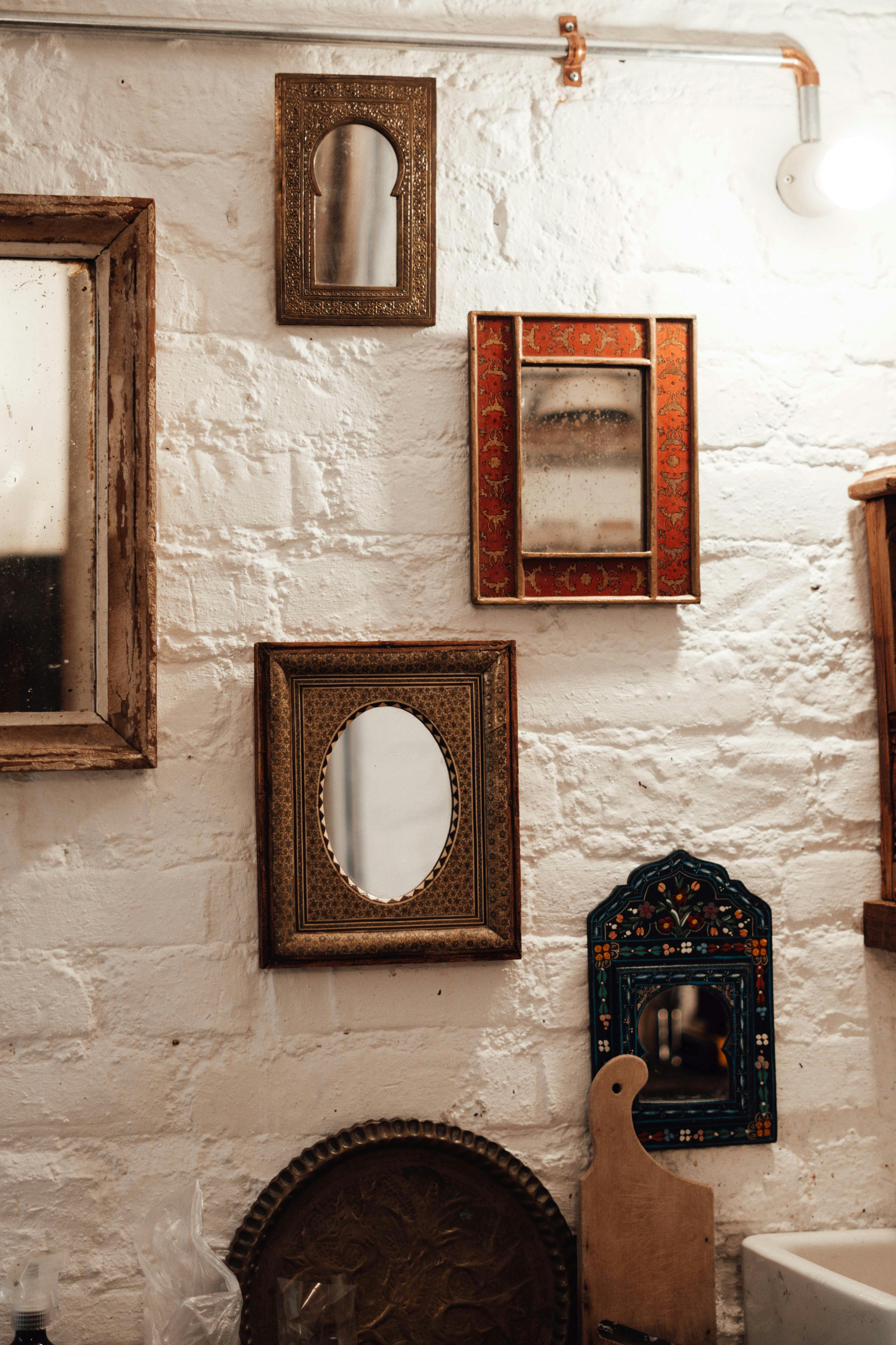 [credit](https://images.pexels.com/photos/6842189/pexels-photo-6842189.jpeg), [licence](https://creativecommons.org/public-domain/) Spacing is the secret weapon here. Keeping a consistent gap (usually 2-3 inches) between all the frames creates a buffer that lets each piece breathe while holding the whole collection together. It's the white space that creates the rhythm. This consistent breathing room is what turns a "collection of frames" into a single, powerful composition. But don't be a slave to the ruler—sometimes a slightly wider gap can create a beautiful pause and prevent the whole thing from feeling cramped. #### Mind the Edges Pay attention to the outer edges of your entire gallery wall. The collection should feel anchored, not like it's about to float away. Make sure the outermost pieces aren't placed too close to the corner of the wall or the edge of the furniture below. A generous margin around the entire arrangement will make it look intentional and complete.  [credit](https://live.staticflickr.com/5208/5349040301_d80dd3a5cd_b.jpg), [licence](https://creativecommons.org/licenses/by-nc-sa/2.0/) Spacing is the secret weapon here. Keeping a consistent gap (usually 2-3 inches) between all the frames creates a buffer that lets each piece breathe while holding the whole collection together. It's the white space that creates the rhythm.  [credit](https://www.pexels.com/photo/paintings-hanging-in-a-corner-19460384/), [licence](https://creativecommons.org/public-domain/) #### 3. The Matched Outline A fantastic modern twist. Frames are different, but the artwork inside is matted and sized to create a uniform rectangular or square shape. The outside edges are wild and varied, but the inner core is a tidy grid. It's a great way to have the best of both worlds—eclectic frames with a clean, organized interior. 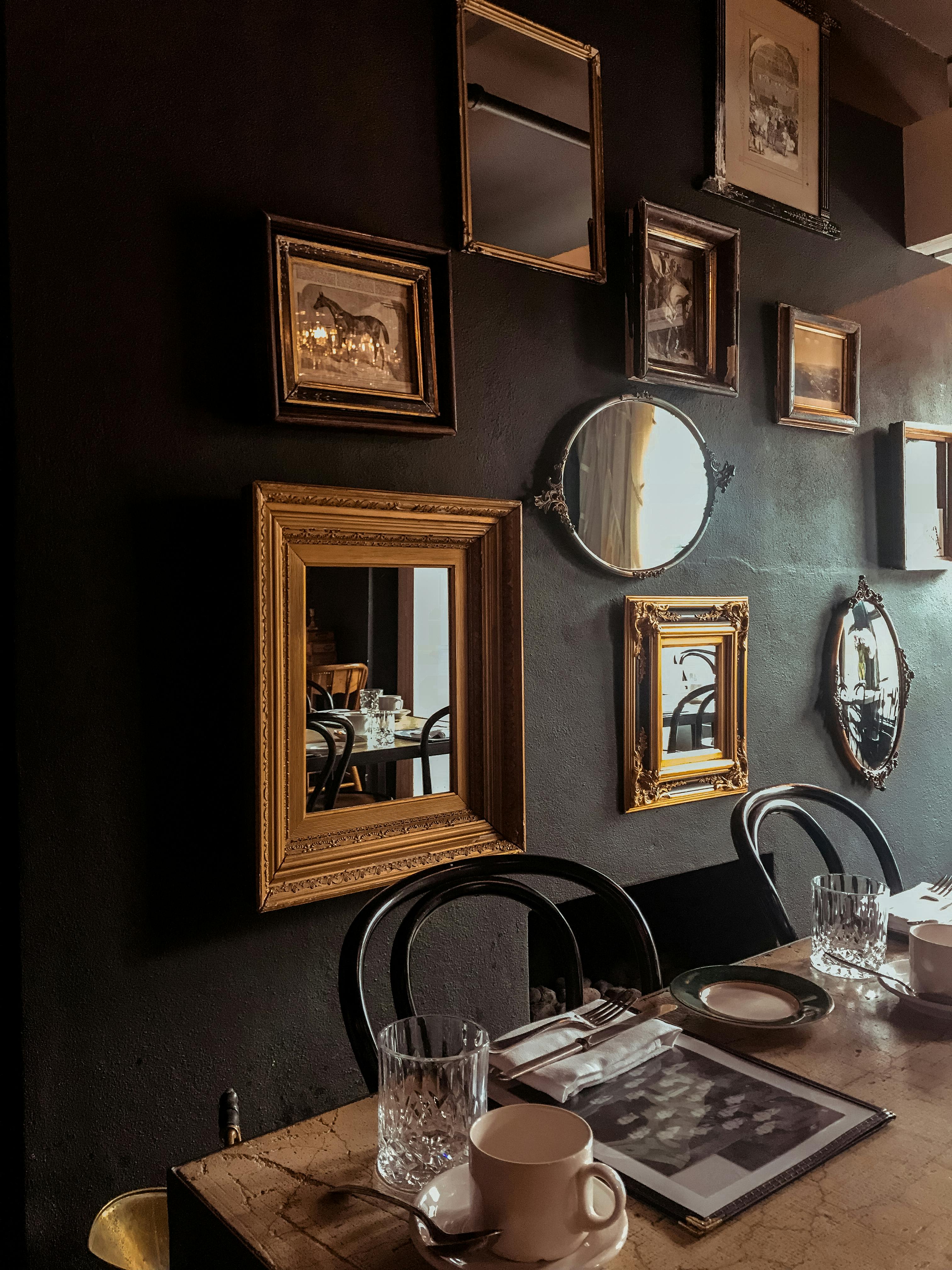 [credit](https://images.pexels.com/photos/2442904/pexels-photo-2442904.jpeg), [licence](https://creativecommons.org/public-domain/) This approach is brilliant because it tames the chaos visually. Your eye isn't distracted by trying to make sense of fifteen different frame sizes; it can relax into the content of the images themselves. It's particularly effective with things like vintage family photographs or a collection of drawings, where the subject matter is diverse but you want a cohesive presentation.  [credit](https://images.pexels.com/photos/4267774/pexels-photo-4267774.jpeg), [licence](https://creativecommons.org/public-domain/) ### The Anatomy of a Great Gallery Wall: 30+ Inspirations A gallery wall is more than just frames. It’s a collection of layers and textures. Here are some elements to weave into your conversation:  [credit](https://images.pexels.com/photos/4279811/pexels-photo-4279811.jpeg), [licence](https://creativecommons.org/public-domain/) - **Art Prints:** This is your primary vocabulary. Mix bold, colorful abstract pieces with quieter, more detailed line drawings. A restrained black-and-white photograph can make the vibrant [contemporary art print](/buy) next to it practically sing. - **Textiles & Tapestries:** Why should paintings have all the fun? A small, framed textile or a miniature tapestry introduces a completely different texture. It breaks up the uniformity of glass and frames and adds a layer of incredible softness. - **Sculptural Objects:** Don't limit yourself to the two-dimensional. A [shadow box](/finder/page/the-role-of-shadow-boxes-in-displaying-art) with a cherished object, a small ceramic mask, or even a beautifully designed wall clock can become a 3D focal point. I once saw a collection of vintage keys hung in shadow boxes, and it was more interesting than most paintings I've seen. - **Text and Typography:** An antique map, a page from an old dictionary, a quote set in a beautiful typeface. Words in an image bring a different part of your brain to the party. They add narrative and literal meaning to the visual mix. - **Mirrors:** A small mirror strategically placed within a gallery wall does two things: it bounces light around, making the space feel brighter and bigger, and it reflects a different angle of the room, adding depth and complexity to the arrangement. It's like a little window into another part of your world. - **Shelves:** A picture ledge or a single floating shelf allows you to "hang" things without putting in a nail. Prop up a few small prints, lean a book with a beautiful spine, add a small plant or a cherished object. It creates a sense of layering and casualness. You can change these items out with the seasons, keeping the wall fresh and dynamic. ### The Step-by-Step Blueprint for a Stress-Free Gallery Wall The thought of hammering twenty nails into a wall with no plan is enough to give anyone anxiety. So don't do it. Here is my failsafe method for creating a gallery wall that looks effortless but is secretly the result of a little bit of planning.  [credit](https://images.pexels.com/photos/5824517/pexels-photo-5824517.jpeg), [licence](https://creativecommons.org/public-domain/) This isn't just about avoiding holes in the wrong place. It's about giving yourself the freedom to be creative without the pressure of permanence. When you know you have a solid plan, you can make bolder choices, try unexpected pairings, and trust that the final result will feel intentional.  [credit](https://images.pexels.com/photos/18631400/pexels-photo-18631400.jpeg?cs=srgb&dl=pexels-celine-3776818-18631400.jpg&fm=jpg), [licence](https://creativecommons.org/public-domain/) #### Step 1: The Floor Plan Clear a space on the living room floor that's roughly the size of your wall. This is your rehearsal space. Lay out all your frames, art, and objects here first. Play with the arrangement, take photos with your phone, rearrange, and repeat. It's so much easier to experiment here than on the wall. Think of it as a dry run—a chance to see how shapes and colors interact without any commitment at all. 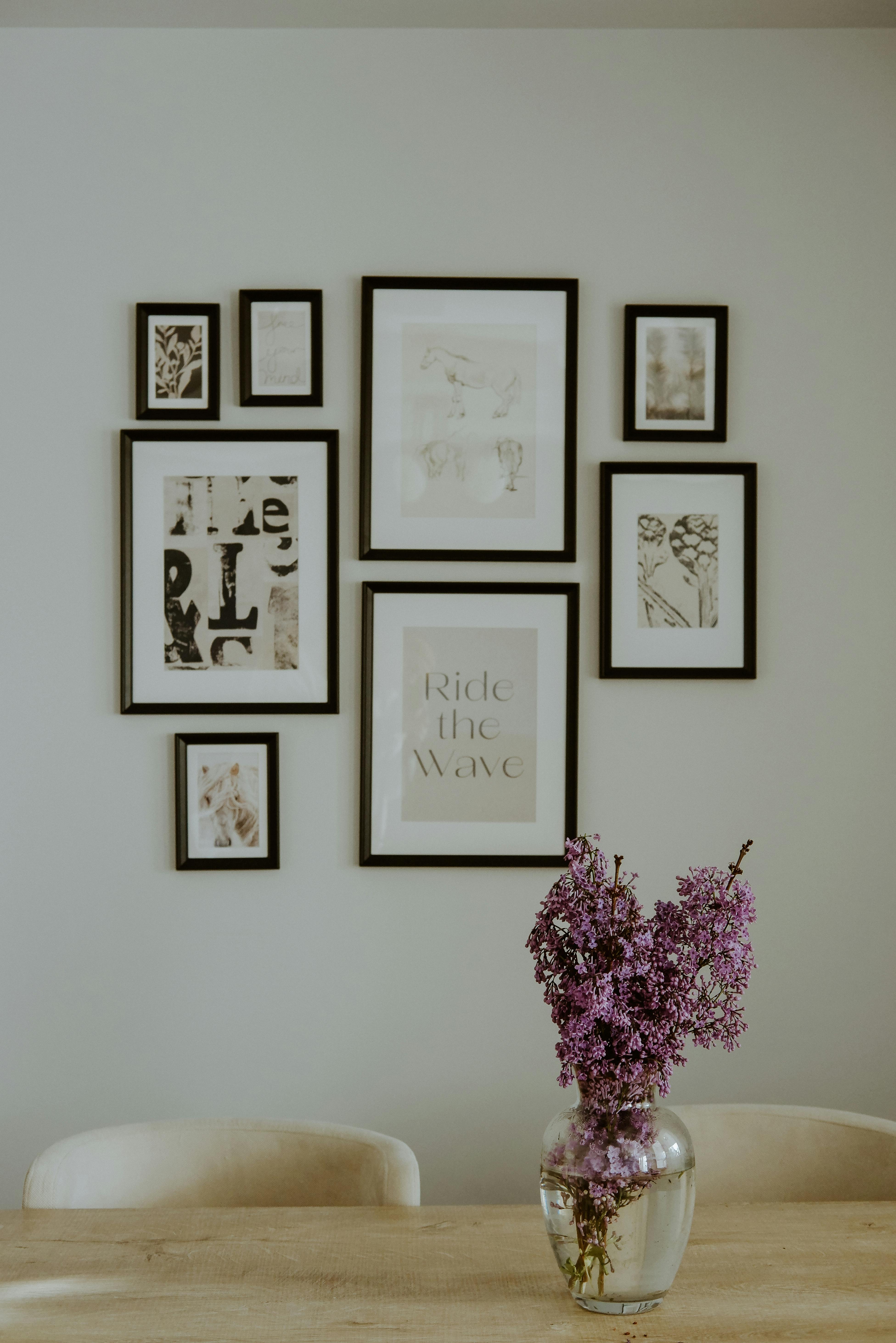 [credit](https://images.pexels.com/photos/16614531/pexels-photo-16614531/free-photo-of-dining-roman-with-bunch-of-lavender-in-vase.jpeg), [licence](https://creativecommons.org/public-domain/) I like to start by laying out the largest pieces first, almost like setting up the furniture in a tiny room. Then, I weave in the medium and small pieces, filling gaps and creating little moments of visual harmony. Don't be afraid to walk away and come back with fresh eyes. Sometimes the best arrangement reveals itself after a cup of coffee. 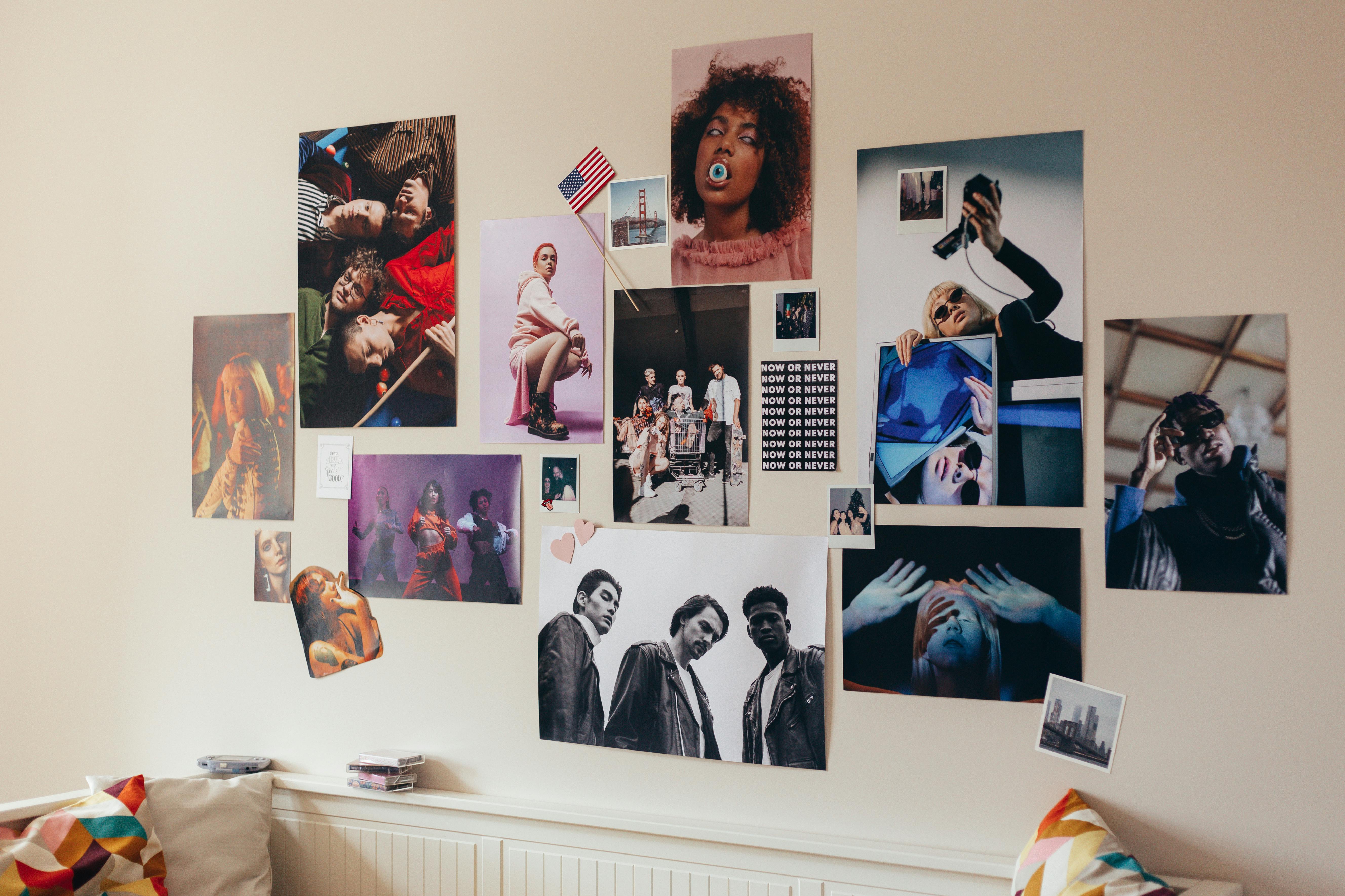 [credit](https://images.pexels.com/photos/10599803/pexels-photo-10599803.jpeg), [licence](https://creativecommons.org/public-domain/) #### Step 2: Find Your Anchor Start with the largest or most important piece. This is your anchor. It's the sun that your other pieces will orbit. Place it first, either in the center or slightly off-center. Don't hang it yet, just decide on its position in your floor composition.  [credit](https://www.flickr.com/photos/fiveblondes/2488269660/), [licence](https://creativecommons.org/licenses/by-nc-sa/2.0/) #### Step 3: Build Around It Now, add the secondary players. Place medium-sized pieces around your anchor. Think about balance. If you have a [heavy piece](/finder/page/how-to-hang-a-heavy-painting) on the left, balance it with a group of smaller pieces on the right. Don't crowd the anchor; give it some breathing room. #### Step 4: Fill in the Gaps Use your smallest pieces to fill in the gaps and create bridges between the larger elements. This is where you add the quirky, unexpected items that give the wall personality.  [credit](https://mastersatart.com/), [licence](https://creativecommons.org/licenses/by-nc/4.0/) #### Step 5: The Paper Trick (The Real Secret) This is the step that will save your wall (and your sanity). Once you have a layout you love on the floor, trace each frame onto kraft paper or wrapping paper. This is the single most important step for a stress-free hang. Cut the paper templates out and write what's on each one (e.g., "red abstract," "grandma's photo").  [credit](https://commons.wikimedia.org/wiki/File:Fenway_Court_Interior_22_%28cropped%29.jpg), [licence](https://creativecommons.org/licenses/by-sa/4.0/deed.en) This turns the abstract concept of 'where does this go?' into a simple, physical task. You're no longer juggling a fragile frame, a pencil, and your mounting hardware while trying to eyeball a measurement. You're just placing a piece of paper.  [credit](https://images.pexels.com/photos/7218533/pexels-photo-7218533.jpeg), [licence](https://creativecommons.org/public-domain/) #### Step 6: Tape and Measure Tape these paper templates to the wall using painter's tape. Now you can stand back, live with the arrangement for a day or two, and adjust without any commitment. This is your moment to be absolutely sure. To get the spacing right, measure from the edge of one [paper template](/finder/page/paper-template-usage) to the next. Once you're happy, measure the hanging hardware on the back of your frames, mark the spot on the paper, and hammer your nail right through it. A little tip: if you're hanging a particularly [heavy piece](/finder/page/how-to-hang-a-heavy-painting), use a stud finder first. If your nail can go into a stud behind the drywall, you'll sleep much better at night knowing your prized piece isn't about to come crashing down.  [credit](https://images.pexels.com/photos/18318322/pexels-photo-18318322/free-photo-of-art-deco-painting-on-brick-wall.jpeg), [licence](https://creativecommons.org/public-domain/) #### Step 7: Hang and Reveal Rip away the paper, hang your frame on the nail you just hammered, and watch it fit perfectly. It's like magic, but with slightly more effort and a lot less smoke.  [credit](https://images.pexels.com/photos/18318322/pexels-photo-18318322/free-photo-of-art-deco-painting-on-brick-wall.jpeg), [licence](https://creativecommons.org/public-domain/) ### The Storytelling Wall: Curating a Narrative The most memorable gallery walls aren't just visually pleasing; they're meaningful. They tell a story. This is where you move from decorator to curator. Think about the narrative you want to tell:  [credit](https://commons.wikimedia.org/wiki/File:Fenway_Court_Interior_22_%28cropped%29.jpg), [licence](https://creativecommons.org/licenses/by-sa/4.0/deed.en) - **A [Personal Journey](/finder/page/my-evolution-from-representational-to-abstract-art-a-personal-journey):** A wall of family photos, travel souvenirs (like ticket stubs, postcards from the [Den Bosch Museum](/den-bosch-museum), vintage maps), and heirlooms. It's a visual timeline of a life. - **An Aesthetic Journey:** A collection of landscapes, seascapes, and skylines. Or a wall of portraits, or still lifes. Grouping things by subject matter creates a powerful theme. - **A Color Story:** A wall that celebrates a [single color](/finder/page/how-to-create-a-cohesive-color-palette-for-your-home-around-abstract-art). Find art, photos, and objects across different mediums that all share a common hue. It creates a surprisingly cohesive look. - **The Unexpected Juxtaposition:** This is the advanced move. Place a modern [abstract piece](/finder/page/case-study-transforming-a-small-dark-hallway-with-a-vibrant-abstract-piece) next to an old-world oil painting portrait. Put a scientific diagram next to a religious icon. The friction between the pieces creates energy and intellectual interest. It tells a story of a mind that's curious about everything. Your wall is a reflection of you. It should contain things you love, not things you think you're supposed to love. The best gallery walls look like they were collected over a lifetime, because they were.  [credit](https://live.staticflickr.com/5208/5349040301_d80dd3a5cd_b.jpg), [licence](https://creativecommons.org/licenses/by-nc-sa/2.0/) ## Beyond the Frame: Unconventional Wall Decor Ideas Sometimes the most powerful statement comes from thinking beyond the traditional framed artwork. When you break free from the expectation of a rectangle in a frame, you open up a world of possibilities that can feel more personal, more organic, and often, more impactful. These are the choices that truly make a home feel like it couldn't belong to anyone else. It's here that we move away from simply "hanging art" and start to think about "dressing the wall." This subtle shift in language opens up a whole new set of creative avenues, from textiles that soften a room's acoustics to sculptural objects that play with light and shadow throughout the day. Let's explore the outer edges of what's possible on a vertical plane.  [credit](https://images.pexels.com/photos/242827/pexels-photo-242827.jpeg), [licence](https://creativecommons.org/public-domain/) ### The Impact of Large-Scale Textiles A textile isn't just a thing; it's an atmosphere. It absorbs sound, creating a sense of quiet intimacy. A large-scale woven tapestry, a vintage rug hung like a painting, or even a cascading macrame wall hanging can bring a level of warmth and texture that paint or paper simply cannot match. I'm drawn to textiles because they are fundamentally human. You can see the hand of the maker in the weave, the slight imperfection of a hand-dyed thread, the texture that begs to be touched. In a room full of hard surfaces, a textile on the wall is like a visual sigh of relief. It softens the entire space, quite literally changing the acoustics and the feeling of the room. Hanging a rug, especially a vintage one with a rich history, is a design move of incredible confidence and soul. To hang a heavy textile, you'll need the right hardware. A **French cleat** or a sturdy, decorative **curtain rod** running through a sleeve at the top of the piece are your best bets. It's a commitment, sure. But it's also an incredibly bold and memorable design choice that tells the world you're not afraid of texture, of history, of bringing traditional crafts into a modern space.  [credit](https://images.pexels.com/photos/10061389/pexels-photo-10061389.jpeg), [licence](https://creativecommons.org/public-domain/) ### Dynamic Displays: Picture Ledges and Hanging Systems Why commit to one arrangement forever? The answer is, you don't have to. For those of us whose tastes—and collections—evolve, the fixed gallery wall can feel like a life sentence. But what if your wall could be a revolving exhibition, changing with the seasons, your travels, or simply your mood? This is where dynamic displays stop being a convenience and start being a philosophy.  [credit](https://images.pexels.com/photos/7445045/pexels-photo-7445045.jpeg), [licence](https://creativecommons.org/public-domain/) **Picture ledges** (or floating shelves) are the unsung heroes of flexible wall decor. They allow you to lean, layer, and swap out art with zero effort. No nails, no hooks, no measuring. You can lean a large print at the back, a medium one in front, and a small object in the very front, creating a rich sense of depth. Change your art with the seasons, your mood, or whenever you buy a new piece that you just have to display immediately. The beauty of ledges is the invitation to layer. You're no longer confined to a single plane. A large landscape print on the back ledge can be partially obscured by a smaller, vibrant [abstract piece](/finder/page/case-study-transforming-a-small-dark-hallway-with-a-vibrant-abstract-piece) in front, creating a dialogue between the two. It’s a casual, non-permanent way to live with art that encourages experimentation.  [credit](https://live.staticflickr.com/3731/13402193294_7e67ffc22a_b.jpg), [licence](https://creativecommons.org/licenses/by/2.0/) **Hanging systems**, like a continuous wire strung between two hooks or a more sophisticated rail system, offer clean, modern flexibility. They allow you to hang and rearrange art without constantly patching and repainting your walls. It’s a sign that you see your space as a living, evolving entity, not a static museum exhibit. ### Three-Dimensional Thinking: Sculptures and Wall Sculptures Let's break the flat-plane barrier. Wall sculptures—whether it's a modern geometric piece, a collection of driftwood, or a series of small bas-reliefs—add a dimension of shadow and form that completely changes a room.  [credit](https://commons.wikimedia.org/wiki/File:The_Creation_Of_The_Mountains.jpg), [licence](https://creativecommons.org/licenses/by-sa/4.0/deed.en) The interplay of light and shadow on a 3D object throughout the day creates an ever-changing work of art. It makes the wall an active participant in the daily rhythm of your home. It's not just something you look at; it's something that interacts with the light and the air around it.  [credit](https://images.pexels.com/photos/18254580/pexels-photo-18254580/free-photo-of-two-contemporary-paintings-on-the-wall.jpeg), [licence](https://creativecommons.org/public-domain/) [Image Placeholder: Wall sculpture casting dynamic shadows] ### Borrowing from the World: Mirrors and Screens A mirror is the ultimate space-opening trick. It's a classic for a reason. By reflecting light and the room itself, a large mirror can make a small space feel twice as large and twice as bright. But beyond that, a beautiful mirror is a piece of art in itself. The frame is the key. Or, for a truly modern look, a frameless mirror becomes a kind of magic portal in the wall. When using a mirror, think strategically about what it will reflect. Place it where it can bounce light from a window or reflect a beautiful part of the room, not a cluttered corner or a [blank wall](/finder/page/how-to-arrange-pictures-on-a-wall). A vintage folding screen, partially opened and leaned against a wall, can also serve as a stunning backdrop. It's an unusual, dynamic, and sculptural way to fill a large vertical space without any commitment. The screen itself, with its panels and often intricate surfaces, becomes the art.  [credit](https://images.pexels.com/photos/31875680/pexels-photo-31875680/free-photo-of-close-up-of-hands-shaping-pottery-on-a-wheel.jpeg), [licence](https://creativecommons.org/public-domain/) ## The Essential Toolkit: Hanging Hardware and Techniques All the great ideas in the world won't help if your beautiful art ends up in a pile on the floor. Let's talk about the practical magic of hanging things securely. This is the part that often feels the least glamorous, but I assure you, the peace of mind that comes from knowing your art is safe is its own form of aesthetic pleasure. I learned this lesson the hard way, with a fairly heavy framed print I hung with a single, optimistic nail. It lasted three days before a slight breeze (or maybe just the settling of the house) sent it tumbling, cracking the frame and my confidence. After that, I decided that if something was worth hanging, it was worth hanging properly. Let's build your toolkit, both literal and metaphorical.  [credit](https://images.pexels.com/photos/15871635/pexels-photo-15871635.jpeg?cs=srgb&dl=pexels-sdvmovies-15871635.jpg&fm=jpg), [licence](https://creativecommons.org/public-domain/) ### The Right Hardware for the Job: A Guide This is one of those things you don't think about until it's too late. The wrong hook for the wrong wall is a recipe for disaster. It's like trying to hang a heavy coat on a flimsy sticker—it might hold for a minute, but eventually, physics wins. Here's a simple guide to demystify the hardware aisle. | Wall Type | Art Weight | Recommended Hardware | Why it Works | | :--- | :--- | :--- | :--- | | **Standard Drywall** | Light (< 20 lbs) | Small nail or picture hook | Simple, fast, and effective for most small-to-medium frames. | | **Standard Drywall** | Medium (20-50 lbs) | Molly bolt or toggle anchor | These spread the weight out behind the drywall, preventing a pull-through failure. | | **Standard Drywall** | Heavy ( > 50 lbs) | Find a stud or use a heavy-duty anchor | For this weight, a stud is king. If you can't hit one, use a specialty anchor designed for heavy loads. | | **Plaster Walls** | Any | Wall anchors specifically for plaster | Plaster is old, hard, and can crack easily. Plastic anchors can buckle; you need metal ones that expand gently. | | **Brick or Concrete** | Any | Masonry drill bit, concrete anchors | You'll need a hammer drill. The anchor expands as you drive the screw in, gripping the masonry. | ### The Handyman's Arsenal: Essential Tools for the Job You don't need a workshop full of professional tools, but a few key items will transform the hanging process from a frustrating chore into a satisfying, efficient task.  [credit](https://live.staticflickr.com/426/19591286139_0b18559ef5_o.jpg), [licence](http://creativecommons.org/publicdomain/zero/1.0/deed.en) - **A Good Stud Finder:** For anything heavy, this is non-negotiable. Get a decent electronic one that can find the edges of the stud, not just the center. Your drywall repair budget will thank you. - **A Level:** This is what separates the amateurs from the pros. A small torpedo level is perfect for a single frame. For a grid-style gallery wall, a longer 24-inch or 48-inch level is essential. Even better, a laser level that projects a perfectly straight line across the entire wall can save you hours of frustration and ensure absolute precision. - **The Right Drill:** A basic, reliable cordless drill/driver is the workhorse of the operation. For hanging art on studs, it's all you need. If your home has masonry walls, you'll need to invest in or rent a hammer drill. The hammering action is what allows the drill bit to pulverize the masonry and create a clean hole. - **Painter's Tape:** This is your low-stakes planning tool. Use it to mark studs, to create temporary reference lines, to mark the spot where your nail or drill bit should go (it leaves a much cleaner mark than a pencil), and of course, for your paper templates. - **A Pencil and a Measuring Tape:** The fundamentals. A good metal tape measure is more reliable than a cloth one, and a carpenter's pencil is great because the lead won't break under pressure. - **The Right Hanging Wire:** Don't just use whatever came on the frame. For anything heavier than a few pounds, invest in braided picture-hanging wire. It's much stronger and easier to work with than thin, single-strand wire. The wire should be strong enough to hold several times the weight of the artwork. It's better to have too much strength than not enough.  [credit](https://upload.wikimedia.org/wikipedia/commons/0/0b/Peter-Doig.jpg), [licence](https://creativecommons.org/licenses/by-sa/3.0) ### The Professional's Touch: When to Call for Backup And a final word of caution: if you're hanging something genuinely heavy (like a large antique mirror), genuinely priceless (a family heirloom), or genuinely irreplaceable (an original piece of art with significant sentimental or financial value), please, for the love of all that is holy, hire a professional. A professional art installer has the tools, the knowledge, and the insurance to do the job perfectly and safely. It's a small price to pay for peace of mind and the safety of your beloved art. These experts can also handle complex installations, like hanging art on a challenging material (glass, metal, or very old plaster), installing a full rail system, or ensuring an extremely heavy piece is seismically secure. It's like calling a master tailor to fit a bespoke suit—sometimes, the professional touch makes all the difference. ### The Art (and Science) of Hanging at the Right Height We touched on this before, but it's worth repeating because it's the single most common mistake people make. Art hung too high feels disconnected and awkward, like a speaker at a party who is deliberately avoiding eye contact with everyone in the room. 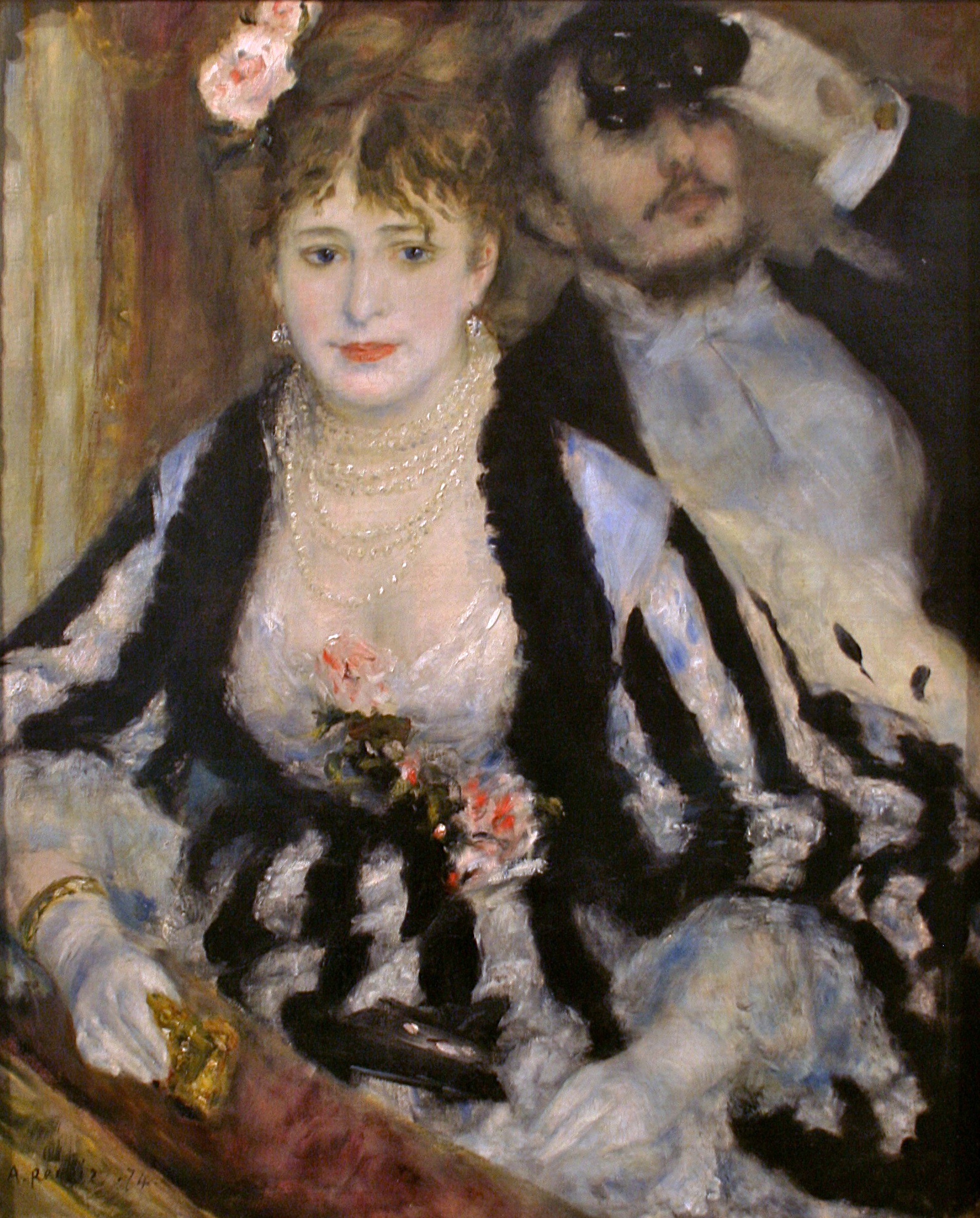 [credit](https://upload.wikimedia.org/wikipedia/commons/7/71/Pierre-Auguste_Renoir%2C_La_Loge%2C_Courtauld_Gallery.jpg), [licence](http://creativecommons.org/publicdomain/zero/1.0/deed.en) The impact of getting the height wrong is surprisingly significant. It can make a room feel off-balance, like a painting that's slightly crooked. It creates a visual disconnect, forcing the viewer's eye to perform an unnatural jump instead of flowing smoothly from the furniture to the art.  [credit](https://images.pexels.com/photos/354939/pexels-photo-354939.jpeg), [licence](https://creativecommons.org/public-domain/) **The Rule:** The vertical center of the picture should be approximately 57-60 inches from the floor. This aligns with the average eye level and creates a comfortable viewing experience for most people. **The Exception:** When hanging over furniture (sofa, console, sideboard), the art should relate to the furniture. Leave only 6-12 inches of space between the bottom of the frame and the top of the furniture. This creates a cohesive unit. The piece should feel like it's "in conversation" with the furniture below it, not floating alone in space. The exception to *this* exception is when you're dealing with a particularly tall piece of furniture in a room with low ceilings. In that case, you might have to hang the art a bit higher to prevent the whole setup from feeling cramped. It's a judgment call, but the key is to always consider the entire vignette as a single unit, not just the art in isolation. ### The Ensemble Effect: Arranging Two and Three Pieces When you're not doing a full gallery wall but want to hang two or three pieces together, the same principles of balance apply. A small, intentional grouping can feel just as powerful as a single statement piece or a sprawling gallery wall. It's about creating a small, curated moment—a haiku instead of a novel.  [credit](https://www.flickr.com/photos/huffstutterrobertl/5150022412), [licence](https://creativecommons.org/licenses/by-nc/2.0/) **For two pieces side-by-side**, treat them visually as a single unit. The space between them should be smaller than the space they share to the outside walls. A good starting point is 2-4 inches apart. They must be hung at the same height—not just arbitrarily, but with their horizontal centerlines aligned. This creates a shared horizon, a single unified statement made of two complementary parts. This is a classic approach for a pair of artworks above a console table or a bed. **For a triptych or a vertical stack**, a similar rule applies. The space between each piece should be consistent and typically equal (e.g., 4 inches apart, all the way up). This creates a beautiful, rhythmic line that draws the eye upward. This is a powerful strategy for filling a narrow, tall wall space or for creating a strong vertical element in a room. ## The Personal Touch: Your Wall as a Reflection of You This is the heart of the matter. Your home should tell your story. It should be filled with things that make your eyes light up, things with a story, things that you've collected on your travels or that were passed down to you. Your wall is a blank page in that story. When I talk about a wall being a reflection of you, I don't just mean your taste in colors and shapes. I mean the things you've chosen to surround yourself with should spark a memory, a feeling, or a question. It could be the frayed vintage concert poster from a show that changed your life, a simple line drawing you picked up in a Tokyo back-alley gallery, or even a beautiful seed catalogue illustration you framed because it reminds you of your grandmother's garden.  [credit](https://live.staticflickr.com/2739/4188216142_f77d710904_b.jpg), [licence](https://creativecommons.org/licenses/by-nc-nd/2.0/) Don't just buy "wall decor." Buy, and hang, things you love. A gallery wall filled with mass-produced "Live Laugh Love" signs from a big-box store will never have the soul of a wall with a few weird postcards, a child's drawing, and a piece of art you bought on a whim because it made you feel something. Here's a simple rule I live by: if I don't love it, it doesn't go on the wall. That filter is the most powerful design tool you have. It forces you to be patient, to wait for the right piece, the one that truly sings to you. It transforms your wall from a decoration into a collection of landmarks from your own life. It's about surrounding yourself with objects that have a story, an energy, or a memory attached to them. ### The Curated Home: Thinking Like a Collector There's a fundamental shift that happens when you stop being a decorator and start being a collector. A decorator fills space; a collector tells a story. And stories take time. They're fragmentary, contradictory, and all the more interesting for it. The most captivating walls I've ever seen weren't designed in a single weekend shopping trip. They were grown, like a garden, over seasons and years. A postcard from a memorable trip might go up in March. In August, a small drawing catches your eye at a flea market. By December, you might frame a particularly beautiful holiday card. Slowly, a narrative emerges. The wall becomes a living archive of your curiosities. This approach liberates you from the pressure of the "finished" room. Your wall is never really 'done.' It's always a work in progress, a conversation that keeps evolving. This isn't about maximalism or minimalism—you can be a collector of quiet white spaces just as much as you can be a collector of vibrant chaos. It's about intentionality, about choosing each piece not because it 'matches the sofa,' but because it adds a layer of meaning to the space. That tiny ceramic sculpture you found in Barcelona isn't just white and blue; it's the memory of that sweltering afternoon, the taste of tapas, the sound of the city. That energy goes on the wall with it. ### Color as Memory: The Emotional Palette Let's talk about one of the most powerful forces in this whole equation: color. I'm not talking about matching your throw pillows (though that's fine too). I'm talking about color as an emotional anchor. The specific teal of that abstract print might be the exact color of the ocean on your first solo trip. The warm terracotta in a textile piece might remind you of the desert at sunset. These aren't just color choices; they're emotional waypoints on your wall. When you build a wall around a color story that resonates with you personally, something magical happens. The room begins to emit a feeling, not just an aesthetic. A collection of cool blues and grays can make a room feel contemplative and calm, like the quiet hush of early morning. A wall filled with warm ambers, deep reds, and burnt oranges can feel energetic and alive, like the heart of a beating flame. It becomes a deeply personal choice that goes beyond what's "in style." 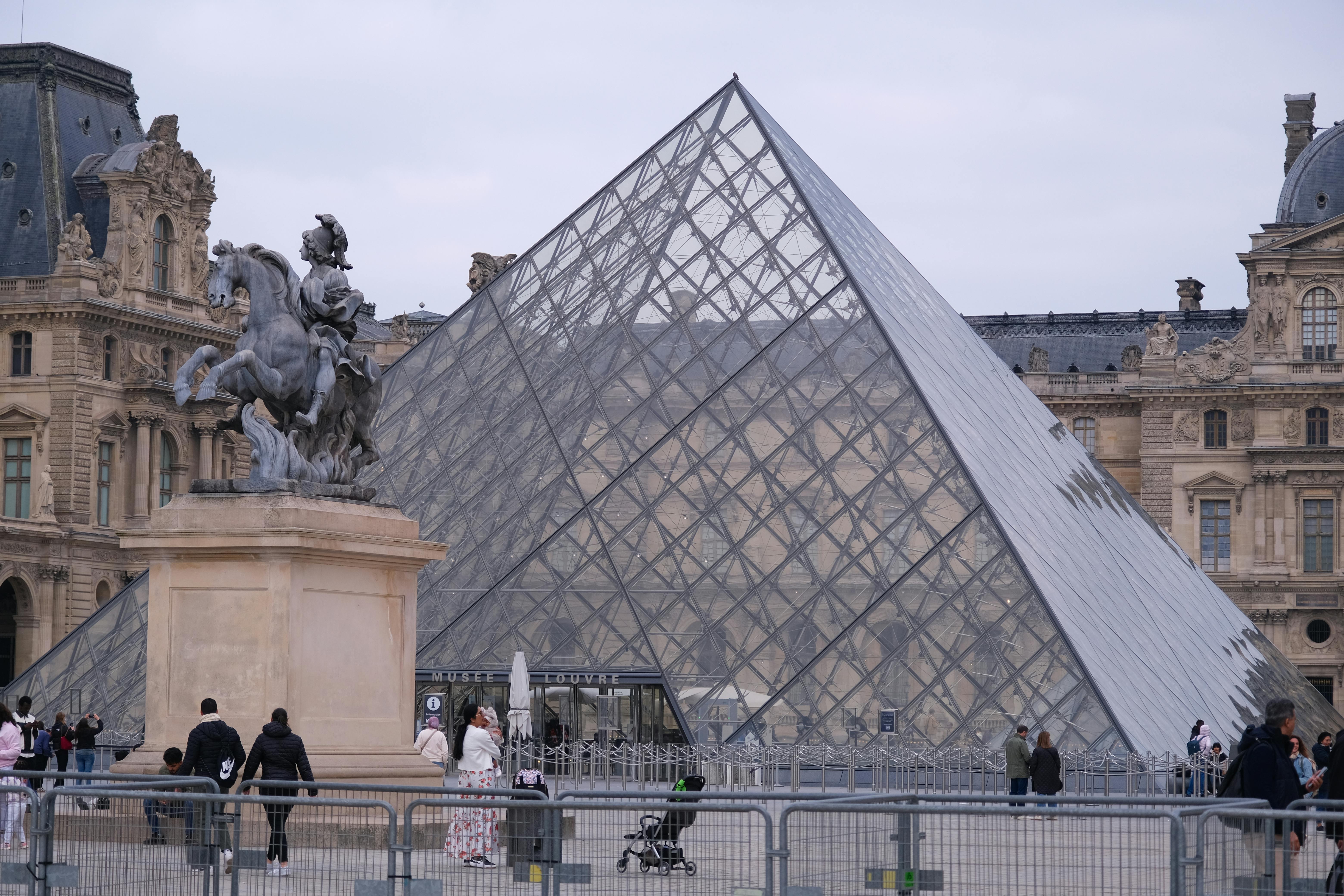 [credit](https://images.pexels.com/photos/34446308/pexels-photo-34446308/free-photo-of-iconic-louvre-pyramid-and-statue-in-paris.jpeg), [licence](https://creativecommons.org/public-domain/) ### Beyond Retail: Finding Art That Finds You The best pieces in your home will rarely come from a store with a massive "HOME DECOR" sign out front. They find you in the most unexpected places. They're the pieces you have a relationship with before you even own them. Here's where to look, once you start training your eye to see beyond the obvious: - **Artist Markets and Student Shows:** There's an incredible energy in emerging artists' work. You can often meet the creator, hear the story behind the piece, and take home something truly unique for a fraction of what it might cost in a gallery years later. - **Estate Sales and Flea Markets:** This is where you find the layers of history that make a home feel deep. An old botanical print with foxing on the edges, a faded map, a vintage travel poster—these pieces carry the patina of other lives, other stories, and they bring that richness into your home. - **Your Own Lens:** We all carry powerful cameras in our pockets. Don't underestimate the power of your own photography. A photograph you took, of a place that means something to you, printed large and well-framed, has a power that no stock image can ever replicate. It's not just a picture of a mountain; it's a record of the hike, the wind, the feeling of that specific moment in time. - **The Imperfect Object:** Sometimes, the most beloved thing on your wall won't even be "art" in the traditional sense. It's a perfectly imperfect piece of driftwood, a collection of sea glass arranged in a shadow box, a child's drawing saved from the recycling bin and given a place of honor. These objects celebrate the beauty of the un-designed, the serendipitous find. They ground your carefully curated space in the messy, beautiful reality of lived experience.  [credit](https://upload.wikimedia.org/wikipedia/commons/3/3c/Burlington_House%2C_Piccadilly_-_DSC04254.jpg), [licence](https://creativecommons.org/licenses/by-sa/3.0) I have a rule in my own home: if I don't love it, it doesn't go on the wall. That simple filter is the most powerful design tool you have. ### Mixing and Matching: The Art of the Eclectic Now, what if your taste is gloriously all over the place? What if you love minimalist Japanese prints *and* ornate Baroque portraits *and* mid-century modern abstracts? Conventional wisdom would tell you to pick a lane. I'm here to tell you that the friction between disparate styles is where the real magic happens. The key to making an eclectic collection sing isn't to force it all to match, but to find the hidden threads that connect them. Think of your wall is a conversation between strangers who discover they have a surprising amount in common. Look for connections in unexpected places: - **Color as the Unifier:** A muted, earthy tone in a contemporary abstract might be the exact match for the background of a 17th-century Dutch [still life](/finder/page/what-is-a-still-life). Suddenly, 400 years of art history collapses, and the two pieces are in perfect harmony. - **Mood as the Bridge:** Perhaps that stark black-and-white photograph and that chaotic, expressive abstract painting share a common feeling of intensity. When you group pieces by emotional resonance rather than by period or style, you create a much more interesting dialogue. - **Subject as the Story:** A collection of portraits—regardless of whether they're modern illustrations, vintage photographs, or classical paintings—will always have something to say to each other. They're all explorations of the human face, of expression, of identity. - **Frame as the Translator:** Sometimes, the frame is the secret weapon. Putting wildly different artworks into identical, simple black frames can immediately make them feel like a curated set. The uniform frame acts as a neutral container, allowing the content's hidden connections to emerge. The risk, of course, is visual chaos—a room that feels like a flea market stall after an earthquake. The antidote is restraint and balance. Don't just throw everything up there at once. Introduce pieces slowly. See how they talk to each other. You might find that an ornate, gilded mirror is the perfect counterpoint to a sleek modern sculpture, precisely because they're so different. It's about creating tension, not just noise. ### The Evolution of a Wall: Letting Go and Moving On One of the biggest fears that keeps walls blank is the fear of permanence. What if I hang this and then get tired of it? What if my style changes? My radical suggestion: your style *should* change. It's a sign you're alive, that you're growing, that you're seeing the world with fresh eyes. Think of your wall not as a permanent installation, but as a rotating gallery exhibit. The pieces you hung five years ago were right for the person you were then. The person you are now might need a different story on that wall. This is a beautiful thing, not a design failure. Give yourself permission to edit, to re-arrange, to take things down and put new things up. The wall of my own home is constantly in flux. I'll wake up one morning, look at a piece I've loved for years, and suddenly know it's time for it to go. Maybe I'll put it away for a while, only to rediscover it years later and fall in love all over again. Maybe I'll pass it on to a friend who needs it more. This fluid approach changes the stakes of every decision. You're not committing to a piece for a lifetime; you're just inviting it into your home for a chapter. A [blank wall](/finder/page/how-to-arrange-pictures-on-a-wall) is intimidating because it feels like a final exam. But if you reframe it as a daily journal entry, a space to work out your thoughts and feelings in real time, it becomes an invitation to play, to experiment, and to be honest about who you are right now. ## Common Mistakes and How to Avoid Them (The Wall Decor Hall of Shame) Let's learn from the mistakes we've all made. This is the wall decor hall of shame, a collection of the most common pitfalls and how to gracefully sidestep them. Consider it a cheat sheet for avoiding the obvious errors that can make even the most expensive art look out of place.  [credit](https://upload.wikimedia.org/wikipedia/commons/d/d1/Front_Fa%C3%A7ade_of_the_Centre_Pompidou_6.jpg), [licence](https://creativecommons.org/licenses/by-sa/4.0) - **The Floating Headache:** Hanging a small picture on a [large wall](/finder/page/how-to-decorate-a-large-wall), leaving vast oceans of space around it. It looks scared and lonely. *The Fix:* Group smaller items together to create a larger visual mass with a [gallery wall](/finder/page/what-is-a-gallery-wall), or choose art that's appropriately scaled for the wall. - **The Ceiling Scraper:** Art hung so high you need a ladder to appreciate it. It disconnects the art from the room, making it feel adrift. *The Fix:* The 57-inch center rule. Stick to it unless you're hanging over furniture. - **The Furniture Nosedive:** Leaving a massive, awkward gap between the art and the sofa underneath. *The Fix:* Hang it 6-12 inches above the furniture to create a single, unified look. - **The Mismatched Family:** A gallery wall where nothing relates to anything else—different colors, different styles, different frames, all fighting for attention. *The Fix:* Find a unifying element. It could be a dominant color that shows up in every piece, a consistent frame style (e.g., all black frames, or all natural wood), or a strong theme. - **The Perfectionist's Prison:** Being so afraid of making a mistake that you never hang anything at all. *The Fix:* Remember, it's just a wall. Holes can be filled. Use the [paper template](/finder/page/paper-template-usage) method to build confidence. Be brave and start. Adopt the mindset of a "rotating exhibit." It's not permanent. It's just what's on the wall *today*. ## Key Considerations Before Your Hammer Swings Here’s a quick mental checklist to run through before you commit to a plan. This is the moment for a reality check, a brief pause to consider the environment your art will be living in. It’s about thinking like a curator, not just a decorator, and understanding the interplay between art, wall, and the world around it.  [credit](https://images.pexels.com/photos/2962140/pexels-photo-2962140.jpeg), [licence](https://creativecommons.org/public-domain/) - **Lighting:** How is the wall lit? Is there a lot of direct, harsh sunlight that will fade that beautiful print over time? Is it a dark corner that needs bright, bold colors to come alive? Consider installing picture lights to highlight a prized piece like a spotlight in a theater. - **Room Flow:** How do people move through the room? Make sure a large piece of art or a protruding frame won't become a head-bumping hazard. An artwork should invite people in, not force them to duck. - **Architectural Features:** Eyesores like thermostats, light switches, or vents don't have to be enemies. You can work around them, frame them, or even hide them. Consider a well-placed frame that can cover a switch, or incorporate the vent into your gallery wall layout for a bit of playful surprise. - **Climate Control:** If you live in a very humid environment, make sure your framed art is properly sealed to prevent mold or warping. Original art, in particular, needs a stable environment. Think of it as creating a mini-museum for your treasured pieces. ## The Living Wall: Beyond the Final Nail A wall is never really "finished." Not in the way a piece of furniture is, or a coat of paint. A truly great wall is a living thing. It breathes. It changes. It reflects who you are today, not who you were when you first hung that picture five years ago. It's a living record of your life, your travels, and your changing eye. The final image I want to leave you with is not of a perfectly curated, static wall in a magazine. It's the image of a wall in flux. It's a wall with a fresh nail hole next to a picture that's been there for years. It's a wall with a blank spot where a piece used to be, a pause waiting to be filled by the next discovery. It's a wall where a child's crayon drawing is hung with the same reverence as a fine art print. This is the wall of a life being lived, not just a home being decorated. That big, blank wall isn't waiting to be defeated. It's waiting to be activated. It's an invitation to make a statement, to tell a story, to express a piece of who you are. So let's step away from the idea that we need to "solve" the problem of an empty wall. Let's instead see it as the beginning of a great conversation.  [credit](https://images.pexels.com/photos/8037022/pexels-photo-8037022.jpeg), [licence](https://creativecommons.org/public-domain/) A finished wall is a happy wall, but more importantly, a *curated* wall is a reflection of a curious mind and a life lived with intention. The goal has never been to just fill the space, but to give it meaning, to create a dialogue between the art, the room, and you. Start with a feeling. Find a piece that speaks to you. Don't worry about the rules too much. The best walls, like the best conversations, are the ones that are authentic, a little bit unpredictable, and brimming with life.  [credit](https://live.staticflickr.com/139/318065672_57cfb7dcc6_b.jpg), [licence](https://creativecommons.org/licenses/by/2.0/) ## Frequently Asked Questions (FAQ) Here are some of the most common questions I get about tackling those daunting blank walls. If you have a question that isn't answered here, it's probably because it's a sign that you're overthinking it. Trust your gut, start hanging, and see what happens. **I love art, but I'm on a tight budget. How can I create a stunning gallery wall without spending a fortune?** This is a fantastic challenge because it forces creativity. First, reframe "budget" as "curated." Start hunting. Explore thrift stores, flea markets, and estate sales for unique frames and vintage prints. A good frame can make almost anything look intentional. Second, think beyond traditional art. Frame pages from beautiful old books, vintage sheet music, or even a piece of stunning fabric. Artist postcards or high-quality prints from museums are incredibly affordable. Third, use your own photographs. A single, well-composed photo, printed large and simply framed, can have the impact of a much more expensive piece. Fourth, embrace the power of a few smaller, high-impact pieces rather than trying to cover the whole wall at once. A single, powerful small piece surrounded by thoughtful negative space is infinitely better than a wall of mediocre mass-produced prints. I once created a whole wall using nothing but beautifully typeset quotes I found and loved, printed on heavy cardstock. It was personal, chic, and cost next to nothing. When you start thinking like this, the "value" of the art becomes untethered from its price tag. A piece you found for a dollar, that reminds you of a specific moment in time, is infinitely more valuable on your wall than a generic, expensive canvas that has no personal meaning. It becomes less about what you can afford to buy, and more about what you're clever enough to see the potential in. **How do I incorporate family photos into a gallery wall without it looking messy or dated?** Ah, the family photo dilemma. The key is cohesion. The chaos of mismatched frames and colors is what often makes a photo wall feel dated, not the photos themselves. Here are a few strategies. The "Unified Frame" approach: Put every single photo in the exact same frame (e.g., all thin black frames, all natural wood, or all white). This immediately makes a collection of different images feel like a single, curated statement. The "Color Coordination" approach: Convert all your photos to black and white. This eliminates the visual chaos of different lighting and color palettes. The "Artistic Placement" approach: Mix one or two special photos in with your existing art collection, treating the photo not as a sentimental object but as an art piece in its own right. Mat it beautifully and frame it identically to the art around it. The "Designed Zone" approach: Carve out a specific section of the wall—perhaps even a picture ledge—just for family photos, keeping your "fine art" gallery wall separate. This respects both the sentimental and the aesthetic needs of your space. 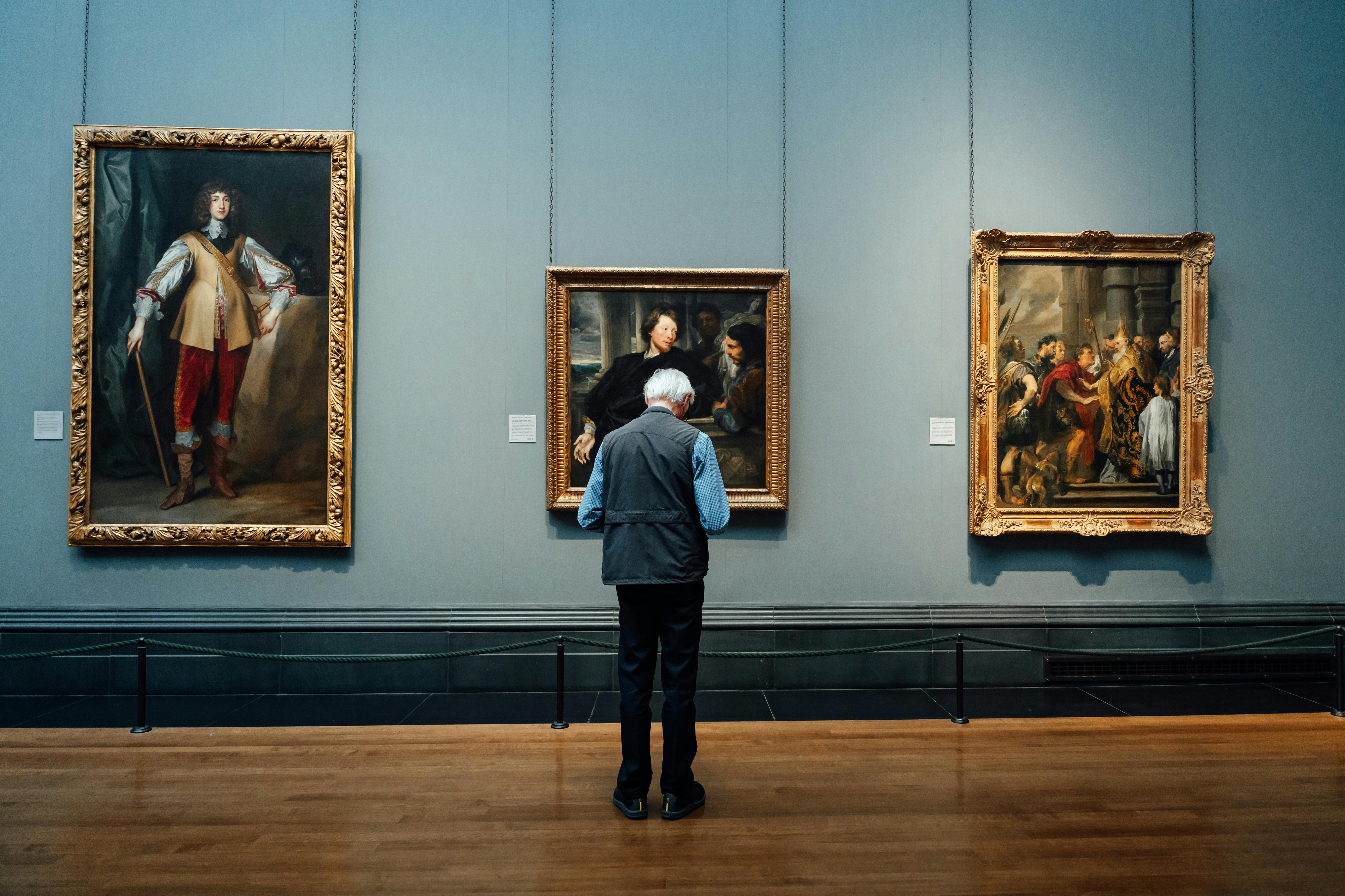 [credit](https://images.pexels.com/photos/30489691/pexels-photo-30489691.jpeg?cs=srgb&dl=pexels-mikegles-30489691.jpg&fm=jpg), [licence](https://creativecommons.org/public-domain/) **I have a huge wall. Should I go with one big piece or a gallery wall?** There's no right or wrong answer, only a right-for-you answer. A single large statement piece offers clarity, focus, and a sense of calm. It's a bold, confident choice. A gallery wall offers personality, narrative, and a collected-over-time feel. Think about the energy you want in the room: do you want focused serenity or energetic conversation? **How do I choose the right size art for my wall?** A good starting point is the 60-80% rule: have the art occupy roughly 60-80% of the wall's width. This gives it enough presence without overwhelming the space. But the most important factor is its relationship to nearby furniture—make sure it's scaled to the sofa or console below it. **How high should I hang my artwork?** The general rule is to hang art so that the vertical center of the piece is 57 to 60 inches from the floor, roughly at eye level. This isn't just a random number; it's the average sightline for most adults, creating an immediate and comfortable connection. If you're hanging it over a piece of furniture, the bottom of the frame should be just 6 to 12 inches above it to create a cohesive look. This visually "ties" the art to the furniture, making them feel like a single, intentional unit. **I'm terrified of putting holes in my wall. Any tips?** Use the [paper template](/finder/page/paper-template-usage) method! Arrange your frames on the floor first. Then, trace each frame onto kraft paper, cut the templates out, and tape them to the wall with painter's tape. This lets you rearrange and visualize the final look without any commitment. When you love the arrangement, you can hammer your nail right through the paper. **What if my gallery wall looks like a mismatched mess?** This usually happens when there's no unifying element. An eclectic mix can look intentional or chaotic, and the difference is often a single, organizing principle. Look for a common thread. Can all your frames be the same color? A consistent 2-3 inch gap between all frames can also work wonders. Is there a single color that appears in every piece of art, creating a subtle rhythm? Or maybe all the items share a similar theme, like travel or portraits. A little bit of visual consistency goes a long way toward making a collection feel curated rather than accidental. **Can I mix different art styles, like a modern [abstract piece](/finder/page/case-study-transforming-a-small-dark-hallway-with-a-vibrant-abstract-piece) with a traditional painting?** Yes! This is an advanced move, but it can create the most interesting walls. The juxtaposition of different styles creates a dialogue and shows a more complex, evolved taste. The goal is to create an ensemble cast rather than a chorus line. The key is to find a subtle connection—a similar color palette, a shared mood, or even just the way the frames interact. A sleek [black frame](/finder/page/how-to-choose-a-frame-for-abstract-art) on a modern piece can create a surprising harmony with an ornate gold frame on a classical portrait. It's about seeing the family resemblances, even if they're distant cousins. This approach shows that you understand that all art, regardless of its era or style, is part of one long, continuous human conversation. **How much space should I leave between frames in a gallery wall?** Consistency is key, but it doesn't have to be a prison sentence. Think of the space between your frames as the "pauses" in a piece of music—they give the individual notes (your artworks) room to be heard. Choose a spacing (most people find 2 to 3 inches works well) and use it as a general guide. This creates a rhythmic "buffer" of wall space that makes the whole arrangement feel intentional, even if the frames and art are all different. But allow yourself some flexibility. If a slightly wider gap feels right between two intense or visually "loud" pieces to give them breathing room, go for it. The goal is balance and rhythm, not rigid uniformity. **Is it okay to hang plates or other objects on the wall?** Absolutely. Incorporating three-dimensional objects, textiles, mirrors, or even interesting books on shelves adds depth and texture. It shows that you're thinking beyond the flat plane and considering the entire wall as a canvas for your personality.