Finding the Perfect Watercolor Sketchbook: An Artist's Guide
Stop your watercolor paper from buckling. I'm sharing my hard-won lessons on paper weight, cotton vs. cellulose, and texture to help you find the perfect sketchbook for your art.
# The Search for the Perfect Watercolor Sketchbook: An Artist's Honest Guide
I remember it vividly. I was sitting at a cafe in a sun-drenched European square, trying to capture the incredible tilework on a fountain. The light was perfect. My espresso was perfect. My subject was perfect. My [sketchbook](/finder/page/best-sketchbook-for-beginners), however, was a disaster. With every wash of color, the paper buckled into a tiny mountain range, turning my beautiful scene into a pulpy, frustrating mess. It was an absolute travesty, paint refusing to blend, colors sinking, and a general air of artistic defeat. That was the day I stopped thinking of a good watercolor sketchbook as a luxury and started treating it as a non-negotiable tool, a foundational pillar of my practice. It was a revelation – the tools weren't just secondary to the vision; they were integral, a silent partner in every brushstroke, subtly guiding my hand and allowing the true essence of the pigments to emerge. This isn't just about finding paper that tolerates water; it's about discovering a surface that actively enhances your technique, bringing forth luminous washes and vibrant colors you might not have thought possible. It's about empowering your creativity. It’s about building a relationship with your materials, a silent understanding that allows your creative spirit to soar without being held back by technical frustrations.
If you're here, you've probably felt that pain. You've seen your colors get muddy, the paper pill up, or your pages warp beyond recognition. You've fought with your materials more than you've flowed with your creativity. It's not you; it's the paper. Or, more accurately, it's the *wrong* paper. We're on a quest together, you and I, to find that elusive perfect partner for your watercolor adventures. This guide isn't just about avoiding frustration; it's about unlocking new possibilities in your art, about letting the paint sing instead of sink, about truly experiencing the medium as it's meant to be. This is the definitive guide to understanding every nuanced aspect of a watercolor sketchbook, designed to arm you with the knowledge to make an informed choice that will genuinely transform your artistic practice. Let's dive in. I’ll share what I’ve learned, often the hard way, so you don’t have to. This article isn't just a review; it's a deep dive into the very soul of [watercolor paper](/finder/page/watercolor-paper-hot-press-vs-cold-press), born from my own journey through countless disappointing sketchbooks to discover the truly exceptional ones.
## Why Your Watercolor Sketchbook Matters More Than You Think
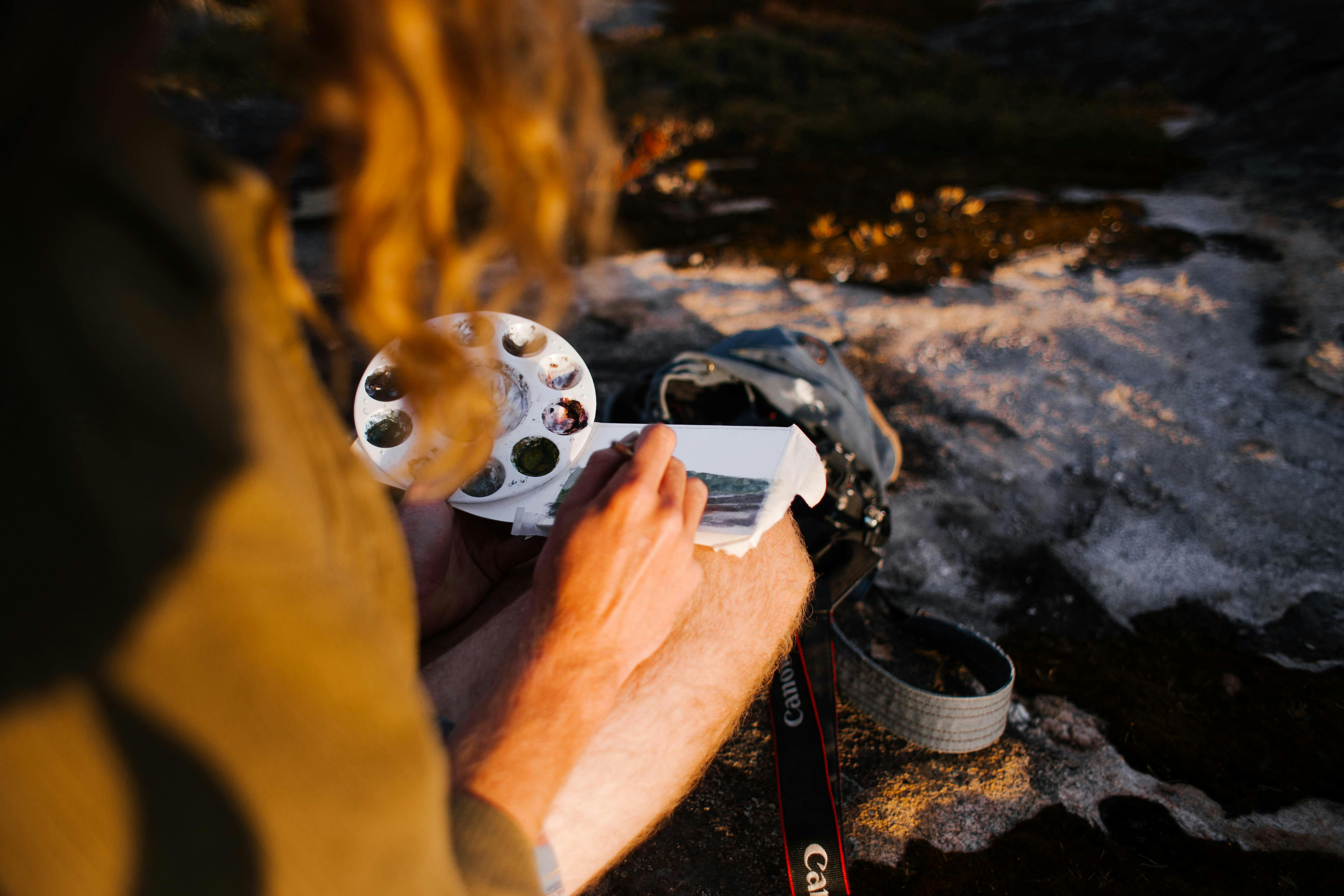
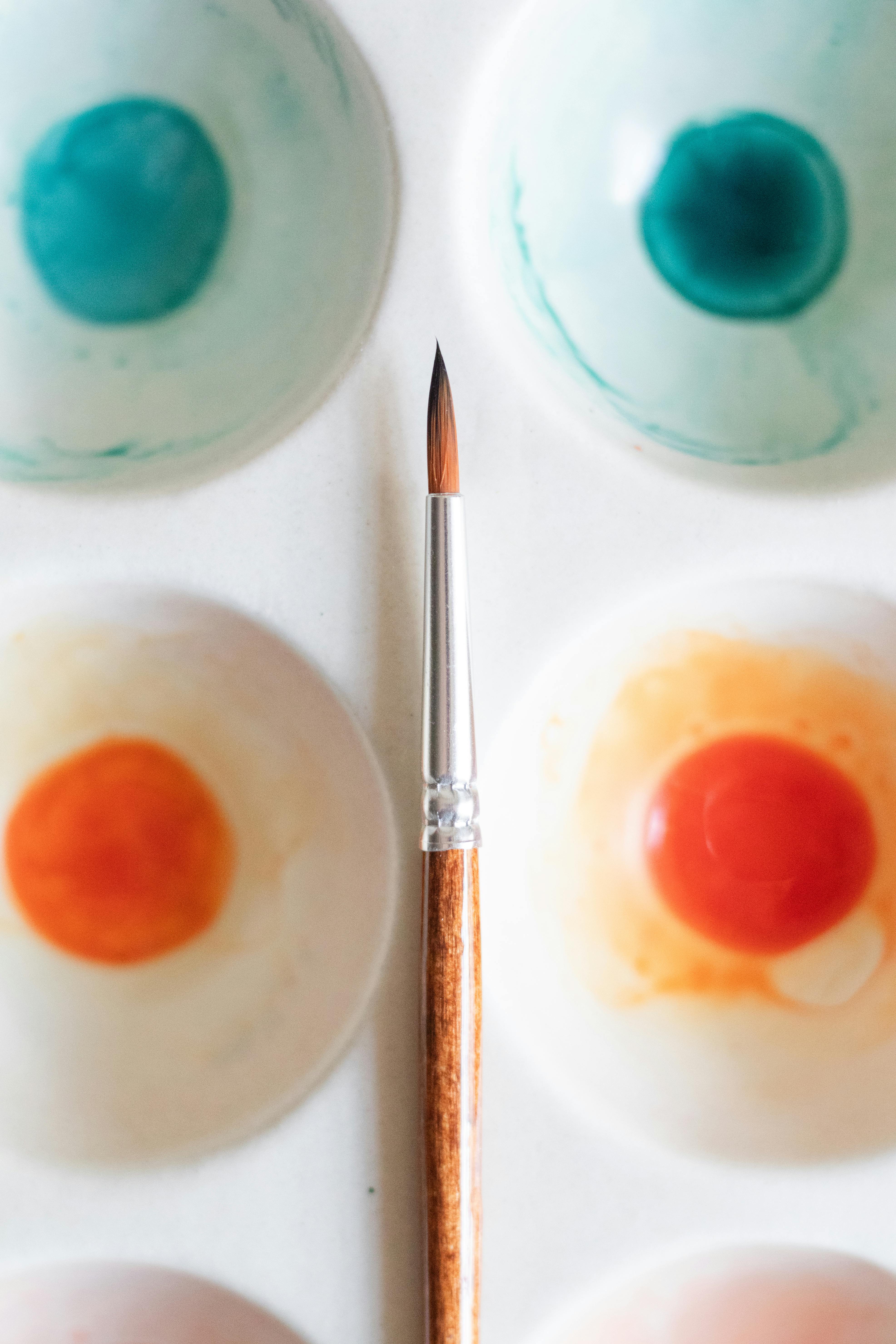
Watercolor is a demanding medium. It's all about water control, and most sketchbooks are designed for dry media like pencils or ink. They just can't handle the moisture. Using the wrong sketchbook for watercolor is like trying to serve soup on a paper towel—it's destined for spectacular, messy failure. And trust me, I've served a lot of soup on paper towels in my [artistic journey](/finder/page/my-artistic-journey:-from-early-explorations-to-embracing-abstract-expression). The paper will warp, your pigments will look dull, and you'll find yourself fighting the material instead of collaborating with it. It’s a battle you just won't win. This persistent struggle with inadequate paper can stifle your creative development and diminish your confidence. You're constantly compensating for the paper's deficiencies, which steals focus from learning techniques and developing your unique [artistic voice](/finder/page/finding-artistic-voice-unexpected-places). I've been there, thinking it was *my* lack of skill, when in reality, my tools were letting me down. This isn't just about saving your art; it's about saving your artistic spirit, fostering an environment where curiosity and experimentation can flourish rather than wither. Investing in the right tools is investing in your growth as an artist. A truly frustrating experience can manifest as **pilling** (where the paper fibers rub up into little balls), **buckling** (severe warping that creates uneven surfaces), and **muddy colors** (due to uneven absorption and pigments sitting lifelessly). These aren't minor inconveniences; they are fundamental roadblocks to developing your skills and enjoying the medium.
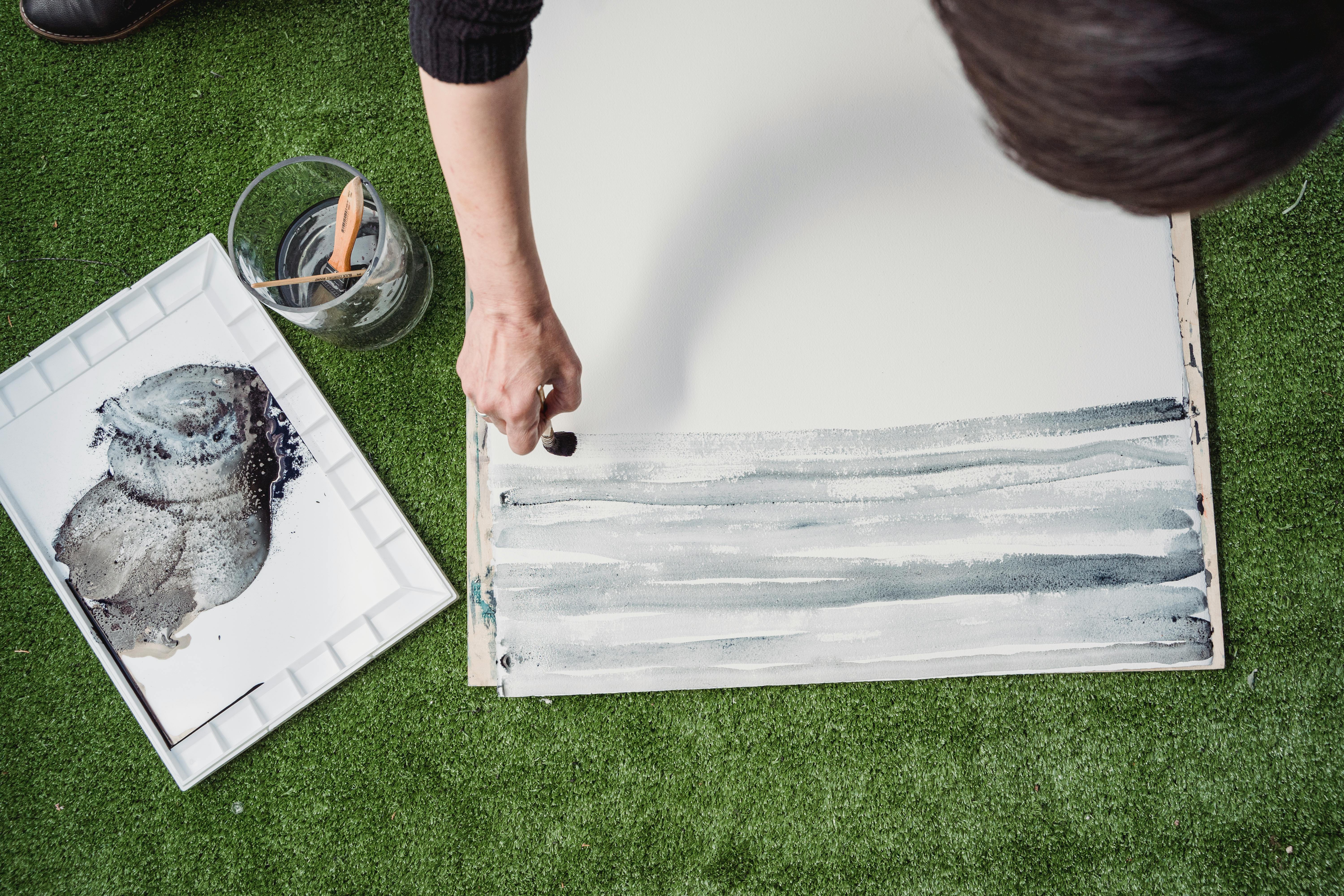
[credit](https://images.pexels.com/photos/7859311/pexels-photo-7859311.jpeg),
[licence](https://creativecommons.org/public-domain/)
At a fundamental level, the paper's structure and chemical treatment dictate how water and pigment interact. Think of it as the canvas's handshake with your paint. A well-designed watercolor paper performs a delicate dance: it absorbs moisture slowly and evenly, allowing pigments to spread beautifully, preventing those dreaded hard edges and muddy puddles that plague lesser papers. This subtle but profound interaction, governed by the paper's fibers and crucial internal and external sizing, is truly what makes it a silent collaborator in every wash. It’s about the **capillary action**, the way water is drawn into and held by the paper, allowing pigments to settle gracefully and evenly, rather than soaking in unpredictably or sitting lifelessly on the surface. This delicate balance provides you with the control necessary for luminous glazes and soft transitions. Without this intricate dance, achieving smooth **glazes**, vibrant **wet-on-wet** effects, or clean **lifting** of color becomes a constant uphill battle.
Here’s a quick breakdown of the core differences, because understanding these can save you a world of heartache (and wasted paint):
| Feature | Standard [Drawing](/finder/page/definitive-guide-to-drawing-techniques) Sketchbook | Watercolor Sketchbook |
| :--- | :--- | :--- |
| **[Paper Weight](/finder/page/choosing-the-right-paper-for-your-art-medium)** | Light (60-80 lb / 90-120 gsm) | Heavy (140 lb / 300 gsm or more) |
| **Material** | Usually wood pulp (cellulose) | Often 100% cotton for best results |
| **Sizing** | Minimal or none | Heavy internal/external sizing to control water absorption |
| **Durability** | Prone to pilling and tearing when wet | Designed to withstand scrubbing, lifting, and multiple layers |
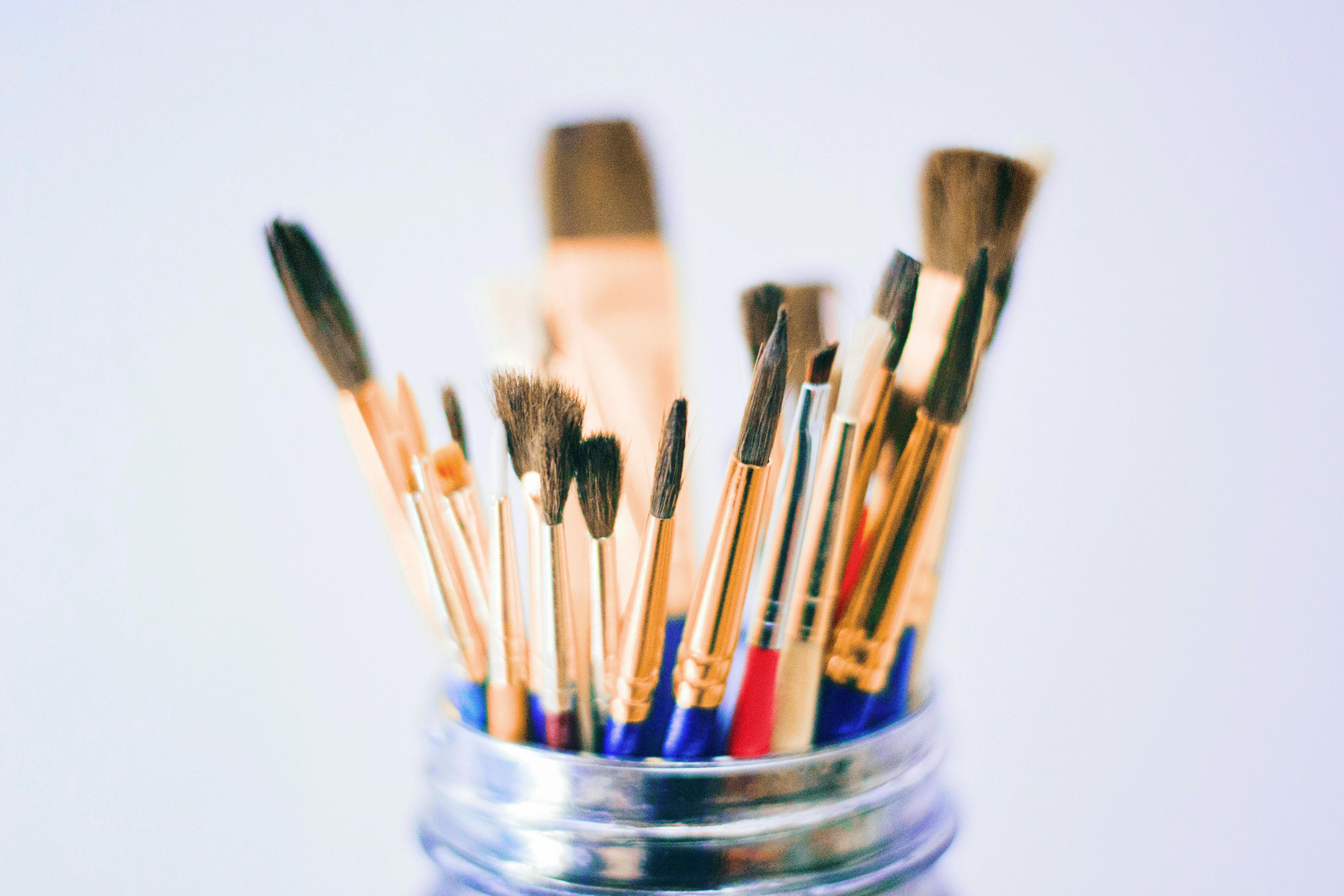
Think of it this way: your sketchbook isn't just a container for your art; it's the foundation. A weak foundation will crumble, no matter how beautiful the structure you try to build on it. It’s like trying to build a castle on sand; it might look good for a moment, but it won't last, and every wave of water will bring it crashing down. Investing in the right tools is investing in your growth as an artist, freeing you to explore the full spectrum of watercolor possibilities.
[credit](https://images.pexels.com/photos/8467263/pexels-photo-8467263.jpeg),
[licence](https://creativecommons.org/public-domain/)
## Decoding the Lingo: What to Actually Look For
Shopping for a watercolor sketchbook can feel like you need a degree in paper science. All the jargon, the numbers, the types – it's enough to make you just grab the cheapest thing off the shelf. But resist that urge! This isn't about memorizing obscure terms; it's about understanding the fundamental properties that dictate your painting experience. Let's cut through the noise and demystify the core characteristics. Here are the only five things you really need to understand to choose wisely, because once you grasp these, the world of watercolor paper opens up and you gain a genuine sense of control over your [creative process](/finder/page/my-creative-process-sketchbook-to-canvas). It’s like learning the secret language of your materials, and believe me, they have a lot to say.
[credit](https://images.pexels.com/photos/6925017/pexels-photo-6925017.jpeg),
[licence](https://creativecommons.org/public-domain/)
### 1. Paper Weight (GSM or lb)
This is the big one. Paper weight is a measure of its density and thickness, often expressed in **grams per square meter (gsm)** or **pounds (lb)**. The higher the number, the heavier and thicker the paper, and the more water it can handle without buckling, warping, or pilling. Think of it as the paper's resilience; heavier paper simply has more material to absorb moisture without collapsing. It’s the first indicator of how much punishment your paper can take before it starts to protest.
[credit](https://upload.wikimedia.org/wikipedia/commons/b/b3/Monoprint_with_leaves.jpg),
[licence](https://creativecommons.org/licenses/by/4.0)
- **Lightweight (<140 lb / 300 gsm):** I'd generally avoid this for anything more than a single, very light wash or quick, dry color studies. It will buckle significantly, and you'll often find yourself fighting against its instability rather than creating. While it's great for pencil sketches, maybe a touch of ink, or very minimal gouache swatches, it's definitely not for serious watercolor paintings where layering or wet-on-wet techniques are involved. You might get away with a single, very dry layer, but any attempt at building up washes will result in a frustrating wavy mess, often leading to patchy color and damaged paper fibers. Imagine trying to paint a soft gradient on a tissue—it’s just not going to happen. This paper is best reserved for quick pencil sketches, very, very light ink work, or low-stakes color explorations where moisture isn't a primary factor and frustration is acceptable. On paper this thin, achieving smooth washes is nearly impossible, as the water absorbs too quickly and unevenly, leading to tell-tale hard edges and blotchy areas. It’s the paper equivalent of trying to drive a sports car on a dirt road – you’re not going to get the performance you expect.
- **Intermediate-weight (90-120 lb / 190-250 gsm):** This is a step up from lightweight but still quite prone to buckling with heavy washes, particularly if you're layering. It can be a decent option for very quick, expressive studies, dry-brush techniques, ink and wash where ink dominates, or if you're working with minimal water and precise control. It's often a good choice for sketchbooks marketed as "[mixed media](/finder/page/the-definitive-guide-to-mixed-media-in-abstract-art-techniques-materials-and-contemporary-masters)" that aren't specifically for watercolor, offering a usable surface for light applications but don't expect miracles. While it tolerates *some* moisture, it's a tightrope walk; too much water and you'll still see noticeable buckling, uneven absorption, and a struggle to lift color or make corrections without damaging the surface, leading to pilling. It's a compromise, really, for those who dabble in watercolor but don't want to commit fully to the expense of heavier papers, making it suitable for casual practice but not for archival work. If you choose this weight, you might want to consider **stretching your paper** beforehand to minimize warping, a technique I often use for loose sheets where I anticipate heavy washes.
- **Mid-weight (140 lb / 300 gsm):** This is the sweet spot, the reliable friend you can always count on. It's the standard for most watercolor blocks and sketchbooks because it strikes a good balance between cost, stability, and absorbency. It can handle a good amount of water and is sturdy enough for most techniques, from light washes to moderate layering. This is where you start to feel like the paper is working *with* you, not against you. It has enough heft to absorb and hold water without immediate warping, giving you precious seconds (or even minutes, depending on the sizing) to manipulate your paint, blend colors, and achieve those luminous washes we all crave. This weight truly unlocks the joy of watercolor.
- **Heavyweight (>140 lb / 300 gsm):** This is the luxury stuff, almost like working on a board. Paper this heavy is incredibly stable and won't buckle even under the heaviest washes, offering a truly flat surface for your masterpieces. Think of it as painting on a rigid surface. The downside? It's often more expensive and certainly more bulky to carry around, making it less ideal for casual travel sketching, but fantastic for studio work where stability is paramount. For larger format works, or if you're layering many glazes, this paper provides an unparalleled sense of security and control, making it a favorite for professional artists tackling ambitious pieces.
My advice? Start with **140 lb / 300 gsm**. It's the reliable workhorse for a reason, and you'll quickly understand why it's a fan favorite. It's forgiving enough for practice but capable enough for finished pieces. This weight generally doesn't require pre-stretching if you're working in a sketchbook, which is a huge time-saver. It just *works*, allowing you to focus on the art, not the material.

[credit](https://www.pexels.com/photo/creative-art-studio-with-brushes-and-paints-29589096/),
[licence](https://creativecommons.org/public-domain/)
### 2. Paper Material: Cotton vs. Cellulose
This is where the magic happens, or sometimes, where the frustration starts. Paper is made of fibers, and the type of fiber determines how the paper behaves with water and pigment. It’s the very soul of your sketchbook, in a way. The choice between cotton and cellulose profoundly impacts how your paints flow, blend, and even how vibrant they appear on the page. Understanding this distinction is key to unlocking the true potential of your watercolors. The journey of these fibers, from plant to paper, is a fascinating aspect that directly translates to your painting experience. Beyond these two, you might occasionally encounter papers made from **linen** (known for extreme strength and longevity, but rare and expensive) or **bamboo/hemp** (eco-friendly alternatives with unique absorbency properties that are still being refined for artist-grade watercolor use).
- **Cellulose (Wood Pulp):** This is what most standard papers are made of. It's affordable and absolutely fine for practice or if you're just starting and don't want to invest heavily, especially for quick studies or preparatory sketches. However, water tends to sit more on the surface due to different fiber structure and less sophisticated sizing, which means colors can look less vibrant and blend less smoothly, often resulting in blotchy washes or hard edges. The fibers are shorter and weaker, making the paper inherently less durable under the stress of moisture and friction. This means scrubbing, lifting color (which is often difficult to achieve cleanly), or even just repeated brushstrokes can quickly lead to **pilling** (where the paper fibers start to rub up into little balls), leaving a fuzzy, damaged surface that refuses to take more paint and impacts the smooth flow of color. It's a fine entry point, but it will eventually limit your techniques and the [archival quality](/finder/page/the-definitive-guide-to-archival-printmaking-techniques-understanding-gicle-lithography-and-more) of your work, as cellulose papers are more prone to yellowing and degradation over time unless specifically treated to be **acid-free**. If you’re using cellulose paper, look for that ‘acid-free’ label – it’s a non-negotiable for any work you hope to keep for more than a few years.
- **100% Cotton (Rag Paper):** This is the gold standard, the paper that truly sings when touched by water. Cotton fibers are significantly longer, stronger, and inherently more absorbent. They soak up water beautifully and evenly, allowing pigments to blend, flow, and bloom in that magical way unique to watercolor. It's incredibly strong, so you can 'abuse' it a bit—lifting (removing paint to create highlights or corrections), scrubbing, scratching (gently, of course!), and layering are all fair game without fear of damaging the surface or causing pilling. If you're serious about your work, or even just curious about what watercolor *can* truly do, investing in [cotton paper](/finder/page/best-watercolor-paper-for-artists-review) will change your life. The way colors interact, the depth and luminosity you can achieve, the ability to work wet-on-wet with remarkable control, and the seamless transitions you can create... it's a whole new world of artistic possibility. I go into more detail about this in my [review of the best watercolor papers](/finder/page/best-watercolor-paper-for-artists-review). Beyond its immediate performance, cotton paper is also inherently archival and naturally acid-free, meaning your artwork will retain its vibrancy and integrity for centuries, a silent testament to your creative efforts. It’s an investment in both your present enjoyment and your artistic future, ensuring your creative legacy endures. Think of it as the difference between a cheap fabric and a high-quality linen; one falls apart with wear, the other gets better with age.
| Feature | Cellulose (Wood Pulp) | 100% Cotton (Rag Paper) |
| :---------------- | :---------------------------------------- | :------------------------------------------------------- |
| **Fiber Length** | Shorter, weaker fibers | Longer, stronger fibers |
| **Manufacturing** | Chemically processed, often bleached | Less processing, retains natural fiber integrity |
| **Absorbency** | Less absorbent; water sits on surface | Highly absorbent; soaks up water evenly |
| **Blending** | Colors can look less vibrant, blend less smoothly | Allows for beautiful blending, flowing, and blooming effects |
| **Durability** | Prone to pilling, tearing, and damage when wet or scrubbed | Extremely strong, withstands scrubbing, lifting, and layering |
| **Lifting Color** | Difficult, often damages surface | Excellent; paint can be easily lifted or manipulated |
| **Vibrancy** | Colors can appear duller, less luminous | Colors appear more vibrant and luminous |
| **Longevity** | Can yellow over time (unless acid-free) | Naturally acid-free, highly archival |
| **Cost** | More affordable | More expensive, but a worthwhile investment |
### 3. Texture (Press)
Paper texture (often called 'tooth') profoundly affects how the paint settles, how colors blend, and ultimately, the final look and feel of your artwork. It's like the canvas for your pigments, offering different playgrounds for them to interact and dictating how much your brush 'drags' or 'glides'. Understanding these textures is key to controlling granulation, achieving fine details, or creating bold, expressive washes. Choosing the right texture can dramatically enhance your artistic intentions. I've seen artists transform their style simply by switching paper textures, finding a new resonance with their chosen medium. It’s a subtle thing, but the way light catches the peaks and valleys of a textured paper can add an incredible dimension to your [finished piece](/finder/page/how-to-know-when-an-artwork-is-finished), almost like an invisible collaborator in your composition.
[credit](https://images.pexels.com/photos/7263852/pexels-photo-7263852.jpeg),
[licence](https://creativecommons.org/public-domain/)
| Texture | Description | Best For... | What to Expect |
| :--- | :--- | :--- | :--- |
| **Cold Press** | Has a noticeable texture or 'tooth', a slight bumpiness created by felt blankets during manufacturing. It's the most common and versatile, much like a good all-rounder friend. | General use, expressive paintings, granulation effects (where pigment settles into valleys), and for when you want a versatile surface that accepts most techniques. Ideal for artists who enjoy a slight tactile resistance from their brush. | Good water retention, easy lifting, and versatile for washes and details. The subtle texture helps "grab" the pigment, enhancing granulation and giving your work a distinct watercolor feel. It offers enough grip for dry brush effects but also allows for smooth washes. My personal go-to for daily sketching, as it's forgiving and adaptable for almost any subject. I've painted everything from a bustling market scene to a quiet [still life](/finder/page/what-is-a-still-life) on cold press, and it always delivers a satisfying experience, allowing for both precise lines and flowing washes without complaint. |
| **Hot Press** | Very smooth, almost like plate glass or a smooth illustration board. This finish is achieved by pressing the paper between hot metal rollers. Dries quickly, demanding swift execution. This rapid drying can be a double-edged sword: great for quick layering and preventing muddiness, but challenging for complex wet-on-wet blends that require longer working times. | Highly detailed work, botanical illustrations, ink and wash, [portraiture](/finder/page/definitive-guide-to-portraiture), and scanning your work (as it lacks texture that can interfere with digital reproduction). Excellent for crisp lines and fine details, making your colors appear brighter and more intense. Perfect for calligraphy or areas where smooth, even color is paramount. | Less absorbent than cold press, paint can slide more easily, requiring more water control and quicker execution, especially with wet-on-wet techniques. Colors appear brighter and more intense due to the smooth surface, as the pigment sits more on top rather than sinking into valleys. Lifting is easier due to less fiber grip, but the quick drying time means you have to work fast to avoid hard edges, truly testing your water control with wet-on-wet techniques. Ideal for precision, smooth, even glazes, and achieving a pristine finish. For those who love crisp edges and controlled blending, this is your surface. It's like painting on silk, demanding a delicate touch and swift decisions, but rewarding you with unparalleled smoothness. |
| **Rough** | Highly textured, with a pronounced, uneven surface, sometimes likened to a bumpy road. This texture is often created by using deeply textured felts or air-drying processes. It really grabs the pigment and creates a very expressive, almost gritty, broken-color look. | Loose landscapes, dramatic textural effects, [dry brushing](/finder/page/dry-brush-technique-acrylic-painting) (where the brush skims over the high points, leaving white specks), adding character to broad washes, and [abstract work](/finder/page/qa-with-an-art-insurance-specialist-protecting-your-abstract-art-collection). Think expressive, not precise, where the paper becomes an active participant in the artwork. | Dries slower, allowing more time for wet-on-wet techniques to bloom and spread. Pigment settles dramatically into valleys, creating prominent textural effects and enhancing granulation. While challenging for fine detail and smooth gradients, it's perfect for expressive, atmospheric pieces and dramatic dry brushing, where the rough surface really shines and adds immense character. When I want a landscape to feel raw and untamed, or an abstract piece to truly speak with texture, rough paper is my first choice, making the [paper itself](/finder/page/how-to-care-for-works-on-paper-a-collectors-guide) an active part of the composition. It's a surface for bold statements.
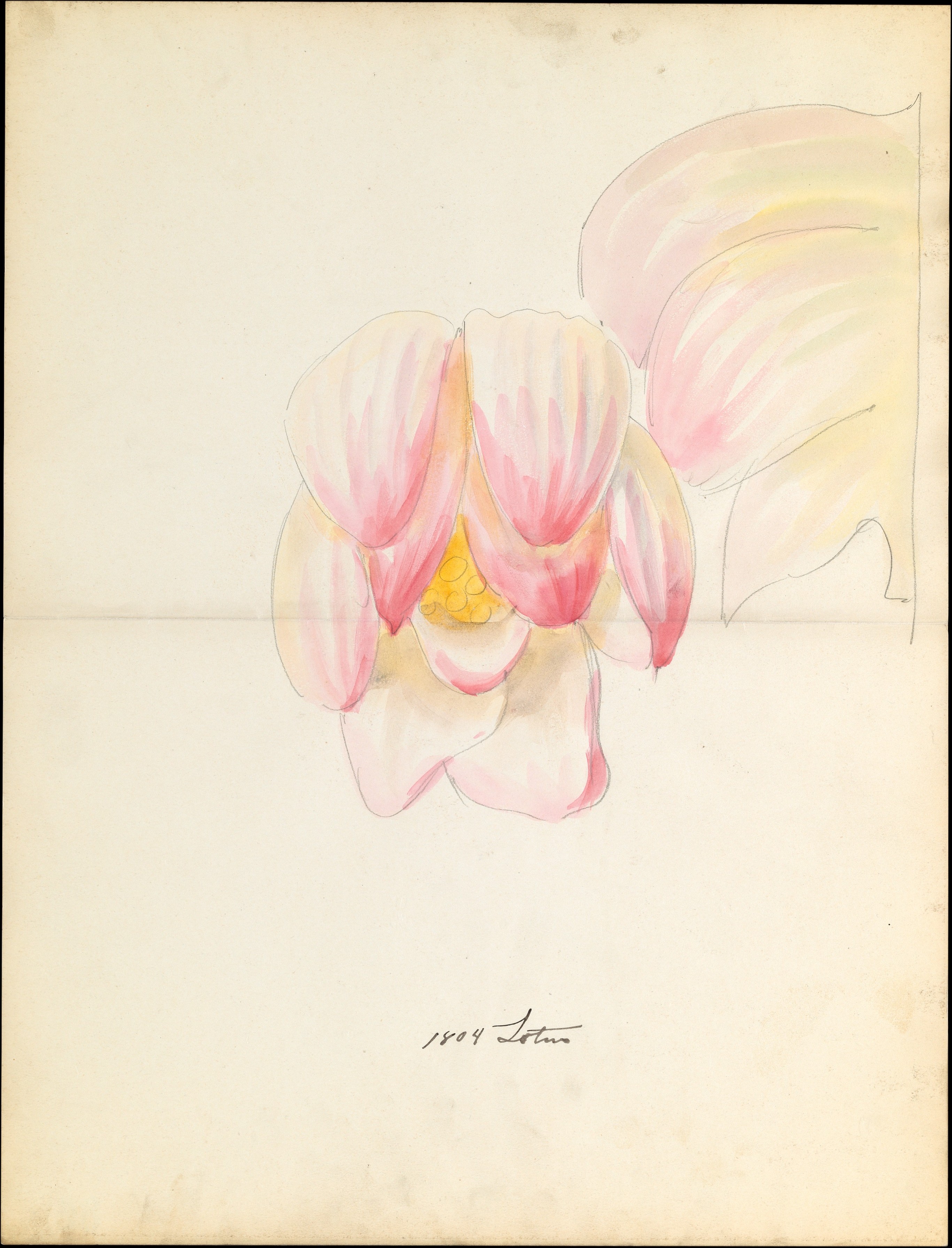
[credit](https://upload.wikimedia.org/wikipedia/commons/9/9e/Design_drawing_of_of_lotus_blossom_of_floral_capital_from_loggia%2C_Laurelton_Hall_MET_DP119414.jpg),
[licence](http://creativecommons.org/publicdomain/zero/1.0/deed.en)
If you’re just starting, go with **Cold Press**. It’s the most forgiving and adaptable, allowing you to explore various techniques without feeling constrained. It’s the Goldilocks of textures—just right for most situations and a superb foundation for learning. My own preference often shifts with the project, but cold press remains my steadfast companion. If I’m doing detailed botanical work, hot press is my absolute go-to, but for expressive urban scenes, cold press or even rough paper just *feels* right.
### 4. Binding: How It's Held Together
Don't forget the practicalities! A sketchbook needs to be functional, especially when you're out in the wild (or just on your couch). The binding determines how easily it lays flat and how durable it is. It's not just about aesthetics; it's about making your life easier when you're trying to capture a fleeting moment or immerse yourself in a lengthy study.
[credit](https://commons.wikimedia.org/wiki/File:Painter_David_Brewster_creating_work_for_the_Art_of_Action_project.jpg),
[licence](https://creativecommons.org/licenses/by/1.0)
- **Spiral Bound:** My absolute favorite for portability and ease of use. Lays perfectly flat, allowing you to work across two pages seamlessly without fighting a crease, which is invaluable for creating expansive compositions or continuous narratives. You can also flip pages all the way around, saving space on cramped cafe tables or small outdoor setups. Great for painting on the go, especially if you're juggling a palette, a water pot, and a coffee (a common scenario for me!). The downside? The exposed spiral can sometimes get bent, crushed, or snagged if you're not careful, potentially making it harder to turn pages or even tearing them out. Some artists also find the spiral itself can get in the way when trying to paint across a full spread, though I rarely find this to be a significant issue with proper technique and a bit of mindful hand placement. Despite these minor drawbacks, the practicality often outweighs the concerns for active artists. Look for **twin-loop wire binding** for extra durability.
- **Stitched/Bound (Case Bound):** This binding style feels more like a traditional book, often featuring a fabric or sturdy hardcover. Historically, these could be tricky to lay perfectly flat, especially in the middle (the dreaded 'gutter'), which could frustratingly interrupt your compositions. However, many modern manufacturers now offer "lay-flat binding" or "smyth-sewn" construction specifically designed to open completely, minimizing the gutter's intrusion. These books are fantastic for preserving your work due to their robust construction and often look more "finished" and aesthetically pleasing on a shelf, lending a more archival and professional feel to a completed volume of work. For studio journaling, creating a formal series, or presenting a cohesive body of work, a well-bound book offers a sense of permanence and gravitas that spiral-bound books often lack. They protect pages from dust and damage more effectively over time. The satisfying thud of a well-bound sketchbook closing is, for me, a small ritual of completion.
- **Block (Glued on all four sides):** While not a 'sketchbook' in the traditional sense, watercolor blocks are indispensable for artists who demand perfectly flat surfaces. The paper sheets are glued together on all four edges, creating tension that prevents buckling or warping even with heavy washes. Once your painting is completely dry, you use a [palette knife](/finder/page/what-is-a-palette-knife-and-how-to-use-it) or a dull blade to carefully slide under the top edge and separate that finished sheet from the rest of the block.
**Why use a watercolor block?**
* **Perfect Flatness:** This is the primary advantage. Your paper stays perfectly flat from start to finish, allowing for even washes and precise control without fighting distortions.
* **No Stretching Required:** The block format eliminates the need for pre-stretching individual sheets of paper, saving you time and effort.
* **Professional Finish:** Finished paintings removed from a block are typically pristine and unblemished, ready for scanning, framing, or presenting in a professional portfolio.
**When might a block be less ideal?**
* **Portability:** They can be heavier and bulkier than traditional sketchbooks, making them less convenient for ultra-light travel sketching.
* **Sequential Work:** You can only work on one painting at a time, removing it before starting the next. This isn't ideal if you want a continuous visual journal.
* **Cost:** Blocks are often more expensive per sheet than loose paper or spiral-bound sketchbooks.
I find myself reaching for a watercolor block when I'm working on a larger, more ambitious piece in the studio, or when I know I'll be using a lot of water and want absolutely no surprises. It's a fantastic tool to have in your arsenal, complementing your sketchbooks for different artistic needs.
- **Glue Bound (Pads):** Not really a sketchbook in the traditional sense, but worth mentioning for single sheet work. Pages are easily torn out from one edge, which is fantastic if you want to frame individual pieces or share them. Good for individual sheets but not for keeping a continuous body of work together. They often lack the overall durability for extensive handling that a traditional bound sketchbook offers, but are a cost-effective way to get high-quality paper for individual pieces. However, for serious sequential artwork or a continuous visual journal, a more robust binding is usually preferred, as individual sheets can be lost or damaged more easily. They are excellent for studies where you want to easily remove and sort pieces.
### 5. Sizing: The Invisible Barrier
This is perhaps the most overlooked, yet absolutely critical, aspect of watercolor paper, a true unsung hero. **Sizing** refers to the treatment applied to the paper, either internally during manufacturing or externally on the surface, to control its absorbency and how it interacts with water. Without proper sizing, watercolor paper would behave like blotting paper, sucking up paint instantly, making blending impossible, and leading to flat, dull, unworkable washes. It’s the very reason your washes have time to flow, mingle, and create those beautiful soft edges, luminous gradients, and controlled blooms. Sizing acts like a microscopic sponge regulator, carefully dictating how slowly and evenly the paper absorbs water, rather than allowing it to soak up like a plain paper towel. Without effective sizing, watercolor would be a frantic race against time, with pigments drying unevenly and leaving harsh, unblendable edges that are impossible to correct. It's the silent force that truly gives you control over the medium. Think of sizing as a sophisticated dam system, carefully regulating the flow of water rather than allowing it to rush unchecked. It’s a delicate chemical dance that, when done right, makes your watercolors sing. It's a delicate chemical dance that, when done right, makes your watercolors sing.
There are generally two types:
[credit](https://images.pexels.com/photos/13600524/pexels-photo-13600524.jpeg),
[licence](https://creativecommons.org/public-domain/)
| Sizing Type | Description | Impact on Paint | When It Matters |
| :--- | :--- | :--- | :--- |
| **Internal Sizing** | Chemicals (like rosin or alkyl ketene dimer) are added to the pulp *during* paper manufacturing. | Reduces overall absorbency of the paper from within, making the paper less thirsty. | Good for basic control, prevents excessive bleeding through the paper, and contributes to the paper's overall stability. |
| **External Sizing (Surface Sizing)** | A gelatin or synthetic substance is applied to the *surface* of the finished paper once it's dry. | Creates a barrier on the paper's surface, controlling how quickly water is absorbed and how pigments interact with the top layer. | Crucial for techniques like lifting color (as the paint sits more on the surface), wet-on-wet techniques (allowing for longer working times), and creating vibrant, luminous washes as paint doesn't sink immediately into the fibers. This surface barrier allows for subtle manipulation of washes, creating those exquisite soft transitions and blooms that define truly masterful watercolor work. |
A well-sized paper will allow your paint to bloom and spread beautifully, giving you time to manipulate it, achieve subtle gradients, and lift out highlights with ease. Poorly sized paper, on the other hand, will absorb water too quickly, leading to flat, dull washes, unpredictable blooms, and a constant battle for control as colors dry before you've had a chance to blend them. It's often the unsung hero of a good watercolor experience, subtly guiding your brush and making your life easier. This unseen treatment is what separates a frustrating struggle from a joyful flow.
[credit](https://images.pexels.com/photos/17792185/pexels-photo-17792185/free-photo-of-a-palette-with-watercolor-paints-and-a-brush.jpeg),
[licence](https://creativecommons.org/public-domain/)
## Beyond the Surface: Other Important Considerations
Once you've wrapped your head around weight, material, texture, binding, and sizing, you might think you're ready to pick a sketchbook. But hold on, there are a couple more subtle factors that can make a big difference in your artistic life. These are the things I often overlook until I'm halfway through a project and suddenly realize, "Ah, *that's* why this feels off."
[credit](https://images.pexels.com/photos/1084406/pexels-photo-1084406.jpeg),
[licence](https://creativecommons.org/public-domain/)
### 1. Environmental Impact & Sustainability
In a world increasingly conscious of our footprint, it's worth a moment to consider the **environmental impact and sustainability** of your sketchbook. As artists, we consume materials, and making informed choices can contribute to a healthier planet. Look for papers that are:
- **FSC Certified:** This certification ensures the wood pulp used comes from responsibly managed forests, promoting ecological balance and biodiversity.
- **Recycled Content:** Some papers proudly incorporate a percentage of post-consumer waste, significantly reducing the demand for virgin resources and minimizing landfill burden.
- **Tree-Free Materials:** Beyond cotton (which can have its own water-use and pesticide concerns, though often less impactful than virgin wood pulp), some innovative brands are experimenting with alternative, rapidly renewable fibers like bamboo, hemp, or even agricultural waste products, offering exciting new sustainable options.
- **Chemical-Free Processing:** Papers processed without harsh bleaches, elemental chlorine, or toxic chemicals are not only better for the environment but often for your health too, reducing exposure to volatile organic compounds.
It might not be the first thing you think of when choosing a sketchbook, but for me, knowing my materials are ethically sourced adds a quiet satisfaction to the creative process. It's a small way to align my art with my values, a subtle decision that reflects a broader responsibility.
### 2. Ethical Sourcing & Vegan Options
Following on from environmental impact, the ethical sourcing of paper, particularly regarding animal-derived products, is becoming a more prominent consideration for many artists. As mentioned in the sizing section, traditional sizing often uses **gelatin**, which comes from animal collagen. For those committed to animal-free practices, seeking out **vegan-friendly sketchbooks** is crucial. Look for manufacturers that explicitly state their products use **synthetic sizing** and are free from animal by-products. This extends beyond just sizing to other components like glues in bindings. Supporting brands with transparent ethical practices means your creative journey aligns with your broader values, turning each page into a statement of conscious living. It’s a nuanced choice, but one that adds another layer of intention to your artistic practice.
[credit](https://upload.wikimedia.org/wikipedia/commons/0/03/Egon_Schiele%2C_Self_Portrait_with_Palette%2C_1905%3B_Leopold_Museum%2C_Vienna.jpg),
[licence](https://creativecommons.org/licenses/by/2.0)
### 3. Cover Material and Durability
The paper inside is absolutely paramount, but don't overlook the cover of your sketchbook! Especially if you're a plein-air painter or someone who, like me, throws their sketchbook into a bag with abandon (guilty as charged!), the cover offers crucial protection. Look for sturdy hardcovers (often found on case-bound books) or durable, water-resistant softcovers made from materials like synthetic leather, robust canvas, or sturdy, laminated card stock. A robust cover is an absolute necessity, protecting your precious artwork from bending, tearing, and spills, which can be heartbreaking after hours of dedicated work. I've had more than one coffee spill incident (and let's not talk about the unexpected rain showers!) where a good, water-resistant cover saved my sketches from utter disaster! Some sketchbooks even come with thoughtful, highly practical additions like elastic closures to keep pages securely contained (a personal favorite feature that prevents stray papers or supplies from falling out) or integrated pockets for small sketching essentials (like a pencil, eraser, a small brush, or even a mini watercolor palette). These seemingly small details can make a huge difference in the longevity, usability, and overall peace of mind you get from your creative companion, transforming a simple book into a resilient fortress for your art. Consider the weight and feel of the cover too – sometimes a pleasing tactile experience contributes to the overall joy of using a sketchbook. For me, a beautifully textured cover can be as inspiring as the paper inside, signaling the start of a new creative adventure.
### 3. Portability and Format (Size Matters!)
Beyond the internal qualities of the paper, the **overall portability and format** of your sketchbook are huge practical considerations that directly impact how and where you create. Are you an urban sketcher who needs something compact that fits in a pocket, or a studio artist who prefers expansive, tabloid-sized pages for grander compositions?
- **Size:** Sketchbooks come in a vast array of sizes, from truly pocket-friendly A6 (roughly 4x6 inches or 10x15 cm), perfect for quick notes or capturing tiny details, to generous A3 (roughly 11x17 inches or 29x42 cm) and even larger, offering expansive canvases for grand compositions. An A5 (roughly 6x8 inches or 14x21 cm) is a fantastic all-rounder for travel, offering enough space for significant details without being cumbersome, often hitting that sweet spot for daily use. For landscape painters, a wider aspect ratio (e.g., a panoramic or square format) might be instinctively preferred, as it naturally accommodates broader vistas, while portrait artists might lean towards taller formats to emphasize verticality. The ideal size is deeply personal and inherently project-dependent; my own collection ranges from tiny pocket books for fleeting ideas and observational sketches to large studio tomes for more ambitious explorations and finished pieces. I've found that having a variety of sizes encourages me to adapt my approach and capture different kinds of inspiration.
- **Orientation:** Some sketchbooks are explicitly designed with a specific 'landscape' (wider than tall) or 'portrait' (taller than wide) orientation in mind, which can subtly but profoundly influence your compositions and how you instinctively approach a scene. Others are square, offering a balanced, symmetrical canvas that can feel liberating for abstract or balanced compositions. Choosing a sketchbook that naturally suits your preferred subject matter can enhance your [creative flow](/finder/page/overcoming-creative-blocks-strategies-for-artists).
- **Hardcover vs. Softcover:** Hardcovers offer superior protection against bending and creasing and provide a rigid, built-in surface for working on the go (a literal portable easel!), but are naturally heavier and bulkier. Softcovers, conversely, are lighter and more flexible, making them easier to tuck into crowded bags or pockets, but offer less inherent protection against bending and impact. Your choice here should reflect your typical working environment and how much protection your art demands. I've learned that a softcover can sometimes feel more inviting, less formal, encouraging a looser, more experimental approach.
I’ve learned the hard way that a sketchbook that’s too big or too awkward to comfortably carry will just sit on the shelf, unloved, gathering dust like a forgotten ambition. Match the size and format to your lifestyle and how you genuinely intend to use it, and you're far more likely to actually *fill* those pages with life and color. The perfect sketchbook for a bustling street scene might be entirely different from the ideal one for a serene studio still life – and that’s perfectly okay! It's all about finding the right tool for your particular journey. Remember, the best sketchbook is the one you actually use.
### 5. Archival Quality
This might sound like something only art historians or professional conservators worry about, but hear me out: it's profoundly important. If you're creating work you want to last, even just for yourself, **archival quality** matters. This essentially means the paper is acid-free and often lignin-free. Why does this matter? Lignin (a complex natural polymer found in wood pulp) and residual acids within the paper cause it to yellow, become brittle, and degrade over time. This insidious process is irreversible and will slowly but surely diminish the vibrancy and integrity of your artwork, turning luminous colors into muted ghosts. If your sketchbook isn't archival, those vibrant watercolors you painted today might look decidedly dull, faded, and aged in just a few short years. It's heartbreaking to see your efforts literally crumble away, turning your artistic legacy into dust.
For cellulose-based papers, look specifically for "acid-free" or "pH neutral" on the packaging – ideally with a pH between 7.0 and 8.5. For 100% cotton papers, this is usually a given, as cotton is naturally acid-free and inherently more stable due to its long, pure fibers. It's a small detail, but one that ensures your artistic legacy (even if it's just for your grandkids, or for your own personal collection) endures. Beyond just personal enjoyment, if you ever plan to sell your work, exhibit it, or simply want to know your efforts won't fade into oblivion, archival quality is non-negotiable. I've seen too many beautiful pieces from aspiring artists yellow, become brittle, or even develop mold because they overlooked this crucial aspect. Investing in archival quality is investing in the longevity of your art. It’s about creating work that can be admired by future generations, or at least by your future self, without the heartbreak of degradation. For more on paper choices for lasting art, consider reading my guide on [best watercolor paper for artists review](/finder/page/best-watercolor-paper-for-artists-review), a decision as critical as choosing the right [brushes for acrylic painting](/finder/page/best-brushes-for-acrylic-painting) or even understanding [composition in art](/finder/page/composition-in-art-explained). If you ever dream of your art hanging in a gallery or becoming part of a historical collection, archival quality is your silent assurance.
### 6. Paper Color: White vs. Toned
Most watercolor sketchbooks come with bright [white paper](/finder/page/best-paper-for-charcoal-drawing), offering a crisp, clean starting point that truly makes colors pop. This is fantastic for vibrant, high-key work and allows your pigments to truly show their pure hues without any interference. However, don't overlook the magic and creative potential of **toned paper**. Some sketchbooks offer cream, grey, tan, or even black pages, which can dramatically alter your artistic process and the final mood of your artwork. Working on toned paper can completely change your approach to color and light, making you think differently about values and contrast, forcing you out of habitual ways of seeing. It’s a powerful way to inject an immediate mood or atmosphere into your work, even before the first brushstroke. It’s like setting the stage with mood lighting before the actors even step on, influencing the entire narrative of your painting before you even begin to apply color. This is where subtle choices can have profound impacts.
[credit](https://upload.wikimedia.org/wikipedia/commons/7/7f/Egon_Schiele%2C_Self_Portrait%2C_1910%3B_Leopold_Museum%2C_Vienna_%281%29.jpg),
[licence](https://creativecommons.org/licenses/by/2.0)
- **Bright White:** The ubiquitous standard, and for good reason. It provides maximum contrast and allows your colors to appear at their most vibrant, pure, and luminous. Excellent for detailed work, high-key bright compositions, and when you want your lightest values to be the pristine, untouched white of the paper itself. It’s a clean, expansive slate, offering endless possibilities for luminosity, clarity, and bold statements, making it the most versatile for most artists.
- **Cream/Off-White:** This provides a warmer, softer base, which can be absolutely lovely for natural scenes, expressive portraits, or for imparting a subtle vintage, aged, or antique feel to your work. Your brightest "whites" will naturally be the paper color itself, so you often find yourself working from a mid-tone up to subtle highlights with opaque white (like gouache). It can gently mute colors slightly, contributing to a cohesive, harmonious palette and a gentle, inviting luminosity. I find cream paper particularly forgiving and wonderful for subtle skin tones and capturing the soft glow of natural light.
- **Grey/Tan:** Can be fantastic for urban sketching, en plein air studies, figure studies, or for instantly adding a moody, atmospheric, or even dramatic quality to your work. It forces you to consider your values more carefully, as the mid-tone is already established by the paper itself. Bright colors, especially warms, can truly sing and pop vibrantly against a neutral background, and opaque white paint (like gouache) used for highlights will stand out dramatically, feeling like applied light rather than the absence of paint. This can be a game-changer for dramatic scenes, especially those involving strong contrasts of light and shadow, and can drastically alter your approach to light source.
- **Black:** A challenging but incredibly rewarding choice that truly pushes your artistic boundaries. Here, you're essentially working *with* light, applying opaque watercolors, gouache, or metallic paints to build up your image from dark to light. It’s a very different mindset, almost like drawing with light on a [night sky](/finder/page/what-is-the-meaning-of-the-starry-night), and is excellent for dramatic night scenes, expressive portraits that emerge from shadow, cosmic themes, or abstract works where strong contrast, luminescence, and a sense of mystery are key. It demands a different kind of vision and control, but the results can be utterly stunning, with colors glowing intensely and magically against the deep, dark background, creating a truly unique impact.
Experimenting with different paper colors can open up entirely new artistic avenues, pushing you out of your comfort zone in the best possible way. For example, painting on a light grey paper requires you to think about highlights as *applied* white rather than the absence of paint, fundamentally altering your approach to light and shadow and pushing you to be more intentional with your lightest values. It's a fun challenge, and sometimes, those challenges lead to the most exciting breakthroughs. I remember a particularly stubborn urban sketch I was working on that just wasn't clicking on white paper. Switching to a toned grey sketchbook completely transformed it, forcing me to build up the light and shadow in a way that suddenly made the city lights pop. It was a revelation. Don't be afraid to try something new; your art might thank you for it.
[credit](https://images.pexels.com/photos/7859575/pexels-photo-7859575.jpeg),
[licence](https://creativecommons.org/public-domain/)
## My Top Sketchbook Recommendations
Alright, I've tried more sketchbooks than I can count. Some were brilliant, some were a waste of money. Here are a few I consistently recommend. Choosing the 'perfect' one is a deeply personal journey, but these are solid starting points, tried and tested in the trenches of my own artistic escapades. I've put these through their paces in various environments, from bustling cafes to quiet studios, and they've always delivered a satisfying experience.
[credit](https://images.pexels.com/photos/17155186/pexels-photo-17155186.jpeg?cs=srgb&dl=pexels-nguyendesigner-17155186.jpg&fm=jpg),
[licence](https://creativecommons.org/public-domain/)
| Sketchbook | Best For | Paper Type | Why I Like It |
| :--- | :--- | :--- | :--- |
| **Stillman & Birn (Beta Series)** | The All-Rounder, Versatile Workhorse | 270 gsm Cellulose (Acid-Free) | Extra heavy-duty, robust cellulose that punches way above its weight class. It's a fantastic, durable book that can take a beating, handles multiple layers, and even light mixed media without significant buckling or pilling. The paper has a slight tooth that's great for both washes and fine details, and it lays perfectly flat, which is a huge bonus for expansive compositions. This is often my recommendation for artists who want a high-performance sketchbook without the 100% cotton price tag. |
| **Canson XL Watercolor Pad** | Budget-Friendly Practice & Learning | 140 lb / 300 gsm Cellulose (Acid-Free) | For those just starting out or on a tight budget, the Canson XL series is a reliable workhorse. While not 100% cotton, its decent weight and acid-free properties make it surprisingly capable for practice, color studies, and light washes. It's often glue-bound, making it easy to tear out individual sheets for framing or sharing. A fantastic entry point that lets you experiment without fear of wasting expensive paper. |
| **Moleskine Watercolour Album** | The Classic Traveler, Pocket Companion | 200 gsm Cold Press Cellulose (Acid-Free) | Let's be honest, it's not going to perform like 100% cotton, but for sheer portability and that iconic Moleskine aesthetic, it's a solid choice. The paper is tough, handles light washes reasonably well (especially if you don't overwork it), and has a surprisingly durable cover. It's perfect for quick urban sketches, travel journaling, and capturing fleeting moments when you don't want to carry anything too precious. It slips easily into a bag and withstands quite a bit of abuse, which, for me, is a must-have for on-the-go art. |
| **Hahnemühle A5 Watercolour Book** | The Reliable Student-to-Intermediate Choice | 200 gsm Cold Press Cellulose (Acid-Free) | A consistently solid performer with good quality cellulose paper and a durable, often textured cover. It's a fantastic step up from basic student sketchbooks without breaking the bank, offering a more satisfying painting experience. The cold press texture is versatile, and the paper handles moderate washes well, making it ideal for [daily practice](/finder/page/my-sketchbook-philosophy-why-every-artist-needs-a-daily-practice), studies, and even finished pieces if you're mindful of your water usage. It's often stitched bound, offering a traditional book feel. |
| **Etchr Sketchbook (100% Cotton)** | The Professional's Dream, Artist-Grade Experience | 300 gsm 100% Cotton (Cold Press or Hot Press, Acid-Free, Archival) | This is the real deal, folks. Etchr delivers true artist-grade cotton paper in a beautifully designed sketchbook format that opens perfectly flat (often with a lay-flat binding). Whether you choose cold press or hot press, you're getting a paper that responds exquisitely to water, allows for incredible lifting, and makes colors sing. It’s an investment, yes, but your paintings will absolutely thank you. This is the sketchbook I reach for when I want to create work that I know will last and truly showcase the luminosity of watercolor. They also offer a handy elastic closure and a durable cover. |

[credit](https://www.publicdomainpictures.net/pictures/490000/nahled/vintage-map-wine-decoupage.jpg),
[licence](https://creativecommons.org/publicdomain/zero/1.0/)
## Choosing Your Perfect Partner: A Practical Decision Guide
Alright, you've absorbed a lot of information – paper weight, material, texture, binding, sizing, and all those delightful considerations. Now, how do you actually *choose* amidst this wonderful complexity? It can feel overwhelming, like trying to pick a favorite star in the night sky. So, let's simplify it with a sort of practical decision guide, structured like a mental flowchart, based on my own agonizing decision-making process. Think of it as a series of guiding questions, not rigid rules. This isn't about finding *the* answer, but about finding *your* answer, a process as unique as your own artistic fingerprint. Your ideal sketchbook will be a reflection of your needs, your style, and your budget. It’s a journey of discovery, and like any good journey, it's best approached with a map, or at least a compass. Remember, the 'perfect' sketchbook is highly subjective and evolves as your art practice does.
[credit](https://live.staticflickr.com/3827/33541704112_b291842da6_b.jpg),
[licence](https://creativecommons.org/licenses/by-nd/2.0/)
1. **What's Your Budget?** This is often the first filter, and that's perfectly okay! Art should be accessible, not intimidating.
* **Tight?** This is completely understandable. Start with a decent cellulose paper (140 lb / 300 gsm, cold press). Brands like Stillman & Birn Beta or Hahnemühle's student lines are excellent entry points. You can also find surprisingly good watercolor pads or spiral-bound sketchbooks from brands like Canson (XL series) or Strathmore (Vision or 400 series). Don't break the bank if you're just exploring; the goal is to make art, not to be intimidated by expensive materials. Remember, even student-grade paper at the right weight can teach you a lot, and the most expensive paper in the world won't make you a better artist if you're afraid to use it. Brands like Canson (XL series) or Strathmore (Vision or 400 series) are readily available and provide a solid starting point for exploration. Don't let perceived financial barriers stop your creative journey; resourcefulness is an artist's best friend. Sometimes the best paper is simply the one you're willing to use freely, the one that doesn't make you feel precious about every stroke. I've seen incredible art made on humble paper.
* **Flexible?** If your budget allows, consider a 100% cotton sketchbook. It's truly a game-changer and will elevate your watercolor experience significantly. Brands like Etchr, Arches (often in block form, which you can use as single sheets in a sketchbook cover), or other premium brands offer a sublime experience. It's an investment, yes, but often a worthwhile one for serious work or if you want to see the true potential of your watercolors. The way colors layer, blend, and lift on cotton paper is simply unparalleled, offering a level of control and luminosity that can genuinely transform your artistic output. It's a luxury, but one that pays dividends in artistic satisfaction and quality. Think of it as upgrading from a bicycle to a sports car – both get you there, but the experience is vastly different, and sometimes that upgraded experience is exactly what you need to push your art further.
2. **What's Your Primary Use Case?** Your environment and intentions for the sketchbook will heavily influence the best choice.
* **Travel/Urban Sketching?** Prioritize portability, durability, and a binding that lays flat (spiral or a well-designed stitched book that opens completely). Look for compact sizes (A5 or smaller), robust covers that can withstand being tossed in a bag, and perhaps an elastic closure to keep pages secure. Moleskine or a sturdy spiral-bound cellulose book works wonders, as does the Etchr Mini. Consider a sketchbook that can stand up to the elements and frequent handling, because the world outside your studio can be unpredictable. I've been caught in unexpected rain showers more times than I care to admit, and a durable cover has saved many a travel memory. Look for features like elastic closures or even integrated pockets for a small pencil or eraser, making it a self-contained portable studio. Convenience is key when inspiration strikes on the go. You want something that becomes an extension of your hand, ready at a moment's notice.
* **Studio Work/Finished Pieces?** You can be less concerned with portability here. Focus on archival quality, heavier weight (140 lb+), and 100% cotton paper for the best results. You might even prefer watercolor blocks for perfectly flat surfaces, or loose sheets that you can tape down or bind into your own custom sketchbooks. Larger formats (A4 or bigger) become more practical for detailed studio compositions, allowing for more expansive narratives and intricate details without feeling cramped. Some artists even prefer using a watercolor block, which keeps the paper perfectly flat as you work (no clips needed!), then removing the finished piece to mount or frame. In the studio, the paper itself is part of the undisturbed creative sanctuary, allowing for unfettered exploration and meticulous finishing. Here, the focus is purely on performance and longevity.
* **Experimentation/Learning?** Go for a mid-range cellulose (140 lb / 300 gsm) or even a slightly lighter weight (like a 90 lb/190 gsm if you're just doing light washes or color studies). The goal is to not be precious with your paper. Embrace the "ugly art" phase; it's where real learning happens, where you can make mistakes, try new techniques, and find your own voice without the pressure of "wasting" expensive materials. The freedom to mess up is invaluable for growth. If you want some tips on getting started, check out my guide on [essential watercolor supplies for beginners](/finder/page/essential-watercolor-supplies-for-beginners). Don’t let the cost of materials become a barrier to exploration.
3. **Consider Your Artistic Mood & Intent.** Are you looking for quick studies, a formal journal, or a space for finished pieces? This overarching intent will guide your choices.
* **Quick Studies & Daily Practice:** Prioritize affordability and quantity. Cellulose paper, 140 gsm, maybe even lighter if you're just doing swatches. The goal is low-stakes experimentation. Spiral bound or glue bound pads work well.
* **Formal Journaling & Sequential Art:** Look for stitched/case bound books with a pleasing aesthetic. Archival quality becomes more important here, as you're creating a cohesive body of work over time. Cotton paper, 200 gsm+, offers the best experience.
* **Finished Pieces & Portfolio Work:** Definitely lean towards 100% cotton, 300 gsm+ paper, potentially in a block format for perfect flatness. Archival quality is non-negotiable.
4. **What's Your Preferred Style?** Your artistic voice will gravitate towards certain paper characteristics.
* **Detailed, Fine Work?** Hot Press paper is your friend. Its smooth surface allows for intricate lines, crisp details, and precise glazes, making it ideal for botanical illustrations, architectural renderings, or realistic portraits. The lack of texture means your fine lines won't get lost in the valleys of the paper, and colors will appear at their most vivid. I find hot press perfect for capturing delicate textures like butterfly wings or a single strand of hair.
* **Expressive, Loose Washes?** Cold Press is the incredibly versatile choice, handling both flowing washes and some detail with grace. It offers enough texture to capture granulation without being overly dominant. If you love texture and a more organic, dynamic feel, Rough paper is fantastic, as it actively encourages dramatic granulation and dynamic dry brushing, though you'll sacrifice some precision. The paper becomes an active participant in your expressive strokes, almost like a co-conspirator in your creative flow. For me, rough paper is where spontaneous landscapes truly come alive.
* **Mixed Media?** Look for heavier weight papers, often described as "multi-media" or "heavy drawing" paper, especially if you blend watercolor with ink, pencil, markers, or even light collage. Stillman & Birn Beta is a fantastic example here; it's a paper designed to push the boundaries of what you thought possible in a sketchbook, inviting layers and different media without crumbling. These papers are the chameleons of the art world, adapting to your diverse creative impulses, allowing you to seamlessly switch between delicate washes and bold pen strokes without a hitch.
Ultimately, the best way to figure out what works for *you* is to try a few different options. My tastes have evolved over the years, and I promise yours will too. What felt perfect last year might feel totally wrong today, and that's the beauty of the journey, the constant discovery of new favorites! Don't be afraid to experiment; your perfect partner is waiting to be found, and sometimes, it's a collection of partners for different moods and projects. That's certainly been my experience!
## Tips for Getting the Most Out of Your Sketchbook
So you've chosen your sketchbook – fantastic! Now, how do you make the most of this beautiful tool? It's not just about what you put in it; it's about how you interact with it. Here are some of my go-to tips, gleaned from years of happy accidents and occasional frustrations. These are the little strategies that can transform your sketchbook from a blank book into a thriving hub of creativity:
- **Use Clips:** Even with good paper, some buckling can happen, especially with lighter weights or very wet applications. Use binder clips (or artist's tape for more stubborn sheets) to hold your page taut while you paint and, crucially, while it dries. This can significantly reduce warping and give you a flatter surface to work on. I always carry a few clips in my travel kit; they're lifesavers!
- **Embrace the Gutter:** Don't be afraid of the center seam in a bound book. Instead of seeing it as an obstacle, embrace it as a design element. You can either work on one page at a time or create a stunning two-page spread that incorporates the gutter into the design, letting it act as a natural break, a compositional line, or even a focal point. Some of my most interesting landscape pieces span two pages, with the seam becoming part of the story, creating a unique visual rhythm. It’s about working * T with the book, not against it.
- **Don't Fear the White Page:** I know, that pristine white page can be intimidating. It whispers, "Don't mess up!" But remember, it's just paper. The goal isn't perfection, it's exploration. Make your first mark with confidence, even if it's just a scribble. Breaking the blankness is the hardest part; once that's done, the real fun can begin. I often start with a loose, gestural line to shake off the intimidation.
- **It's a Sketchbook, Not a Masterpiece:** This is the most important tip, and one I constantly have to remind myself of. A sketchbook is for playing, experimenting, making mistakes, and failing gloriously. Don't be precious with it. Make ugly art. That's how you learn, how you discover new techniques, how you break through creative blocks, and how you truly find your own voice. Every "mistake" is a lesson, every failed experiment a step closer to a breakthrough. It's your personal laboratory, not a [gallery wall](/finder/page/what-is-a-gallery-wall).
- **Practice Value Studies:** One of the most powerful ways to improve your painting in a sketchbook is to dedicate pages to value studies. Work in monochromes (using a single color, like Payne's Grey or Sepia) to focus solely on light and shadow, pushing your understanding of composition and form without the distraction of color. It's a foundational skill that will elevate all your colorful work. Your future self will thank you for this disciplined practice. This ties back to what I mentioned earlier – seeing in black and white first can truly make your colors sing.
- **Use a Consistent Palette (or don't!):** Especially if you're working through a single sketchbook, trying to stick with a relatively consistent palette of colors can help build a cohesive body of work and allows you to truly learn the nuances of how your chosen pigments interact on that specific paper, fostering a deeper understanding of your materials. It's like getting to know a close friend's personality. *However*, sometimes the best approach is to throw consistency out the window and just play with whatever colors call to you, embracing chaos for the sake of discovery!
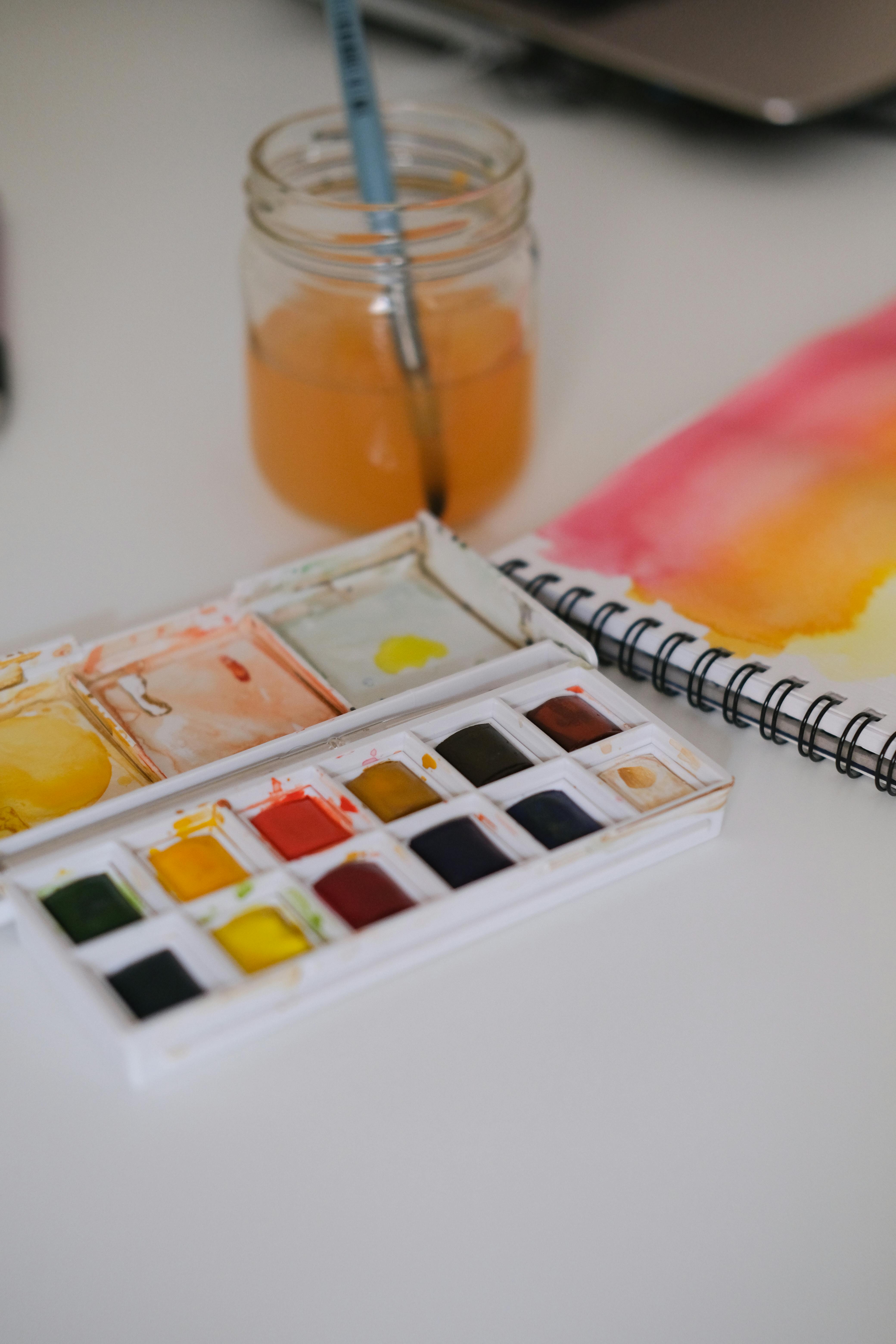
- **Consider a Palette Test Page:** Designate a specific page (perhaps the very last one, or the inside back cover) for testing colors, mixes, and techniques. This saves your precious painting pages from unwanted swatches and allows you to see how your specific paints behave on that particular paper before committing to a full piece. It's like a scientific experiment for your art, and I always have one running in my current sketchbook. It’s also a great way to record your color journey.
- **Test New Paper:** Before diving into a full painting, always dedicate a small corner (or even the inside cover) to testing your paints on new paper. How does it absorb water? How do colors lift? Does it pill? How does it handle layering or scrubbing? This small step saves so much frustration later, letting you anticipate the paper's quirks and adjust your technique accordingly. It's a crucial diagnostic step, like a doctor checking your vitals.
- **Document Your Journey:** Don't just fill your sketchbook with finished pieces. Use it as a visual journal. Date your entries, jot down notes about the weather, your mood, the colors you used, challenges you faced, or inspirations you found. These personal reflections make your sketchbook a priceless record of your artistic evolution, a tangible timeline of your growth, and a source of inspiration for future work. I often look back at old sketchbooks and find surprising nuggets of wisdom.
- **Protect Your Work:** Once a painting is completely dry, especially if it's in a spiral-bound book, consider slipping a sheet of glassine or wax paper between pages to prevent colors from transferring. This is particularly important for delicate or easily reactivated pigments. If you're using a bound book, keeping it closed and under a heavy object for a day or two after painting can help flatten any residual buckling, acting like a gentle press for your pages. A little prevention goes a long way in preserving your precious memories.
- **Mind Your Paint's Lightfastness:** Even on archival paper, if your paints aren't lightfast, your artwork will fade over time when exposed to light. Always check the lightfastness ratings of your watercolor pigments, especially for pieces you intend to keep or sell. A sketchbook full of ephemeral art is fine for practice, but for lasting work, choose your paints wisely. It’s a silent killer of artistic integrity.
- **Set a Theme or Challenge:** Sometimes having a specific theme (e.g., "all blue washes," "local landscapes," "daily portraits") or a personal challenge (e.g., "one sketch a day for a month") can help you fill your sketchbook and push your boundaries. It provides focus and encourages consistency without stifling creativity. I find these self-imposed limitations often spark unexpected freedom.
- **Try Different Orientations:** Don't always work with the sketchbook in the same orientation. Try turning it sideways, upside down, or even working across two pages vertically. Changing your perspective can spark new ideas and compositional approaches, helping you break out of habitual ways of seeing. It’s a simple trick with profound creative results.
- **Protect Your Work from Humidity and Light:** Once your paintings are completely dry, ensure your sketchbook is stored flat in a cool, dry place, away from direct sunlight and extreme temperature fluctuations. High humidity can encourage mold or mildew, while direct light can fade pigments over time, even on archival paper. For particularly precious pieces, consider slipping a sheet of glassine or wax paper between pages to prevent pigment transfer or smudging, acting as a gentle barrier.
- **Experiment with Mixed Media:** Your watercolor sketchbook isn't just for watercolors! Don't be afraid to integrate other media. Try adding ink lines for definition, colored pencils for detail and texture, gouache for opaque highlights, or even a touch of collage. A good watercolor paper can often handle these additions beautifully, expanding the expressive possibilities of your work. It's about breaking down barriers between media and letting your creativity flow freely.
Getting your hands on the right [essential watercolor supplies for beginners](/finder/page/essential-watercolor-supplies-for-beginners) is just the first step. The real journey begins when you start making marks, making messes, and making art.
[credit](https://upload.wikimedia.org/wikipedia/commons/0/04/D2017.023.019.089.jpg),
[licence](https://creativecommons.org/licenses/by-sa/4.0)
## FAQ: Your Watercolor Sketchbook Questions Answered
I've gathered some of the most common questions I hear about watercolor sketchbooks. Think of this as a quick-reference guide to help clear up any lingering confusion. These are the kinds of questions I wish I'd had clear answers to when I started my own journey, the ones that often seem simple but hide a lot of nuance. Let's demystify a few more things, shall we?
**Can't I just use my regular drawing sketchbook for watercolor?**
I mean, you *can*, but you'll likely be very, very frustrated. The paper in standard drawing sketchbooks isn't sized or heavy enough, so it will buckle, pill, and bleed mercilessly. It's akin to trying to paint a complex scene on tissue paper; it's technically possible, but why inflict that kind of torture on yourself? I'd save your regular sketchbooks for your pencils and ink, where they will truly shine. Watercolor paper is specifically engineered to handle moisture, something regular drawing paper simply isn't designed for, and the difference in experience is profound. Regular drawing paper lacks the internal and external sizing that prevents rapid absorption and allows pigments to sit and bloom on the surface. For a deeper dive, see our section on Why Your Watercolor Sketchbook Matters More Than You Think. It's truly a false economy to use the wrong tools; you'll spend more on wasted paint and endure more frustration than if you'd just started with proper watercolor paper.
**What is a watercolor block, and is it different from a sketchbook?**
Yes, they're quite different, though both contain watercolor paper. A **watercolor block** consists of many sheets of paper that are glued on all four edges, forming a "block." The purpose of this gluing is to keep the paper taut while you paint, preventing buckling even with heavy washes. You paint directly on the top sheet, and once it's dry, you use a palette knife or a dull blade to carefully separate the top sheet from the block. A **sketchbook**, on the other hand, is a bound collection of pages, usually with a spiral, stitched, or glue binding on one side. While some sketchbooks are designed to lay flat, they don't offer the same built-in tension as a block, so buckling can be more common. Blocks are fantastic for studio work or finished pieces where a perfectly flat surface is desired, while sketchbooks are often preferred for portability, journaling, and continuous work. Each has its place in an artist's toolkit, and I find myself using both depending on the project. For more details, refer to our section on Binding: How It's Held Together (where blocks are discussed). Blocks are particularly good for artists who work wet-on-wet extensively and despise warping, as they eliminate that concern entirely.
**What's the absolute minimum paper weight I should use for watercolor?**
I wouldn't go below 90 lb (190 gsm), and honestly, even that is pushing it for anything more than the lightest, driest washes. You'll spend more time fighting the paper's instability than enjoying your art. For best results without breaking the bank, stick to **140 lb / 300 gsm**. Anything less, and you'll find the paper warping, pilling, and generally making your life difficult. It's a false economy to buy lighter paper for watercolor, as your artistic output will suffer, and your frustration levels will soar. Remember, good paper can make a huge difference in your learning curve and enjoyment. For a detailed breakdown of paper weights, revisit our section on Paper Weight (GSM or lb). If you absolutely must use lighter paper, consider lightly taping it down to a board before painting to help mitigate some of the buckling.
**How do I stop my pages from warping after they dry?**
While a good quality, heavy paper will resist warping significantly, some slight buckling can still occur, especially with very wet applications. The best defense is a good offense: use painter's tape or binder clips to secure your page while you work and, crucially, while it dries completely. This provides tension and helps the fibers realign without excessive distortion. Once your painting is completely dry, you can close the sketchbook and place a stack of heavy books on top of it for a day or two. This will help gently press it back into flatness. For truly stubborn pages, a light misting on the *back* of the page (with clean water) and then pressing can work, but proceed with caution and only if the paint is completely insoluble on your paper. My personal trick is to apply gentle heat with a hairdryer on a low setting from a distance, while the page is still clipped, but again, caution is key to avoid over-drying or damaging the paint. Patience is key; rushing the drying process or removing clips too soon can exacerbate warping.
**How does humidity affect my paper and sketchbook?**
Humidity is a silent saboteur! High humidity can cause your paper to absorb moisture from the air, making it more prone to buckling even before you apply paint. It can also slow down drying times significantly, potentially leading to duller colors, less controlled blooms, or even mold growth if stored improperly. Conversely, very dry conditions can make paper brittle and prone to cracking. Storing your sketchbook in a relatively stable environment, away from direct sunlight, extreme temperature fluctuations, or damp areas, is best. If you live in a very humid climate, consider using a desiccant pack with your [art supplies](/finder/page/best-art-supplies-for-beginners) or investing in a tightly bound book that offers some protection from atmospheric moisture. Environmental control can make a surprising difference, and I’ve learned to be quite vigilant about this, especially with my more precious sketchbooks. Imagine trying to paint on a soggy sponge – that’s what high humidity can do to your paper!
**Are 100% cotton sketchbooks really worth the high price?**
If you are serious about watercolor, yes. A thousand times, yes. The difference in how paint behaves on cotton vs. cellulose is night and day. Cotton paper absorbs water evenly, allows for smoother blends, more vibrant colors, and incredible **lifting** capabilities (the ability to remove paint and create highlights or correct mistakes without damaging the paper). It allows for techniques that are simply impossible or deeply frustrating on cheaper paper, truly letting the medium shine. If you're on a budget, my advice is to buy one small cotton sketchbook and use it for your 'special' paintings, saving the cellulose for daily practice. You'll quickly understand the investment and likely never look back; it's an undeniable upgrade in your artistic experience. For more, check out Paper Material: Cotton vs. Cellulose. It's not just about better results; it's about making the entire artistic process more enjoyable and less of a battle against your materials.
**Can I use masking fluid in a watercolor sketchbook?**
Yes, you absolutely can, but with a few caveats! Masking fluid works wonderfully on good quality watercolor paper (especially 100% cotton with robust surface sizing) by creating a resist for precise highlights or intricate details. However, on cellulose-based papers, especially those with less surface sizing, it can sometimes pull up paper fibers or leave a residue if left on too long or removed too roughly. Always test it on a scrap piece of the same paper first, and make sure the paint is completely dry before gently rubbing off the masking fluid with a clean finger or a rubber cement pick-up. Patience and a gentle touch are key! I've had perfectly good results even on some student-grade papers, but only after careful testing and a very light hand when removing the fluid. Don't rush it! Leaving masking fluid on for too long, especially in humid conditions, can also make it difficult to remove cleanly.
**Can I use both sides of the paper in my watercolor sketchbook?**
This depends heavily on the paper's weight, sizing, and your technique. For lighter weight papers or very wet applications, paint can bleed through, making the backside unusable. With 140 lb (300 gsm) or heavier paper, and especially 100% cotton, you can generally use both sides, particularly if you're not doing heavy, soaking washes. However, be aware that the texture might be slightly different on the reverse (sometimes one side is designed as the 'front'), and **ghosting** (a faint impression of the painting on the front showing through) can occur. I often use both sides for studies and less precious work, but for a truly finished piece, I tend to stick to one side to ensure the best presentation and avoid any unintended visual distractions. If you're using very transparent washes, ghosting is less of an issue, but for heavier applications, it's something to consider for the aesthetics of your completed sketchbook. For very absorbent papers, even lighter washes can sometimes show through more than you'd like.
**Cold Press, Hot Press, or Rough? I'm overwhelmed! Which should I choose?**
When in doubt, start with **Cold Press**. It's the most popular for a reason—it's incredibly versatile and works well for most styles, offering a good balance of texture and control. Think of it as the friendly handshake of watercolor papers, accommodating a wide range of techniques without being too challenging. Once you're comfortable, you can always branch out and experiment with Hot Press for details or Rough for dramatic textures, knowing you have a solid foundation. Our Texture (Press) section has more details and specific use cases for each. It's the 'Goldilocks' option – not too smooth, not too rough, just right for most watercolor adventures.
**What about mixed media sketchbooks? Are they good for watercolor?**
Ah, the versatile friends! Mixed media sketchbooks are designed to handle a wider range of wet and dry media, often having a heavier weight than standard drawing paper but sometimes less sizing than dedicated watercolor paper. They're fantastic if you like to combine watercolor with ink, markers, collage, or pencil, offering a compromise for artists who don't solely focus on watercolor. Just be aware that while they can *handle* watercolor, they might not offer the same nuanced performance as a 100% cotton watercolor sketchbook. They often have less sizing and can absorb water differently, meaning you'll need to adjust your approach to wet-on-wet techniques or lifting. Always test them out first, and be prepared to adapt your technique to the paper's specific characteristics. They're excellent for versatility, but sometimes a dedicated tool is just... better for its dedicated purpose, if you know what I mean. Think of it this way: a mixed media sketchbook is a great generalist, but a dedicated watercolor sketchbook is a specialist, excelling in its chosen field. If you're truly serious about watercolor, investing in a dedicated watercolor sketchbook, even a student-grade one, will give you a much better experience than a mixed media book.
**Should I pre-stretch my watercolor paper in a sketchbook?**
Generally, no, not in a sketchbook. Pre-stretching (taping wet paper to a board to dry flat) is usually reserved for individual sheets of lighter weight watercolor paper (under 140 lb / 300 gsm) that you intend to work on very wet. For proper watercolor sketchbooks, especially 140 lb (300 gsm) and above, the paper is heavy enough to minimize buckling. If you're working extremely wet on lighter paper in a sketchbook, clips are your best bet to secure the page. Trying to pre-stretch a page *in situ* in a bound book is more trouble than it's worth, trust me on that one, and could damage the binding. Stick to clips for in-book flatness. For block paper, the edges are already glued, eliminating the need for stretching altogether. Stretching involves soaking the paper, taping it to a rigid board, and letting it dry completely, which is simply not practical or advisable for a bound sketchbook.
**What's the best way to care for my watercolor sketchbook?**
Care and longevity go hand-in-hand! Always ensure paintings are completely dry before closing your sketchbook to prevent sticking, smudging, or mold growth. Storing it flat in a cool, dry place, away from direct sunlight and extreme temperature fluctuations, will protect the paper and your art. If you're particularly keen on preservation, slip a sheet of glassine or wax paper between precious pages to prevent pigment transfer or smudging, especially for delicate or easily reactive paints. Think of it like a cherished journal; a little care goes a long way in preserving its stories for years to come. I often keep mine in a drawer or on a shelf, away from any direct light, and away from my frequently used paints to avoid accidental spills. A consistent environment is paramount to prevent premature aging and deterioration of your cherished artworks.
**What's the difference between paper 'tooth' and 'texture'?**
These terms are often used interchangeably, and in many contexts, they refer to the same thing – the surface quality of the paper. However, 'tooth' specifically refers to the microscopic peaks and valleys on the paper's surface that give it a slight roughness, allowing pigments (especially dry media like pastels or charcoal) to adhere and granulate. 'Texture' is a broader term that encompasses this tooth but also includes the overall visual and tactile feel of the paper, which can be influenced by the manufacturing process (like the felt blankets used for cold press). So, while all paper with tooth has texture, not all texture is necessarily 'tooth' in the strictest sense; it can also be a more subtle or irregular surface variation that impacts how your brush glides. Think of 'tooth' as the micro-texture that grabs pigment, and 'texture' as the overall feel and visible pattern on the surface. Our Texture (Press) section explores this further. The best way to understand the difference is to feel different papers; your fingertips will tell you more than any dictionary definition.
**Can I use watercolor pencils or markers in a watercolor sketchbook?**
Absolutely, and they can be a fantastic combination! Watercolor pencils and markers are designed to be activated with water, just like traditional pan or tube watercolors, so using them in a sketchbook designed for watercolor is a natural fit. The paper's sizing and weight will handle the moisture well, allowing for smooth blending and vibrant washes. Just be mindful of how much water you apply, as excessive scrubbing with a wet brush on watercolor pencils can sometimes damage the paper surface, especially on cellulose-based papers. Experiment to find your sweet spot for activation, and enjoy the expanded range of techniques these tools offer. I often layer watercolor pencils over washes for fine details or textural effects. They offer a unique bridge between drawing and painting, allowing for precise control with the vibrancy of watercolor.
**What brands offer good student-grade watercolor sketchbooks?**
For reliable student-grade options, look to brands like Canson (their XL series is popular for beginners and mixed media), Strathmore (the 400 series or Vision watercolor pads are solid choices), or Bee Paper Company (Super Deluxe Watercolor Book, which offers good performance for the price). Stillman & Birn's Alpha or Beta series (cellulose) also offers excellent performance for their price point, providing a great stepping stone from absolute beginner to more serious practice. These brands offer a good balance of quality and affordability, allowing you to experiment without significant financial commitment and build confidence before investing in premium artist-grade materials. Remember, even student-grade papers can produce beautiful results with the right technique and understanding of their limitations. They are perfect for daily drills, color studies, and low-stakes experimentation.
**How can I make my own watercolor sketchbook?**
Making your own sketchbook can be a incredibly rewarding project! It allows you to customize every aspect: the paper type, weight, texture, cover material, and binding style. You'll need high-quality watercolor paper in sheets, a sturdy cover material (like bookboard or heavy cardstock), and binding supplies (such as bookbinding thread, glue, and a needle for stitched binding, or a spiral coil and binding machine for spiral-bound). There are many excellent tutorials available online for various binding methods, from simple pamphlet stitch to more complex Coptic binding that allows for a lay-flat design. It's a fantastic way to deepen your understanding of paper and book construction, and the finished product will be uniquely yours, a truly personal artistic statement. It's an excellent way to use loose sheets of your favorite paper and tailor a sketchbook exactly to your needs. For some inspiration, check out my guide on [how to make your own sketchbook](/finder/page/how-to-make-your-own-sketchbook).
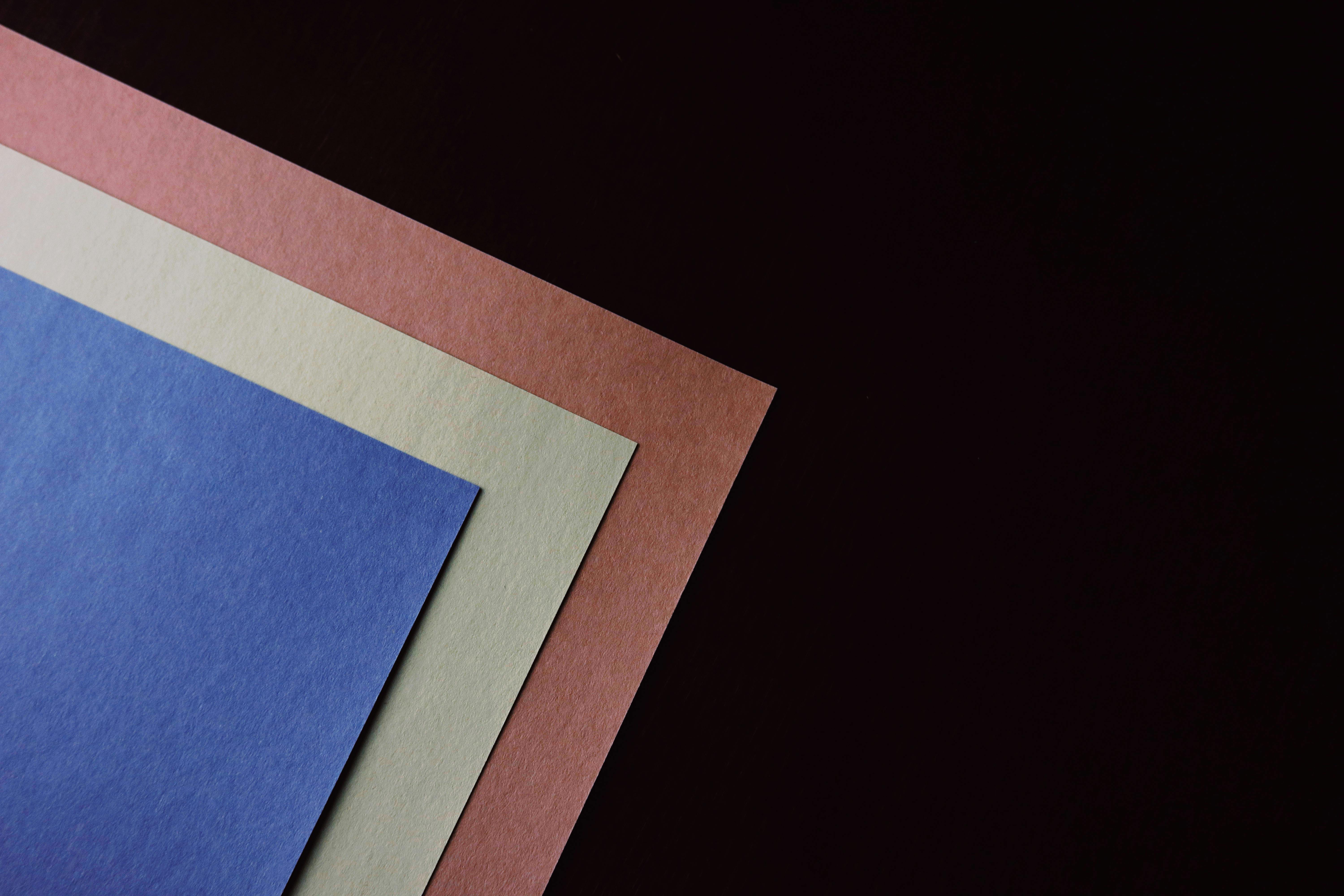
[credit](https://images.pexels.com/photos/7457657/pexels-photo-7457657.jpeg),
[licence](https://creativecommons.org/public-domain/)
**What's the difference between student-grade and artist-grade watercolor paper?**
The difference primarily lies in the quality of materials and manufacturing processes. **Student-grade paper** is typically made from wood pulp (cellulose), often has less robust sizing, and may contain optical brighteners or other additives to make it appear brighter. It's more affordable and great for practice or experimentation, allowing you to develop skills without significant financial outlay. **[Artist-grade paper](/finder/page/best-sketchbooks-for-artists)** (often called professional or archival grade) is usually 100% cotton, meticulously manufactured for consistent quality, features optimal sizing (both internal and external), and is naturally acid-free, ensuring longevity. Artist-grade paper offers superior performance in terms of absorbency, blending, lifting, and vibrancy, allowing for a wider range of techniques and ensuring your work endures for centuries. While student-grade is excellent for learning, artist-grade unlocks the full potential of the medium and the expressive capabilities of watercolor. It's a choice between a good learning tool and a professional instrument. The consistent quality of artist-grade paper means fewer surprises and more predictable results, which is invaluable for advanced techniques.
**Can I use light washes of gouache or acrylic in a watercolor sketchbook?**
Yes, absolutely! Many watercolor sketchbooks, especially those with heavier paper (140 lb / 300 gsm and up) and good sizing, can handle light applications of gouache or fluid acrylics. Gouache, being an opaque watercolor, integrates beautifully, and thin washes of acrylic can also work without too much buckling. However, avoid heavy impasto (thick layers) with acrylics, as the paper isn't designed for that rigidity or surface adhesion. Always test on a scrap page first to see how your specific paper reacts. This versatility makes a good watercolor sketchbook a truly multi-functional tool for exploring different mixed media approaches, blurring the lines between media in exciting ways. I often combine watercolor with gouache for highlights, or with fluid acrylics for bolder, more opaque passages. Just remember that heavy applications of acrylics can make the paper stiff and prone to cracking over time, so moderation is key.
**How many pages should a good watercolor sketchbook have?**
The ideal page count really depends on your intended use. For travel sketching or quick daily studies, a sketchbook with 30-60 pages (60-120 sides) is often sufficient and keeps the book portable. For studio work, a formal journal, or a project that will span a longer period, a sketchbook with 60-100+ pages might be preferred. More pages mean more space for exploration, but also a heavier, bulkier book. It's a balance between volume and portability, and I find having a mix of different page counts for different purposes works best. Remember, it's better to fill a smaller book than to leave a large one mostly empty. Sometimes, a smaller page count can actually encourage you to finish the book, giving a satisfying sense of completion.
**What is a sketchbook journal?**
A sketchbook journal is more than just a collection of finished artworks; it's a blend of visual and written expression, a personal diary that incorporates sketches, paintings, notes, thoughts, observations, and even found objects (like ticket stubs or leaves). It's a space for creative exploration, idea development, and documentation of your life and surroundings. The emphasis is on process over perfection, making it a truly intimate and invaluable record of your artistic journey and personal reflections. It's where I work out ideas, capture moments, and sometimes, just vent my creative frustrations.
**What is a sketchbook journal?**
A sketchbook journal is more than just a collection of finished artworks; it's a blend of visual and written expression, a personal diary that intentionally incorporates sketches, paintings, notes, thoughts, observations, and even found objects (like ticket stubs or leaves). It's a dynamic space for creative exploration, idea development, and comprehensive documentation of your life and surroundings through both art and words. The emphasis is typically on process over perfection, making it a truly intimate, invaluable record of your artistic evolution, personal reflections, and daily inspirations. It's where I work out ideas, capture fleeting moments, and sometimes, just vent my creative frustrations or celebrate small victories.
**How do I choose the right size for my sketchbook?**
Choosing the right size is a deeply personal decision that should align with your lifestyle and artistic goals. For on-the-go sketching, opt for smaller, more portable sizes like A6 (pocket-sized) or A5 (fits easily in most bags). These are perfect for quick observations or when space is limited. For studio work, more expansive compositions, or detailed studies, larger sizes like A4 or A3 provide ample room. Consider if you prefer working across two pages for panoramic views; a wider aspect ratio (like a landscape-oriented sketchbook) might be ideal. Ultimately, the "right" size is one that feels comfortable and encourages you to actually *use* the sketchbook regularly. I keep a variety of sizes for different moods and projects!
**Are there ethical considerations beyond paper material?**
Absolutely. Beyond the choice between cotton and cellulose and sustainable forestry certifications, you can also consider brands that prioritize fair labor practices, use renewable energy in their manufacturing, or minimize water usage in production. Some brands are transparent about their entire supply chain, offering a deeper insight into their ethical commitments. While it can be challenging to find all this information for every product, supporting brands that actively work towards greater social and environmental responsibility contributes to a more ethical art industry as a whole. It’s about making a holistic choice that aligns with your values as an artist and a global citizen. Doing a little research can make a big difference, not just for the planet, but for your peace of mind while creating.
The perfect sketchbook isn't the most expensive one; it's the one you're not afraid to fill, the one that becomes an extension of your hand and your mind. It's a personal record of your progress, your travels, your ideas, and even your glorious failures. So go find one that truly speaks to you, grab your paints, and make a beautiful, unapologetic mess. If you're curious about what those messes can eventually turn into, you can see some of my finished pieces over in the [/buy](/buy) section of the site. Remember, it's a journey, not a destination, and every page is a precious step along the way. So, arm yourself with curiosity, choose a sketchbook that excites you, and wholeheartedly embrace the beautiful, messy, and endlessly rewarding process of creating art. I can't wait to see what you discover within those pages!
[credit](https://live.staticflickr.com/3824/9659311885_3c49c2a509_z.jpg),
[licence](https://creativecommons.org/licenses/by/2.0/)
### Can I use watercolor with other dry media like charcoal or pastels in my sketchbook?
Absolutely, and this is where a good quality watercolor sketchbook, especially one with a decent weight and some tooth, really shines! You can layer charcoal, graphite, or pastels over dry watercolor washes for added depth, texture, and detail. The paper's surface will provide enough grip for the dry media. However, always ensure your watercolor layers are completely dry before applying dry media to avoid smudging or picking up pigment. Conversely, you can also start with light pencil sketches before your washes. Experiment with the order of application to discover exciting mixed media effects. Just be mindful of how much pressure you apply with harder drawing tools, as you don't want to indent the paper too much for subsequent watercolor layers. I often find that combining media adds a whole new dimension to my sketchbook studies. This can lead to surprisingly rich and complex textures that wouldn't be possible with a single medium.
### How often should I replace my watercolor sketchbook?
This is entirely dependent on how often you use it, how many pages it has, and how precious you are about keeping completed volumes together! For daily sketchers, you might go through a smaller sketchbook every few months. For those who use it for more detailed, finished pieces, a larger sketchbook could last a year or more. There's no hard and fast rule. Some artists prefer to replace them once they're full, creating a physical archive of their artistic journey. Others might switch them out seasonally or when they embark on a new project or travel adventure. The most important thing is not to let an unfinished sketchbook sit gathering dust for too long; keep that creative momentum going! I have a shelf of completed sketchbooks, each a snapshot of a particular period in my artistic life, and looking through them is like reading an old diary. It’s less about a strict schedule and more about listening to your creative flow and practical needs.